Matt Hardigree
A long-time writer and editor in the car space, you may have read my work in Wired, Jalopnik, and the newsletter for my local Ultimate Frisbee team. I love writing about the car industry, driving minivans, and dreaming about owning various European Fast Fords. I drive an E39 530i Sport (with the stick) and a CR-V Hybrid. You can email me at matt@theautopian.com or follow me
on Instagram. Oh, I'm also the Publisher of The Autopian. That seems less interesting than the European Fords thing, though.


I love the night panel, but I don’t understand why it isn’t called the dimmer switch.
It seems to be in production mode now.
The Dingaling drop down that tells you if people are replying to your comments or if people you are following our commenting has the links in light teal on a white background, which in my opinion is pretty much illegible.
Speaking of UI and features,what exactly is the glove box?
Of, and that Manage Consent button, is a surgical procedure involved? It seems creepy.
Teal is by far my least favorite color, but I suspect I would put up with it in order to get less eye-searing reading of the Autopian.
That said, if you can dial down the teal or just use some other complementary color that would be awesome!
I love it!
Night Panel is something I’ve thought about asking for. Pleased to see it in development. Don’t like the ‘teal’ or the Autopian ‘Olo’ for font color. Also, feels very odd for hyperlinks to be in white font. Just my poor aesthetic taste.
Hey, I would just like to point out that as an older person, white text on a black background is vastly harder to read than black text on a white background. Cataracts even mild ones cause what are effectively multiple overlapping images. If it is a dark letter on a light background, the extra images are obscured by the white background. Light text on a dark background is a real mess. Does it suck while you’re driving at night? Oh yes, it very much sucks.
Slightly off topic — spending 60 years of your life concentrating on being a visual artist and then getting cataracts, and an attached retina, which is a whole other mess, especially sucks, so my advice is wear dark glasses whenever you can because the alternative is getting cataracts.
So please make dark mode optional, especially on mobile devices and while you are at it, how about a big print option?
Don’t worry, this will definitely be a feature you can turn on or off.
Hold shift and hit + to supersize the font – works on most browsers and websites.
I do that on the laptop, the iPhone is different
So you want us to pay $7/month for the site to not be blindingly white? Before background was just annoying, now it feels malicious. I love The Autopian, but I can’t justify paying that much for it.
I can only speak for Firefox, but there’s a browser extension called Dark Reader that turns any website into a dark mode. It’s not 100% perfect because it can’t account for the color of every type of web element. Things like radio buttons, along with color choice options on shopping sites have trouble, but you can toggle it quite easily if it’s proving too hard to read. And it remembers what setting you have on a per-website basis.
James, surely if you try very hard you can understand the work the word “preview” is doing in the headline.
I think the confusion is that members are mentioned twice.
“A Member Preview of ‘Night Panel’ for Autopian Members”
It reads that there is a feature called ‘Night Panel’ that is for Autopian Members, and this article is a preview for those members to see it early.
Also, as a Tales from the Slack, it’s *already* an article just for members. So that’s, like, *two* extra mentions of Member.
“So you want us to pay $7/month for the site to not be blindingly white?”
that isn’t at all what they are even suggesting.
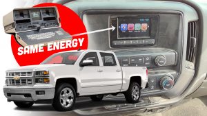
Shoot – I was hoping the night panel was a jailbreak mod for my car’s dash!
That was exactly my thought, too
Could there be an option to swap the blue for the classic orange? (Jeep XJ, first gen tacoma from my experience)
I expected to hate it, but I like this particular shade for the text. I’m actually usually not into dark mode on the web because most sites are kinda crap. So, well done!
SAAB REFERENCED!