I think more than most industries, carmaker logos and badges tend to have a lot of longevity, and changing or updating a logo is seen as a Big Deal. Maybe its because cars tend to immortalize their logos in chrome badges and large signs over dealerships and other very obvious and tangible things. That’s why it’s a much bigger deal when a carmaker changes a logo than if, say, WhatsApp changes their icon, or KFC moves to a new typeface next to a more handsome Colonel. Car logos are different; if you don’t believe me, look at Ford, which has kept the essentially the same objectively wildly-outdated logo that they’ve used (with various minor refinements) since 1909. Bentley is a carmaker with a well-known, over-century-old logo, and now they’re changing theirs, so the least we can do is look at it and scrutinize it like the good obsessives that we are.
The Bentley logo is an example of a classic motif in logo design: some center element, be it a name or object or letterform, bracketed by a pair of wings. This comes up over and over in logo design, and especially automotive-related logo design, where the wings suggest speed and mobility, even if, generally, actual flight is off the table for most cars.


Consider the logo for Indianapolis Motor Speedway, for example:

…or Aston Martin’s logo:

…or even the logo on the grille of my Nissan Pao:

Winged things are a true staple of automotive visual identity, and Bentley has been enjoying such ornithological logos since way back in 1919. Here’s the progression of their logo from then until now, so we can understand better how they approach this old but still compelling concept:

I think what’s most fascinating about Bentley’s logo is how seemingly cavalier the company has been to the details of the logo, as they all seem to mostly just be based on a general description: the distinctive Bentley “B” in an oval, bracketed by wings of some kind and maybe with some extra feathers at the bottom. That seems to be it, pretty much?
The visual style of the wings hasn’t been particularly consistent, really, and aside from a good bit of simplification and streamlining from the 1919 one to the 1931 version, you could almost take the 1931, 1996, and 2002 logos and put them in any order and almost nobody would be able to tell. There really hasn’t been any sort of logo evolution for Bentley, just some minor shuffling of feathers and bezel widths and so on.
Just to prove my point, let’s reverse the order of the three in the middle and move the oldest to the top, and the new one to the bottom. Would you be able to tell this wasn’t right?

I don’t think I would.
Anyway, given all of that, this new logo is a pretty dramatic departure from the old ones. For the first time, the wings are aggressively stylized, and no longer attempt to resemble actual feather patterns of real bird wings, instead opting for a faceted, jewel or quilted textile-like pattern that at most suggests feathers. The wing shape has been dramatically simplified to near-triangular forms, and all of the extra feathers and fussier details on the bezel around the “B” have been eliminated.
I think perhaps we got an early taste of this new look, in hood ornament form, around 2019 when they introduced the new Flying Spur and its shy hood ornament that can retreat into the grille:
You can see a very similar simplified wing shape there, as well as a more stylized feather pattern, even if that one was a bit more naturalistic.
Here’s some PR-talk about the new logo from Bentley:
The design of the new Winged B was led by Robin Page, supported by a small and dedicated internal team. Initially, a competition was run, allowing the entire design team to submit concepts and sketches. The final design chosen was proposed by Young Nam, a member of the Interior Design team, and that concept was then developed and detailed into the final version.
The mission in designing the new emblem was to capture some of the beautiful details from the previous designs – for example, the diamond pattern of the inner wings and the B ‘centre jewel’ – but create a more modern and progressive design.
The shape of the new wings themselves are sharper and more dramatic than the outgoing version – more reminiscent of the angled wings of a Peregrine Falcon than the previous softer shapes. The lower feathers underneath the B have been removed entirely, for a visually-cleaner shape.
Okay, that all generally makes sense, though, I, embarrassingly, can’t seem to conjure up a Peregrine Falcon’s wing shape off the top of my head. Let’s check on that:

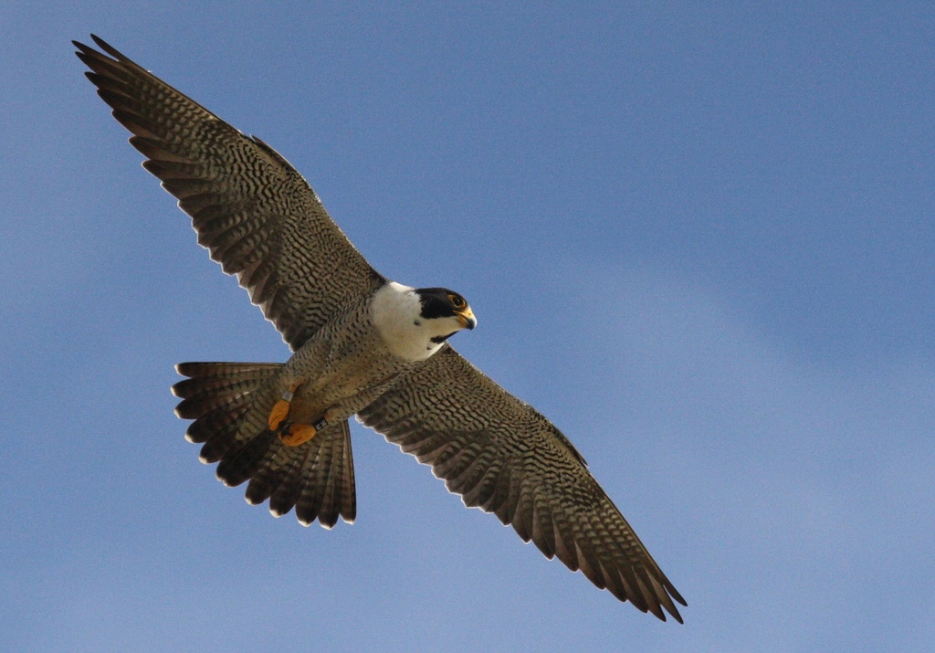
Ehhhhh, okay, I guess I can kind of see what they mean, but it is a bit of a stretch. Whatever, we all like Peregrine Falcons, right?
You know what, though, and I suspect this is not what Bentley was going for? Those new wings feel sort of insect-like, at least to me. Which I kind of like!
The new logo is set to be first used on a concept car that Bentley will show in just six days from now, and the new badge is about all we see of that concept in this new teaser video:
It looks like it illuminates, which has been a car badge trend lately, and there’s what looks to be an illuminated grille made up of a lot of greater than- and less-than signs (<> ><). I’m curious to see how all of this define’s Bentley’s new overall look.
I think this is a welcome re-design for Bentley; I’m glad to see them sticking with the winged basics, but it was probably long overdue for a nice distillation and streamlining of the logo, which this does seem to accomplish pretty well.
So, okay, Bentley, I guess you have my approval. You’re welcome.
Cool. Reminds me a teensy bit of when Cadillac went full Mondrian and got rid of the ducks. And Bentley Flying Spur? Spurs fly? Think of something else Bentley. Airships fly. Aka dirigibles. Bentley Flying Dirigible. The BFD, that’s a car I’d want to check out.
I think I could use some sleep… G’night folks.
Car manufacturers are redesigning logos without putting Arial text on a single solid color. Apple is copying Windows Vista’s interface. Even Pepsi has gone back to a real style.
Are we finally out of the horrible design doldrums of the past 15 years?
Re peregrine falcon wing resemblance: the new wings resemble the outer half only of each falcon wing. They look like a peregrine falcon got cleavered at its midway knuckle joints. Nasty.
The Aston wings resemble the falcon more closely, as well as being a beautiful design.
Re this:
I’ll bet Bentley management were not hoping for that kind of reaction from the press.
Re the unspoken-of Belephant in the middle of the logo:
Damn, the that B is horrible in every version. I understand that its outer outline is being shaped by the surrounding oval. But in no version do the counters begin to work with, complement or harmonize with that outline. The latest version is the least bad, but in all of them the counters are strange, and combined with the outline create horizontal strokes with no balance, proportionality, flow, or appropriateness to the whole.
On the topic of winged emblems, I’m not going to pass up the opportunity to bring up the amazing winged ‘Toyoda’ kanji emblem on their Model AA:
https://upload.wikimedia.org/wikipedia/commons/3/37/Toyota_Model_AA_hood_ornament_Toyota_Automobile_Museum.jpg?20130816033806
Fun fact: peregrine falcons are the fastest animals (aside from humans using mechanical aids such as cars, planes, & rockets) but only in steep dives so the prize for *horizontal* speed goes to the Mexican free-tailed bat or Brazilian free-tailed bat (Tadarida brasiliensis) which can hit 100 mph in level flight. The peregrine falcon might be able to hit about 240 mph in long steep dives but can hit *only* 68 mph in horizontal flight.
“[W]e all like Peregrine Falcons, right?”
Yeah, agreed but also some of us like bats 🙂
Laden, or unladen?
Kind of moot since these free-tailed bats are neither African nor European
The previous ones look like actual birds with one giant eyeball with a B in it (I think 1931 is my favorite).
I like those better. Not everything has to be modernized ad nauseam.
It looks to me that Bentley took its logo “B” and set it to ludicrous speed. At this point, the might as well go plaid.
Rearranging the deck chairs on the Titanic. Though I suppose it gives all those highly-paid marketing weenies justification for their paychecks.
No a business class will show it is mostly based on the shelf life of the products. Cereal expires in 4 months it changes logos quicker than fresh food and slower than long term products like cars.
Next refresh they will replace “B” by “GENESIS”
And sometimes companies just get it plain wrong. Take for example the logo refresh for Pizza Hut from the 1990’s. Both the hut design and the logo’s wordmark looked like they gave crayons to a toddler and said have at it… you’ll get some extra breadsticks with dinner if it’s a good one.
At least here, they are attempting to actually refine something and not upset the masses.
Ha – that was the 90s for ya. Michael Graves stuff at Target and that one paper cup design pretty much say everything you need to know about the decade’s graphic look.
I think there’s a typo. The article mentions 1909 a lot, but the logos start at 1919, when the company was founded.
2025: curved wings are woke
Classic Shakespearean conflict.
I honestly don’t get the logo changes. The older it is, the more prominent, distinct, distinguished etc. To me the perfect example is the Coca-Cola logo. That thing is old as shit but can you imagine them going with something modern? It’s arguably the most recognized logo of them all. Now compare that with Pepsi which changes their logo every year it seems and they may as well not have one. Even Ford with their old cursive, I’d hate for it to be modernized. It’s history. Maybe I’m just sentimental but for something that’s well recognized and been around a long while, leave the damn thing alone.
Sometimes a logo is just perfect and completely beyond the ability to change. I’d argue Coke’s is the world’s greatest logo – the script is old as shit, but it’s just so astoundingly distinctive. All you need is red with a white swoosh of the C and you know what it is
Yes and yes to Protodite too. Old trad logo on swoopy modern car=rich and tingly contrast.
The Dallas Cowboys have changed their logo…never.
Heck yeah!
It looks cheaper. Sure it’s more *modern* or whatever the marketing department wants to say, but it looks cheaper. I think it’s the implied glass over the winged element that looks like the kind of plastic covered chromed plastic crappy trinket you get as a boardwalk souvenir that says “I LOVE *insert beach name*” on a generic background. This doesn’t do it for me.
I’m glad they’ve decided to keep the asymmetry of the logo. If you look closely on the earlier ones, they have one more ‘feather’ on the right side. This was done intentionally to trick copycats and counterfeits way back when – in proper coachbuilding times. For a long while it was symmetric, but the asymmetry was brought back again.
The new one isn’t as distinctly ‘feather-like’ as the old ones, but they’ve kept the theme of having more segments on the right side.
It’s gone from resembling bird wings to resembling insect wings. Maybe it’s a pun? B = Bee?
Adrian or the Bishop can (and I would say, should!) make a better one.
And Jason can make one featuring the Jeffersons’ neighbor.
This new logo really puts it over the top for me. I’m on the way to the Bentley store!
Or maybe the train store, which you could also afford.
https://youtu.be/uO3ZEgv613k?si=H4b_TcB6rAplAgQd
Please do not kill me, I have owned the car for decades, the flying B is glass, yes Lalique glass and very subtly asymmetrical. It is quite nice.
Owning it for decades via inheritance from a relative who also owned it for decades is the only acceptable way to possess a Bentley or similar car. Otherwise you may as well be a Kray or an oligarch or one of Mrs Thatcher’s succubi or something.
My grandfather bought it new,in 1934 although it took a year to build, a windfall from the war office I think. On the occasion of my reaching my majority ( 21st birthday) I assumed responsibility for it. That was 1981, I still drive it, because it is a car, that is what it does. It has had work done, the big engine rebuild was a thing, the gearbox is not the original, I have the first one but the ratios are a bit short. I have no children, but my 12 year old nephew is a fan. Another million miles? I wonder what folk will make of it in 2135!
Dear Jaguar – this is how one should go about revising a logo.
Paging KN! Oops I meant Kia.
Kind Inch Nails. It’s similar, but they’re based on Stoke-on-Trent Reznor, which is very close to Bentley’s home in Crewe.
Damn, that took a weird turn.
Bentley originally was worried about competitors ripping off his logo so the 31 logo had 10 winglets on one side and 11 on the other. I always thought that was a neat quirk.
I think eliminating the tail deather section is fine. The texture within the wings was fine before and is fine now. I do think they should have left more curve on the bottom profiles of the wings. It feels like one step too far from being identifiable as wings.
I had never really looked at the Bentley logo before. I didn’t know it had tail feathers, thinking it was just a B with wings.
Seeing the tail feathers — whoa, that’s kind of creepy. With the tail there, there is obviously a head missing.
I see Operation Dammit Genesis! has led to another evolution in the bird wing motif, led by a person called Robin, no less.
I liked the older styles. Especially the 1931 version. The new version doesn’t look near as nice to my eye.
I mean, why NOT be ostentatious with the wings?
I agree, I think the 1931 is the best of the lot
This Bentley logo is one that looked better to me before the “update”. I’ll also chime in on the 1931 version looking the best.