BMW recently unveiled its first of its new-wave Neue Klasse cars, the iX3, and on top of a whole new design brief and an estimated 400 miles of range, the car also brings with it a new BMW logo—and yes, we are also just now noticing it.
To be clear, this is not referring to the much more notable, “flat” BMW logo that came out in 2020, and was optimized for and really only seen on screens, although this one shares similarities. This one actually shows up on the iX3’s sheetmetal and will eventually come to future BMWs as well, but the differences between it and the old badge are subtle to say the least.
In fact, let’s make a game out of it. Below is the new badge as it appears on the iX3, and below that is the old one. Can you spot every difference?
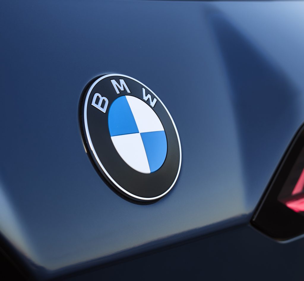
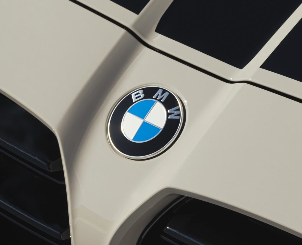
And here are a pair of more straight-on shots of the two as they exist on the steering wheels of the iX3 and iX, respectively.
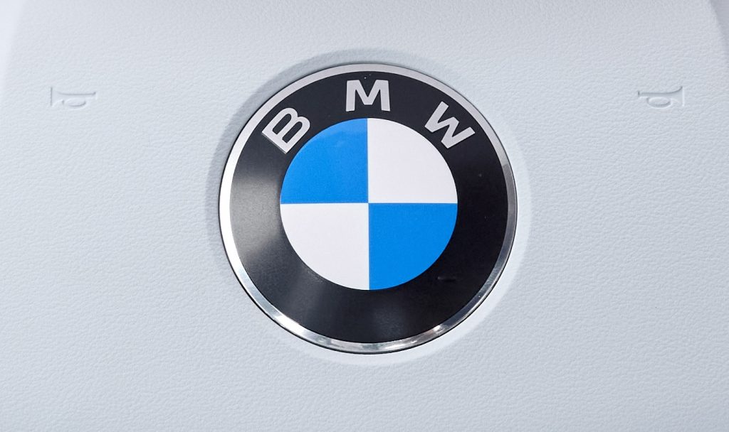
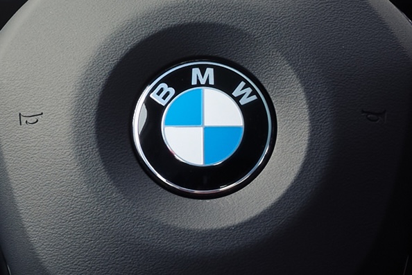
OK, let’s check your answers.
- The ring of chrome that separates the inner blue-and-white circle from the outer black one has been removed.
- Similarly, the chrome bars that separate the blue and white sections within the inner circle have also been deleted.
- The “BMW” font is ever so slightly slimmer—the two “holes” within the B are noticeably longer now.
- On the inside, at least, the old badge’s glossy finish is now matte.
Did you get everything?
According to BMWBlog, the company is also ditching the additional blue outer ring that came with the roundel on its electrified cars going forward. Hence, why the electric iX3 does not have this.
[Ed Note: Here’s that blue ring, since I bought a spare badge for my BMW i3 for some reason:
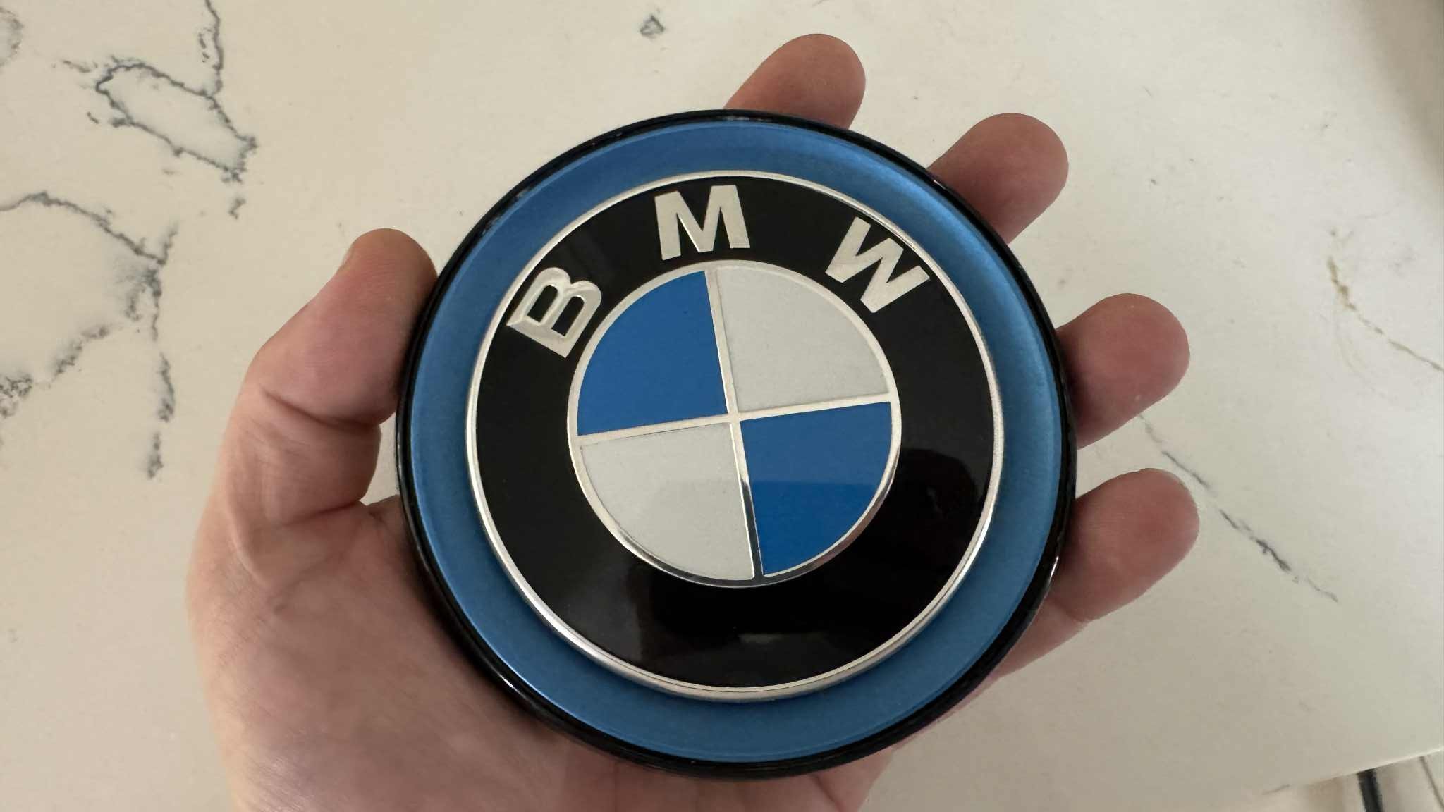
-DT]
Still, the differences, especially on hoods, trunk lids, and center caps, will be hard to spot for most people. The one on the steering wheel, however, which is now satin and almost looks printed on now will likely get the most attention from repeat BMW customers.
And, frankly, I don’t hate it! It makes it look vintage—like a car from BMW’s first Neue Klasse from the ’60s.
Now, if only BMW applied this “less is more” philosophy to the designs of the cars themselves.
Topshot: BMW



Pretty sure BMW will activate those chrome dividers between the inner ring parts if you pay for the subscription.
Ha, ha, ha! THAT made me laugh out loud. Thanks!
Otherwise, I have zero interest in BMWs or really anything German automotively related these days.
And the money saved from those chrome deletions will cover part of the exorbitant fees charged by the deleting consulting firm.
Noticed one more. The middle points on the M and W now come all the way to the bottom and top of the letters. Not sure if that description was good.
Thanks – I hate it.
Reminds me of an old VW ad from the 70’s. A guy at an auto show is wearing a lab coat, holding a long pointer. He waves the pointer at the car and states: “by 1957 all cars will have holes in the hood!” He was gesturing at the style features of what I believe was an old Hudson, which were a line of 4 chrome rimmed holes on either side of the hood. Yep every car had them eventually.
The true amazing aspect of this. Think of all the boring committee meetings and focus groups this involved! This had to be the brainchild of some wanker. Now perhaps they need to have more of a look at the trend BMW has towards giant pig snout look to their lineup. Probably the same guy thought up the pig snout and the new logo. He will be CEO soon.
The old logo had manual transmission, rear wheel drive, inline-6 driver’s cars in a world that had shifted to automatic transmission, front wheel drive, V6 appliances.
The new logo has single gear, rear wheel drive, electric motor cars in a world where every single auto company has single gear (or two speed), rear wheel drive, electric motor cars.
Unlike the same slop, less rose colored view of history challenge another company recently faced, the challenge here is not the logo.
“Now, if only BMW applied this “less is more” philosophy to the designs of the cars themselves.”
Truer words rarely spoken.
I’ve driven some older BMWs (80s-90s) and loved them. The first time I did, I said out loud (to my girlfriend at the time, who owned the car) ‘I see why people like them so much!’ Hers was an automatic, a white 3-series (appropriate for a young lawyer living in the valley) but the steering and brakes were very good, and there was more than enough ooomph from whichever engine it had (a six I think). The instruments were analog, and easy to read, and I liked the orange lighting on the dials/LED readout. It was a very nice car to drive: light, but solid feeling, and very precise. Back then, the only car I’d driven that felt even better (from a driver input POV) was the new/first-gen Porsche Boxster.
However, every recent/ish BMW that I’ve driven or sat in feels HEAVY, and is SO overladen with electronica as to be off-putting, even to a tech guy like me. Who needs, let alone wants, all that gadgetry in their car? Of course, this affliction isn’t limited to BMW these days.
And then there’s the matter of design. The 3 and 5 and 6 and even the 7-series (for one or two generations) were truly lovely cars: they looked athletic, with restrained, tasteful detailing. They came off like track stars compared to Mercedes’ powerlifters and shot putters. They literally seemed like advertisements for German engineering excellence, visually and functionally.
Now? There’s not a single current (American market) BMW product that I can get excited about, let alone seriously consider owning. Almost everything they offer is bulky and sort of baroque, as if props from a promising, big-budget sci-fi movie that flopped at the box office and has long since been forgotten. Of what we have now, the 2-series comes off as the least offensive, but perhaps that’s simply because it’s smaller.
A sad state of affairs. IMO.
Let’s discuss that which remained the same. It still says ‘BMW’ using Western characters and not Cyrillic or Chinese, it’s still round, still has the propeller image, in blue and white, and is still sized to where one can identify the car at distance without the need for binoculars.
I usually dislike badge redesigns, but I actually really like this. Removing the chrome dividers makes it feel cleaner and yet somehow more vintage.. Definitely a better execution than Aston and Nissan’s recent revisions.
Has the blue itself changed too?
No, the onset of fall places the sun at a different angle, changing the reflectivity of the emblem, and the light leading to the cone cells of your retina. It’s just your brain processing the environmental stimuli in a different manner. Or maybe they changed the color.
This is the only thing BMW has redesigned in the last decade that looks better than the outgoing design.
My first thought was, don’t they have bigger fish to fry? Maybe fix the Ugly first?
I dind’t include the matte finishing because I didn’t consider it a design decision, but maybe it is, who knows. I got everything else; the changes are all subtle but noticeable because they work. They did an excellent job modernising the logo by simply decluttering it visually (I wish we could say the same of their design philosophy when it comes to cars). The font immediately stood out to me, all three characters are visibly different. There’s also a detail in the outside badge that isn’t present in the steering wheel one that I really like, which is how the tips of the blue sections don’t seem to touch. But maybe that’s down to the angle of the photo, because the one in the steering wheel doesn’t seem to have this small gap.
Neue Klasse? Really?
Cue the new new vs the old new, and how the old stuff is modern
This is how you update a brand logo, noticable, yet still subtle.
Overall good job TBH.
I just noticed “night panel” in the top right corner. Thank you whoever made that change!
I built a 3D model of the BMW rondel in AT&T/Crystal TOPAS back in 1988.
With a keyboard and a pair of calipers.
The chrome ring and the crossbars have a very specific radius you forget to mention.
ItsTheSamePicture_TheOffice.gif
Also, they removed Onkel Hershel
And the center of the M and W don’t extend all the way down/up respectively.
I was going to add that as well – I think it is technically a different font now.
ACKSHUALLY you mean a different typeface. :p
It’s hard to be sure but the outer silver ring on the older logo appears to wrap around the edge. The newer logo looks to have a black edge.
Also on the typeface, the newer M and W have a middle vertex that doesn’t hit the baseline/cap height.
I wonder how much cheaper to make it is.
Also, who else is not at all surprised David bought a spare i3 badge?
Cue the the “Someone stole the badge off my i3, but I can’t bear to put a non-original badge on it, so I think I have to buy an additional i3 and keep this one as a spare” article
I’m really curious what other spare parts David bought- Spare windshield? Spare left stub axle? Spare pistons?
Maybe he “sold” the previous i3 to a lady named Tracy David who lives next door.