
I remember very clearly when Nissan finally decided to take the wraps off its new Z sports car back in 2020. The car world seemed to love it, save for one thing: The grille. The big, black-colored rectangular opening in the bumper cover drew lots of controversy when it was revealed on the prototype, and criticism continued when it went to production.
Nissan heard people’s complaints. In 2023, it released a Heritage Edition model, which placed a body-colored piece of trim through the middle of the black grille area, effectively splitting it into two openings. Today, the company revealed a refreshed version of the Z that revamps the grille entirely, making the lower portion body color and drastically changing the front end’s styling.
The thing is, Nissan had it right the first time. The big grille was excellent, and I’m sad it’s going away.
Pure And Simple, Just Like The Original
Huge grille openings were all the rage back in 2020. BMW famously revealed its current M3 and M4—the cars with some of the biggest, gaudiest grilles on the planet—that same year. So it wasn’t very surprising to see Nissan go down that same path.

While I don’t very much like BMW’s approach, I’ve always been fond of the Nissan design. It was first revealed on the Z Proto, a near-production prototype that, for the most part, showed off the road-ready version that would enter production two years later, virtually unchanged. While many were upset Nissan didn’t address their complaints, I was happy the big grille made it through unscathed.
Explaining why I prefer the Z’s original grille compared to either of its updated versions is like trying to explain why I love mint-flavored chocolate candies, while other people don’t (if you like York Peppermint Patties, shout out to you). To me, the uninterrupted black rectangle seems to fit best against the bright yellow paint, without being too busy. It’s bold, simple, and uncompromised.
That grille design was also an accurate homage to the original Nissan/Datsun S30, known domestically as the 240Z. The car was very obviously designed to be a retro callback to that original coupe, with a similar headlight design and sloping roofline. The big grille is just another design piece to harken back to the S30. People don’t really remember the original Datsun having such a big grille, since it was blocked by ugly bumpers:
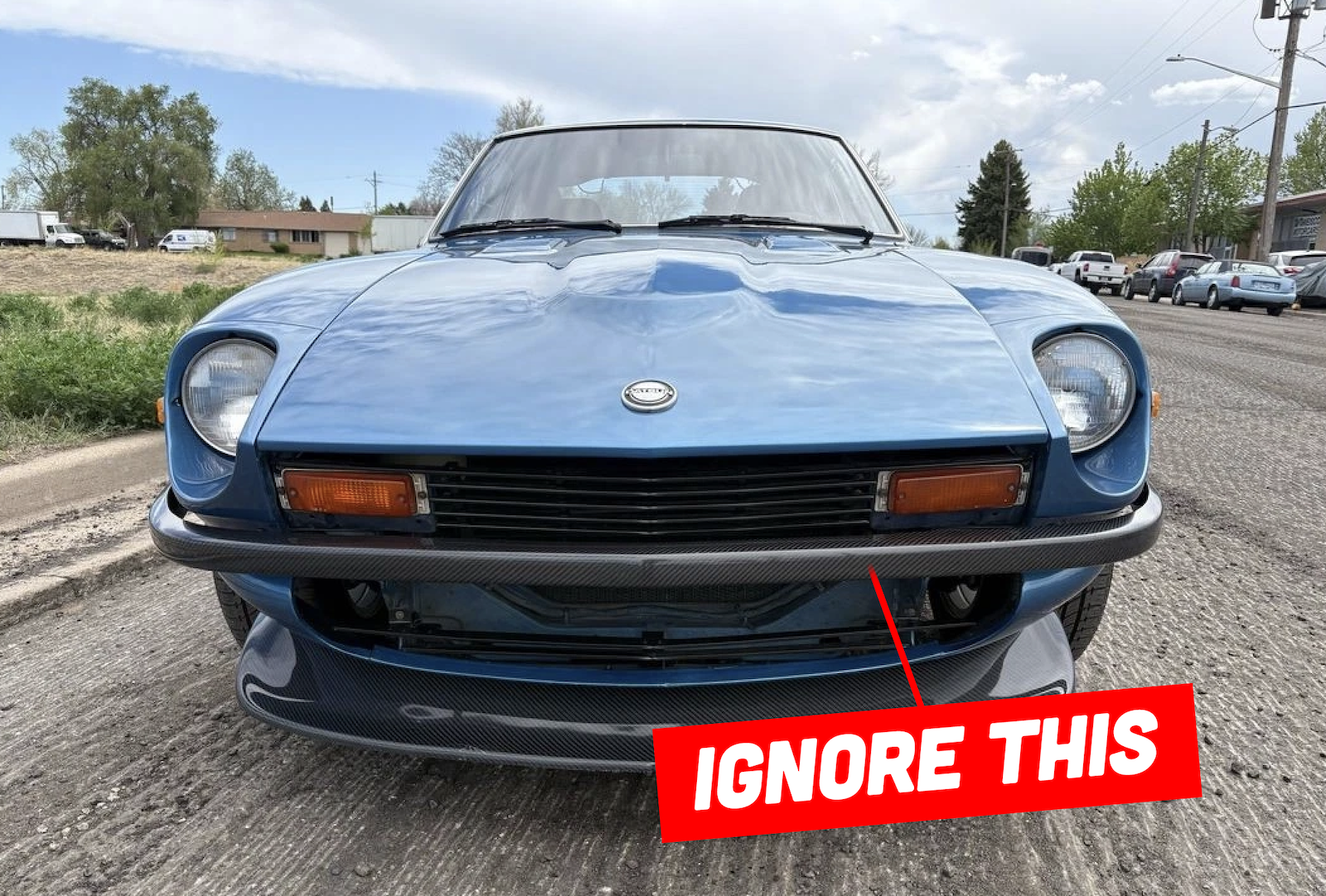
It’s much more obvious when you look at an original Z without its front bumper:

It’s Only Gone Downhill From Here
My opinion shouldn’t carry much weight, of course. I’m a lowly car writer who will never be able to afford a brand-new Z. That means I’m not a part of the buyer demographic. But when I have an opinion, I feel compelled to share it here. And in my opinion, Nissan’s attempts to satiate buyers complaining about the grille have only made things worse. Just look at this:
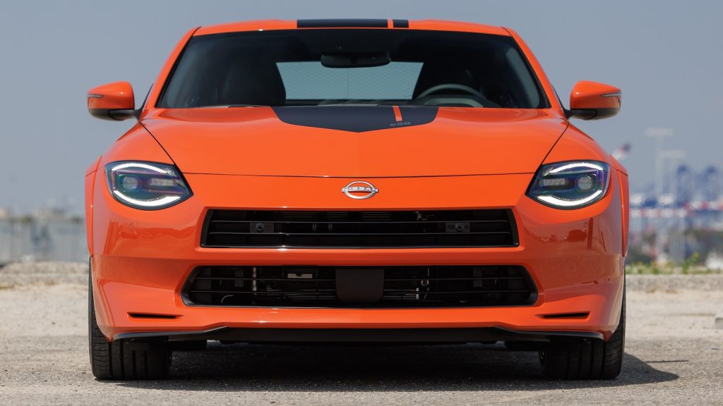
What you’re looking at is the Nissan Z Heritage Edition, an orange-only special edition model that debuted in 2023. Even if you think it’s not as brash as the original design, you have to admit, it’s still awkward-looking. I’m sure there will be some of you who will defend this, as it also calls back on the original 240Z’s fascia, which, as I mentioned before, is cut through the middle with a bumper beam.
That’s a fair argument, and one that my colleague Jason Torchinsky made back when this car came out. But I still prefer the original. It’s cleaner and delivers more of a statement, while staying true to the car’s most pure design aspects (those aspects being the grille without any bumper). An orange piece of plastic going down the middle feels like a compromise.
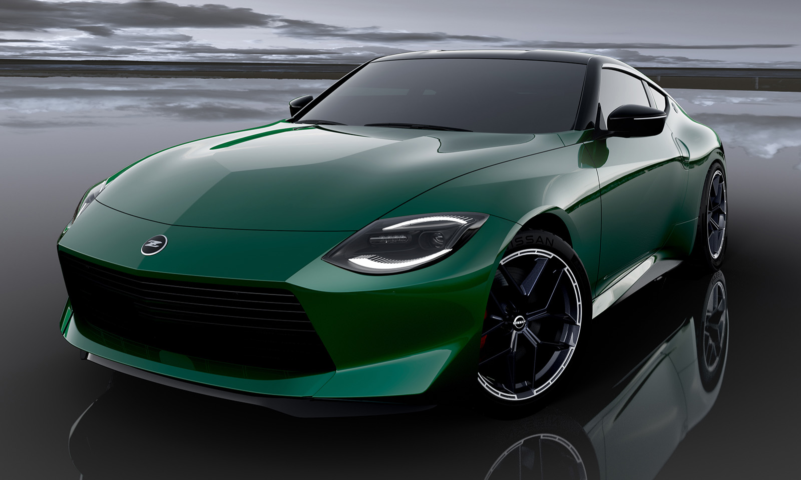
The newly refreshed Fairlady Z—the name for the Japan-market Z—was revealed today at the Tokyo Auto Salon. It takes the Heritage Edition’s changes one step further. Again, we get a body-colored beam cutting through the middle of the bumper, and it’s accompanied by a resculpted lower chin area, with a reshaped lower opening.

While I do appreciate the new color and the new wheels, I worry this new bumper will look just as strange on cars with brighter paint jobs. It is more cohesive than the orange car’s setup, I’ll admit, but all of this separation a the front just seems pointless, and only serves to muddy up the once-iconic front end. If Nissan removed that central beam but kept that lower chin update, I’d be really into it.
I’m sad the original grille design will be going away for good. Nissan confirmed to The Drive earlier today that the design will also be making it Stateside in the near future, which means that weirdos like me will only have a limited amount of time before pre-refresh models disappear from dealer lots for good.
Top graphic images: Nissan


I agree. The only thing I don’t really like are the headlights. IMHO the recessed headlights of the original design were iconic, and if they could acheive something similar with slight surface changes, it would look better.
Absolutely horrible 2 minute PS job, kind of showing what I mean.
https://i.imgur.com/OW9l8eP.jpeg
I need to see the newest version that isn’t half hidden in shadow and dark colors to really judge.
but nah, the original and refresh were out of place and forced, it does not look good.
Latest Banger from the King of Bad Takes.
That Heritage edition was poorly executed and I’d prefer the open mouth original to that. However, I think the new bumper is a lot cleaner and more elegant. PLUS, if you don’t like the central bar, you could visually “delete” it with some black vinyl.
I do wonder how any of these perform in a 5mph impact. With such a sharp beak, there’s no way they get away without significant cosmetic damage.
“Automotive journalist takes contrarian view to rest of entire country’s population to generate clicks.” – See it worked, I clicked.
It is funny to say “see, the big grille without the bumper bar looks more like the original in this picture (ignore the bumper bar).”
The problem with the big rectangular grille isn’t that it’s large, it’s that it doesn’t match anything and looks unfinished. I think the Heritage version looks worse, but the new version is a big improvement.
Judging solely based on a Throttle House video on the 400Z, it sounds like the design is not the main issue of this car, not that it helps.
The 2020 was mediocre looking, and the huge grill was part of that. It looked… incomplete. Like they got 85% through the design process and then gave up. Which, given how Nissan is doing these days, was not a good look.
The new one looks much better. I agree that it would also look good with the new chin and no cross bar, but they had to make a choice, and it looks good either way.
The design of the current generation Z car seems to have taken all the individual styling cues from the original, and put them together in a way that manages to avoid having any of the desirability of the original.
As a long-time Z owner and enthusiast, I have to say that you are way off and that this facelift is a major improvement. This opinion is shared by many in the community.
But, you are welcome to your own opinion, just as you are welcome to spout it like a jaggoff here.
The newly sculpted chin fixes so much of what they got wrong in the first two attempts. The nose was too in a way that was unlike the original. It’s more like they sculpted an early aughts 350Z in the front end and tried to make it retro. It felt blocky and lazy. This actually feels so much more balanced and in line with the OG cars. Plus that green is delightfully sumptuous.
The Heritage for the win; a design nicely cleaned up and “flowing”, removed are the two goofy outboard mail envelope slots on the lower front end (brake cooling ducts? LOL).
The Orange front end comes out as if 2 design committee’s took control of their very own upper and lower grill openings without talking to the other. And the Production Line boss said “Send it! Looks good to me!”
Good to see a nice, dark metallic green. Time to get back to the late 60’s/early 70’s color chart.
In the topshot it looks like the photo is implying “no C7 corvette, buy a Nizzan Z instead”.
After some image searches, it seems the C7 Vette has some grilles with bars and some with mesh. But non are trying to be a false bumper beam. It seems more likely that it’s homage to vintage Ferrari grilles.
The big grille is dishonest, as are most these days. Possibly the worst is the Forester. How much cooling does the system behind it need? Is there something from Cummins behind it? Is there something psychological called radiator envy?
Soooo based on the commentary – Seems Brian is the one who was wrong, and everyone else is right about Nissan’s second try?
The problem with the black slab front grill is that it makes a modern sports car with a too tall beltline look even taller and more awkward. The original Z was of course lower, and there was nothing wrong with the front bumper breaking it up.
The new one is almost pretty. The old one was not.
“You all like this, but I’m right you’re wrong”
“Blah blah blah has been revealed and thoroughly detailed but I still have questions”
“Expensive and impractical campers are really great”
“I bought or sold a junk car”
– Most Autopian articles
I like it here though.
So I’m hearing we shouldn’t be holding our breath for your subscription then
Cut him some Slack. Or rather from Slack.
1) Just this guy. He’s straight up channeling the German lighting site and I hate it more each article.
2) I either haven’t noticed this or haven’t cared.
3) I enjoy looking at expensive and impractical campers. It’s fun in the same way that it’s fun looking at expensive and impractical supercars.
4) I enjoy looking at cheap and practical cars. Both ends of the enthusiast spectrum are valid and worth discussing.
So in conclusion: this guy is the problem.
So I guess my opinion on this one counts for once,
as I am in the buyer demographic.
and personally I prefer the big grill.
Which is lucky as I bought one.
that said I love that green, there is just not enough green cars these days.
Upvote for green car love, that Fairlady looks sweet
As I am never at a loss to repeat, I own 2 green cars. That’s 100% of my fleet.
I loved the big grille too. I don’t think the refresh looks bad (the car as a whole is a banger), but the big rectangle was better.
I always thought the headlights ruined it. To each their own, of course.
Yeah, everyone talks about the grille, but it’s the teardrop headlights that don’t do it for me. This car with the rounded headlights of the original Z would be a beaut.
Maybe one of our resident designers covered it in more detail back in the day, but I’m inclined to agree with you.
The angles view on both designs looks pretty good, and the straight on view in both looks off.
On the old one I think it was the straightness of the top of the grill versus the swoopiness of what surround it. But on the new one, I think there is just too much smooth plastic on that bumper. More grill would fix that, but I think the size of the headlights is the issue. A bigger headlight housing would help the front end flow better.
I disagree. The facelift is downright beautiful. The car looks mature, and it’s suddenly of my desirability radar. But, of course, it’s just my opinion.
I could live with either. To bad you couldn’t just do both and let the buyer decide. Oh wait, you can if the manufacturers weren’t so cheap. I swear Bean counters are more concerned about a quarter than an alcoholic panhandling outside a liquor store
I like the big grille too, but I don’t agree that the original bumpers were ugly. On the 240 they were a cohesive part of the design so the race versions always look unfinished to me. I think a small contrasting color bumper across the 400’s grille opening would tastefully appease both camps.
I always felt a thin chrome blade would fix it (and pay tribute), especially considering the different grille textures upper and lower. I also wonder – how much of the debate is camera angle. These are always ground level shots, not normal human perspective. Maybe it looked better in person?
Everyone has an opinion. I have to disagree. I think this is a good fix for a glaring design issue. I’m always skeptical of press photos though so I’ll wait to form a full opinion until I see one in person.
I agree, also I have never actually seen any of these in person. One reason the old maw seems so glaring is because it is always shot from ground level, not from an actual human perspective.
It wasn’t just the size, it was that it’s a rectangle on a car with no other rectangles; the lines didn’t match. It looked like a grill off a truck or boxy suv. That’s why the heritage one looked even worse, That’s why the photoshop on the new one looks good. They didn’t just need to break up the grill, they needed to make it look like it actually belongs on the car they stuck it on.
This is exactly it – it was a straight, vertical box on a car that had no other straight vertical lines. The split and last photoshop both fix that issue which is why they both are improvements. This guy telling us that the original was better is just his tiring contrarian shtick.