Ford is making a huge announcement as we speak, about a new electric car/truck platform that will be used for a wide variety of cars, but the thing that caught my attention was in the background, and was more than a century old: a logo. A Ford logo, of course, but one that hasn’t really been in use since the Model T-era. Which, based on what Ford CEO Jim Farley was saying, kinda fits.
The announcement today is essentially about a modular EV platform, which really isn’t that big news, since lots of companies use standardized modular platforms, EV and otherwise. But Ford is a little late to this, so it’s definitely a big deal for them, and, as is noted in our story about this, Ford is claiming theirs is even more modular.
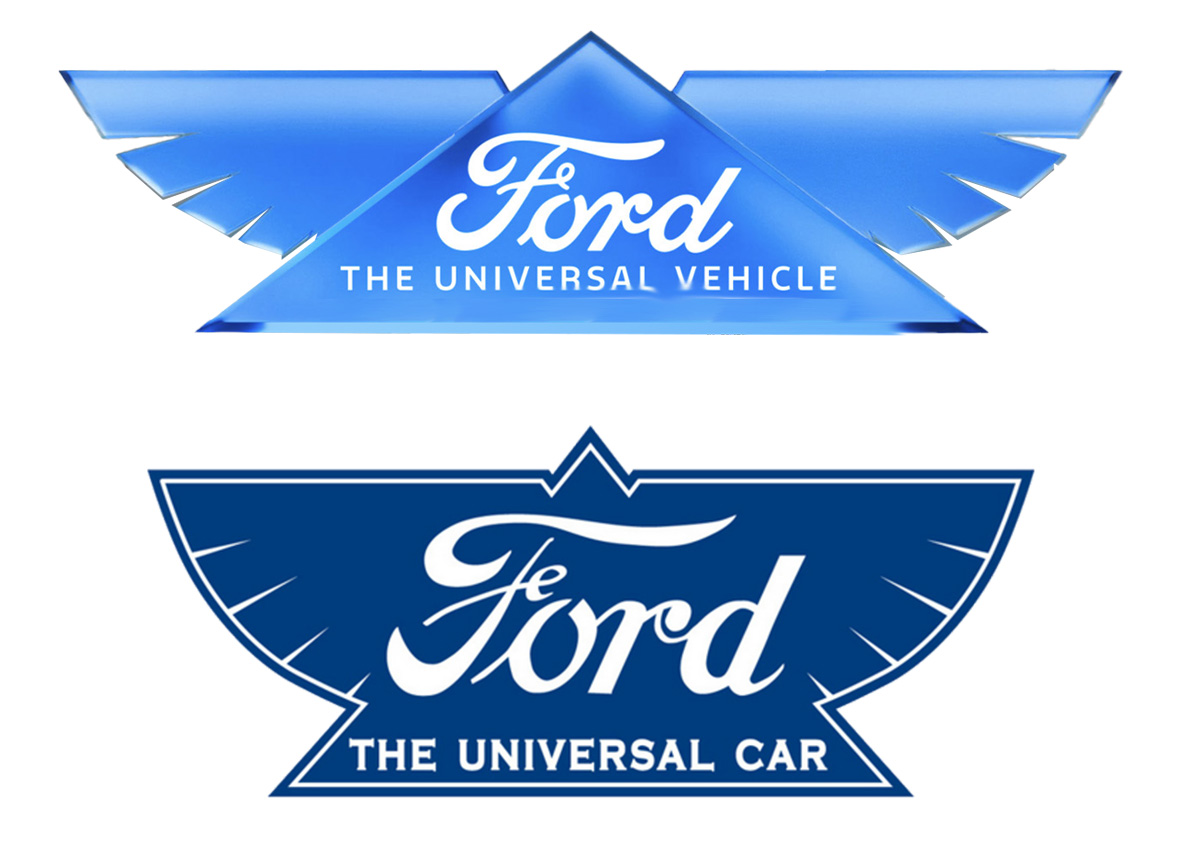
So, why the different logo? Well, let’s take a look at what that logo has. It’s the winged one that you see here:
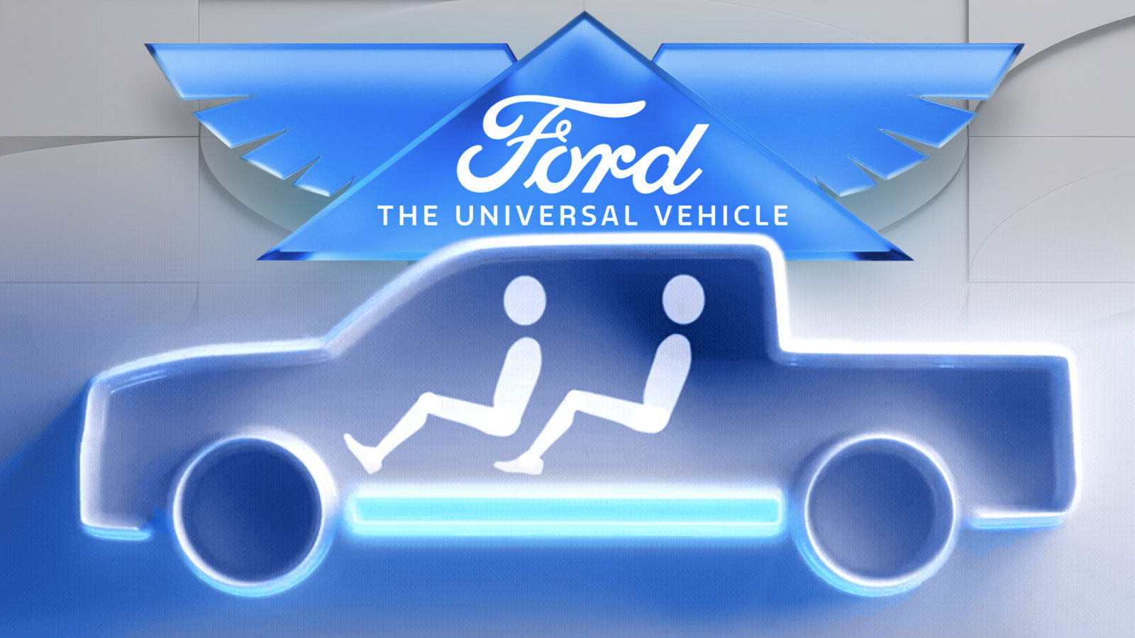
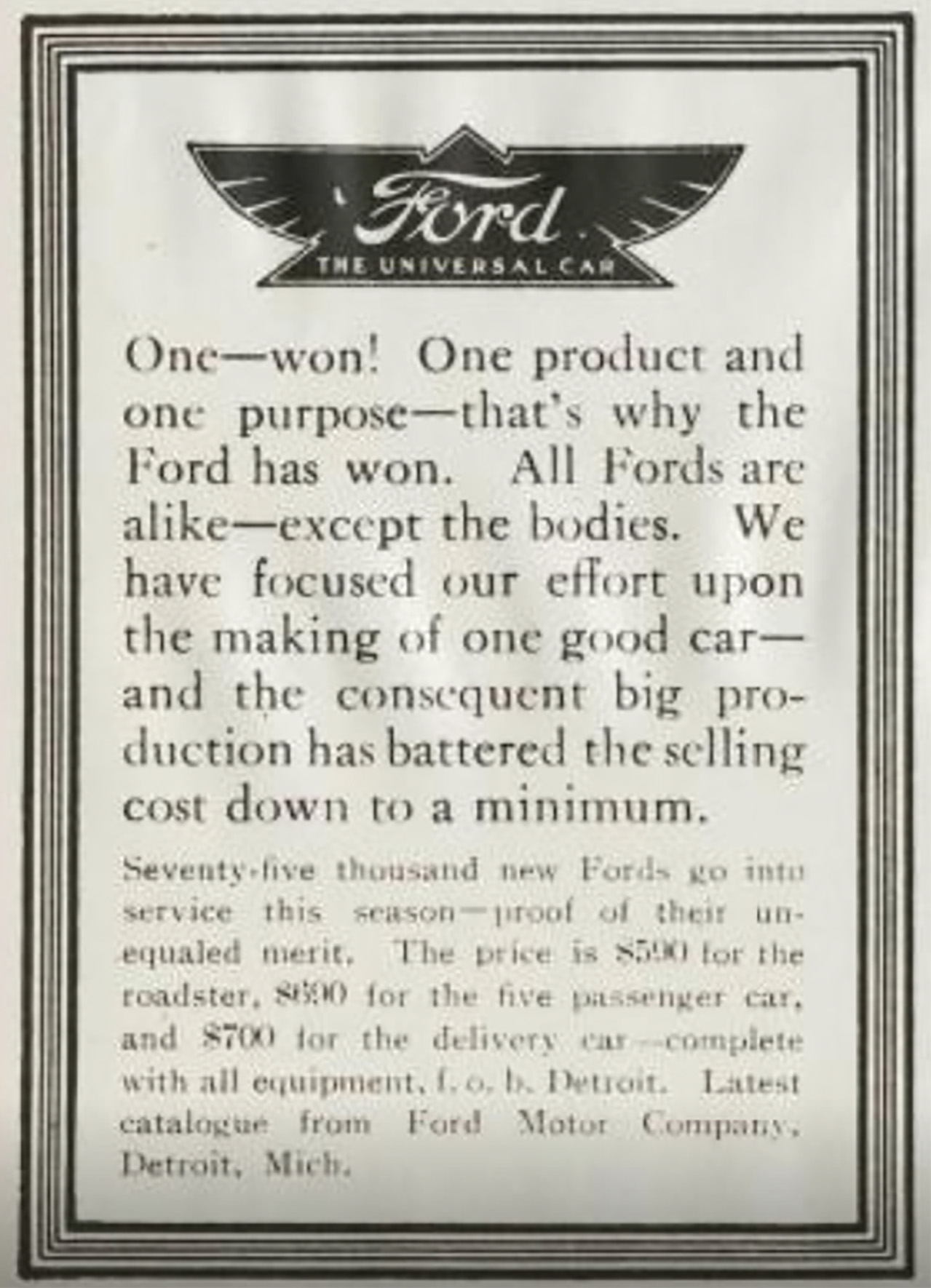
That triangle with wings and the traditional Ford script inside. At first glance, you might think this is some kind of Masonic thing, with a pyramid and mythic wings and all that, but it’s not, it’s actually a Ford logo from 1912:
Here it is in a newspaper ad from 1912:
Here’s where it fits in the Greater Fordic Logo Evolution:
So, this predates the Blue Oval we all know so well, which was not defined until 1927. I like how the 1909 one is in quotation marks, suggesting maybe it’s not really a Ford.
I think the key part here, why this old logo was revived, is the addition of the motto “The Universal Car.” This was referring to the Model T, which was very much a Universal Car. This was from an era long before deliberate modular platforms, but the Model T’s basic chassis and drivetrain did become something of a modular platform, with all manner of different bodies available for it:
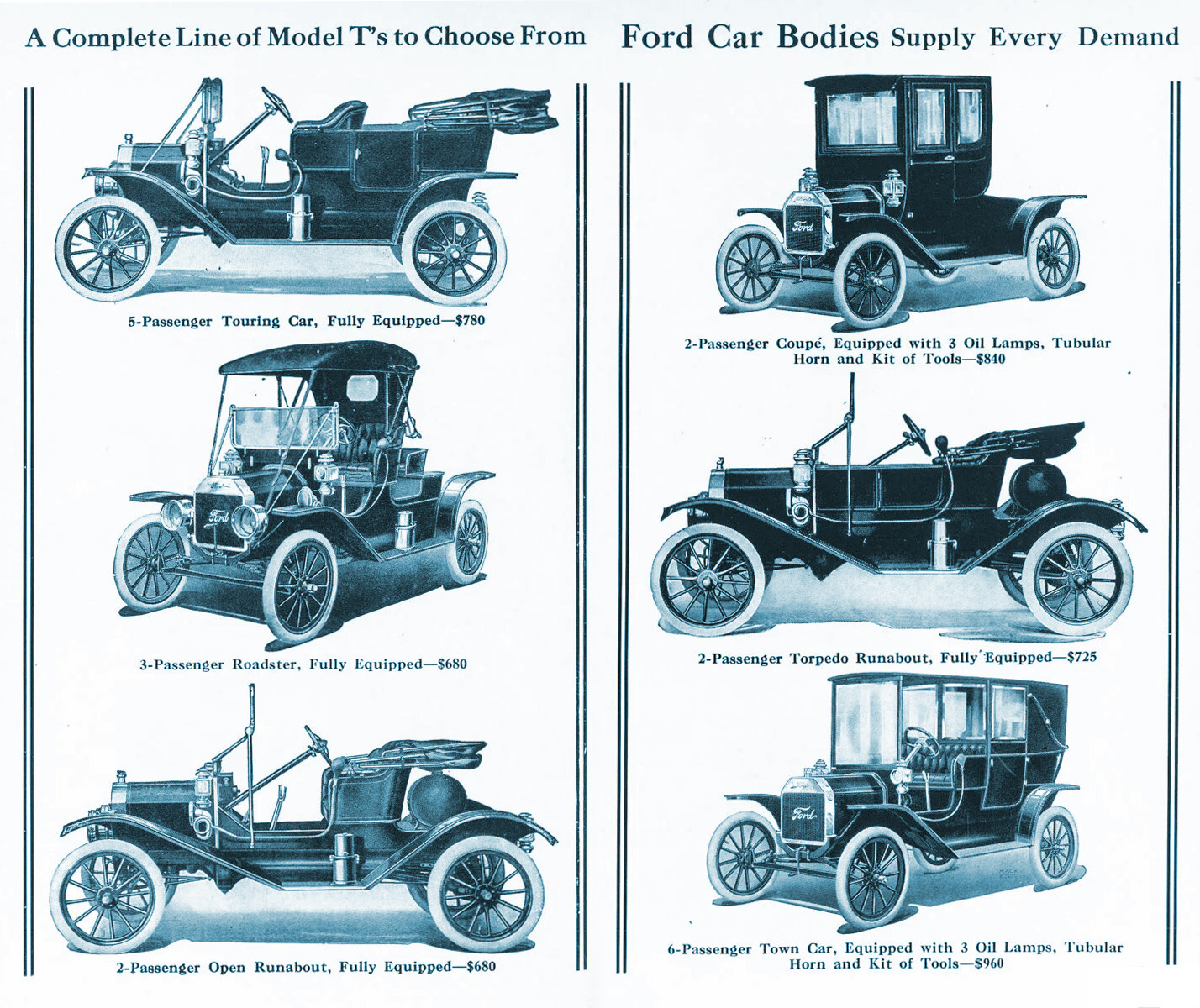
Back in the separate chassis/body era, before the Rise of the Unibodies, this wasn’t that uncommon. Think about how many different cars Volkswagen built on the basic air-cooled Beetle platform, for example. The Model T, of course, did this really well.
So there’s Ford’s first Universal Car. And they want to try it again, only in electric form:

I get it, it’s a great concept. And, it makes sense that Ford was a master of this over a century ago. It’s very convenient that they even had a motto and logo that reflected this idea way back in 1912, so I’m not too surprised they’re using the old pyramid-and-wings logo today.
Sure, it’s been updated a bit, but notably, the way it’s been updated is surprisingly pretty minor. It’s mostly limited to the look of the material the logo is “made” of, now all slick and shiny, fitting in with the current “Liquid Glass” trends. The triangular section is also now more distinctly outlined, and the wing proportions have gotten longer. Oh, and the “Ford” script is the modern variant of that long-lived logo.
But more significant is the change to the motto, now “The Universal Vehicle” instead of the more limiting “The Universal Car.”
I doubt that it’ll replace the famous Blue Oval, though? I suspect it’ll mostly be used in the context of cars built on this new modular EV platform. I can’t see it on, say, a Mustang. But will the winged script design be used on the badging of these new EVs? I guess we’ll have to wait and see. It could be pretty cool!


Somehow I’ve never noticed that little curlicue on the F’s horizontal stroke, which suggests a lowercase “e”. Fe is iron on the periodic table, so that tracks. Wonder if it’s intentional.
I have wondered about that as well. Maybe like Volvo using the alchemical symbol for iron
I’m glad Ford went away from the winged logo, since it’s a bit of an overplayed idea for car companies.
I’m probably being my typical overthinking German self, but I think bringing back that old logo says to me that Ford wants to be like everyone else. Meh.
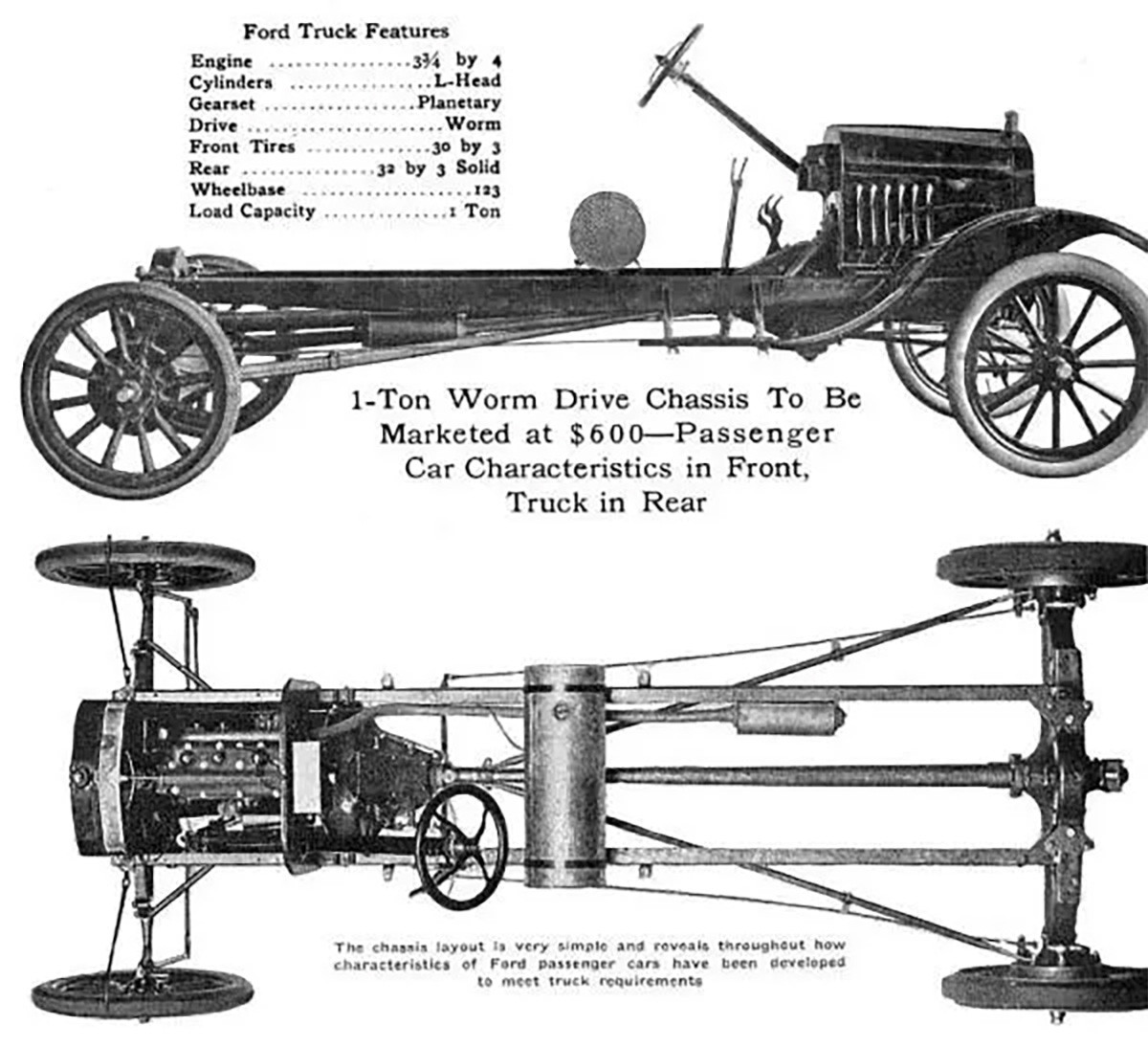
I did not know that Ford had a worm drive. That must have made for some interesting characteristics. Engine braking must have been prodigious, never mind bump starting.
Makes me think of old movies where a car is starting, and its engin sputtering, and the car bucks like a bronco. that would happen with a worm drive unless the worm was unusually steep, since it doesn’t want to be backdriven.
1 guess they wanted to carry a lot of weight really slowly on steep inclines. Can’t think of another reason.
Another aspect: a worm set is a way to get a lot of gear reduction, at a right angle, for cheap.
A guitar tuner takes advantage of both the high reduction and no-backdriving aspects, at the expense of ergonomics, as compared to the inline planetaries on banjoes.
My project this week is dealing with a bunch of 50 years old guitar tuners. The basic design is good, but boy do the implementations leave a lot to be desired.
An inexpensive rugged zero backlash design would really be nice. You can work around it on guitars but steering boxes on cars would benefit from a better design.
If a 50yo guitar tuner has been used for all that time, it seems like it would be loose enough to become a major PITA, and time for retirement. Especially ones staked together rather than screwed, so you can’t replace a screw/shaft. Though I haven’t tried rebuilding one myself.
Side note, the idea that a ‘75 could be a 50yo instrument is disconcerting.
Cripes!
58 years actually. Teisco EP-9T in white, like this one
https://reverb.com/en-pl/item/77370870-teisco-ep-9t-electric-guitar-1960s-white
Mine has “signs of use” which is a good thing because the ones that look perfect were unplayable when they were new.
Someone had taken it apart, put it back together with the nut raised above the zero fret, using hot glue!, and all the parts that could put in backwards or exchanged with another similar part,installed wrong, and there were weird liquid stains and probably mouse shit on it. oh and an inch and a half action. Two of the tuners’ worm gears are slightly bent, and from experience with another rare Teisco I now know better than trying to bend them back.
Good part was I paid $20 for it and it plays perfectly after a day of work.
But it has weird 3 on a plate tuning pegs that aren’t rebuildable and all the junk guitars I can find are even worse.
Looks like a really expensive fab repro of a really cheap part is in the future.
I can ask my friend who buys/rebuilds/sells vintage guitars whether he has the parts (a stretch for sure), or if he knows anybody.
I’m getting pretty close to to a repair that is non invasive, reversible,, looks ok and is functional
Trying to get some open back slotted peg tuners, that I will cut down and redrill to fit the existing holes. May take buying several sets and Frankensteining the parts, which in half the fun.
This is quickly becoming my favorite guitar, but it feels like a viola body compare to a strat or tele. Sounds amazing though.
Ah ok, we cross-posted. The ones I linked above are not what you’d want then.
He has nothing, but he sent an ebay link for this set that doesn’t look the same, but might fit. There’s a measured drawing in the listing.
https://www.ebay.com/itm/376196779832
The worm drive was on the heavy-duty one-ton truck chassis. Slow!
My family has a Model AA lumber truck from 1929. IIRC it also has a worm drive rear end – the differential is the size of a very large pumpkin. There’s also a high/low range auxiliary gearbox behind the three-speed. Rated for 1.5 tons, it tops out at 30-35 mph in high range. In low-low range, they used to shove railroad boxcars around with it.
I’d like to think the transition from 1909’s to 1911’s logo was a realization that people couldn’t properly read cursive so they changed the shape of the “r” to look more like printing.
No, that (the general public’s inability to read cursive) happened in the 2009’s to 2011’s)
The vehicles using those logos could be great for Munros YouTube channel lots of doing their research people will want it see what’s inside with a large number looking for king tuts nuclear reactor.
I like how Ford is sporadically using other visual identifiers. The Puma rally car’s Ford script all by itself on the grill looks cool, and my humble Focus has plenty of parts stamped FoMoCo.
There are “FoMoCo” stampings all over the engine of my 2020 Range Rover, since the engine was built under contract by Ford to about that time. After that, JLR bought or acquired all the tooling and has set up shop to make the 5.0-liter V8 elsewhere, though it is definitely on its way out.
It almost looks like a fake logo that Disney World would insert into one of their more utopian or futuristic rides. Honestly though, they have that Paul Rand logo sitting around collecting dust that is one of the greatest discarded logos ever created. They should have used that one.
The art department definitely took the old logo to ChatGPT with the prompt: Modernize this logo.
Boring. generic. Regurgitated corporate history no one except those at the top actually cares about.
I think we’re the only two people who liked that one…it was universally panned in the comments here:
This Is The Logo Ford Never Used, But Maybe Should Have – The Autopian
I, too, love that logo
Looking forward to seeing people on social media say Ford ruined their heritage by using a “new” logo
I love how the 1906 is strikingly modern
That Ford ad reads like an automotive mullet: “Passenger car characteristics in front, truck in rear”
Business in the front… party in the rear.
Ad copy: mis-using apostrophes since (at least) 1912.
Oh, boy. A triangle and wings, used to promote EVs. Conspiracy nutjobs are going to have a field day with this one…
I can understand the wish to revive an old logo, but the “liquid glass” texture on it, especially the separation between the pyramid and wings, looks incredibly tacky and dated right now, and can only imagine how bad it’ll look in a few years. I really hope the 3D execution of the badge on vehicles is a lot better.
I know it’s not super popular, but I was fond of the treatment print logos got last decade, being turned into flat graphics rather than pictures of the 3D thing. It seemed to me like a return to form – after 3D graphics came out, we used them for everything for a bit and then realized that we don’t have to just because we can.
1000% agree. It was fine for 2003, but there is no need to go through that all over again.
Honestly the old logo is better – update to current font if you must. Flat surfacing just looks better in most print and ad applications.
Fully agree, the 3D-render logos always look like they’re made by someone’s nephew who “knows Blender”.
It looks to me like it’s mainly meant to be a physical sign with LED backlighting to be hung up on the showroom wall.
Could the Liquid Glass style be a modernized return of the Aqua style?
A Ford Escape will soon be retrofitted in the style of the MK1 Focus, with its edge design and false aluminum cladding?
Extensive focus group testing showed that when abbreviated, F.U.V. resonated with customers better than F.U.C..
Clearly Subaru took the opposite message when they made the Forester Ultimate Customized Kit Special
I remember my first time using PowerPoint to create a logo…
The 1957 badge makes me uncomfortable. I do not like looking at that.
Yeah, is that correct? The oval isn’t even symmetrical.
Maybe some Torch graphic trickery for a laugh.
Almost queasy making if you stare at it.
Ford only used the oval and script on corporate stationery and parts stamping anyway.
1912, eh?
The logo from that year could be a coded reference to the iceberg that sank the Titanic: it has a small pointy-uppy bit but the bulk of it is below the [notional] waterline. The parts that look like wings could represent the fractured hull of the boat.
Or not. But that 1903 logo is fantastic.
Ford is, to me, a great example of why big, mostly successful companies should not be changing their logos. Yeah, there’s been some changes around the edges and the sub-brand for this platform gets a different silhouette, but for basically a century the ford logo has been that white cursive script on a blue oval and despite violating all sorts of modern logo “rules” it’s instantly recognizable.
Compare with Kia, who, for essentially all its time as a major player in the US had the KIA in an oval log, swapped the color, shape, and font at the same time to something so radically different people thought it was a different company, mostly because the new logo was illegible.
Note to the guy who wrote that 1912 magazine ad copy: hyphen much? Every sentence?
Is that – how people talked – in Edwardian times? They sound – like Bill Shatner- trying to act.
I’m sure – s/he appreciates – the feedback.
We can all get better
Now I can’t get TOS out of my head….
I can never get TOS out of my head, ‘cuz SNW keeps reminding me.
Beam – me up – Scotty.
Nimoy’s final memoir is at times scathing about TOS writing. His example is Shakespere by the TOS writers.
Kirk – To be
Spock – Or not to be
McCoy – That is the question
Maybe that is where ChatGPT learned it.
Herb Caen approved.
Good enough for Emily Dickinson-
Good enough for me
It goes well with the Romulan Ford logo.
Ford moved away from the Blue Oval in the ’70s, reembraced it in the ’80s.
“It’s not a Masonic thing…”
This is Henry Ford we’re talking about. It might be a Masonic thing.
Yep, for sure:
The Grand Lodge of New York confirms that Ford was a Freemason, and was raised in Palestine Lodge No. 357, Detroit, in 1894. When he received the 33rd degree of the Scottish Rite in 1940, he said, “Masonry is the best balance wheel the United States has.” ????
https://en.wikipedia.org/wiki/Henry_Ford#Personal_interests
A strange interest to have for a guy whose other great interests were rabid antisemitism and cozying up to top Nazis for whom official doctrine was persecuting freemasons:
https://encyclopedia.ushmm.org/content/en/article/freemasonry-under-the-nazi-regime
It’s just clipart from that era.
Beats that swastika ol’ Henry used in the 30s.
Although I have to admit this badge is evocative of the old Bundesadler (aka “Nazi Bird”). That’s the first thing I saw here, followed by maybe a Pan Am logo.
Likely predated that by about 2 decades. A few of the Thunderbird emblems were not dissimilar.
Tongue in cheek, but yeah. Besides, if we get into winged logos, that’s pretty much every third company from 1900-1970 🙂
I thought this too, but I was afraid to google it.
*looks at logos*
There are some sizable gaps in their progression.
At the Piquette Plant tour my buddy pointed at the couch in ol’ Henry’s office and said “That’s the couch he used to sit on and hate Jews”.
I admit whenever I read something about Ford’s history, I always braced myself for something along that line.
I’m glad that’s not the case here.
I just noticed a lower case e in the crossbar of the F in Ford and now I can’t unsee it.
Have you driven a Teord lately?
I was wondering about that too… Fe is iron was the only thing I could think of, but…
Does the Mustang even have the regular blue oval logo anywhere on its exterior?
Nope.
It didn’t in the early 90’s. Hence the great school yard debate about whether or not Mustang was its own car company or — as legend had it — a secret Ford.
Pretty sure the Fox Bodies had the oval on the hatch/trunklid.
dang you’re right. my life has been a lie…
Not a blue oval, but there is a Ford oval in the center top of the windshield on modern Mustangs.