
The world of automotive design, like so many things in life, relies heavily on the concept of intent. If something looks like the designer wanted it to look that way, then that’s a victory, at least in part. That’s also what makes the concept of “retro” so interesting. A retro design can only really be considered retro if the intent of the designer was to specifically reference the look and feel of a specific time in the past, and translate that into the contemporary design vocabulary. Or, to put it more simply, did a car designer want the car to kinda look like an older car? In like a retro sort of way?
This is what I’m wondering about with the Volvo 164: can we consider the design of the 164 to be a retro-style design? It has some visual elements that certainly have a retro feel, but was that the designer’s intent? Let’s look a little deeper at the 164 and see if we can figure this out.
The 164 came about as a way to take the midrange Volvo 140 more upmarket, a process that included making room for Volvo’s new inline-six engine. The body from the A-pillar back was the same as the 140, so designer Jan Wilsgaard didn’t have to re-design everything, just the hood, fenders, front end, and so on. With that in mind, let’s look at the design of the 140, which Wilsgaard also designed:
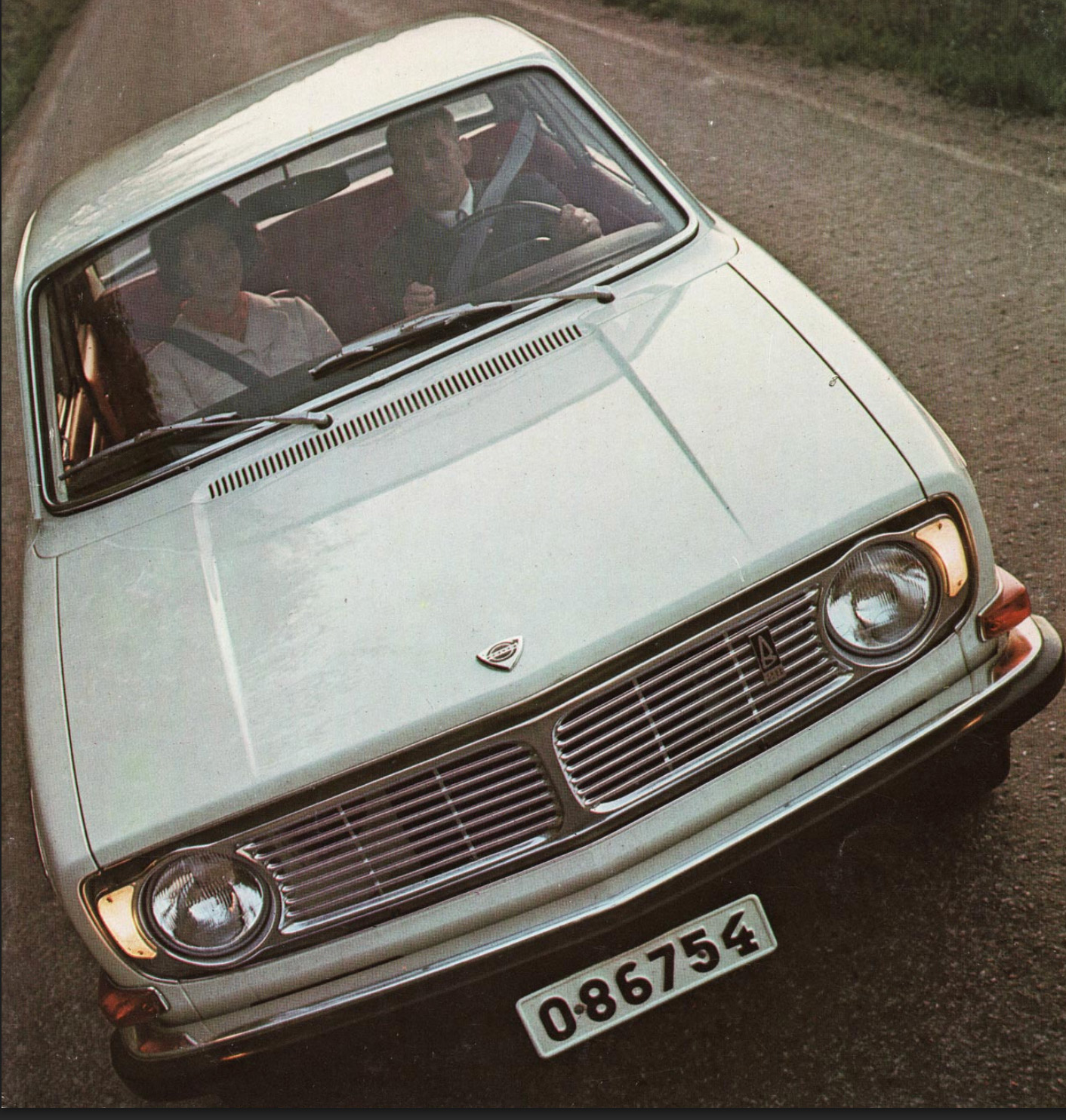
The 140 design was what set the template for Volvo design for several decades to come; it introduced the unashamedly boxy look for Volvos in 1966, which was a significant departure from the curvier Amazon that preceded it. It was a very rational, clean look, unencumbered with ornamentation, and was quite modern for the time. The front end kept with this very clean, simple theme, with a pair of round sealed beam headlights, a stamped aluminum grille panel, and not much else.
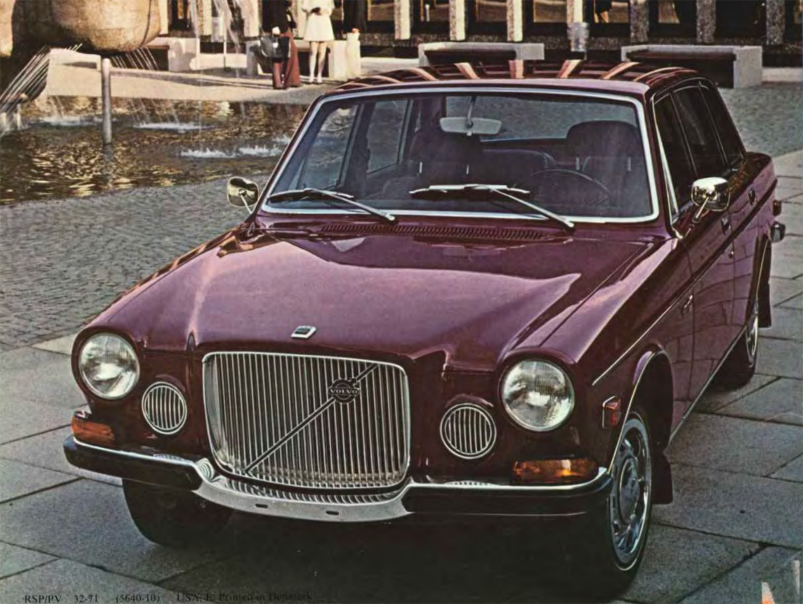
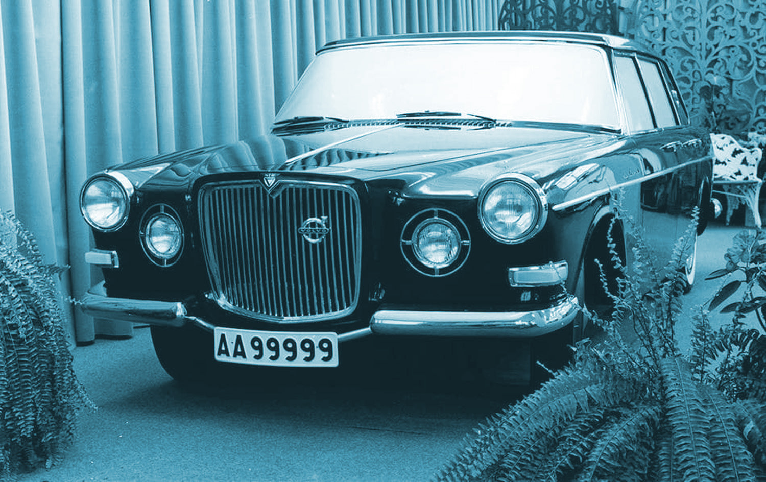
The 164’s face is the most significant departure from the 140, with fenders that have a curve that conforms to the round headlamps, an inset, square-ish grille that the hood conforms to, and a pair of round horn grilles/driving lamps. Oh, and some funny turn indicators that sat atop the corners of the bumper, strangely non-integrated into the body.
The look of the 164’s face comes directly from a Volvo concept car/styling exercise, the T358, which Wilsgaard designed back in 1958, a full decade prior to the release of the 164:
It definitely feels upmarket, which was the intent. The T358 was a concept for an swanky V8 Volvo sedan that never quite made it to market. It feels almost British, which is a particular kind of upmarket. There even seems to be some specific British cars that Wilsgaard may have been influenced by when designing the 164, like the Wolseley 6-99 (any direct influence is purely speculative, of course):
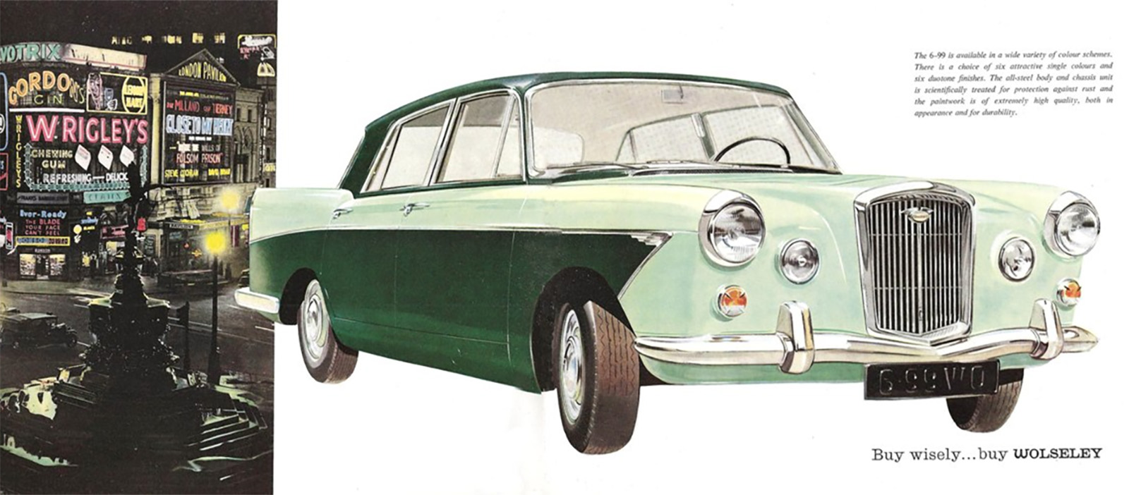
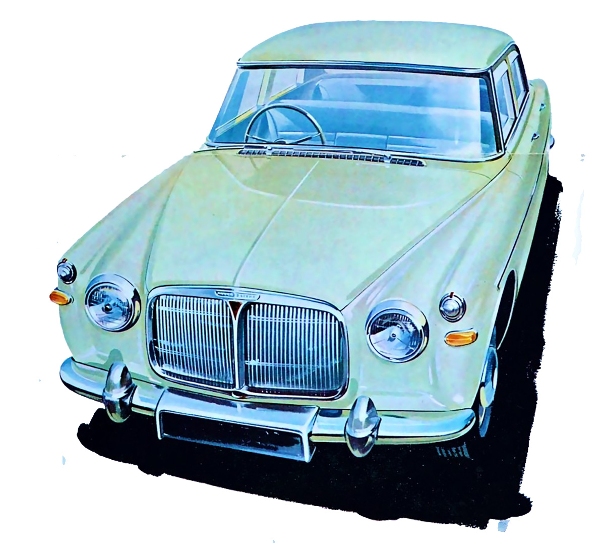
There’s definitely a resemblance there; I’m also reminded of the Rover P5:
I think there’s a definite influence there, and both of these cars are from around the time of the T358 concept car, the late 1950s to early 1960s. That does seem to suggest a retro-ish motive in the design of the 164.
But if we look at other contemporary upmarket cars that this Volvo was intended to compete with in 1968 or so, we can see that this general sort of look – prominent upright grille, separate headlight pods, chrome trim, and so on – was present on cars of that era, too. Like on the Mercedes-Benz W114:

I wouldn’t consider the Mercedes-Benz a retro design, though; it was more of an evolutionary type of design, with elements that Mercedes-Benz designers had been gradually refining over the years.
So, I think you could argue that some of the basic traits of the 164’s look were contemporary as well. But, if we consider the cleaner look of the 140 in relation to the 164, I think it’s clear that the 164 was definitely a deliberate step backwards, in the interest of making some kind of link to “tradition” or something like that.
And this brings us back to my original question: can we consider the 164 a retro-look kind of car? I think it could be. I think we tend to think of mass-market retro cars as an hallmark of the late ’90s to early 2000s, with cars like J Mays’ Volkswagen’s New Beetle or the re-born Thunderbird or the new Mini, but maybe the retro phase had a tentative start 20 years earlier? 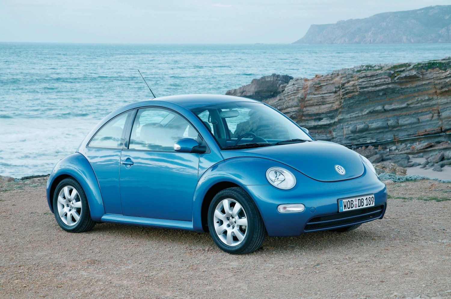
I’m still not entirely sure how I’d choose to categorize the 164. I’ve always liked the design, and I’ve always felt it was sort of out of character for Volvo. Thinking about it in the context of a deliberately retro design makes it a little more interesting, I think. It also feels oddly whimsical for normally stoic Volvo, so I appreciate it in that context as well.
Is this an obvious thing? Am I overthinking things? Is it important? I mean, of course it’s important. Vitally so. Maybe now more than ever. So let’s take a poll here; is the 164 just a design that uses some traditionally upmarket-coded elements, or is it a deliberately retro design, as in almost playfully re-appropriating old design motifs, but with an updated design language?
Help me work through this.


Those horn grilles make it remind me of the early Jeep Wagoneer and Gladiator;
https://www.jeep.com/content/dam/cross-regional/global/jeep/history/1960s/vehicle-lineup/2018-Jeep-History-1960s-Vehicle-Lineup-Jeep-Wagoneer.jpg.img.1440.jpg
Oh, definitely retro! Thanks for doing a poll, it’s always fun to vote for stuff on The Autopian
Also, as far as 164’s go, I prefer Alfa Romeo!
I tend to think of a retro design as referring specifically to dominant styling cues borrowed from a much earlier production version of the same car (New Beetle, Millennium T-Bird, Mini Cooper, Challenger, Camaro, S197 Mustang, etc.). Using style elements from a bygone era not necessarily found on a particular car in the past I think of as anachronistic. Like,say, Mazda decided to put fins on a Miata. Using these criteria, I’d classify the 164 front end design as mildly anachronistic instead of retro (ignoring the concept vehicle from which it was obviously derived as it didn’t reach production before the 164). There, that cleared up everything!
Wolseley, shmolseley. The 164 front end design was clearly a modernized version of the T358 concept, slimmed down to fit the 140 body shell. But at least in my humble opinion, both of these derived conceptually from the 1956-57 P1900 Sport Cabriolet, an in-house design of which only 56 were made. I saw one of these last summer at a car show in the Sierra Foothills, maybe the only running and fully restored P1900 in the US.
https://www.volvocars.com/us/cars/legacy-models/sport-p1900/
The retro craze was largely trying to recall an earlier design, which this wasn’t really doing, and those abominable throwback cars and design features of the ’70s were clearly trying to link to the past. I wouldn’t count being inspired by a show car barely a decade old as retro. This was arguably a bit archaic when introduced, but not really much out of line, and fit expectations for a higher end car. I think it’s more like the last domestic manufacturer coming out with a new model with fins just as everyone else’s new models drops them or severely reduces them. As a kid, though, I thought the 140s were newer until I learned the difference. Always thought these were dowdy. I’ll take the 140, thanks.
If the 164 is a retro design, then overnight oats are just leftovers we haven’t tasted yet.
Steven Wright said that he once put instant coffee in a microwave oven and almost went backwards in time. 🙂
“A retro design can only really be considered retro if the intent of the designer was to specifically reference the look and feel of a specific time in the past, and translate that into the contemporary design vocabulary.”
I reject this premise. I believe that what makes something “retro” is my experience of it as the observer. Sometimes it’s intended and sometimes not. An artist’s intent is beside the point when it comes to the finished work. How does it make the observer feel? Sometimes intent hits you over the head and diminishes the work.
Just my thoughts. I’m an accountant, so don’t take me too seriously when it comes to art.
I don’t know if I’d call the 164 a retro design necessarily, any more than the Jeep Wrangler (or even better, a knock-off Jeep) is retro, it’s more borrowing dated design language that never went away.
On the other hand, retro design absolutely predates the turn of the millennium, probably most notably all the stuff inspired by the Hooper-bodied Rolls (Cadillac Seville, Chrysler Imperial, Lincoln Continental).
I wouldn’t say retro at all.
Upright grilles equalled fancy in Europe back then – especially when you consider the fanciest of the fanciest, the
Rolls Royce Silver ShadowVanden Plas Allegro.https://classicsworld.co.uk/cars/vanden-plas-1750-road-test/
So it makes a certain amount of sense that when aiming for the ‘fancy’ market, they styled the car appropriately.
I would definitely call the 140-240 as of their time with similar austere and boxy style as other cars of late 60s to mid 70s. The 164’s front end is definitely a departure, although I see Mercedes W108 and several Jaguar designs in the front styling with the round headlights and central grille, especially European models with driving lights instead of horn grilles. Since those were older I’d call it intentionally retro, evoking signifiers of older luxury cars in a less extreme version of Malaise Era landau bars and opera lights
Big sigh. You got so close to finally shutting down the damn Wolseley thing once and for all, and then you had to bring it up anyway. As you correctly pointed out, the T358 was designed in 1958. What you failed to note was that the Wolseley went into production in 1959. The Volvo was not influenced by the Wolseley. This story has been dogging the poor Volvo since day one, mostly due to the patriotic chauvinism of the British motoring press.
IMO No, the design was dictated by the packaging more so in the 164 than the 140.
https://www.dsf.my/wp-content/uploads/2023/04/volvo_164_1968_engine.jpeg
https://www.autodata1.com/media/volvo/pics/volvo-140-142144-%5B12105%5D.jpg
The 164 was more space constrained by making sure there’s enough cooling that forced it to have a big grille, whereas the 140 had space for ducts etc. to give the designer freedom to do what he really had in mind.
Did a very good job of working within constraints though, arguably a much, much, much better job.