
You know what today is? Sure you do, you can feel it in the air! It’s Car Brochure Art Appreciation Day! This is a magical holiday that occurs whenever a particular bit of auto brochure art catches my eyebones and then I can’t stop thinking about it, so I talk about it here, spreading its influence far and wide, like sneezing into a fan. Today I want to look at a particular sort of style seen on not just car brochures, but in a lot of commercial art, especially paperback book covers and record albums. I’ve been calling this style Coarse-and-Smooth in my head, and I think you’ll see why.
Like so much of the art seen on these brochures from the 1950s to the 1970s, this is an illustrative style as opposed to a photographic one. There’s some incredible talent and skill displayed here, and I really appreciate how this particular style combines a loose, very hand-of-the-artist sort of technique along with some genuinely hyperreal rendering.
In the case of this 1964 Mercury brochure, that divide in style is constrained by the subject of the work: the backgrounds and people are rendered in the coarse, expressive style, while the cars are rendered with incredible accuracy and care. Here, look:
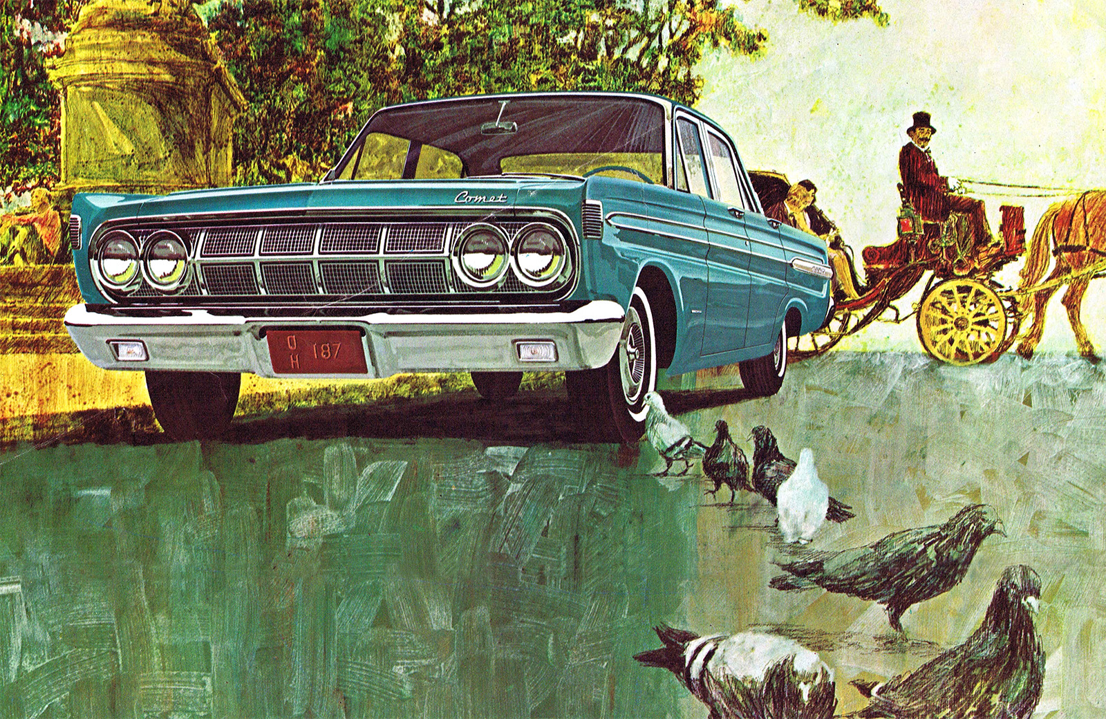
Look at how that Comet is rendered compared to the road surface, that small congregation of pigeons, the background flora, and the carriage in the background, complete with a horse’s ass. The style of the coarse parts I think is really lovely, and looks a bit like a gouache painting, which it may very well have been. Maybe tempera?
The car is impeccably illustrated, with every glint of chrome and shadow captured, the gloss of the paint beautifully reproduced, and there it sits, plopped onto that loose backdrop.
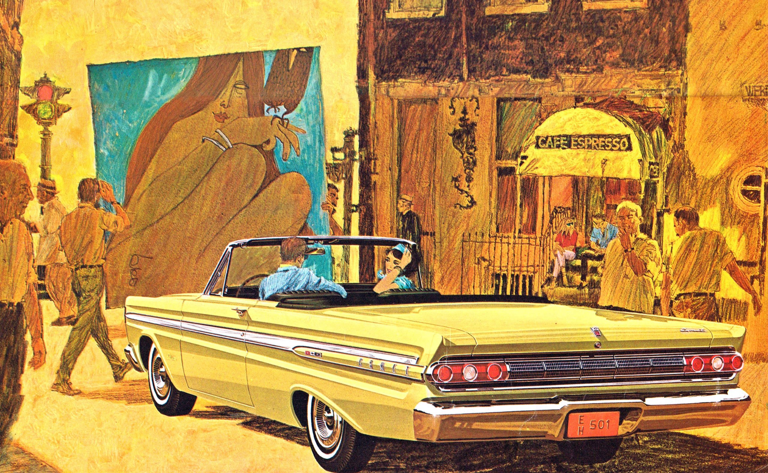
I really love this one: the golden mustardy color scheme of everything, that amazing poster of what seems to be a woman and her crow, and especially how the people in the car are part of the coarse style while the car is, as expected, tightly rendered and perfect. The technique draws the focus to the car in a subtle and exciting way, and when you look at the image above, where the color of the car feels like it should get lost in that jaundiced sea, it doesn’t, and that’s a hell of an achievement.
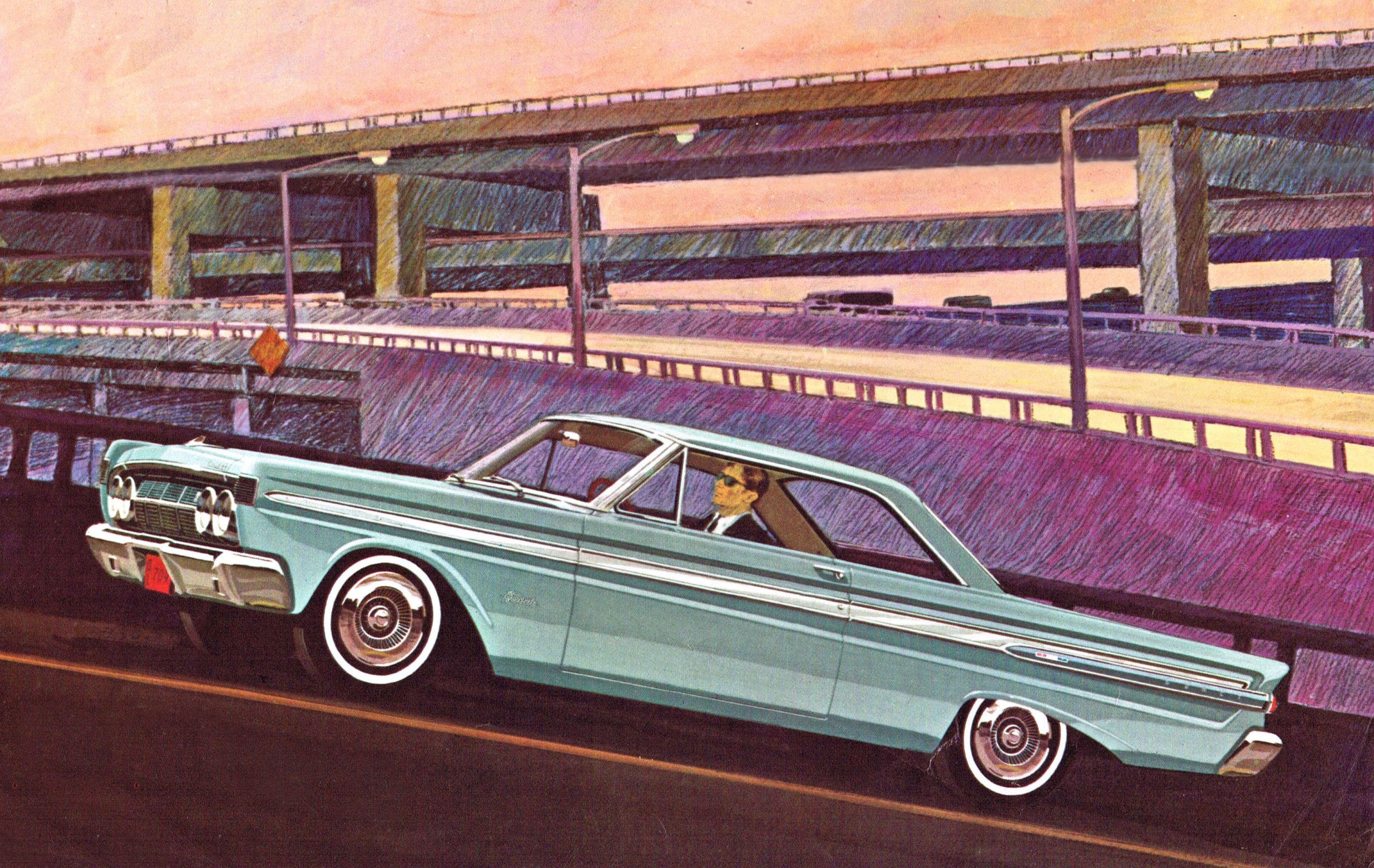
Here’s another great example: Agent Uphill there is barreling up that on-ramp, and the complex array of overpasses and whatever is handled in what looks to be colored pencils. Again, the car pops, but still manages to feel part of the whole composition.
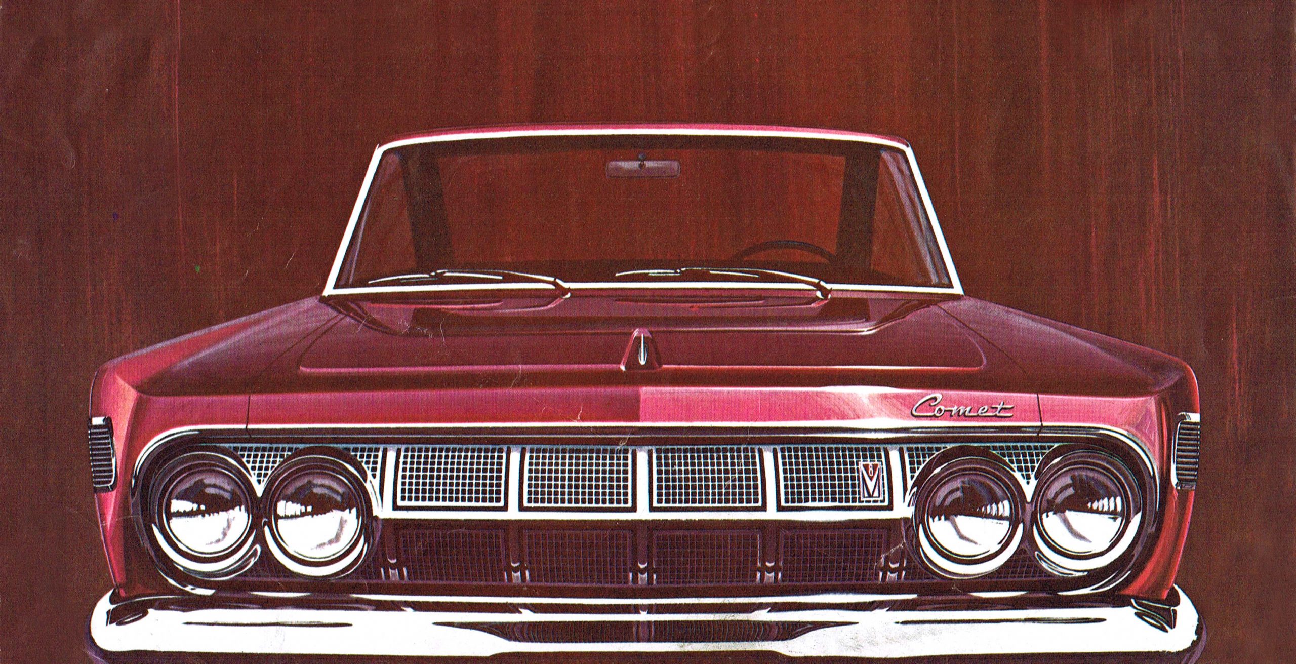
In some of the illustrations, all that’s needed is a brushy, featureless background; in this example above, the brushiness almost feels like woodgrain. Look how beautifully the artist captures the glint of light just to the left of the Comet badge. Holy crap that’s good. The paint feels slightly metallic here! Ugh, so good.
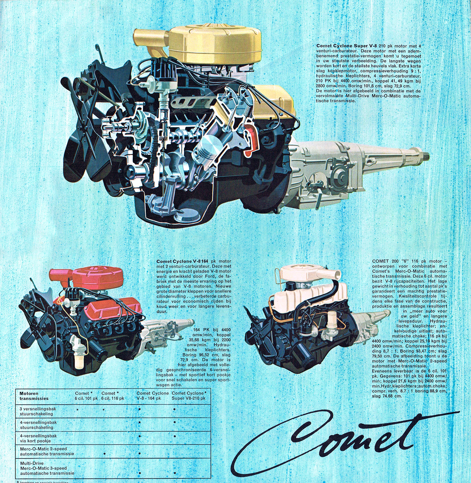
Here, the engines get the hyperreal treatment as they float over a watery-seeming blue wash, with a beautiful cutaway V8 up top. And I love seeing the Comet badge script rendered in ink!
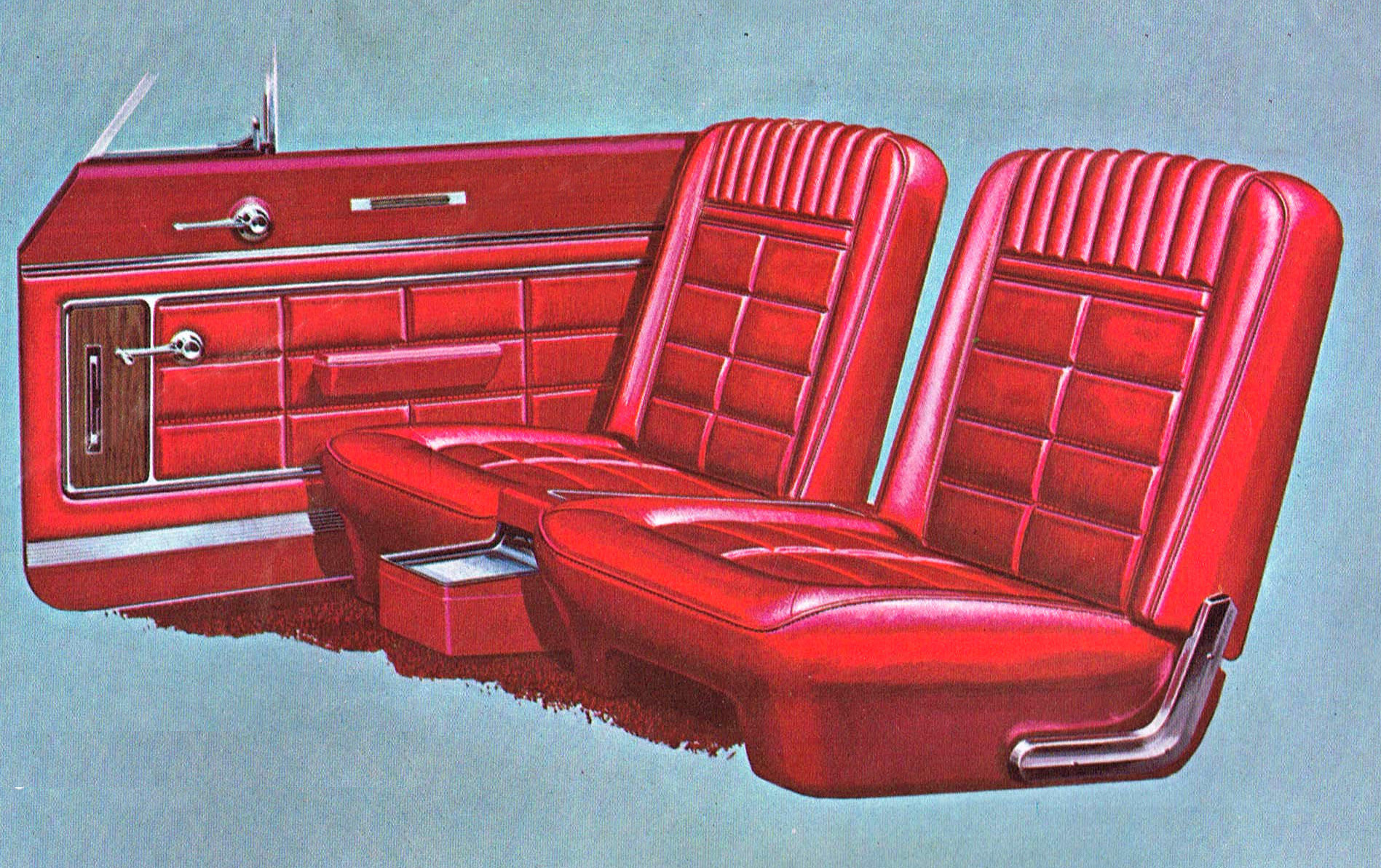
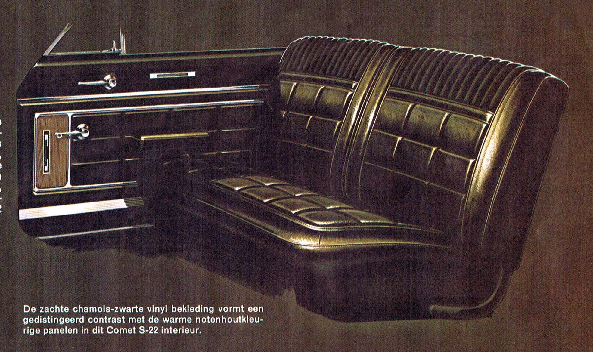
The only place we don’t really see the two-style approach here is in these interior renders, which are careful and extremely precise, but just slightly looser than the exterior car drawings. Look at the edges to see it clearly. These are just wonderful illustrations in their own right.
These artist were so damn good at what they did! Revel in these, friends! Give those eyes something to really enjoy!


i wonder if like Fitzpatrick and Kaufman one artist did the cars and the other the backgrounds? In that first shot, note the careful cut out of the background around the front left wheel.
This one’s going into my glovebox.
Torch, for a massive cache of mid-century automotive art, check out Plan 59.com. Nirvana for people who appreciate the best of the genre.
What a cool site! Thanks for sharing.
It’s a shame that we can post JPGs as I have thousands of brochures that could be featured for Car Brochure Art Appreciation Day. I’m currently entranced with the sleek lowrider look of the 1937 Nash brochure. You could also check out the definitive Eighties art on the cover of the 1981 Camaro book or the sassy primary colors on the 1986 Chevrolet full line mailer. We lost a lot when the auto business moved to photos instead of illustrations. All hail VanFitz!
Perhaps you can post them in Flickr and link it here.
I haven’t had a Flickr account for ten years and thought they had gone away. I seem to recall them shutting me off from my pictures. I’ll look into making another account.
I’m going to have to remember the name of this art style. 60s have always been my favorite decade for car design and this art style fits the cars that came out in that decade so well.
For your viewing pleasure:
https://smithhousedesign.com/the-1960s-and-the-golden-age-of-automobile-advertising/
Thanks! I’m a long time aficionado of brochure art and have a digital ton. I also have the book of Van Fitz. I’m not at home so I don’t have the author’s name.
Art Fitzpatrick & Van Kaufman: Masters of the Art of Automobile Advertising by Rob Keil. $55 published by Advection Media.
Another interesting one is Auto Erotica by Jonny Trunk. It’s focused on British and European brochures and was published by Fuel. It’s more about graphic design than skill in illustration.
Yes, and I believe these illustrations were pivotal in Pontiac’s success in the 1960s.
Both great additions to my library.
Thanks for that link. Nice!
Thanks Jason! My first car was a 64 Comet Caliente. I learned everything I know about wrenching (admittedly not much) keeping that thing on the road while I was putting myself through school. I still miss that car.
Thanks for mentioning the Comet Caliente. A girl about 5 years my elder, when I was 13, who lived a block away received a new one in black over black as a high school graduation gift. I admired that car and thought it was just beautiful.
Mine was mostly primer grey, but I painted it black. Black really suits the car.
Girls about five years our elder were so hot back then.
Have you seen them lately? Seriously, one I knew then is now mid 70’s and still hot. Several others, not so much. We all age, some gracefully and beautifully who work at staying in shape, and others who just let themselves go.
Yeah… I sweated out posting that. I remember girls back then. I’m 68 and realize I’m not that great to look at either.
“Coarse-and-smooth.” Something else for me to love. I’ve seen this before of course, but never knew of/assigned it a name. 🙂
Thanks Jason, and thanks for the ‘…like sneezing into a fan’ chuckle too.
The “crow” appears to be a human walking in the background. Note the not-black head.
The “woman and her crow” line is not referring to the woman in the car but to the woman on the artwork that’s being carried across the street in front of the car.
I love how that lovely woman’s toes are rendered in the painting being carried to maybe the Cafe Espresso, the door of which looks too small for it to get through. Pity about her painful-looking distorted pinky. The guy casually puffing a smoke to the right of the car is a nice little bonus element.
I t would be awesome in the most car-nerdy way if someone were able to locate a photo of the cutaway V-8 that the artist used as a model. Maybe from a car show or something.
I wouldn’t assume there was ever a physical model.
Yeah, the artist might have rendered it directly from the plans.
Maybe, but
!. if you’re talking the product drawings, I think it would have required that a drafter had already done that exact extremely complex cutaway. I don’t think an artist would have the skills to take a stack of literally 100 part and assembly drawings, and figure that cutaway out. That cutaway drawing is something a mechanical engineer and a drafter would work on, were it needed.
2. If such a drawing existed, the best use I can think of for it is for giving it to the people doing a physical cutaway. It doesn’t have a use for manufacturing. The second possibility would be to give it to an artist for a car brochure, without a physical cutaway being made. In that second case, it is a hell of a lot of work to do for a brochure.
3. People doing a physical cutaway probably wouldn’t have need of such a drawing anyway. Likely easier to give them an engine, some instructions on what’s desired and some consultation with an engineer, and let them get to work.
4. The way the intake and exhaust ports are colored looks like how they paint show models.
It’s possible. My money though is on the illustrator having had something to look at. Same for the other two unsectioned engines.
Even with those super cool sectioned full vehicle illustrations that Jason posts (thank you!), that are e.g. a 3/4 view with the near fender and half the hood and grille removed to see the engine and the suspension, I’ll bet the illustrator had photos taken of a loaded frame with no body panels for reference, or sketched that in person first.
The enthusiast magazines used to be full of artist’s cutaway drawings. Road & Track was especially fond of them. If you like mechanical objects and you’re an artist, it’s not hard to come up with something like those engine drawings.
https://www.amazon.com/David-Kimbles-Cutaways-Techniques-Stories/dp/1613251734
Looks like a cool book. I still disagree with ‘it’s not hard’ and with the earlier ‘artist might have rendered it directly from the plans.’ Have you read that book? My expectation is that it will say that he had physical objects to look at, not just assembly or part drawings.
In the book, David Kimble refers to his work in the same breath as that of Da Vinci. I don’t think he’s saying that “it’s not hard to come up with.”
Yes to all of your excellent insights.
These pictures of the disembodied car seats with the equally disembodied car door bring to mind the old joke about the people whose car has broken down in the desert and decide to walk back to the last service station they passed.
As they embark on the hike through the desert one person takes off one of the car doors and is carrying it whereupon the other person asks why. The first person replies, “Because if I get hot I can just roll the window down.”
Those illustrations really bring it back for me as I have a real fondness for the ’64 Comet.
My friend’s mom had a ’64 Comet Caliente Convertible in dark blue with a white interior and white top. It also featured the 289 V8, which was plenty of engine for a relatively light car.
His mom would let us take it out for drives, and I drove it many times. The power steering was too light, and too much gas pedal would break the wheels loose, so it required a deft touch on a rainy day. However, riding around with the top down on a nice day was awesome.
Those are pretty amazing illustrations. Shame most people likely never have seen them.
Exactly! Torch makes it possible for us to see these gems, and fine myself feeling grateful this site exists almost every day. Just one more reason to love it here.
God, I miss car brochures. Used to have a ton of them, starting from when I was old enough to ride my bike to the big three dealerships in my small town. Everybody knew my dad, so the salesmen let me take brochures home. Scoring a Corvette or Trans-Am or Mustang brochure was huge, but there was good stuff in even the basic car brochure.
Contrast that with now, as I was in a Ford dealership with my mother-in-law. We were waiting and she asked if they had any brochures she could look at. Nobody makes them anymore or if they do I haven’t seen any.
I agree. It suggests a thought: I wonder whether Torch or anyone is saving auto manufacturers’ websites, or screenshots of them, so that someone looking at them later thru the lens of time can be impressed or humored by aspects of their design that we might not recognize now. Websites are the ephemera of today.
Internet Archive Wayback Machine?
I had considered that, but: not all websites are scraped, the scrapes seem random in their regularity, not all scrapes yield a functional page with all its elements intact, and importantly there’s no guarantee that it will continue to exist.
The artwork is fantastic, and I appreciate that they show the cars doing normal car stuff. They’re not parked in a meadow or on a beach with the ocean splashing them with salt water that would burn a rust hole in the metal like xenomorph blood. Stylistic but realistic is better than photorealistic and non-sensical.
When I was in school for product design, all presentation materials were still created manually. There were several students who had amazing rendering skills and could create compelling presentations, whether or not the design itself was all that good. The thing that those students all understood was that the style of the rendering could provide an impression of the product in use rather than just a realistic representation.
The last class in the program was a semester-long project that was sponsored by a well-known national tool company. The company sent designers, including their design chief, to introduce the project, do a mid-project review, and then judge all the final presentations. The student with the highest-scoring project was offered an internship.
One excellent designer wasn’t the best illustrator, so he hired a painting student to take his pencil drawings and transform them into final renderings. They absolutely stole the show! They had a different style than the mid-century beauties, but followed the same basic idea. The student was very clear during the presentation that he hadn’t done the finals, but the judges basically gave him a zero for the renderings, which meant that, despite having what I consider the best design, he didn’t get the internship.
That student ended up getting a job at a consulting firm and quickly became their creative director. Ironically, one of his first projects in that role was for the same tool company.
Seems this style of illustration ran up to about 1970 – Then it went to photography.
Which is a shame – these images were real works of art.
The other thing I noticed here – how Mercury attempted to make the Comet into a mini-Continental. Just look at that grille and compare it to the ’64 Lincoln. It wasn’t till ’65 that Mercury really started pitching its lineup as “in the Lincoln Continental tradition”
Many of these illustrations used photographs as a starting point for the realistic elements. They were meticulously retouched with an airbrush or painstakingly traced and re-colored from black-and-white images. Some of it required literal cut-and-paste to place them over the background art, collage-style. Basically all the things we can do in moments with software, but painstakingly by hand.
Fitz and Van have entered the chat.
Completely here for this! The “Commercial artists” were still absolute masters. Check out Robert E McGinnis for a similar/similarly-awesome style in the world of book covers.
Totally. I love commercial artists’ work. Maxfield Parrish is one of my favorite artists. And Norman Rockwell did a bunch of commercial art as well. Good art is good art, whether it’s in service of an advertisement or brochure or hanging in an art gallery.
These are beautiful; they make the cars look even better than they did in real life.