
For most of us, the image associated with air-cooled-era Volkswagen advertising is the most famous one, the one still taught to students of advertising, the legendary Doyle Dane Bernbach Think Small campaign, known for its use of witty, urbane copy, extremely straightforward black-and-white photography, and a very grounded sense of honesty and humility. But that’s not how VW advertising started!
Before the DDB campaign, when VW was just barely getting going as a commercial concern, they used much more typical-of-the-era advertising techniques, and that included how their cars were portrayed visually, which is to say, not so accurately.
Those very early Beetles and Buses of the early 1950s may look iconic to us today, but back then they were strange looking beasts, funny little insectile lumps and bigger wheeled loaves, well outside the usual expected window of what people tended to find appealing in cars. So, with that in mind, illustrators like Bernd Reuters took some pretty considerable artistic liberties when portraying these early Volkswagens, and the results are kind of amazing and hilarious, in hindsight.
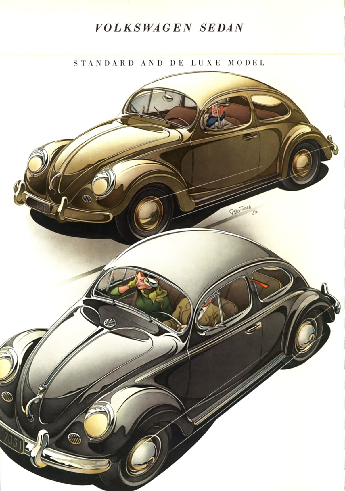
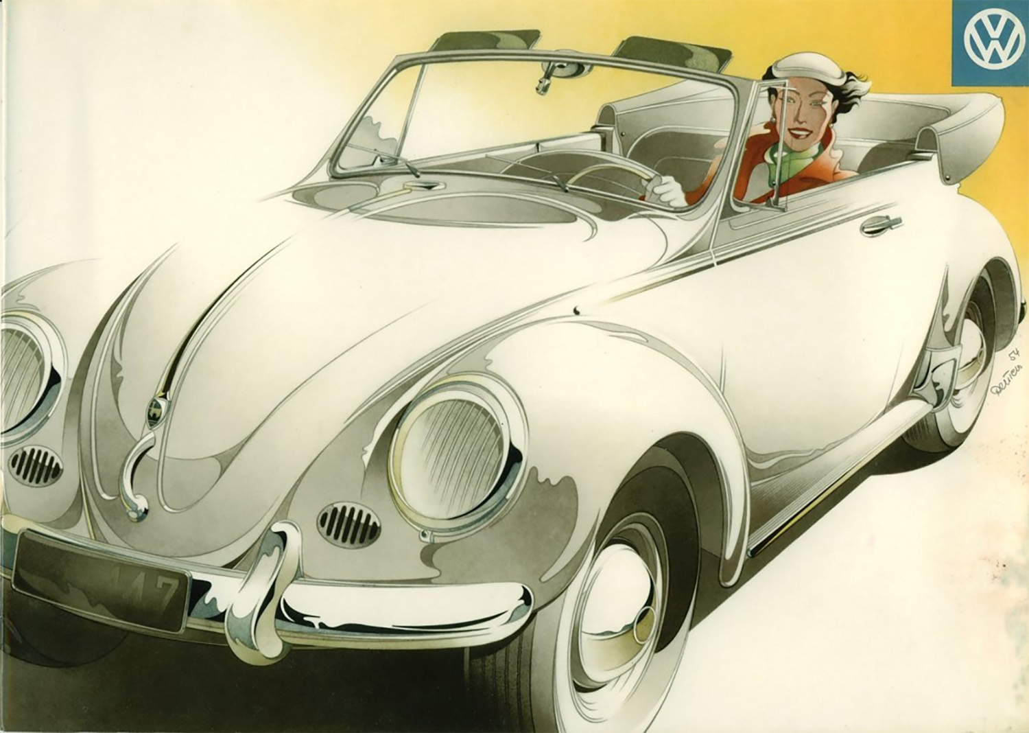
Just look at that example there, for example. Those are clearly Beetles, but every line has been pushed and massaged and stretched and tweaked, and the result is something so much lower and wider and sensual than the actual car. Also, note the extended semaphore turn signal arm in the lower Beetle there!
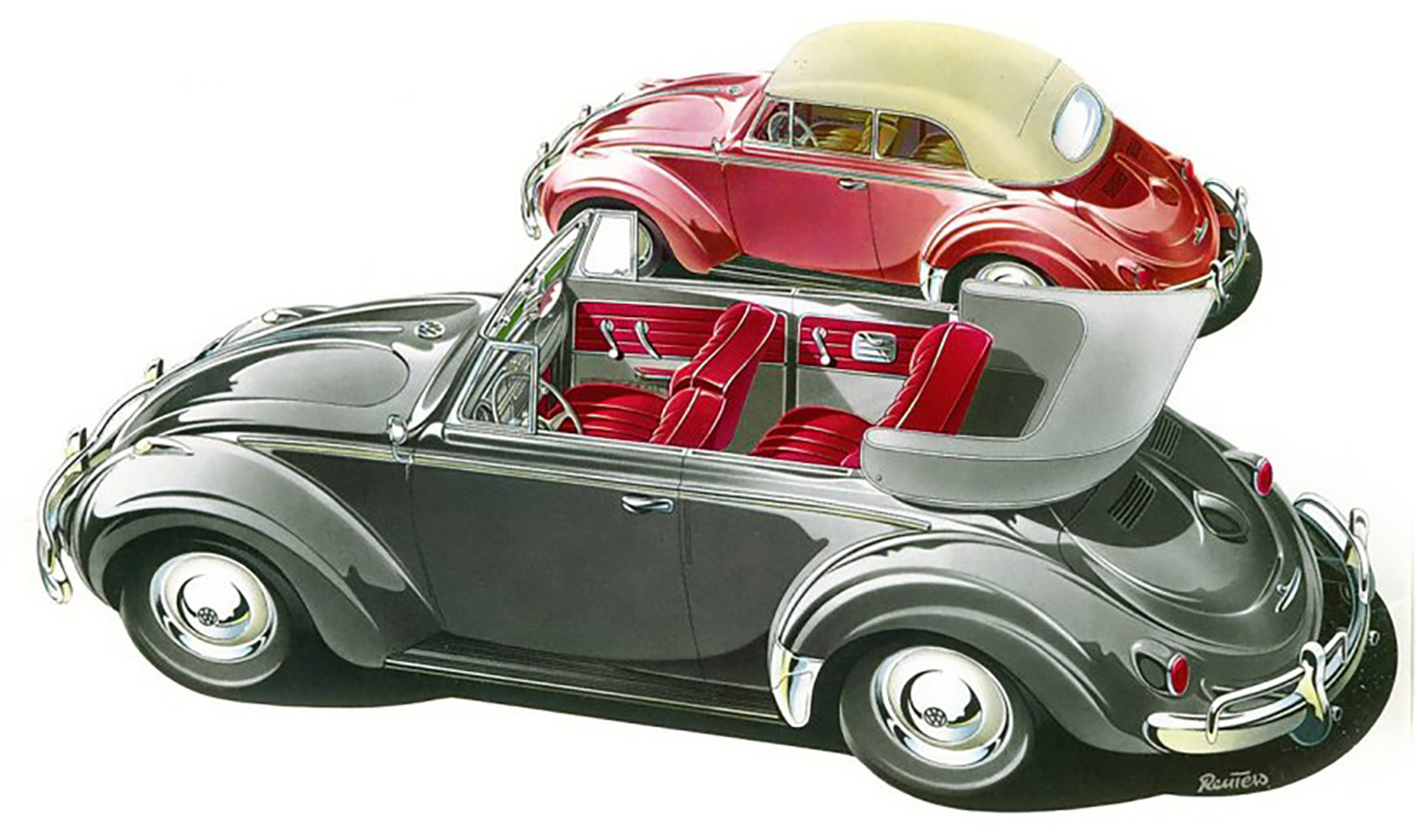
Here, let’s do a direct comparison between one of Reuter’s illustrations and a press picture of the actual car:
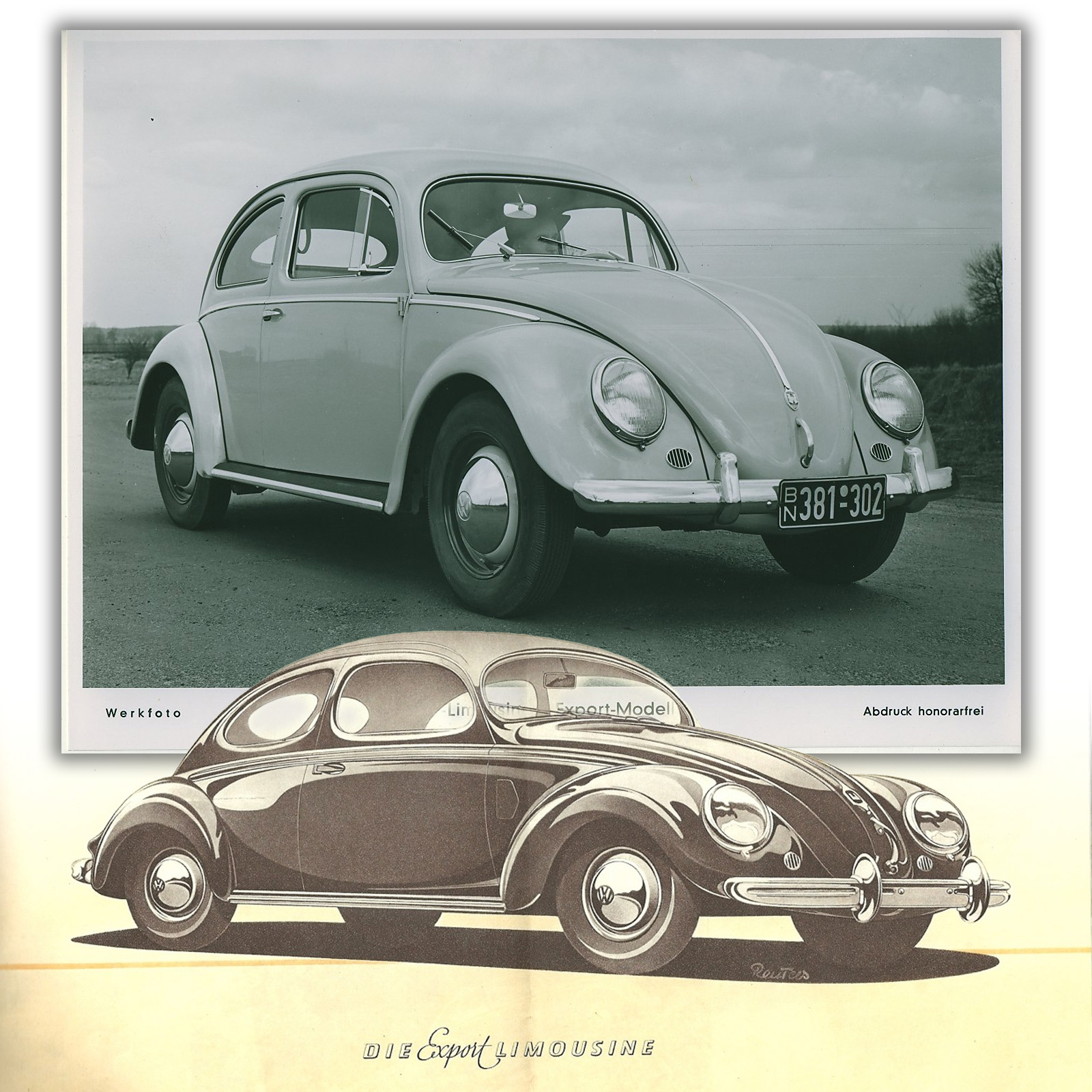
Those proportions are wildly different! Look how much longer and lower Reuters renders the car, and how the windows have become more rounded, the headlights more prominent, somehow, the fenders fuller and more bulbous, and the pattern of shine and light and dark more dynamic and exciting.
It’s a Beetle still, sure, but not a Beetle that actually exists in normal human reality.
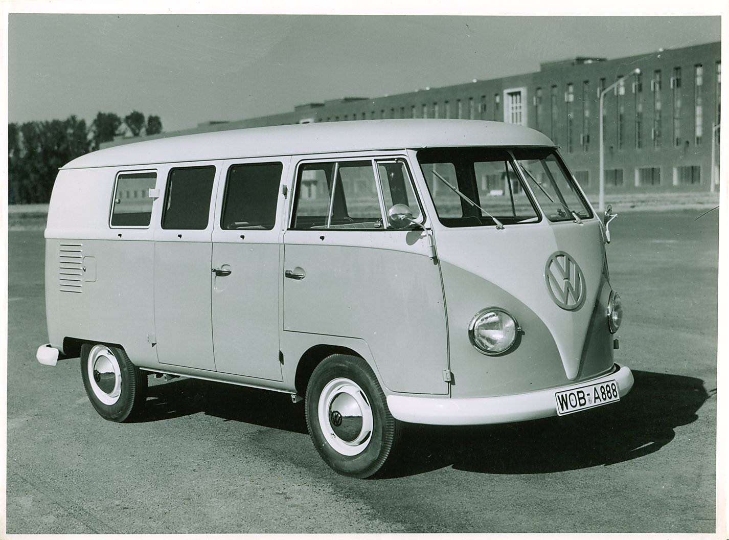
The same approach was taken for the Bus:
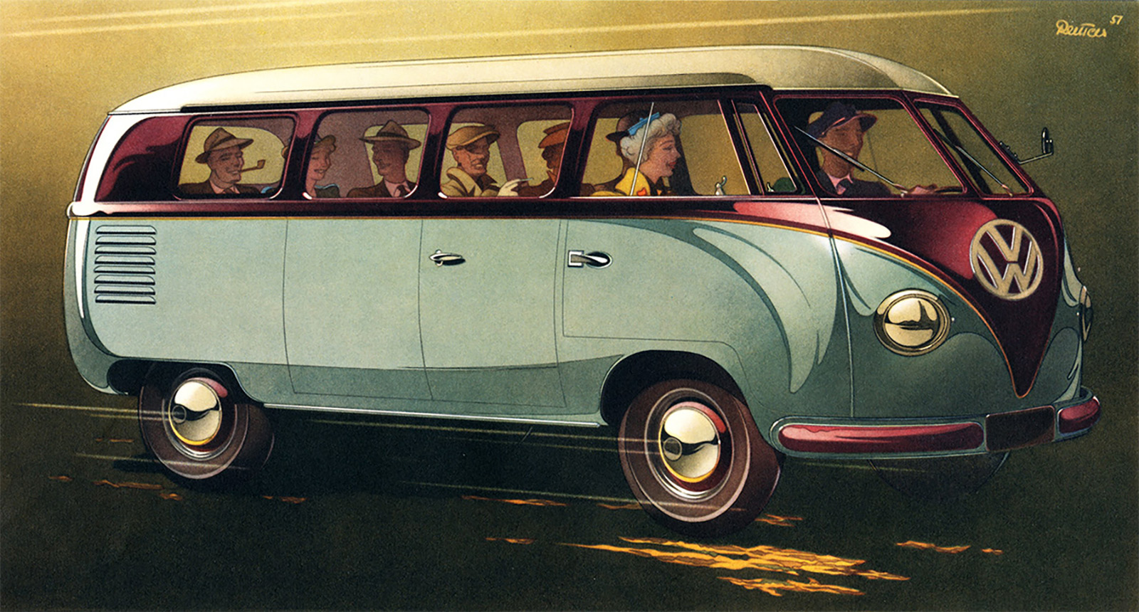
Here the passenger version of the bus gets more rounded and flowing, and feels something like a streamliner train; again, clearly a Type 2, but a pretty far cry from reality:
The same ensexification approach was taken for the fully commercial vehicles, too, like Type 2 pickups, because sexy exaggeration knows no working class prejudices:
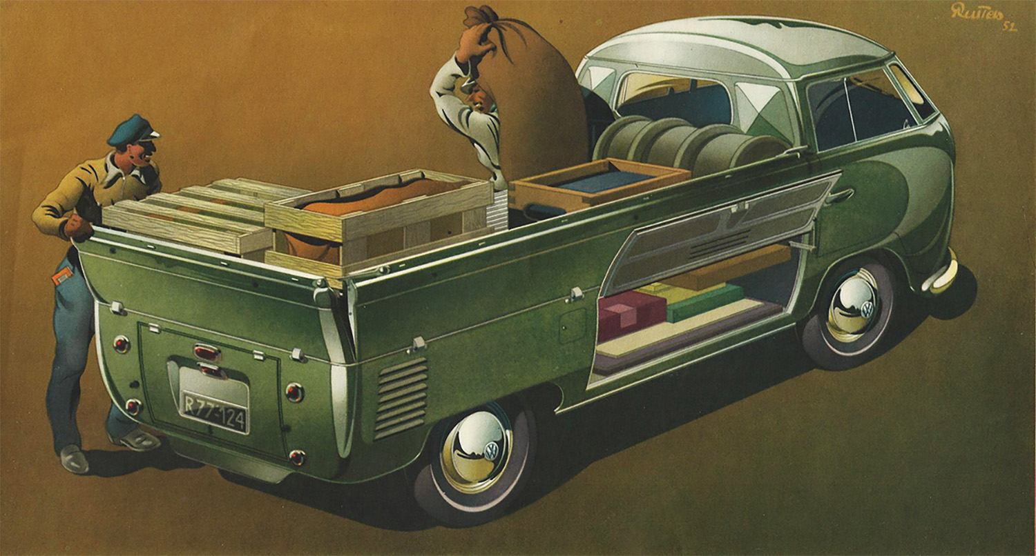
This one feels something like a Thomas Hart Benton painting to me, with that strangely rubbery quality of the figures and the inherent sense of motion. The truck here is also shiny and gleaming, and yet still shows off the vast carrying capacity of these trucks, both above and below decks.
The feelings these illustrations evoke go far beyond the peoples’ car utilitarian character of the early Volkswagens and inject a good amount of romance and excitement into the cars; and maybe that was something useful for VW’s early introduction to the motoring world, at least until they found their own character and message and identity.
Personally, I love Reuter’s early illustrations, mostly because of the gleeful exaggerations and inaccuracies. I wish I had the time and resources and talent to build a Beetle or Bus based on these illustrations; some skilled metalworker I’m sure could replicate these pneumatic and stretched curves, and seeing a Beetle with these lines and proportions in the metal I think would be sublime.
How has no one tried this yet? Holy crap, would that be cool.


Wow, these are beautiful…yeah, it would be awesome if someone made one
There was something about the point of the rear bumper guard on the “lower Beetle” with the erect (Freud was big in the popular mind of postwar America) semaphore was juxtaposed with the driver’s-side rear fender that reminded me of the first little finlets on the ’48 Cadillac.
Speed lines! Needs moar
cowbellspeed lines!The illustration of the bus looks (to my eye at least) more like the current Buzz
The white convertible illustration would make a fantastic T-shirt.
I see less Thomas Hart Benton and more Tom of Finland. Those workingmen are not so much rubbery as they are flexing and the caps are similar as well.
I believe this is the first reference to Tom of Finland that I have ever seen in the wild..
Some of those Beetles are getting very 356-looking.
Bernd Reuters excelled at his craft. To evoke a positive emotional response to an image is high art. My parents had a friend that spent his entire career depicting women’s shoes. I laughed when first told, but it was no joke, and he and family lived well.
A lower Beetle? So he was just drawing a 911 then
When I saw that Type 2 utility truck drawing I immediately thought “Thomas Hart Benton”! I was thrilled to see you, an actual artsy type person, thought the same thing.
I know they don’t really look like the real vehicles, but one in particular captures the feeling of the car: the woman in the white convertible. But maybe that was what Reuter was going for in all of them. Even though the Beetles weren’t particularly fast, perhaps they were enough faster than many other vehicles available at the time that this is how people felt when they drove them. Isn’t art supposed to capture/portray feeling as much as reality, or maybe even more so? We have photographs for reality, but I appreciate the way a painting can capture the essence of a thing. I never had a white convertible Superbeetle, but I wanted one badly when I was a teen and that picture above perfectly captures my mental image of what it would feel like to drive one.
Didn’t know about Thomas Hart Benton so I checked in google image. At first, I thought it was AI generated picture (the flow, the overall yellowish color). I’m curious to know if AI was trained with this artist.
PS : I like his painting a lot.
We see now, where Dr. Seuss got the inspiration for some of his drawings, especially the curved side windows on the Beetle.
What makes you think no one has tried? Clearly, some have tried.
That semaphore threw me for a second. I was thinking, did the driver close the door on his tie?
There is more than a hint of the Stoll coupe in those drawings, I wonder if that is co-incidental?
I like the more torpedo like illustration of the Type 2 vs reality. Though with 8 people in the van, I am sure it was as fast as molasses.
I don’t know why, but I think the actual vehicles are much more handsome than the drawings. Maybe it’s because I am accustomed to seeing the real thing, maybe because I am European, and these drawings clearly tend to US American tastes.
The drawings vs the production car are reminiscent of the A5 Beetle vs New Beetle.