
Have you gotten your dose of righteous indignation today? I sure hope so; your body needs that in order to maintain healthy levels of vitriol in the bloodstream. If you haven’t, I’d like to propose a handy target for your indignation: the sinister and persistent draining of color from our modern lives, and Range Rover’s complicity in this aesthetic crime. It also has to do with Range Rover’s 55th anniversary, so that’s nice.
Yes, it’s Range Rover’s 55th anniversary this year, and I feel bad that I’m about to talk some feces about them because they’re not exactly having a great day. But I think what’s being shown in their celebratory marketing materials contains a message that I hope will be read as a warning, or at least a sort of wake-up call to anyone who currently enjoys color vision.
Before we get into all that, this is a nice visual survey of Range Rover evolution that can’t hurt to view and enjoy:
Man, that side vent graphic didn’t show up until 2001? I thought that was a ’90s thing!
Okay, back to Range Rover’s big 55th. They’ve been promoting it by staging some lovely photoshoots with the same model dressed in period clothing matching a Range Rover of that period, and it’s a striking campaign. Here’s one of their Instagram posts:
View this post on Instagram
Man, that looks great! Here’s the image itself, in case you have an Insta-allergy:

The blue of that early Range Rover is stunning, it’s boxy charm really bursting through, and that woman’s dress, a riot of purples and violets and browns, stripes and paisleys and swirly patterns that look like book inner jacket marbleizing, it’s wonderful. And gold shoes! Exuberant, classy, of the period.
The ’80s one is great, too:
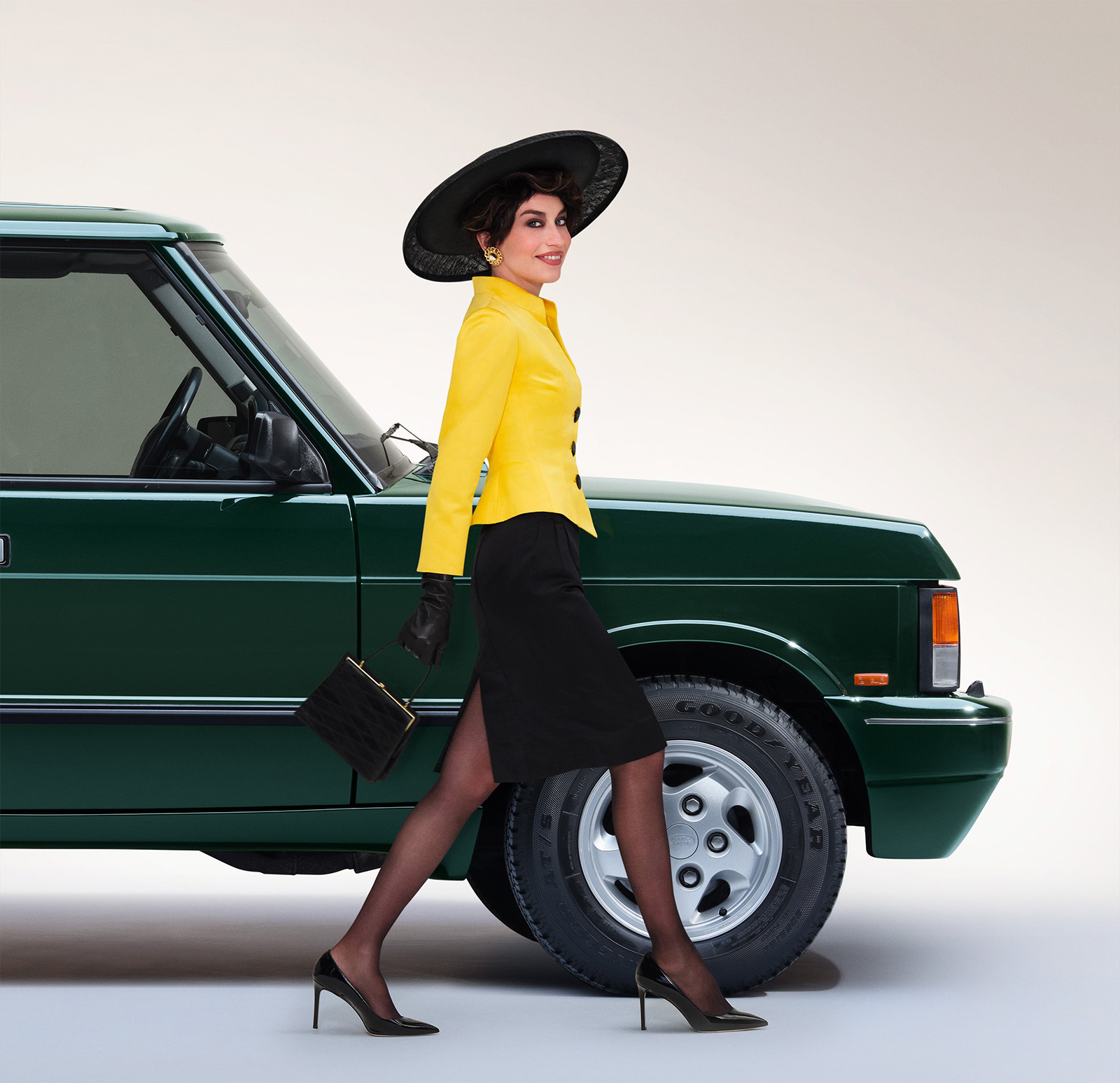
We have some vivid color like that yellow, and the iconic British Racing Green that was such a hallmark of ’80s Range Rovers, evoking outdoor sportiness and unassailable Britishness all at once. Also, that hat, those buttons, and those earrings. The design of the ’80s was bold and graphic, and this shoot shows all that to great effect.
Okay, now let’s see what they posted for their modern, current era:
View this post on Instagram
Here’s the full image:
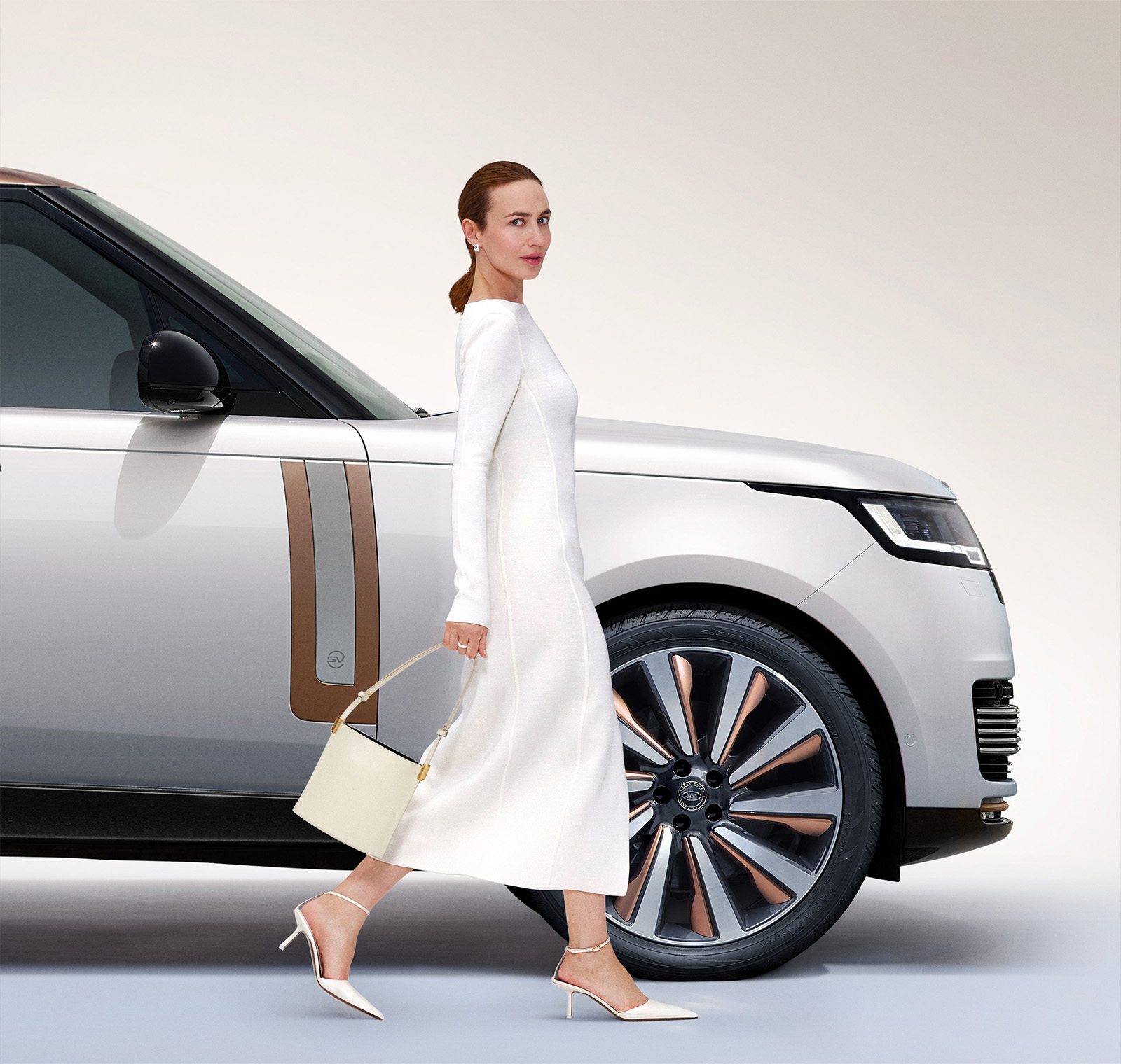
So, here we are, in the year of our fjord 2025, and this is how we’re choosing to express wealth and taste and status. There’s a restraint at play here: the dress is a minimalistic ivory frock, looking kind of like the muslin pattern it was likely made from, the purse and shoes are daring to be ivory and cream or whatever other names for almost-white they come up with (Blanched Mayonnaise? Winter Caulk? Cocaine Unguent?)
Makeup is minimal, hair is pulled back into a sensible ponytail, and that look, that expression, it’s no longer a coy smile or an outright grin, it’s a look of possible recognition mixed with slightly annoyed contempt.
The color palette ranges from white to off-white to copper, taupe, black, and maybe putty. Beiges. Because this is yet another symptom of an aesthetic plague taking over, the plague of beigeification. It’s not just me saying this; beigeification is a known term being used to describe a design trend we’re all trapped in – a trend that seems to spread across disciplines and arenas and kinds of design, like a beige version of the terrifying Sherwin Williams logo, covering the Earth.
View this post on Instagram
Somehow, beige has become the color of status and wealth and money, based on the idea that the ultra-wealthy don’t want to be too showy with their opulence, so they tone it all down into something that looks like it shares a color palette with the lunch special at a North Carolina coastal fried seafood restaurant. That means that this studious non-showiness has itself become a status marker, and now the beige-er you can be, the wealthier you seem, so boring and restrained has become as showy as gold-slathered everything.
Personally, I think this sucks, deeply, and these Range Rover promo posts just drive the point home, a point I suspect they weren’t trying to make: we were better in the past. Look at that ’70s image! It’s fun and classy and vibrant and exciting! It wasn’t all about class and money, it was about making things that looked engaging and appealing.
The modern Range Rover image that this photoshoot conveys is not connected with traditional Range Rover ideas of being able to go anywhere you want in comfort and style. Modern Range Rover looks like cold, grim opulence, like judgement, like the vain attempt to mask emptiness with wealth, a joyless, pampered slog though life. It looks like making an appearance at a gala and going home and crying and not even full understanding why.
If this is modern Range Rover, I’m okay being kicked out of that club. Maybe I can find out where the people in the old Range Rovers and loud clothes hang out, instead.
Top graphic images: Range Rover


The interesting thing to me is that the dress in the 70s photo is probably a dress from Emilio Pucci. One of the greatest Italian fashion designers and an aristocrat known for his class and elegance.
Ginger (i.e., “red”) Baker (Maniac Drummer extraordinaire) drove an olive/tan Range Rover from London to Nigeria, to set up a recording studio. That is nothing but colorful. Range Rover’s existence has been otherwise meaningless.
The first thing I thought when I saw the lead photo was ‘somebody get that new one on anti-inflammatory meds, stat!’ And I totally agree about the color thing…I waited two extra months to get my 2012 Fit in Raspberry Blue Metallic.