I’ve fan-person’d many, many midcentury car illustrations here over the years, and I don’t intend to stop anytime soon, despite what a series of increasingly strident and vulgar letters sent to us from the American Egg Board demand. This particular one is worth any number of threats from the egg goons, because the illustration shown above there is so strange and clever and unexpected that I had to share it with you. Can you tell what that illustration represents?
It’s very highly stylized and abstracted, of course, but it represents something very specific. It’s also interesting in how it, in its very simplified and geometric form, conveys not just forms but time as well. Also interesting is that the style of this illustration is just one of many in this brochure, and is not even the most used style in the brochure, which is a British Ford brochure from 1960, for the Consul, Zephyr, and Zodiac. Is it a wave?
Know what it’s showing? Here’s the full cover, which should reveal the truth:
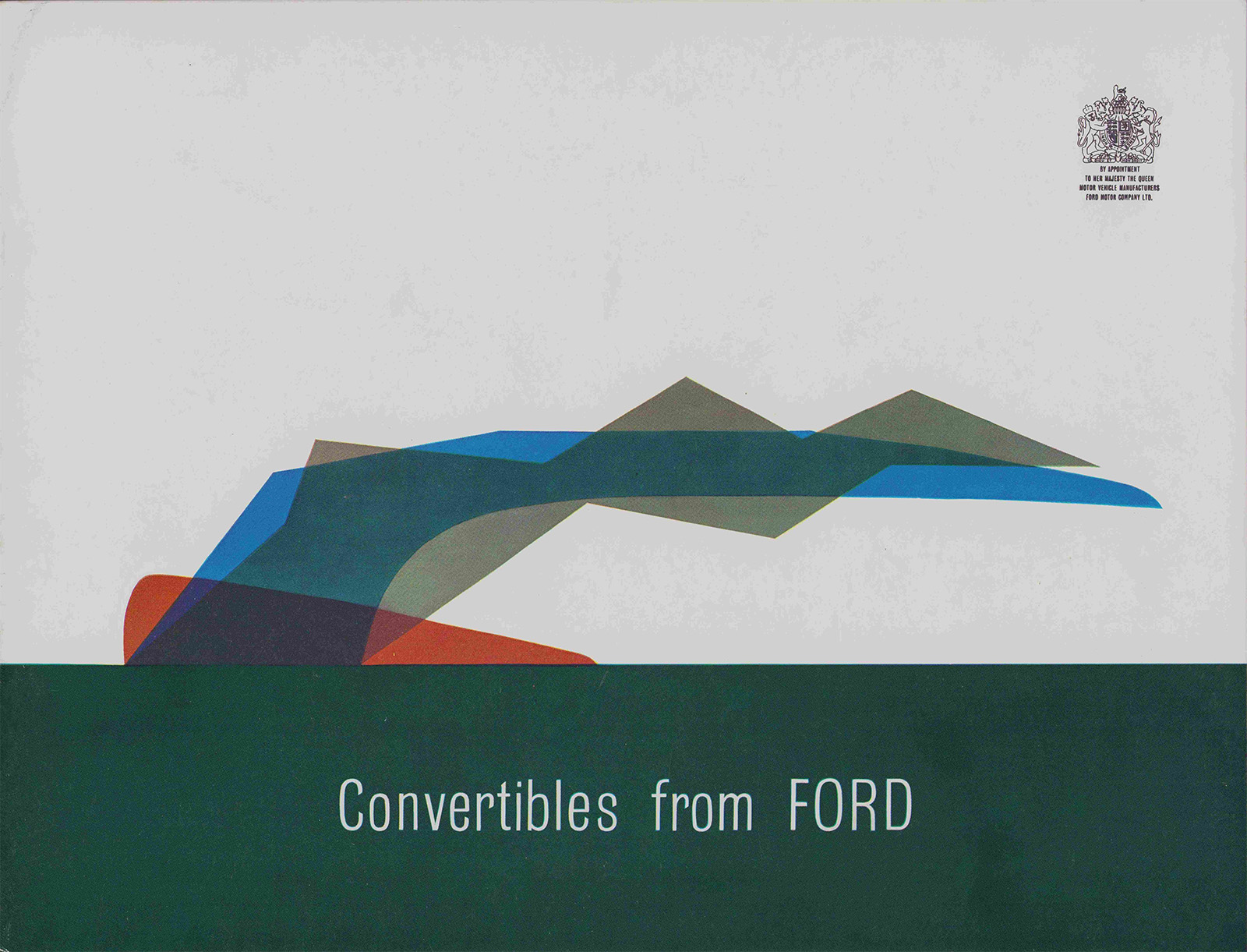
It’s a convertible top! Seen in profile, highly stylized, and shown in three states over time: blue for fully closed, gray for the halfway folded point, and orange for the fully folded position.
I really love how this was done; at first glance, it just reads like an interesting design choice, something unspecific, but it is, of course, the opposite. Somewhat strangely, there’s only one other illustration in this brochure rendered in anything close to the cover:
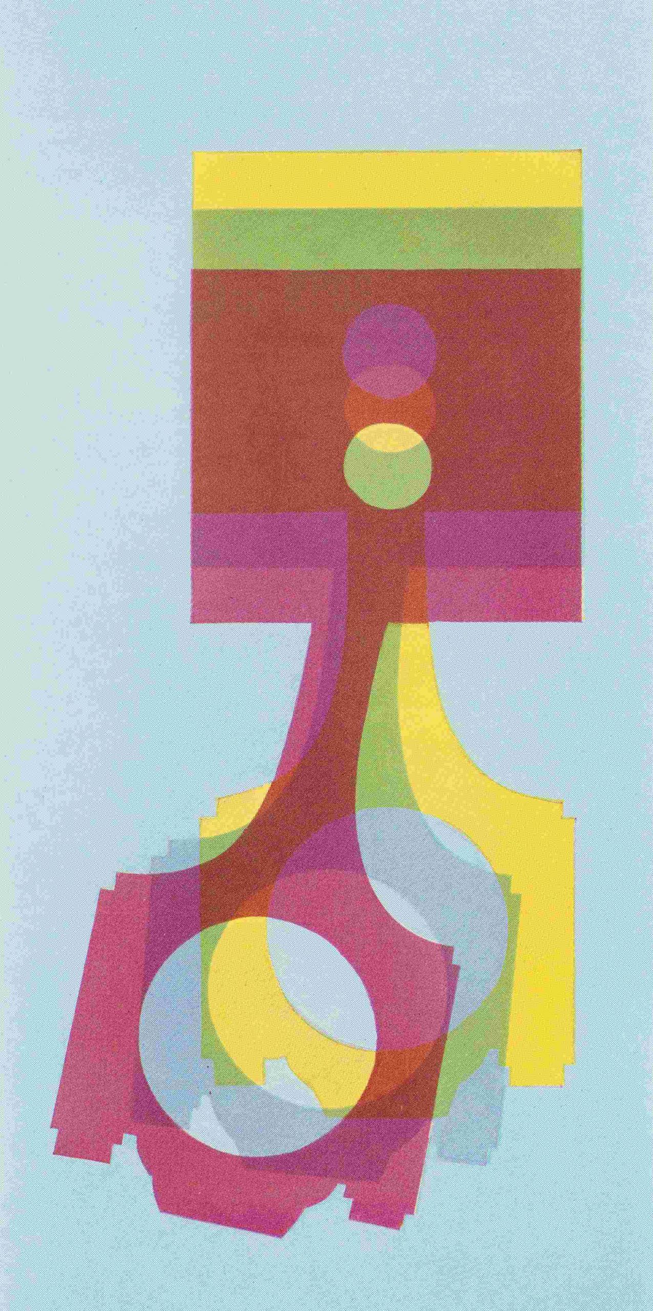
A piston and connecting rod! Ford offered four and six of these in these cars, depending on how much of a big shot you were. The rest of the illustrations are handled in much more conventional and naturalistic styles, like the careful illustration of the engine choices:
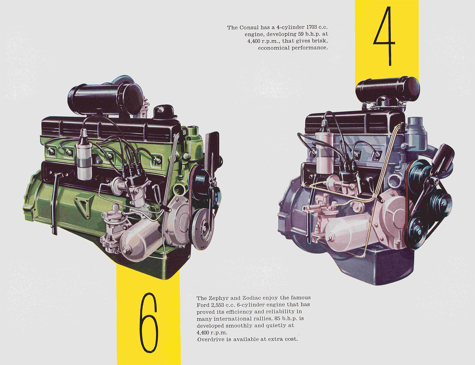
Lovely illustrations, too, of course. This same style was used for renderings of the cars themselves:
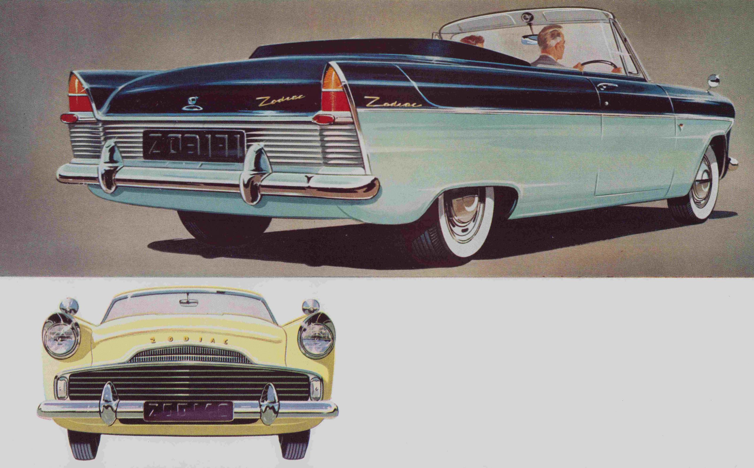
…but there were more variations as well. Some combined this careful, naturalistically-rendered style with a simple linear sketch-style:
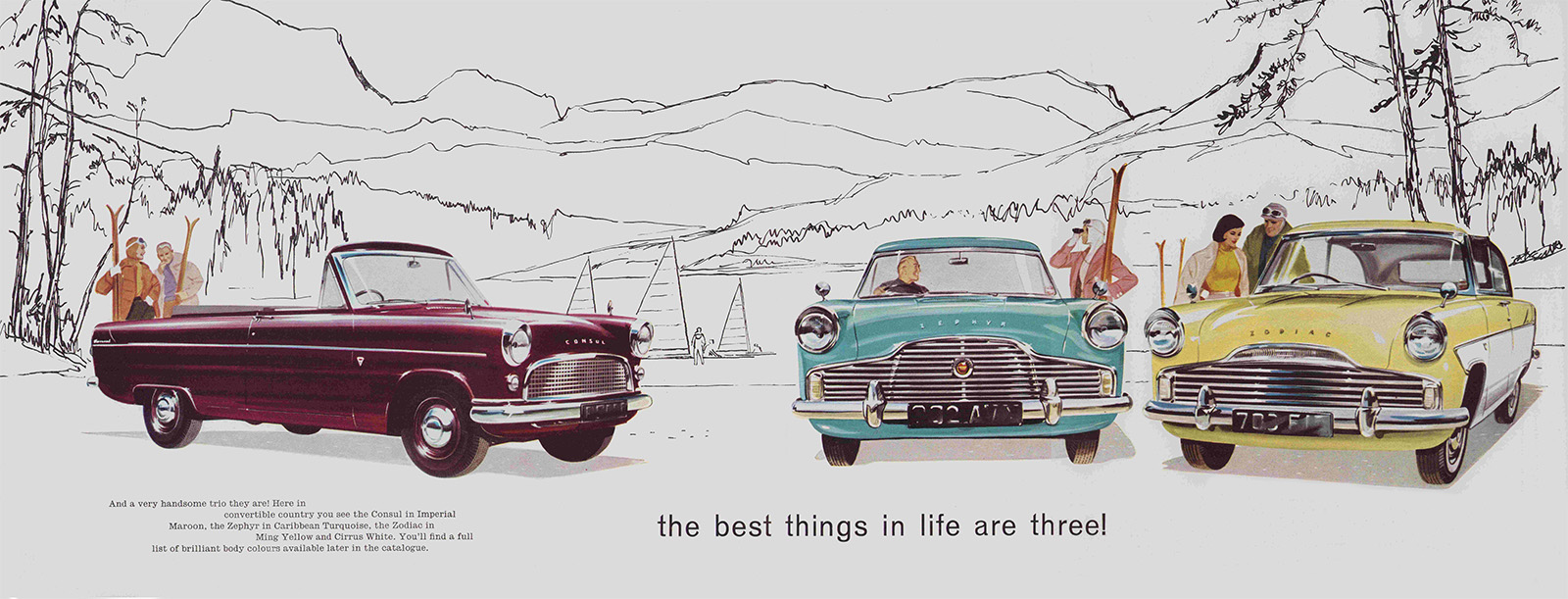
That’s fun, everyone hanging out in Sketchy Illustration Outdoor Funland, with skiing and sailing and probably a nice buffet and/or swing club.
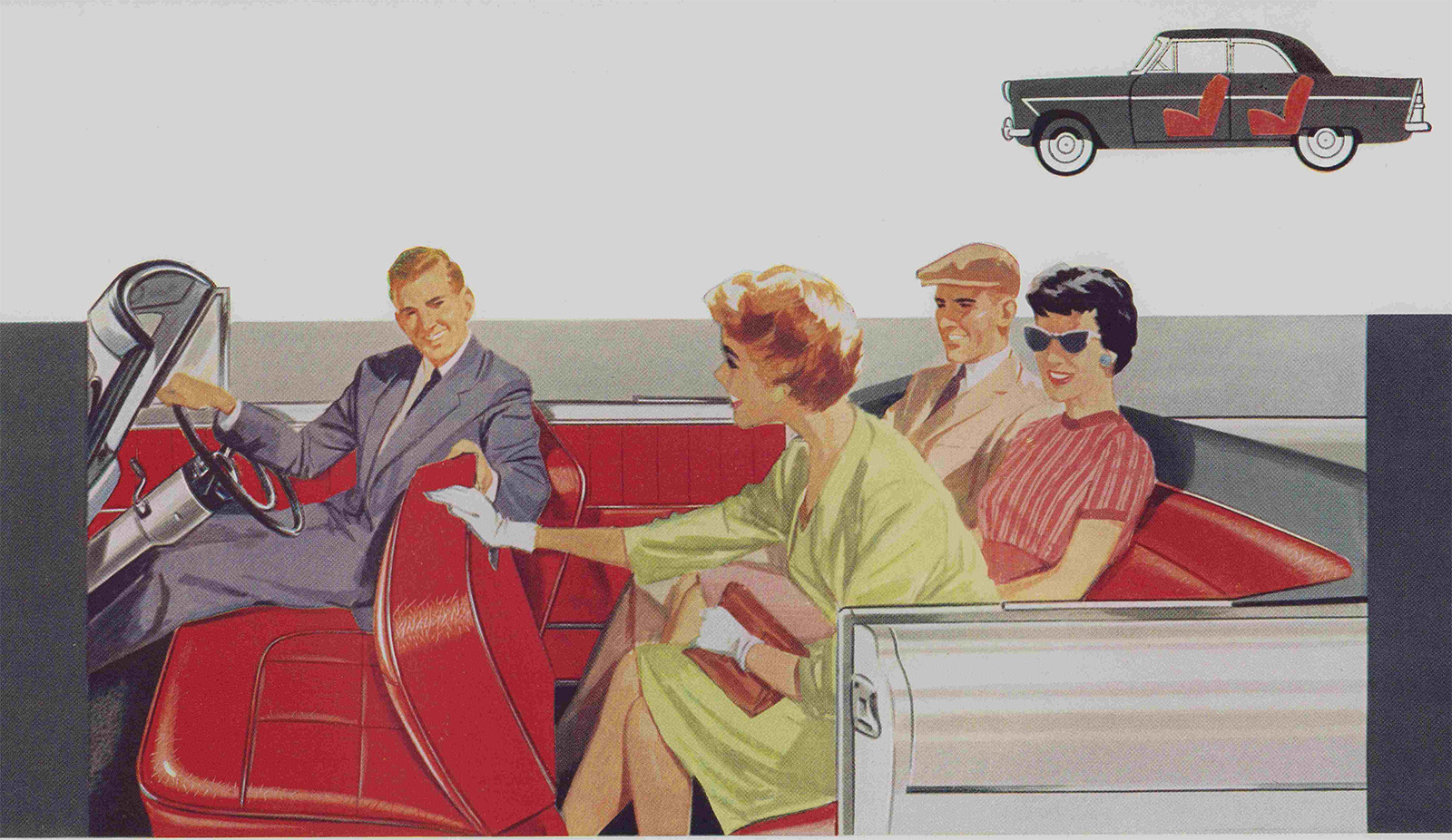
There’s a slightly looser style used as well, as you can see in these people happily crammed into the back seat. Compare this to how tightly the car itself is rendered:
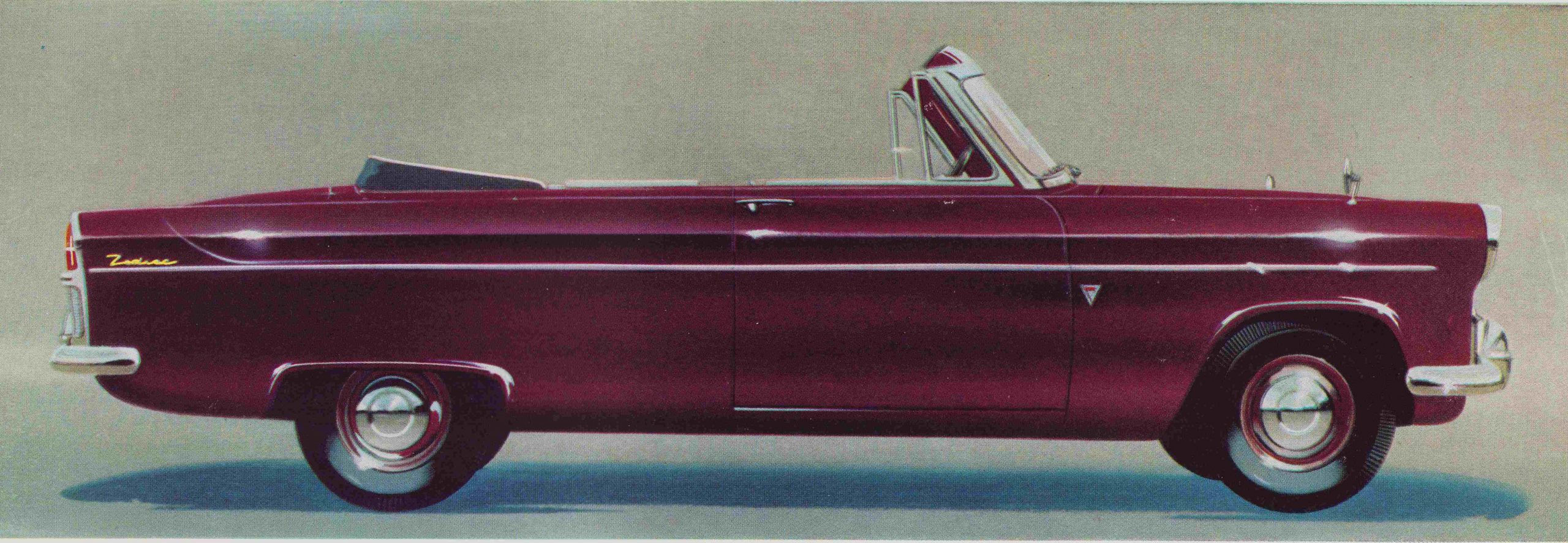
Fantastic work on those light hotspots! I like these little British Fords, they have a sort of charming dowdiness, especially when compared to their American counterparts.
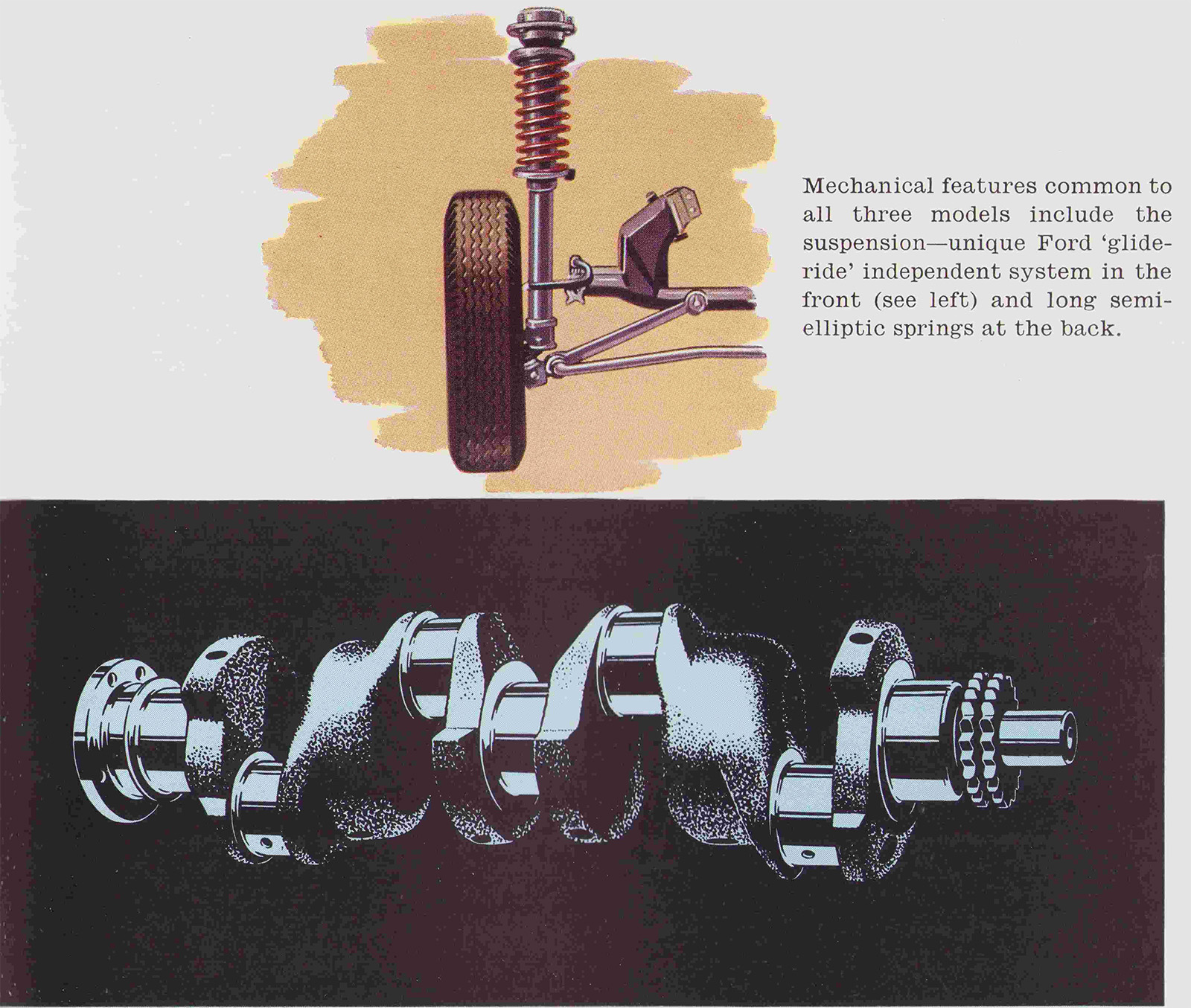
Finally, we have two other illustration styles here: the upper suspension diagram combines a careful, tight style with a coarse brushed colored background, while that crankshaft has a very different duotone, almost block-print or single-color silkscreen sort of approach.
That cover, though. It’s so good an unexpected!



These remind me of some of the charts/graphs seen in Tufte’s “Visual Display of Quantitive Information” even though the states of toplessness aren’t really a chart/graph of course https://www.edwardtufte.com/book/the-visual-display-of-quantitative-information specifically this famous one https://www.theinformationlab.co.uk/wp-content/uploads/2016/02/Visual-Display.png or https://youtu.be/sYLQNpU5FiQ if you prefer a sub-1-minute video.