
If you’ve spent even a fraction of the time I have obsessing over weird, old, obscure BMWs, you’ve very likely heard of Alpina. It’s a German tuning firm that, for the past 60 years or so, has been modifying BMWs—first to go racing, and then to sell as more luxurious, capable versions of the base cars. For decades, Alpinas have been described as the thinking man’s M cars, nearly as capable but with their own distinct characters.
Alpina’s arrangement with BMW, which sees BMW supply vehicles to Alpina for modification and resale, has been going on for many years. But in 2022, BMW announced a change: It would be taking ownership of the independent tuner firm and bringing Alpina in-house. The full transfer of ownership happened at the beginning of this year, with the new entity simply being called BMW Alpina.
In the next step of BMW’s takeover, the company has reworked Alpina’s legendary emblem for the modern age. Thankfully, the makeover isn’t as severe as I feared.
I Prefer The Old One, But At Least They Kept The Cool Parts
I won’t lie to you, when I saw this embargo come in, my stomach dropped a little bit. Of the manufacturer emblems out there, Alpina’s is certainly among the coolest. Its general layout mirrors that of BMW’s iconic Roundel, with two circles and the tuner’s name printed along the top of the space between the two circles. But instead of blue and white pie-cuts inside, the inner circle features a coat of arms with two sections. On the left is a set of throttle bodies with velocity stacks with a red background, and on the right is a crankshaft with a blue background.

Alpina’s logo is easy to spot versus a normal BMW logo due to its distinctive, bright colors, while the engine parts are a throwback to the company’s early tuner days, where it modified engine parts to extract more power. That’s cool because 1) it’s a proper throwback to the firm’s beginnings, and 2) engine parts as part of a logo is just cool as hell.
To hear it would be changing scared me. Why change such a well-known, legendary, explicitly tuner-focused design? Much to my relief, BMW has only changed a few small things and left the most important parts alone.
Like many manufacturers and other big-name fashion and tech brands, BMW went the minimalist route with its logo redesign back in 2020, dropping the fill color from the outer portion of its Roundel and simplifying the rest of the design:

It looks like the company has done something similar here, dropping the color in favor of a simpler black and white appearance. The distance between the circles has also been made larger to accommodate bigger text for the brand name:
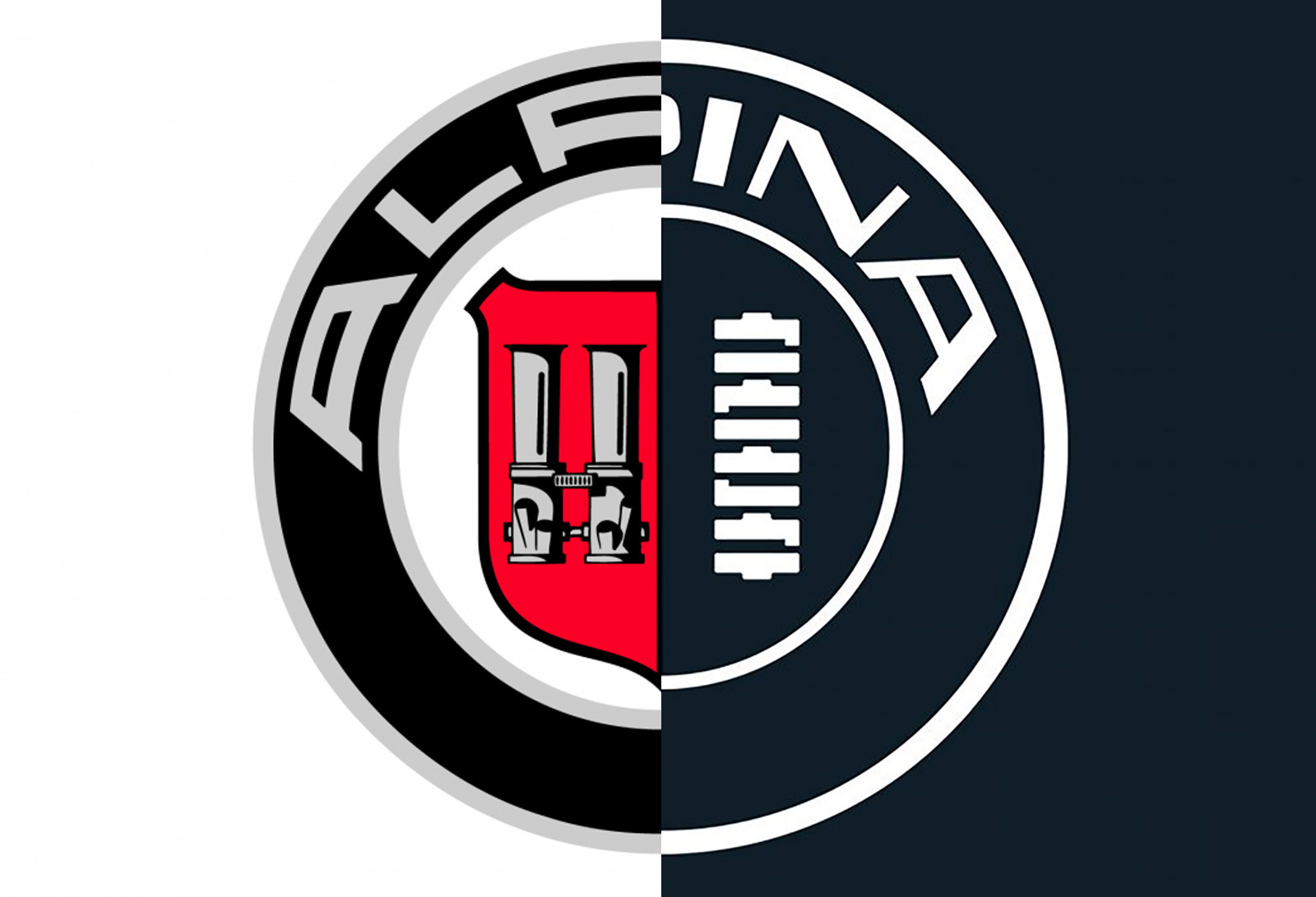
Firstly, I want to express how relieved I am about the Alpina logo keeping the velocity stacks and crankshaft, albeit in a simplified style. I’d be heartbroken if BMW simply started using the text “ALPINA” and nothing else, but that’s not the case here. But I am sad about how the logo has lost all of its color. Like I said earlier, that two-colored coat of arms is what made the emblem distinctive and easy to spot. In the case of this new emblem, the coat of arms has been eliminated, with the inner circle now just split into two opposite-colored halves.
Here’s how BMW explains the change in its announcement:
The new BMW ALPINA emblem honors the brand’s heritage while authentically evolving into the modern age. The new design features the same two significant elements as before – throttle body and crankshaft – central to the historic story of the brand. As with the already revealed wordmark, which encircles the badge, the elements within the badge benefit from clear and concise linework. A unique transparent execution emphasizes the emblem’s modern silhouette, and reduced colouring enhances the contemporary look and feel. The new badge design conveys a precise and refined execution, perfectly suited to the exclusive positioning of BMW ALPINA.
The thing is, I’m not really worried about this logo actually showing up on any new Alpinas. That new BMW logo I shared above hasn’t ended up on any production BMW exteriors since its launch six years ago; the company’s been using the same logo it’s had since the late 1990s, and only made some extremely subtle changes back in September.
Like that fancy new BMW logo, I bet this version of the Alpina logo will be used for marketing, branding, and everything that isn’t the cars themselves. When it comes to what’s actually on the bumper, I suspect the old Alpina logo (or at least a version more closely resembling it) will still be used. I asked a BMW representative to see if I was right, and here’s what they told me:
The release refers to a new „badge“ design, which indicates the design shown will be the template for what’s on the vehicle.
Top graphic image: BMW, Alpina


I’ve never seen the Alpina logo before this. I don’t think I agree with the “a little bit” part. The old one is significantly better.
BMW Ruins Everything.
Flatten then add monochrom colors.
Colors are good, the Germans don’t seem to understand that. And the crankshaft looks more a coil over now. But it could be worse.
Every brand wants to be as bland and infantilized as possible. No personality, just Mormon-levels of subdued.
Yes, most brands trend toward the bland (curious what part is coming across as infantilized to you, though) because that tends to have wider appeal. People spending lots of money don’t typically like to drop it on a brand/product that has tons of, uh, “personality”… as those kinds of design choice tend to suggest an amateurish operation.
Work like this to “Clean up” old designs or “smooth the edges” are usually very intentional and not taken lightly: Alpina is now part of a massive corporation, so clarity and simplicity will win every time. But yeah, it’s all subjective.
Infantilizing is probably an overwrought (but fun!) term. It just makes me think of the simple logos used for toys aimed at young children. Bigger, simpler designs. Not that something has to be finnicky and detailed to be more “adult”, I’m just tired of the trend. I still think GM’s logo change a couple years ago is the worst; it looks like it’s for Goodwill or something.
Yeah, the slim lowercase “gm” is just… a weird choice.
” 2) engine parts as part of a logo is just cool as hell.”
Yeah, though unfortunately sometimes such things can give Milhouse Van Houten vibes à la his Radioactive Man costume: https://i0.wp.com/tstoaddicts.com/wp-content/uploads/2016/07/milhouse-radioactive-man-costume-simpsons.jpg?ssl=1 which prompted Lisa to say “I don’t think the real Radioactive Man wears a plastic smock with a picture of himself on it.”
There’s likely more to this logo than what’s shown for this initial reveal: it’s common practice to create a set of approved logos for different cases. Looks like this is single-color version, made to ensure it works in those less-than-ideal uses (tucked into a pile of other sponsor logos, displayed against a photo or busy background, embroidered onto a hat, etc.)
I bet there’s a dedicated version for badging (just as you mentioned with BMW’s latest logo change).
Also for what it’s worth, IMO this is a rebrand done right: it has all of the important elements but has removed a bunch of unnecessary touches that were distracting from the graphic (extra outlines, overly detailed coat of arms shape, etc). Hopefully the badge version is still red on the left and blue on the right, but with these cleaned-up throttle body and crankshaft images.
I don’t think the font is any good though… oh well.
TLDR: Designer here, don’t freak out about this logo being black & white. There are almost certainly other versions.
I agree — a lot of this redesign work looks like it is for printed materials. BMW notably replaced a blue-silver outline which looked like chrome with a plain grey — they went from using five colors in their logo to two.
Alpina similarly has gone from four colors in their logo to one. This makes a real difference when printing, in cost and production complexity. (For those not in the know, commercial printing is usually done one color at a time, alignment sometimes is off meaning a whole batch has to be scrapped, each extra color is another full run…)
I agree the change in font is bad. The former version was very good, its curving of lines to match the surrounding circle worked beautifully, and it harmonized with itself as a whole. The new lettering with mostly-straightened horizontals is clumsy, and the variation in stroke widths isn’t attractive. The narrower horizontals at the bottom of the L and the truncated top of the A in particular are bad. IMO.
Exactly. Why not just use the same font as the parent BMW logo at this point…
I agree, not a bad logo all things considered, but at the same time, do we really need to millenial-grey all the things?
Yeah, in addition to the aforementioned grey goodness knows we already have *plenty* of greige.
Dunno about that term re: grey, though, since millennials already get so much blame on account of all the avocado toast and take-out coffee they keep buying instead of houses and high-end cars…
Millennial-grey/landlord-grey refers to new construction homes and apartments, which are covered floor to ceiling with grey paint, grey furniture, and grey cabinets.
Yeah, I only ever see terms such as landlord-grey or flipper-grey. I’d not ever seen “millennial-grey” before and thought it a bit unfair to judge millennials by the actions of people who are more likely to be…boomer; not too many millennials are actually landlords, much less homeowners, lol.
Boomers are all in retirement homes or dead. They can’t be Gen X because they don’t really exist. Therefore they must be Millennials.
The boomers that are around and active (i.e., as landlords, developers, bankers, stockbrokers/stockholders, and the like) prefer to call themselves Generation Jones ever since the term “boomer” gained such negative connotations but they’re still very much boomers…
Technically, it could be a flat-plane V8 crankshaft as well, not that BMW builds one. But they could!
A very clever observation 🙂
I was today years old when I found out that the Alpina logo still shows a crankshaft for a four-cylinder-engine, going back to their roots in the 1960s with the M10 engines.
Glad they did not „upgrade“ that to a six cylinder in the redesign process.
One can realize that is getting old when you become the person saying “this was better in my time”.
But I agree is not that bad, even more when you compare with current BMW designs…