There’s a sort of strange phenomenon in the world of automotive design, one that seems a bit like a paradox. It’s the realization that sometimes, the best designs aren’t designed at all, they just sort of happen, as a byproduct of a car’s engineering and the job it is intended to do. It’s sort of like the Bauhausian concept of form follows function, but perhaps even taken to a greater extreme than what those Bauhaus kids were doing. The paradox is that it often takes a good car designer to realize this, and to sort of be a guide to make sure no misguided attempts at “design” actually happen. It’s design by not designing, but that itself is a form of design.
I told you it was kind of a paradox.
One of the best – though by no means only – examples of this is the Citroën H-Van. These vans were built between 1947 and 1981 and featured a construction philosophy inspired by aircraft like the Junkers and the Ford Tri-Motor, where flat panels were heavily corrugated to add strength without adding weight. They were extremely straightforward vehicles, with a unibody design and front-wheel drive layout that provided a huge amount of usable space. I mean, just look at the thing:

If you consider the overall length of the vehicle and how much is actually usable for people or cargo, it’s pretty damn impressive. This is clearly a machine made to accomplish a task, the task of moving crap around, and it achieves that incredibly well. And, yes, it appears that precisely zero effort has been devoted to “styling” the H-Van, to a degree that I find extremely impressive.
You know how some car brochures include detail shots of some of the interesting design elements of a car? This brochure does the same thing, but all of the details picked are just utilitarian parts bolted without ceremony to the van: handles, lights, that sort of thing. There’s no attempt to “design” here:
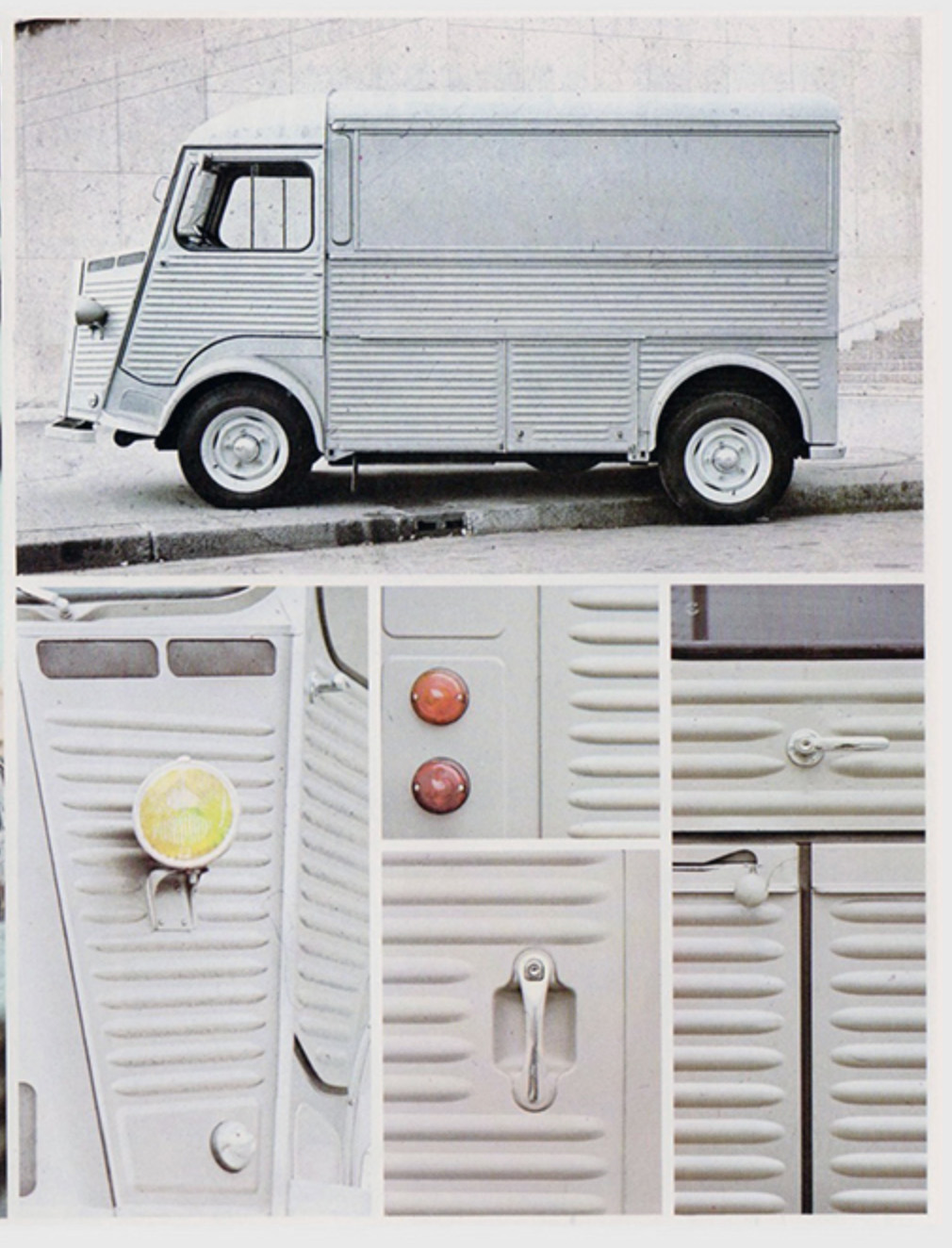
I love all of this so very much. Look at that headlight, for example. They just took the same units used on the 2CV, made the most straightforward bracket they could, and bolted it on. Done. The only styling that happened there was that someone made sure they were facing forward before knocking off for lunch.
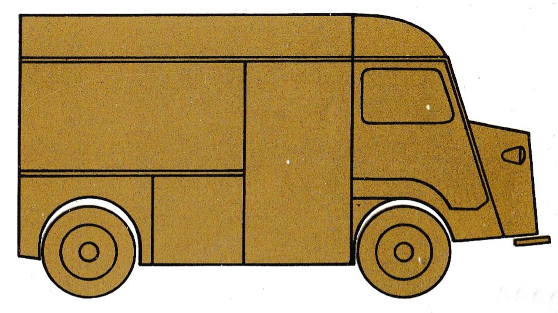
This crude diagram of the H-Van really isn’t that far from a full portrait of the van. This is pretty much it!
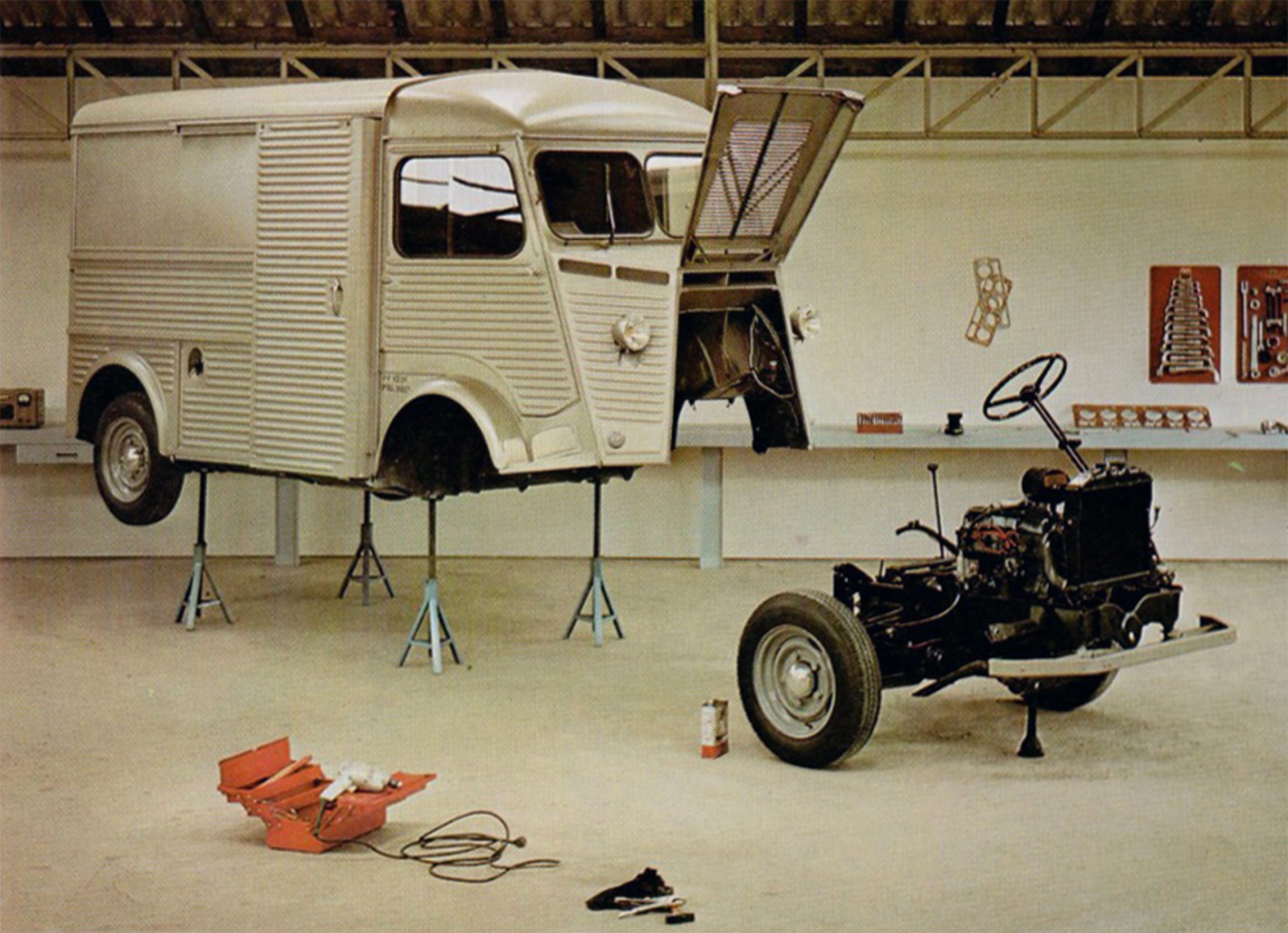
Look at this incredible serviceability! That whole drivetrain just rolls right out the front!
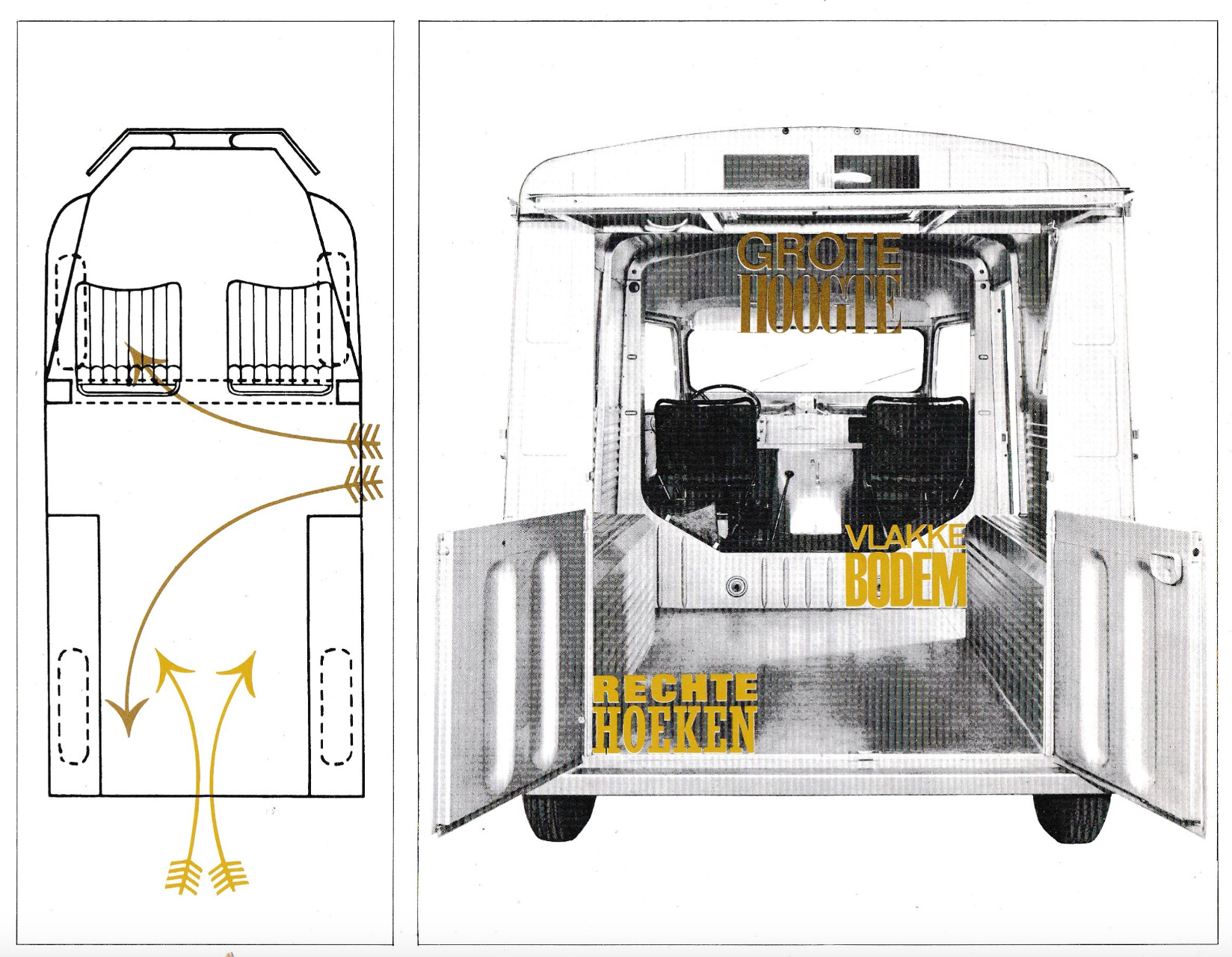
There’s zero pretention here, no attempt to make this into something it’s not. It’s just a tool, and however this particular tool ends up looking in order to do its job is just how it is. And then, somehow, the end result becomes something that actually is stylish, is a design icon, because that’s how things work, sometimes.
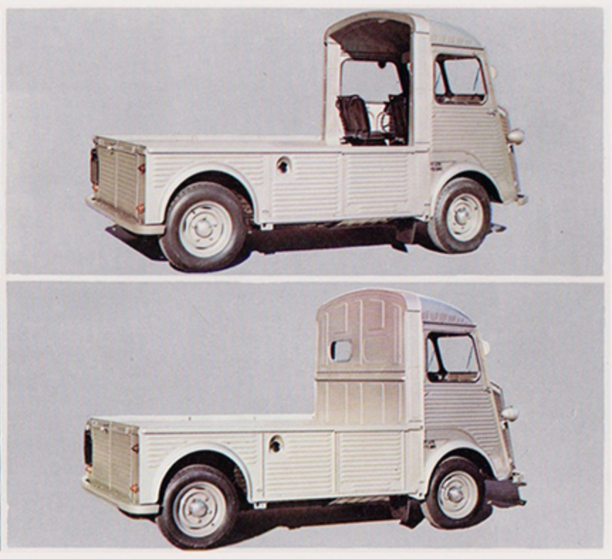
There were pickup and chassis-cab versions of the H-Vans, and they were variations that were created via subtraction: body panels were removed until you ended up with a pickup, and then one more was yanked off the back of the cab, and boom, you now have a chassis-cab version. Note that rear cab panel up there, and how there are two stampings for the rear window (I guess to accommodate LHD and RHD versions) but only one gets to actually have a glass window.
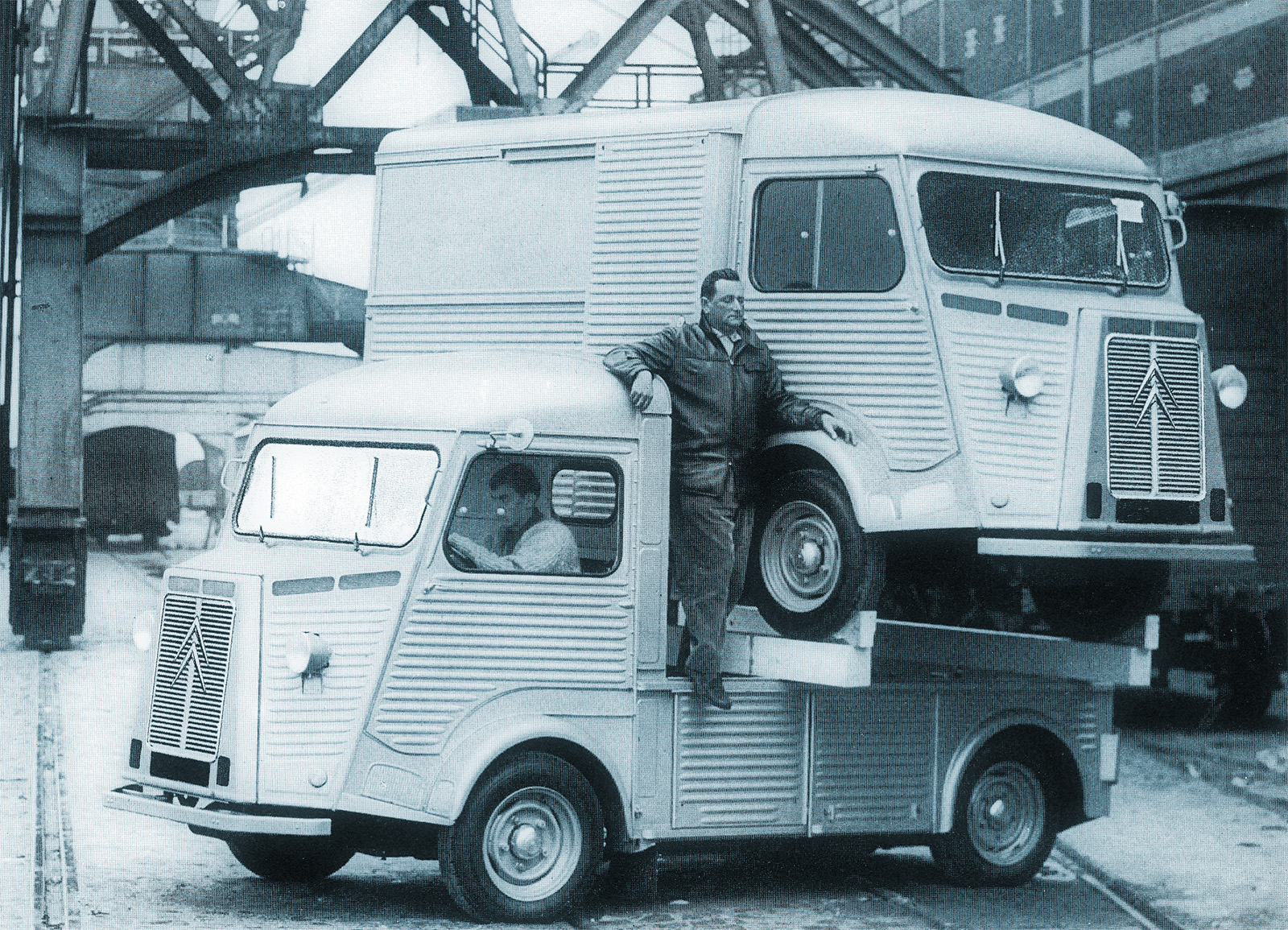
Aside from the Citroën chevrons, is anything on this thing just there for ornament? I did hear one of those rectangular air-intake slots on the hood is a dummy, to keep things symmetrical and balance the heater air-intake slot, but I think that’s it.
It’s perfect as it is. And, perversely, I think this lack of design is actually a testimony to good design, and the surprisingly hard part of design that is knowing when to not do a single thing.






I think there was a lot of careful design to H-van! It takes a just as much engineering to design things simply WELL as it does to design things complicated well.
It’s part of the reason I love the old FIAT 500 too – they were running low on steel, so they just removed a giant section of the roof to save on production materials and gave almost all of that that iconic fold-back fabric sunroof! It also had the bonus of adding marketing appeal, made the cars lighter (so even better on fuel economy), and meant the engines could be simpler and not as powerful to push the same-sized car. They also had only ONE transverse leaf spring across the front as the car was light enough that was all it needed for suspension there 🙂
The Citroën HY was built in the same factory as the Citroën DS. Most elementary van and most complicated car from that era on two lines next to each other.
“I did hear one of those rectangular air-intake slots on the hood is a dummy, …”.
I would love it even more if it had been assymetric.
I would argue this is carefully designed. Not just engineered mind you, which it is to the tilt, but actually designed. It’s just that the brief put simplicity and practicality first, not “attractive” or “opulent” or “comfortable”. And utility does imply logic and efficiency, so that will show in the final design as “beauty”.
At least to some people.
I often think of the Citroen H van when I drive past my local Chevy dealer and see the Brightdrop EV vans there.
The H van is a better design with its super low floor and nothing hanging down to limit the ground clearance. I can’t stand how little ground clearance many of the EV vans have with their motor integrated rear axles – or the Ram Promasters rear drop axle that seems to be there for no reason…
I did see a build video of a guy who swapped out the H van’s ancient engine/tranny for a Subaru boxer with the twin stick manual gearbox – it fit in really well and could also be removed as a complete assembly with the radiator still connected. I always thought an H van with a Porsche 6 cylinder boxer in the nose would be a cool sleeper build.
To be sure, the van space is really full of these utilitarian vehicles whose personality is from their no-nonsense utilitarian designs. Like the Dodge Fageol mail vans, Divco Milk vans, Jeep FJ van, International Metro and Metro Mite, Morris J2, down to the Vespa Ape… there are a lot of these charming old vans.
Nowhere near as utilitarian, but the original Range Rover was an engineering buck, those in charge of styling the thing took a look and decided nothing more than refinement was needed
The original RR was actually very utilitarian, the first version had no features other than 4 wheel drive and power steering, and of course the famous V8. Other than that it was a pretty bare bones vehicle, and lots of British farmers used it as a work vehicle. It was also very affordable , but the very strong British pound made it a very expensive car in export markets.
I think the Range Rover had more styling than you think. The lead designer David Bache had just done the iconic Series II Land Rover and the Rover P6, and would go on to design the Rover SD1. He knew what he was doing and did what was needed to create a strong image of a more refined Land Rover
I got a flight in a Trimotor this past September.
I can definitely see the similarities in design.
To quote Rush ” If you decide not to decide you still have made a choice” and I choose What is Art Deco/Brutalism fusion, Alex.
These are such cool vans if you ever get to see one in person
Agree 100%. And that they are so uncool they are over the top cool now. Saw the espresso cart, baguette lunch version in Cognac a few years ago in rust red. Just fell. in love with it.
They’re not that uncommon in the UK, and every single one has been converted into a mobile coffee truck.
The queen must be rolling in her grave that they are coffee trucks and not tea trucks lol. It would make for a cool looking coffee truck.