
You know how sometimes you wake up with a question that’s already lodged in your head? Like it was placed there by some unseen cosmic force, because that question is deeply important? Sure you do. This morning this happened to me, and that question was What Is The Least Appetizing Picnic Ever Featured in a Car Brochure? You’d think this would be the sort of question that would take a lifetime to answer, but, incredibly, I think I have somehow managed to find it right away. In a 1970 Mercury brochure.
I suspect some manner of otherworldly forces conspired to guide me to this brochure; there’s really no other reasonable explanation that accounts for how perfectly unappetizing this picnic looks in that photograph. It’s too perfect, and the odds of just finding it by chance seem astronomical. Some other powers are at play here. There must be a reason we needed to see this.
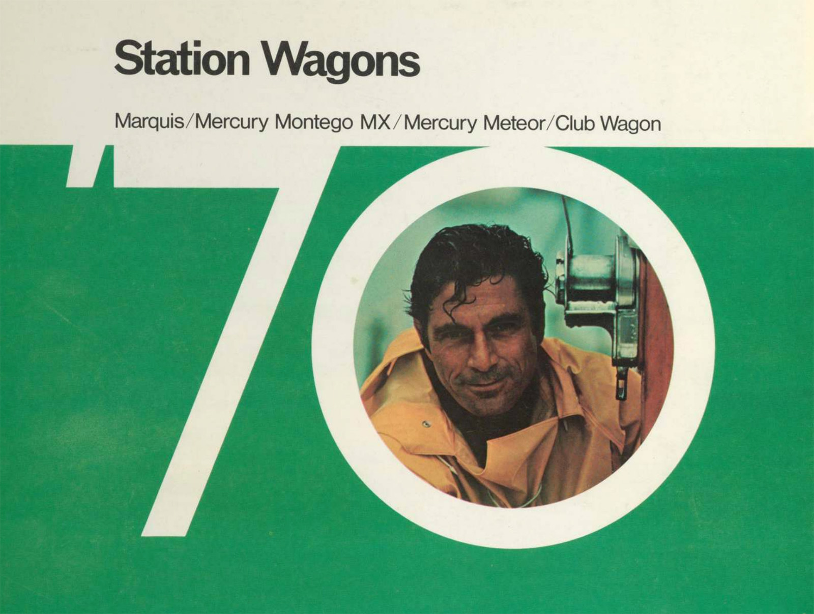
The brochure the Least Appetizing Picnic is in is an interesting one, a 1970 Mercury brochure that seems to be focused on selling wagons to men, real men, like the one one puckishly peering out of this zero:
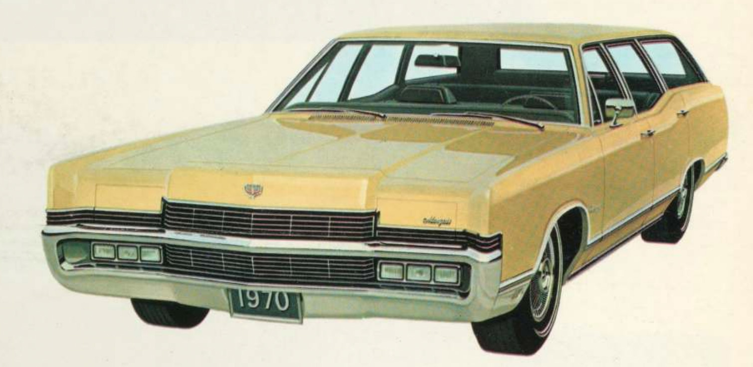
The brochure is filled with pictures of handsome mercury wagons, like this Marquis:
The brochure also features some non-car pictures that seem to feature what early 1970s concepts of cultured, erudite masculinity would entail, like models of tall sailing vessels:
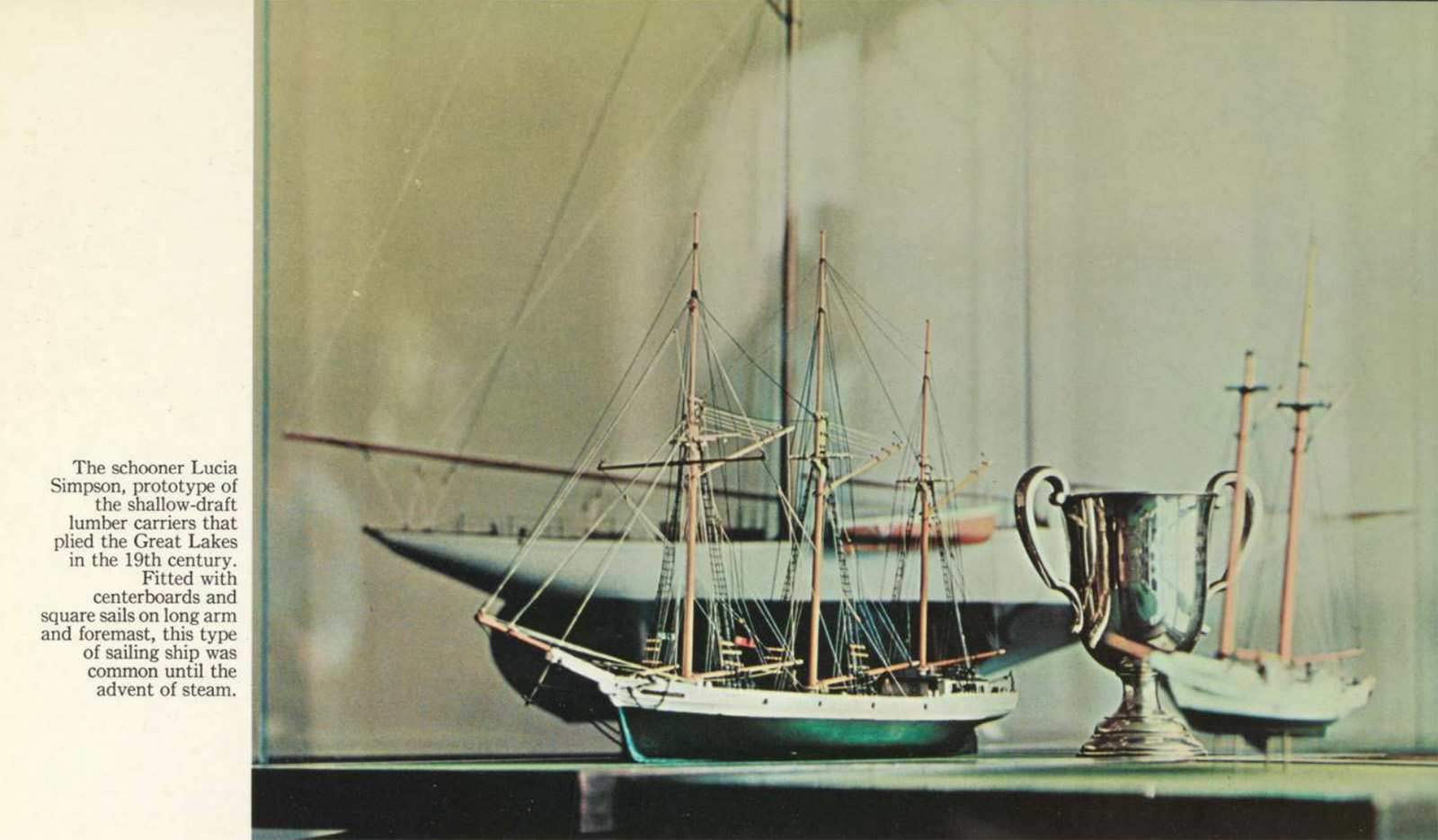
I feel like the phrase “advent of steam” is one of those that never fails to draw me into something painfully within my old man demographic. Also, were “shallow-draft lumber carriers” of the Great Lakes such a widespread interest back in the late ’60s and early ’70s?

The Meteor wasn’t as fancy as the Marquis, but it showed its “headlamp theme” unashamedly and, you know, ushered in that look of action. It was also paired with this saddle:

Yes, model ships and saddles! Perfect for the man’s man that wore a sportcoat made out of prime-rib steaks stitched together with bailing wire and smoked rolled-leather cigars filled with thinly-sliced prosciutto and Turkish tobacco.
 Okay, one more wagon to clear your mind’s palette, and then let’s see this picnic:
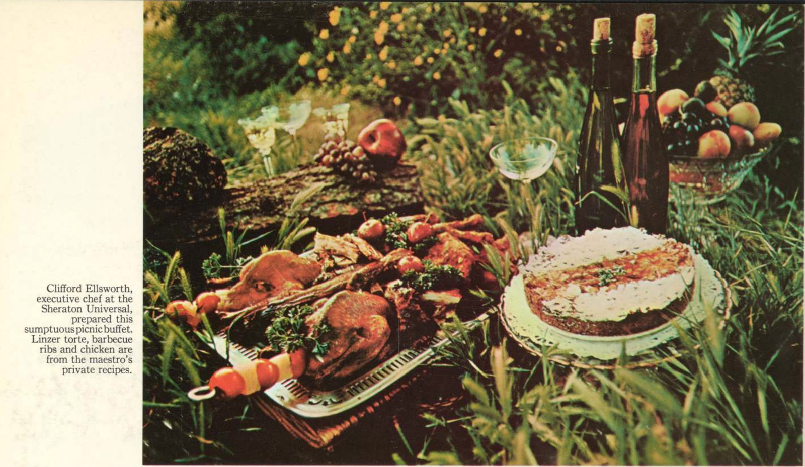
Wow. I know that this is very fancy food – Chef Ellsworth of Sheraton Universal isn’t going to throw together some garbage. There’s a Linzer torte, ribs, chicken, some fruit, skewers jammed into carcasses, and it’s all just plopped down there in the tall grass.
Maybe it’s the old color-faded photography, maybe it’s the fact it’s just on the ground there, likely swarming with ants and other hungry insects, maybe its the thought of trying to deal with all those bones and skewers, I can’t put my finger on just one thing, but as an overall image, this picnic is wildly unappetizing.
Imagine showing up at a picnic and seeing this and being told “okay everybody – dig in!” and then just standing there, not seeing any sort of plate or utensils or anything, and just thinking “how?”
There’s certainly been other unappealing picnics in the brochure world; remember this sullen-looking one?

That one isn’t great. But there’s plenty far more appealing ones out there, too:

… and even Mercury figured out how to make picnics look less horrifying later, in this Sable brochure:

That one isn’t amazing – it’s mostly just bread and fruit – but it is definitely less horrifying than the fancy mess in the grass up there.
Am I being unfair, here? Is this just my lack of refinement showing? I’m not sure.
What I can say is that I do really appreciate all of the options Mercury offered for the back halves of their wagons:
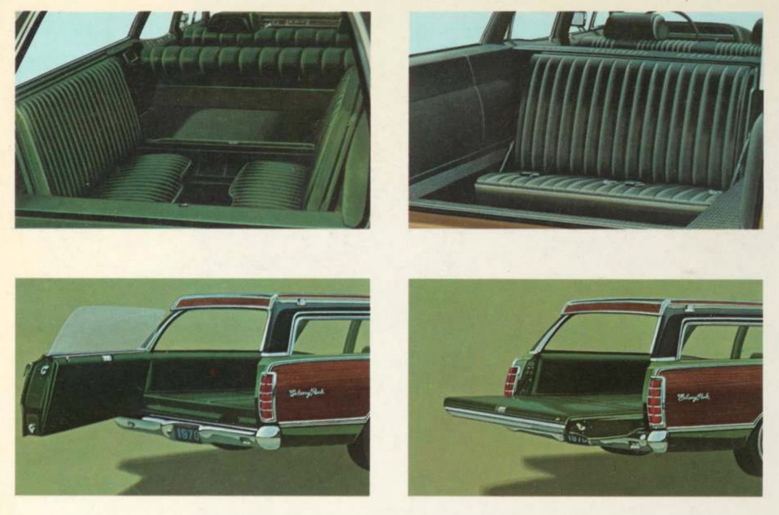
Two different arrangements of jump seats at the rear, and that amazing two-way tailgate. Why aren’t those a thing anymore?


What grinds my gears is that both of the wine bottles have been corked already. It’s pretty clear that someone has “tested” the quality of each bottle and topped them off with a hose or faucet
The grille on the yellow Marquis wagon is fantastic. They can’t fool me by painting it yellow. That is a car an early 70s supervillain would drive, but in black.
The burgundy one. Is that a Montego? It’s the only one that looks attractive. At least from that angle. As for the picnic… sullen is a perfect word for mom/wife and daughter. And the food (and lobby bar crowd) is better at the Universal Hilton. That I know for a fact.
So Country Squire dude is eating watermelon while chatting up his imaginary horse friend, Mr. Spots. His kids and wife are ignoring him because they’ve seen it all before, even after extensive family counseling.
I’m a rare millenial that spent many formative years in the back of a Mercury Colony Park wagon, with the sideways jump seats for a “third row”. There’s little more nauseating than floating along the NYS Thruway in the back of one of those things.
Based on car brochures, people fucking LOVED picnics back then. Almost as much as people apparently love scuba diving these days.
In a drunken rage, Dad threw the picnic food on the ground. “Eat it. You said you were hungry. EAT IT! Oh, now you’re crying? I’ll give you something to cry about if you don’t shut up and eat it!” Magical times, childhood.
The comments and links on this post are pure GOLD. Thank you community for surfacing childhood trauma.
I don’t get this. They are promoting a product that has a pretty distinct characteristic; a drop down tailgate, yet they don’t spread their fancy pants buffet out on that?
And what’s the saddle for? The tow horse?
My apologies to the chef, but I will not be dining at the Sheraton Universal.
Can you open the drop down tailgate while the glass is up or does it not allow until the glass is fully retracted? Ive never thought about this until now
I think you cannot. I’m not positive, but I believe you have to use that chrome handle on the inside of the tailgate which is obviously only accessible from outside with the window down. And I doubt they’d make it so a kid sitting in the way way back could open that thing while you were cruising down the highway.
I had an old Suburban with a similar tailgate, not two way unfortunately, you had to roll the window down to open the gate.
My 78 Aussie Ford wagon has the 2-way tailgate – can confirm window has to be down to open either way. It’s controlled by a little cam thing in the left-hand latch, (would be RHS for you lot), which you can move by hand to open the window when tailgate is open – required to access motor etc.
Window must be down, you must use the internal handle. Then you pray to your preferred diety the glass goes back up.
These were the massively slow power windows where it seemed as if any second it was going to give out?
YES, and the other power windows on that car felt like they were built by Amtrak. ’80s Ford power window motors were stupid strong, they actually had 3 nylon nuggets in the drive mechanism that were meant to strip out in the event of a jam. Amazing what a dowel rod, saw and sander can accomplish.
The Lucia Simpson, a 3 masted schooner, wow.
I’ll have to add that to my list, it was a lovely looking ship, I’ll have to see if there are good plans for the model.
50 years later, the Mercury brochure finally reaches its intended audience. Thank you, Autopian.
I’m as amazed as you are
Looks like all that food was sitting in the back of the wagon and somebody opened up of the back, hit the gas and voila, your repast is ready. Kind of a William Inge picnic, ready for the drunks, leches and rapists.
There’s a racist joke about drunks, rapists, and tres leches cakes in here somewhere but i’m not the guy to find it.
The guy in the “0” looks like Ian McShane. I would quote something from Deadwood but this is a family place.