
You know how sometimes you wake up with a question that’s already lodged in your head? Like it was placed there by some unseen cosmic force, because that question is deeply important? Sure you do. This morning this happened to me, and that question was What Is The Least Appetizing Picnic Ever Featured in a Car Brochure? You’d think this would be the sort of question that would take a lifetime to answer, but, incredibly, I think I have somehow managed to find it right away. In a 1970 Mercury brochure.
I suspect some manner of otherworldly forces conspired to guide me to this brochure; there’s really no other reasonable explanation that accounts for how perfectly unappetizing this picnic looks in that photograph. It’s too perfect, and the odds of just finding it by chance seem astronomical. Some other powers are at play here. There must be a reason we needed to see this.
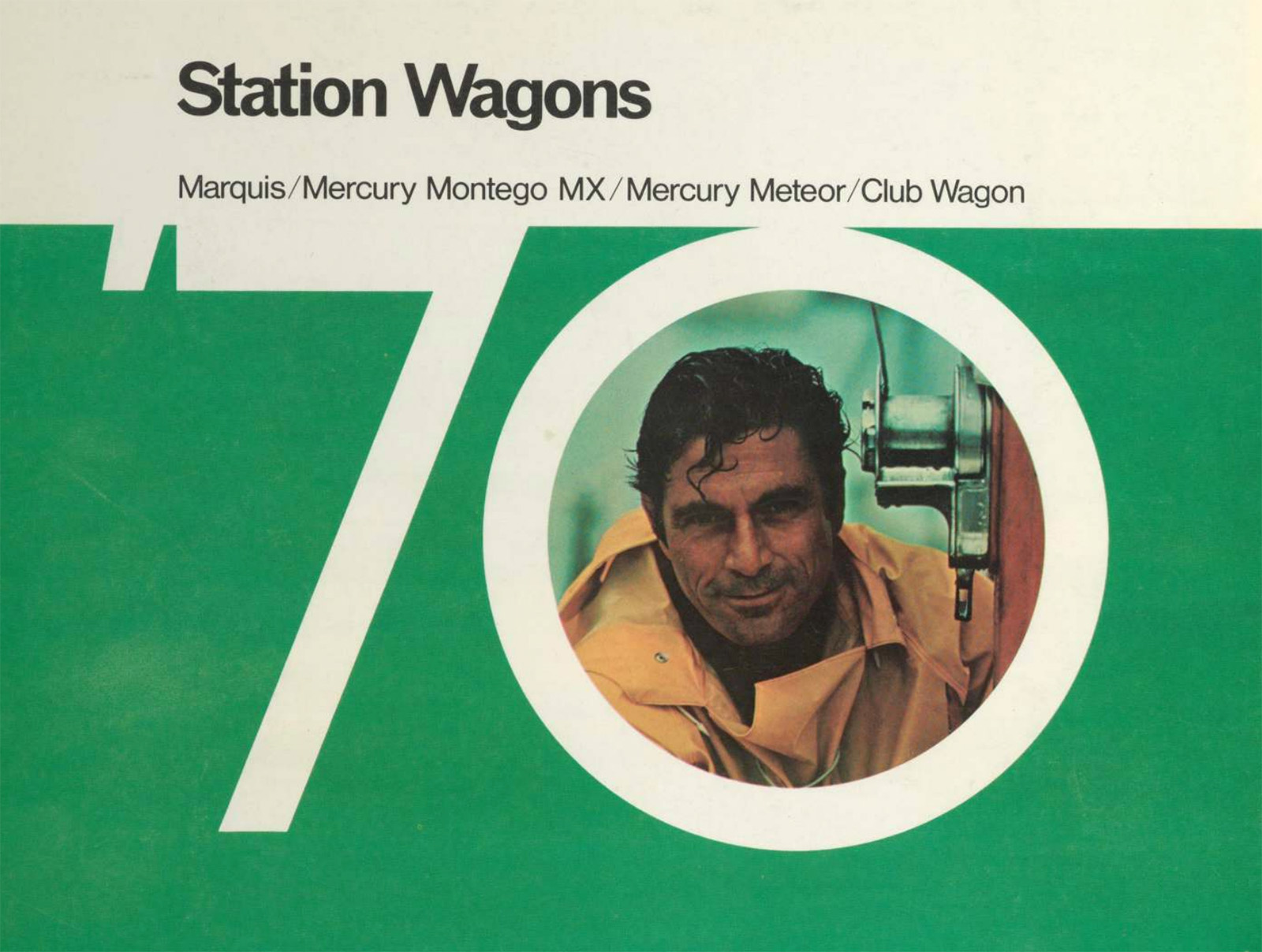
The brochure the Least Appetizing Picnic is in is an interesting one, a 1970 Mercury brochure that seems to be focused on selling wagons to men, real men, like the one one puckishly peering out of this zero:
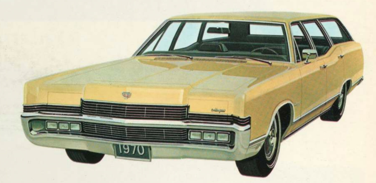
The brochure is filled with pictures of handsome mercury wagons, like this Marquis:
The brochure also features some non-car pictures that seem to feature what early 1970s concepts of cultured, erudite masculinity would entail, like models of tall sailing vessels:
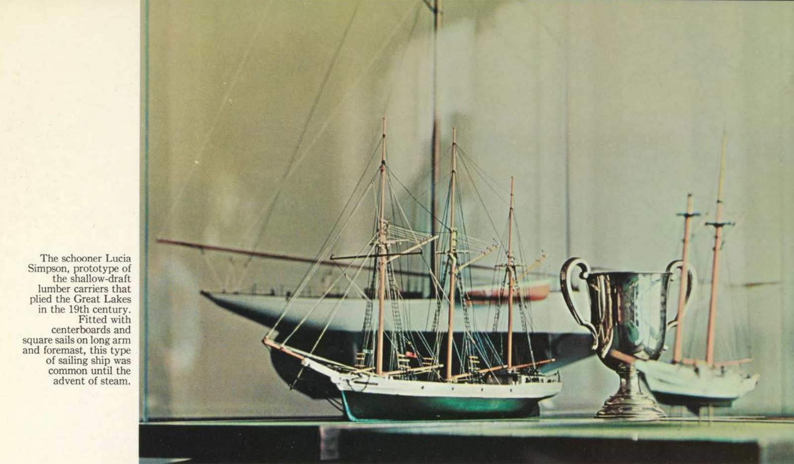
I feel like the phrase “advent of steam” is one of those that never fails to draw me into something painfully within my old man demographic. Also, were “shallow-draft lumber carriers” of the Great Lakes such a widespread interest back in the late ’60s and early ’70s?

The Meteor wasn’t as fancy as the Marquis, but it showed its “headlamp theme” unashamedly and, you know, ushered in that look of action. It was also paired with this saddle:

Yes, model ships and saddles! Perfect for the man’s man that wore a sportcoat made out of prime-rib steaks stitched together with bailing wire and smoked rolled-leather cigars filled with thinly-sliced prosciutto and Turkish tobacco.
 Okay, one more wagon to clear your mind’s palette, and then let’s see this picnic:
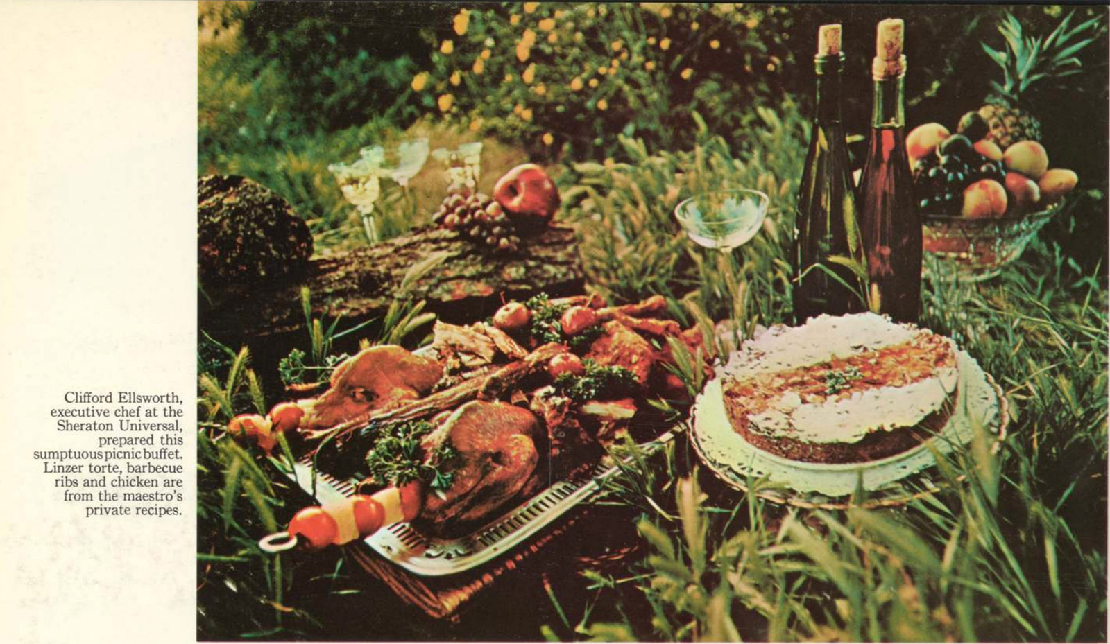
Wow. I know that this is very fancy food – Chef Ellsworth of Sheraton Universal isn’t going to throw together some garbage. There’s a Linzer torte, ribs, chicken, some fruit, skewers jammed into carcasses, and it’s all just plopped down there in the tall grass.
Maybe it’s the old color-faded photography, maybe it’s the fact it’s just on the ground there, likely swarming with ants and other hungry insects, maybe its the thought of trying to deal with all those bones and skewers, I can’t put my finger on just one thing, but as an overall image, this picnic is wildly unappetizing.
Imagine showing up at a picnic and seeing this and being told “okay everybody – dig in!” and then just standing there, not seeing any sort of plate or utensils or anything, and just thinking “how?”
There’s certainly been other unappealing picnics in the brochure world; remember this sullen-looking one?

That one isn’t great. But there’s plenty far more appealing ones out there, too:

… and even Mercury figured out how to make picnics look less horrifying later, in this Sable brochure:

That one isn’t amazing – it’s mostly just bread and fruit – but it is definitely less horrifying than the fancy mess in the grass up there.
Am I being unfair, here? Is this just my lack of refinement showing? I’m not sure.
What I can say is that I do really appreciate all of the options Mercury offered for the back halves of their wagons:
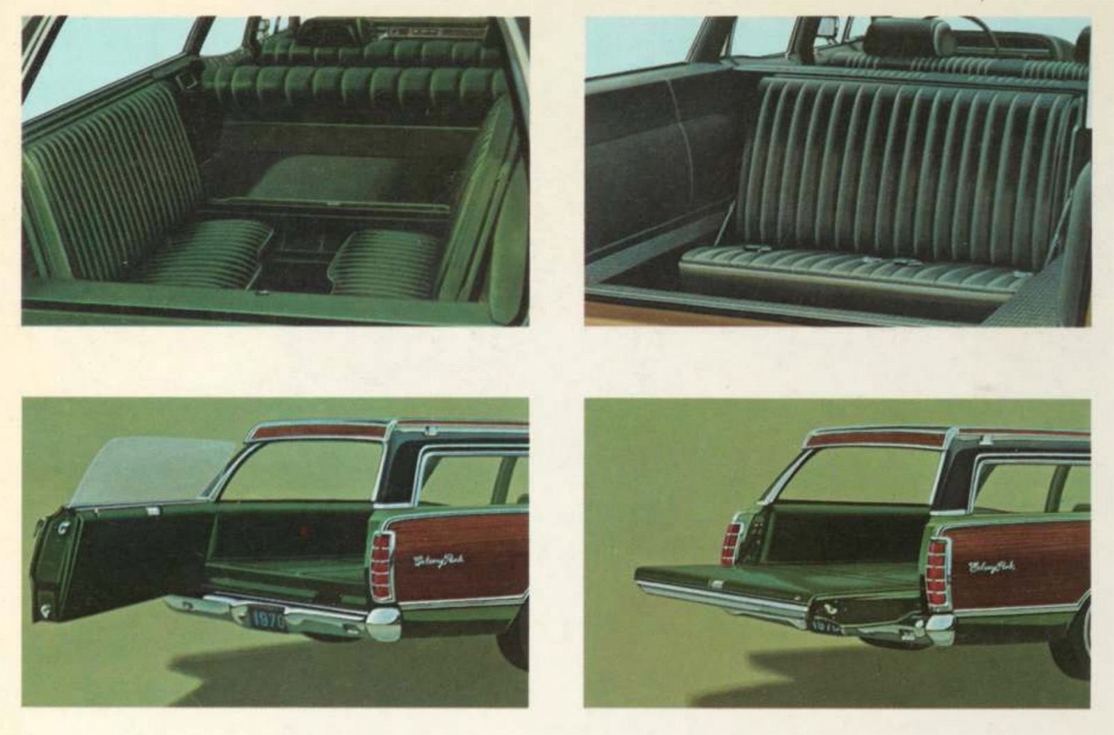
Two different arrangements of jump seats at the rear, and that amazing two-way tailgate. Why aren’t those a thing anymore?


Is this a Canadian market brochure? I noticed the Meteor wagon was shown in “Rideau” trim according to the photo caption.
Exactly. The moment I saw Meteor and Rideau I was back in Ottawa…
As we recently learned with the Tesla diner, car photographers don’t necessarily make good food photographers.
Food in photographs often isn’t food.
I can tell I’m older than you. That picnic looks absolutely delicious compared to what ended up being available at church socials or holiday events in the 70s.
Two big problems:
It’s also missing some major salad parts. Where’s the bright red Jello mold with bananas floating in it? Where’s the leaf of iceberg lettuce with a scoop of cottage cheese (and a cherry on top if you are being fancy).
Finally, there’s not nearly enough Pineapple. Pineapple should be everywhere. Someone screwed that up and put an Apple on a Pine Log, but anyone from the 70s knows that if Pineapple doesn’t come in a can, it’s not Pineapple.
This reminds me of the TV series Dinner At Julia’s although that’s only from the early 80s. In any case, the meals the guest chefs prepared a lot of times were not very visually appetizing, at least not to my 2025 knowledge of food preparation.
Bleh. I was a kid in the 80s and there was still plenty of that nasty stuff being served up at every family gathering or church function. I think the grown ups at the time just really embraced all of this in the 70s and kept it going.
I avoided Jello like the plague at any social event. Is it sweet whipped cream – or mayonaise??
Don’t forget the hot dog, they were in everything. And not the good natural casing ones….
The bright red ones!
I think the skewers are tomato alternating with pineapple chunks. Nothing like hot pineapple-tomato for a flavor sensation and a guaranteed roof-of-the-mouth burn.
Guessing that the hardware that enables it weighs about 40 lbs.
I’d sure like to read more about that 2CV with removable seats!
If you showed me the first ‘picnic’ out of context – the apple placed next to the pinecone, the cut glass servingware stalking the tall grass, the cake which appears to be in a seperate plane, the mystery piss bottles with non-euclidian mouths and distended corks, the chicken or maybe fried Weimaraner head – I would swear to you it was AI slop.
Fried Weimaraner head is what I saw but it all fits on one platter so it may just be a Beagle.
I dunno – the picnic doesn’t look all that bad to me. But the picture of the “real man”? Yeesh! Looks like the kind of guy who catches your eye in the mirror behind the bar and then says, “What the hell you lookin’ at, chief?”
I get that kind of look from guys like him a lot.
And that’s never what he’s saying.
Sounds like you guys are hanging around in the wrong bars.
Heeerrree’sss Johnny! All that’s missing is the fireaxe.
“New parking and side marker lights usher in the look of action for the 70’s.”
There’s no way that Torch didn’t cream his shorts after reading that one.
Why were old color photos so…off? Especially the ones reproduced in print ads. Was it that old color film didn’t have accurate ways to represent color? Was it the ink that was used to print? Maybe it’s just my fairly young age, but even into the early 2000s I’ve found that color photos didn’t look quite right, and around that time digital photography took off, and that’s when things started to look more correct to me. This picnic looks unappetizing to me because of the lighting, the film/print grain, and especially the colors, which manage to make everything look like plastic. Funny enough, old illustrated print ads don’t seem nearly as bad to me in terms of color reproduction.
Photography and printing were just not that great back then. It was the available technology that makes everything look off. And they aged even worse.
WRONG. The photos are accurate; colors in the real world back then just kinda sucked.
https://featureassets.gocomics.com/assets/e17b1ca0541f01315eb4001dd8b71c47
I was waiting for someone to post this lol
That’s interesting- I felt like early digital photography was way off… no depth of field, colors too sharp. Everything looked like a cartoon, not how the eye would see it.
were “shallow-draft lumber carriers” of the Great Lakes such a widespread interest back in the late ’60s and early ’70s
I’ll point you to the Wreck of the Edmund Fitzgerald as Exhibit A for Great Lakes maritime history being an interest in the 70s.
To be fair, the Edmund Fitzgerald was far from shallow-draft, and she certainly wasn’t a lumber-carrier. Maybe an iron freighter could have carried lumber on occasion, but I doubt it.
true, but in general we now have 2 data points on great lakes maritime interest.
That is twice as many data points. Maybe with a few more we can learn to predict the Gales of November.
That is one gloomy drone of a song. Not that Gordon Lightfoot ever perked up much in his other songs.
Sundown?
Oh there’s a happy tune.
It was a gloomy night and a several gloomy days thereafter.
I was there.
Carefree Highway? https://en.wikipedia.org/wiki/Arizona_State_Route_74#/media/File:Carefree_Highway.jpg
Probably had an off day.
The EF was an ore carrier, which apparently is where there public interest lay. Not lumber.
Looking at how that later picnic from the Sable brochure is clearly staged in the back of the wagon, I wonder if someone who was around in 1970 dramatically smacked their forehead and said WHY DIDN’T WE THINK OF THAT!?!
Someone who was with L-M’s ad department all that time would’ve been there through the wild Smooth-Ride-Demonstration years – the jeweler cutting a diamond! The little girl doing penmanship in the wayback of a wagon! And the crashing end SNL brought to it with the rabbi doing a bris!
(Was that your bris, Jason? I still think it has to have been.)
The Honda Ridgeline is keeping the two-way “tailgate” alive to this very day! (Similar, just without a glass panel)
By the standards of 70s food, it’s not really that bad. There’s no weird tuna and pineapple constructs, or roasted bananas with whipped cream and ham. Not even any terrifying, folk-horror adjacent faces made of food for the kids. TBH, ‘food, but on the ground, no cutlery’ is pretty tame for the era.
I know. That cake thing looks to be cake of some kind. Not something assembled out of tuna and spam to look like a cake and surrounded by clear jello of some mystery flavor that might be used underwear.
Impossible. All the used underwear was still going into the bodies of Trabants back then.
I was hoping for a real Gallery of Regrettable Foods moment, but this one fell short.
Just add Jello
Surprised there is no mention here that this is a Canadian brochure. The Meteor was not sold in the US.
https://en.wikipedia.org/wiki/Meteor_(automobile)
By that point the Meteor Rideau 500 was identical to the US Mercury Monterey
The Old Car Manual Project Brochure Collection
I came here to say that is not a Mercury Brochure it is a Canadian Mercury Brochure. To be fair it is just the US Brochure with a few things changed to protect the guilty. However this isn’t the first time Torch has used Canadian versions w/o mentioning it or without knowing it.
Ah. Well, picnic mystery solved.
Question for folks that are old enough to actually remember the early 70’s (I’m an 82 model) – were all the colors in the entire world actually muted and muddy like that (including the human beings) or is that an artifact of the film quality / developing process / some odd fetish of a chemist deep within the bowels of Kodak at the time?
Both
This, I’m a ’76 model – the house was all dark earthtones. Vibrant color really wasn’t common until I was 10 or so. Then we got the purple and teal years.
Photography and film processing was not the issue. What you’re seeing is the limitations in the printing process..
Also, I think that with the age of the brochure, it looks like the C has faded more than the Y and M, and the K is still at 100%. Along with maybe the printing overly favored the blacks in the first place.
Possibly, but I remember ads in 1970s National Geographics looking pretty much like that, in the 1980s when they probably wouldn’t have faded much.
Maybe the non-ad content was the same, but I remember the ads favored earth tones.
Someday people will watch films from the 21st century and ask if everything was really so teal and orange. Or overcast green like Matrix movies.
Oh, as I said in a different post, absolutely earth tones were in. What I’m getting at here is that I don’t think that it’s just that.
Actually the world, including all of us that occupied reality, was black & white prior to 1980. Color had to be added by artists using their interpretation of events which is why you see stylistic changes through the ages where the 60s gave us bright and cheerful colors and the 70s brought the more muted earth tones to match the mood and trends toward more organic styles and choices.
Once we hit the 80s color exploded on the scene for reasons that are still unknown.
I agree, the 70s environmental movement manifested in the earth tones pushing aside the previous bright psychedelia influence. To then be replaced by the teal and magenta and neon and video games 80s.
According to my source, this happened in the 1930’s.
I only quote from the best!
All the black and white photos of MLK Jr meant that it took an embarrassingly long time to really hit me that he was killed just a few years before I was born. Like I knew, but it didn’t quite sink in because all the photos had made him seem like a long-ago thing.
“The cover lets you know what you’re in for: brown times to come, folks.”
I love this takedown of the 1973 Sears catalog so much:
https://lileks.com/70s/sears1973/index.html
73 model here.
Yes, everything was muted and muddy.
Remember everyone smoked back then and the EPA was just getting started.
And the fashion was hideous color combinations.
To be fair, the color combinations weren’t as hideous as the food people served during fancy meals.
They didn’t understand yet how important presentation is when you serve man.
1965 model here.
Everything was muted in the 70’s except for game shows and prime-time network Television.
Unless you used Kodachrome in your Nikon camera.
Then you had those nice bright colors, the greens of summer – which made us all think of a sunny day, Oh Yeah!
NO – just the opposite. Aside from a love of “earth tones” in some homes & commercial spaces, that time (just post-hippie) was a riot of bright colors. Cars especially! The sad, near-monochrome state of the current cars on the road are pretty pathetic in comparison.
I absolutely agree that cars had colors. Many were earthtone, but I’d rather have a green car than a silver one.
It’s actually hard to tell. The problem was the 80s and 90s
In the 70s, my memory is green, beige and brown. Seemed like everything was a mix these earth tones. The biggest color I really remember was that super dark brown paneling everyone had in their houses somewhere.
In the 80s, geometric shapes with strong colors were the rage. White, Black, Red. The colors smacked me in the face and left marks.
Then in the 90s, Teal took over. Teal, Teal-Blue, Teal-Green and somehow or another Teal Pink. You couldn’t go anywhere without seeing a schmear of those colors on something.
After all these strong vibrant colors in big bold patterns were done beating the juice out of my eyeballs, I think back of what the colors were like as a kid in the 70s, I can’t remember strong colors *. So, when I look at old faded photographs, that looks about right. But how much is the faded photograph or the more earthtone colors of the era? No idea.
* The exception of muted 70s colors was Christmas. The Red was really strong and the green was super strong as well. Silver tinsel covered every tree, and the giant lightbulbs that could burn down a house in minutes were strong bold colors that reflected with the 20 pounds of tinsel on the tree If you watch kid’s Christmas specials of that era, you can see the in-your-face Christmas color show going on.
Ironically, in the 80s, Trees became white lights, no tinsel, etc. Christmas decorations went from a couple hundred miles of 3″ wide red velvet ribbon to greenery. It’s like Christmas is opposite time. The 70s went from muted to bold and the 80s and 90s went from bolt to muted colors in the holiday season.
I owned a metallic teal Jetta, I think they only were around for the 1994 model year. The most colorful car I’ve ever owned. Everything else has been grey, silver, black, or white.
“I think back of what the colors were like as a kid in the 70s, I can’t remember strong colors”
Strong colors were for toys like the Fisher Price wooden telephone pull toy with the bright red receiver and rainbow dial background. Or the MEGO Jokermobile.
Staging a picnic photo with no people in it weirds me out. What happened to the people? Did they get raptured away? Beamed up by aliens? Or maybe the picnic is bait, and some fiend is waiting for the first sucker to try and take a bite out of that chicken.
Same thing?
COTD
That’s the price we had to pay as a society. Car companies made wagons but we had to eat over-saturated and glistening food in exchange.
The covenant was broken, wagons are gone and food turned beige.
I think the two-way tailgates on wagons (and where they would have ended up, crossovers) died off because of almost certainly costs, but also possibly water intrusion and corrosion issues from bad window seals. When I was growing up, we had an ’86 Grand Marquis wagon with the inward-facing seats in back (which were not at all roomy) and the two-way tailgate. We were afraid to use it in the fold-down way because of getting the door card dirty, or the window mechanism failing, and the latch was very stiff, so we always used it in the swing-open way. Which did make loading and unloading a bit of an easier reach.
But still, it’s probably the fault of cost-cutting.
Dad had an ’85 Colony Park, doubt we used the fold down feature more than a handful of times. Agree with the latch stiffness, and the window was slow and sketch.
A lot of those tailgate window mechanisms in American cars back then were sketchy as hell. We had a K5 blazer, and every time we had to put the window up or down, it was always an exercise in breath-holding to see if this was the time the regulator would break. And it was the manual one, not the electric, iirc.
The Chevy II my Dad bought to replace Mom’s Corvair when they were married and I was expected had a crank-down rear window – the fold-out crank was outside under the window, then the latch was just inside under the window.
Never failed.
Our Blazer was pretty jank, to be fair. Quite rusty and definitely leaky. The tailgate window crank was not confidence-inspiring in its various crunchiness and sticking.
and everything having some manner of curved rear glass now prevents it. There are still flat glass SUVs but the only one I can think of with a operable tailgate window is the 4Runner. I dont think the new LC can do it, or I havent seen this option?
This. Just bought a used ’13 Highlander and the BACK GLASS ACTUALLY OPENS!! Had not had this feature since my ’99 WJ Grand Cherokee. Always pissed me off that Honda didn’t include it on the MDX. So useful.
I realize not retracting glass, but just flip up glass is a godsend.
So let me get this straight, as you read your Manly Mercury Wagon brochure, the important car information was interspersed with exhibits from the Maritime/Equestrian/Small Arms Museum of Waukeshoobeedoo, Michigan? Wild.
Also wild, Country Squire Guy grinding his white-panted knee into the grass.
Those white jeans were double-knit polyester.
Machine washable and drip dry.
Colors never ran – nothing ever stained it.
Perfect for everyone – except teen girls.
Some photographer’s assistant spend an hour trying to stage that photo, 55 minutes of that was trying to get the wine glasses to not fall over.
“Imagine showing up at a picnic and seeing this and being told “okay everybody – dig in!” and then just standing there, not seeing any sort of plate or utensils or anything, and just thinking “how?”
Ask the ants.
Man, what was going ON with food in the 70s?
For a laugh check out the Gallery of Regrettable Food: https://lileks.com/institute/gallery/index.html
Well shit. There goes the rest of my morning.
The whole Lileks website is such a fantastic timesuck
I was going to post this!
Although the candyboots Weight Watchers Cards will always be my favorites:
https://www.candyboots.com/wwcards.html
I have so many of those cookbooks. It’s kind of been everyones ‘go to’ gift from people ever since I started cooking for a living a zillion years ago. I actually look for them in antique bookstores. The older the book, the more facinating the attrocities
Was going to mention this. Lileks’ dry humor on the site had me in tears at some points.
I’m gonna guess that Chef Ellsworth’s food is actually pretty good, or he wouldn’t have got this ad gig in the first place.
When a gourmet chef makes BBQ, you should eat it.
The 70s were a sullen decade filled with plastic food.
May I interest you in a nice Jello salad with hot dog?
Remember the glitter covered plastic food in old ladies’ glass bowl centerpieces?
… and awesome prog rock
I would so rock that menacing ’70 Marquis.
Re: picnic – it is the oversaturated red and green color tones, that and the utter inappropriateness of setting.
“What is mommy doing daddy?”
“Getting drunk down by the river with a cucumber in her hand….”