
This is one of those weeks where I’ve been finding myself appreciating the warm comfort of old car brochures, and when I get into these moods, I sometimes find that I’m more likely to fixate on some really tiny and insignificant details. Today is definitely one of those days, because there’s a little illustration in this 1977 GMC truck brochure that has really managed to stick in my brain.
The late ’70s was a sort of odd era for American car brochures; I feel like it was a transition period, moving from the illustration-heavy 1950s and 1960s and into the more photography-based 1980s, but there was still definitely illustration present.
The styles of these illustrations had changed, and – in my opinion at least – I think there was a bit of a downturn in quality. Not a huge one, really, and some of it may be related to the more outline-heavy, simpler-colored, and overall looser aesthetic of 1970s illustration, but generally I find these ’70s illustrations to not quite have the refined artistry of the past couple decades.
But there are some gems! Like this cutaway:
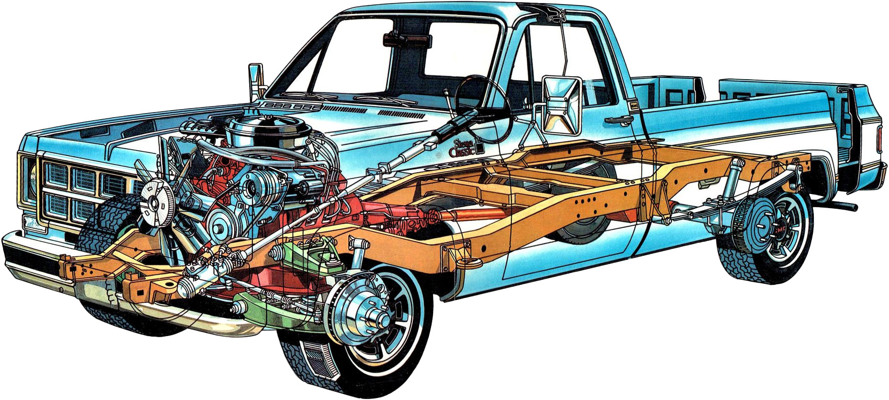
I’d be curious to learn more about how techniques had changed in the ’70s; for something like this, I wonder if any early CAD imagery was a factor in how these illustrations were produced?
The illustration that caught my attention, though, is this one:

It got my attention mostly because… what the hell am I looking at, here? Is that water spraying out of the under-windshield vents from that, um, lump of water in the driver’s seat? And that water is, um, kicking it’s rear-facing water-legs through a flap in the door?
It seems this illustration is for the ventilation system, and we’ve certainly seen flow-through ventilation system diagrams before, usually with airflow-indicating arrows, but I’m not sure I’ve ever seen one quite like this, especially with that strange lump of “air” on the seat? How can that even work? I get the arrows there are showing air exiting through the vents in the door, but the “intake” air sure looks more like a jet of water going outward, I think because of the way it tapers at the point of the vents and then expands past the hood? Like a jet of water would?
It’s so strange. And, even more strange, is I can’t not see this:
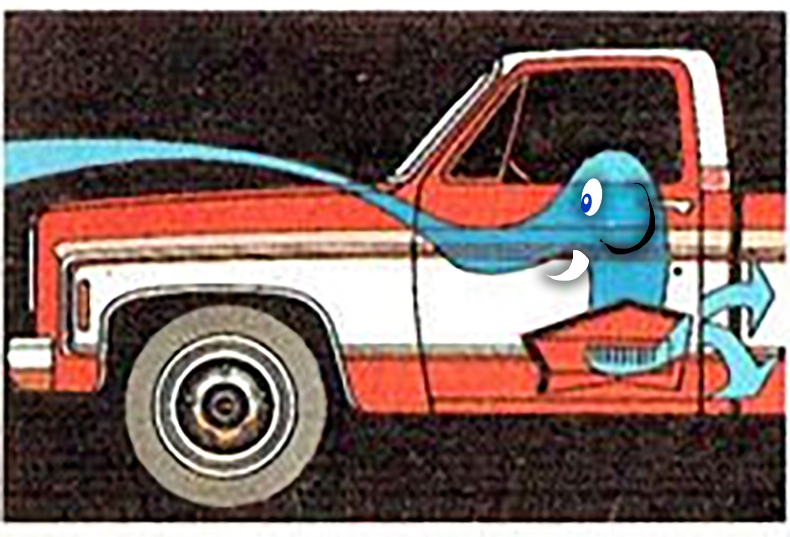
It looks like some friendly elephant is in the seat, spraying water from its trunk out of the cowl vents, dangling his crossed legs out the door flap thingy.
I suppose airflow isn’t an easy thing to illustrate, but this is the first time one has reminded me of an elephant.
I’ll note some nice details now, to make up for my pachyderm-based mockery. As a modern designer using modern tools, I have to respect the work that my long-ago colleagues put into things like making that truck break the boundaries of the background. That’s an effect I’ve always loved, and to do it back in 1977 would have required a lot of careful X-acto-knife work.
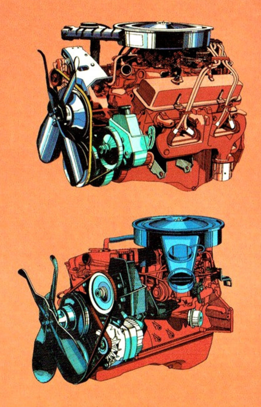
Also, I love these engine illustrations – V8 atop, straight-six below – especially the way the shiny bits are rendered, with the bands of like three to five shades of blue. I wonder if these were made with that old color-separation gel technique?
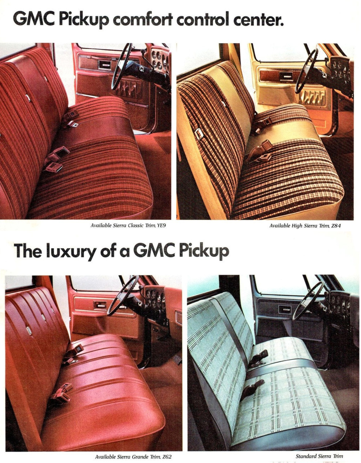
Speaking of color, I don’t think we can show any ’70s brochure without noting the glorious array of colors almost every interior was available in. We’ve got a terracotta color, a patterned, ruddy colorway, a golden pattern, and then an icy blue plaid-esque one. I also like how GMC calls this the “comfort control center” and touts the “luxury” which I guess here means, what, the seats have padding? Oh and carpet. So much carpet.
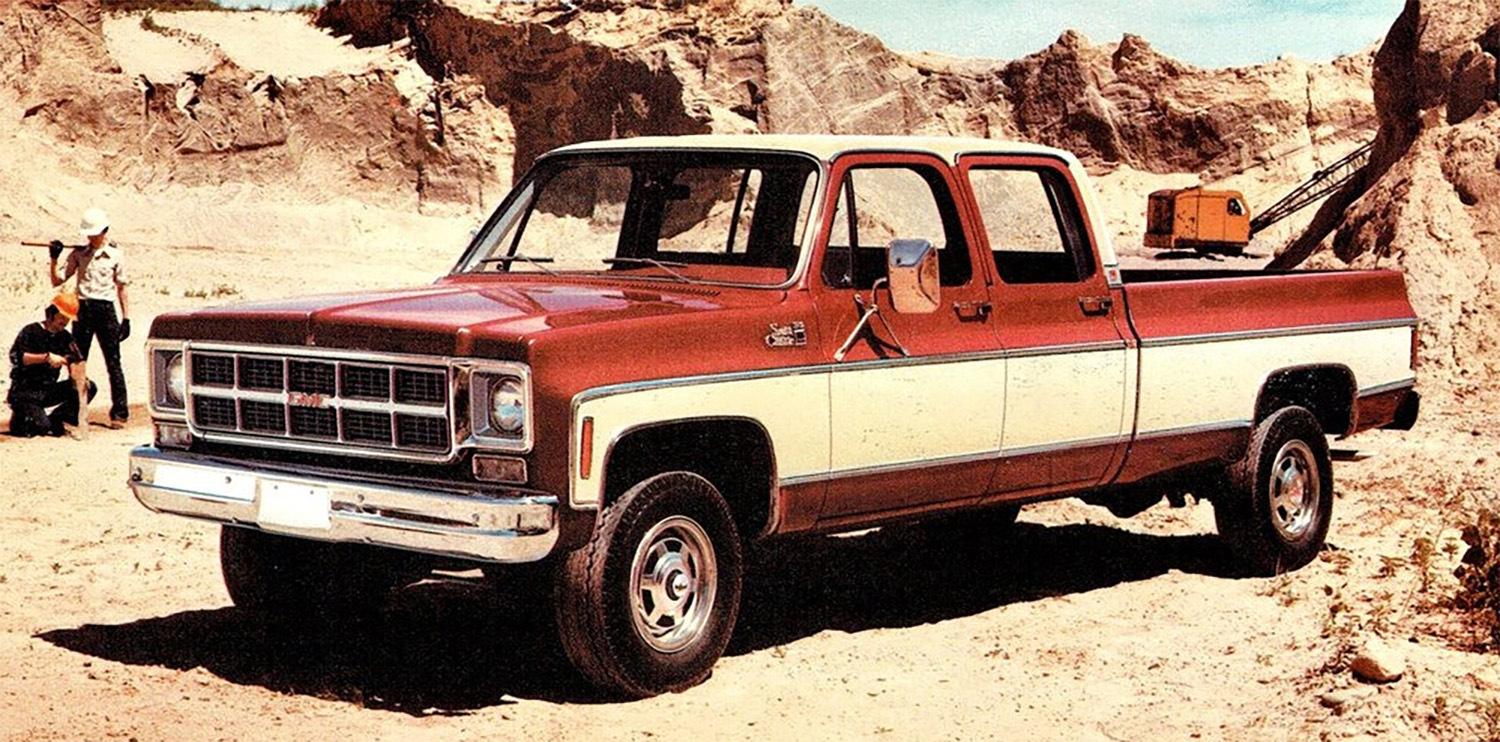
And finally, I’d like to note how weird double-cab pickup trucks used to look before they became the norm, as they are today. This just looks weirdly stretched, and it looks like all of 40 minutes of work went into designing those doors, clearly just based on the front doors. Compared to the single cab trucks, these just looked awkward, but, again, that’s what eventually won, so what the hell do I know?


I can imagine the conversation on that airflow diagram. At first it didn’t have that large hump. Then someone pointed out it seems like the air only goes to your lower region then out. So they made a quick change to show that the fresh air intake affects your whole body, without having to re-do the rest of the graphics.