
When you think of military vehicles and typography, what comes to mind? I bet I know what comes to mind; I bet it’s some sort of stencil-based typography, right? You know it was. That’s because that’s what we usually see on military vehicles, typographically. Now, for the typography on instrumentation, it’s a little different, since stencils don’t make sense in the context of gauges. For these, I suspect most of us would picture something clear and utilitarian. The word “whimsical” likely wouldn’t be uttered at all.
And yet, I’m here to show you the instrument cluster of a military vehicle that is absolutely crammed full of Art Deco-inspired whimsy, possibly even at the expense of legibility.
It’s hard to imagine, right? And yet that’s what’s going on with this remarkable military vehicle, the Volvo TP21 “Sugga.”
The Sugga – that nickname means “sow,” as in a demure lady pig, is an interesting military vehicle, as it’s built from Volvo 4×4 truck mechanicals with the body of a Volvo taxi plopped on top:
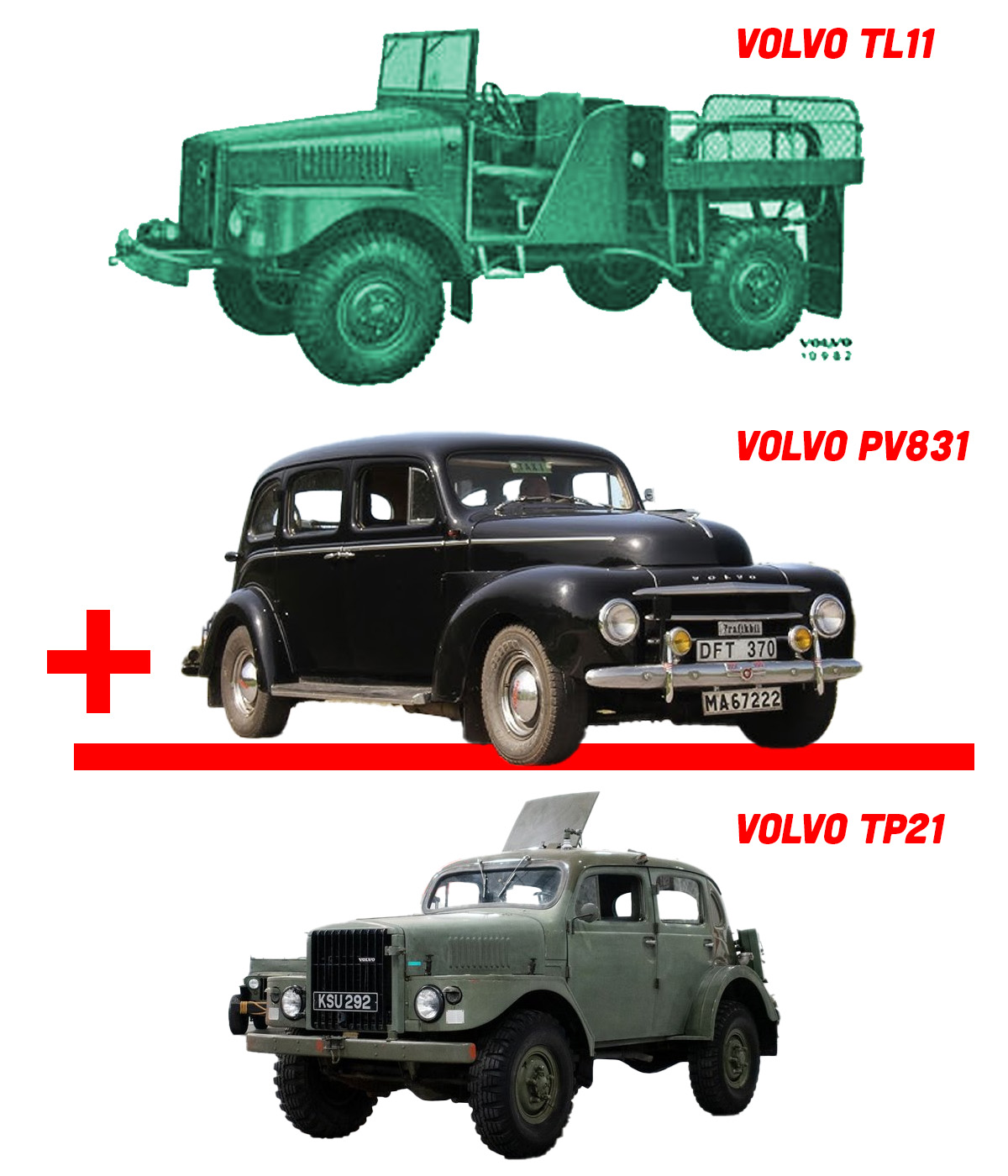
These TP21 Suggas were built between 1953 and 1958 and were used as command cars or sometimes radio cars, and were, by pretty much any definition, rugged, no-bullshit military machines.
Except maybe for the instrumentation.
Just to compare and get a sense of what the expected aesthetic standards of military vehicle instrumentation were at the time, here’s what an M38 Jeep’s instrument cluster was like, from the Jeep’s instruction manual:
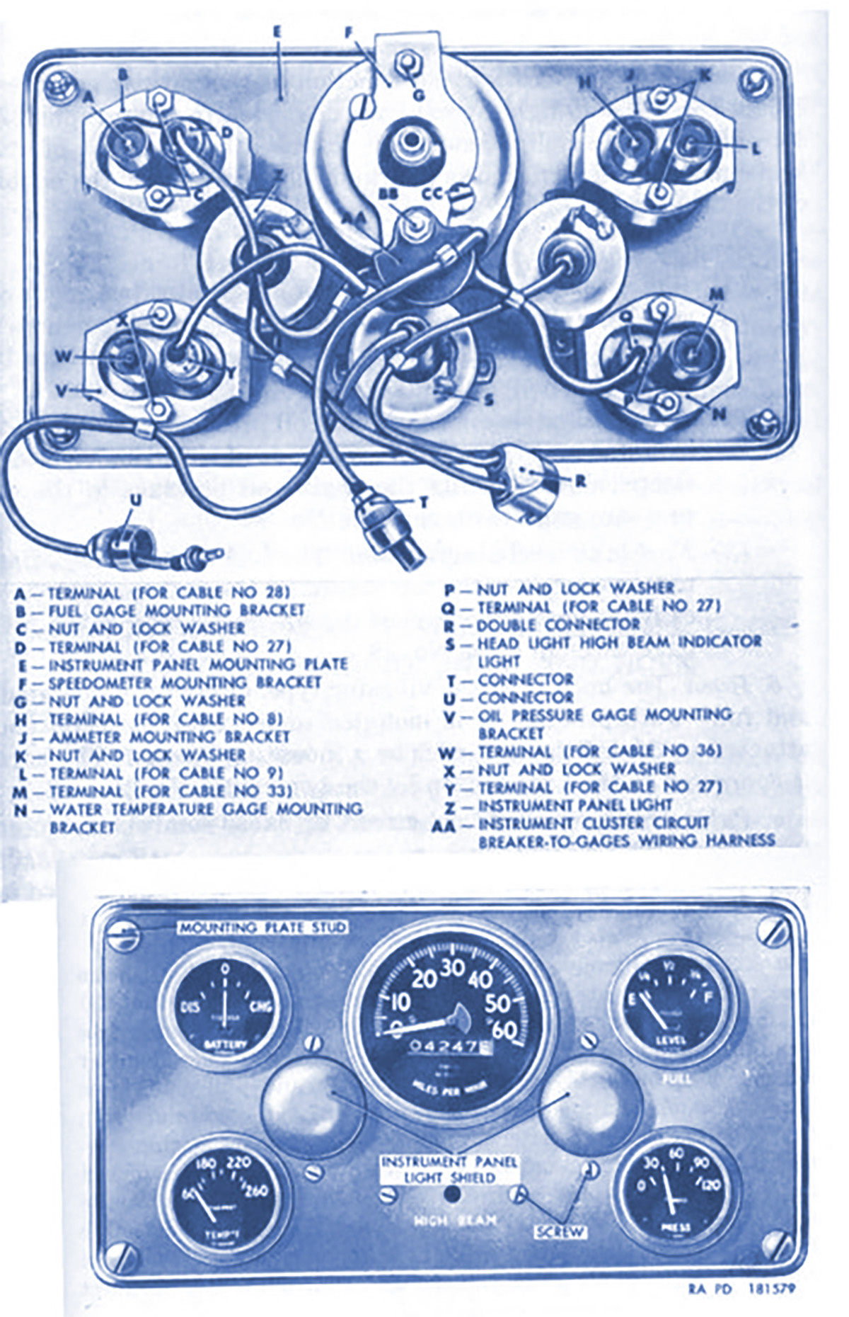
Okay, we have clear, easy-to-read sans-serif typography, white on black, clearly designed for easy legibility. These instruments are like the intestinal tract of a Holstein Friesian bovine just after a rigorous and comprehensive colonic: no bullshit.
Now, to compare, here’s the instrument cluster page from the Volvo TP21 manual:

Hm, that’s not particularly clear, is it? Let’s see if we can get a better look at that instrument cluster. Computer! Zoom and enhance, using other sources online, like the one recently sold at this site! Display image!
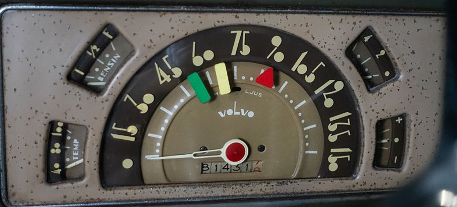
Wow. Look at that typography! This isn’t just Art Deco, this is intense, bonkers Art Deco, with the filled-in zeroes and bulbs of threes and fives and eights and nines, strange proportions and an overall highly designed, decorative, and, again, whimsical look.
Look at the “80” in the temperature gauge there; oriented on its side, it looks like a small stack of oranges. The “90” looks like leaves on a stem, the 30 looks like the upper body of a person at a piano or something – it’s all wonderfully strange.
And so you can see this isn’t some custom one-off anomaly, here’s a video walkaround of another one, this one from 1955:
Now, I suspect the reason for this strangely stylish dashboard is because the instrumentation was all brought over from the civilian taxi PV380-series cars, which catered to a cabbie’s innate sense of style. It didn’t make sense to design and engineer a new instrument cluster, so the TP21 just inherited the taxi instruments, with all their Deco-style excitement.
I can’t prove it just yet, but I have a strong suspicion that this old fighting Swede may have the coolest and most stylish military vehicle instrumentation typography ever. And that’s a wonderful little bit of charm in something that’s otherwise so utilitarian and somber.


It took a lot of Aquavit to approve that look!
Why do I love this? Not just the outlandish instrument type, but the car as a whole. Looks like a beefier P444/544 with a lift and squared-off nose, which reminds me of those Rolls Royce-looking front-end conversions for air-cooled Beetles. Being almost 80 years old, it’s probably stiff and noisy to drive, but I still want one. 😉
You’re correct.
Which is why I, too, want one!
Yep. Bizarre.
It makes me think of a child’s toy car dash on a soldier’s machine.
Akin to seeing a brightly colored Lego piece as the sight on an infantry rifle.
A tiny flair of Whimsy stuck to a massive hunk of Whammy!
60. Glasses or breasts?
Cherries. Roll them slots.
When you are outclassed in military strength, you can outclass the competition with military ingenuity, frivolity and style. 10/10 would drive.
Oh, I never thought about the TP21 just being a 831 body on other mechanicals. Thanks!
But it is indeed very Volvo, like using sedan rear passenger doors on station wagons from 1968 to 1993…
I love love those gauges!!
The idea that they were used in taxis is bonkers in and of itself.
They only built 720 of the military variants over 5 years, no point in spending the money to produce a special instrument cluster if you don’t absolutely have to for reasons
If this fell into the hands of the enemy, they would taken without a fight just a few miles down the road, staring at the instruments with heads cocked like confused dogs.
Hmm, would I kick the Minneapolis-Moline UDLX Comfortractor out of the imaginary garage for this?
Similar vibe.
Look at the clock that go with it!
http://www.sundsutsikt.se/htmf_pv_831.html
Love it!
I always liked the Isuzu Axiom’s instrument cluster which uses the font that I can only describe as “Batman: The Animated Series”
Bravo. I can picture exactly what you’re going for.
Came here hoping for comic sans. Still left happy.
Same!
Now I want to redo a Hummer HI with all the gauges in comic sans, just for the LULZ.
Those gauges are great. I did a bit of a jaw drop as I scrolled down.
You can see that actually the body is purely TL11 from the firewall forwards, and PV831 only from the firewall back. Seeing that they used the taxi instrument cluster in the taxi main body, it makes me wonder what the seating was like.
First thing that popped into my head was “Can you dig it….Sugga?!?”
It’s like Volvo saved all the stylishness they could have lavished on the rest of the vehicle and crammed it all into one place in the worst possible way. That being said, I low-key love this thing.
I’d it wasn’t from an owner I’d think JT was paid by the letter here
Here we are again, complaining about article length on a *checks MS Word* 550 word count article. Do you actually enjoy reading, or do you just see how long it takes you to scroll to the comments box?
Holy shit, I never believed that these words would ever come out of my mouth/fingers, but…
Comic Sans might actually have been an improvement
I love that the lady pig is, in your mind, demure by default.
I like the typography, but it’s sad they didn’t have the pizzazz to also use it for the odometer.
First thing I noticed. If you’re gonna be weird, you gotta COMMIT.
Mom pig actually.
I immediately thought “Set the light timer to come on at 50 and go off at 65. We want the Russians to think someone is home.”
Swedish gearshift pattern:
N N N
H H
N N N