
I feel like I do these sorts of illustration-delight Cold Starts fairly regularly, and I hope you don’t get sick of them. I sure don’t. This somewhat lost art of advertising illustration is something I think worth remembering, and sometimes the choices and style of these things is just slightly unhinged in just the right way. I think this 1956 Saab 93 brochure is a good example of that, as the artist really seems to have been determined to use every color possible, and to bring a sense of loopy glee to every bit of this.
The style here is a little bit looser than a lot of the contemporary illustrations you may see on, say, American brochures; there’s a way color and shading tends to be handled here in an almost posterized way, with less blending, and I think American brochures of the era were more likely to have a smoother transition between areas of color.
I mean, I could be imagining it, but the method and techniques seen here feel more like a European School of car brochure painting. Look at this engine illustration, for example:

See the almost posterized effect of the shading, say on the air cleaner there? It’s like 4 shades of blue-gray, in discreet areas, not overly blended. I love this effect, personally.
Also, that engine is the famous DKW-derived inline-three two-stroke. Very few moving parts, and that fan guard looks like what you’d see on a desk fan.
And while that engine is pretty dazzling, I think the real tour-de-force of this brochure is this full car cutaway, which is absolutely incredible:
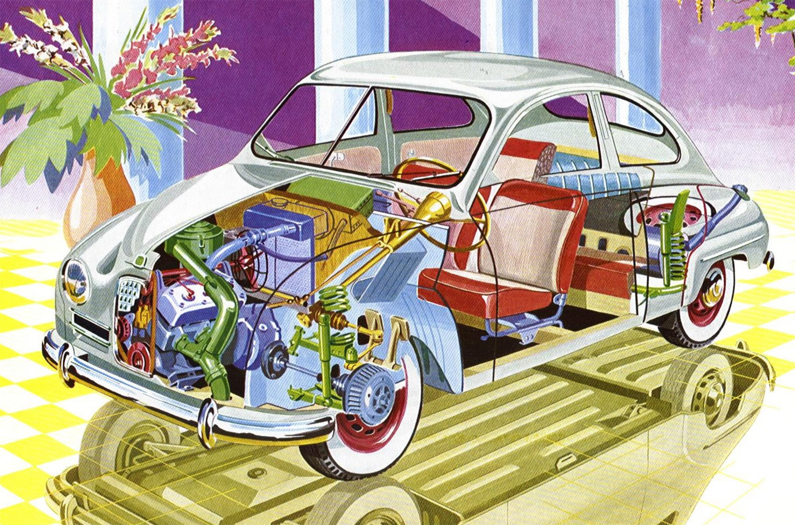
Look at this! All the color, the golden reflection of the underside in the floor, the pipes and hoses in the engine, the reflections of the chrome, the purpleness of the background, that plant, it’s all so good. This cutaway is a party.
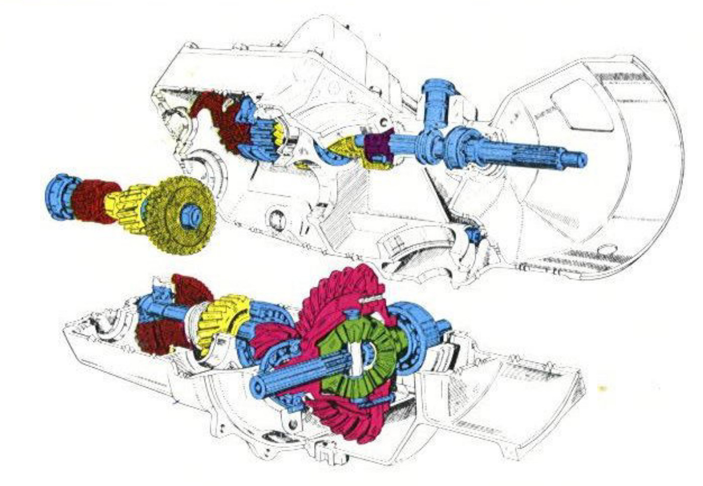
Even the more mundane line-art diagrams get a splash of color; with this palette, those transmission gears feel like a bouquet.
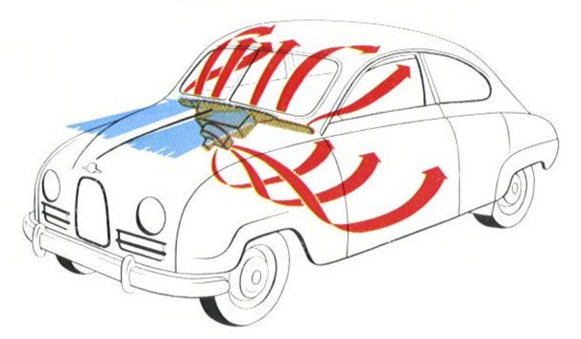
Or this diagram of ventilation airflow, where it feels like maypole ribbons flowing into the car. Whoever illustrated this must have done a fat rail of uncut flair before getting started.
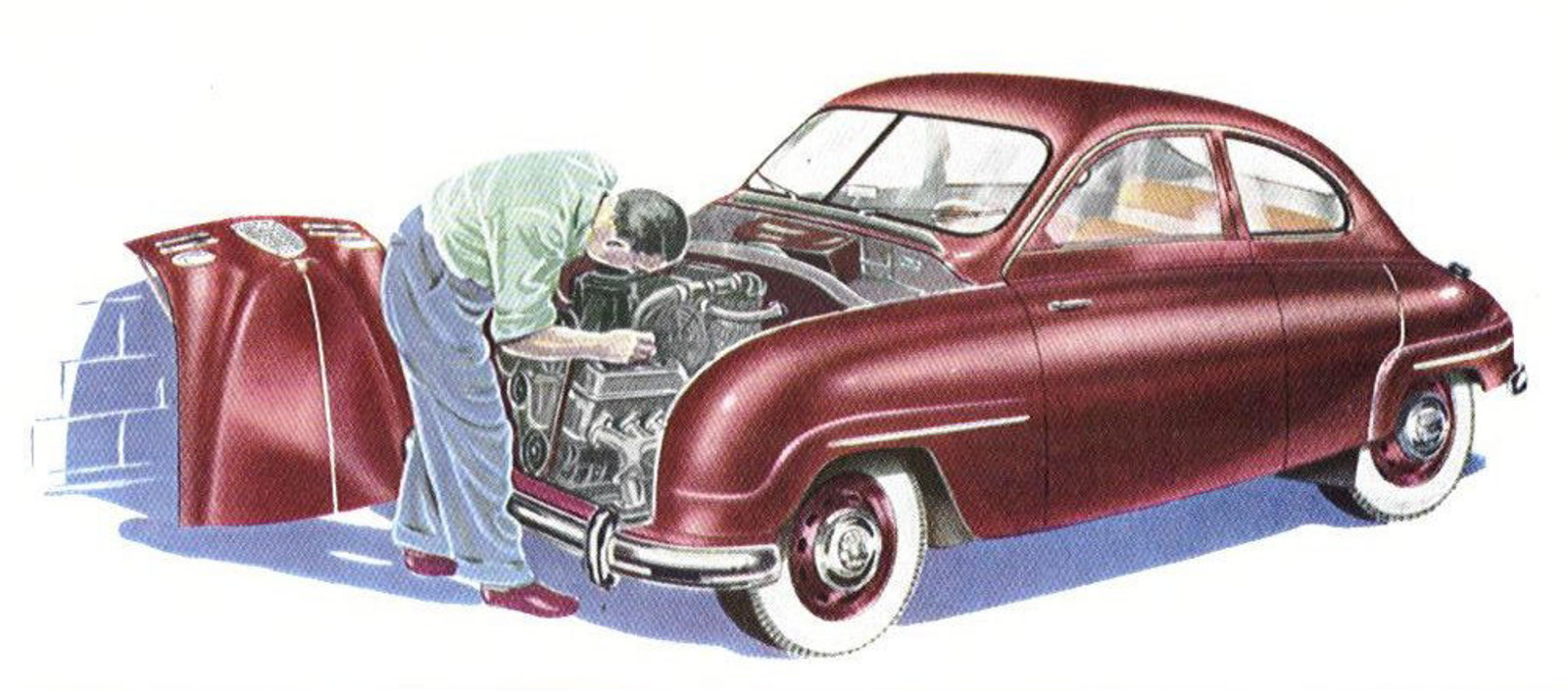
Sometimes, the illustrator switches to a more restrained style with more color blending, and that also works nicely, giving a calmer sort of book-illustration feel to things. Also, great engine access in that 93 with the hood off.
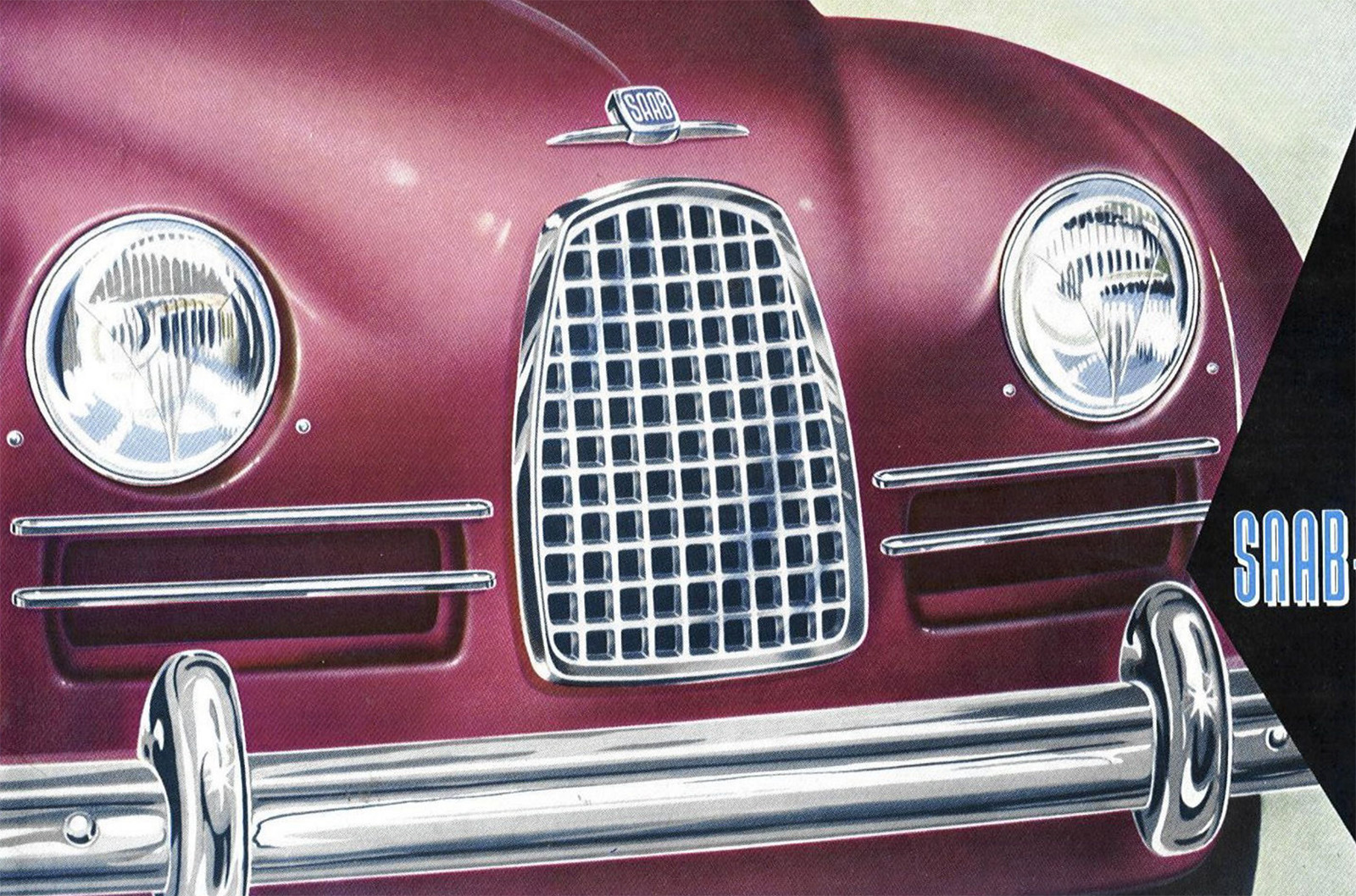
The more careful style was used on the cover, too, really rendering those curves of the body nicely. I like the little asterisk-like hot spots on the bumper guards, a little of that other more unhinged style coming through.
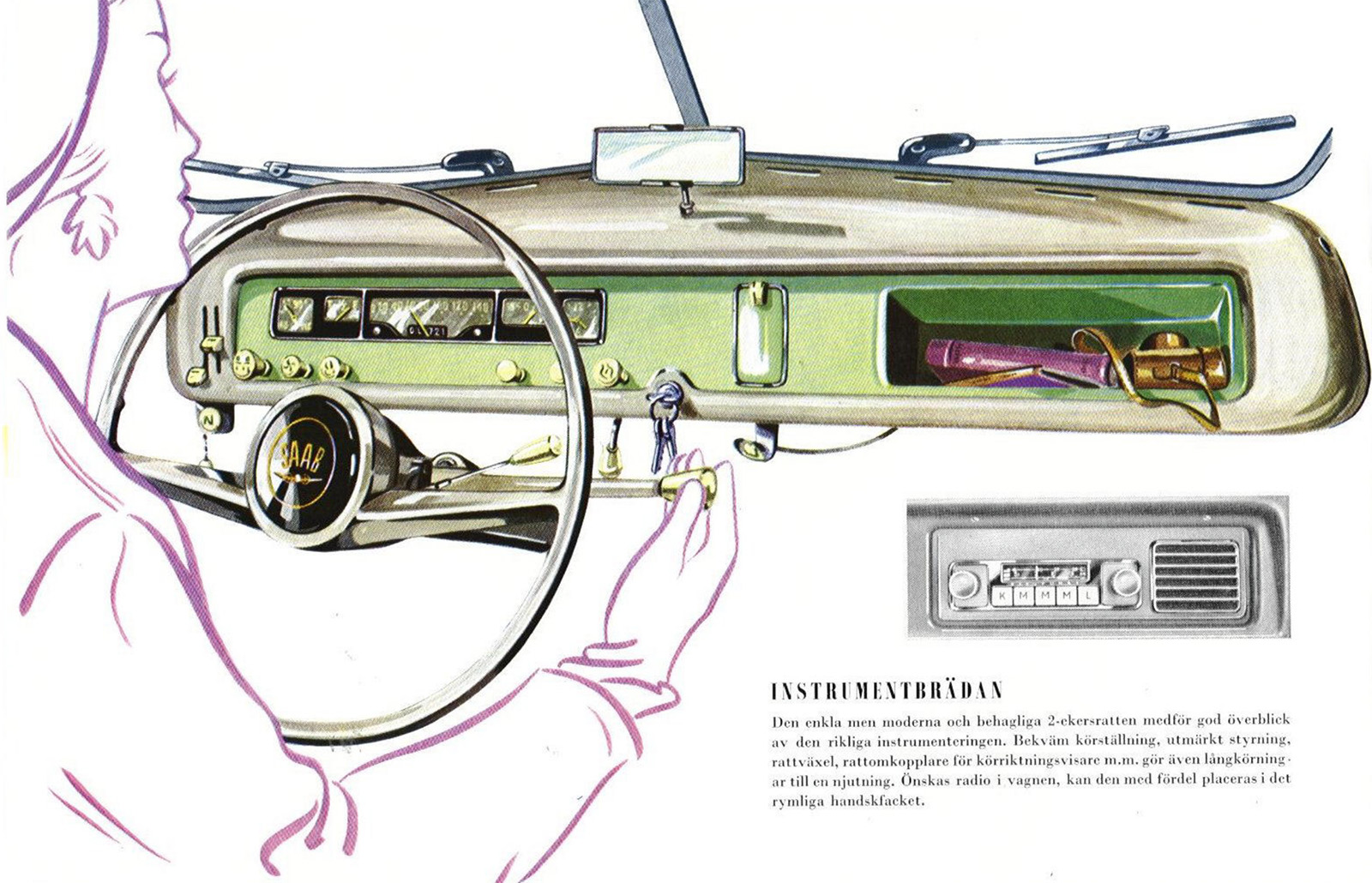
Here’s another fun detail; the Saab 93 had a pretty simple, narrow dashboard, and if you wanted a radio, there was a small sacrifice involved: your glove box.
That little radio unit with its integrated speaker is pretty cool, though, and it gives your passenger pretty direct control over the tunes.
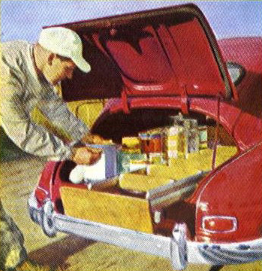
There’s not a lot of photography in this brochure, but there is some, like this picture of a very well-organized trunk that in my head I read as a sort of make-your-own hotdog bar, but I’m pretty sure it’s not. I think it’s paint and related tools, but when I glance at it, it feels very different. Maybe I just want a hot dog.
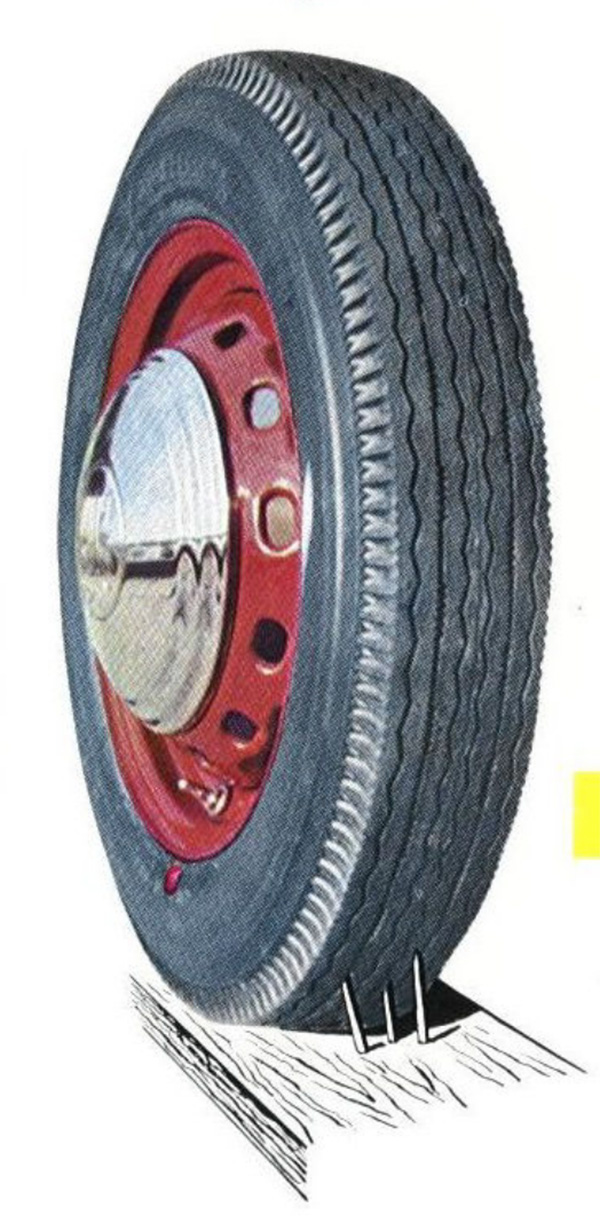
And finally, I have no idea what the point of this illustration is; those aren’t puncture-proof or run-flat tires, so this is just showing, what, you can puncture tires? If you drive over a discarded 2×4? Is that what 1950s Swedes were looking for in their cars?


To all of you who appreciate the illustrator’s art form, I recommend Pete Beard’s YouTube channel, even though almost nothing he explores delves into the automotive world. He’s shared the work of so many amazing artists.
These are fantastic!! And I love your analysis.
I find it interesting that the least vibrant color in the first image is the SAAB itself. I would think in a car ad you would want the car to be a source of energy, but that color makes it feel like a slightly drab transportation device you take to the beach.
Its a pretty color – but I feel like a red or yellow would have really given the car life.
As someone who just paid a stupid amount of money for a compact spare. that last picture is gut wrenching. Darned if it doesn’t look like a compact spare. I’m loving these old brochures.
Even if I weren’t a SAAB fan, I’d still consider those illustrations beautiful.
Love that artwork and the simplicyt of the vehicle.