I feel like I do these sorts of illustration-delight Cold Starts fairly regularly, and I hope you don’t get sick of them. I sure don’t. This somewhat lost art of advertising illustration is something I think worth remembering, and sometimes the choices and style of these things is just slightly unhinged in just the right way. I think this 1956 Saab 93 brochure is a good example of that, as the artist really seems to have been determined to use every color possible, and to bring a sense of loopy glee to every bit of this.
The style here is a little bit looser than a lot of the contemporary illustrations you may see on, say, American brochures; there’s a way color and shading tends to be handled here in an almost posterized way, with less blending, and I think American brochures of the era were more likely to have a smoother transition between areas of color.
I mean, I could be imagining it, but the method and techniques seen here feel more like a European School of car brochure painting. Look at this engine illustration, for example:

See the almost posterized effect of the shading, say on the air cleaner there? It’s like 4 shades of blue-gray, in discreet areas, not overly blended. I love this effect, personally.
Also, that engine is the famous DKW-derived inline-three two-stroke. Very few moving parts, and that fan guard looks like what you’d see on a desk fan.
And while that engine is pretty dazzling, I think the real tour-de-force of this brochure is this full car cutaway, which is absolutely incredible:
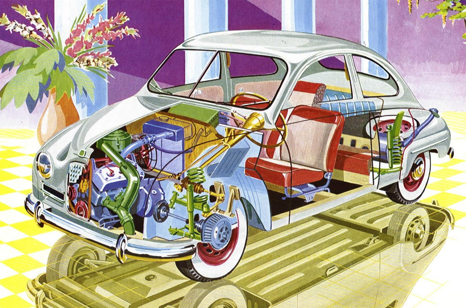
Look at this! All the color, the golden reflection of the underside in the floor, the pipes and hoses in the engine, the reflections of the chrome, the purpleness of the background, that plant, it’s all so good. This cutaway is a party.

Even the more mundane line-art diagrams get a splash of color; with this palette, those transmission gears feel like a bouquet.
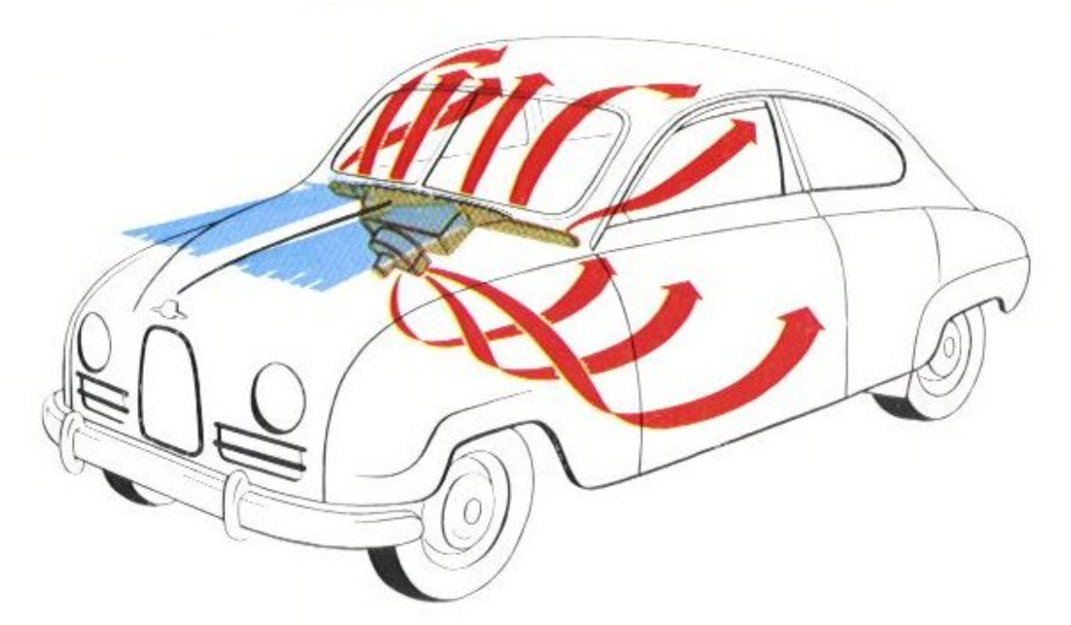
Or this diagram of ventilation airflow, where it feels like maypole ribbons flowing into the car. Whoever illustrated this must have done a fat rail of uncut flair before getting started.
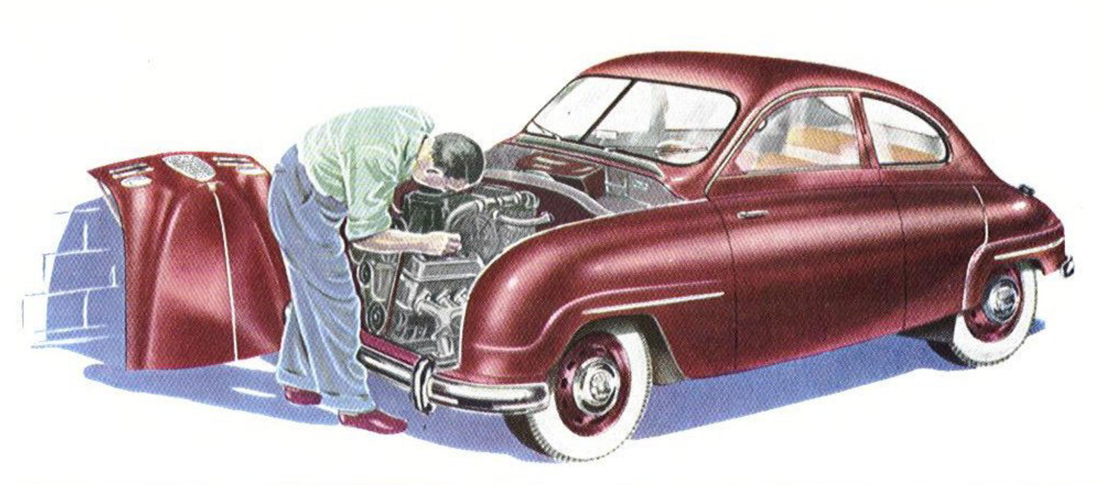
Sometimes, the illustrator switches to a more restrained style with more color blending, and that also works nicely, giving a calmer sort of book-illustration feel to things. Also, great engine access in that 93 with the hood off.
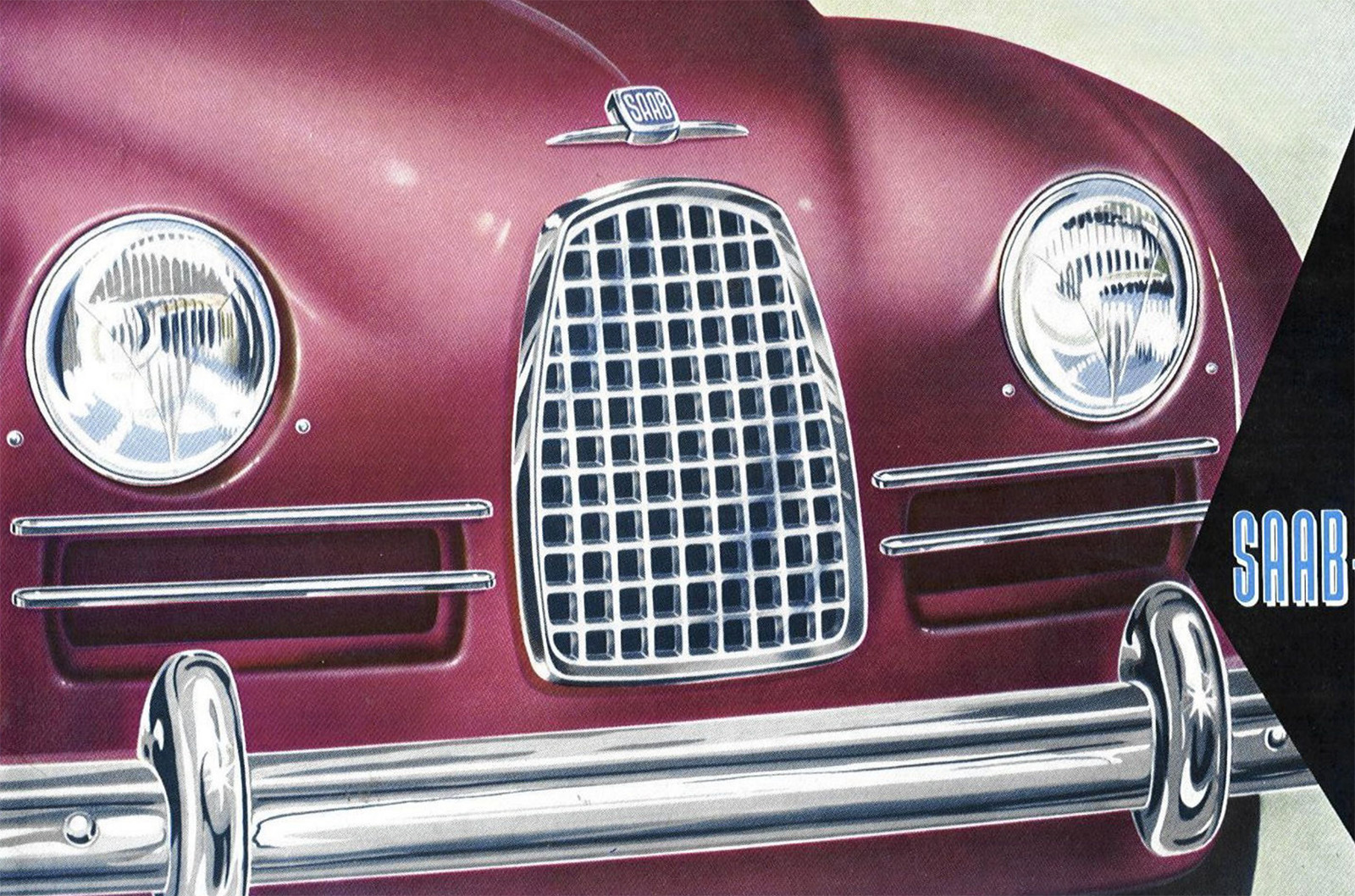
The more careful style was used on the cover, too, really rendering those curves of the body nicely. I like the little asterisk-like hot spots on the bumper guards, a little of that other more unhinged style coming through.
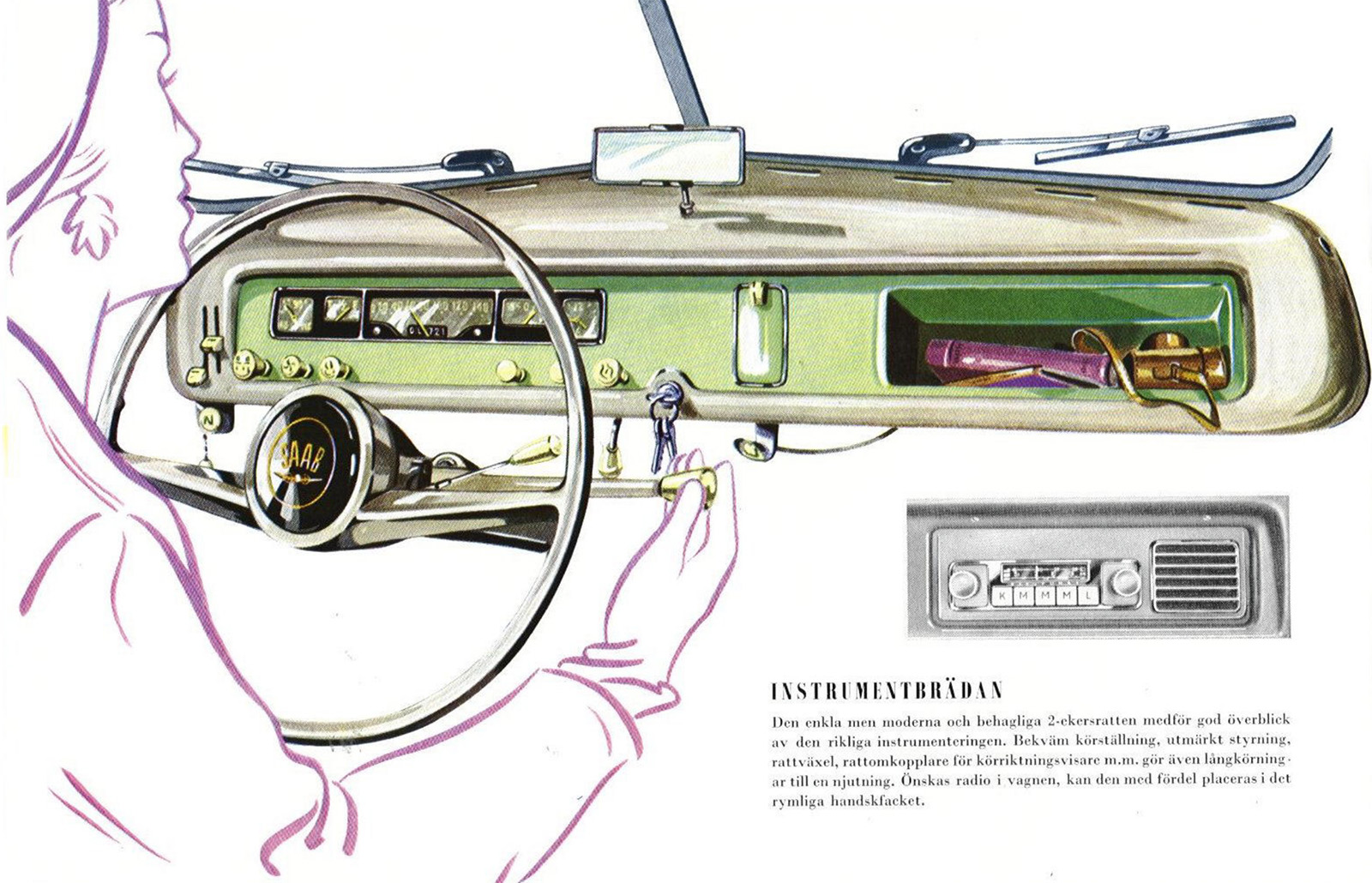
Here’s another fun detail; the Saab 93 had a pretty simple, narrow dashboard, and if you wanted a radio, there was a small sacrifice involved: your glove box.
That little radio unit with its integrated speaker is pretty cool, though, and it gives your passenger pretty direct control over the tunes.
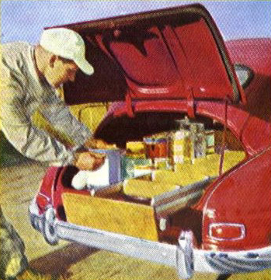
There’s not a lot of photography in this brochure, but there is some, like this picture of a very well-organized trunk that in my head I read as a sort of make-your-own hotdog bar, but I’m pretty sure it’s not. I think it’s paint and related tools, but when I glance at it, it feels very different. Maybe I just want a hot dog.

And finally, I have no idea what the point of this illustration is; those aren’t puncture-proof or run-flat tires, so this is just showing, what, you can puncture tires? If you drive over a discarded 2×4? Is that what 1950s Swedes were looking for in their cars?

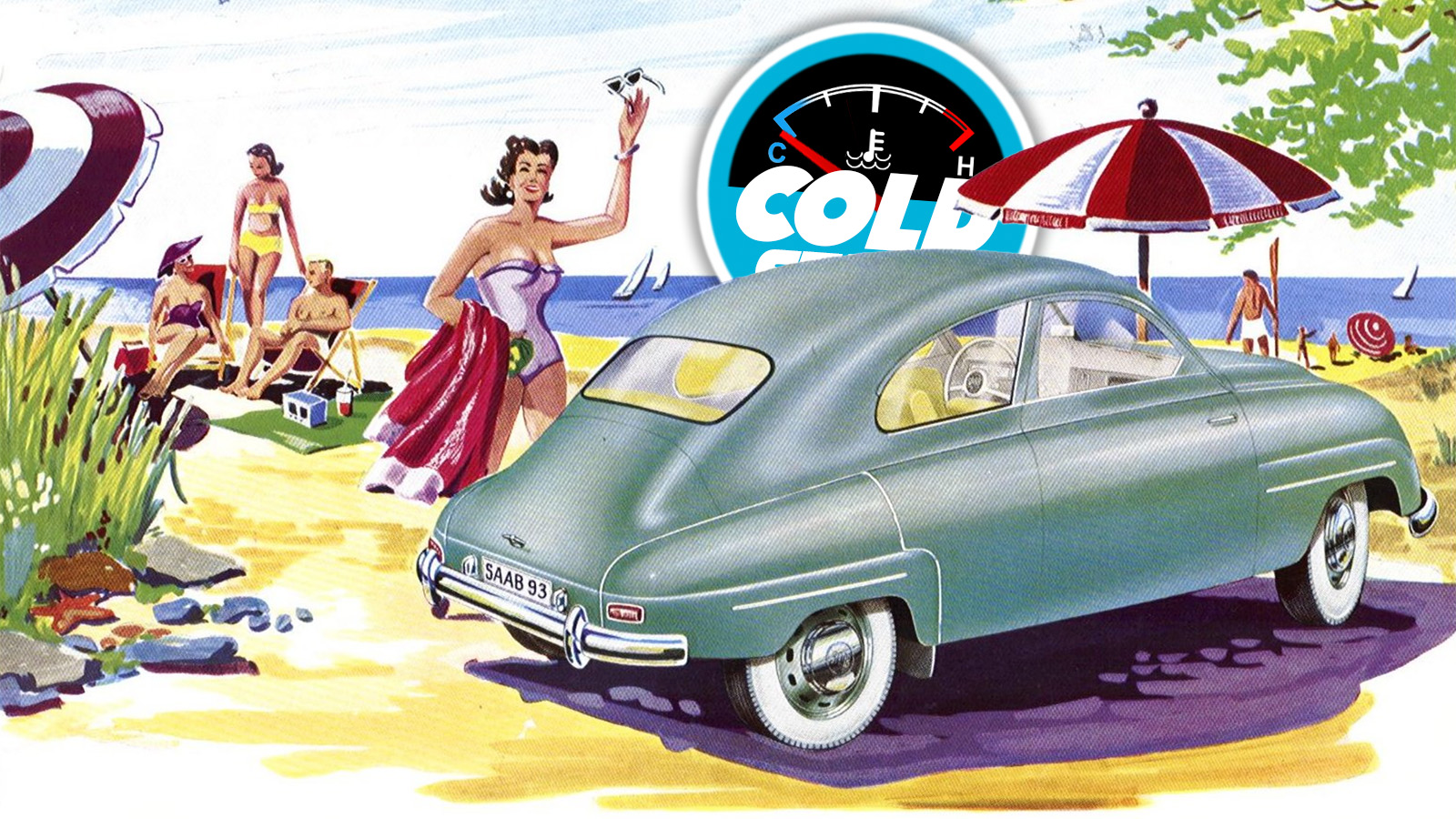


Yeah… I don’t think I will ever tire of your obsession and analyses of older car brochures.
Let’s start with the first picture. It’s Sweden. Where are the blondes?
And so, it looks like the cooling fan is at the back of the engine? That’s an interesting choice, but I’m sure they had their reasons.
Finally, that’s probably a 2×6 or 2×8 (or whatever the metric equivalent would be) with the nails sticking up. And I don’t understand what point they were trying to make with that one, either.
These are great – I don’t ever see myself getting tired of seeing them.
The top shot makes it look like Saab owners bring a beach-blanket for their car (in this case a purple one), something I would totally be on board with.
Reminds me so much of Curious George illustrations. Sad I couldn’t find the Man in the Yellow Hat anywhere in these pics.
Where did you find that ? I want a blow up of the leader painting. So MCM I would h as no it on my wall
The reflective chrome hubcap detail on that soon-to-be-punctured tire is spectacular.
Or specular?
Taken in context… at this time SAAB was a very new car company, with cars designed by aircraft engineers and designers with little to no background in the automotive field. Aside from the DKW-ish engine, everything was brand new, including some of the very basic concepts of how a car should look and operate.
These illustrations do a fantastic job of showing potential buyers all of this newness.
Some of these you offer are rather mundane, however, this one IS EXCEPTIONAL! This one was done by a professional with years of experience. I’m certainly not an art critic, but the level of detail… Like you, nails in front of a tube tire is NEVER good!
I feel like this illustrator likes the color purple almost as much as I do.
Two things here
First, I’m not understanding the fan placement on the engine. It looks to me like the engine is running a dash-mounted fan to keep the
pilotdriver cool.Second, I’d love to see the whole-car cutaway include a subtle cutaway of the plant and vase, just to see who’s paying attention.
Old Saabs had the radiator at the back of the engine compartment.
https://www.lanemotormuseum.org/wp-content/uploads/2016/12/saab_93b_1958web4.jpg
This arrangement is responsible for what’s known as the single overhead fanshaft.
Also visible both in that shot and in the illustration above is the combination generator and water pump, affectionately known as the waternator.
Oh gawd, I don’t know if you’re joking or not. The stuff I’ve seen on this site….
Oh, it’s real. I’ve also heard the term “waterator” for it which, strictly speaking, makes more sense as the electrical half is a generator, not an alternator. At least one hopes that only the intended half is electrical…
https://www.skandix.de/en/spare-parts/electrics/alternator-with-water-pump/1033715/
Personally I’ve only ever owned the later “longnose” two-strokes which have separate water pumps.
Absolutely not. I LOVE seeing/reading about these older automotive illustrations 100%. I woke up at 4AM with so much back pain that I haven’t been able to even think about breakfast, but just coffee. Getting to see these charming illustrations, which (IMO) took SO much more talent to create than AI dreck, is almost certainly going to be the highlight of my day.
The ‘posteried’ style could have been the result of knowing the printing process that would be utilized for the brochures.
I used to work at a printing company which utilized the 4 color offset process (CYMK). While gradients were certainly available, it would have been much easier (cost effective) to have discrete separations between colors / tones.
I worked at a Linotronic printing place eons ago, and after that I was in digital film compositing/restoration for years, where we usually referred to this as ‘quantizing’ and it was regarded as an artifact (usually due to insufficient bit depth at some point in the image processing) to be avoided (in 35mm film photography).
Lovely car!
Had to look it up: If you get one from before September 1957, it has the characterful split windscreen 🙂
I grew up in a SAAB family. At least it was til Mom left the old man.
But if Mom had looked like the girl approaching the lead drawing, maybe the old man would have been nicer to her?
WTF am I kidding?
She still would have split.
But I would have accepted that one for a new Mom, no problem. YMMV.
Oh yeah, nice drawings.
I literally never tire of technical illustrations, especially ones with an artistic bent. Maybe that’s part of why I became an engineer, who knows.
I’m an engineer, and I was once asked to do an exploded drawing of a supercharger for the owners manual because the intermeshed spirals of the rotors were a bit of a nightmare.
I was honoured, and thrilled, to do a nice neat technical illustration.
I was really proud of it, until I realised that because it was in the manual no one would ever see it.
I read, or at least skim, every manual I get. Half to look at illustrations!
Thank you.
I once traveled for business and my rental car was a brand new Dodge Intrepid. I was curious to find out more about the LH platform’s unusual engine and transmission packaging. When I got to my hotel, I brought the manual with me as my evening reading. After the trip was over I realized I forgot the manual in the hotel room. Oops!
I amuse myself with the thought that somebody checked into the same room after me, opened the bedside drawer, and instead of a bible they saw a Dodge Intrepid owner’s manual.
“… WHY is this here?”
Always amazed at the skill in convincingly rendering chrome in these.
That image on the beach has to be a Swedish beach, which means it’s about 64F and the water is like 50F, perfect weather for a beach day!
A major innovation for the mid fifties Saab 93 was tubeless tires, which while not puncture proof, were more puncture resistant than the old tube tires.
Also, doesn’t it look like if you put pressure on the roof and gently the flattened the the 93 down you’d wind up with a Hyundai Ioniq 6?
Loved these old Saabs and vintage car the brochures are great. Keep ‘em coming.
If you find a resemblance between the 93 and the Ioniq, check out the ‘Ursaab’ prototype. First thing I thought of when I saw the Ioniq.
I like how in the topshot and the image of the guy working on the engine, the rest of the scene is rendered in the posterized style Jason is talking about, but the car is in full, realistic gradation. It’s a nice way to put a subtle focus on the subject, without going to fully monochromatic background.
Can any one identify the medium used for the illustrations?
I think its a mixture of watercolours and Gouache but the body panel gradients look smooth like airbrush.
I always thought it strange that Kurt Vonnegut Jr. had a Saab dealership in Cape Cod but now after viewing this brochure and its candy coloured science fiction tone it all makes sense.
I read that his dealership wasnt very successful and closed after a few years, but he had so much Saab letterhead that he continued to use it for decades for most of his correspondence!
The Saab 93 is the most soothing-looking vehicle of all time for me. I can’t explain why this is.
Agreed and even in wagon form: just stellar. That and the Volvo Amazon and I’m set for what I have left on the planet.
I truly think I’m going to be heavily into Saabs at some point in the near future. I was browsing Sonnett prices recently and they’re absurdly cheap.
After spouse and I snagged electric bikes just before Covid I found that my toys usage went down to almost zero. I sold my 909S convertible. I kept the reliable and restored Del Sol. In the subsequent 5 years we have put on > 5000 mikes on the bikes. Maybe 300 on the Honda, way less on the Saab that left here in 2022. I miss it foibles and all. A CA car restored no rust less that 100 k when it left. Hoping the new owner is using it alot
Posterized refers to an image that has been altered to reduce the number of colors or tones, creating a stylized, flat look.
Keep the mid-century brochure madness coming, Torch. Nothing like a big hit of great graphic design to start the day off right!
I love how the engineering-compromise details show up in the illustrations and aren’t smoothed away which would’ve been just as easy. The fender cutline that looks exactly like an orphaned rear-door shutline (especially odd since there was no 4-door model to share rear fenders with) is there even in the looser style, and the headlight-adjacent (adjuster?) screws that are just right there out in the open are lovingly depicted.
what’s with the ‘more flowery’ signature lately?
I wonder if all the vertical bars are supposed to be coding for a paragraph/heading break that doesn’t quite work.
“I feel like I do these sorts of illustration-delight Cold Starts fairly regularly, and I hope you don’t get sick of them.”
Nope, not at all! By all means, do continue with those!!
Likewise with the ones about the 2CV!! It seemed like it was starting to become a Monday tradition to have something about the 2CV so today’s Saab post was almost a disappointment, lol. But only almost. So it’s all good!
Yeah, 2CV Mondays do indeed beat Mercury Mondays. Ha, yeah, I have absolutely no FOMO about FoMoCo.