
I usually think of the 25-year-or so period between roughly 1950 and 1975 as the Golden Age of car brochure illustration, globally. But that doesn’t mean photography wasn’t a huge force already, because of course it was. Photography is a powerful tool, and midcentury brochure designers were doing all sorts of interesting experiments with the medium, including ones that, in hindsight, make you wonder just what the flapjacks they were thinking. Like this 1964 Pontiac Tempest brochure.
This brochure came to my attention earlier this week when we were discussing the car testimony from My Cousin Vinny, which referenced a 1963 Pontiac Tempest. This ’64 Tempest is a very different car, losing all of the interesting technical stuff the bold ’63 had, like the rear-mounted transaxle and the flexible “rope drive” driveshaft, and maybe this return to conventionality is what sparked some of the, um, bold choices of the photography here.
Some of it I really like! Take the way the photographer pushed the pictures of the cars in their various colors into a monochromatic space, which makes things look sort of surreal and dramatic:
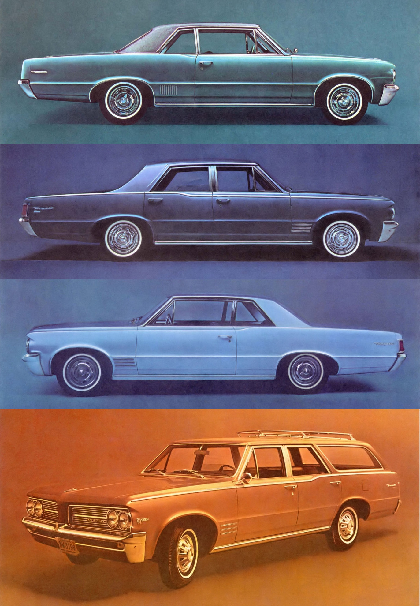
I like that effect a lot. I’m guessing instead of just backgrounds, lens filters were used? Nobody was just pulling these into Photoshop and ⌘-Uing the Hue/Saturation palette back in 1964, after all. This took physical effort.
The monochromatic wash was used in other places in the brochure, sometimes maybe pushed a bit too far:
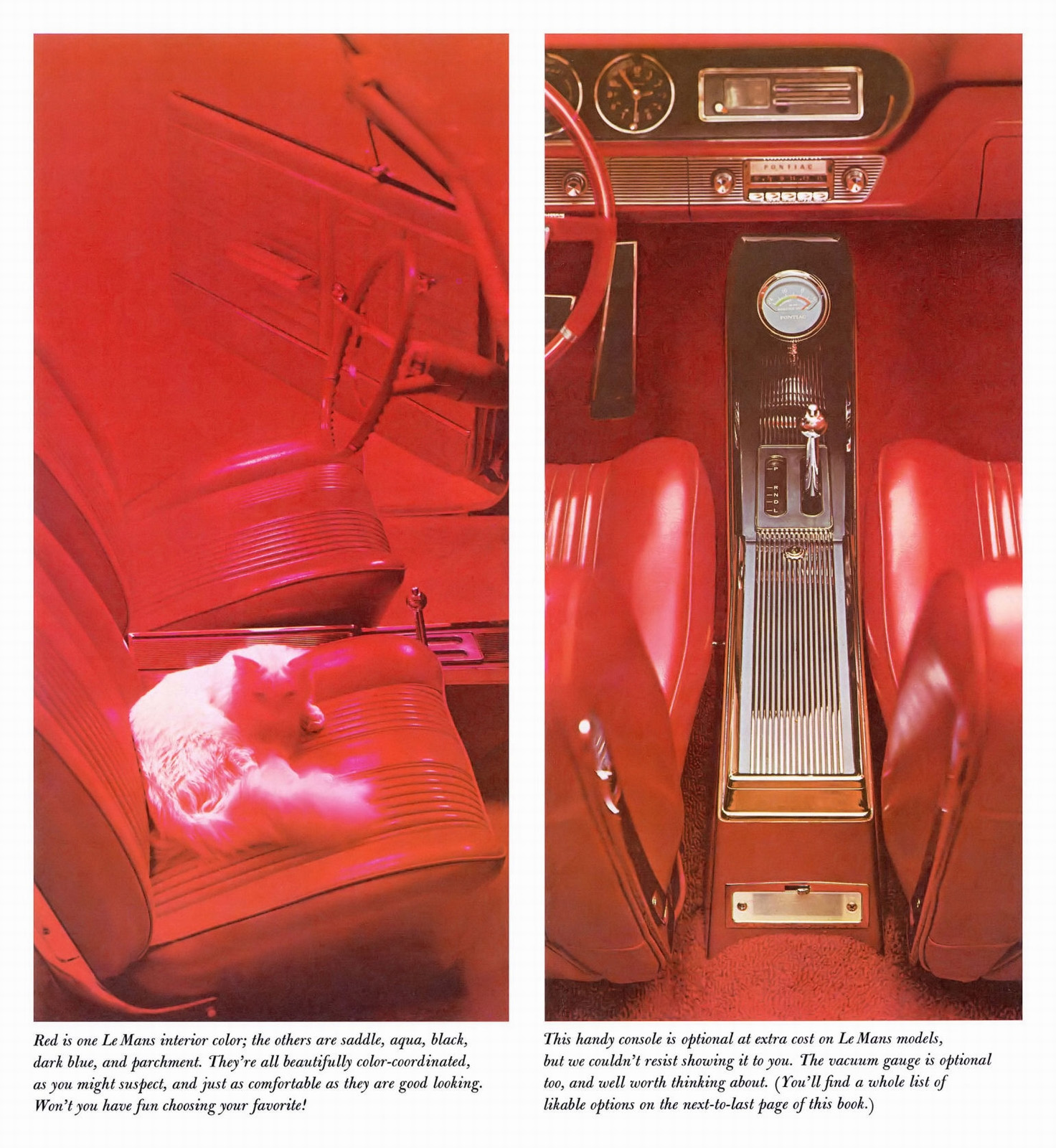
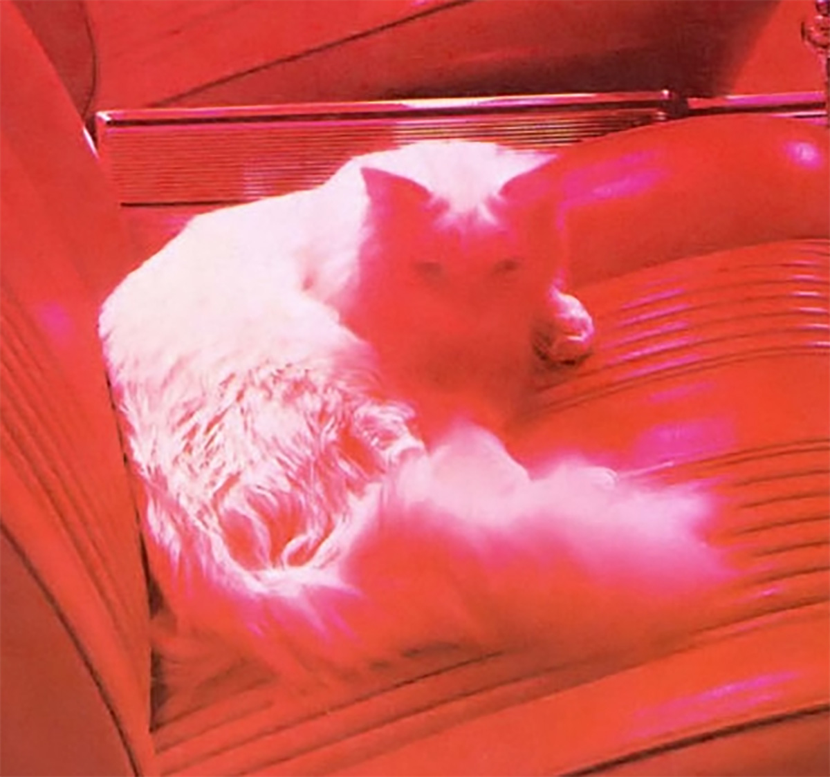
It’s almost hard to read that cat, as scarlet-blasted as they are:
They look pretty damn comfortable there, at least. And, the low-mounted vacuum gauge in front of the shifter is interesting; that’s one of those gauges that carmakers just seemed to thrown in on a whim, sometimes labeled as a crude “fuel economy” gauge.
Still, I think there were some good ideas at play, but they maybe got a little misguided. Look at this:
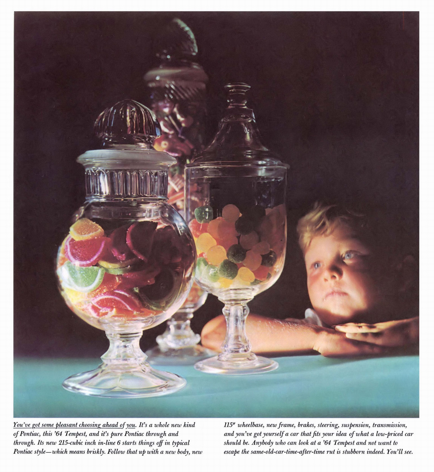
What’s going on here, exactly? They want to convey the idea that there’s a lot of choices to be made here, and that’s a good thing. An embarrassment of riches kind of situation, and the copy even says “pleasant choosing.” So why light it so dramatically and ominously? Why does that kid look so serious and grim? Isn’t this candy-related situation an opportunity to smile? This doesn’t convey “pleasant choosing” as much as it suggests a last treat before going back in The Box.
I do love those fruit-slice gummy dealies, though. They’re my favorite part of Passover. I mean, other than not being a slave in Egypt or whatever.
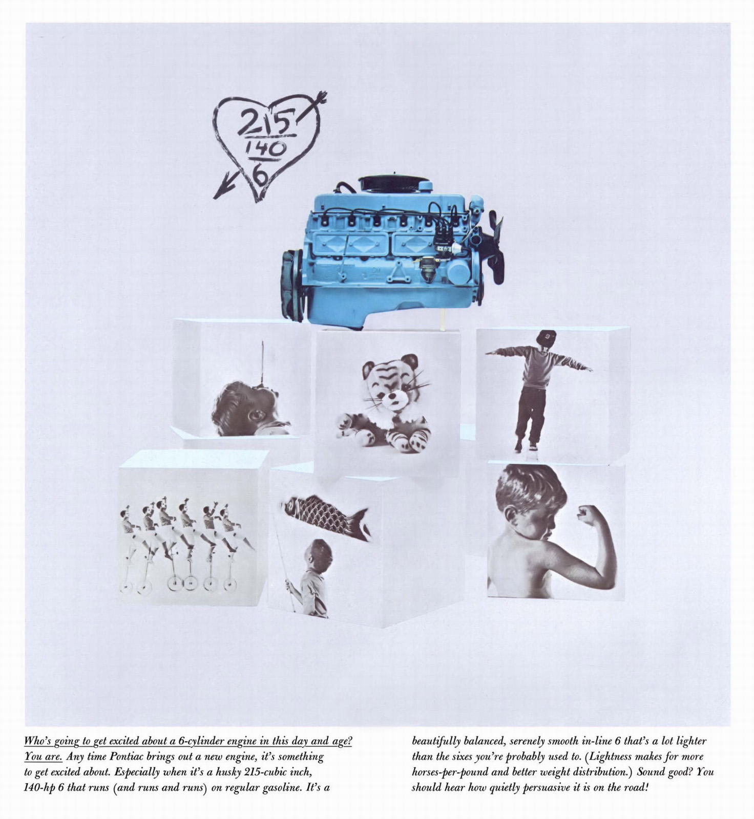
Some of the brochure gets back on track, like this interesting way to show that baby-blue inline-six, stacked atop cubes with black-and-white pictures showing some of the charming bits of childhood. The idea that the childhood imagery is supporting the engine as opposed to the other way around is a strange choice, but perhaps it makes sense on some level.
Also, that stuffed tiger in the middle-top box kind of reminds me of how Hobbes was shown when perceived as a stuffed tiger in the comic strip Calvin and Hobbes.
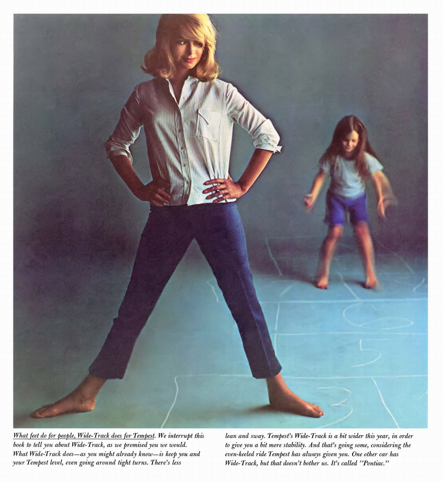
But don’t worry, things get a little weirder. For example, real people are used in the brochure, like on this page:
…but then this decision was made:
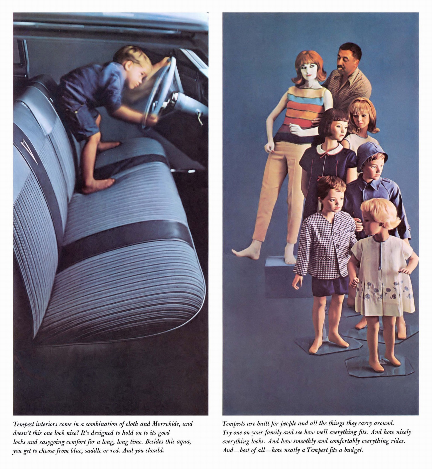
Why the mannequins? And, even weirder, why all the mannequins except for the (I assume) mom there, who is just creepily made up to look like a mannequin? Being placed into position by that cigar-chomping dude? What are they getting at here?
Also, nice to see the use of the term “Morrokide” here, which was one of GM’s names for Naugahide, to keep people from lamenting at the fate of those poor naugas.
Let’s get to the perhaps strangest choice now, the one that would likely be met with some genuine outrage today, because you know how people get about naked kids in car advertising:

So, yeah, we have a nice collapsing Tower of Babel of Blocks and then, for some reason, a naked kid eating ice cream on the car seat. Now, I don’t think for a second there was any impure intent going on here, and the bits you’d want hidden are hidden. I think it was just seen as “cute” at the time, but well, let’s just say it didn’t age that well.
I guess the message is that the seats are easy to clean?
So many strange choices made here. Did all of this misguided art-school mess get people to buy Tempests? Maybe?


Some of the photos raise questions, sure.
But I would rather prefer a small child instead of full grown adults in such advertisements.
Some car ads are quite innappropriate. But that may be due to my conservative background.
This ad is WAY more tame , than lets say, Dodge’s adult toys ads or Ford’s Free Wheelin packages (I get Chevrolet did have some similar ads in the early 70s, but I don’t find further ones like those).
Wow. That was visually a lot. The ad copy wasn’t far behind.
I always get a Mad Men vibe when you show us this stuff.
And I must say Miss Wide-Track is quite fetching.
The color wasn’t done in-camera, but in the four-color printing for publication of a monochrome image.
Groovy, man! I can imagine John Delorean signing off on this brochure.
(edit: he was Chief Engineer at Pontiac at the time and likely not involved)
Flashbacks. My first car was a 64 Tempest four-door handed down by my parents. It had 80,000 miles on it so they considered it a basket case. It was, but it was my basket case. The 215 was easy to work on and reliable as a rock. I hated the Power-Glide. rrROAAAR-hmmmm.
All the hullabaloo over the brochure photography is just a Tempest in a teapot.
Fruit slices rule! I’m a rind last man, though.
Actually, that’s a pretty good effort. It’s really hard to dodge and burn a cat.
They may dodge, but if you’re quick you can still burn them.
Looks like the creatives at their ad agency were on a collective acid trip.
Well that’s an odd tasting comment