

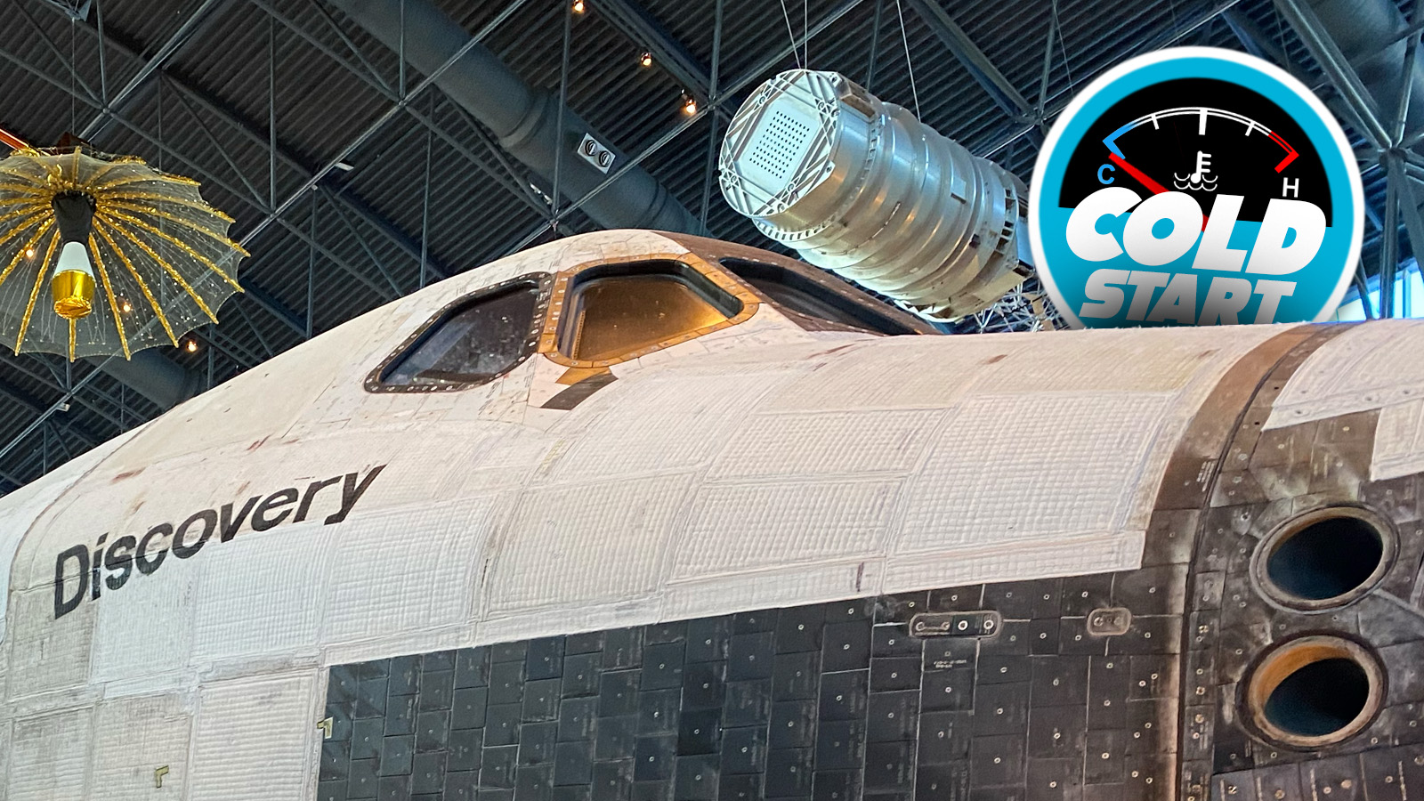
Even though I was born in the Apollo Era, barely, the spacecraft that I think had the most influence on my childhood had to be the Space Shuttles. I remember poring over diagrams and drawings of the shuttles in National Geographic foldouts, where they even took my attention from the Forbidden Nipples seen on some of the other pages. I remember watching that first launch of the shuttle Colombia in 1981, I remember the tragedy of the Challenger in 1986, and I remember covering the process of moving the orbiter Endeavour through the streets of Los Angeles to its eventual home at the California Science Center. And more recently, I’ve taken my kid to see the orbiter Discovery at the Udvar-Hazy Center just outside of Washington, DC.
It’s that orbiter that I want to talk about specifically, because I saw a social media post about the orbiter Discovery that grabbed my attention and held it with the sort of fierce grip I imagine Miss Piggy employs on Kermit’s impossibly thin limbs when they’re alone.


That post was on Threads, and I just figured out how to embed a post from that site, so here, you can see it for yourself:
View on Threads
Wait, what? Discovery has an upside-down ‘s’ in its name? How the hell did that happen? Discovery was usually considered, by astronauts and NASA people, the jewel in the Space Shuttle crown. It was recognized to be the most reliable and best-performing of all the orbiters, and had the most missions and time in space. Since it was first launched in 1984, Discovery completed 39 missions, spent in total a full year in space, and traveled 150 million miles.
The thing flew for 27 years, and somehow nobody noticed that the ‘s’ was upside down on the starboard side name text?
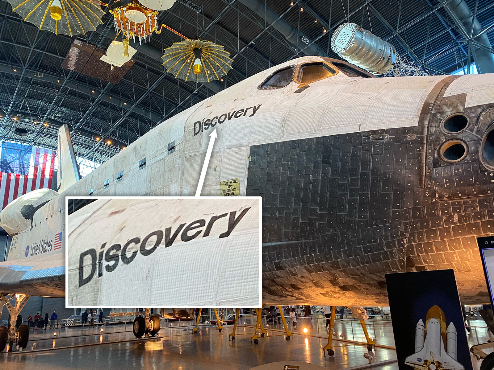
I mean, I guess I should be more understanding; I’ve seen it several times and never noticed, and it wasn’t until just tonight that I looked back at some old photos I took of Discovery the last time I was there and saw, holy crap, the dude on Threads was right. That ‘s’ is rotated 180°.
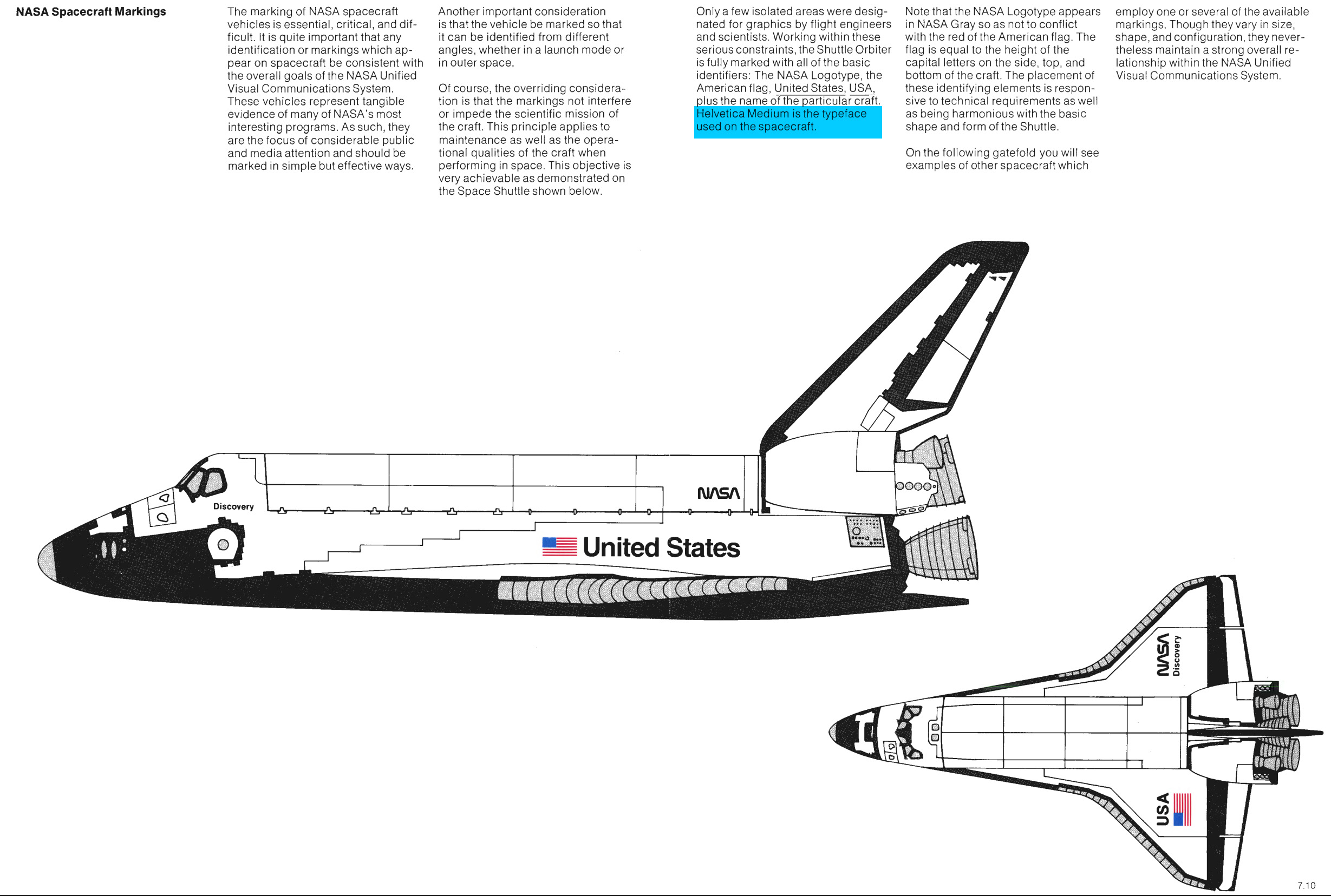
Now, the typography on the shuttle orbiters follows NASA’s carefully-planned and strictly-enforced graphic and typographic guidelines, which state that the typography used on the spacecraft should be Helvetica Medium:
Okay, let’s take a look at the typography on the orbiter:
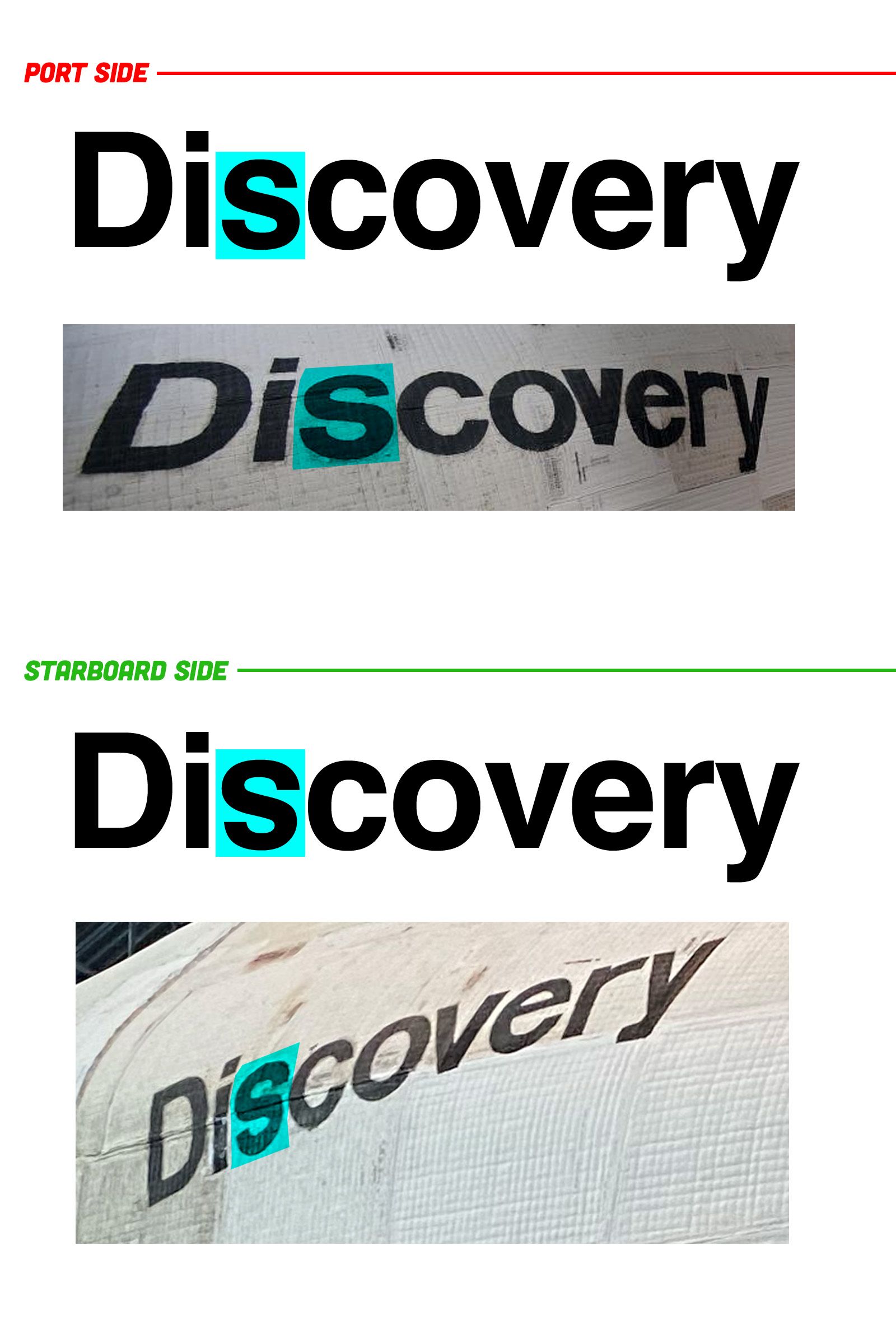
(the ‘r’ on the font I used there feels a bit different, too, but this gets the point across and I have to get on a flight in a few hours so I’m gonna let that slide)
It’s a subtle difference, but as you can see, the starboard side’s name definitely has that flipped ‘s.’ It’s subtle, but the Helvetica ‘s’ is slightly wider on the bottom, giving the letter a somewhat more settled appearance. Here, look:

You can see the difference there, right? I feel like once it’s pointed out, you can’t help but notice it. The ‘v’ on the port side looks oddly thick, too, now that I’m looking at it.
I’ve been told that the graphics on these orbiters was applied using large stencils and special space-grade paint, and I’m sure the complex curves of the fuselage didn’t make the application of these elements easy. It’s understandable that a letter stencil may have been flipped around, but I am sort of surprised it was never corrected in its 27 years of service life.
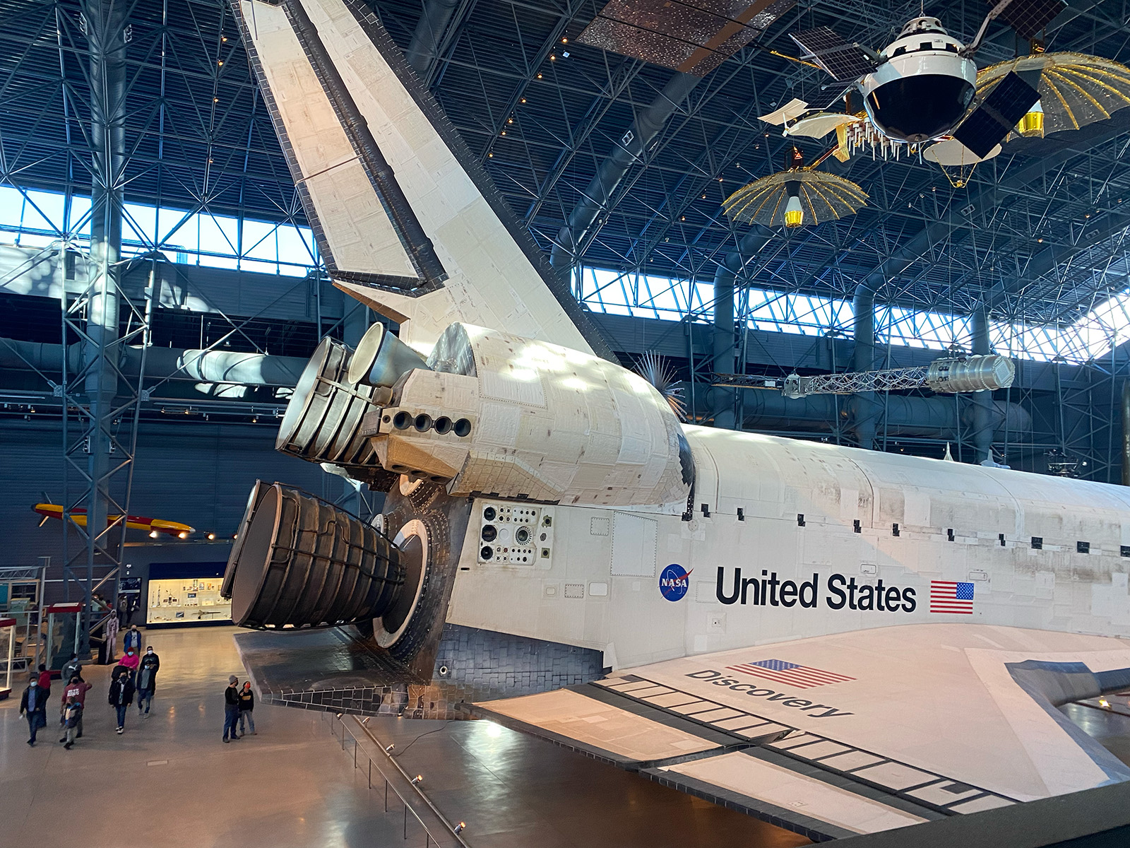
All the other graphics and typography are applied with impressive precision; maybe there were people who knew that ‘s’ was wrong, but kind of liked that subtle imperfection, as it does add character to the spacecraft. I get that, absolutely. If I was in charge, I’d have just let it ride, too.
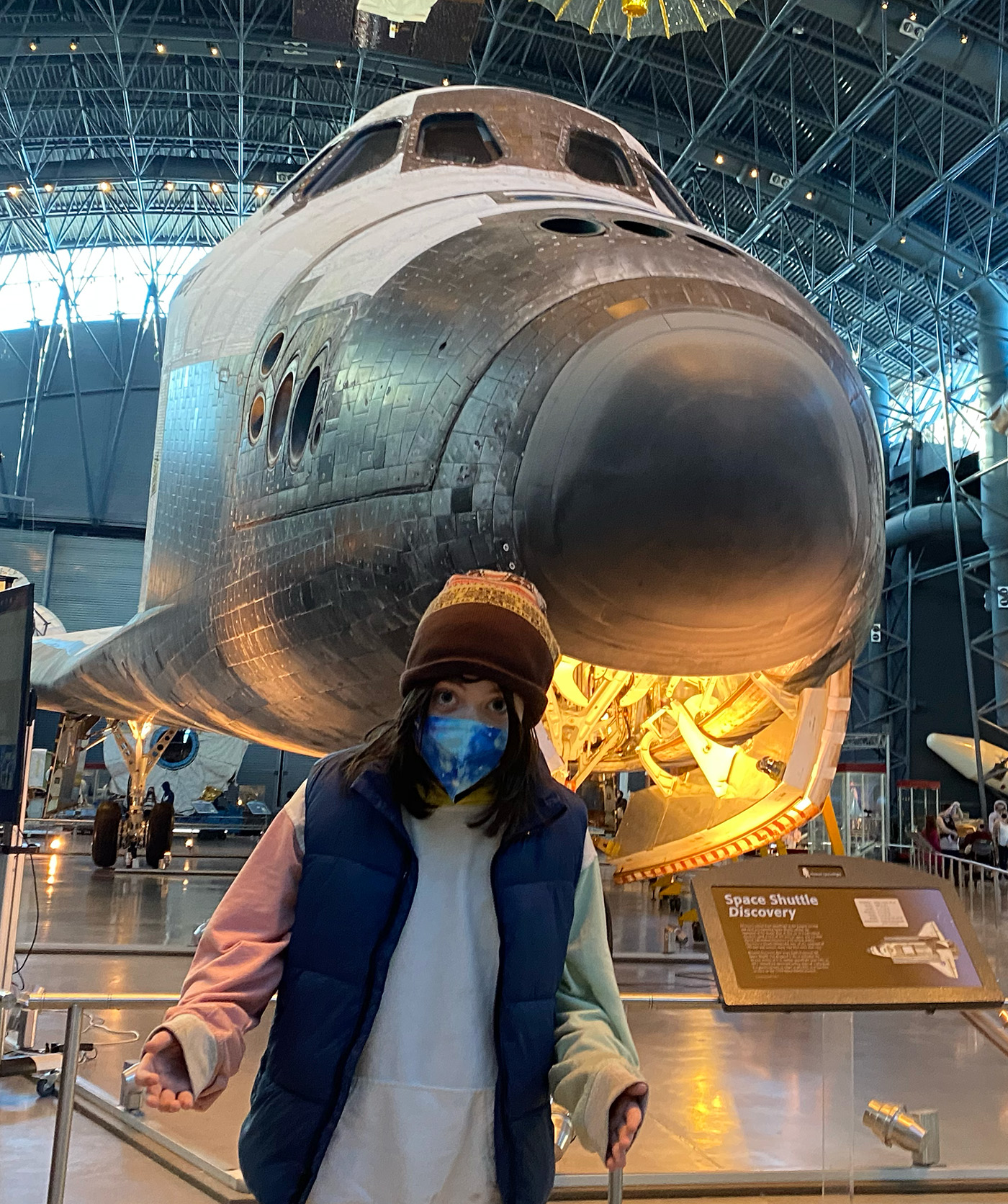
I still can’t believe I’d never clocked this before; as a typographic geek and a space geek who has spent far too much time looking at pictures of spacecraft in books and online, you’d think I’d have encountered this before, but, nope. Or if I did, it didn’t make enough of an impression to consciously note it or remember.
But now that it’s there? I can’t unsee it. And I’m sort of delighted by that.


“fierce grip I imagine Miss Piggy employs on Kermit’s impossibly thin limbs when they’re alone.”
Did y’all know that James Hetfield of Metallica officiated the wedding of Kermit and Ms Piggy?
Makes sense because he’s the pastor of Muppets.
Working lightly in a similar field, I doubt the S would have had its own separate stencil. It would have made more sense to have the entire word spelled out.
I wonder if there are pictures of the shuttle in the paint booth?
I’m guessing the reason most of us don’t notice is the angle at which we see it combining with the curve of the craft. It’s a subtle enough issue that those things absolutely mask the problem.
But now that you’ve mentioned it, I will never unsee it.
In space, nobody can hear you scream about typography errors.
There is no up or down in space.
Cue the “but the S used to be right-side up” Mandela-effect conspiracy theorists…
IT DID!
https://upload.wikimedia.org/wikipedia/commons/2/26/Space_Shuttle_Discovery_and_Carrier_747_at_Vandenberg_Air_Force_Base.png
The “V” on the port side used to be normal as well:
https://upload.wikimedia.org/wikipedia/commons/1/1e/Space_Shuttle_Discovery_lands_for_the_first_time%2C_completing_STS-41-D.jpg
The thing re-entered the atmosphere 39 times; it makes sense that NASA re-sprayed it at least once at some point.
Shouldn’t have let that Australian painter apply that stencil.
Croikey!
(Flip your phone upside down to get the joke)
The phrase “good enough for government work” keeps running over and over in my head.
Worked at a tool & die shop and we had to use paint stencils to paint “PROPERTY OF…” on assembly fixtures we were building before we applied clear coat. Had a young guy who needed to put “PROPERTY OF CHRYSLER” on one, but he couldn’t find a 4th capital ‘R’ in our stencil kit. Told him to just use a ‘B’ and some masking tape (to fudge it into a ‘R’). Nobody noticed until the tooling was being loaded onto the truck that they all said, “PROPERTY OF CHRYSLEB”, underneath 2 layers of perfectly applied clear coat.
A whole bunch of model builders just looked over at the their models of Discovery on their shelves and swore.
I see some impressive arguments at IPMS contests in the future.
IDK, in my club the car guys are starting to win over some of those types to the point we’re starting to joke that IPMS means “I Paint Models Shiny”.
Hands shaking, sweat beading up, wondering if their old bottle of Testors B- 1168TT, 1168C2 (P) FLAT WHITE has dried up yet or if it’s still viable for some touch-up work.
“$” happens.
This is what happens when one contractor types in English and the other in metric.