

Even though I was born in the Apollo Era, barely, the spacecraft that I think had the most influence on my childhood had to be the Space Shuttles. I remember poring over diagrams and drawings of the shuttles in National Geographic foldouts, where they even took my attention from the Forbidden Nipples seen on some of the other pages. I remember watching that first launch of the shuttle Colombia in 1981, I remember the tragedy of the Challenger in 1986, and I remember covering the process of moving the orbiter Endeavour through the streets of Los Angeles to its eventual home at the California Science Center. And more recently, I’ve taken my kid to see the orbiter Discovery at the Udvar-Hazy Center just outside of Washington, DC.
It’s that orbiter that I want to talk about specifically, because I saw a social media post about the orbiter Discovery that grabbed my attention and held it with the sort of fierce grip I imagine Miss Piggy employs on Kermit’s impossibly thin limbs when they’re alone.


That post was on Threads, and I just figured out how to embed a post from that site, so here, you can see it for yourself:
View on Threads
Wait, what? Discovery has an upside-down ‘s’ in its name? How the hell did that happen? Discovery was usually considered, by astronauts and NASA people, the jewel in the Space Shuttle crown. It was recognized to be the most reliable and best-performing of all the orbiters, and had the most missions and time in space. Since it was first launched in 1984, Discovery completed 39 missions, spent in total a full year in space, and traveled 150 million miles.
The thing flew for 27 years, and somehow nobody noticed that the ‘s’ was upside down on the starboard side name text?
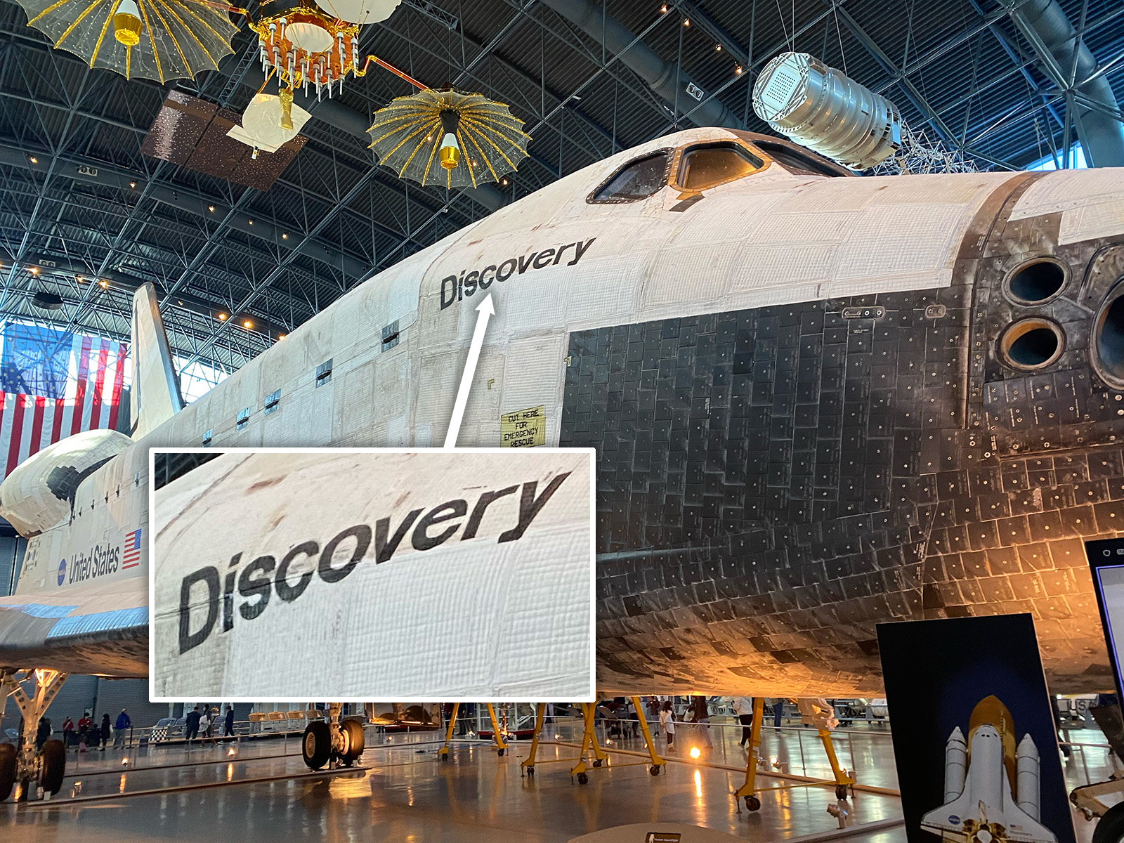
I mean, I guess I should be more understanding; I’ve seen it several times and never noticed, and it wasn’t until just tonight that I looked back at some old photos I took of Discovery the last time I was there and saw, holy crap, the dude on Threads was right. That ‘s’ is rotated 180°.
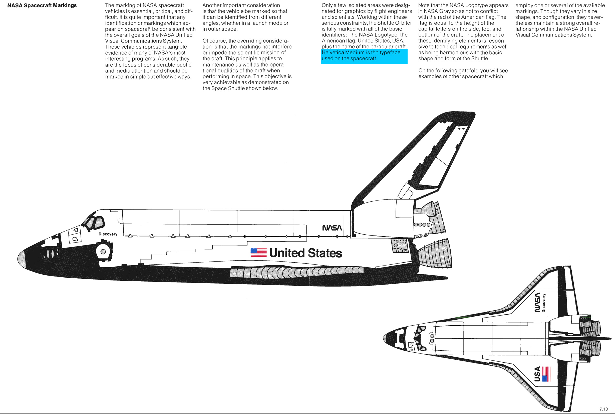
Now, the typography on the shuttle orbiters follows NASA’s carefully-planned and strictly-enforced graphic and typographic guidelines, which state that the typography used on the spacecraft should be Helvetica Medium:
Okay, let’s take a look at the typography on the orbiter:
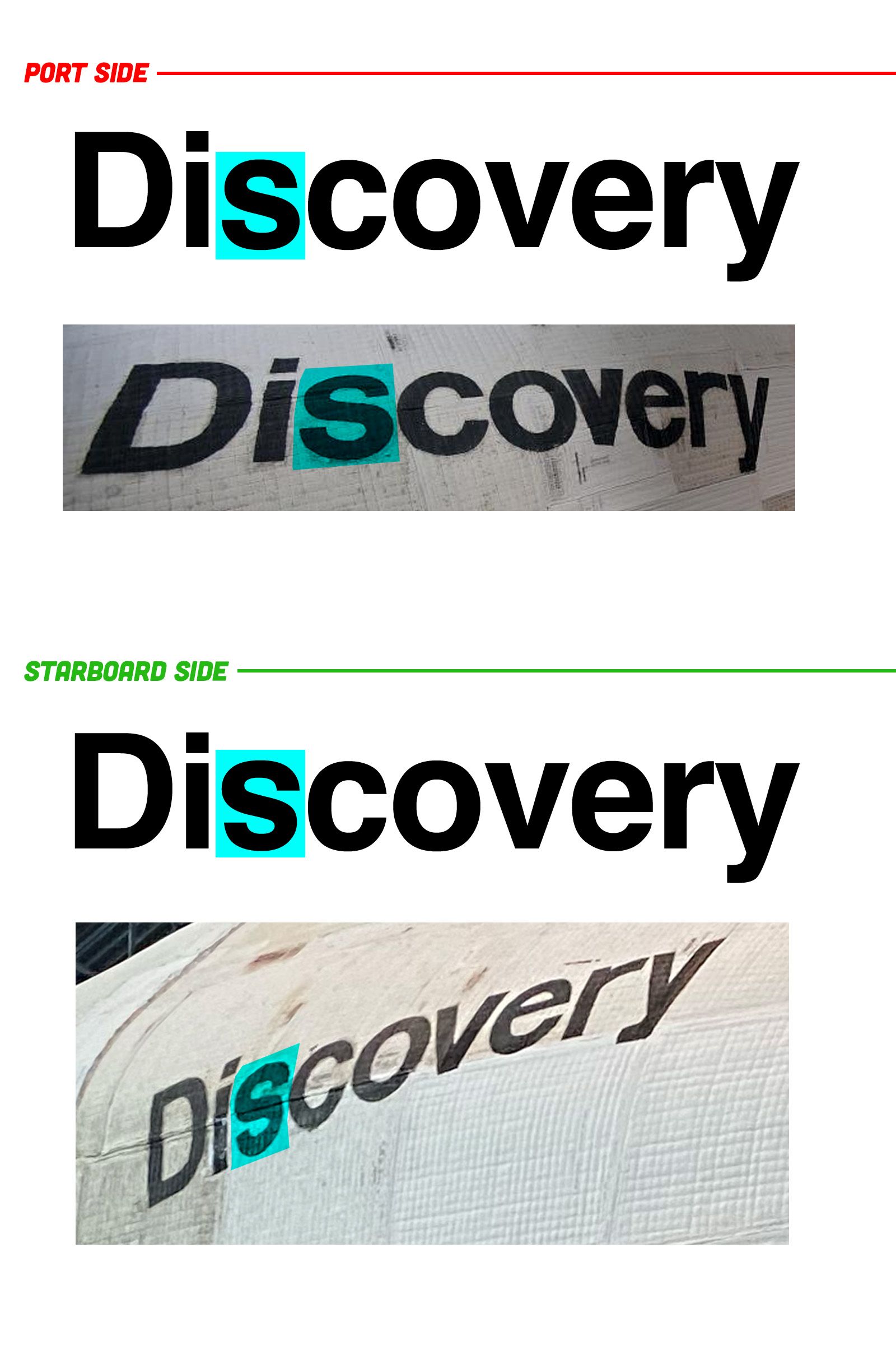
(the ‘r’ on the font I used there feels a bit different, too, but this gets the point across and I have to get on a flight in a few hours so I’m gonna let that slide)
It’s a subtle difference, but as you can see, the starboard side’s name definitely has that flipped ‘s.’ It’s subtle, but the Helvetica ‘s’ is slightly wider on the bottom, giving the letter a somewhat more settled appearance. Here, look:

You can see the difference there, right? I feel like once it’s pointed out, you can’t help but notice it. The ‘v’ on the port side looks oddly thick, too, now that I’m looking at it.
I’ve been told that the graphics on these orbiters was applied using large stencils and special space-grade paint, and I’m sure the complex curves of the fuselage didn’t make the application of these elements easy. It’s understandable that a letter stencil may have been flipped around, but I am sort of surprised it was never corrected in its 27 years of service life.
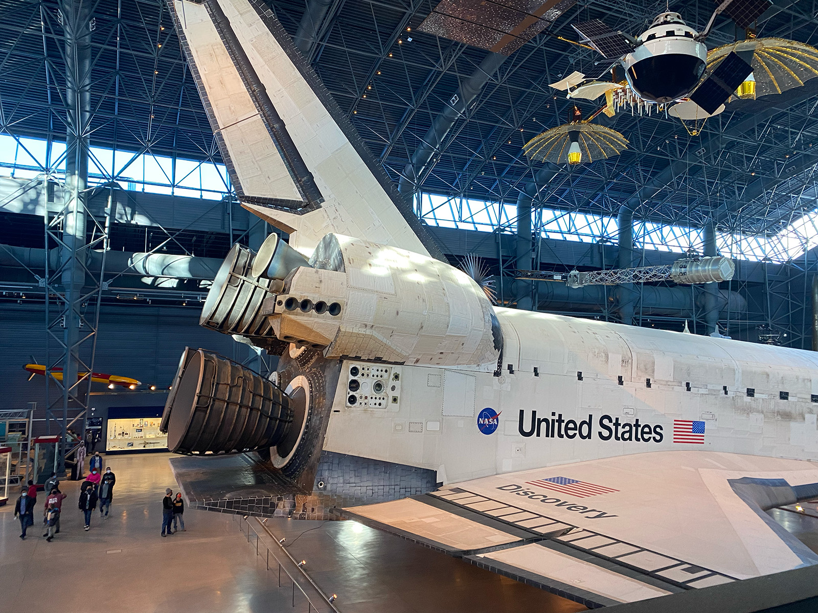
All the other graphics and typography are applied with impressive precision; maybe there were people who knew that ‘s’ was wrong, but kind of liked that subtle imperfection, as it does add character to the spacecraft. I get that, absolutely. If I was in charge, I’d have just let it ride, too.
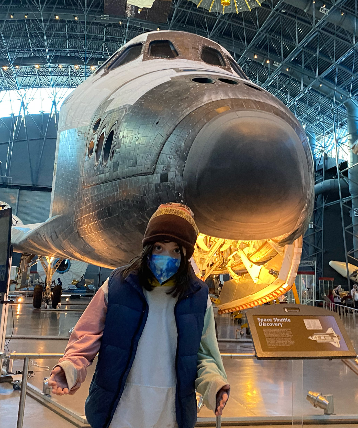
I still can’t believe I’d never clocked this before; as a typographic geek and a space geek who has spent far too much time looking at pictures of spacecraft in books and online, you’d think I’d have encountered this before, but, nope. Or if I did, it didn’t make enough of an impression to consciously note it or remember.
But now that it’s there? I can’t unsee it. And I’m sort of delighted by that.


“Good enough for government work”
Well, that took a keen eye to spot.
For about a year, I had a recurring nightmare about a Space Shuttle aborting a landing and then not have enough kinetic energy left to try again.
That they nailed every landing of the ones that survived launch and re-entry is a testament to the training and technology involved. They were, after all, essentially very heavy gliders at that point of their missions.
I saw Challenger blow up live on TV and to this day, the words “throttle up” still haunt me.
When I lived in SE Texas, we made a trip up to the little town of Rusk where pieces of Columbia (not Colombia… ahem) came raining down. We were there to ride an old train to Palestine, TX and back, but also stumbled upon a memorial of sorts for the astronauts and documentation of where pieces of Columbia were recovered in the area.
Apparently, there were many incidents of protective foam shedding from the external fuel tank or supporting structures and hitting the Space Shuttles during launch and some other close calls to disaster.
RIP to those who perished and prayers for peace for those who supported them. I really can’t imagine the mental trauma those two accidents caused everyone involved.
I was in hazy years ago with some autist who discovered that about discovery and began ranting about it. I later heard a story about it from some air force space guys and some that have since turned space force guys echoed by a few others but don’t really remember the details. Something about they noticed at some point but just left it.
I still remember my dads aerospace engineer buddies after Challenger they knew it would do that because the temperature was too low and was out of spec for the seals. They called everyone they knew to get them to abort to no avail. They were messed up for a long time. They were working a primary defense contractor right outside of DC with some NASA contracts as well as lots of DOD contracts and contacts I always thought that was a bit strange.
Yeah, it’s well known that a bunch of people raised alarms about the o rings and got ignored.
Wow Otto is getting big.
Shuttle Colombia?
Despite being a more recent than Challenger, the loss of Columbia is not so etched in my brain. I remember it happening, but not where I was at the time. My whole school watched Challenger blow up live, one of our teachers was a runner-up to Christa McAuliffe for Teacher in Space (and he was a cousin of mine to boot).
Being a graphic design obsessive is bad for your mental health. The little serifs on the circle around the current Nissan logo being perfectly parallel, so that they look as though they’re flaring slightly outwards, picks at my nits every time I see it.
And, as if things weren’t bad enough, the horrible kerning of “USA” on DJ Trump’s baseball cap feels like a pointer to everything else that’s going wrong.
If his cap really reflected how bad everything was going, the font on it would be some horrid conglomeration of Papyrus and Comic Sans…
Bad kerning with a Times-style serif font shows real dedication to chaos.
It probably couldn’t be painted over without looking, you know…painted over. That leaves cutting it out, but that’s likely a whole section of ship, not just the patch the inverted S lives on. So live with it
I wonder if it was an *intentional* choice to do with the way the curvature of the body influences the perception of the lettering? The upper part of the ‘S’ being slightly further away from the viewer when seen from a right angle to the horizontal plane, which might make it appear smaller, making this the less visually odd of the two choices? The positioning of the ‘S’ on the port side doesn’t appear to have that same level of variation in the body, vertically.
Of course, NASA could have avoided having to work around that challenge by making the names of all the space shuttles palindromes.
Orlove’d!!
This took me back to the time I didn’t spoke/read English very well, so I had to read the Brazilian version of Jalopnik. I thought that Raphael Orlove was a fellow Brazilian (same first name as me, save for the PH).
Jalopnik Brasil was cut off from the main site around 2014, and what was left of it regrouped and became flatout.com.br, which was actually quite good, sort of a Brazilian version of the Autopian, but years before.
Thanks for the trip down memory lane 🙂
there’s a name I haven’t seen in a long time
I’ve been there 2x never noticed!! I bet it was an inside joke and it made no sense to correct, they would have to remove the blankets and replace them to redo the name.
In space, there is no “upside-down.”
“Next, we’ll draw a more different S…”
The “S” is for sucks.
And now consummate (and thicker on the port side) Vs.
There’s a motorway sign near me (UK) where the number 8 is upside down.
Tried to find it on Google Maps, but no joy. I think there’s a truck blocking the view
Obviously I’m not going to try and photograph it while driving.
It’s like the weavers who would make ornate oriental rugs by hand, only to tie one knot incorrectly, because “perfection is for the gods”. That saying is my standard response to someone saying “It’s not perfect, but…”
Several geeky/picky things I’ve never noticed: typography glitches, body panel alignment, and bad-sounding MP3s. I think I’m better off that they don’t bother me.
It all evened out on the launch pad when all the letters were rotated exactly 90 degrees.
Not to take it too dark, but the ‘B’ in the “ARBEIT MACHT FREI” gate at Auschwitz is also upside down. Allegedly as an act of resistance by the prisoners forced to make it.
Thanks for reminding me that I need to build the Lego set that’s been sitting in my backlog for 5 years.
This one? https://brickset.com/article/58344/review-10283-nasa-space-shuttle-discovery
Looks like the Discovery name is a sticker, so make sure to use a craft knife to cut out that one letter and turn it upside down.
Great idea! I’m all for authenticity.
Stencil story makes sense, but equally plausible is that whoever was doing the stencils flipped it upside down just to see if anybody would notice, and it took this long. In my professional career, I have hid so many easter eggs on things from circuit boards to promotional materials to advertising.
I went to high school with a guy who had a part time job at his dad’s car dealership, doing, among other things, applying the dealer name decals to the trunk lids. He used to intentionally remove a decorative underline under the logo, just to get some amusement out of identifying which cars he did out and about in traffic
I could see that. There would be certain thrill getting to see an imperfection I created that only I could see. Somehow way more satisfying than just knowing I was the guy who stenciled the letters.
Some Volvo 850s have a herd of moose on their instrument cluster PCBs thanks to someone with a similar sense of fun.
PYLE!!!!!!
I am not sold. The word lies. on two planes, joined by an angled convex rib. The pics where it looks upside down are all from below the belt line, and the upper part is skewed more and differently from the lower.
I’d like to see pics from above the belt line. And considering other comments, from above the belt line on similar dates.
In a zero gravity environment, the S can work in many directions.
Letters were applied by a Jeep owner and typography enthusiast. Somewhere on the shuttle is a bumper sticker readingIif the starboard s reads I upside down, flip me over.”
Maybe it was like what the carpenters did with staircase spindles.
An old religious tradition holds that only God can create true perfection. Carpenters would intentionally leave one spindle upside down to show humility and acknowledge that human work always has flaws.
Nothing more humble than deliberately flipping a spindle to avoid the otherwise inevitable perfection.
Also I’m still mad at the entire staircase industry for call a helical staircase “spiral”.
I understand and appreciate the gesture but I know all of my projects have flaws and I didn’t have to intentionally put any in.
I believe Navajo weavers do the same thing
I make sure all of my work is flawed to anvoid incurring the wrath of the perfection gods. Most of my work is deeply flawed, just to err on the safe side.
When Discovery was delivered to the Smithsonian, they first did a flyover of the National Mall. I was lucky enough to be working at a building on the Mall at the time, with legitimate access to the roof. Best day on the job.
That would be worth securing illegitimate access for, I think!
Yeah but did you notice the s?!
Cool. I was there that day, too!
I worked on a high floor of a building in the Financial District of NYC and got to see the shuttle piggy backed on the 747 flying up the Hudson.