


Over the past few days, I’ve done a lot of driving. With a lot of driving comes two things, of course: lots of urinating and lots of stopping to get fuel. Fortunately, you can often do both at the same place, though most gas stations prefer you go inside to pee instead of just letting loose at the pumps, which I attribute to lingering Puritanical influences in our culture.
As a result, I ended up spending a good amount of time staring at gas pump display screens, and found that some old issues I’ve had with them are still extremely present. Specifically, the UX used on these pumps is piping-hot garbage.


I’ve actually talked about this before at The Old Site. Even this very same gas pump UX before, which hasn’t changed one bit since I bitched about it in 2019. Only this time, I’m a little less sure of myself, a little less willing to be as dismissive as I was before, because I’ve found that this whole thing actually brings up many more complex issues than I initially realized, and I think those issues are worth discussing.

The interface I’m talking about is one that I’m pretty sure you’ve seen before – if you remember any of its screen displays, I bet it’s that one above– and it’s used on an extremely popular gas pump, the Gilbarco Encore 700 S series. It’s a fine machine, generally. It pumps gas into the car, I’ve never seen one explode, it takes my money, all that. It does its job.
But why are all the user interface graphics and the overall so… amateurish? I mean, look at that image up there, with what appears to be a hand-drawn ’73 Camaro Z28. It’s not a bad rendering, as such, but it’s not exactly professional-grade. It feels like the work of a talented, young artist still finding their style. And the way it’s integrated into the screen display is, to be charitable, crap:

I mean, look: the edges have obvious aliasing from where it was once over a white background, that fuel pump graphic is just slapped on, in the wrong place for the car, in a different style – it all just looks like it was knocked out in six minutes by whoever coded this system while they were eating a sandwich.
Gilbarco is a big company! Why is this so bad? These machines are not cheap! I was a designer for years before I saw the light of motorjournalism, and I would never have let work this half-assed go out to a client. Never.

Then there’s the question of why some of the simple text information screens seem to run at a resolution that’s about 1/3 of the other screens? Why does the text get all pixelated for some screens and not others? It just feels like nobody was able to give one single solitary shit about how these interfaces actually looked.

And why, exactly, are there two display types here, again? Why are we still using those old seven-segment LCD numerical displays when that high-resolution full-color display inches below it could easily display the price and fuel amount displays? Why keep the old-school numeric displays? I don’t get it.
Years ago, I actually contacted Gilbarco about this for a follow-up, and was told by an employee that there were at least some people in the organization railing against the “Commodore 64-level” (their words) displays. But despite any internal pressures, it does not seem that Gilbarco has decided that this is something worth pursuing.
I was complaining about this to a friend, who told me, “And? Not everything has to be professional level. I think it’s great.”
And you know what? I think she’s right.
Or, at least partially right, right enough that I’ve been thinking about this ever since. You know what I would have done if these interface displays were polished and professional? Ignored them. I wouldn’t have given them a second thought. They would have blended into the competent background of the world, inoffensive and deeply uninteresting.

Would that have made me happier? Honestly? No. The mild incompetence I see in these gas pumps gives me some perverse delight. Life is actually more fun when things are a little slipshod or misguided or sloppy. The pumps (generally) work fine, or at least good enough. Sure there’s some annoying stuff – why is there a physical keypad for some number entries, and sometimes it’s on screen? Pick a lane, Gilbarco.
But the charmingly hand-drawn Camaro? If I’m honest, I love it. I would take that over some AI horseshit car any day of the week, and with a nice stiff drink on Shabbos. In fact, I’d love to see more amateur automotive art on gas pump screens – gas station chains should let people load pictures of cars (photos or artwork, whatever) to gas station websites and (well, after making sure they weren’t full of slurs or genitals) then those pictures get sent to gas pumps all over the country! Why not?
Life is just more interesting when it’s imperfect. For example, at this moment I’m writing this during a layover at the Denver airport. This airport is famous for a terrifying piece of public art that’s nicknamed Blucifer, a demonic colossal blue mustang with eyes that glow like crimson hellfire.
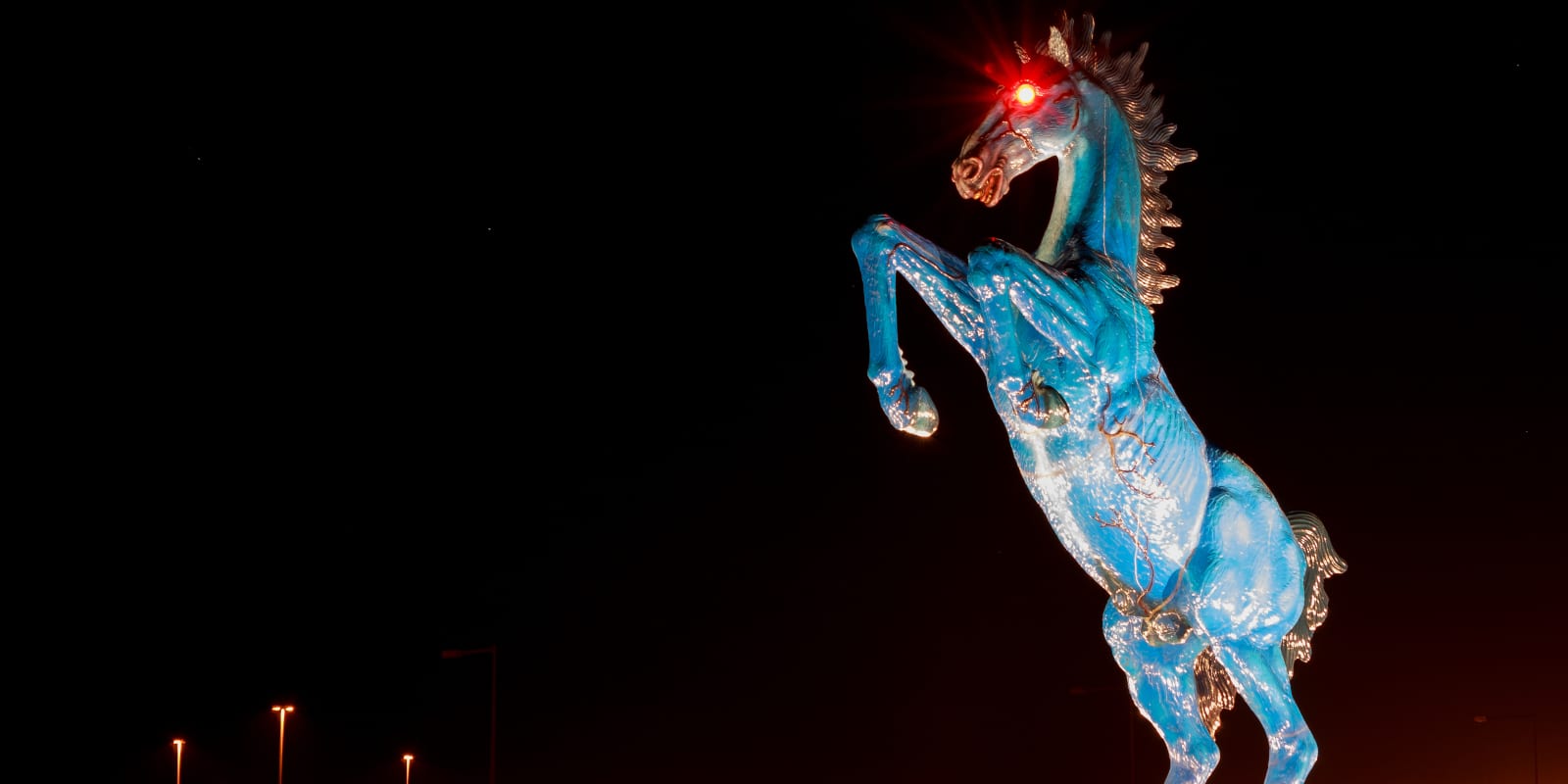
The artwork has a tragic backstory, as the artist behind it, Luis Jiménez, was killed in the process of building it. The resulting artwork is striking and, let’s be honest, a deeply strange choice for an airport sculpture.
Nothing about Blue Mustang (the actual name of the work) suggests travel or any of Denver’s rational sources of pride. It’s an unhinged monument to untamed, wild rage – not the thing a committee would pick for an airport. As far as rational decisions go for airport art, it’s a disaster.
It’s also spectacular.
Blucifer is why people are excited to land at this airport. A carefully considered, reasonable monument would be as compelling as a frisbee full of tepid chowder. The misguided decision is the best decision here because it makes life more interesting.
My friend is right. Why the hell do we need everything to be so professional all the time? Not everything needs to be polished to a mirror finish. Let’s see the fingerprints and smudges, let’s delight in some kid’s excellent drawing of a Camaro that somehow ended up on thousands and thousands of gas pumps all over the country.
Let the Swiss or whoever have their precise, controlled, rational lives. A little bit of chaos and imperfection sprinkled on life adds some much-needed spice, and I think I’m happy to see some when pumping gas.
That said, it can’t hurt to get the stupid typography problems sorted out, Gilbarco. And let’s get some new hand-drawn cars in there!
Top graphic image: Jason Torchinsky


Nothing about Blue Mustang (the actual name of the work) suggests travel or any of Denver’s rational sources of pride.
From what I understand, Denver has a horse-adjacent football team. Whether or not that’s rational or a source of pride is debatable, I suppose.
awww the Denver Broncos
Colorado resident here and this is the correct take.
My pride in the Broncos changes weekly based on the outcome of their most recent game. If I go through the trouble of putting my lucky jersey on and then they lose, well that leaves me less than prideful. Now I’ve got to wash the jersey to get the bad luck off and then hope they win next time I wear it so it’s luck-o-meter starts to go up again. It’s can be quite frustrating.
Maybe you aren’t doing it right. If the luck has run out you need to get lucky in it to put the luck back in it. I wish we had More scientific people on here so I wouldn’t have to explain everything.
Yes people it’s a joke!
See another explanation.
Huh. I’ll have to try that next time they lose!
Bronco not Mustang, orange not blue, I should know we had a horse once
But You can paint a horse whatever color you want.
Now that’s a horse of a different color!
A bronco is just an untamed horse, not a breed. A horse can be both a Mustang and a bronco. I’m also fairly certain the football team colors are both orange and blue.
One of my local stations features a comically ersatz ’69 Mustang when the screen gets to the come inside to buy snax pitch. The headlights are unmistakable, even if the body’s a bit off. And it’s jet black, so I like to think it might be a Boss 429.
One of the Sunoco stations on I90 in NYS had a sweet C3 Corvette on its screen, complete with 3-spoke wheels. It had a similar lunar eclipse going on, too.
C3 should be C4 btw.
this is a common one on Exxon/Mobil stations I believe. The 3 spoke wheels kill me every time. They look like knock off/badly drawn Antera Tri-Spokes
I somehow skipped the transition paragraph to Blucifer in my initial read. This led me to read the story as having the artist who drew the Camaro as having died during the creation of his art. I was immediately intrigued as to how that might have happened…
I’d assume in a freak gasoline fight accident while doing field testing of the artwork
I’d assume because he parked his Art Van Studio next to the Camaro he was scketching and a gang of mullet wearing Camaro owners killed him.
Found what seems to be the original illustration:
https://i.pinimg.com/236x/5f/81/2e/5f812e29d1419978b831bc36d4a987b7.jpg
I’d reckon it was drawn from reference. Would be interesting to find what the original photo was.
See that one has better proportions; the one on the gas pump has the front end shortened quite a bit, which just looks awful. Do you think someone just snapped a photo of that drawing at an ANGLE and said that was good enough? I have so many questions how something so bad came to be.
Since we are on the subject of Point of Purchase Graphics, does anybody remember the first generation of “Self Checkout” systems where it had a generic middle aged lady with her pants hiked WAY UP? I tried to find it a while back and couldn’t locate the graphic or anybody discussing it.
I would also note the Camaro as pictured was not offered by Chevy as the split bumper was a Rally Sport package option and those Camaros had round turn signals beside the headlights, not rectangular below the bumper. I also pointed this out in today’s Shitbox Showdown. Many Camaro owners retrofitted their cars with Rally Sport bumpers because it proved a popular look, so as a customized Camaro the drawing is valid.
One thing to take into account: The guys who make the gas pumps are primarily concerned with selling more gas pumps, as they should be. If putting another dollar into better stock art for the wallpaper doesn’t sell any more gas pumps, it’s just burning money.
Gas stations know they won’t lose customers because the pumps have ugly art, and so the pump manufacturers know they won’t lose customers because they have ugly art. Why, then, spend money on beautiful art?
At some point there’s a crossover, where the thing appears to be so utterly incompetent and sketchy that gas station customers might be turned off, or that gas station owners might be worried that they might be turned off. The moment you cross that threshold, any money spent on making things particularly nice is wasted.
Finally a businessman. I have a local station that after 4 months hasn’t corrected the one screen that doesn’t show you the step by step instructions because it’s damaged like a 1984 Lebaron electronic display dashboard. I can now pump gas without reading instructions. It would be nice if they were all the same
The audio for ads playing on fuel pumps needs to die.
I use the same gas station nearly every time for these reasons:
1) Easy to get into and out of.
2) CC reader asks me no questions; slide the card in, wait for the click, pull it out, push the octane number.
3) NO GODDAMN MUSIC
My go-to is my go-to because
1) Across the street from work, and
2) 8 cents a gallon cheaper than any other station on this side of town.
Luckily this place is always on par with the others price wise, but I’d gladly pay extra just for the peace and quiet.
SORRY I CAN’T HEAR YOU OVER OUR SPONSOR
You can see the heavily-worn unlabeled white buttons to the side of the display so presumably the photographed pump at least at some point would blare ads or “viral” videos at you prompting people to rage-mash all the buttons trying to shut it up. Usually one of those mutes audio, though I have run into some particularly evil ones that evidently had that mute function disabled.
sometimes it takes two button simultaneously
I’ll remember to try that if I come across one that a single button doesn’t mute it.
Since going EV the only gas I buy is for my mother’s car, so every 3-4 weeks I stop by Costco and enjoy a few minutes waiting in a ridiculous line, but it’s a small price to pay for cheaper gas and silent pumps.
Two screens and a speaker to keep you distracted from watching the amount of money your “freedom fuel “is costing you.
i didn’t even realize that there is GSTV network.
DETROIT (June 25, 2020) — GSTV, the national video network entertaining targeted audiences at scale across tens of thousands of fuel retailers, today announces a new partnership with Emmy-award winning journalist and AfterBuzz TV co-founder Maria Menounos. Menounos will produce custom-created content based on her popular podcast and daytime talk series Better Together with Maria Menounos, sharing tips for improving physical health, emotional wellness, spirituality, finances, relationships and more.
They want the 0.3¢ they get from serving you ads. But nobody says the speaker has to work.
This is quite a few years back, I haven’t seen Maria Menounos on the gas station TV in at least 5 years
Where I live in the very most northern part of Wisconsin,she’s still On !
My guess they are repeats ?
I still see them in the Baltimore area.
“Do you have a mockup for this?” I asked. “No, just figure it out – it’s due Monday”, the product manager said.
There I was in my cubicle at 8:30 on a Friday night, hacking out a user interface in C#. I basically just reached down and pulled it out of my ass, committed it to source control, and went home.
A few months later, I was walking by a training room and there were 100 people inside, all learning to use this UI that came from my lower torso. They would have to work with it day in, day out, possibly for years. I suddenly felt awful that I’d put so little effort into their user experience.
I suspect that’s what happened here.
Imo this is still better than the Wayne pumps that have begun appearing at Canadian Chevron locations after Sunoco bought out the franchisee.
They have a huge, high-resolution colour touchscreen with speakers that you use to perform various operations (such as selecting your octane, entering your PIN if you insert your card, etc.), which then serves you promotional material with sound while it pumps. Or, at least they did, as all of the locations I’ve recently visited with these pumps have defaulted the sound to be off. I’m not sure if it’s because customers were complaining or because the attendants were finding them annoying (these are in a city that requires gas stations to have attendants on duty, though they aren’t required to pump your gas, similar to Oregon).
Also, the pumps are clearly made for the US market and barely localized for Canada, as even though they measure in litres, count in CAD and have options for English and French language, they still have an “ADA” option on the screen when the equivalent legislation in Canada is “ACA”.
I only know the brand because I wanted to know whose idea all of this was. Thankfully they are quite prominently branded so it wasn’t that difficult.
I paused at “touchscreen” and it just went downhill from there.
Speakers, audio, ads. Ugh. Another reason to take the bicycle.
I’ve slowly started seeing these appear at newer-build stations in Texas. Namely, since Casey’s bought out Cefco, as those stations are getting renovated into Casey’s they all have those pumps with the ginormous touchscreen.
On one hand, it does appear that at least a single, if not two, solitary shits were given about the UX design. However, despite being a month or two old at best, the graphics and interface had a noticeable amount of lag. The background animation- which was a lightly animated slideshow of ads for stuff in the c-store, seemed to be running at about 5 FPS, so even rendering a hotdog sliding across the screen was overwhelming whatever bare-minimum SOC jammed in there. This lag extended not just to the ads but the $/gallon counter too, I guess they figure barely anyone pays with cash anymore, and if you do, you probably have to pre-pay, so being able to stop the pump exactly on $20 was not considered a significant design criteria.
Also, with no physical octane buttons to press, you can tell people were still just poking the screen with the nozzle (which did work as the nozzle is presumably grounded and thus forms a circuit the touchscreen can detect) as the surface was already noticeably scratched up and chipped over the big 87 “button”. I’m sure those will age beautifully.
I don’t know where you’ve been getting fuel, but that bottom screen is used for forcing a captive audience to watch commercials.
And a 2 1/2″ trim nail is long enough to permanently mute the speaker.
The separate LCD display for price/volume is probably because it is easier to certify for Weights and Measures compliance.
The bad resolution is because these things last forever and backwards compatibility. There are probably some ancient CRT displays still out there. As long as it pumps gas and collects cash, the gas stations don’t care how bad it looks.
Agreed. I can’t prove this as fact but I danced in the world of weights-and-measures and certifications in my wild youth and came to the same conclusion. My guess is that old seven-segment display is W&M approved and building/testing/certifying a new integrated screen just wasn’t worth it (or even possible) at the time.
This was my guess as well. The circuits are probably all hardware logic gates that aren’t susceptible to software hacks. The video screens are definitely running some sort of Android or cheaper OS that are probably not too difficult to hack.
The last gas pump that caught my attention were weird and crappy pumps at a gas station in Waynesboro, VA. The interface and screen stuck out far with weird buttons, including a keypad. I thought it might be a card skimmer but it was so elaborate I took a chance. It of course, like so many pumps, gives the option to press a button to skip entering PIN and run as credit, but the pump just BOOPs at you when you try to skip the PIN.
Then, when I started filling the gas I noticed about a minute later that I had only pumped 50 cents worth of gas. From what I understand that can mean the underground tank is almost empty, so I stopped that fuel-up and went to the next gas station right down the road.
It had the same pump interface. Again pressed O to skip credit, nope, BOOP! But they had gas at least and it was only $3.99.
Also why do I need to press three different buttons that say Yes (or No)?
Is this a debit card?
Would you also like to purchase a car wash today?
Do you have a DataHarvester’s Club Card?
Well I for one want to know why someone would use a frisbee to cool their chowder.
It’s shallow and wide. Lots of surface exposure. Perfect vessel for cooling chowder.
Flawless logic.
Those placeholder default design are a gem. I miss seeing them. You don’t see them at franchise gas stations ever. It’s always buy our drinks, subs, pizza, zin, dip, or rewards.
Blucifer is a menace every time they move it some one dies. Last time I drove by where it is it was all closed off. By my daughers friend got in there to take pictures with it recently. They did have that illuminati museum in the new part for a while. I heard people were making sure they had to time to see that.
I’m willing to bet the number displays stick around because people are more likely to trust the price when the display looks like a typical calculator. Same way I trust the slot machines with wheels instead over the ones with graphics and digital lines. I know they’re both going to screw me, but at least one makes it look natural.
I have never seen that graphic in my life. And I live in the same state as you.
Ive only ever seen them at non franchise gas stations. Small local chains sometimes too. Sometimes even those eventually get switched out with something relevant to them.
I don’t care how low-res the screen is. If it doesn’t blare those fucking ads at me the moment fuel starts flowing, it can have ten of them.
And before someone tells me to mute it, there are multiple gas stations in my area where there is no mute or volume function.
It should be legally permissible to jam a flathead screwdriver into the speaker grille in those cases. Wiggle it around, give the machine a digital lobotomy until the sound stops.
I mean, as long as nobody narcs on you….
I as a “Fuel Transfer Technician” in college, and I am 99% sure that a Camaro of that vintage would have the gas filler behind the license plate.
This one is wrong too.
The cheesy corner station has the same crap but the images is a low budget corvette.
With the tri-wheels?
yes!
I wonder what are the odds.
My cheesy gas station is a Shree’s in Seattle.
Yep, I was gonna mention the 3-spoke C4 Vette.
For everyone’s favorite source of news and entertainment, Gas Station TV!
MUTE
Not always possible.
It’s often the second button down on the right, but yeah if it doesn’t mute I avoid the place.
I’ve tried every combination at the Shell and also Wawa near me and nothing works. Apparently I’m not the only one because many of the pumps have layers of duct tape over the speaker.
Is it unmarked?
I’m going to give that a go. This forced exposure to shrieking advertisements when I’m already giving money to the gas station makes me irrationally angry.
Yes, unmarked beside the big color screen. I have about a 70% success rate.
This finally gives me something to look forward to when pulling up to the pump. Who can say that nowadays?
Silver linings everywhere!
Phil the gas pump hacker!
Used to be top two buttons simultaneously but not so much now. Second two buttons is sometimes some type of diagnostic mode, but I wouldn’t recommend using that while getting gas.
The ones around me usually use the second button down on the left as a mute button.
If the choice of gas station media is either a hand drawn Camaro or Maria Menounos hawking her latest podcast, I’ll take the Camaro every time.
Even if there is a minivan parked next to it.
I get most of my gas at one of two places. The Meijer down the street from the house, or the Marathon on the way to work. Like 95% of my gas in 4 cars comes from these two locations.
Neither has annoying pumps with advertising running 24/7. Which is what that second screen seems to be for. The UDF by my mom is one of the 5% exceptions I use and the constant bombardment of advertising today…