
Something that I love about every writer at the Autopian is that we’re not just mindless car news drones. Each and every one of us has a personality and injects it into every story. I’m a little unhinged, David used to eat spaghetti in showers, Adrian is sassy, Thomas is a fun living encyclopedia, Stephen Walter Gossin can fix anything with a smile a country mile wide, the Bishop is an easygoing artist, and Matt reminds you about pop culture you forgot about. But Jason? Oh my, I’m not sure anyone can predict what’s going on in his head.
Jason wrote about a bizarre old Winnebago brochure and used his colorful language to describe it. I mean, just take this bit:
The hell, Winnebago? Why? Why do we need Col.Sanders and his favorite daughter, Herbsann Spices Sanders, promenading in front of this old plantation house to their massive, parked RV? I get that we look at this sort of scene through different eyes today, just seeing a miserable time of oppression, but even back then, why is this a way to sell RVs? I just don’t get the connection here?
Bob Rolke:
Herbsann Spices Sanders, don’t ever stop Torch.
Spikedlemon:
These pictures smell musty to me.
Bronco2CombustionBoogaloo:
The woman standing between two beds with a mirror in one hand and a birdcage (?) in the other could absolutely have been one of those 70’s prog album covers designed by Hipgnosis.

UnseenCat:
So much of the RV market, especially big motorhomes, are primarily bought by retirees. So the marketing department has to use the current styles that are popular with the older demographic.
In the 60s and 70s, that meant the peculiar stylized “Old-Timey” vibe of that era. It was freaking everywhere. Just like 50’s nostalgia was so damn pervasive in the 80s where styles otherwise tilted toward avant-garde futurism, Bauhaus/brutalist design, or gritty punk.
It’s why today, as you go up the price scale in big class A motorhomes, the interiors now look like a combination of cruise ship, casino, and tourist-resort hotel design. Because that’s what the late Silent Generation and early Boomers are familiar and comfortable with in their travels leading up to their retirement years.
The next wave is probably going to be greige and “modern farmhouse” HGTV slop because that’s what’s been foisted off onto aging Gen-X homeowners as fashion. It’s already entrenched in mid-price RVs.
As older Gen-X who just freaking can’t stand mass-market HGTV “style” it’s annoying when I go looking at motorhomes on sale, used or new. I just want practical and comfortable, not overwrought or trendy. A few manufactures do, fortunately, offer “basic” interiors like that. As soon as I see some of the gaudy or trendy stuff, I nope right out.
The funny part is that UnseenCat is so right. There are already campers built to look like the interior of a “modern farmhouse.”
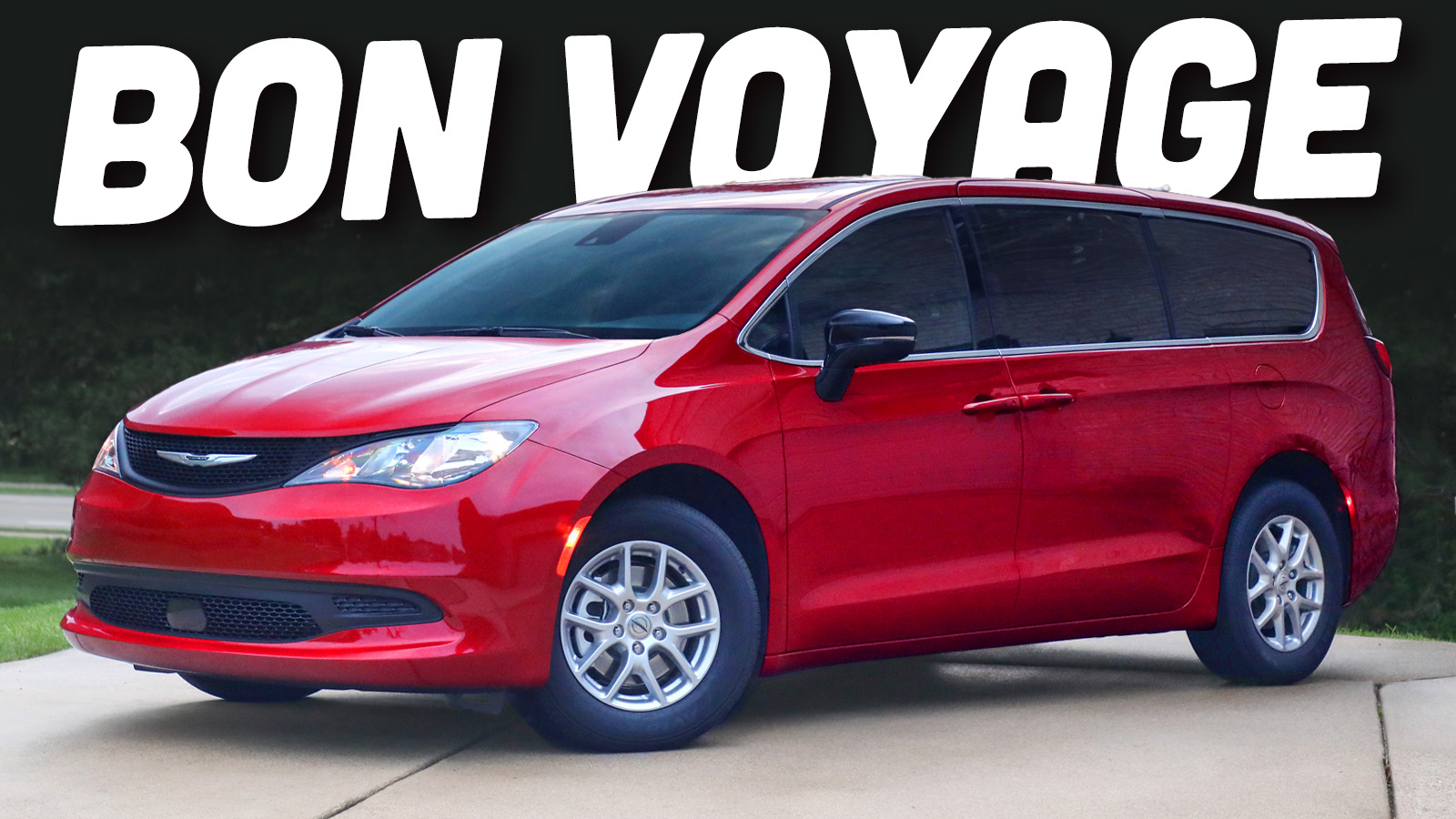
Chrysler is a one-trick pony now as it just killed the Voyager, which was already just a rebadged Pacifica. Matt Sexton:
Bugatti is a one-car brand also, so I think Stellantis is seeing the success there and figure they can obtain the same cachet with Chrysler?
Have a great evening, everyone!
Top graphic image: Winnebago


Jason is indeed a national treasure… now Torch, when can we expect the next installment of the Mack Hardigraw series!?!
You, my dear, are completely unhinged in the finest, most delightful way, and I literally subscribe to your newsletter!
All y’all are doing great, keep up the good work.
“Jason Torchinsky is a National Treasure”
I’ve said exactly the same about David Tracy once before.
Hey hey! I made the cut again!
I don’t know how much extra work COTD is but it’s definitely a fun thing that brings us all together, creates such great commentary, and draws knowledge out of the membership oftentimes to boot. Really glad you do it for us.
I didn’t see it at the time, but spot on with that Hipgnosis comment, especially with respect to WYWH and maybe The Lamb. I was thinking of some Rush covers too, but looked it up and they weren’t Hipgnosis.
Talk about “now I can’t unsee it.” That headshot of the lady with the flowers at the bottom looks like a Todd Rundgren album cover based on a lithograph of his girlfriend.
I’m once again amazed and flattered that my brain-droppings have been worthy of COTD material! I’m once again proud to be part of the greater Autopian collective’s truly distinctive tendency (Compulsion?) toward the depth, breadth, and obsessiveness of uncovering the most obscure knowledge… Automotive and otherwise.
Also, I 100% agree with Bronco2CombustionBoogaloo that the photo in question looks like a Hipgnosis album image design. I was thinking the same thing when I saw it!
Jason is great, indeed one of the two great writers here. I always read his stuff.
I’ll let you all duke it out over who the other great writer here is…
It’s Mercedes, sadly David no longer writes for the Autopian as he has fused with his Jeep on a cellular level.
You don’t have to be shy, I’m right here in the comments