


I was doing a little demographic research on the Greater Autopian Community using an experimental AI system I developed in COBOL for the recently-upgraded Autopian Mainframe (a massively parallel array of over three Mattel Aquarius computers with the 16K RAM expansion packs) and I was surprised to find that a shockingly high percentage (98%) of our readership is planning to open an art gallery in the immediate future, but also has zero artwork to populate that gallery with! Since this problem affects thousands of our community members, I leapt into action with a solution, because that is what I do, people.
I also soon discovered that the demographic information I was being presented was a complete AI hallucination, so technically all of this is moot. But! Not entirely, because there could be someone out there about to open a gallery and realizing they have nothing to put up on the walls. This solution will still work!


Here’s the plan, and, like all worthwhile solutions, it comes from an old car brochure. In this case, a French-language Pontiac brochure from 1969. I don’t know who the hell in France was looking to buy a massive land yacht of a Pontiac in 1969, but whatever, that’s midcentury GM’s problem. What I do know is that this brochure had this wonderful illustrated spread of features and options on the ’69 Pontiacs:

As usual, there’s beautiful artwork here, even if it may seem like mundane commercial art. But change the context, and I think we could have some gallery-worthy pieces! Just enlarge and reproduce these on canvas, and boom, you’ve got some compelling works. Plus, they’re all the same square format, so you can buy square frames in bulk for big savings!
Let’s see what we’ve got here:

We can start with something a bit traditional, a portrait of a family. It actually reminds me a bit of Alex Katz’ portrait works, and I think could exist in a similar sort of space. There’s something a bit off-putting about the smiles and the sunglasses that lend the work a bit of an edge.

A tilt steering wheel diagram, aggrandized and enlarged and in a gallery context becomes something much more striking and beautiful, a sort of almost-floral near-abstract piece with a little bit of Fernand Léger machine-era influence.

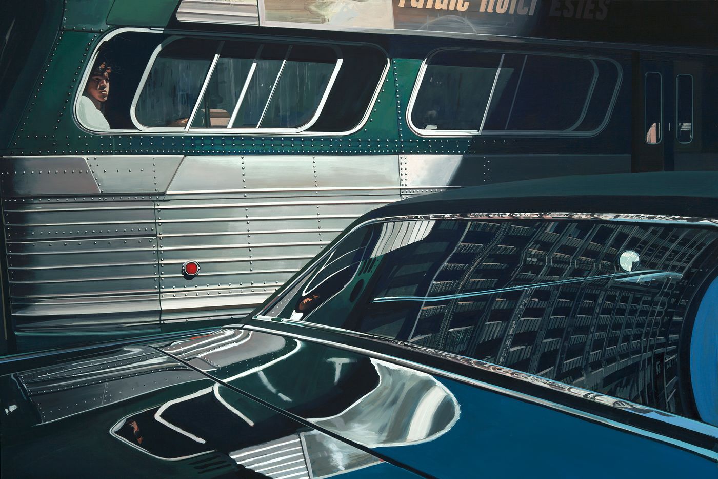
These lovely close studies of marker lamps in chrome surrounds have the same careful attention to light and reflection that a photorealistic painter like Richard Estes strove for. Intense, close observation.


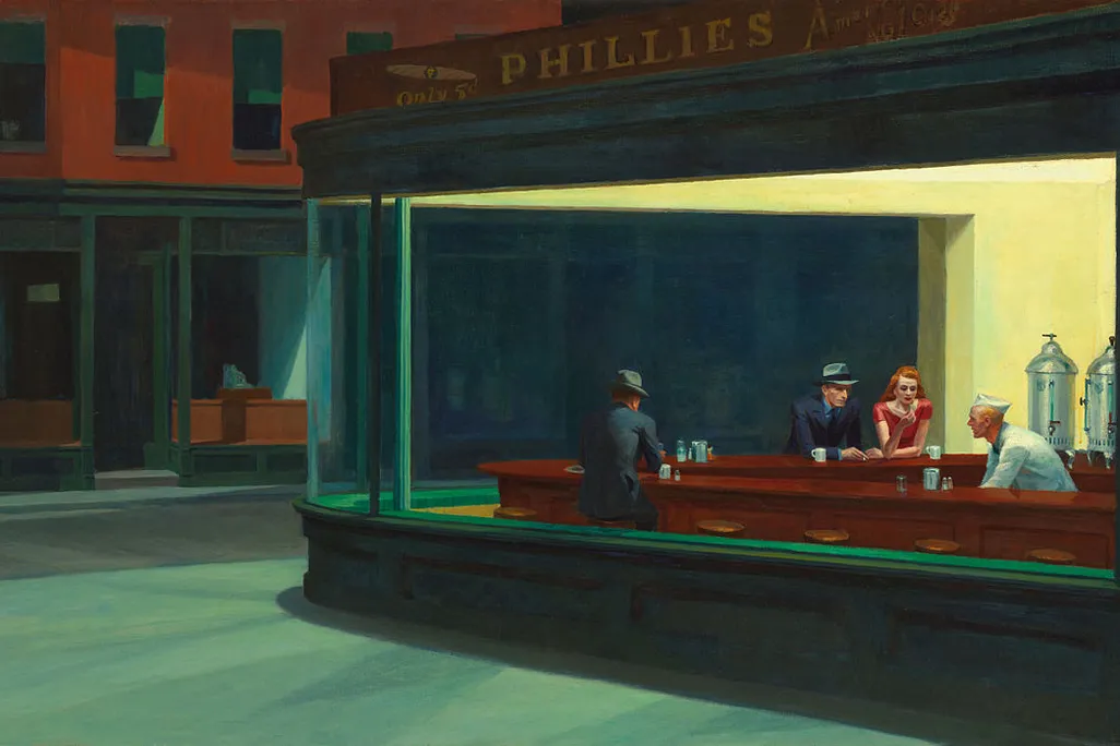
I’d pair these two together, as they both have the same sort of moody, Edward Hopper-like appeal, with the common theme of darkness punctuated with shafts of golden light attempting to cut through the gloom.

At another extreme, this deceptively simple study of towing feels like Matisse’s late cut-paper works. There’s a real energy here, with the offset overlapping colors at uncomfortable angles.

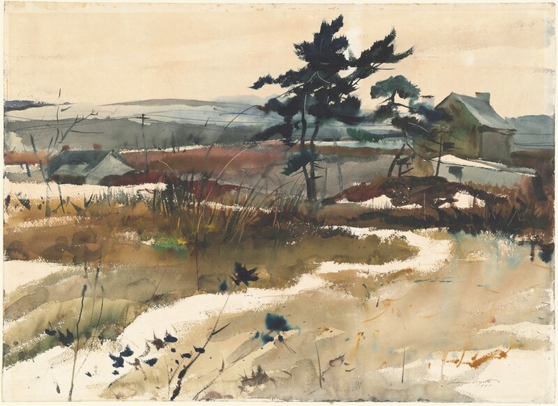
The snowy landscape, with its brown winter-dormant plants and lovely overall bleakness calls to mind the work of Andrew Wyeth, just with more Pontiac.

There’s a lot of pop-art appeal to this one, especially with that deep saturated red background. This could be a Warhol silkscreen, maybe if the colors were a bit more off-register. A lovely example of the mundane (a bank of window switches, a pedal pad, half a steering wheel) recast as grand elements.

This Pontiac beak, made of that magic self-restoring Endura polymer, makes for a striking portrait, so enlarged and close that it almost blurs into abstraction.
See? look at that! You could absolutely fill a small, thriving gallery with these pieces and have a fantastic opening, provided you don’t cheap out on the charcuterie and booze. Wine is great, but let’s have some gin and tonics, too, why not? Tipsy people are more likely to buy paintings, after all!
Good luck with the opening!



I see what you’re up to here Mr Torch. Using your clever Autopian Intelligence (AI) Rorshach images to place ideas in our brains. Well, I see right through it, like a lightbulb through the colored fresnel plastic of a VW taillight. Oh no, you won’t drive me buggy! You see the Thing is ….Aghhh …
I would genuinely love to go to an art gallery filled with random images from old car brochures.
Most of these are actually very pretty. My god how far we’ve fallen as a species…
French? With no cigarets? I don’t think so. The towing picture looks more South Park to me.
So a couple boxes of wine and a bowl of trail mix….not good enough?
Obviously, a Parisienne would need a Parisienne, and since this is a French Canadian brochure, it works since the Parisienne was sold in Canada at that time.
c’est magnifique
Brilliant how your mind works JT. This as posters could be some decent Autopian merch
I had fun first looking at each pic to see which of them I would pick, and then seeing how well I matched Jason’s choices.
I hope one of these days one of the original artists for these brochures is shown one of these articles, and Torch gets to talk with a 90 year old former commercial artist about it.
Not being super familiar with Matisse’s work, I took something slightly different from this one.
Look at the red pieces. The trailer is canted forward and the back of the car is lower. It’s almost a subconscious rendering of how not to tow and, as mentioned, it’s red – a widely-used sign of danger.
Now look at the white. The trailer is level and the back of the car is not sagging like it was in the red. It represents a proper and desirable towing situation.
I wonder if that was intentional.
I think this what they call an art education.
Remember: if you’re not part of the solution, you’re part of the precipitate!
Some of us are part of the offgassing.
*politely moves upwind of Twobox*
I’d never heard of the Aquarius! It came out just after I’d had a job for a couple of summers working on Intellivision software
oh wow! you dealt with 10-bit bytes!
MIDI also uses 10-bit bytes to this day.
How am I not surprised you know that obscure bit of trivia? We usually called them decles when we had to name them
I’m reminded of a high school buddy who had a Trans-Am screaming chicken tattooed on his shoulder. He’d already made a number of poor life choices at that point, and I imagine the reason I haven’t heard from him over the last 30 years is that he hasn’t made parole yet.
I once wrote a song about some jock douche who had a Nike logo tattooed on his arm. Imagine a tattoo sleeve of nothing but multinational corporate logos.
Not hard to imagine. “Was it worth it? Did the company love you back?”
Oh, he made parole. But then he bought a gun, stole a car, tried to run but he didn’t get far. His mama cried.
I’d hang the beak on my wall right now. I also really like the rear-view mirror one, as well as the snowy road.
A hobby of mine used to be that I’d go to car shows and take close up shots of interesting design features.
(Psst! It’s in French because it’s a Canadian brochure.)
Also, I would readily decorate an entire house with vintage car brochure art, or at least a couple rooms.
The rearview mirror one!
And I also thought Edward hopper, before I read your words [hug emoji]
Abstract or Obsolete?
It took me a minute to identify the ignition key on the steering column (so modern in 1969, sorta fading away now.) The composition’s a bit thuggish on that one, though.
As for the “three lights under shrouds” diptych above the tape deck I have no idea what the actual accessories are, but I like the lower one for color and composition; the upper one is blunt.
I would pay for poster sized prints of some of these.
What a coincidence! I happen to be wearing a ’69 Pontiac shirt today. It’s a Firebird with tank treads, so NOT pictured in your gallery, but still!
I have a 68 Pontiac sales brochure, and can confirm, the artwork is fantastic.
The retro style never gets old.
Artfully done, Torch. But I have one minor quibble…
a vent, a pedal pad, half a steering wheel
Are you sure that’s a vent? I thought it was a bank of switches for power windows or locks. It would go with the theme, power windows, power brakes, power steering. I guess I need to start googling interior shots of ’69 Pontiacs.
crap, yes, I think it is power window switches! I’ll fix that!
I will say, that trailering photo conveys a wonderful sense of motion. My overactive imagination is telling me it could be a frame from the stop-motion animated opening credits for a mid-century family road trip comedy, like if Vacation had been done 15 years earlier and they were lugging a canned-ham trailer.
During the comedy, the oft-posted pic of the couple standing by their overturned canned ham and inverted 1969 Pontiac would be re-enacted.
I would sign up for this college course.
That steering wheel illustration is a great example of how context impacts the perception of a work of art. It actually stands out on its own as a piece of art when taken out of the context of a brochure. There’s a few of these like that, though there’s also a few that clearly cannot escape the context of being advertisements even when presented in the context of fine art. The ones with Pontiacs identifiable in particular, are hard to separate from Brochure Art.
Regardless these men (likely almost all men at the time) were skilled! Even Rockwell considered himself an illustrator, not an artist.
I do think illustration and commercial art is underappreciated in scholarly circles, who seem to prefer works with less commercial/patronly restrictions attached. I couldn’t tell you why, other than maybe institutional bias.
Non-commercial art is seen as more “pure” for some reason, probably tied into ars gratia artis.
It sure is. It’s art with a purpose. The guardrails make you truly creative.
This Pontiac brochure was being done, and meanwhile, Andy Warhol was having people piss on aluminum for art.
Warhol began his career as a commercial artist and used that background extensively in the fine arts. Influences go both ways; as rebellion and bohemianism have become commodified since the ’60s, I’m imagining an ad campaign consisting of Nikes and packaged foods marinating in (or, worse, influencers narrating videos of them placing them in) beakers filled with various forms of human excreta.
I don’t know if it’s art, but I know I like it.
What’s going on around here today, it’s like the two of you are creepin me.
I have a concept with a friend of when we no longer are employable due to age to open…
PizzArt
Yup, you read that right. An art gallery and pizza place in one. The idea is to keep it small, but high quality in both art and pizza. Like, the size of a she-shed. This is the type of art I like, but my friend may find it… Not sure. I’m forwarding this comment to them to only then be in trouble for disclosing it too soon.
Love this. Any the NJ Turnpike rest stop version PissArt
When I saw the name, I thought you would have pies that mimic famous art pieces, but your medium would be toppings on dough.
Yes, yes there would very much be Dad jokes being served up and the pies fly.
You would need to offer one called The Girl with the Pearl Onion
(Apologies to Vermeer)