All right, slackers, have you all been doing your sketching homework? I hope so. You don’t want me to send you to the dungeon for punishment, do you? (Or maybe you do, you perverts.) The key to improving at any activity is to keep doing it. Amateurs practice until they get it right; professionals practice until they can’t get it wrong. This is why Torch keeps us all chained to our company ZX81s in our cubicles here at Autopian Towers.
Saying that, when I got Daniel Simon to sign my Art of Tron: Legacy book he royally fucked up the light cycle sketch he was doodling for me inside, although, like a true pro, he saved it in the end.
Back when I was a kid I was always drawing cars, and because of my eye for detail I was pretty good at it. Sadly this creativity was never encouraged for a variety of reasons so I fell out of the habit for years until I started studying in my mid-30s. The point is, it’s never too late to pick back up something you used to enjoy or to learn something new, wherever you are in life. Don’t get discouraged if your efforts from our previous tutorial were lacking. I guarantee you if I saw them they’re not as bad as you think—we’re always our own worst critics. As Mama Ru says, don’t listen to the inner saboteur. Another important thing to remember if you’ve skipped ahead a few lessons and started looking at professional sketches online is that you’re not seeing the fuck-ups—you’re only seeing the finished article the poster wants to show, so don’t compare your work to theirs.
In our first lesson, we looked at how to sketch out a very basic side view of a two-door FWD coupe. What we’re going to do today is expand on that, by punching up the sketch with some extra details, and add in some basic shadows and highlights. Details help bring the sketch to life, and shadows and highlights help describe the shape of the car.
You might hear them called “tone” or “value,” but what we’re really talking about is using shading to show what the metal and glass are doing. Does it face upwards or downwards, or neither? Again, for this lesson, I’m keeping it dead simple. No need for markers yet or fancy paper yet. I’ll get into that next time.


So grab the best one you’ve done so far, and the first thing we’re going to do is blow it up a bit bigger. You want your side view to take up most of your sheet of paper. If it already does, fantastic. If not, don’t worry. You don’t need Photoshop. Simply scan it, crop the scan and right click to print using the Windows ‘Print Pictures’ dialog box (don’t double click and open it in Photos as it won’t give you the full-page option when you go to print. I have given a name to my pain, and it is Windows) or whatever the equivalent is on your OS.
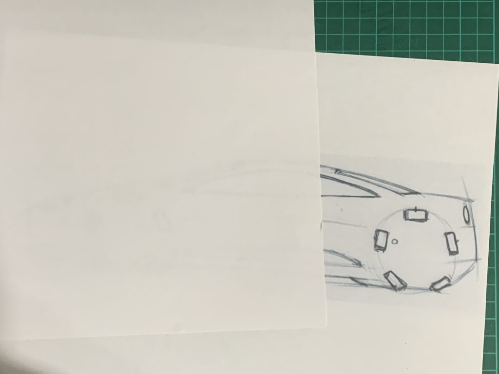
We’re going to use this as an underlay. Place a clean sheet of paper over your existing sketch (or printout) and you should just be able to see the original underneath. Use this as a guide, effectively tracing over your first sketch. But remember, keep it loose and expressive with a light touch of pen on paper until you get it right, like last time.
You should find that because you’re effectively going over the same thing again and you have a guide, the new sketch is much tighter and cleaner. Don’t go over any of your new lines just yet, just get down the basic outline very lightly.

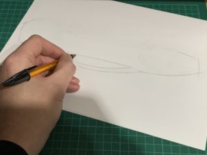
There are a couple of things to keep in mind. Because we’re now working at a bigger scale, you are going to need to start rotating your paper as you work your way around the profile of the car. Where the outline changes direction sharply from trunk to bumper say, or from hood to the front bumper, turn your sketch to meet the natural arc of your arm, rather than contort yourself into working at an unnatural angle. If you need a line to curve away from you, turn your paper all the way around so you are always drawing your lines from the inside. Remember, your elbow is the pivot from which your hand moves, so turn the paper, not your body. Forcing your arm to make unnatural movements means you won’t get a nice sweeping line.
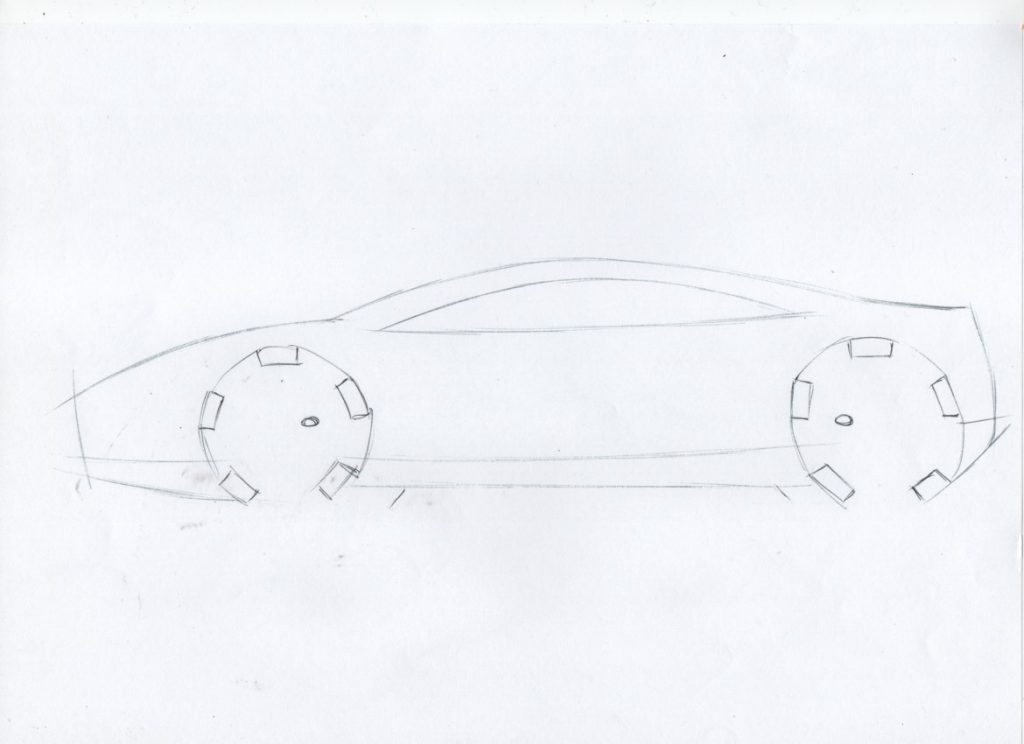
You can use this as an opportunity to correct any mistakes on your original sketch. As you fill out your sketch, when you get to the wheels leave off the bottom part of the spoke that’s touching the ground. This will ‘plant’ your car on the ground plane.

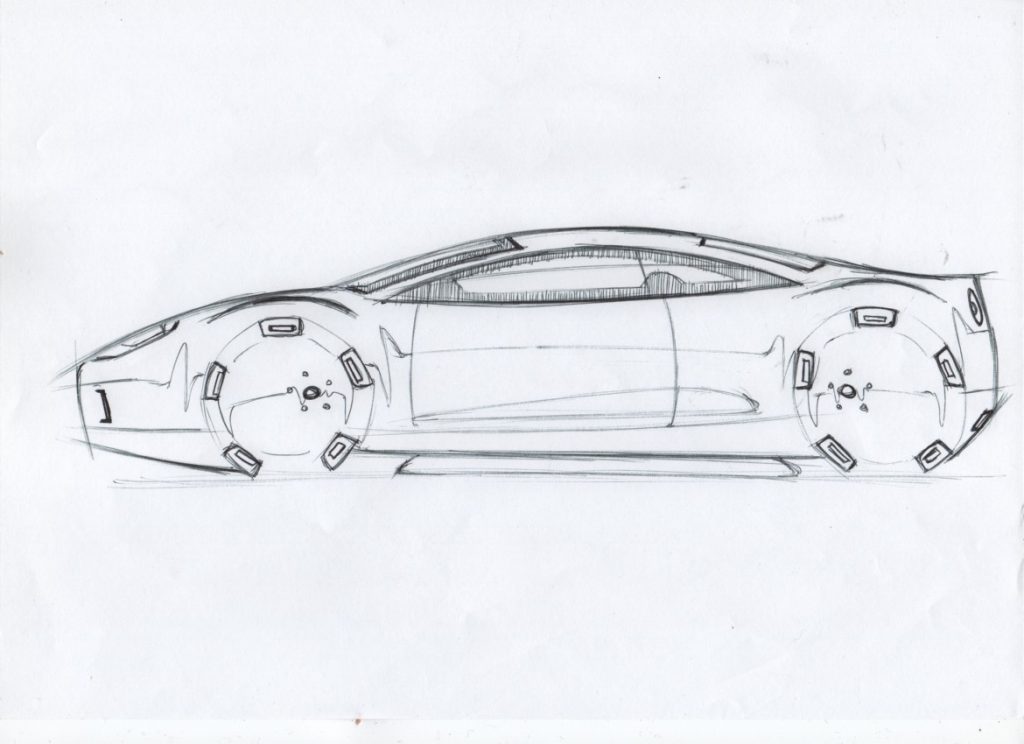
Now we are going to add some detail as before, but because the sketch is a bit bigger we can take it a bit further. Start off by adding a hint of interior and the passenger side window inside the Day Light Opening. Really, all you’re going to show is the top of the seat and maybe a little bit of the steering wheel, like this. Don’t forget the front and rear windshields like before.
When it comes to working out how light reflects from the body, there are lots of convoluted methods you’ll find in textbooks and other tutorials online that will drive you absolutely crazy, like drawing an imaginary lamp on your sketch and then trying to work out how the rays bounce off in all directions. All you need to understand, for now, is if a surface is facing up it’s lighter, and if it’s facing down it’s darker. Imagine the bodyside of a car is shaped like an unpainted soda can lying on its side. The lower half is reflecting the ground, the upper half is reflecting the sky. Again I’ll expand on this in later tutorials, but I want you to grasp this basic rule first.

So the next step is to add a highlight line as we did at the end of the first tutorial. Only this time we’re going to give it a bit more detail. Where the line approaches the wheel arches, give the line a sort of sine wave shape, one peak and one trough before it comes back to the middle where it meets the edge of the arch. So, get the highlighted line in the middle of the car first, then add the little waveforms at the end afterward. This shows how the light reflects differently around the flare of the wheel arch and gives them some depth. I’ve also added a reflection line across the DLO, so we know it’s glass.
Do the same thing for the wheels. They are concave and have a dish to them, so the upper half of the wheel faces down and the lower half faces up. Lightly sketch in a curved highlight line that intersects the center badge and dips as it meets the edge of the rim. If you’re feeling adventurous you can give it the little sine wave shape at each end like before. Don’t forget to add the light catcher to the body between the wheels as this will be important when we start shading.
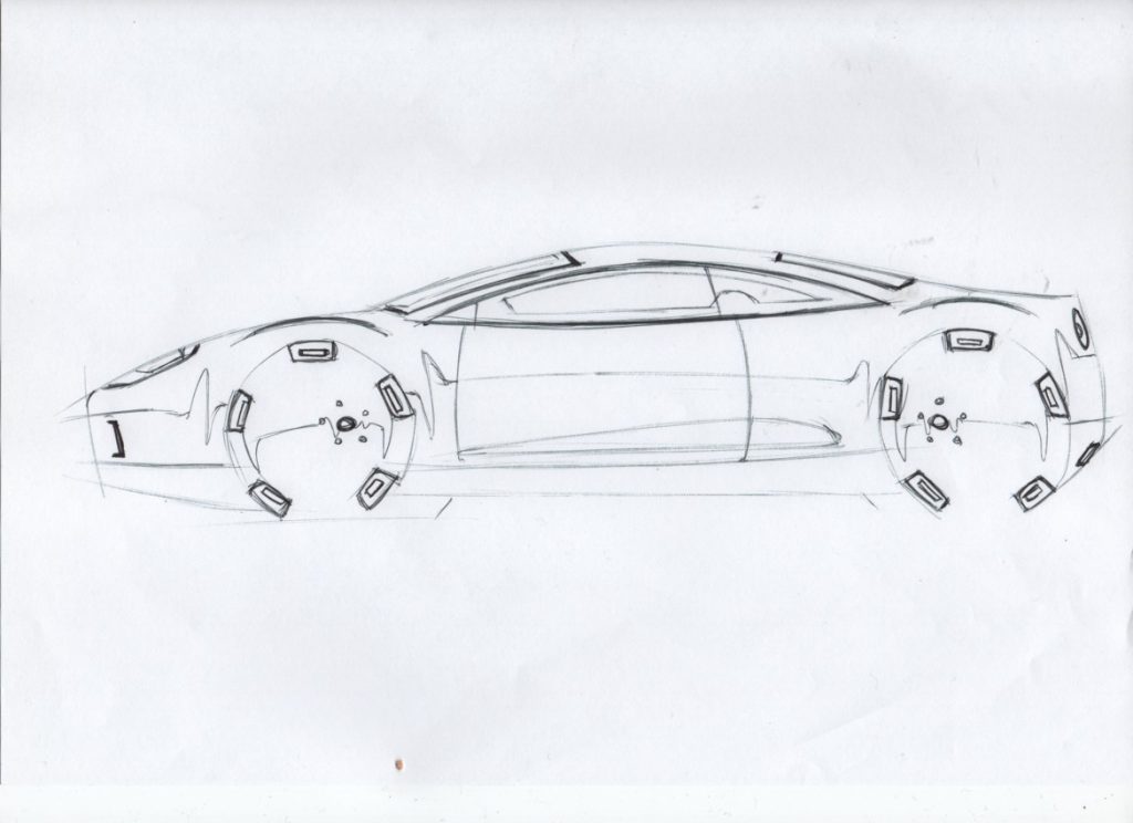
At this stage, you can start adding more details to really bring the sketch to life. Let’s start with the door shut line. On the side, glazing adds in a vertical line just in front of where you have drawn the driver’s seat. Then break the line where it meets the metal and continue it down the body side to the feature line, giving it a slight bend outwards to show the curvature of the door. Put the A-pillar glazing shut line just behind the corner of the DLO. Again, break the line and continue it down the body but curve it in the opposite direction to the other door shut. Because our viewpoint is the dead center of the car, this helps sell the curved shape of the bodyside.
Continue to add whatever extras you want. Trim pieces, lights even small vents or openings if you wish. Remember this is a small FWD coupe, so don’t give it big openings in front of the rear wheels or a massive wing, because it doesn’t need them and wouldn’t have them in real life. The purpose of a sketch is design intent, so it should reflect the functionality of the real vehicle. You can see I’ve added a small air inlet in front of the front wheels, an exhaust opening in the rear bumper, and lights and I’ve detailed the wheels a bit more. I’ve gone over these details to make them stand out, increasing the line weight to define the holes.

We use line weight (or how dark or light a line is) to bring emphasis to certain areas of our sketch. In general, you want to darken lines that highlight details such as lights, glazing and any open areas in the bodywork or wheels. I call this ‘drawing in the holes’, and it’s useful to think of a car as a basic metal can with a load of holes punched in it. Not only will this help keep your sketches realistic(ish) it’s the first stage in understanding how surfacing works. You don’t need to worry about this too much for now, but when adding in your details and features remember lines either have to form a loop and close on themselves or have room to blend out into a flat surface. Here’s what I ended up with, yours should look similar.
The sharper-eyed amongst you will have noticed a couple of things. First, I’ve added a curved line above the wheels to define the wheel arch shape a bit more. Second, I’ve not darkened the outer line of the front and rear windshields. From our viewpoint, we can’t see the seal on the far side, so not darkening this line helps get across this is transparent. A bigger sketch gives us more canvas to include more information about our design.
Adding line weight also means you can taper it to fade out at the ends, giving your lines an extra element of expression. If you look at the lines I added over the wheel arches, you can see they are thicker in the middle and lighter at the ends. As I’ve gone around the outline of the car, generally the lines are thicker where there is more mass of the car—the center of the roof for instance and lightened it towards the extremities.
It’s always important to recognize when it’s time to put down the pen and say “This is done; nothing I can add will make this any better.”
We’ve only got one more thing to add, and that’s shading to illustrate the basic form of our car. Remember when you were a kid with a big pack of color felt tips and you meticulously filled in areas inside the lines? Forget all that. What we’re going to do is similar to hatching on construction drawings. Lots of light lines closer together that darken an area. I like to keep my shading lines vertical because it looks more professional.
Remember when you’re doing this you can make it darker, but you cannot make it lighter. So start off very, very lightly. If you’re left-handed like me, move from right to left so you’re dragging the pen across the paper rather than digging it in, and vice versa if you‘re right-handed. The darkest part of the sketch is going to be the interior, so fill in that without filling in any glazing.
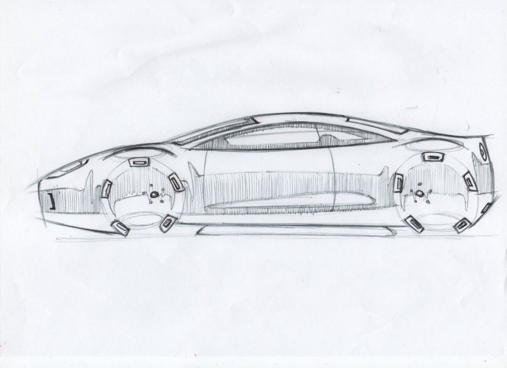
Now we’re going to shade the body side. Remember, the lower half below the highlighted line is the darker part, because it’s reflecting the ground. Take your time and try to keep how hard you press consistently. Don’t worry about staying perfectly within the lines, it gives the sketch a bit of vibrancy and life. Remember the light catcher feature on the bodyside is facing upward, reflecting the sky, so don’t shade that.
Then you can shade the wheels, but remember the rims are dished and concave, the opposite of the body. We shade them the other way around, with the top half darker. As a final flourish, I’ve added some quick ellipses at the bottom of the wheels and on the wheel arches. This is where the bright spots would be – the areas that reflect the most light.
If you make a mistake, don’t worry. Don’t start again, unless you’ve really screwed up. There is a temptation to keep starting over and over because you haven’t nailed the first couple of lines perfectly or you’re not happy. Don’t fall into this trap, because all you’re doing is wasting paper and all you’ll have to show for your efforts are a load of half-started sketches.
Keep going and finish the sketch, and it won’t turn out as bad as you think. Remember to have fun! I always find having some of my favorite up-tempo music helps keep me in the creative zone—don’t put on a podcast or a video because you’ll find it harder to concentrate. And remember, if it’s not fun, take a break. I’ll be down in the comments to help.
Now, show us what you came up with!
Support our mission of championing car culture by becoming an Official Autopian Member.


i’m a week or two late but these are fun– i do a lot of drawing but rarely this kind of car sketching- -thanks for posting about this stuff. would like more insight into how pro car designers think.
https://imgur.com/XJO9A3V
cheers
how about one more https://imgur.com/xt97pL5
This is really good, thanks a lot! 🙂
Will try some of your methods here.
I have been around a long time; for quite a while reading articles that were actually printed with actual ink on actual dead trees that had been pressed into sheets which were glued together.
I don’t remember ever being instructed in how to draw cars. This stuff is fantastic, and that this site even considers publishing it says great things about TheAutopian. Keep it coming!
“Now, show us what you came up with!”.
On a site where we can’t leave pictures in comments…
Great stuff again Adrian – cheers! I really liked your soda can shading analogy…very intuitive.
I took up sketching during the pandemic, and the book I used did the “position a light source (imagine a swirly little sun) above the object” method. It was difficult at first for me to grasp, and while I eventually did, I wish I had your visualization then, would have made things much easier.
Though I was pleasantly surprised to find that shadowing was easier than I’d expected…you don’t have to be crazy precise for it to look good, at least for amateur, just-for-fun stuff.
The Scott Robertson tutorials are absolutely bonkers. He makes it so complicated, I don’t know how that guy has a job teaching.
Now draw it again, with 14-inch wheels!
See me after class, choppers.
Now, here’s a way to follow along that’s easier after the initial learning curve: an iPad, Apple Pencil, and Procreate. Most modern iPads work with the Pencil, the Pencil is $99 (US), and Procreate is $10 (US). (I think. The Canadian price is $12.99.)
Procreate is a painting program, very similar to Photoshop in function, but optimized for the iPad and pencil, at a ridiculously low price in comparison.
There are loads of tutorials to learn the basics of Procreate but put simply, it’s an infinite sketchpad. Use ‘layers’ as your tracing paper, with a huge number of layers, each one perfectly transparent. It turns the pencil into every drawing tool on the planet. Pen, pencil, airbrush, crayon, paintbrush … you get the idea. Infinite undo and redo, two-finger tap to undo, three fingers to redo.
And if you want to get fancy, as Adrian described in the previous article, with French curves, then Procreate has magical curves with Bezier paths.
The whole thing seems a little daunting at first, because everything is hidden in order to give you to maximum drawing space. But like I said, there are loads of tutorials, and the whole thing starts feeling very natural after a short time. Highly recommended!
I haven’t really played much with Procreate, but I will get around to it. Sketchbook is another good alternative, and I think it’s free.
It is worth noting neither are as powerful as full on Photoshop, and it does have a lot of features that make pro renders possible (paths for instance).
“Remember this is a small FWD coupe, so don’t give it big openings in front of the rear wheels or a massive wing, because it doesn’t need them and wouldn’t have them in real life.”
Right, so all those Civics are imaginary. C’mon.
Ahhh . . . the ZX81. What an era! (I had an article published somewhere detailing how to increase on-board RAM — my first of very few.)
A few months ago I jabbed at your industry for unrealistic sidewalls, and you’re saying the newest trend is to now eliminate them all together?
This shall not stand. Sidewalls are important in the vibe of a vehicle, bulgy, meaty, stretched, tensioned, etc. Why do you guys hate tires so much? I agree most stock vehicles have terrible stance/awful fitment but pretending sidewalls don’t exist is going too far!
#bringbacksidewallsincardesignsketches
Cheers man! Do some OG Canson renderings next, they are my fave
Fair, but it’s actually quite hard to sketch wheels and tyres without it looking shit, unless you use circle guides.
I *can* do old style rendering to a point, but I’m not brilliant at it, because I only did it during the first year of university. These days it’s essentially a lost art.
I don’t have all my old art materials where I’m living at the moment, but it’s something to consider for a future piece if the interest is there.
Friggin ellipse guides are so expensive. I sold all mine a few years ago on ebay to raise funds for more car parts.
We got given a set when I started at Coventry – I hardly used them at all. I really don’t think they are necessary unless you are doing super accurate illustrations (as opposed to looser sketches).
I said consummate glazing! CONSUMMATE!! Geez. Guy wouldn’t know majesty if it came up and bit him in the face.
I’ll improve on your methods!
TROGDOR!!!
Oh crap, I didn’t know you were doing one.
Trogdor was a man
I mean, he was a dragon-man
Er, maybe he was just a dragon
Um… But he was still TROGDOR!!
TROGDOR!!
Burninating the countryside
Burninating the peasants
Burninating all the comment trolls
And their money-scam robot A.I.’s!!!
Money-scam robot A.I.’s!!!!!