
You know how sometimes you see something so ridiculous and absurd you find yourself becoming unreasonably smitten with it? Like, say, if a kitten in a Dickies jumpsuit showed up to repair your HVAC, or you bought a new set of brake pads and found that they were made of intricately carved scrimshaw. I’m a big fan of such things, and David showed me something that I feel like fits into this category remarkably well, and it comes from a pretty unexpected source: the dashboard of a third-gen (2014-2018) Chevy Silverado 1500.
Specifically, it’s the center stack infotainment screen on the Silverado 1500. I know almost all of us have very mixed feelings about how much modern car interiors are now dominated by screens, but I think we’ve also been trained by now to expect a certain look and size of screen on a car or truck, and when there’s a significant deviation from that, it strikes us as off. Perhaps even funny. Which is pretty much what I’m getting from these third-generation Silverado screens.
You’ve already seen it in the top image up there, but let’s take another look, because it really is remarkable:
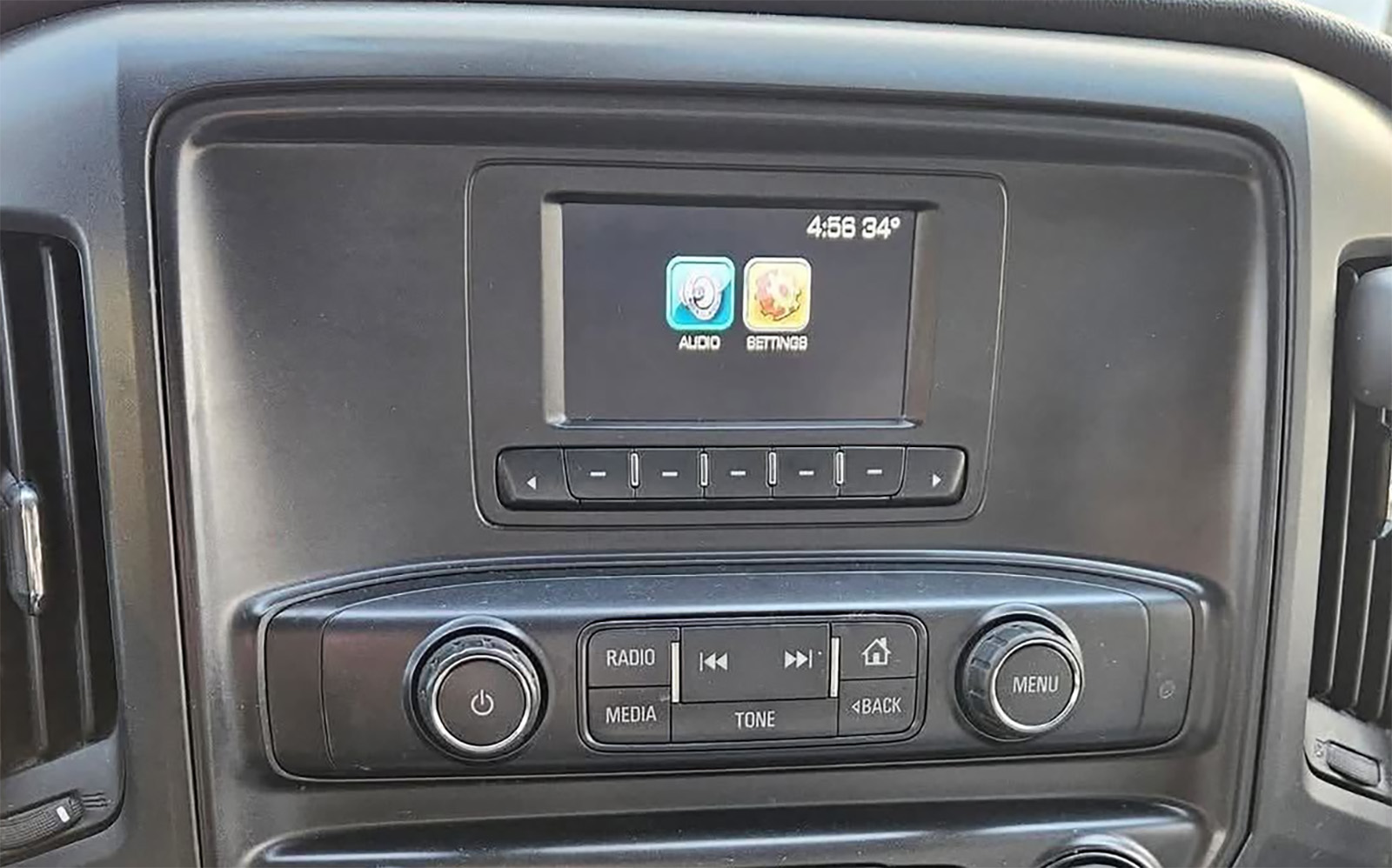
Now, let me be clear here: I don’t have a problem with small screens, and I prefer physical controls to controls embedded into touch screen menus. Absolutely, no question. But that doesn’t mean I can’t appreciate the design comedy of a tiny screen set into an area clearly designed to house a significantly larger screen. Because look at that!
Look at the size of that bezel around the screen! There are acres of featureless black, slightly curved, textured plastic forming a vast territory around that tiny pond of a screen. Really, it’s not so much that the screen is too small – I’m sure there are other cars that have had similarly-sized screens before – but in this context, in this design, where it gets lost in the vastness of nothingness that surrounds it, you can’t help but smile.
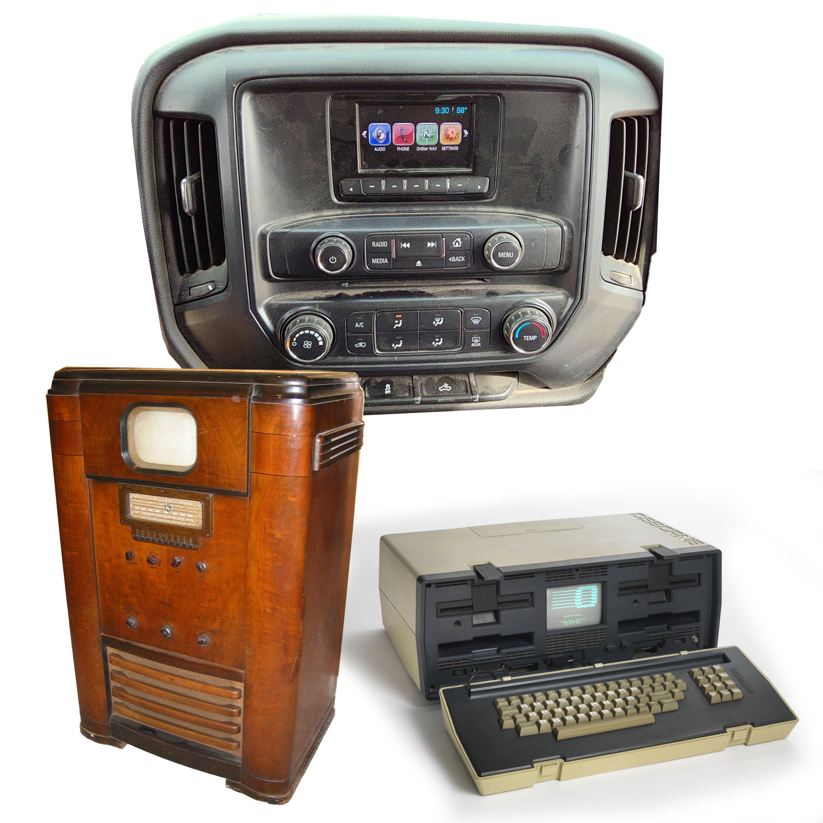
It’s hard not to look at that screen and be reminded of 1940s-era televisions, with their tiny black-and-white CRTs peeking out of huge wooden enclosures and early portable computers like the Osborne I from 1981, with a tiny 5″ green phosphor screen inset into the middle of a suitcase full of electronics:
Oh, you know what else it reminds me of? The control panel in a Soviet-era Soyuz spacecraft!
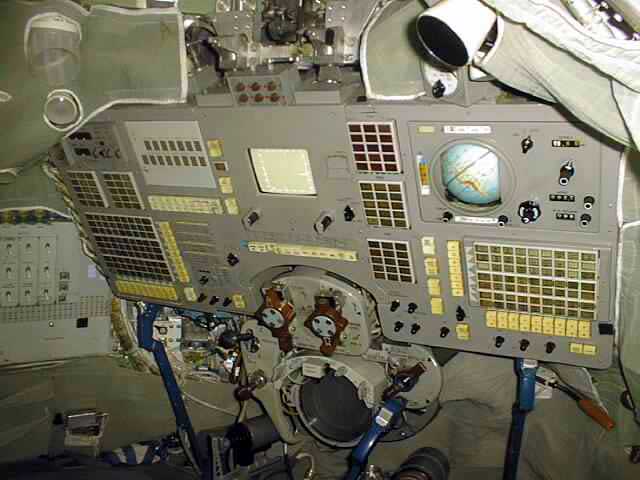
The Silverado doesn’t have one of those amazing mechanical globes, but you get the idea.
If you’ll permit me to go even farther with the visual associations, even beyond the world of tiny screens embedded into bigger pieces of equipment, then consider this visual analogy: the toilet with the joke hole only big enough for farts from that episode of I Think You Should Leave:
I mean, look at it; you can see what I’m getting at, right?

I don’t necessarily have a greater point to make here other than to note the inherent and strangely charming comedy of these design choices, and I think that’s probably enough. I think back in 2014 or so this would have looked much less strange; but today, when the default is massive screens commanding every available inch of dash real estate, it absolutely feels quaint and strange.
I mean, look at the dash of the current Silverado:

Screens on screens on screens. Once, long ago, we had these things contained, protected, and separated by massive bezels. Is this progress? Who’s to say?
Top graphic image: eBay; oldcomputers.net


I rented a u-haul pickup with one of these screens. It was almost more distracting than a larger / more functional screen because I was so bemused by the relative absurdity of the thing.
Scrimshaw. That’s all I have to say.
As soon as I saw the word Scrimshaw, I knew it was a Torch article.
Is this from a base model or something, my dad has a ’18 or ’19 Silverado and it doesn’t have this teeny tiny screen.
Yeah I had a ’14 GMC 1500 and the screen was the whole bezel area.
Likely Work Truck aka W/T trim Silverado.
Ah right, thank you! I was spacing what they called that trim level aka Uhaul spec lol
Yep, that’s pretty great.
I must say, though, that the new Silverado’s interior is also excellent. Buttons and dials and screens everywhere, I’ve seen less complicated aircraft cabins. I love it. Modern vehicles are denying us our fundamental human need to push all the buttons, and that interior has averted the problem with gusto. Also, on a more serious note, if a vehicle must be the size of a naval frigate, it has an obligation to be usable while looking out the windshield, and physical controls are absolutely key to that. All things considered, it would be enough for me to chose the Silverado over most competitors if I were shopping in that market. Also, column shifters are one of the most correct shifting methods. Good interior is good.
You have the up-level interior pictured there.The screen in the my 2026 Silverado with the basic interior is 7″. It works fine for Android auto, the regular radio, and backing up. You can also change settings for the truck with it. Other than that the rest of the interior is all clicky buttons and easy to find knobs. One thing I really like is that the volume control is a big knob under the screen with skip forward and backwards on either side. I can skip through my spotify songs with physical buttons!
I spent like 10 minutes the other day laughing about how awful the new Totino’s party pizza recipe is. feels like a cruel joke by the manufacturer. comes out looking like someone spilled a watery can of Chef Boyardee on a piece of cardboard.
This screen reminds me of our old fleet vehicles–and an unexpected advantage they have in that situation! Little screens don’t do much, so the old fleet vehicles were easy to use. The new ones have a larger screen, which means they can do all the things… if you take the time to learn them. =)
The fact that the icons are in color makes it look even sillier.
Now I want that 1940s television for playing Fallout.
Ford did the same thing. Looks so wrong how small it is. lol
https://i.redd.it/atqxv6umuxyb1.jpg
I’m all for smaller screens in vehicles. I know how use rear-view and side mirrors, and I use our Garmin 5″ GPS for navigation, anyway, so I really have no need for large in-dash screens.
Small screens don’t get you to pay for a data connection the vehicle already has and are easier to replace with aftermarket infotainment systems that aren’t stealing every bit of PII possible.
Thankfully its super easy to upgrade it to the 8 inch display. I did that in my 2016, but now I’m upgrading the sync 4 with a 12” display from a 2022 F150
Yeah, I helped my brother swap to a 8″ Sync 3 in his Mustang.
That was a truly remarkable screen. The “up level” screen for that generation silverado filled out the bezel and was honestly perfect. It got the job done, never crashed, didnt have HVAC or volume (those were still real knobs). I had a 2014 for several years and nearly 100K miles, that screen was perfect. I do think this smaller screen might have been troublesome to use?
I had a 2017 WT and that screen always cracked me up. It’s like someone at GM said, “We should put a screen in here, but we only have like $11 left in the budget”
I think truly the only reason GM figured they should put this tiny screen in there is because they were federally mandated to have rear cams in all cars, otherwise they’d have made a normal 8 segment display.
This is correct. Mandated backup cameras = mandated screen. Automakers start integrating these features as soon as they know they will be required during that model run. Funny enough the law doesn’t mandate a screen size, just apparent size based on driving position and distance to the screen. In most situations a 3.5″ diagonal screen is sufficient.
Especially in a two-door short-bed truck. Not many blind spots to worry about (if any at all).
For sure. I’m sure they also figured the average WT driver was less concerned with niceties and more concerned with an interior that could handle dirty clothes and boots and crap piled on every surface, a truck that didn’t fall apart at the mere sight of a construction job, etc.
I detest this screen. I have a 2010 gmc which to me is peak interior – no screen simple radio, cd player. We have a 2016 shop truck at work and whenever I drive it the enshittification of the interior and the useless screen really annoys me.
“Yo dawg, we heard you liked bezels…”
German GM comically did it too, on the Astra which we briefly got as a Saturn [nee Opel] https://tinyurl.com/GMtinyscreen
I hate to admit it, but when I bought a Colorado of that same era, I needed to get the bigger screen. That bezel was just wrong. Like those blanks they put in place of buttons for options you didn’t buy. I mean, if I have to have a screen, give me a gosh dang screen.
At some point, doesn’t it have a sort of dystopian feel, like a classic car updated with newer gear?
In ‘Until the End of the World’, driving an older car with talking navigation, Claire leaves the jammed autostrada.
The navigation speaks
“You’re leaving the map now, [Claire]”
Then,
“You’re on your own now, [Claire]”
I kind of feel that way in my GT6 when I’ve got my phone on the dashboard and Google Maps engaged.
But no, not really. Driving Claire’s car is one thing, but buying it is another. That expansive black bezel is more just a reminder that you paid tens of thousands of dollars for some half-assed tech that was obsolete the moment you drove off the lot. On the other hand, that is rather dystopian, isn’t it?