
For as long as I have been driving cars for work, I have known one thing about Ferrari: It doesn’t really know how to make a cohesive interior. Whether that’s nonsensically located radio controls, no central infotainment screen, infuriating touch-capacitive controls, or buttons that get weirdly sticky after a few years, there’s never been a modern Ferrari that’s had a cabin that doesn’t bother me in some way.
Instead of trying its hand at the interior of its latest car, an all-electric four-seater called the Luce, Ferrari decided to enlist the help of Jony Ive, former head of design at Apple and credited as the designer of the iPhone, to do the job instead.
Going by images released of the cabin today, I’d say hiring Ive was probably the best thing Ferrari has done for itself in years. Because it looks spectacular.
I Simply Cannot Believe Ferrari Got It This Right

Wow. Just look at that driver’s cell. I had my doubts when Ive first signed onto this project with Ferrari, but honestly, I think he and his team absolutely knocked it out of the park here. There are so many things to talk about, but I think it’s worth starting at the most important part of any interior: The steering wheel.

In a world where thick rims and weird multi-spoke designs dominate the luxury and exotic field, the Luce’s steering wheel is an obvious outlier. It looks as if it was lifted straight off of a 308 GT4 from the 1980s, with three simple, flat metal spokes and a thin rim that’s mostly round. It’s simple and elegant, and most importantly, it has nothing but real buttons, toggle switches, and knobs for all of the controls.
Because Ferrari doesn’t believe in turn signals or wiper stalks, all of those controls are incorporated into the wheel, as they have been since the 458 Italia. The only two buttons embedded into the spokes are the turn signals, which are matched to the same metal color as the spokes to blend in. Every other button is bunched into two nodes below the 3 o’clock and 9 o’clock stalks, and while they’d look a bit out of place on a 308, they fit nicely here.
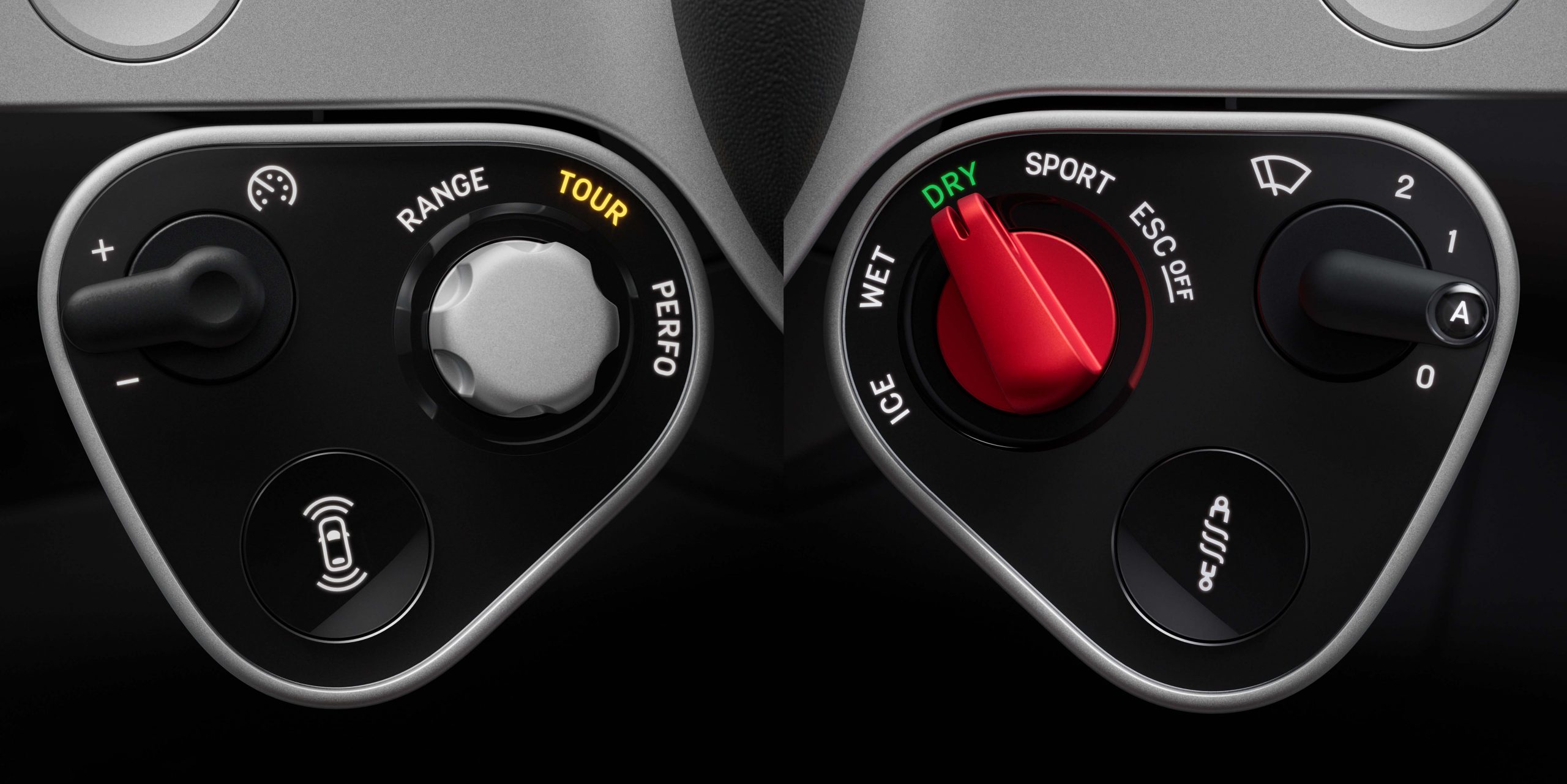
On the left module, you’ll find controls for things like the active safety systems and the cruise control. On the right node, there’s a toggle switch for the wiper blades, Ferrari’s famous Manettino switch for drive modes, and a button with a coil-over printed on it, presumably to enable or disable Ferrari’s well-known “bumpy road” mode, which softens up the shocks when pressed. Note how all of these controls are real, actual buttons, not the touch-capacitive nonsense Ferrari’s been running with on its steering wheels for the past few years.

Thankfully, it’s more of the same throughout the rest of the interior. The control panel, which houses the infotainment screen, is centrally located but mounted on a pivot system, which means it can be turned to face either the driver or the passenger (or sit dead in the center). Even better, you’ll see at the bottom that it’s loaded with real buttons and toggle switches for stuff like the climate control and seat temperature. That clock-looking thing on the top right? It’s a multigraph that can act as a clock, chronograph, compass, or launch control timer, and even has physical buttons of its own along the edges of the panel.

All of this makes sense if you know Ive’s opinion on buttons. He predicted the industry’s move back to physical buttons all the way back in 2022 in an interview with Australian outlet Drive:
“I do think there are fabulous affordances with interfaces like, for example, multi-touch [the technology allowing for pinching and zooming on phone screens],” Ive said.
“But we do remain physical beings. I think, potentially, the pendulum may swing a little to have interfaces and products that will take more time and are more engaged physically.”
When the panel’s moderator – journalist Kara Swisher – asked if Ive was referring to cars, the former Apple design boss responded, “for example”.
In a way, Ive simply had a hand in making his own predictions come true. But that’s not to say there aren’t screens. In addition to the one found on the control panel, there’s another in the rear for back seat climate controls, and a third embedded into the gauge cluster.

Though the cluster looks analog, it’s fully digital underneath. The three round cutouts give data to the driver like an analog cluster would, with the goal of not overwhelming the driver with info. From Ferrari:
The binnacle’s graphics are inspired by the clarity and elegance of historic instrument dials, particularly Veglia and Jaeger instruments from the 1950s and 60s. Drawing on decades of experience in horological design, the team sought to achieve a watch-like clarity, creating a modern, clean layout that highlights the legibility of the dials. Information is presented in a way that is immediately legible and intuitively understood.
This approach is rooted in the concept of reducing cognitive load for the driver. By referencing the simplicity of analogue watch dials, where time can be read at a glance, the designers aimed to make the car’s controls and displays equally intuitive. The graphics are purposefully minimal and clear, allowing drivers to glean essential information quickly and effortlessly while keeping their attention on the road.

The center console has been redesigned as well, and it looks just as slick. It includes the four window switches, the luggage compartment release, the lock switch, the hazard light button, the gear selector, and a little indent area specifically to hold the car’s keyfob. There are also two cupholders mounted just forward of the console itself. The tiny selector switch is made from Corning Fusion5 glass that had to be etched by laser, according to Ferrari:
To achieve the level of precision required by Ferrari, lasers were used to make tiny holes in the glass half the width of a human hair to deposit the ink for the graphics with the perfect level of uniformity. Fusion5 is designed to offer superior surface durability as well as better impact and scratch resistance than conventional glass and is used on the control panel, binnacle and on the surface of the central console.

Is it as cool as Ferrari’s retro-style gated shifter-shaped gear selector? No, I don’t think so. But it does still look pretty cool.
Let’s Talk About That Name
In addition to revealing the interior, Ferrari also revealed the final name for its first production electric car: Luce. It translates literally from Italian to “light.” Hearing that, you might think Ferrari went all-out on making sure its EV would be as lightweight as possible, breaking the trend in the electric performance car space of exceedingly heavy vehicles. But you’d be wrong.
According to Car and Driver, which attended an unveiling event for the car’s interior, the Luce will still come in at “under 5,100 pounds,” or two and a half tons. For some context, that’s a bit more than a BMW i4 and a tiny bit less than a Tesla Model X. It’s also more than two Miatas.

Even when comparing the Luce to other performance EVs, it’s on the heavy side. The Hyundai Ioniq 5 N is a few hundred pounds lighter, at 4,849 pounds. The Taycan Turbo GT, the most expensive, quickest version of Porsche’s four-seater EV, comes in at 4,915 pounds. It does have the Lucid Air Sapphire beat, though, with that car coming in at over 5,300 pounds.
In reality, “light” refers to luminescence, not lightness. That makes a bit of sense, considering the electric drivetrain and all. Thankfully, no numbers or letters are accompanying the name, at least for now, which I prefer. Alphanumerical car names are almost always boring—if you’re going to call a car a Testarossa, call it the Testarossa! Don’t slap the number 849 in front of it just to keep in line with corporate naming structure.
The Luce’s final design has yet to be revealed, but that should come in the Springtime along with all of the specs. With demand for ultra-high-end EVs nearly nonexistent, I’m really curious to see how it performs.
Top graphic image: Ferrari


Hot take: Ive is a hack with his head so far up his own exhaust he can lick his own stomach ulcers.
His embrace of tactile controls is a bit rich considering he led Apple design when they replaced function keys with that idiotic touch bar (since reversed) and the crappiest-feeling keyboards known to man because thinness was paramount.
He also led Apple design when they made the mouse that charges upside down and the Pencil that sticks out of the iPad’s charge port like a timid enema.
He also led Apple design when they made, and still make, the least ergonomic mice known to man.
The wiper controls and ESPECIALLY the turn signal controls should not be moving as the wheel moves. They need to be in the same spot so you don’t have to look for them. Tesla has shown turn signals on wheels are stupid.
Ive hasn’t heeded Jobs’s pronouncement that design is how things works, not how they look. His designs are mostly flash and very little substance.
The rest is pretty cool.
I agree with a lot of what you said, but the mouse that charged upside down was on purpose to prevent people from using it while plugged in.
None of their cables were designed to be flexed that much, and there’s no strain relief on them really either. Even if the instructions said don’t plug it in and use it, you know people would do that thinking they are ‘saving the batteries’ or something.
If you want to criticize Ive’s usability, just go back to his first hit, the original imac and the godawful “puck mouse” that you couldn’t tell if you were holding correctly since the form was a simple revolve. It was TERRIBLE. I drove over mine with my car as soon as I got a new mouse, it was that bad.
The puck mouse was the worst computer peripheral ever made.
Why would they want to prevent people from using the mouse plugged in? That’s dumb. Their cables are hot garbage and my $3.59 6-footers from Aliexpress work and last longer. They can just make the cables better. Or better yet, only connect the power channel in the connector so the mice don’t work plugged in.
Because it wasn’t designed to be used while plugged in. The cord and the ports were not designed for that amount of constant stress.
Then design better ports and cords! There’s almost no stress on a mouse cord. That’s not where they fail.
Or better yet, disable the data line in the mouse so it only gets power and doesn’t work at all when plugged in. Or make it charge from the side or the back.
I’m sorry, that doesn’t make it better. To design a crucial input device to go (literally) belly up while you are using it, essentially disabling the computer, is a design fail of the highest order. Design a proper cable. Software disable the mouse when plugged in and fully charged. There are better solutions than having the mouse play dead.
It was not designed to go belly up while you were using it. It was designed to be plugged in when you are NOT using it. The battery, when fully charged, lasted long enough to use the mouse about a month.
You’re assuming that you’re not using it at the end of that month when it needs to be charged. If it needs charged in the middle of the work day do you tell your boss that you can’t get anything done for an hour, your mouse is charging? There are multiple solutions to the problem, Apple chose the one that negatively impacts the user. There’s no way to spin that as a good design.
You are literally ignoring everything I’ve brought up, and just repeating yourself. You should run for office.
Well, not to defend him, but the wiper and signal controls being on the wheel is a ferrari thing, and I guarantee he didn’t get a choice in the matter.
The rest of your criticisms, though, I completely agree. I’ve said for a very long time that apple puts appearance over functionality. On the software side, especially. Too many slow/smooth animations that end up hampering me if I want to navigate quickly. And still not on board with settings being in the centralized app instead of in the app they pertain to. But I digress.
Will the infotainment system accept Android Auto?
It looks like a Temu Ferrari,I guess the pictures don’t give it context,but that is a very boring interior.
I dig it. Granted I am a bit of an Apple fanboy, but this looks like genuinely restrained and intentional design.
I expect nothing less from the man that brought us the masterpiece that is the iMac G3, which is the most beautiful computer ever built.
I am not an apple fan in 95% of use cases. But man I remember the G3s back when I was in like 5th grade. What an absolute nostalgia trigger. Wild how much times and design have changed. I’d love it if 90s and 00s physical buttons and clear and colorful plastic made its way back into fashion.
Same here! We had a computer lab of the teal ones when I was in elementary school, and they were cemented to me then as the ultimate cool computer. I too desperately want the transparent and colorful tech of the 90’s to return. Man, now I need to see if I can dig my old clear-purple gameboy color out of a box at my parent’s house next time I visit!
Here we’re going to have to disagree.
I absolutely hate the “I taped an iPad to the dash” look, whether it’s Hyundai, Tesla or Ferrari.
Gauge clusters and dashboards used to be designed so they looked like they were integrated with the car. That also had the advantage of recessing gauges and displays under the top dash line which helped keep sun glare from making them unreadable.
Now they’re designed so they look like your teenager forgot his phone behind the steering wheel. Even the aftermarket gauge pods you buy at Pep Boys look better than that.
A couple days late to the comment party, but I’ll back Brian up here. I think it looks nice, especially the steering wheel. Someone finally puts buttons, switches, and visually appealing analog dials back in a car and somehow the commentariat still finds something to be upset about.
I agree with ADDvanced that it is a well-designed interior, but that it doesn’t scream “Ferrari”. That said, I’ll reserve full judgement until I see the rest of the car and what the vibe of it is. Maybe it’s a good Luce interior?
More than anything I’m glad to see a company taking the opportunity to try something different, and I applaud that even if it doesn’t always work out.
Good for them bringing back buttons, but I just don’t like the way it looks. Its such a bare-bones design and doesn’t seem like it belongs on anything that isn’t a budget utility vehicle. I think they could’ve done this same thing with some more flair. I also think there should be volume controls on the steering wheel if a bunch of other stuff is there. Pausing music is something i should be able to do IMMEDIATELY.
So my background is industrial/product design and usability/HMI; I’ve designed both the physical controls on Harley Davidson baggers, as well as Mercury Marine’s current tillers, and dual ERCs, etc. I’m stating this just to highlight a large chunk of my career has been doing usability studies and making things easier to use.
IMHO, this is a clean, well-designed interior that looks highly usable.
It does NOT, however, look like a Ferrari to me. If you take away the wheel, it looks like 100000x other minimal interiors in pretty much any car.
That center stack seems like it would visually work just as well in a Tesla, VW, etc.
The dash is also reduced to the point where other than the screen with the built in stop watch, there’s nothing even memorable about it.
Good design is about finding balance between ultra-minimalism to reduce information and visual complexity to the user, good HMI/ergo, AND communicating brand values, and it’s that last one where this falls apart. Ferrari is also ‘exclusive’ and handmade/celebrating craftsman, lots of stitching, premium materials, etc. It should also be a bit ‘exciting’, and a rounded rectangle is the most stable/least exciting shape available, and it’s everywhere. Adding some angles to those rectangles, to be more of a parallelogram, would help tremendously. It needs SOMETHING, otherwise it’s just generic.
Is it a good interior? Sure. Is it a good FERRARI interior? No, not in my opinion.
Agreed. I was waiting for this to be a joke post by Brian, I was looking around for the opposite take that never materialized. It certainly looks very useable but the aluminum (I hope it is and not plastic) looks like plastic because nearly every other car is using plastic to look like aluminum. It honestly just feels like a Hyundai with better materials. The seats look flat, not able to handle what a Ferrari should be able to dish out and it is almost too simplified. The older Ferrari interiors looked almost unfinished, because they were meant to be more purposeful. This is nice, but just left in the sterilizer too long.
I fully agree, the same materials look great on the little clusters hanging off the steering wheel spokes, because they’re not rectangular, and I think could’ve been a real winner if the clusters weren’t so rectangular and uniform. I also don’t think there’s anything that premium about the clusters being digital, and I think Ferrari is failing to follow Bugatti’s lead and losing a lot of mojo in the process.
The ultimate benefactor of Ferrari cars is the 10-year-old that sees one street-parked when their family takes a summer trip to Los Angeles or Monaco or whatever, and that 10-year-old wants to run up to the window and look at the gauge cluster to see how high the numbers go and imagine themselves driving it. I mean, after looking through the rear glass to see the airbox, of course. Not much left to look at if the gauges disappear when the car turns off.
100% this. Saved me the time to type pretty much the same. I would have been more outspoken though in thinking that the looks are bafflingly infantile and oh so dated.
I don’t think it’s a good human interface design at all. Turn signals on the wheel are objectively worse than stalks. Why waste space for an analog watch that duplicates the information in the digital clock literally next to it? Why are performance and traction controls front and centre on the wheel when you don’t need to change those settings all that often, but phone and audio controls aren’t at hand, even though you probably need to interact with those more frequently?
If you look close the watch has some buttons, I think it’s supposed to be a lap timer? I agree with the rest of your criticisms
I’m an industrial designer by training who drifted into design engineering professionally and I came to say the same thing, although not as well. It’s quite stunning in its restraint and the details are well executed. But, minus the Ferrari specific functions, it’d be at home in any mainstream sedan or SUV.
Ferraris are expressive, bold, outrageous and beautiful. This is clean, restrained and logical.
I love the way the pendulum is swinging and this design is miles ahead of what most marques are doing right now. That being said, the swivel pod is a little too Ive and not Ferrai enough – some subtle design changes would go a long way to making it feel a bit more prancing horse. That aluminum handle looks straight off a Mac Pro desktop and I suspect it won’t be pleasant to touch on a scorching summer day. Ditto for the black glass items.. I’d be curious to see how hot they will feel on a 95F day in direct sun.
I can’t be the only one who thinks this looks terrible….
You are not, I hope Brian is able to get the help he so clearly needs.
No car interior with 2 ipads can be good.
I say this as a fan of the brand and it may just be me, but this would have been a better evolution of the Mini F56 interior to the F66 instead of what Heilmer went with for the redesign. The switches, the gauges, the iPhone 4 style corner radius on the screen, all of it, even Mini malt brown seats would fit in nicely with it. Jony Ive designed a Mini interior for a Ferrari.
Jony Ive (“Sir” Jony Ive) has to be one of the most intolerable humans on the planet, and is clearly a one-trick pony. While I applaud some of the design cues here, it doesn’t take a genius to create a 3 spoke steering wheel. I wonder if there is a button you can press that will emit the scent of one of his farts?
It’s a $4,999 upgrade.
Looks a bit too much “utilitarian” for a Ferrari. While pleasant to look at, it is not beautiful. Elegant at most. Looks too much like Apple for my taste, but coming from who did designed so many Apple products, it is not a surprise.
I am don’t think the average Ferrari driver will wear an Apple watch to match this. Maybe they will have an option to make some of those surfaces in a golden shade instead of silver…
Honestly, not many cars interiors are really interesting nowadays. It is an interesting direction, but one that would match something more like an Ineos, Jeep or International than a Ferrari imho.
“kid’s toy” “toy-like” “toy car”
Guess what: Ferrari is a toy.
I always wondered what’s the point of flat bottomed steering wheels? Legroom? You still need room to steer it.
It gives you more room to get in and out.
All the recent small Lotuseses have an eccentric wheel which is about an inch higher up when steered straight ahead. I can’t get out of mine with half a turn of steering lock.
It’s horrible, but not as horrible as a flat bottomed wheel.
I’ve also had a whole bunch of cars that weren’t so ergonomically challenged that the major driving control had to be distorted. Wheels should be round.
It’s the sort of thing that shouldn’t be a problem in a car with a height adjustable wheel, which makes me think it’s mostly a styling affectation.
I’m surprised at the level of enthusiasm for this, Brian. The steering wheel is brilliant, and I’ll concede the quality of the physical controls looks unreal.
But visually, this looks awful. Who wants a screen on a swivel like a doctor’s computer station?
There are a ton of good ideas here, and it’s a good direction for Ferrari to head in. But stylistically, it’s garbage.
The first vibe I got was the IP/”Contol Center” of a late 70s GMC Astro COE diesel tractor.
https://www.autopaper.com/1978-gmc-astro-95-coe-tractor-embossed-cover-sales-brochure-original.php
Anyway, I don’t like it, but it’s a moot point as I don’t see myself ever buying a new Ferrari, ICE or EV.
Frankly, it is very underwhelming. I don’t see anything that gives me Ferrari vibes. It’s simple, but kind of boring. Simple can be really nice, and though I love the sparse interiors of 80s cars, this still is lacking a good deal of excitement for a Ferrari. And it’s not like the exterior designs of current Ferraris are boring.
Seems like I’m in the minority on this one, because I frickin’ love this interior. I honestly can’t think of one in *any* car that I like more.
If somebody told me this was the dash of a Fiat 500e, I would probably believe it.
It’s giving Thrustmaster