
For as long as I have been driving cars for work, I have known one thing about Ferrari: It doesn’t really know how to make a cohesive interior. Whether that’s nonsensically located radio controls, no central infotainment screen, infuriating touch-capacitive controls, or buttons that get weirdly sticky after a few years, there’s never been a modern Ferrari that’s had a cabin that doesn’t bother me in some way.
Instead of trying its hand at the interior of its latest car, an all-electric four-seater called the Luce, Ferrari decided to enlist the help of Jony Ive, former head of design at Apple and credited as the designer of the iPhone, to do the job instead.
Going by images released of the cabin today, I’d say hiring Ive was probably the best thing Ferrari has done for itself in years. Because it looks spectacular.
I Simply Cannot Believe Ferrari Got It This Right

Wow. Just look at that driver’s cell. I had my doubts when Ive first signed onto this project with Ferrari, but honestly, I think he and his team absolutely knocked it out of the park here. There are so many things to talk about, but I think it’s worth starting at the most important part of any interior: The steering wheel.

In a world where thick rims and weird multi-spoke designs dominate the luxury and exotic field, the Luce’s steering wheel is an obvious outlier. It looks as if it was lifted straight off of a 308 GT4 from the 1980s, with three simple, flat metal spokes and a thin rim that’s mostly round. It’s simple and elegant, and most importantly, it has nothing but real buttons, toggle switches, and knobs for all of the controls.
Because Ferrari doesn’t believe in turn signals or wiper stalks, all of those controls are incorporated into the wheel, as they have been since the 458 Italia. The only two buttons embedded into the spokes are the turn signals, which are matched to the same metal color as the spokes to blend in. Every other button is bunched into two nodes below the 3 o’clock and 9 o’clock stalks, and while they’d look a bit out of place on a 308, they fit nicely here.
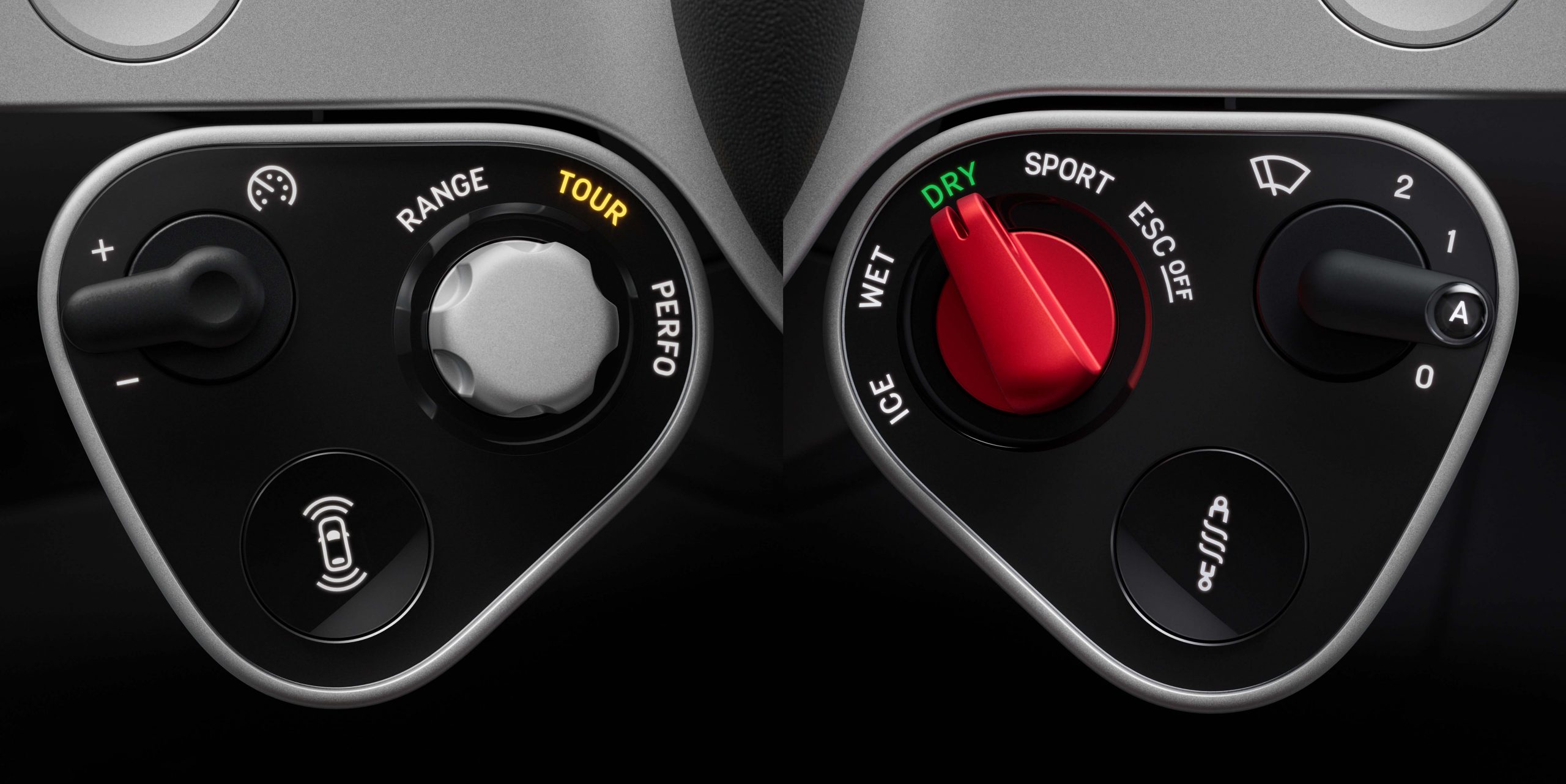
On the left module, you’ll find controls for things like the active safety systems and the cruise control. On the right node, there’s a toggle switch for the wiper blades, Ferrari’s famous Manettino switch for drive modes, and a button with a coil-over printed on it, presumably to enable or disable Ferrari’s well-known “bumpy road” mode, which softens up the shocks when pressed. Note how all of these controls are real, actual buttons, not the touch-capacitive nonsense Ferrari’s been running with on its steering wheels for the past few years.

Thankfully, it’s more of the same throughout the rest of the interior. The control panel, which houses the infotainment screen, is centrally located but mounted on a pivot system, which means it can be turned to face either the driver or the passenger (or sit dead in the center). Even better, you’ll see at the bottom that it’s loaded with real buttons and toggle switches for stuff like the climate control and seat temperature. That clock-looking thing on the top right? It’s a multigraph that can act as a clock, chronograph, compass, or launch control timer, and even has physical buttons of its own along the edges of the panel.

All of this makes sense if you know Ive’s opinion on buttons. He predicted the industry’s move back to physical buttons all the way back in 2022 in an interview with Australian outlet Drive:
“I do think there are fabulous affordances with interfaces like, for example, multi-touch [the technology allowing for pinching and zooming on phone screens],” Ive said.
“But we do remain physical beings. I think, potentially, the pendulum may swing a little to have interfaces and products that will take more time and are more engaged physically.”
When the panel’s moderator – journalist Kara Swisher – asked if Ive was referring to cars, the former Apple design boss responded, “for example”.
In a way, Ive simply had a hand in making his own predictions come true. But that’s not to say there aren’t screens. In addition to the one found on the control panel, there’s another in the rear for back seat climate controls, and a third embedded into the gauge cluster.

Though the cluster looks analog, it’s fully digital underneath. The three round cutouts give data to the driver like an analog cluster would, with the goal of not overwhelming the driver with info. From Ferrari:
The binnacle’s graphics are inspired by the clarity and elegance of historic instrument dials, particularly Veglia and Jaeger instruments from the 1950s and 60s. Drawing on decades of experience in horological design, the team sought to achieve a watch-like clarity, creating a modern, clean layout that highlights the legibility of the dials. Information is presented in a way that is immediately legible and intuitively understood.
This approach is rooted in the concept of reducing cognitive load for the driver. By referencing the simplicity of analogue watch dials, where time can be read at a glance, the designers aimed to make the car’s controls and displays equally intuitive. The graphics are purposefully minimal and clear, allowing drivers to glean essential information quickly and effortlessly while keeping their attention on the road.

The center console has been redesigned as well, and it looks just as slick. It includes the four window switches, the luggage compartment release, the lock switch, the hazard light button, the gear selector, and a little indent area specifically to hold the car’s keyfob. There are also two cupholders mounted just forward of the console itself. The tiny selector switch is made from Corning Fusion5 glass that had to be etched by laser, according to Ferrari:
To achieve the level of precision required by Ferrari, lasers were used to make tiny holes in the glass half the width of a human hair to deposit the ink for the graphics with the perfect level of uniformity. Fusion5 is designed to offer superior surface durability as well as better impact and scratch resistance than conventional glass and is used on the control panel, binnacle and on the surface of the central console.

Is it as cool as Ferrari’s retro-style gated shifter-shaped gear selector? No, I don’t think so. But it does still look pretty cool.
Let’s Talk About That Name
In addition to revealing the interior, Ferrari also revealed the final name for its first production electric car: Luce. It translates literally from Italian to “light.” Hearing that, you might think Ferrari went all-out on making sure its EV would be as lightweight as possible, breaking the trend in the electric performance car space of exceedingly heavy vehicles. But you’d be wrong.
According to Car and Driver, which attended an unveiling event for the car’s interior, the Luce will still come in at “under 5,100 pounds,” or two and a half tons. For some context, that’s a bit more than a BMW i4 and a tiny bit less than a Tesla Model X. It’s also more than two Miatas.

Even when comparing the Luce to other performance EVs, it’s on the heavy side. The Hyundai Ioniq 5 N is a few hundred pounds lighter, at 4,849 pounds. The Taycan Turbo GT, the most expensive, quickest version of Porsche’s four-seater EV, comes in at 4,915 pounds. It does have the Lucid Air Sapphire beat, though, with that car coming in at over 5,300 pounds.
In reality, “light” refers to luminescence, not lightness. That makes a bit of sense, considering the electric drivetrain and all. Thankfully, no numbers or letters are accompanying the name, at least for now, which I prefer. Alphanumerical car names are almost always boring—if you’re going to call a car a Testarossa, call it the Testarossa! Don’t slap the number 849 in front of it just to keep in line with corporate naming structure.
The Luce’s final design has yet to be revealed, but that should come in the Springtime along with all of the specs. With demand for ultra-high-end EVs nearly nonexistent, I’m really curious to see how it performs.
Top graphic image: Ferrari


I wish my car had overhead panels and toggle switches.
The basic dash architecture says “1980’s GM Midsize/Pontiac Fiero” to me.
To me, it screams out high build quality and cohesion but it doesn’t seem Ferrari-like. I’ve never experienced the terrible Ferrari interfaces so I cannot speak to that but this just doesn’t seem like the best fit for the brand, even if it is a massive improvement to live with compared to other Ferraris. I think this interior might work better in a Mercedes or Lexus type vehicle.
With effectively zero demand for electric supercars nor for 2.5 ton Ferraris, this will indeed be interesting to see play out.
After looking more it seems like maybe part of why this feels off and bland (and apple-y) is it seems to be using a different font on the gauges than the one Ferrari has been using since at least the ’80s?
Gross. No, no, no, no, no. TWO iPads stuck to the dash do not a decent interior make, even if one of them has some goofy switches glued to it, and the other a sheet of plastic with holes cut in it to allow for fake gauges. And I have less than zero interest in a Ferrari without a gated manual shifter and a howling engine. Pointless.
Genuinely thought the same when I first saw it, but as I’m looking more I’m finding myself torn. On one hand this feels the most premium of any screen heavy interior we’ve seen, with an interesting blending of touch and analog elements, if we must go to haptic and touch heavy stuff. While I hate the ideas of two buttons for turn signals (if that’s what’s happening) that’s a pretty cool interpretation of a classic ’60s-’70s steering wheel that blends in modern elements like an airbag and the mannetini.
But the more I’ve looked at this the more I’m afraid it feels just a tad too iPhone, Jonny Ives is clearly a skilled designer but this just doesn’t seem like he was able to step far enough outside whats worked for him in the past and embrace Ferrari as a unique heritage brand that deserved its own design language, and the bummer is it’s soooo close.
Yup, too many squircles. The man does not like sharp corners, so it looks soft.
100% and I think it also winds up feeling a bit toylike because of that?
Ironically I think the software world has been moving away from so much roundness in the last few years so this may wind up feeling dated quickly, which isn’t to say they should chase digital trends but since it feels like it’s based on a trendy design from 10-15 years ago…
I-I-Ay-yi-yi! I’m happy for you that you like it. The steering wheel is cool but the instruments look like cardboard cut-outs. Even the Mustang’s dual screens are better looking.
As much as I like physical controls and some of the specific functional elements here (thin steering wheels and overhead panels do rock) the overall look is as if Apple released a new version of the Fisher-Price dashboard I used in my car seat as a toddler. There’s no sense of Ferrari heritage, no rawness, no artisanal handcrafted weirdness. Feels like there should be a set of key-shaped teething toys hanging there for when you’re tired of playing Bluey videos on the screen.
Yeh after sitting with it I was thinking the same thing, there’s some really cool design work and integration of analog controls with digital ones here, but it does feel just a little too iPhone and a little toylike which might be the worse sin in some ways for a ferrari.
Wow. I don’t think I’d ever realised how incredibly cheap touchscreens look once you get to a certain level of luxury, now that they’re pretty much the standard in most cars. There’s nothing in this interface that feels remotely as exclusive as analog gauges and physical controls.
For real, I’ve thought about this before. I really don’t understand the luxury car makers moving so quickly to screens and touch controls. I get they’re afraid of feeling behind the times, but really nice physical controls and gauges actually further distinguish and make high cars like Ferraris feel more special and exclusive.
Is Ive just continually doing his One Really Good Idea?
But did Ferrari have to pay off Mazda for their old flagship’s name?
(Waiting for the first American to call it “Loose”)
This is a joke right?
Looks like something a two year old would play while having it strapped to a table.
hideous.
It looks like it’s made from cheap plastic and will make that hollow clonk sound when you move the drive selector. It’s very 2012. I know it’s none of those things, but it just looks that way to me.
Still, at least when they make the toy car version of it they won’t have to change much.
I read this article and now I’m completely on board. Let the car world take the right infuence from Jony this time. https://www.prndlcars.com/p/what-they-copied-ferrari-luce-jony-ive
sorry, I hate this, the steering wheel doesn’t really match with all the rest of what’s going on, and that big iPad with toggle switches just looks terrible, toggles aren’t better than rotating dials, toggles are for on/off, not range adjustments.
the gauge modes changing is pretty cool, but otherwise, not feeling it at all.
This is a great interior for the next Scion xB, but terrible for a Ferrari.
I would rather have poorly-arranged (Isn’t that part of the charm?) controls made of and surrounded by expensive-looking materials. This looks like someone made a home sim racing setup with great cable management.
I think this design looks terrible. The otherwise classy steering wheel has a bowtie tacked onto it. The shifter looks like it isn’t very ergonomic. Launch control and light controls on the ceiling? Sure, why put them somewhere convenient. That ipad isn’t better because it’s on a swivel. Honestly, I think Ram has done the best job of integrating the center screen. That said, I think buttons are better than screens or touch controls, so at least they got that right.
Gonna have to go ahead and disagree. I like individual elements of it, like the steering wheel, but the whole thing is way too Apple-y for the type of car it’s going in. And the completely non-integrated center tablet thing has been done to death and is honestly kind of outdated at this point.
I am coming around to the steering wheel, but I will never come around to the rectangular gauge cluster or infotainment panel. Both feel intensionally disjoint from the rest of the interior and that drives me crazy.
Nope. Hate the current trend of tacking on screens to the dash. Never been a fan of Ive, but at least the digital gauges look
Huh. Agree to disagree. I guess it works since it’s an EV, but I’d be bummed if I bought a Ferrari and it just had some iPads in it.
idk it looks like an Apple iCar concept render from back when iPhones still had notable amounts of bezel and had flat sides. There’s too much shiny black surface which we now associate with cheap plastic (even if it’s Corning glass or whatever).
The really thick aluminum surrounds on the screen make it look like a kids version of an iPad (thicker = easier for kids to grip), and those clock control buttons scream Apple.
The one positive that I’ll take from this is that it’s a reminder that (ignoring the little button/switch pods & the turn signal buttons on the spokes) we can have classy airbag steering wheels. Just everyone chooses not to.
Jony Ive is a billionaire who can afford to spend multiple lifetimes dabbling in whatever design explorations he wants. The execution here is as obsessive and well-executed as any Apple product, but those of you think this is a production proposal are missing the point, which is solely for Ive to say, “Ferrari is a client.”
Very very well thought out designs. Gorgeous execution – but – not aligning with Ferrari values. This is probably the closest we have come to see what an Apple car might have looked like, Im sure Jony had some of that prior work in mind already, but for Ferrari, you look at maintaining a heritage and that heritage or philosophy is grounded in performance and the experience that brings. This is too clinical and almost delicate sometimes where you expect raw race-inspired refinement. Jony approaches this point from a diametrically opposite angle and I dont think he has arrived. But he has created something incredibly pretty and innovative.
https://www.youtube.com/watch?v=6Wv1btxCjVE
Car interiors don’t look like car interiors anymore. I guess this one is designed for the demographic they expect to buy this sort of car – the ipad generation.
But that’s what I don’t really understand, I’m guessing the people who can afford these are mostly 60+ and nobody that age I’ve talked to likes touchscreens.