
I can’t recall the exact details of when I first saw an original production Audi TT, but I can remember my reaction to it: stopped dead in my tracks and a hurried rush across a central London backstreet to examine it. It was 1998, before I had any notion of my future as a car designer, but even then I recognized this car was something new – its metallic blue metal geometric forms a startling juxtaposition against the grubby pomp of the grand old buildings surrounding it. Fifteen years later, while studying car design, one of my lecturers discussed having a similar Road to Damascus moment when seeing one for the first time.
The origins of Audi as a company, entwined as they are in the turmoil of pre- and post-war Germany are complex. The modern day company, as we know it, emerged with the death of NSU in 1977. After leaving Mercedes, Ferdinand Piech found himself at the helm, and his intention was for Audi to forge its own identity distinct from the gussied-up VW-based cars it was selling. An experienced engineer, he defined the brand with a series of technological advances, including the 1980 ur-Quattro and the superbly aerodynamic Audi 100 (5000) of 1982. British ad agency Bartle Bogle Hegarty came up with the perfect copy line – Vorsprung durch Technik (forward through technology), and the brand was all set for the designer eighties.
By the beginning of the nineties, Audi were the epitome of full wheel trim German puritanism. Porsche built RS2 and Trans-Am conquering 200 turbo aside, post-quattro there was a conspicuous absence of pizazz about the range. Then Princess Diana bought an 80 cabriolet and went full Sloane Ranger in front of the paparazzi, sending the British establishment into convulsions. Audi suddenly found itself on the covers of the world’s style magazines but even with the world’s most famous woman giving the company a shot of glamour, they remained a car bought by people who wanted something German that wasn’t a flash BMW or a stuffy Mercedes.
From Two Wheels To Four
Taking its name from the Isle of Man motorcycle races, where NSU had been successful in the thirties, the TT concept appeared at Frankfurt in 1995. It was a bold statement of intent. Audi was leaving behind its worthy but dull image and embracing a Bauhausian aesthetic of simplified shapes, straight lines and minimal external decoration. Audi design chief J Mays said in an interview with journalist Mark Walton:
“The TT work started in 1994. By that time I was head of Audi design. Because we’d established Audi’s design language with the Avus, the TT was quite easy. That language was German but, more than that, it was a systemic Bauhaus approach. I think the TT is unique in that respect, because it’s a non-automotive design language, it’s architectural. It’s very geometric, as though it was milled out of a solid piece of aluminum. There are no flowing lines in Bauhaus architecture or furniture, so it’s very ‘non-dynamic’ in its approach – how you connect the lines from one end of the vehicle to the other. Everything else at the time was fluid – everyone was trying to make things look as though they could go faster and faster. We just took a completely industrial approach.
…I would never take full credit for the Audi TT. It was a joint effort between myself and a good friend of mine called Freeman Thomas. Freeman had done some sketches – one was quite fluid, the other was extremely architectural. I just pulled the more architectural sketch off the wall and took it to show Franz-Josef Paefgen, who was CEO at Audi at the time. He and I looked at this sketch, and we made the entire decision to go to production in about six minutes. The fastest car approval I’ve ever done in my life”.

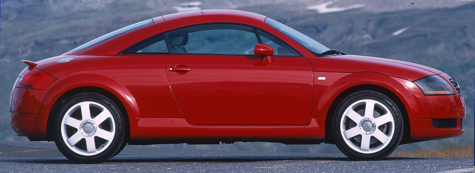
The TT 8N arrived in showrooms in 1998 with minimal changes from the concept. There was additional side glazing, but the rest carried over to production with remarkable fidelity, including the interior, which went against the VAG parts bin grain by containing a lot of bespoke pieces. It was an immediate sensation, selling 100k units in its first three years on sale and over 265k before it was replaced by the more rakish second-generation 8J in 2006.

The TTs influence spread across the Audi range. This dedication to rationality and functionality reached its apogee with the A2 of 1999. It was a revolutionary car but it was just too odd and expensive for a sub-compact. When it came to a small Audi, the market wanted style – not cold German logic. Nonetheless the rest of the Audi range became superbly restrained designs, beguiling in their Teutonic elegance. The A4 B6 and especially the glorious A6 C5 featured similar sweeping curves and straight lines locked together to create an impressively solid form.

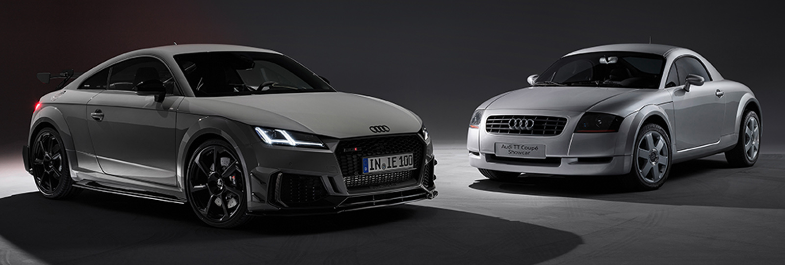
The problem was although laudably free from tinsel and unnecessary decoration, these ‘Bauhaus’ Audis were devoid of warmth and emotion. As a design language, it was limiting as there was nothing left to remove. The only way to advance the look was to add, and incoming design chief Walter da Silva did exactly that when he gave the second generation TT a full height Auto Union inspired silver grill surround. The original 8N TT is a purer example of industrial design, but the second generation 8J is a much better looking as a car. The third generation is a mess – angry creases at the front and a weird kink in the C pillar corrupting the purity of the original car. During our time at the RCA together J told me he absolutely hated it. However, the generation of cars created under the next head of design Walter da Silva were exceptionally good. The A1 hatch, A5 coupe, A7, R8 and Q7 were all excellent, but when Marc Lichte replaced da Silva in 2014, he ruined all their respective sequels. Audis became increasingly aggressive and angular – never using a curved line when a straight one could be forced into its place. Speaking to Car magazine back in June this year (before the Concept C was revealed) Audi exterior designer Gary Telaak said:
“We use blisters and undercuts to break the surface, break the volume and create a proportion we want to see. We have probably reached the peak of this sort [of design]”.
“This is, I think, our first point of attention: to treat the skin, not to overload it and leave out what is not necessary.”
Once Again, The Germans Put Their Faith In An Italian
So who would have the stylistic touch Audi were looking for? Massimo Frascella left his position as Design Director of Jaguar Land Rover in January 2024. The very next month, he was announced as the new Audi Head of Design. After a few months tending his roses, he officially assumed the position in June 2024. Frascella had been Gerry McGovern’s right-hand man at JLR for more than a decade, overseeing the entire Land Rover range since 2014. But after Julian Tompson departed his position as head of Jaguar design in 2021, McGovern merged the two studios together, giving Frascella day-to-day responsibility for both brands.

At Land Rover, Frascella was responsible for the most anticipated car launch of the last decade – the 2019 L663 Defender. Despite upsetting ruddy faced traditionalists the Defender is now Land Rover’s best selling model by some margin at over 100k units a year and climbing. With an outstanding reinvention of an icon on his CV, it’s little wonder Audi grabbed him before any of their rivals. Given the timescales involved, work on the C Concept must have started soon after Frascella drunk his first morning espresso in the Ingolstadt studio, but Audi’s design resources are greater than Jaguar Land Rover’s.
The Concept C was introduced at a standalone event in Milan at the beginning of September, prior to a full public appearance at the IAA Mobility show in Munich this past week, ensuring PR coverage in the glossy design press as well as traditional auto media outlets. The Concept C is the first manifestation of Audi’s new design language, focusing on clarity and simplicity, both of which sound familiar to anyone who has been to a Land Rover launch in the last decade or so. But while the outline of the Concept C may be familiar, the name is not. Nowhere in any press releases are the letters TT mentioned – according to CEO Gernot Döllner, development happened so fast they didn’t have time to come with anything better so they named it after the Auto Union Type C Grand Prix racers of the thirties. The “new TT” headline you’ve been seeing is the product of some overactive imaginations.
If It’s Not A TT What Is It?
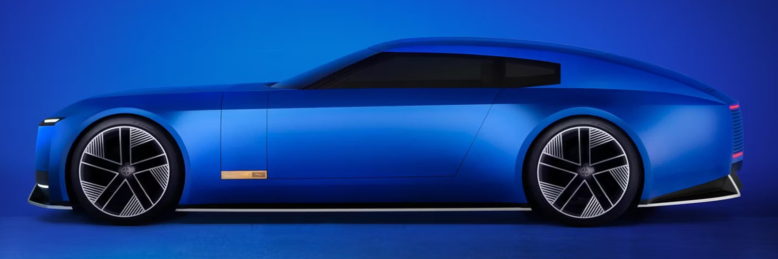
The Concept C is not TT-sized at 178” (4520mm) long, 78” (1970mm) wide and 50.5” (1285mm) high. So it’s fractionally larger than the R8 all round, whilst having a 3.2” (82mm) shorter wheelbase – disguised by the 21” wheels. Being a strict two-seater has allowed Audi to package the cells behind the cockpit as opposed to the usual EV practice of stuffing them under the floor, which as I’ve discussed before can lead to some unfortunate proportions if you are not careful. Specifics around pack size are lacking, but the weight is quoted as 3725lbs (1690kgs), which again is close to an R8 Spyder.
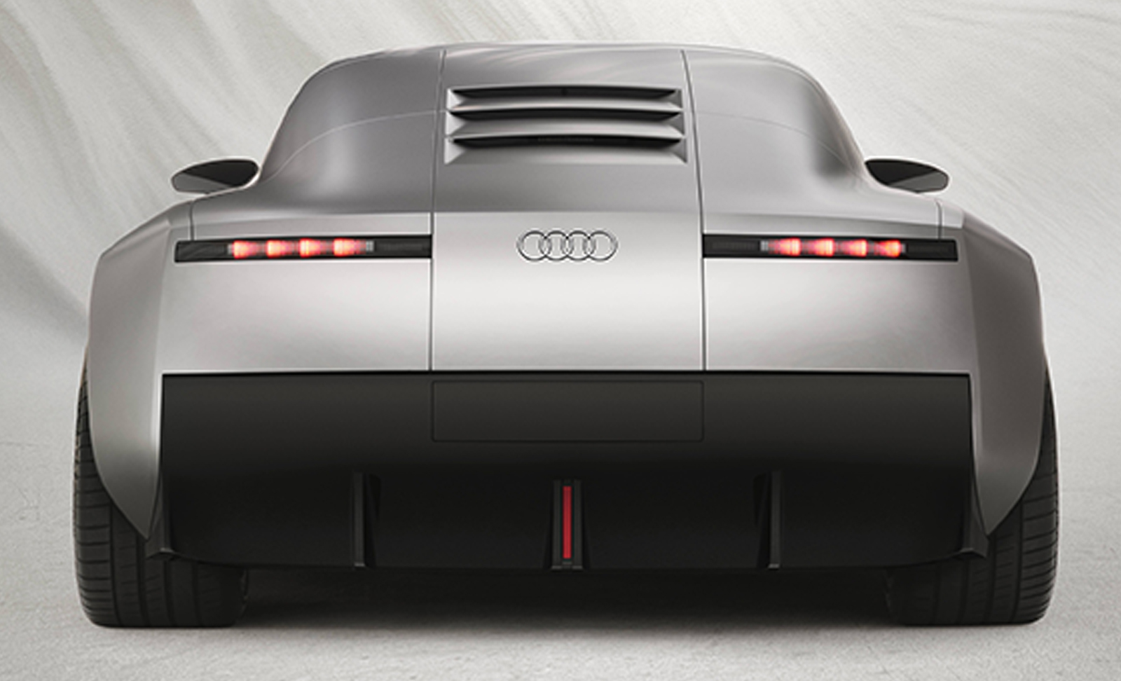
So the Concept C is a more exclusive and upmarket proposition than the TT. It’s interesting to compare Audi’s less-is-less approach against an OEM like Bentley, whose idea of luxury is predicated on layering exclusive materials on top of each other like an expensive sandwich. The exterior of the Concept C has a spartan and minimalist feel like a Rams-era Braun product. Every constituent piece feels like it is positioned in exactly the right place. Each graphical element is in total harmony with everything around it. Look at how the plinth for the license plate lines up with the vertical shut lines that run up and over the car. The rear light graphics are shallow, but don’t look lost because of the way the diffuser breaks up the depth of the rear fascia.
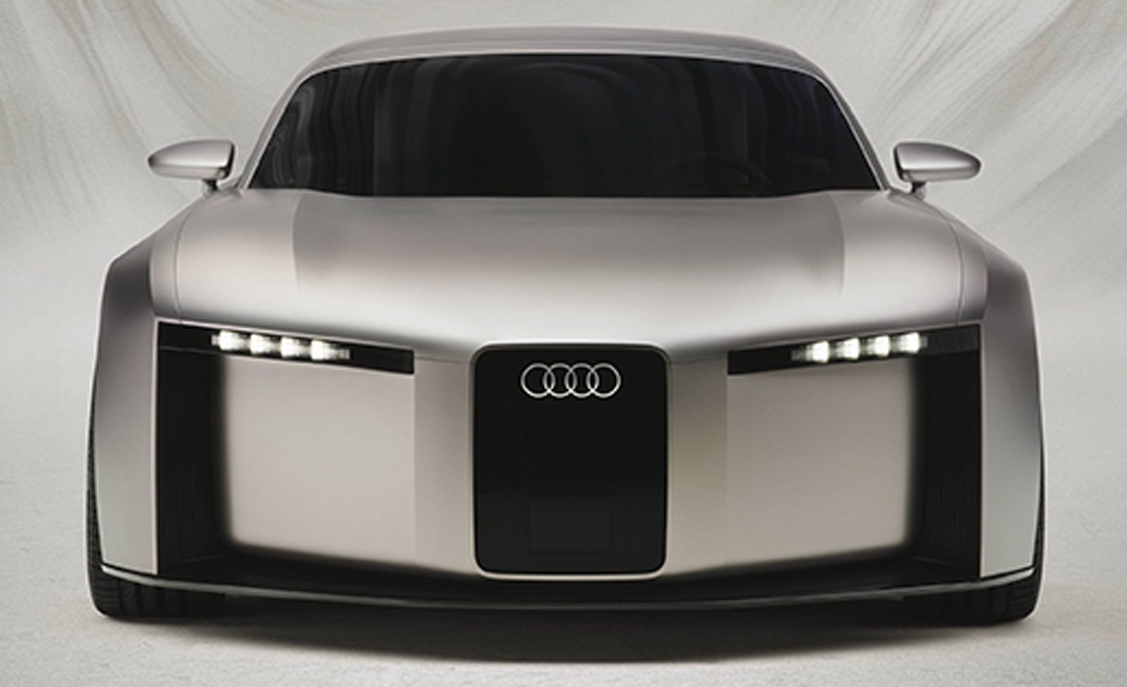
The front graphic is quite brutal with the way the side vents, grill, and feature lines all plunge down towards the ground plane. It’s not immediately apparent in the press shots, but there is a vertical strake pattern behind the glossy surface of the grill, which is also hiding a big ADAS sensor. That’s a neat solution to that potential electronic facial wart. I do feel if the bottom of the side vents rolled under the car a fraction in a comparable manner to the body side, it would help lighten the down the road graphic without losing any of its identity and impact.

You would normally expect a mid-engined car to be lithe and muscular with its bodywork pulled taut over the mechanical components and platform hard points. In side profile the Concept C is the complete opposite. In fact it’s almost two contrasting volumes – the rectangular blocky lower half and the softer, rounded upper half. It works because the transition between the two is so smooth. The sharp shoulder line lets the bodyside surface transition ninety degrees from vertical to horizontal, making it easier to blend into the cabin volume. This gentle treatment of the surfaces continues in the profile of the roofline. Theres no sudden changes of radius creating disruption – just a beautiful sweep from the header rail up to the high point above the cockpit and then all the way down to the rear. The crucial front three quarter view works brilliantly, showing a great stance and just how much shape the car contains. My only minor quibble is that small panel behind the side glazing – I think this could be a lighter color to break things up a bit on the quarter panel.

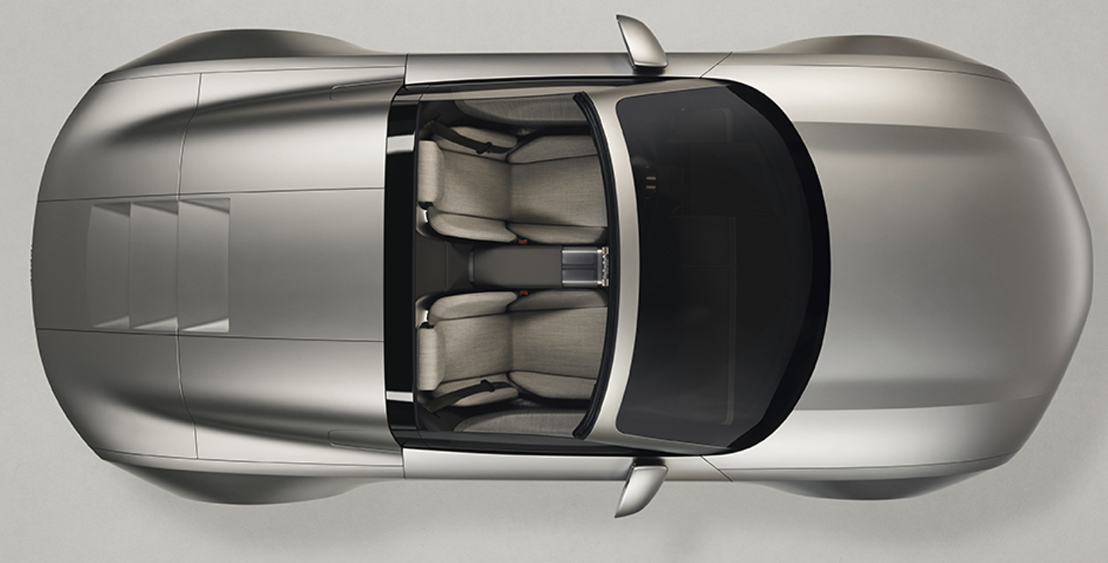
The interior is spectacular. There are circular hard controls made of machined aluminum and swathes of wool covering the door cards, dashboard and seat faces. Its not just for show – wool breathes so is more comfortable in both summer and winter, important for an open top car. Speakers fire through the fabric, reducing part count and giving a more sophisticated appearance. I especially love the translucent compartment on the center console, perfect for storing my sunglasses. A completely color matched interior in anything other than black is something we’ve not seen for a while. This warm gray treatment is both calming and inviting and other more vibrant tones would work equally well. The overall feeling in getting behind the perfectly round steering wheel is going to be like sitting inside a Bang & Olufsen hi fi.

Although much was made at the time about the original TT being inspired by the Bauhaus school, it didn’t teach car design because it hadn’t been formalized as a serious discipline at the time. The lasting influence of the Bauhaus is how after it closed its teaching and thinking led to Modernism – a design movement about how creative arts could better utilize modern production techniques and materials, leading to more logical, rational designs in consumer goods, architecture and visual communication. These ideas are as relevant today as they were a hundred years ago because the clue is in the name – modern. Taking what is new and using it to improve design outcomes. So despite the shape of the grill and the dorsal vents referencing those fearsome Auto Unions of the thirties I don’t consider the Concept C to be a nostalgic throwback to the past. They are just minor details. Now I’ve had a few days to gather my thoughts I feel it’s a car that’s feels fresh and different, and the exterior form language is something we haven’t really seen before…
Except of course we have. About a year ago, on the big blue elephant in the middle of the room. As soon as the Audi Concept C hit social media a few days ago some wags were putting it side by side with the Jaguar Type 00 and comparing them. Both cars do share similar bodyside treatments and a sharp shoulder line running the length of the car that turns a corner at each end to frame a flat, vertical nose and tail. Not entirely surprising given Frascella oversaw both cars, but I don’t think his last car at Jaguar and his first car at Audi being superficially similar is proof of lazy design of even copy and paste.
The two cars have vastly different overall proportions – the Jaguar is much longer, has a proportionally lower roofline and an extended hood. To me the Jaguar is not as well resolved – the lights are too small, it’s visually very heavy and it’s a bit plain. The Audi gets away with a paucity of external detailing because it’s smaller, and both the proportions and shut line management are a lot better. The Type 00 just isn’t as visually satisfying as the Audi, although I must admit after seeing the Jaguar at Goodwood in July, I understood what they were trying to do a bit better – it’s all about making an impact. But given the sudden nature of his departure from JLR, beyond the initial design work I wonder how much of Frascella’s influence the Jaguar contains. There was nearly a year (about the time it takes to build a concept model) between his leaving Gaydon and the car being shown at the end of 2024. The Type 00 being finished under someone else’s direction may be the explanation for its slightly heavy-handed feel.

Like all people who create things, car designers have a personal style they develop over time. A way of working within certain visual themes and ideas that translate across the cars they develop, like a band with a particular sound or a fashion designer with a certain look. If you squint a bit you can see the similarity in the flowing lines of Ian Callum’s Aston Martins and his later work at Jaguar. Frascella has plenty of design award glass trophies on his desk from his time at Land Rover – so his current style clearly resonates with the critics and was what Audi wanted. What I find fascinating is what this brutalist, minimal aesthetic means in terms of vehicle design at this moment in time.
The word Brutalist as it applies to architecture doesn’t refer to the blocky, visceral look of the buildings it describes. It comes from béton brut: French for concrete, the predominant building material used to aid rapid reconstruction after the war. I love Brutalist architecture because it embodied an optimistic post-war consensus. But a lot of these buildings were hastily constructed and subsequently fell into disrepair so public opinion turned against them. Brutalism became shorthand for a cold, harsh and unsettling object that elicited feelings of discomfort, which was unsympathetic to its surroundings and didn’t fulfill its intended purpose.

Jason pondered exactly this a little while ago when another bulky, squared off concept arrived with the subtlety of a brick through a stained glass window – the Bentley EXP 15. It is a poor design that drew a lot of attention, and attention, good or bad is the currency of the social media age. Cars with a markedly different appearance than expected are easy fodder for online taste makers and gatekeepers. This prompts knee-jerk outrage and bad-faith debate in the enthusiast community at large without any consideration of the wider context involved. Jaguar had to do something different because they had been in trouble for decades. Audi has a slightly different problem. In an interview with Automotive News Audi CEO Gernot Döllner made the tacit admission that the brand was spread too thin across too many categories, saying:
“Clarity and focus are top key parts of our new strategy. Therefore, we will have a less complex offer structure. We will have a more focused portfolio and a more focused selection of options per model. This will improve the overall customer experience. Reducing complexity is one of the key levers to making our brand even more successful and profitable”.
I think the Audi is an excellent design and nothing like as challenging as the Jaguar (or the Bentley) so hopefully opinion will warm to it in time. The Type 00 is still mired in controversy 11 months after the car was revealed because, like the 2010 XJ before it, it challenged perceptions of what a Jaguar should be. A lot of this reflects where we are as a society: we have a desire not only to shock others but to be shocked ourselves, so others pay us attention. Which leads us to another consideration: are these cars subconsciously or otherwise a response to a demand from wealthy customers for something not just exclusive and attention-grabbing, but polarizing. A wheeled slab of middle finger to the masses?
Perhaps the Cybertruck has been influential after all – just not in a way any of us might have expected.
Authors Note: In the interests of full disclosure my period as a designer at Land Rover occured when Massimo Frascella was in charge. He was my manager’s boss. As well as working on other versions, I was one of two designers charged with getting the Defender through to production. I wasn’t in Massimo’s cool kids clique so at first our interactions were somewhat limited until he knew me better. I was smoking buddies with his wife Amy, who at the time was head of CMF (color, materials and finish). She told me his favourite band was The Cult, which suggests Massimo and I could have been closer than we actually were.


My boss in 2001 bought a new TT convertible (2nd job out of college). Magnificent, stunning machine.
I still think this Audi has more in common with Bentley than the Type 00. Aside from the cartoonish oversized wheels, I like the Audi more.
Except for the front, which looks like a mashup of a robot face and The Mandalorian’s helmet.
I’m getting tired of everything being so serious and angry looking.
This specific kind of Adrian article is chemically optimized for my enjoyment. Love the insights into the techniques and triumphs of auto design.
Right into my veins, please!
Your servant, sir.
Concepts like this just further emphasize the fact that the original TT is a contemporary design icon
It’ll be in the next round of coffee table car design books.
Probably – Great Cars of the ’90s by Easton Press or something
Besides the fact that this is a VWAG product, it’s freaking fugly. So, no. I won’t be buying one. I was once married to a woman who claimed to have bought the first TT in Australia for her then husband.
I have my doubts, but my own personal experiences with a 2001 Jetta TDI have forever disinterested me in any further other ownership experiences with anything else engineered in Germany.
I’ve owned an Audi, a Mercedes Benz (purchased new), and a handful of VWs. I too have had my fill, and will probably avoid German cars in the future, unless maybe some irresistible old Benz crosses my path…
I was born too late for the original TT, but I don’t really like it. I find the wedge-of-donut shapes in the lights and bumpers ugly. This new one is interesting because a camera effect or lighting makes it look 90s or 2000s more than present in the press photos.
You and your black TT look like they were made for each other Adrian. 🙂
I loved the first-gen TT: yes, it drove like a tweaked Golf, but the form and proportions and details: so nice. I almost bought one of the Neiman Marcus editions (grey with the baseball glove leather interiors) at a used car lot a few years after they came out, but didn’t since it was an automatic.
I know they’re a pain to work on, and the timing belt in the 1.8 turbo is also a PITA (and costly) to replace, and like any Audi (or German car) from that era, it gets more expensive to run each year you own it past ten.
They’re still lovely though. The sequels weren’t awful, but lost the petite visual charm of the original, which sort of defeats the purpose entirely. To me, anyway.
What kind of filthy animal works on their own cars. Don’t you have staff?
I went to Frankfurt when the TT was introduced (the prototype, not the production one). I have a brochure stashed away somewhere…
If this heralds a new age of actual round steering wheels I won’t care about the exterior styling.
Although I don’t hate this, and might actually like in person.
The original TT made a big impact on me. I loved how it looked inside and out, but not how it drove. I’ve mostly had a string of cars that are the opposite, but the TT was close to making me buy it just for the looks.
That platform wasn’t the last word in driving dynamics, at least at first.
Adrian, as per usual, terrific write up. I’m right there with you on this thing – when it dropped I saw all those comments of “oh it’s the Jag” but the detailing in here really just makes this thing look great. To me, it does take this Industrial Design kind of approach, much like a Polestar does, and I’d say it’s captured in you line that the TT could have been machined from solid aluminum. I had the exact same thought about this when I saw it! How badly I’d want to touch a machined scale model of this thing haha.
The further I get from design school, I’ve gotta say, the less and less I like the work from the Bauhuas. International Style Modernism, at least from an architectural and product design standpoint, to me has this very rigid academic approach to being as boring as possible. For instance, I much prefer American streamline industrial design products from that period – there is this cleanliness you’d expect from a “modern” piece, but it’s more optimistic, forward looking and just plain fun. We’ve got a 1930s/40s Rival Juice-O-Mat juicer we use for our citrus and boy oh boy is it simply a gorgeous piece of design (end works extremely well). Likewise for the explorations of American mid-century architects and designers, like the Eames and Saarinen. If you’ve ever been to the Saarinen TWA terminal at JFK, it’s spectacular. It’s thoroughly “modern” but is a massive departure from the International Style, and with buildings like that he broke away from the good graces of the modernist intelligentsia.
I applaud you as well for, while liking brutalist architecture, being able to acknowledge the failure as a product. I can absolutely appreciate some of the buildings from a design perspective – but there’s no doubt that they are mostly utter failures of a product. The public generals hated them, hated living in them, and hated working in them. It’s a massive disservice to design when a product as large as those large scale buildings gets imposed on a public that does not want them. Don’t like a product? You don’t have to buy it. Don’t like a building? Well not much there for you to do. Design is a service industry, and a lot of people stuck in academia seem to oh so often forget that.
But yeah, I think this concept looks terrific, considered and well executed. Bravo Audi, it doesn’t look like some sort of increasingly angry fish!
I love Eames and Saarinen (who did the Tech Center for GM – aka the design offices and buildings).
Not all Brutalist buildings failed and it pleases me a lot of it is now being reappiraised, but sadly a lot of the surviving housing has ended up in the private hands and become extremely fashionable, totally upending its original purpose as quality homes for working people. I like to think a new round of state sponsored building of high density living could solve our housing problems in the UK, but it’ll never happen.
Oh I mean I can definitely see that from a UK perspective with the modernist estates. Now, that said, didn’t most of modernism really go that route? The idea of clean homes for workers that they didn’t really like now the purview of wealthier, fashionable clientele? I tend towards more modern design and taste myself, and especially in my own work, but I feel the academic and philosophical backings of it wind up not matching up with the reality that it created.
And yeah, there are definitely some good builds (The Met Breuer is a winner), but especially in the US I think the most known brutalist buildings are quite disastrous, most of Boston hates their city hall, while the J Edgar Hoover building in DC has been falling apart for decades.
Paul Rudolph’s Yale School of Architecture is a fascinating building, and it’s much better suited as a building for architects. Put that one as a building somewhere else on that campus and it would not be nearly as well received. Sometimes these projects can wind up going too far inwards to be truly public facing successes, kind of like that guy we all know who got really good at woodworking, and loves the lathe, but who’s work could really use a lot less random shapes done on the lathe haha
It’s not that the residents didn’t like them, as Thatcher began gutting local council budgets they couldn’t afford to maintain them. Also the Ronan Point disaster basically killed new high rises for decades.
I just can’t help myself but hear Jeremy Clarkson’s attempt to link this car to Bauhaus in that art themed episode of Top Gear.
The pendulum swings back and forth. New concepts were being ridiculously overdesigned with vents and black filler panels and every crease and inducted surface one could fit onto them. Now they’re being cut back to the bare minimum.
Even in the late 1970s where concepts were just a wedge and a bubble canopy there was a lot of intricate detailing, since all those strengthening ridges and chrome framing were required to keep the cars from folding in on themselves when you opened the doors or flipped the headlights up.
Now they’re just making 3D models in Autodesk Maya, and there’s no physical constraints like a door bending in on itself because it’s a smooth uninterrupted surface. An interesting thing to consider is when we’re going to get something like the Ford 021C Concept again, but as a Brutalist bare steel block.
Interesting to note also that many of these cars have gone from being outwardly aggressive to being stoic and more subtly intimidating. As if the designers are presenting them not as a weapons to lash out at other people, but as protective armour to keep you safe from them.
Data for building concepts would be created in either ICEM Surf or Alias. Sub-D software is not accurate enough.