
When you’re surrounded by something, especially something that changes gradually over time, it’s easy to miss how things are changing. It’s like the thing with the frog and the boiling water, which I was reluctant to reference because even if we put aside the inherent cruelty of it all, who the hell is eating a boiled whole frog? No amount of VW Curry Ketchup is going to make that good. The point is things change, and sometimes we need a jarring moment to actually see that change. And I think Chrysler just gave us that moment with their new facelifted minivan, the Pacifica.
As you may have seen in our earlier story, Chrysler has given the Pacifica it’s third facelift since its 2016/2017 introduction, with a mid-life face job in 2021. This should show how important this minivan is to Chrysler, which it should be, since it is also the entirety of Chrysler’s lineup of cars, which technically includes the Voyager, but the Voyager is really just a slightly cheaper Pacifica that still retains its original face.
Since we’re talking about car faces and facelifts, here’s a little visual reminder of what the various visages of the Pacifica have looked like:
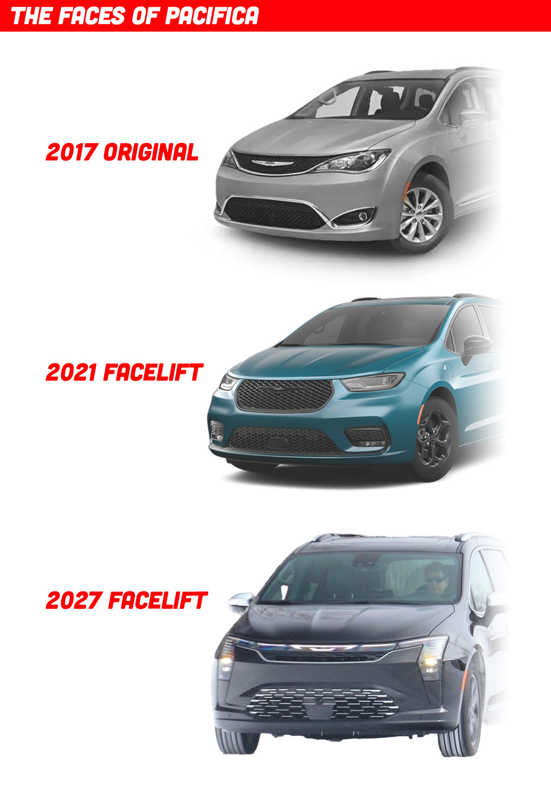
Personally, I always liked the original 2017 look best; I thought the way the flowing lines that defined the upper and lower grille seemed to blend into the other character lines of the car was quite elegant, and I especially liked the double-ended infinity-symbol-like lower grille treatment.
The 2021 redesign I always felt was a step back, to me cruder and less refined, but I know it was just echoing trends of the time with its wide, thin headlamps and prominent hexagonal grille. This latest refresh is quite different, and I think is a really effective way to look at how car front-end design has changed over the past few years. Let’s compare the current Pacifica face with this latest one we’ve just seen from Chrysler:
There are a lot of interesting things happening here. I suspect – though I’m by no means certain – that the only changes have been to the front bumper skin/fascia panels. I think sheetmetal like the hood and front fenders remain unchanged, which would mean the designers had to make their new look work with that triangular notch cut into the front fender to accommodate the last generation’s headlamps, which I also believe was the case when that facelift happened, too. I think all of these can share front fenders, which, considering how different they all look, is a pretty impressive design achievement.
Now I haven’t actually measured the size or angle of that triangular-ish notch, so I’m not 100% certain, but it looks like it.
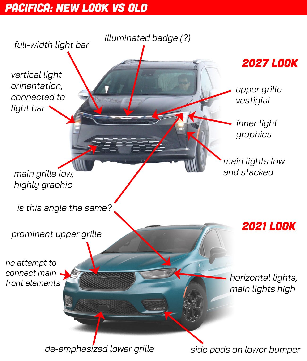
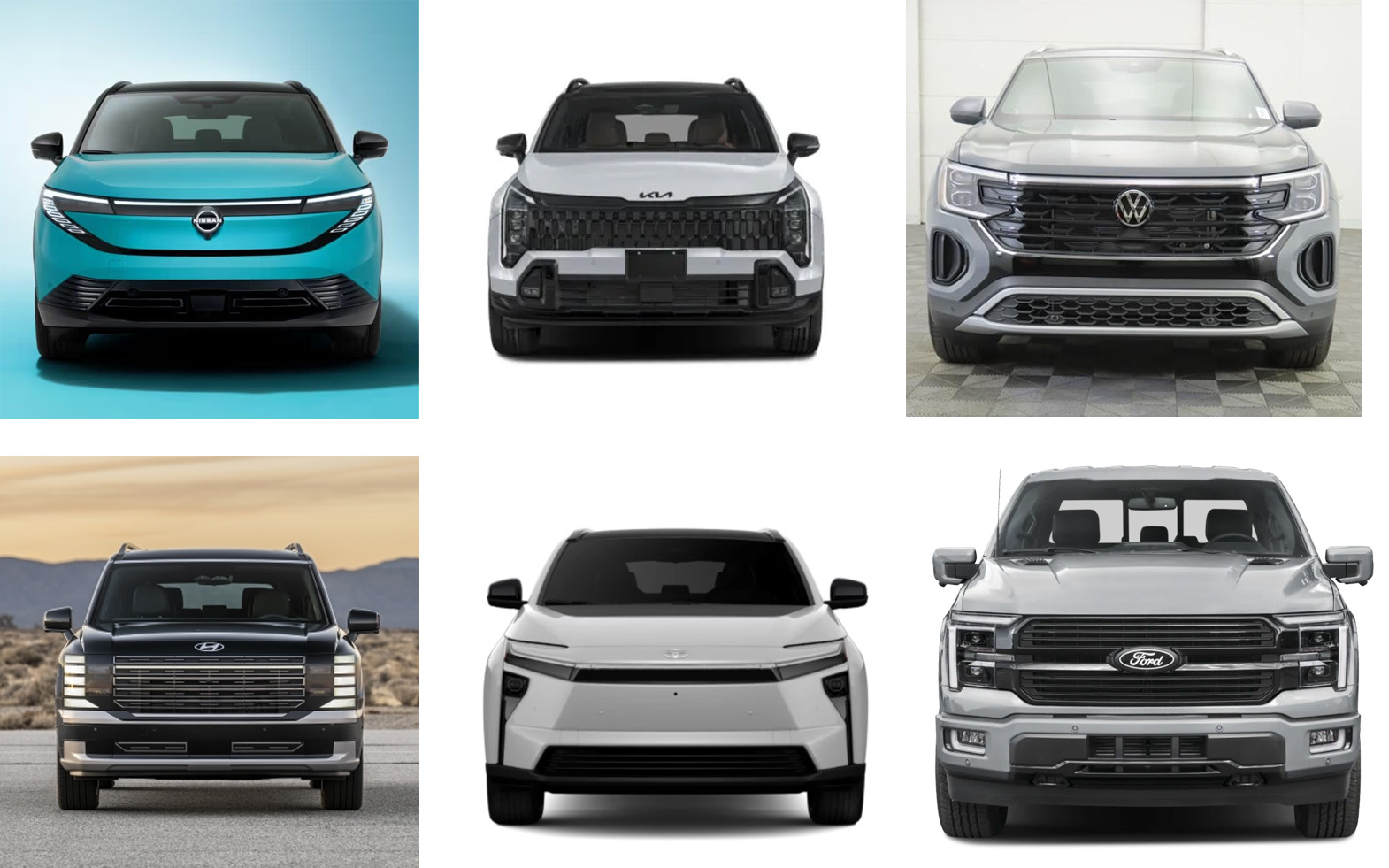
But look what’s happening here; the whole way front-end elements are arranged is changing. Here’s a sample of some other 2026 front ends that seem to be also part of this overall design trend so you can see what I’m talking about:
We’re firmly in the Lightbar Era; full-width white LED DRLs are becoming very popular, along with illuminated badges, both of which the new Pacifica now has. The orientation of headlamp units, which were once trending to be extremely wide and thin, have not taken a turn towards the vertical, and often remain visually connected to the light bar itself, creating designs that resemble downward-facing angled brackets or shapes made from bent paper clips.
The lights themselves have more distinct graphic elements inside them, similar to how grille patterns are becoming more unique and graphical as well. Upper grilles on many cars are becoming smaller and more vestigial, while lower grilles, once de-emphasized, are now taking on greater visual importance.
Paired “pods” of vents and lights under the bumper line and on the extremes of the lower bumper are falling out of favor, with the vertically-oriented “tails” of the headlight units compensating for that visual space on many cars.
Car faces are becoming somewhat less anthropomorphizable and less “facelike” in the bio/zoo/anthropological sense. Headlights are becoming a bit less eye-like, grilles a bit less mouth-like, and the car face is increasingly becoming more, um, machine-like, if that somehow makes sense?
Having a car like this, where everything remains the same except for the vocabulary and design language of the front end, is a real gift when it comes to being able to see exactly how car design is developing. I think, based on what we see on the punim of the Pacifica, we can sort of distill old and new car faces into something like this:
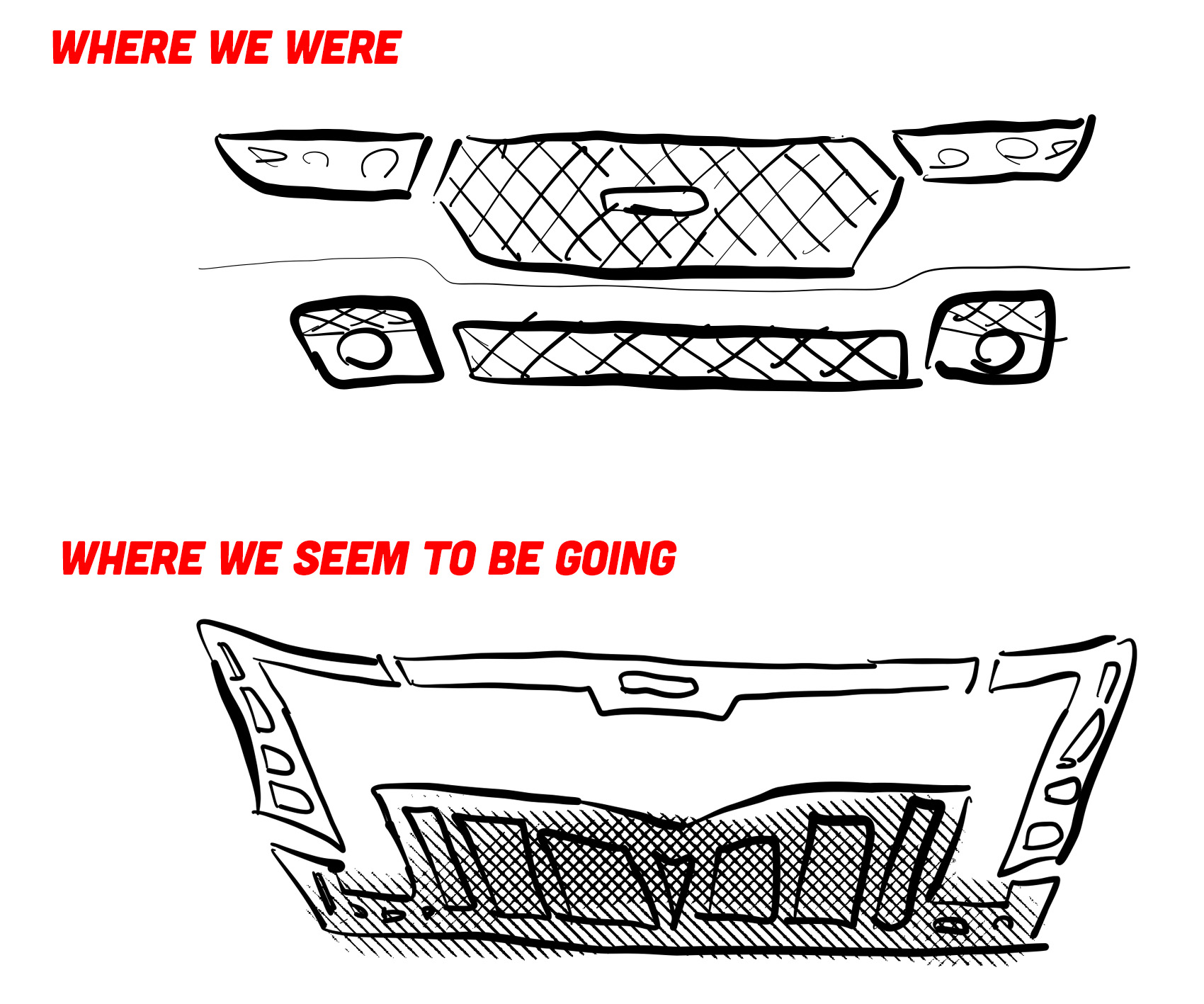
That’s a crude sketch, sure, but you see where I’m getting at. Front ends, I think, are entering an interesting period of attempting to make more overall cohesive elements, and less collections of individual components. These attempts already seem to be getting oddly ornate and many are even taking on design vocabularies that feel, to me at least, like some sort of neo-Aztec or maybe neo-Myan, in the sense of how Frank Llloyd Wright found inspiration in those cultures for much of his architecture.
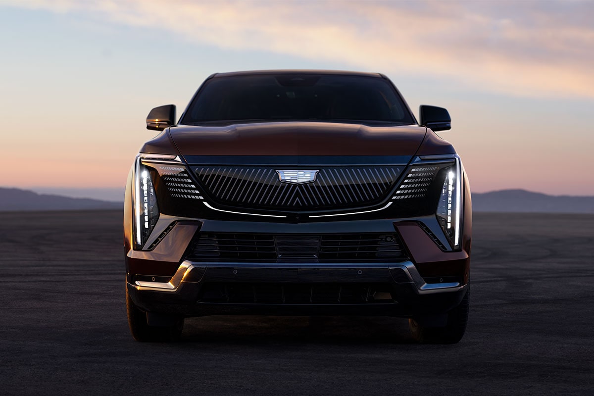
Look at this Cadillac Escalade IQ, for example; see what I’m getting at?
There are a lot of interesting things happening, and I should thank the Pacifica for making me take a moment to reflect. That’s important sometimes, and the most we can hope for from any refresh of a nearly decade-old minivan.


:max_bytes(150000):strip_icc()/Volkswagen-Is-Bringing-Its-Cult-Favorite-Ketchup-to-America-for-the-Very-First-Time-FT-BLOG0924-04-49b25555b3e54bd3b909e5e226d96e53.jpg)
I can’t tell if modern design is genuinely worse, or I’m getting older and hate change more and more. I’m going to go with “both”. Everything is so overwrought and try-hard. I hope it means the inevitable swing back to simpler designs feels that much better when it happens.
Autobots go!
Now I have arty farty, design part of me, so forgive me for saying so the driver here is not design but price.
It now costs more to replace a front end of a car, and sometimes even one headlight, than I used to spend on a whole car.
Like football shirts, which change every year, and sometimes twice a year, cars change their faces to screw as much money out of mugs as possible.
Do the new headlights shine any better — doubt it. In fact in France there is a distinct possibility of nearly all re designed front faces being recalled, because the headlights dazzle on-coming traffic too much…
2017: Classy for what it was
2021: Anonymous
2027: Wants to be Korean
Celine Dion??
This refresh is fucking heinous.
The 2017 was a damn fine looking car, not just minivan. It’s gotten significantly worse each refresh.
Much a small difference in our DNA would make us porpoises, a few centimetres mean that Escalade looks good while the Pacifica looks like it was in a frontal crash and was put back together with duct tape and a hammer.
Wait…Is Pontiac coming back?
And I guess the old one really is just the Ford Police Interceptor Sedan‘s face.
Makes me think of the Spongebob episode where he thinks Mr. Krabs is a ROBOT!
Funnily enough, this is even happening to trains!
Stadler really seems to like these kinds of designs – The new MARTA trains have the light bar, light up logo and vertical headlights – that design was signed off in 2019 so they joined the trend pretty early. If you look at the RS Zero, it has the light bar and some Flirts like the BLS Mika have the vertical headlights. That one also had a light-up BLS logo in the renders but it didn’t happen, likely due to regulations.
It looks like the first Pacifica was a Chrysler.
The second looks like a Ford.
The new one looks like a Kia.
catfish!!!!
New design is ugly. Original design was the best one.
Thinking about picking up one of these things used in a few years. I had a 2015 Town & Country that was good enough, so this is probably about the same.
I don’t hate the idea of having cars look like barely-disguised Transformers, but this is like some horrific science experiment where someone grafted the face of a Transformer onto the body of a cute puppy. This is less peanut butter and chocolate, and more BBQ-flavored whiskey (yes, that’s a thing, yes, I’ve tried it, no, it was not good). I like BBQ, I like whiskey, but I never want the two combined ever again.
Correction: this would be the 2nd facelift, not the 3rd. It is, however, the 3rd design on this bodyshell.
Before even reading the whole way through, came here to comment that the hood and fenders have remained the same for ages no matter what the headlights and grille look like. Was satisfied to find out it was covered in the article.
There will be some cars that will be unable to lose the anthropomorphic face as they will definitely lose their whole identity. I’m thinking like a Miata or GTI or a Mustang
The vertical timeline is like watching it hit branches of the ugly tree on the way down.
This helps me understand why I think modern cars are so ugly and hard to like. Cars should have faces! My mind knows them as lifeless appliances, but my heart believes they’re just modern horses. My first car was a dodge neon and I have a Nissan Juke now, both have very ugly faces, but they make you feel something other than mild intimidation.
Maybe people don’t want cars with friendly faces anymore. Have we gotten so angry that our cars can’t even smile?
Yes, the fenders and hood are 100% the same. This ends up making the sculpting on the rest of the van, and the graphics on the back, look dated, but it’s a pretty good job for not a lot of money.
I think the new one looks weird but inoffensive enough, it’s definitely not the worst of this new futuristic language going on.
I also think the original facia design was the nicest, even now it doesn’t look as old of a design in general and has even aged better than the 2021 version