
When you’re surrounded by something, especially something that changes gradually over time, it’s easy to miss how things are changing. It’s like the thing with the frog and the boiling water, which I was reluctant to reference because even if we put aside the inherent cruelty of it all, who the hell is eating a boiled whole frog? No amount of VW Curry Ketchup is going to make that good. The point is things change, and sometimes we need a jarring moment to actually see that change. And I think Chrysler just gave us that moment with their new facelifted minivan, the Pacifica.
As you may have seen in our earlier story, Chrysler has given the Pacifica it’s third facelift since its 2016/2017 introduction, with a mid-life face job in 2021. This should show how important this minivan is to Chrysler, which it should be, since it is also the entirety of Chrysler’s lineup of cars, which technically includes the Voyager, but the Voyager is really just a slightly cheaper Pacifica that still retains its original face.
Since we’re talking about car faces and facelifts, here’s a little visual reminder of what the various visages of the Pacifica have looked like:
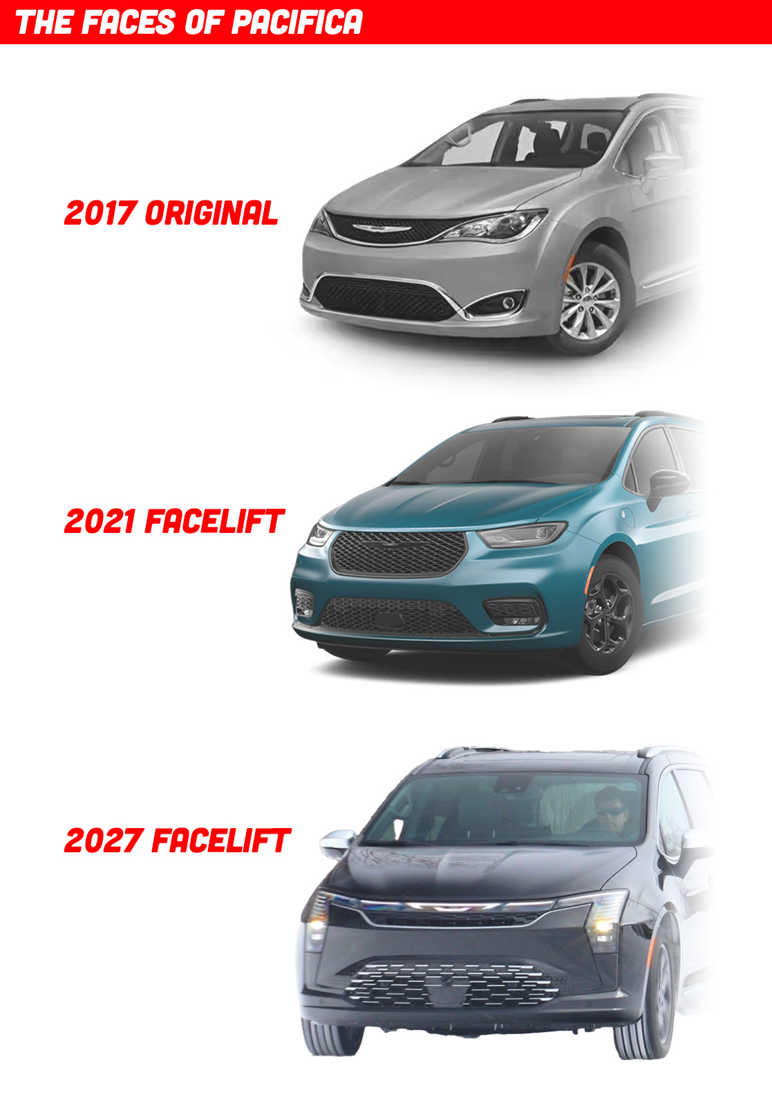
Personally, I always liked the original 2017 look best; I thought the way the flowing lines that defined the upper and lower grille seemed to blend into the other character lines of the car was quite elegant, and I especially liked the double-ended infinity-symbol-like lower grille treatment.
The 2021 redesign I always felt was a step back, to me cruder and less refined, but I know it was just echoing trends of the time with its wide, thin headlamps and prominent hexagonal grille. This latest refresh is quite different, and I think is a really effective way to look at how car front-end design has changed over the past few years. Let’s compare the current Pacifica face with this latest one we’ve just seen from Chrysler:
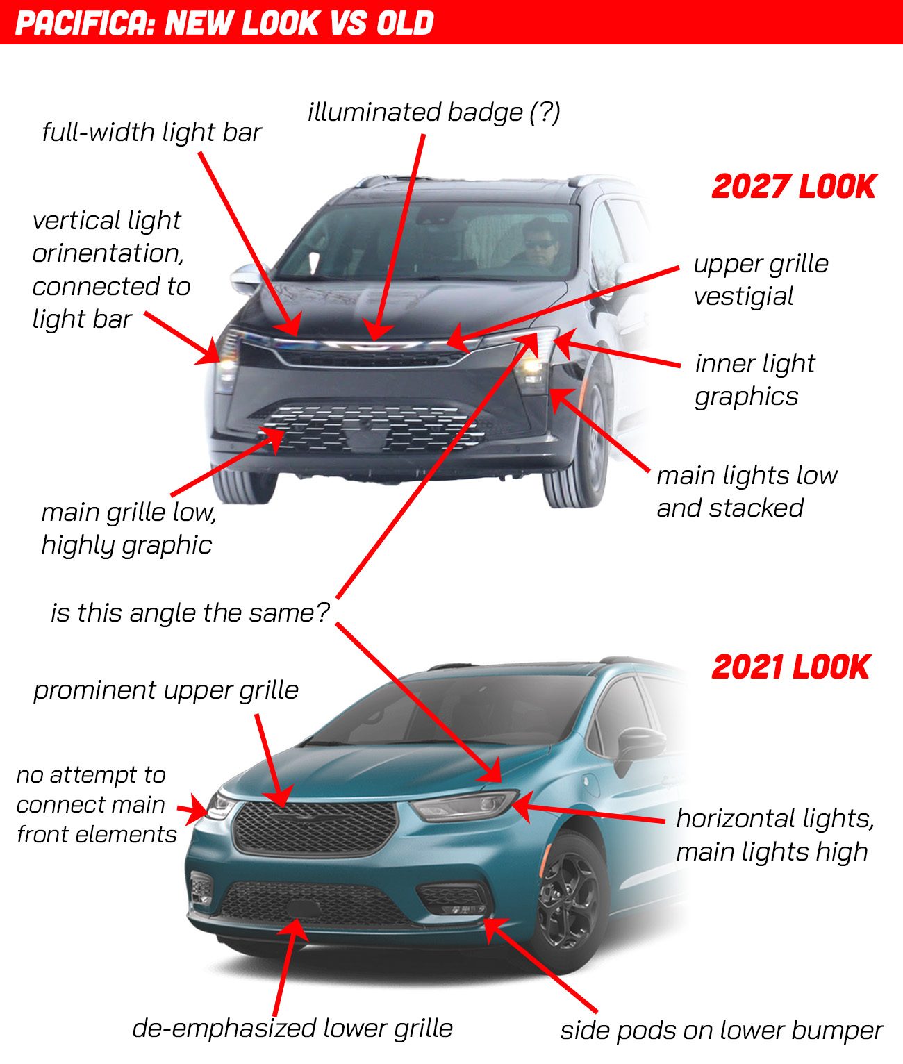
There are a lot of interesting things happening here. I suspect – though I’m by no means certain – that the only changes have been to the front bumper skin/fascia panels. I think sheetmetal like the hood and front fenders remain unchanged, which would mean the designers had to make their new look work with that triangular notch cut into the front fender to accommodate the last generation’s headlamps, which I also believe was the case when that facelift happened, too. I think all of these can share front fenders, which, considering how different they all look, is a pretty impressive design achievement.
Now I haven’t actually measured the size or angle of that triangular-ish notch, so I’m not 100% certain, but it looks like it.
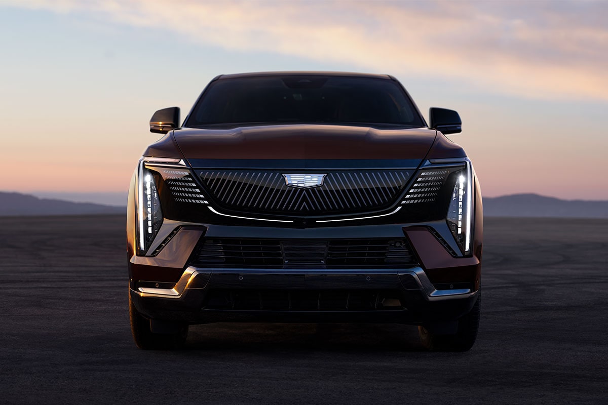
But look what’s happening here; the whole way front-end elements are arranged is changing. Here’s a sample of some other 2026 front ends that seem to be also part of this overall design trend so you can see what I’m talking about:
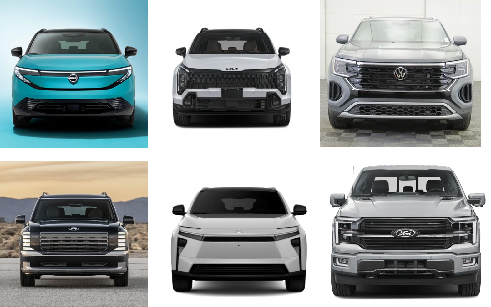
We’re firmly in the Lightbar Era; full-width white LED DRLs are becoming very popular, along with illuminated badges, both of which the new Pacifica now has. The orientation of headlamp units, which were once trending to be extremely wide and thin, have not taken a turn towards the vertical, and often remain visually connected to the light bar itself, creating designs that resemble downward-facing angled brackets or shapes made from bent paper clips.
The lights themselves have more distinct graphic elements inside them, similar to how grille patterns are becoming more unique and graphical as well. Upper grilles on many cars are becoming smaller and more vestigial, while lower grilles, once de-emphasized, are now taking on greater visual importance.
Paired “pods” of vents and lights under the bumper line and on the extremes of the lower bumper are falling out of favor, with the vertically-oriented “tails” of the headlight units compensating for that visual space on many cars.
Car faces are becoming somewhat less anthropomorphizable and less “facelike” in the bio/zoo/anthropological sense. Headlights are becoming a bit less eye-like, grilles a bit less mouth-like, and the car face is increasingly becoming more, um, machine-like, if that somehow makes sense?
Having a car like this, where everything remains the same except for the vocabulary and design language of the front end, is a real gift when it comes to being able to see exactly how car design is developing. I think, based on what we see on the punim of the Pacifica, we can sort of distill old and new car faces into something like this:
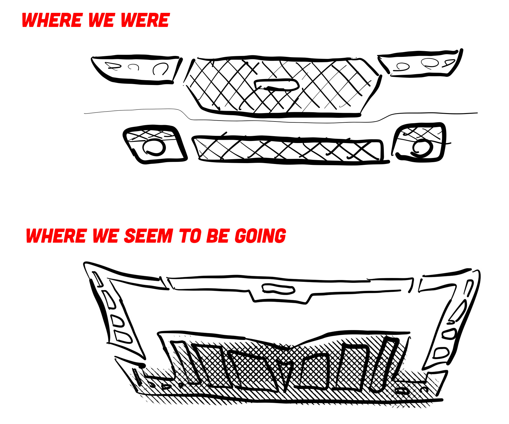
That’s a crude sketch, sure, but you see where I’m getting at. Front ends, I think, are entering an interesting period of attempting to make more overall cohesive elements, and less collections of individual components. These attempts already seem to be getting oddly ornate and many are even taking on design vocabularies that feel, to me at least, like some sort of neo-Aztec or maybe neo-Myan, in the sense of how Frank Llloyd Wright found inspiration in those cultures for much of his architecture.
Look at this Cadillac Escalade IQ, for example; see what I’m getting at?
There are a lot of interesting things happening, and I should thank the Pacifica for making me take a moment to reflect. That’s important sometimes, and the most we can hope for from any refresh of a nearly decade-old minivan.


:max_bytes(150000):strip_icc()/Volkswagen-Is-Bringing-Its-Cult-Favorite-Ketchup-to-America-for-the-Very-First-Time-FT-BLOG0924-04-49b25555b3e54bd3b909e5e226d96e53.jpg)
I think the new version looks great, especially considering the unchanged sheet metal. The vertical light units really fit the vertical nature of the vehicle, and the ‘face’ (if you can call it that) looks confident yet neutral.
While the original front end wasn’t really my cup of tea, I can respect the designer’s vision. It does flow nicely with the rest of the car.
The 2021 facelift though? Ooof. The horizontal lights don’t really feel anchored to anything, and they don’t fit the shape. They tried so hard to make the van look aggressive, like it was a ‘mean’ minivan for tough dudes who don’t pay their child support. I’m really glad we’re moving away from the angry design era.
I have polar opposite opinions to basically everything you just said. Wild how subjective tastes can be.
I suppose it proves the saying, there’s a shoe for every foot!
I am less concerned with the facelift, though it is very interesting, and I have definitely noticed the sudden shift in trends recently, towards light bars and such. What really gets my goat is the loss of a plug-in hybrid option. To my knowledge this was the only plug-in hybrid minivan. We are planning on getting one soon ish to replace our ancient Grand Caravan. We have a plug-in Prius, and really think the plug in hybrid model works very well for our situation. I was quite surprised the Sienna doesn’t have a plug in hybrid option. To my knowledge the Pacifica was the only plug in hybrid van. RIP Plug in Pacifica…
You don’t want the Plug in Pacifica. It is Stellantis’s least reliable vehicle (and that’s saying something) with multiple recalls due to spontaneous combustion and many many electrical gremlins. My guess is the reason it’s canceled is to cut their losses on it and then roll out something new that is at least somewhat reliable.
Exactly this. I agree a plug-in minivan would be great, but you do not want any plug-in anything from Stellantis.
When I first saw the thumbnail, I thought the photo was of an Aion Y which is a Chinese car by GAC.
https://en.wikipedia.org/wiki/Aion_Y
Based on Jason’s illustration, all cars will have the face of Soundwave cut off and glued to the front bumper. Which company trapped a Decepticon in the basement and decided it would be a smart idea to use it as a design study?
Soundwave superior, Autobots inferior…
So we’ve gone from cars having human-like faces, to looking like some kind of alien. I don’t like it.
It used to be trucks were getting uglier front ends. Now all the cars and crossovers are getting the same, hideous front-end treatments.
That Cadillac at the bottom. In person, up close, it looks strange from pretty much every angle. Front, back, 3/4. It’s like this “modern” front-end design is also on the entire car.
I rented one of the originals back in 2021, before the face-lifted version came out. And TBH, I never even noticed that facelift in the wild. It’s not like I was a Pacifica fan boy in tune with every variation on the platform. It was a decent vehicle for two couples and their luggage to cover the miles from MIA to Key West and back.
This newest iteration is certainly more noticeable. It will be interesting to see one in person. I do like how the horizontal crease line resolves through the headlight cluster. The lower grill is reminding me of the outgoing Toyota treatments. That’s not necessarily a good thing in my opinion.
But overall, I think there are worse-looking things on the road these days.
I don’t really like the front end on its own, but that pales in comparison to how bad I think it looks on the rest of the vehicle. It’s a complete mismatch.
Had they actually invested in a heavier restyle that spread the design across the whole van, I would still dislike it, but at least it would match
“I think all of these can share front fenders, which, considering how different they all look, is a pretty impressive design achievement.”
Yeah, not at all an easy feat to pull off so kudos to the designers. Reminded of what David Tracy wrote over at the German lighting site about how Jeep would update grilles and somehow convert from round headlights to square/rectangular headlights while retaining the original round holes: https://www.jalopnik.com/the-fascinatingly-cheap-way-jeep-restyled-the-jeep-wago-1826931827/
(Alas, that article appears to no longer have its images intact.)
Rubber-bumper MGs get so much hate but they’re another impressive design achievement in that they managed to switch from chrome bumpers to rubber safety bumpers while keeping all the sheet metal basically unchanged; honestly, those rubber-bumper MGs actually do look pretty damn good…
My uncle had a rubber bumper MG when I was very little. I always just remembered it had a big dog like nose until I got old enough to realize what was going on lol
My first car was an MGB and I chose a rubber bumper car because I actually liked them better.
I’m moderately in favor of the design trend for a few reasons.
Yes! The zero-function hamster cheeks was a trend we can live without.
Yes, flat black panels with barely-embossed fake grillwork. Unless you have a trim level with fog lights, in which case fog lights magically appear in the middle of your fake vents, half blocking your fake airflow !
I wonder if it’s something like aligning between EV and ICE models. It basically reminds me of something like a BYD Dolphin. https://www.bydauckland.co.nz/images/landing-pages/2025/may/byd-offers/dolphin.png
Also maybe they’re looking for a way to deal with ever higher hood lines
I would think it is the same fender. Keeping the sheetmetal saves a lot of money and I doubt they’ve used up their designed life on sales volume.
It successfully manages to look so much cheaper/lower grade than it’s meant to be. I believe these photos are of the top spec model (I feel like it’s relatively safe to assume that the Pinnacle trim is the top spec).
I hope there are some other upgrades that go along with the 2027 facelift… such as an improved plug-in hybrid system that has a tow rating that is greater than zero.
Or improvements made to the engine so that leaky coolant pump doesn’t dump coolant into the oil and prematurely kills the engine (a well-documented issue with the transverse versions of the Pentastar V6).
Is that a Pontiac logo I see in the second sketch? I caught that sneaky little “neo-Aztec” reference too.
Don’t tease us like that Jason! Let’s see the full concept 2027 Pontiac Aztec revival that’s been living rent free in your head!
Face to Face
The pace is haste
Grace for lack of waste
Did they brace the base, ace?
Seems to be the case.
No sir, I don’t like it. Said it looks like dog eye stains on caddies years ago.
Amazing how many manufacturers copy their competitors styling cues, and far from a recent development. Struck me when restomodding a 64 f100, how similar the Dodge and Chevy’s were, and fairly certain starts with the begining of mass production.
neo-Aztec? more like neo-Aztek amirite?
It kinda looks like a Chevy bolt
My main quibble with the current trend in vertical design language is that I do not believe lights belong at the bumper line. Hyundai really kicked this off a few years ago and it’s leaked into a lot of manufactureres. Literally just more things to break, lenses to crack, and proprietary LED modules to smash when it’s embedded into a modern soft bumper.
Expensive LED modules, at that.
Although on pickups lower headlights would be awesome
Pickups especially, but not just pickups.
Ooof. Choices were made…
Interesting how the facelift also seems to make the hood look taller/more blunt SUV than sleek car.
It’s amazing how Kia / Hyundai made funky looking cars and everyone followed. Could be a Kia, could be a Tesla , Cadillac, and now could be a Chrysler. Maybe our eyes just haven’t adjusted to it like when the jelly beans came in or I guess when everything was square.
For a long time Kia / Hyundai copied everyone else in exterior designs.
Now everyone is copying Kia / Hyundai.
Not sure if that is a good thing, but it’s kind of Amazing.
For sure, no doubt they will be copying the Chinese next.
This Chrysler already is.
https://upload.wikimedia.org/wikipedia/commons/6/6d/2023_Geely_Boyue_L_%282%29%2C_front_8.3.23.jpg
they stole the best car designer on the planet from audi and just let him cook. notice how audi has barely changed their design language since 2006. you can’t really beat perfection.
The Escalade IQ thingy looks like it has a lower bumper on it’s lower bumper. Or lower fascia because nothing has a bumper anymore.
As a former minivan owner I wouldn’t give a shit what it looks like outside as long as it worked like I needed inside. That said I prefer the 2017 Pacifica. Prefer, because as long as it has stow and go seats you can put an Avanti front end on it and I wouldn’t care.
I would like to credit all post 2021+ model design’s to Cyberpunk 2077 art staff. Almost everyone in the art/media space was enthralled with the game and specifically the “Entropy” design aesthetic. This is outlined in the collector’s guide book. Kia and Hyundai are very entropic in terms design. This minivan is now joining them. It’s giving function over form AND easy write off in a minor crash.
Helps sales obviously when cars get totaled for any reason in the US. I sorely wish we had the UKs insurance bands instead of the proprietary models we have now.
This is fascinating – thank you/tell me more. The aesthetic seems very much a continual refinement of the Blade Runner style, a sort of 21st century brutalism that conveys high tech but focused on durability.
Blade Runner and RoboCop were definitely the contemporaries of the Cyberpunk franchise during their heydey. Here’s a roster of the vehicles in-game. There’s options to view their styles, of which the game is built upon four styles in total. Most styles I see today are from the Entropism and Kitsch styles.
https://cyberpunk.fandom.com/wiki/Cyberpunk_2077_Vehicles
Cool (I only know the game’s trailer, which is awesome). I can see why “entropic” – a design style for a world winding down, a mix of new tech grafted onto older things, with a focus on at least looking tough. Makes me like Kias and Hyundais even more now. I’ve noted before that to my eyes, the K4 sedan, esp from the rear, looks very Blade Runner.
I think you’re right about the fenders, but taking a closer look it seems like they all use the same hood, too! For as different as these all look that’s pretty impressive.
I like the second version best, but the first was ok. It’s just a little too swoopy for me. The new version is bad.
I saw the hood appeared to be unchanged earlier, but the fender detail seems like it has stayed the same.
Changes to these parts would have definately made for a less “tacked on” appearance to the new grill and lights, but I’m not sure they would have done enough to make it actually appealing, so probably best they saved their money.