
You might think that the one crucial element in an advertisement about a car is that you should, you know, show the car. The thing you’re actually talking about. The thing you’re trying to sell. Incredibly, this doesn’t seem to be entirely true. While not exactly common, there have been enough attempts at advertising cars without showing any cars at all that I think it can be considered a particular genre of car advertising. The car-less kind.
It’s a novel approach, and I suspect that the initial impetus behind it is that by not showing a car, you’re getting attention from people who are expecting to see a car. To break them down further, car-less ads, I think, generally fall into a few categories: allegory/analogy ones, where some aspect or quality of the car is expressed via things other than a car; moody/pretentious ones, where the ad is so high-concept that actually showing the car would somehow be gauché. These are usually done for entire brands, where some more abstract quality of the brand is being called attention to.
Huh. Maybe there are just two categories? I actually think those two cover the spectrum of these ads pretty well. And, while we’re at it, we should define some parameters of what makes a car-less ad: I think a truly car-less ad has no depictions of the particular car being sold whatsoever, even if the depiction is just a drawing or, really, any kind of representation of the car.
That’s why I don’t think this ad would qualify, for example:
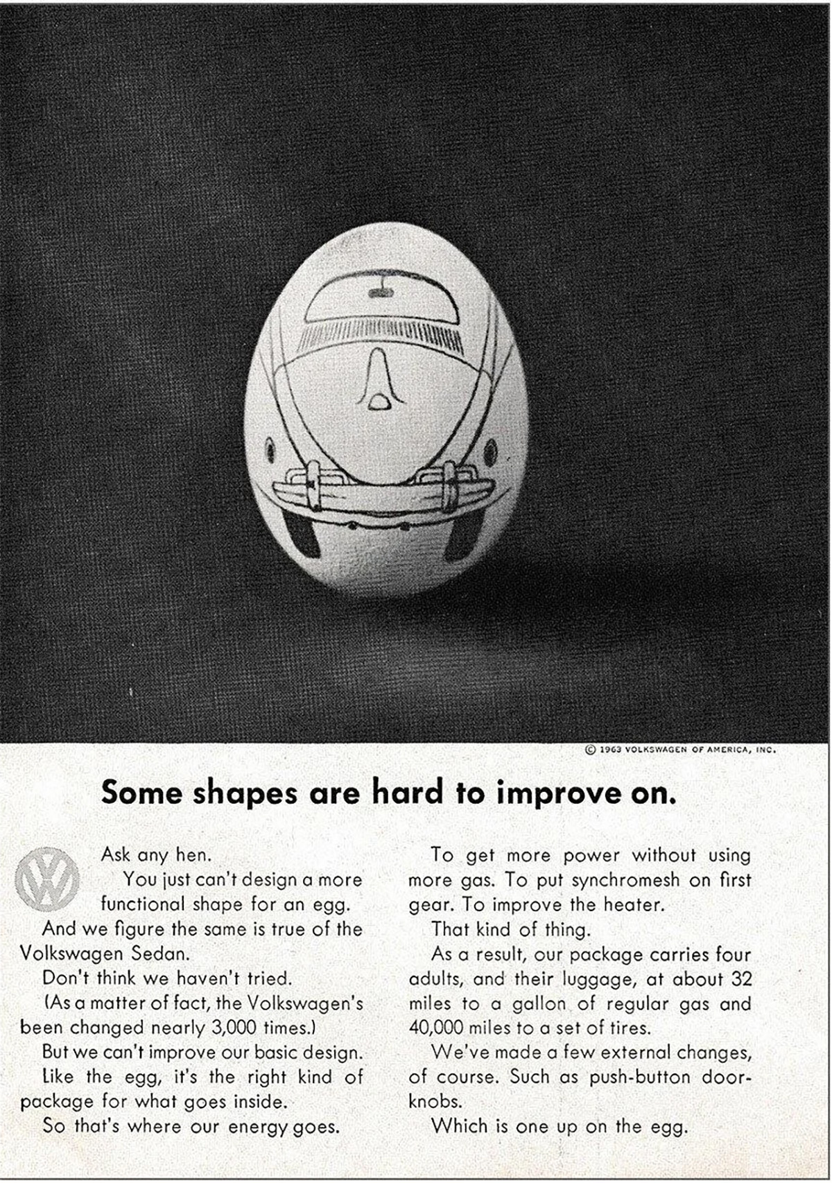
Yes, there’s no car there, just an egg, but it’s an egg with a Volkswagen Beetle drawn on it. So that disqualifies it.
Let’s look at some ones that do qualify and, unsurprisingly, we’ll continue with more from Volkswagen’s iconic midcentury ad campaign from Doyle Dayne Bernbach, which was not afraid to take risks like not showing a car. Or, in the case of this ad, anything at all:
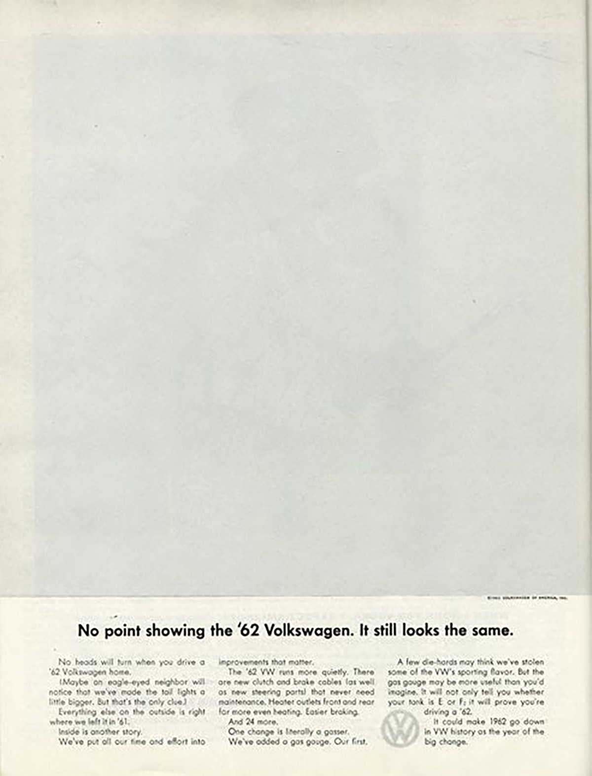
Really, this ad from 1962 may be the ur-don’t-show-the-car-ad. It was clever as hell, and while it may have seemed like madness to pay for 75% of a blank page in a national magazine, DDB knew what they were doing. This vast white void caught a lot of eyes, and expressed VW’s fundamental philosophy better than a whole spread of pictures could.
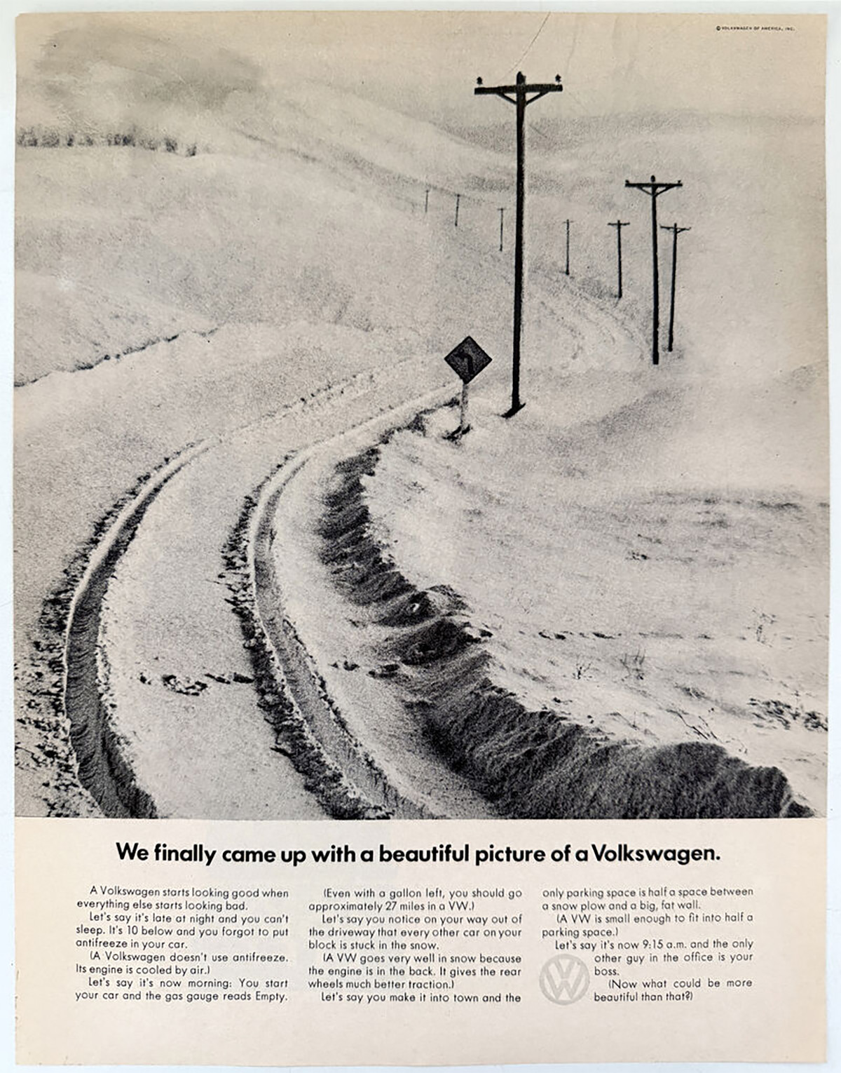
So this one I think would fit into the allegory/analogy one, where we see the results of what the car can provide, without seeing the car itself. Here we see tire tracks in snow, and the absence of the Beetle is evidence that the Beetle can drive well in the snow, which is the whole point of the ad. Again, very clever and effective.
DDB sure liked these kinds of unusual ads; here’s one of my favorites, from 1969:
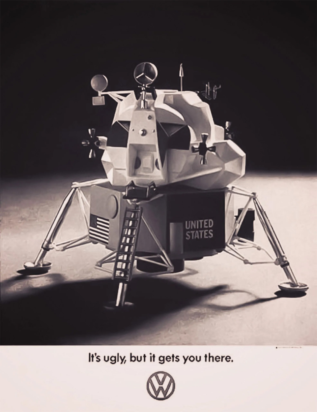
This one combines a lot of things, and makes some really interesting demands on the viewer: it’s commemorating the moon landing – this ran right around when Apollo 11 landed on the moon, in July of 1969, and nearly everyone who saw it would recognize the lunar lander. The caption is a masterclass in self-deprecating praise: “It’s ugly, but it gets you there.” The VW logo below confirms that the “it” referred to both the lunar lander above and the Volkswagen Beetle, the perceived ugliness of which the advertising had long established a gleeful embrace of.
That one line suggests that the Beetle, like the lunar lander, may be unconventional looking, but is capable of achieving remarkable tasks of transportation. Not a word about the car is mentioned, but a whole narrative is formed in the viewer’s mind. This is an amazing ad.

This 1979 ad for the Fiat 132 takes a more literal allegorical approach, showing a wolf in sheep’s clothing, the meaning of which pretty much everybody understands: something that is fiercer than it looks. And that, in turn, suggests that the Fiat 132, a fairly reserved and proper-looking car:
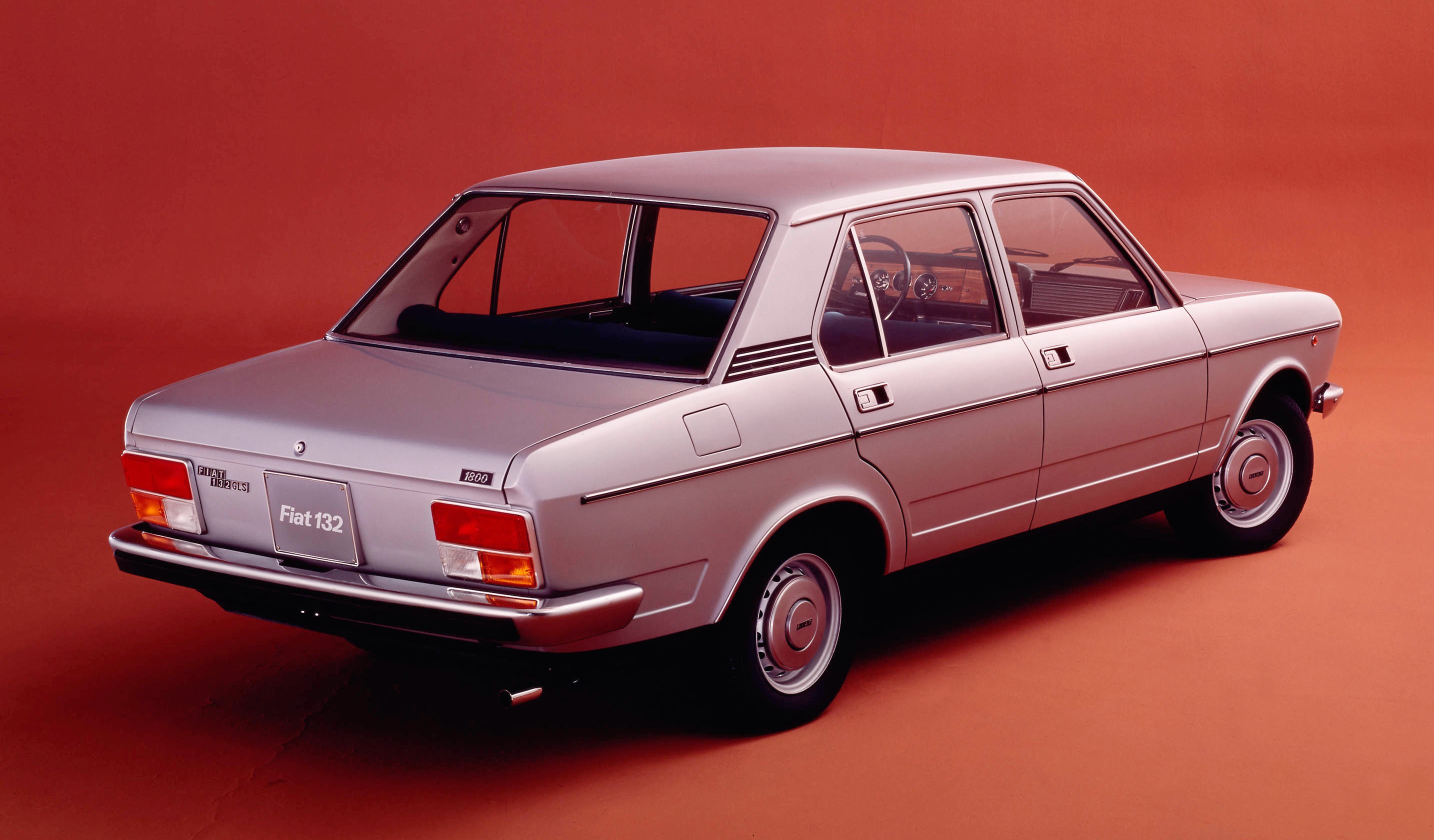
…nevertheless had a more sporty, wild side that wasn’t immediately apparent. It’s an incredibly efficient way to convey that idea.
Let’s look at some of the other categories of car-less ads, the moody/pretentious category. As the name suggests, this one often veers into annoyingly pretentious and first-year-film-school sort of bullshit, though occasionally these can work. When they don’t work, though, they usually don’t work spectacularly, as in the case of what may now be the most infamous of these kinds of car-less car ads, the Jaguar Copy Nothing ad campaign:
Oy, remember how worked up we all got over this pretentious bullshit? I hear ERs all over the world had to staff up with ophthalmologists because of how many people were coming in with injuries from excessive and protracted eye-rolling.
I think prior to Jaguar stealing the most-annoying-car-less-car-ad crown, most people would have given that honor to the early Infiniti ads, which were sort of pioneers in the pretentious, show a mood, not a car category. Here’s the set of the commercials they ran just prior to the launch of the brand:
There’s a very conversational narrator, talking in hushed tones like he’s right there next to you at a bar, hovering a little too close. The imagery could have been taken from a slow-paced nature documentary, or perhaps a DVD that they play at the dentist’s office to try and keep you calm. I don’t think these played terribly well, but they did bring attention to the brand.
This one was a little different; it feels a bit like the pretentious/moody ads, but it’s really just an analogy:
The house, you see, is the Infiniti! The Infiniti has just that same sort of Japanese luxury, you see. Like the houses that carpenters build. Also, who is this old dude that goes into something like that as soon as he sits down at the table? Did he just arrive? Come back from the toilet? Does he know the other, silent guy? Is he selling something? I’m confused.
More recently, Lexus has run an ad campaign that sort of reminds me of those early Infiniti ads, but they’re a little weirder, in a way, and maybe in a way that disqualifies them from this category:
So … is this about the car or just the warranty? Is a warranty an inherent part of the car that’s being sold, conceptually? If it’s just about the warranty, is it still a car ad? I mean, maybe – lots of cars have been advertised based on the strength of their warranty.
Cadillac has tried this, too, during their Dare Greatly campaign, and it’s a pretty weird way to try and sell cars:
The text that the narrator is reading is part of a speech from Theodore Roosevelt, a speech with a title that gave Cadillac that motto. They show some background cars in the ad, but no Cadillacs, no driving, nothing that even really references the idea of a car or driving or anything. I’m honestly not really sure what the hell they were going for here, beyond attempting to associate Cadillac with, um, Teddy Roosevelt? I wonder how that’s working out for them?
Maybe at the opposite extreme is this 2007 Mercedes-Benz ad that just seems to be a filmed enactment of an old silly blonde joke:
I mean, okay, it’s sort of funny, but it also feels pretty dated and maybe a little misogynistic to modern eyes? I mean, I’m all for the idea of filming old jokes with high production values just because – I think that old one about the guy who had to clandestinely fart and a dog named Duke would be a great candidate for this – but is this a good way to sell cars? Maybe? Who knows.
Sometimes the analogy ads can really backfire on you if your initial analogy isn’t particularly well thought-out. Saturn’s most famous car-less ad (it does briefly show cars at the end, but I’m still going to accept this one) inadvertently spoke to a lot of people who didn’t particularly like cars at all, or who felt society could be better with many fewer cars:
I mean, I guess I can see that, unless you start to really think about the distances involved here or the existence of, you know, rain.
When it comes to analogy/allegory ads, I think a tighter focus tends to be better. These VW ads use analogy to highlight very specific safety features, for example:
Okay, that’s cute. And we get the message. Here’s another one:
Similar concept, also clever, gets the concept across well. Also, look at that cake! That looks pretty good.
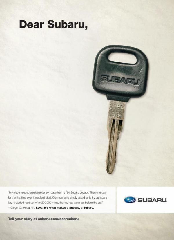
Let’s end with another print ad, this one from Subaru. It’s an interesting take; it relies on the text of the letter as much as the image of that old key. The point is that Subarus are long-lasting, and the fact that the key wore out before the car is used to illustrate that. There’s really no need to show the car, just showing the key is much more attention-grabbing and memorable. There’s also a touch of self-deprecation to keep things grounded – the key did wear out, Subaru isn’t invulnerable – but it’s just mild enough not to detract. It’s clever.
I know there’s more of these, and if you know of good ones, please shove them in the comments! This is an interesting niche of car advertising, and I think there’s a lot of compelling thinking going on here that reveals what is really being sold when advertising cars: not a car, but a concept of a car. And that doesn’t always need a picture.
Top graphic image: Lexus


This made me remember the original Daewoo ad campaign from when they launched in Germany in the mid 90s (maybe used elsewhere, too): https://youtu.be/cMeXLixsq1o?is=ZUGg-gSJznf0gk6-
It played into Daewoo being completely unknown at the time, being Korean and all, which the ad also acknowledged at the end, where you were told to call the phone number shown, if you wanted to know more. Apparently you could then also win… something, which is kinda ironic, since they also didn’t tell you what that was. Just imagine the disappointment if that something turned out to be a mid 90s Daewoo…
Remember, Hyundai and Kia were still brandnew in Europe and still separate companies. Plus, there was no Internet to speak of, so it’s not like I could just google it. Heck, we didn’t even have a computer back then. The ad just had me, as a fledgling car enthusiast* sitting there wondering wtf Daewoo even was. I didn’t realise it was a car company until the cars eventually showed up in later ads and car reviews.
*Not that Daewoo ever made cars for enthusiasts. The Saturn Sky was sold as the Daewoo G2X in South Korea (and maybe other asian markets?), but it wasn’t engineered or built by Daewoo, thankfully.
I really want to know the backstory of how an American businessman became friends with a Japanese construction worker.
VW really needs to go back to that “less is more” philosophy, and not just for the advertising.
I’m still stuck on the fact that the Beetle didn’t have a gas gauge until 1962.
Gas gauges are for Audis.
Mopar or No Car?
Yeah I guess I’d take the lede photo.