
I’m fiercely interested in logos. I used to design them for a living, in a former professional life, and I have thoughts about them that I’ll happily share with any poor bastard unfortunate enough to be sat next to me on an airplane, at a banquet, or on a grand jury. Carmaker logos are an especially interesting sub-category, because they’re the sorts of logos that people tend to have a lot of feelings and opinions about, so dramatic changes tend to be met with a lot of resistance. Sometimes a hell of a lot. As a result, carmaker logos tend to make pretty subtle changes to their logos when they do change them. Honda just made a change to their logo, and I think it qualifies as subtle, and maybe even a bit of a throwback.
Their new logo – which they refer to as an “H mark,” I suspect because of, and I’m going out on a limb here, the big H – is going to be the new symbol of “Honda Automobile Business.” The logo will start to be rolled out on next-gen EVs and Hybrids, but will soon be used for everything, as their press release notes:
Moreover, Honda will expand the use of the new H mark to represent Honda automobile business as a whole, including not only automobile products but other customer touchpoints such as dealership locations, communication initiatives and automobile motorsports activities.

Here’s what the new logo looks like:
If that logo looks familiar, it probably should, as it’s very close to the logo Honda proudly (and hugely) stamped on their very first automobiles, like the T360 mid-engined truck of 1963:
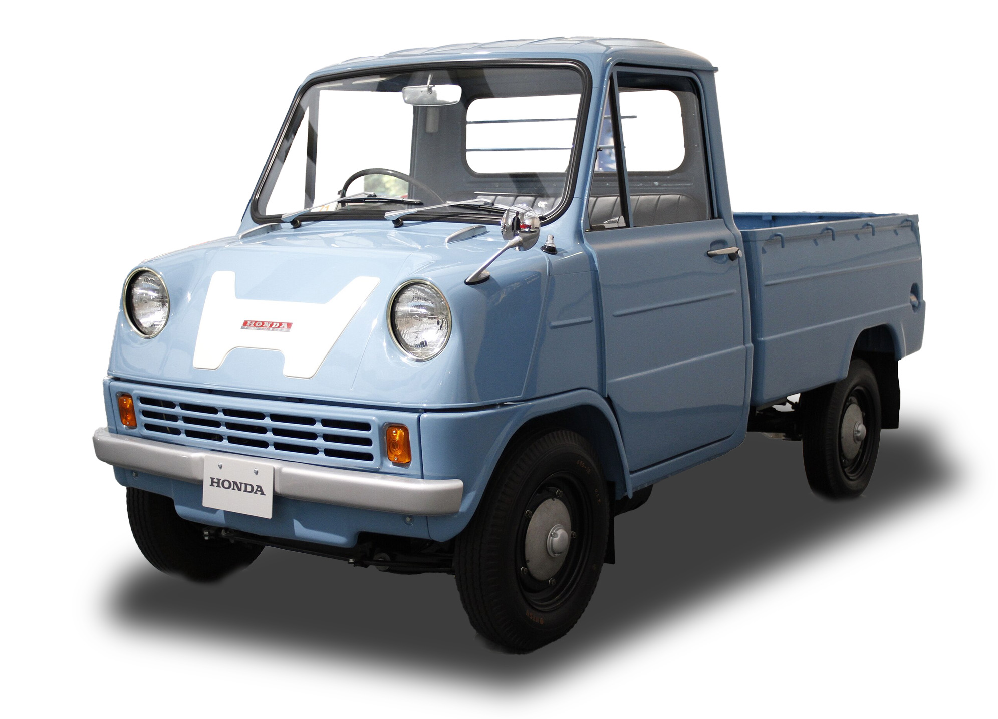
These trucks are so fun. Let’s watch a promotional video about them!
This same type of wide, stylized H persisted and was used on subsequent cars, like the N600:
Proportions of this H were fairly malleable; a very narrow version was used on the hood ornaments of Accords in the 1980s:

Soon, the default Honda badge circumscribed the H with a rounded-corner sort of trapezoidal/squarish border, as you can see on this Passport:

This was also the sort of Honda badge Superintendent Chalmers lamented the loss of on his Accord:

This new Honda logo is a nice throwback to the original source, a clean, simple H. Of course, Honda’s press release can’t just leave it at that, suggesting that they appreciate the logo on deeper levels (emphasis mine):
The H mark design was refreshed in conjunction with the development of next-generation EVs, including the Honda 0 Series, which are being developed with the determination to “create new EVs from ‘zero’ by going back to the starting point of Honda as an automaker.” Honda refreshed the H mark design to express its commitment to the transformation of the company as well as its corporate attitude of going beyond the origin of Honda and constantly pursuing new challenges and advancements. The new design expression, like two outstretched hands, represents the commitment of Honda to augment the possibilities of mobility and sincerely serve the needs of the customers of Honda automobile business.
Two outstretched hands? What do they mean? Like, connected by the thumbs? Like this?
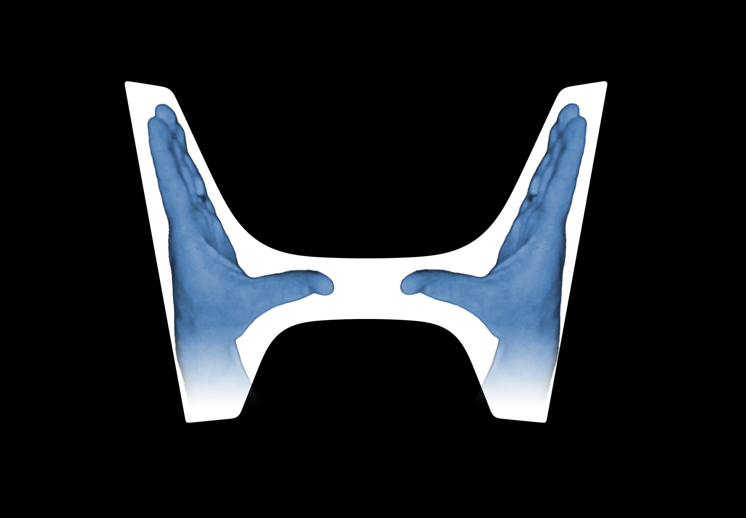
Is that what they’re getting at? This feels like a stretch. A stretch in the same way that Hyundai’s claim that their H-logo is supposed to represent two dudes shaking hands:
View this post on Instagram
Come on, Hyundai. Really?
Still, silly made-up-by-PR-hacks outstretched hands explanation aside, I think Honda’s new logo is pretty good, and I think going back to the original, clean source is a wise idea.
This’ll look good on grilles or grill-free front ends alike, illuminated or chrome or matte. It’s a good logo. But it’s an H, not two damn hands.


I can’t help but be struck how that ancient tiny blue pickup in the topshot reminds me of a Telo. Just generally in shape and a bit of character, not in any functional way of course.
The Hyundai logo causes an unreasonable amount of anger within me. I hate it.
The dude on the right in the Hyundai explanation there looks deeply uncomfortable, meanwhile the guy on the left looks like he is enjoying that handshake far too much and I am scared to ask what sort of deal they just struck.
If you worked in design long enough then you know that we’re really good at bullshitting. You have to make whatever you do sound digestable to the various layers of corporate leadership, meaning a dry and remarkably underwhelming statement followed by some flowery bullshitting language to sell it off.
“Fine art” photography always felt like that too. Just a more modern version of The Emperor’s New Clothes.” Sometimes there is more artistry in the BS than the art itself.
The hands are implied, at the end of two upstretched arms, while the legs of the H are…legs, on a very squat, headless individual.
Will this get me an internship on the PR team?
The guy on the left in the Hyundai logo clearly has garlic breath.
Whatever you do, don’t Honda Hands your significant other unless you want to go to jail on a DV charge.
I like that the new Honda logo represents strangle hands.
The Hyundai logo represents a class action lawyer shaking hands with a new Hyundai owner.
Hey, I’ll have you know my Genesis Coupe was only on it’s THIRD engine when I sold it! And it’s second transmission. And had body panels re-painted twice under warranty.
My wife’s Optima is only on it’s SECOND engine! Progress!
were all the engines and transmissions replaced under warranties?
My engines, no. Wife’s was under the massive campaign, which had an unlimited time/mileage replacement deal.
I love the little truck, loaded with wood or barrels of whatever, spitting gravel. That DOHC doin’ it!
That was a joyful commercial to watch, lively jazz and all!
Peeling out, I wondered how all that cargo actually stayed in the bed.
I always think of a twisted/squashed I-beam when I see the old (now new) Honda logo, so my thoughts go to not up to spec steel [shrug emoji]
The “outstretched hands” thing is some classic “pissing on your leg and telling you it’s raining” corporate bullshit. Someone from the design agency told that to someone at Honda and they believed it. Meanwhile, the design agency made a slight revision to a very old logo and called it new. smfh.
So….wait another 30 years and then switch back to the one we have now? I think you can still claim it’s hands.
I researched/wrote the Speeed video on car company logos and boy-howdy is there some bullshit from companies about what theirs mean. Guess they can’t just say “It’s retro. That’s cool, right?”
Thank you for your work! I love Speeed videos. Oddly, I find myself more interested in the non-car ones, and I don’t know why.
Aw! Thank you for the pat on the back. Behind the scenes folks rarely get direct feedback from the audience, so it’s always uplifting when we do
I do curriculum development, I understand being behind the scenes, lol. Keep up the great work!
Related, I may be the only one, but the upper/lower-case Honda seen on the back of the Prologue (and maybe others?) is really growing on me. I hated it at first, but it now seems kinda funky-futuristic.
Pretty sure it’s Super Nintendo Chalmers.
Pictured with Prinskiple Skimper.
I’m learnding
That’s unpossible!
Steamed hams
Oh boy. I’m a Viking!
Only when I’m dreaming.
I eated the purple berries. It tastes like burning.
Oh cool, more branding overthought for a very safe change in an age where branding people are afraid of social media backlash.
I mean, wouldn’t you be? All it takes is some 12 yr old on twitter to point out it reminds them of some part of human anatomy and no one will ever look at it the same way. Or see that it represents human-centered design based on technological advancement or whatever BS you and your firm invested 13 million dollars over 18 months to create. They’ll just see a nipple.
Well, I was thinking more of Cracker Barrel or Gap this-is-doing-big-damage-roll-it-back scenarios over something like the announcement of the Nintendo Wii, which all but the most childish got over after a few days.
fair enough. Maybe brand equity plays a roll? Nintendo has so much credibility that they’ll get you to come around on their silly sounding name. Like, I don’t think a startup could get away with a product called Wii (unless it had to do with, well you know).
That Hyundai trivia seems a little far-fetched, I KN-not believe it.
One person’s posture looks super aggressive, the other looks like they’re under duress (or at least responding to being pushed into something by leaning back). Not the look I would have gone for.
Yeah, I feel like salesdude has some serious halitosis.
Yeah, whenever I heard that it was supposed to represent a salesman, shaking hands with a customer, I think of the cover of “wish you were here”.
FWIW I became aware of the Hyundai businessmen shaking hands ~15ish years ago (I believe it was around the Genesis brand launch) so I’ve always taken this as a true piece of brand history.
They had marketing liars in 2010, and Hyundai seem quite gullible.
They believe KN spells Kia.
Fair, but I’ll believe Hyundai over random armchair takes on the same subject.
I can see the KIA in their logo even if I’m not a big fan of the logo… maybe time to visit the optometrist?
I’ll believe just about any rando over a marketing firm trying to sell the significance of an italicized ‘H.’
The Hyundai logo looked like a ripoff of the Honda logo. It was much better then the current KVI, though.
What the H, Honda? This is not new; at best it’s a minor modification. Now a Q, that would’ve been a real bold move. Honda, we’re the car for Q. See? Stuff writes its self.
Only if they get John deLancie for the commercial voice-overs.
Very few people know that the Honda Motor Company was actually named for a list of successful vehicle manufacturers that Soichiro Honda wanted his nascent company to emulate – the fact that their initials coincided with his name was a happy accident that went unnoticed for the first 3 decades of the business.
In case you’re curious: Hispano Suiza, Oldsmobile, Nissan, Delage, Austin.
And all of those are gone now. Well, almost (sorry Nissan!)
Hey! I resemble this post… I feel seen haha
Love the way he says UNDERFLOOR ENGINE at 0:22.
I know English is, like, 40%+ loanwords, but I’m always intrigued by the English words that get used in other countries, especially Japan.
Japanese has a ton of fun loan words, and my favorite might be Kīhorudā (pronounced roughly like keyholder), which is their word for keychain.
My favourite is bigumaku. It’s apparently a unit of value used for vehicle pricing.
“This’ll look good on grilles or grill-free front ends alike, illuminated or chrome or matt.”
Yeah, fronts are pretty great, but some look good from ANY end.
Make Honda H Again?
This hits a bit differently now that I have a Triumph Acclaim:
https://live.staticflickr.com/65535/53958968424_fbb558552a_c.jpg
Ohhh – Nice Honda Ballade!
(And Saab.)
(And DAF 66/Volvo 343.)
Thanks! Both the yellow sedan and the white wagon two rows over are examples of the Volvo 66 GL, not the later 343.
Pay me $200,000 and I’ll come up w all kinds of marketing drivel about what your brand’s “H” logo symbolizes:
A Pushmi-Pullyu! (Which way are we going today?)
The Space Family Robinson’s 1960s space ship! (Yah, they got lost…)
An Egyptian Bench! (For your journey to the afterlife)
Two guys docking! (We know where this is going…)
Hey – Where’s my money?
Guys…?