
Generally, I’m quiet fond of most 1970s design, even the stuff that looks especially dated and hilarious to us now. Maybe especially that stuff. But there is a subset of 1970s design that always kind of creeps me out. I think most of what I like about ’70s graphic design is that it can (not always, but the potential is there) become a sort of zanier take on Bauhaus/Modernist design, with earthtone stripes and clean typography and a certain strange futurist feeling. But every now and then, designers in the ’70s would give in to these weird urges to make things absurdly fussy and ornate, and look to this weird idealized Victorian era for inspiration. And the combination of those things just ends up, well, weird. And a little creepy.
This 1971 brochure for the Winnebago Chieftain is a great example of what I mean; Winnebago design from the 1970s was usually felt more like that ’70s futurist sort of feeling, but this brochure leans hard into that other weird ’70s influence, that strangely saccharine and somehow unsettling Victorian influence that just makes me think of strange lonely old houses and creepy porcelain dolls that rotate their heads slowly to look at you, clearly possessed, and a certain sort of musty, heavy, overly sweet lingering smell.
It weirds me out. I mean, just look at this stuff:

What a I supposed to do with these images? Does this make me want an RV? I mean, only in the context that it could help me get away from whatever this is. That picture of the bed in the upper left feels like a photo the cops would take to show where the hostage was held for all of those months. Then there’s Madame Ghosty in the other upper corner, and that bedroom set out in that field with Primrosetta Hathawayfield taking her mourning dove out of its floating, gilded cage just creeps me out. And that carmel-mustard colored shag rug looks longer than the grass it’s flopped on.

Why were we doing this? Why couldn’t ’70s design keep looking boldly forward? Why were we looking back so hard, just with more orange and burnt umber, inscribing fussy lines on cheap particleboard cabinet veneer, faking marble on the walls and getting way too into making tea?
And that typography up top. Ugh. I have this thing against really fussy script typography, it feels cloying and pretentious and is kind of a visual mess. I especially feel this way when script fonts are used for all-caps text, like this:

Ugh, awful! It’s almost illegible, too. Loopy script types like this can have their place, but they were never meant to be all-caps and used for strings of letters and numbers like this. Who likes this?
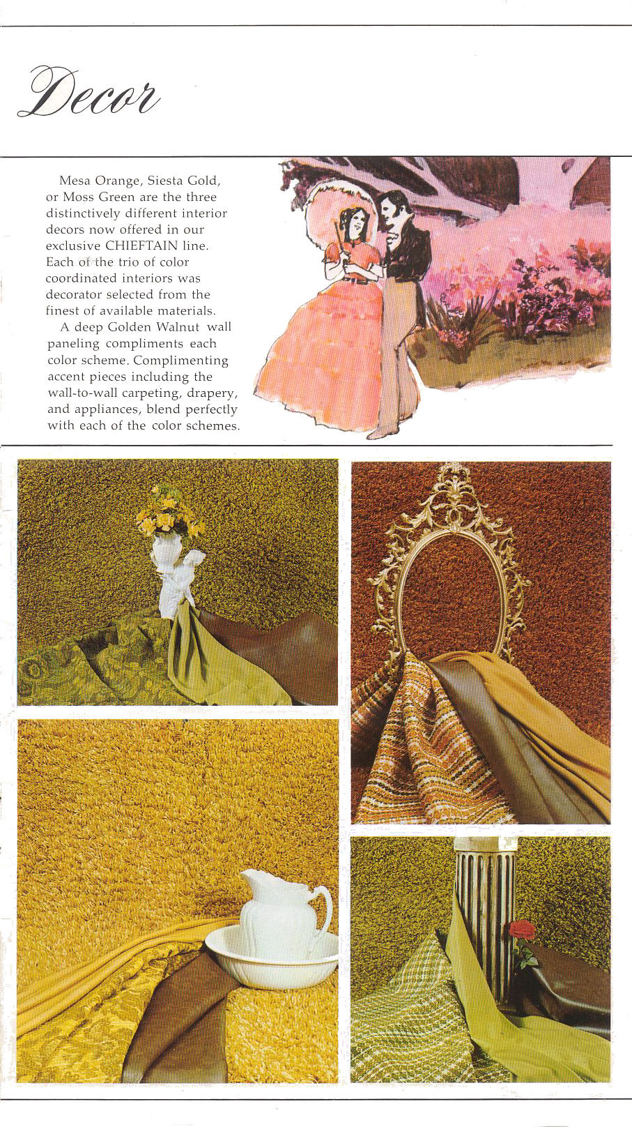
Oof, look at this incredible display of textures and earthtones! Sometimes I forget that a lot of the ’70s was like being in a world made of guacamole and chili and creamed corn. All the fabrics seemed so thick and textured, that I remember. For years I think I thought plaid was as much a tactile experience as a visual one. All of these fabrics feel like everything I touched in the Lutheran church basement youth rooms that hosted the Boy Scout troops I was in.
And, again, up top, we can’t escape this weird backwards-looking fetish. This time it feels more antebellum South than Victorian, though.

The whole pre-Civil War south thing keeps cropping up, too. In this spread about propane tanks and water level gauges, they really needed to sneak in a bit of the Confederate battle flag?
And then sometime they just went full plantation:
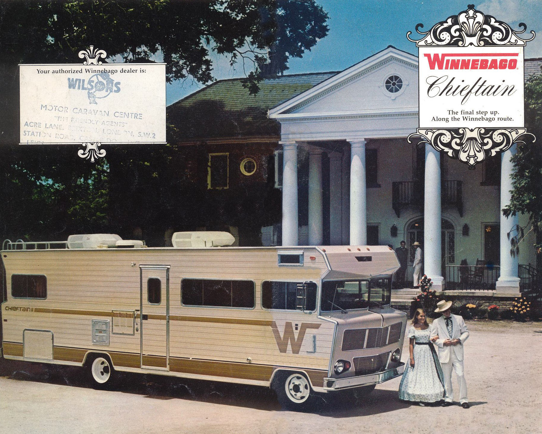
The hell, Winnebago? Why? Why do we need Col.Sanders and his favorite daughter, Herbsann Spices Sanders, promenading in front of this old plantation house to their massive, parked RV? I get that we look at this sort of scene through different eyes today, just seeing a miserable time of oppression, but even back then, why is this a way to sell RVs? I just don’t get the connection here?
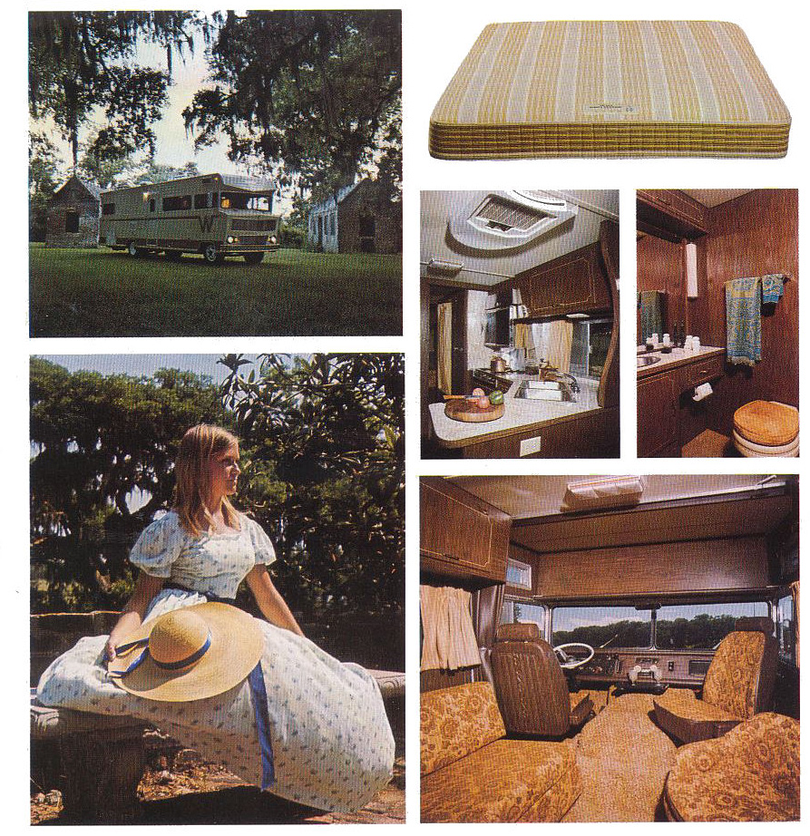
Of course, what could be better to show than a bare RV mattress? Give that some stains, chuck it by a ravine in the woods, and stick a tattered stack of Oui and Swank and Hustler magazines and you have a really powerful scene of woodland discovery for so many people of my generation.
Also, please note the shag toilet seat cover and all those patterned, brocaded fabrics that made every seat look like it had a skin condition.
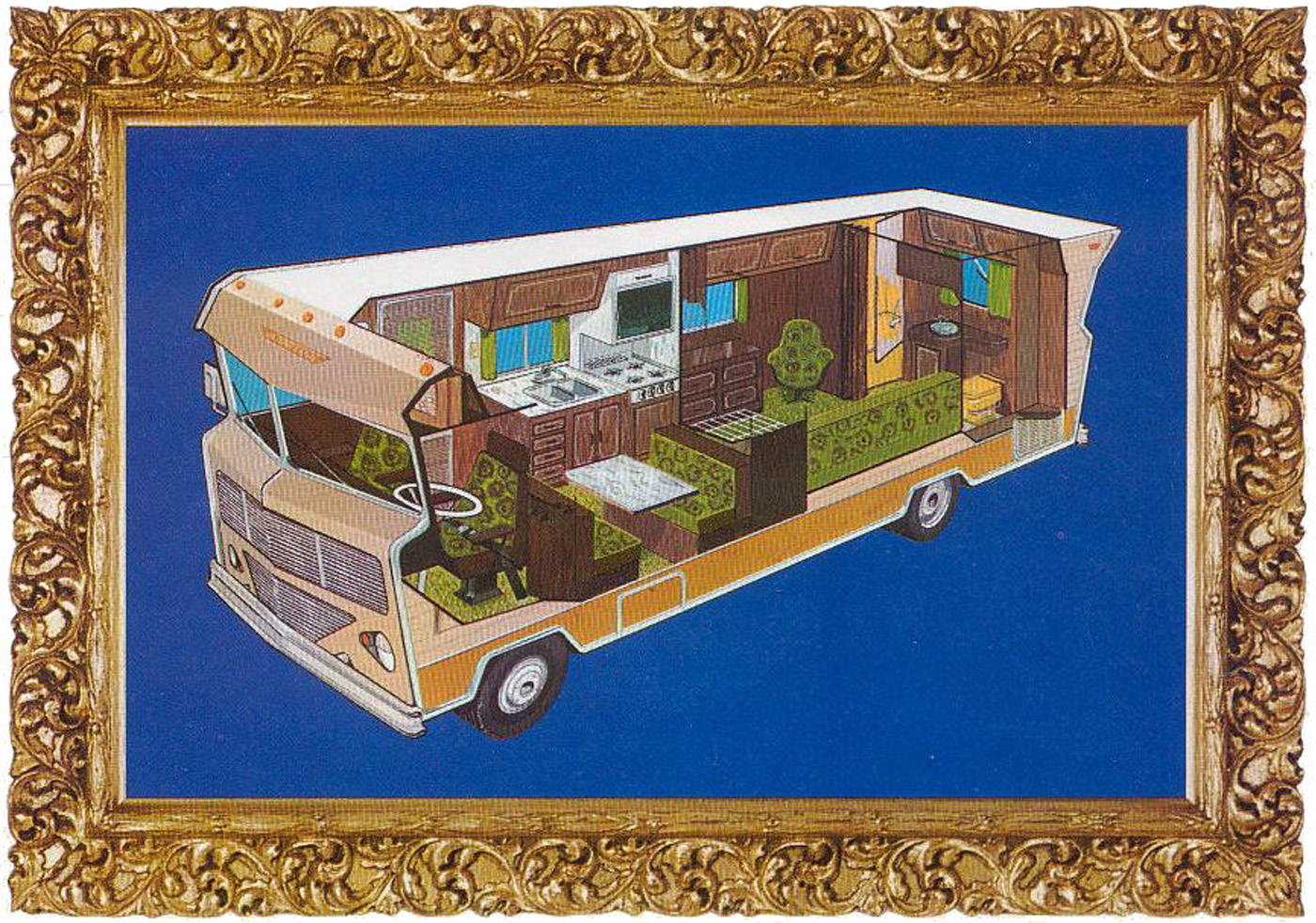
I like how the fabric patterns are shown in this cutaway, because it makes those chairs look like weird aliens. Especially that one near the back, above the couch.
These cutaways are pretty fantastic, though:
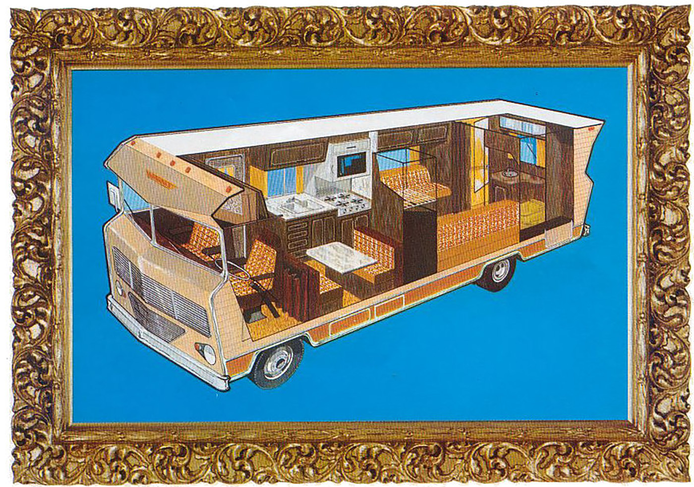
I can’t stay mad at a brochure with such fantastic cutaways! There’s even one free of the absurd ornate frames! Look!

Now that’s a satisfying diagram! These things were so huge, and with their corrugated sides, really built like drivable sheds. I also love their profile/silhouette, which wasn’t just non-aerodynamic, it had a genuine, undisguised contempt for the wind, shoving it aside with real malice as it lumbered down the highway, chugging a gallon of gas every other mile.
Man, the ’70s were weird.
Top graphic and story images: Winnebago


So much of the RV market, especially big motorhomes, are primarily bought by retirees. So the marketing department has to use the current styles that are popular with the older demographic.
In the 60s and 70s, that meant the peculiar stylized “Old-Timey” vibe of that era. It was freaking everywhere. Just like 50’s nostalgia was so damn pervasive in the 80s where styles otherwise tilted toward avant-garde futurism, Bauhaus/brutalist design, or gritty punk.
It’s why today, as you go up the price scale in big class A motorhomes, the interiors now look like a combination of cruise ship, casino, and tourist-resort hotel design. Because that’s what the late Silent Generation and early Boomers are familiar and comfortable with in their travels leading up to their retirement years.
The next wave is probably going to be greige and “modern farmhouse” HGTV slop because that’s what’s been foisted off onto aging Gen-X homeowners as fashion. It’s already entrenched in mid-price RVs.
As older Gen-X who just freaking can’t stand mass-market HGTV “style” it’s annoying when I go looking at motorhomes on sale, used or new. I just want practical and comfortable, not overwrought or trendy. A few manufactures do, fortunately, offer “basic” interiors like that. As soon as I see some of the gaudy or trendy stuff, I nope right out.
this reminds me of one time I really offended my Mum when I was a kid, we were watching some random old TV show rerun full of ugly, ugly 1970’s fashion & design aesthetics just like this, and I asked her:
“Mum, did it not used to matter how people dressed or what they looked like?”
she was probably in the middle of watching it and re-living her glory days or something lol
All I can think of now is those 1970s Time-Life hardcover cookbooks of “food from around the world” and the nauseating color grading of the food photography. The recipes weren’t much better, although I expect many were actually pretty authentic, esp the early-70’s German potato pancake recipe I tried. I think the pancakes were 1.5lbs each from the butter. I remember telling my British college hall-mate that my mom had taken a “cookery” class in the UK in 1978. She made a confused expression and blurted, “my God… Why?!?”
Point of correction – Col. Sanders’ daughter was called Mildred. I only know this because we have a local chain of bootleg fried chicken places with a fascinating history.
https://missmillies.co.uk/our-story/
Maybe Herbsann Spices were her middle names?
But we do love the Great Gatsby 70s advertising design? That’s really a fine line to walk..
These pictures smell musty to me.
I was born to old people. My father would view this decor as elegant. He liked those dark heavily paneled restaurants of that era so this approach makes sense since he’d be the target market for these.
Glad to see I’m not the only one who’s perturbed by the use of script fonts in all caps!
And a comment on all the confederate garbage. Sadly even today, if you’re a business like Winnebago, that’s headquartered in a “northern” state (Iowa), you have to include subtle (or even obvious) nods to this “southern culture” to sell your product to those in the southern US.
At my previous job, we had a client that was headquartered in a northern state. With that state name in their corporate identity. But they have a separate subsidiary with “Southern” in the name to sell in the southern US. Otherwise there’s a subset of people who won’t buy anything from “yankees”.
Cause bros are still mad that they can’t own humans. Or something.
https://images-stag.jazelc.com/uploads/theautopian-m2en/cs_winnechief_2.jpg
Nothing says “Elegance” like pea soup green polyester sateen pinch pleat curtains covering the window right above the surface mounted stainless steel sink of a Winnebago
It’s extremely challenging for me to imagine a time when this style of design was fresh and new and desirable. I can look at 80s or 90s stuff and kind of get it, but 70’s? Nope.
Always a birdcage… What also struck me is the kitchen photo with the antiques roadshow collection of antique copper and brass pots which were used for cooking over an open fireplace. I will say though that 1970’s was also a period of “peak antique interest” so that may account for some of the Victorian styles seen here.
Modern media tries to tell us that everything in the 80s was neon and pastels but the vast majority of my memories of the 80s and into the 90s was the left over 70s browns, avocado greens, and maize yellows shown in these brochure photos.
Only the rich redid everything in the 80s pastels. Seemingly everybody in the US redid everything in the 70s puke colors.
I scrolled the article to see the photos and was struck by the sight of the mattress. Was that meant to be enticing? I’m glad Torch had the same reaction.
In case you didn’t think the pic with Col. Sanders in front of the plantation house was bad enough, on the next page, next to the bare mattress, they’ve got a shot of the RV parked by what appear to be slave quarters. That was… a choice.
Herbsann Spices Sanders. You can’t see me but I’m clapping.
The woman standing between two beds with a mirror in one hand and a birdcage (?) in the other could absolutely have been one of those 70’s prog album covers designed by Hipgnosis.
Wait a second, the 1971 Chieftain didn’t have a bedroom? You had to resort to a second living room with a pull out bed for Colonel Sanders??
Here’s the really fun part, Jason: look at the “full plantation” pic. See the authorized dealer stamp?
WILSONS MOTOR CARAVAN CENTRE, ACRE LANE, BRIXTON, LONDON, SW2
…anyone still have fake crystal handle faucets in their house? I do. And that super thin wood paneling in the basement. And one stairway in particular with shag carpet.
I own a house built in 1965 and it has that crap wood paneling in the dining room. Sadly, a previous owner painted it white.
It really was all the rage back then. My folks redid several rooms in our house in the mid-70’s when it was still trendy yet inexpensive, and they all got a different shade of it. Living/dining room, family room, primary bedroom. The different wood tones gave each room its own character, I suppose. I don’t hold it against them; it was the ’70s after all.
My house, built in 1993, has those fake crystal handled faucets. They were manufactured by Delta and every single one of them still works flawlessly after 33 years. They are not my style and one day I am going to remodel these bathrooms, but those faucets are tanks. I can’t imagine even the most expensive faucet available today would last 30+ years.
I think the one I still have in the bathroom is finally giving up the ghost. Shower faucet still going strong though.
Is this really early Cottagecore or Tradwife? I keep saying that the 70s were just awful. Did the battle flag just predate the Dukes of Hazard fad a 1/2 decade earlier?