

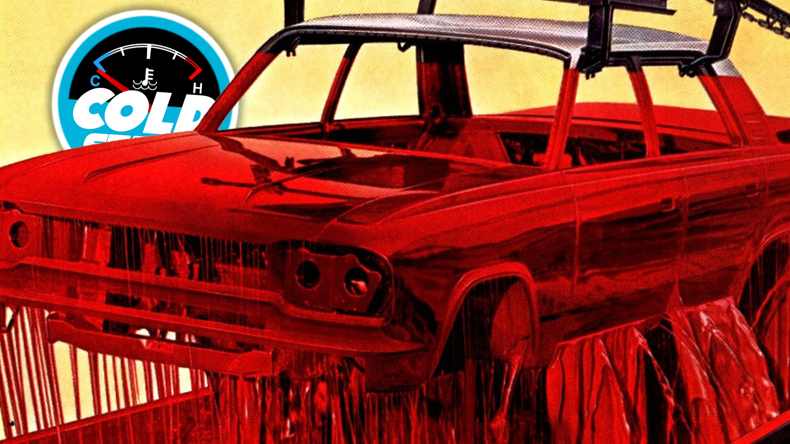
You know how sometimes you’ll have an idea that seems great, and you go out of your way to execute it well, and then when you look back on it later, you’re struck with a bit of horror as you try to figure out just what the hell you were thinking? I feel like this is a pretty familiar feeling for me. I also suspect that whoever put together this 1965 Rambler brochure may find this sensation familiar as well.
You can look through this and get the idea that the fundamental ideas behind each photoshoot and spread were just fine, well within the parameters of what defined a car brochure of the era, but then, somehow, things just kind of ended up off the rails.


A combination of art direction choices and the nature of color photography and just how our minds associate things all conspired to make some of these images more, well, loaded. Like the one I used for the top image, showing the full-immersion paint method Rambler was using:
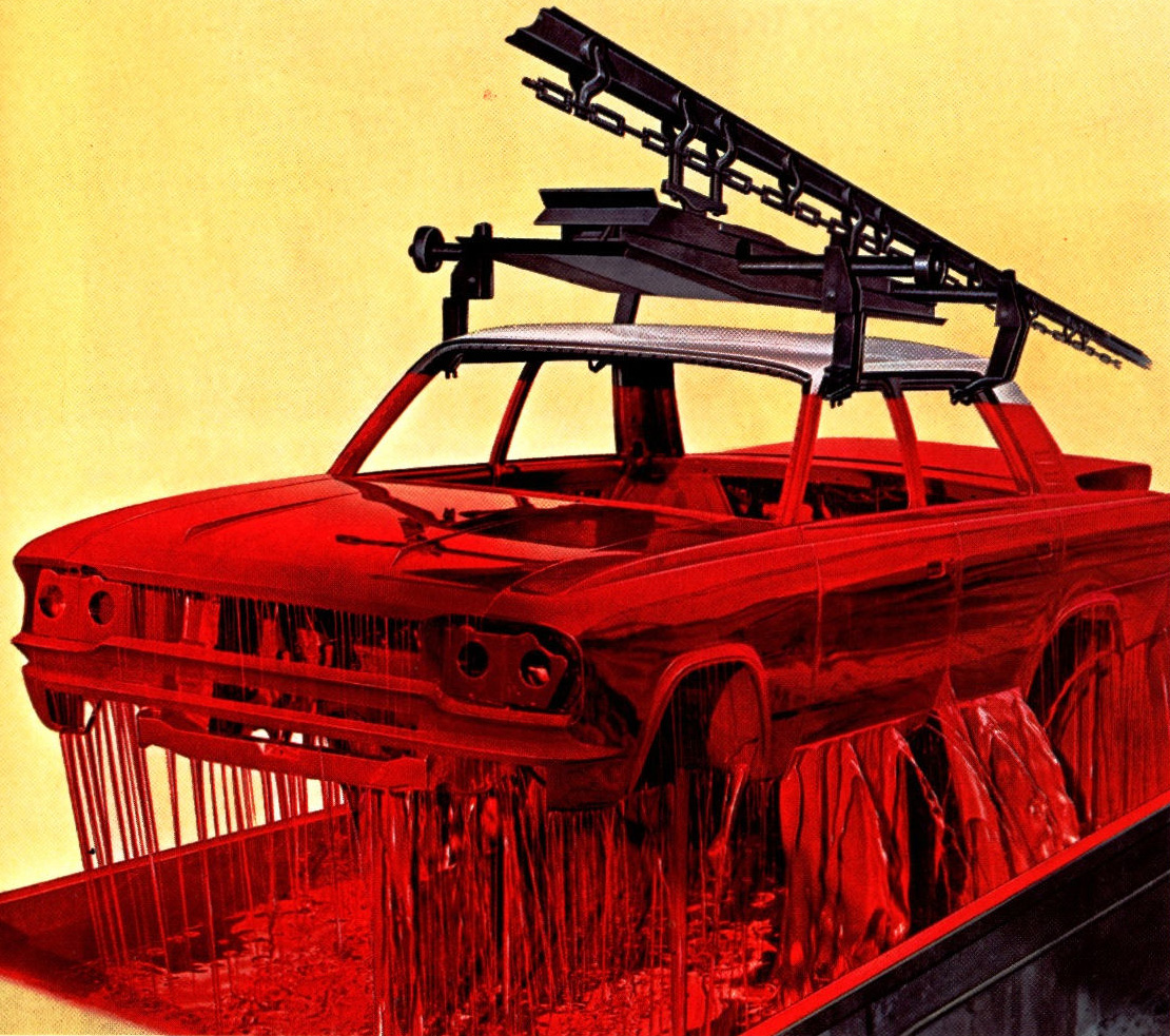
Okay, not a bad idea, but something just changes when using red. I don’t know if it’s enculturation by endless horror movies, but is there anyone who sees this and doesn’t feel unsettled by what appears to be a car body dripping vast quantities of blood? Are we all just ruined by the Shining‘s elevator scene? It’s not just me, right?
This reminds me of how a friend of mine and I used to come up with terrible prom theme ideas, and one of those – Bloodbath? – was my favorite. It’s the “?” that makes it, I think.
The extensive use of red in this brochure feels like it may be part of the problem. I love red, deep vivid reds – I chose one as one of the main signature colors of this website – but it’s a color that must be handled with care and respect because of all of the cultural baggage it carries.
Maybe that’s why these otherwise normal-seeming car portraits feel a little off, because of the red hellscapes they all seem to be trapped in:
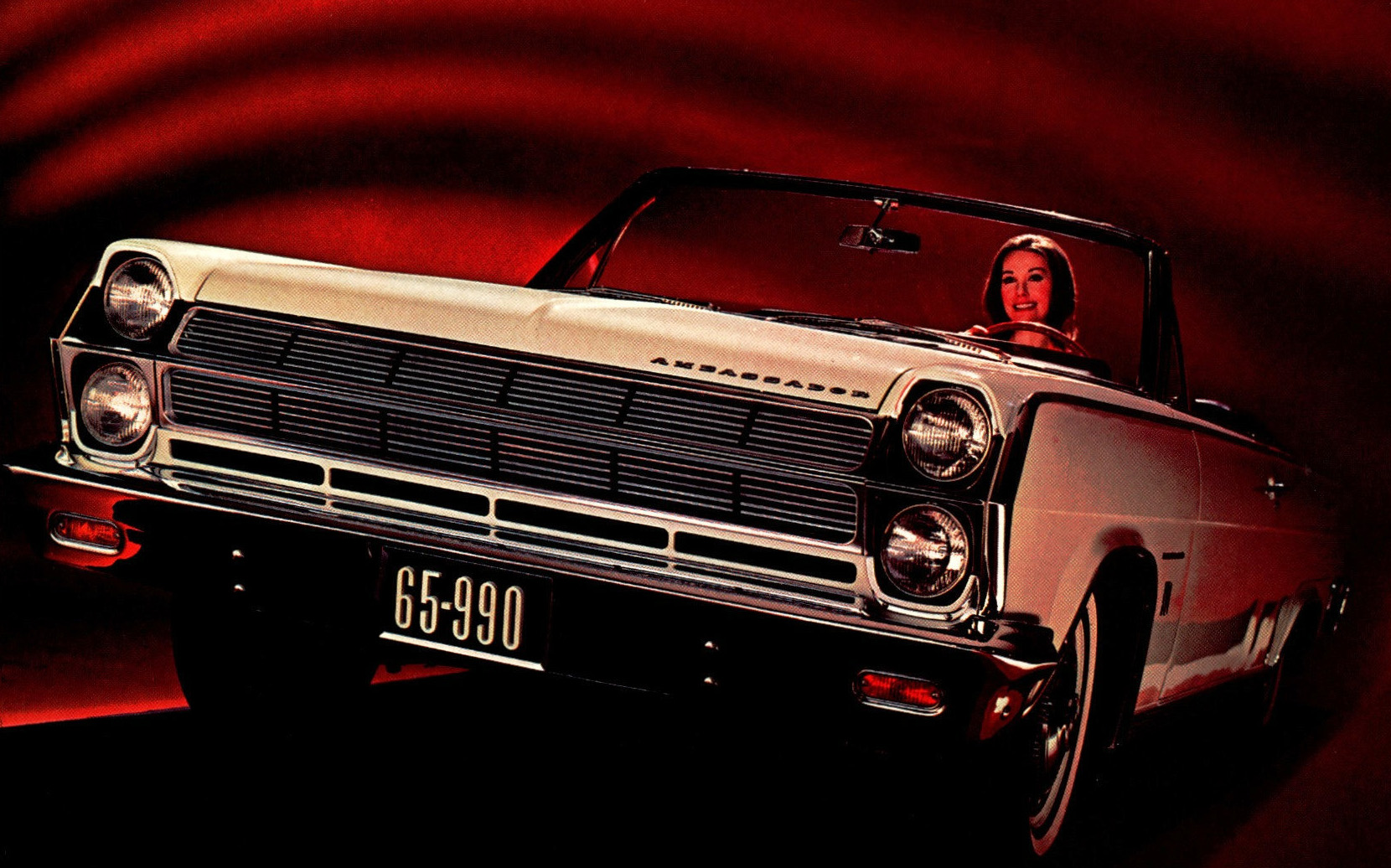
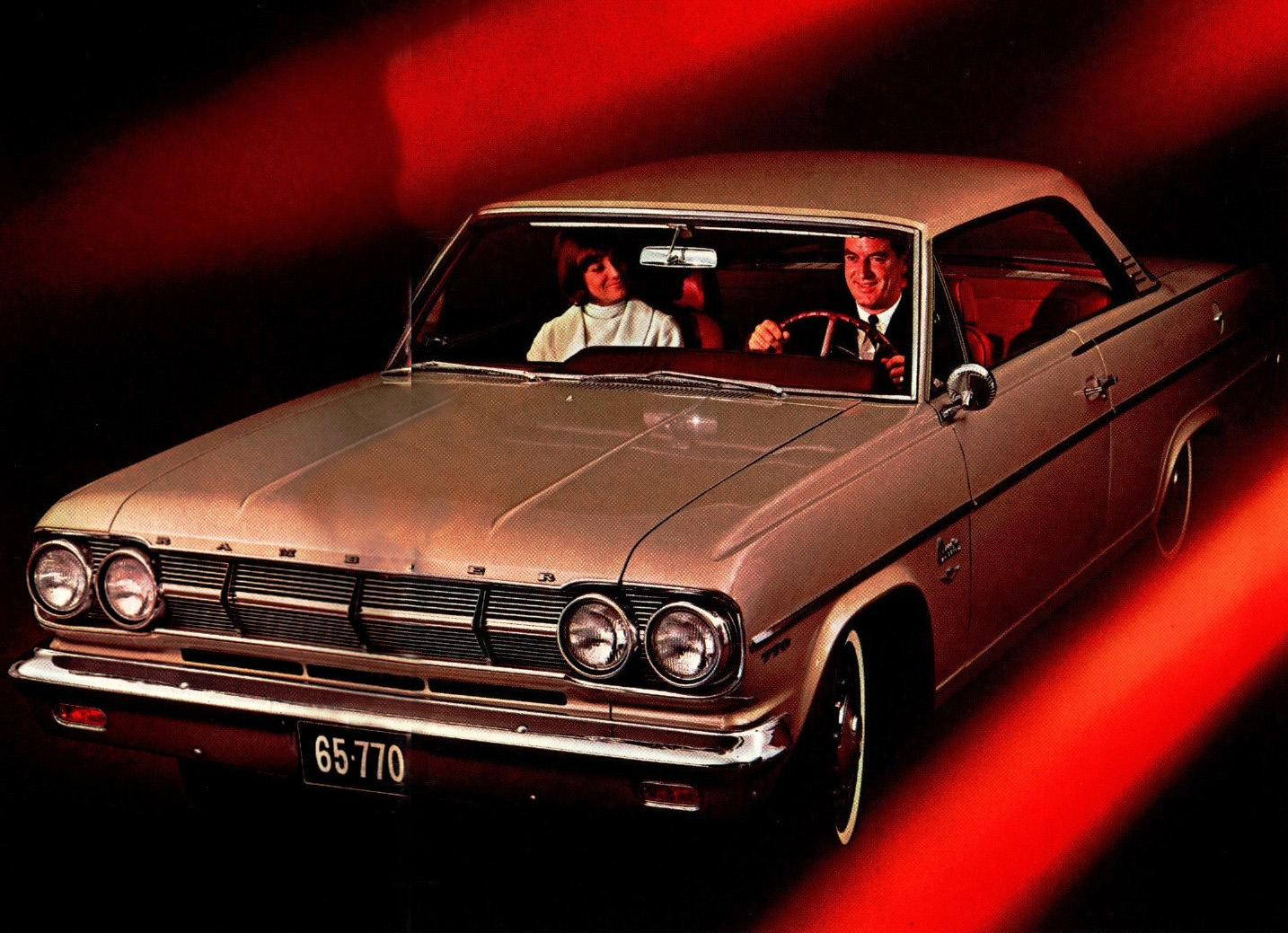
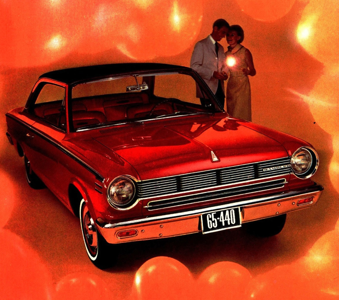
Red backgrounds, red light bathing faces, and that last one seemingly trapped in a balloonic nightmare, or perhaps the intestines of some Rambler-hungry leviathan! It’s a lot.
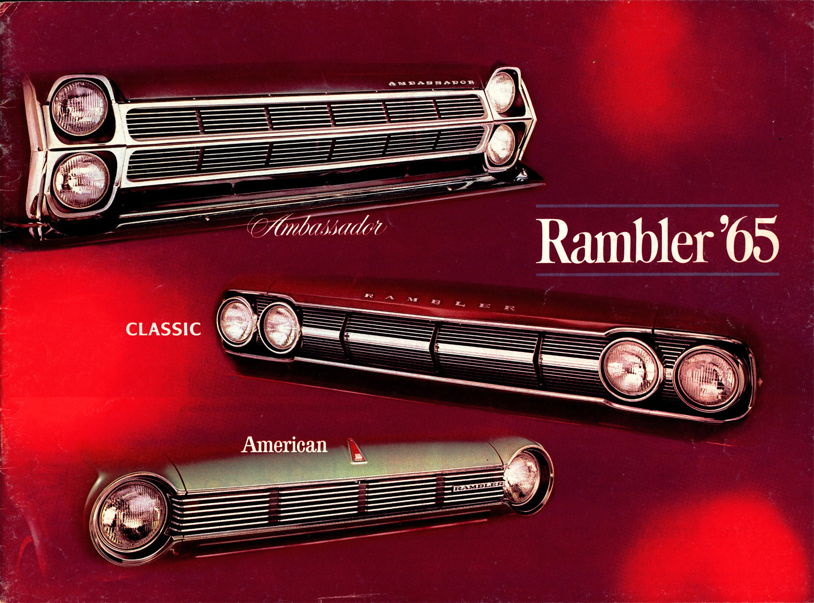
The ruddy hellscape is also host to the cover, which features the faces of Rambler’s three main car lines – Ambassador, Classic, and American, each with its own distinct typography. I like seeing these car faces; you get a good sense of how status is suggested by some basic elements, like headlights.
Even though they’re all just the same standard round sealed beams, there’s a hierarchy at play: single lamps are at the bottom, then dual, set next to one another on a horizontal plane, then the pinnacle: vertically-stacked dual lights. There are examples of this same hirearchy beyond Rambler, even, though some add an extra upper tier with covered lights.
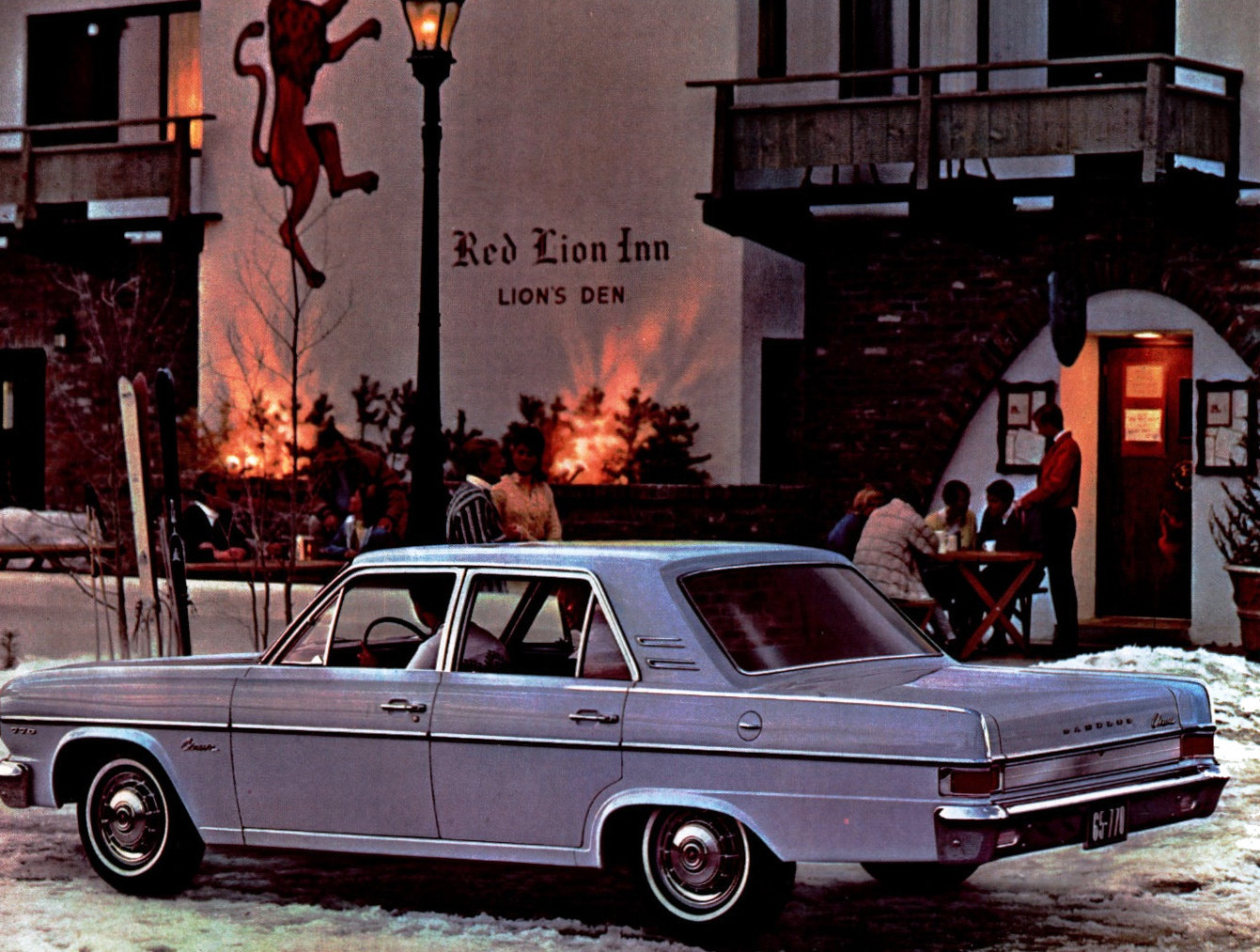
Here’s another unfortunate color-related situation. This is just a nice little German-themed restaurant/bar – in fact, David and I like to go to a place with the same name, Red Lion, when I’m out in LA to drink beer and eat big sausages. But here, the photo is generally fine, except the decorative lighting behind those bushes sure makes them look like they are on fire.
I mean look at that image; maybe hold your phone arm’s length away and look, if you’re on a phone. If not stand up and take a step back or look up at your Jumbotron or whatever. Those bushes are burning. Rambler is getting all biblical on us here.
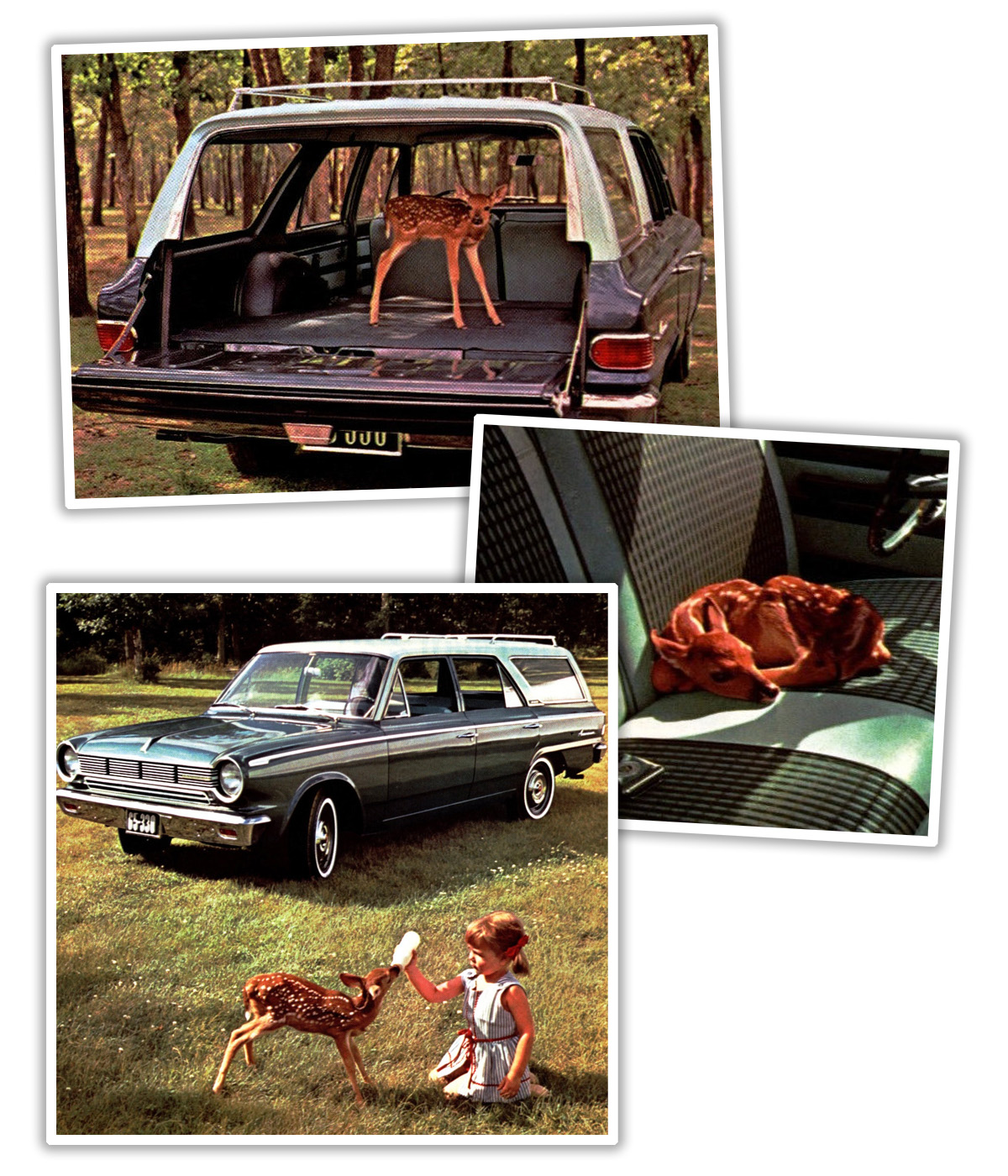
And while not exactly biblical, this spread with that fawn definitely has a… feeling. Why do they have this fawn in their Rambler wagon? Are they returning it to their mom? Taking it away? Those things get big, you know. I’ve seen The Yearling, I know how this shit goes down. Also, it just makes this all kind of feel like a pamphlet for a cult. If you know, you know.
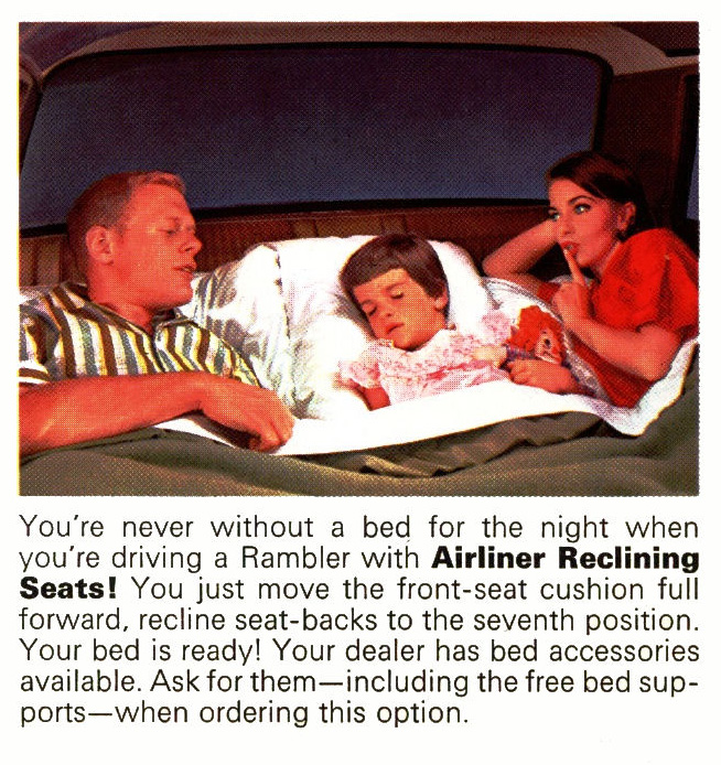
There’s other stuff in here that’s a little less unhinged-feeling, but still worth contemplating. Like Rambler’s famous reclining seats that turn into beds: did people really make these so bed-like when they used them?
Also, I was curious about what those “free bed supports” were, so I found some on eBay:
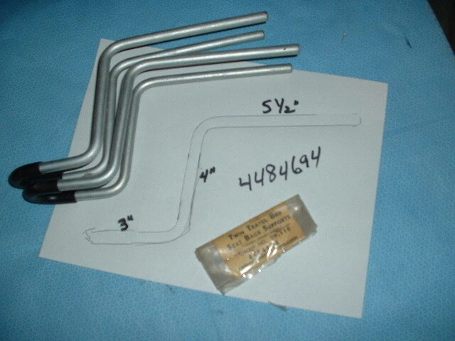
Huh. I had no idea.
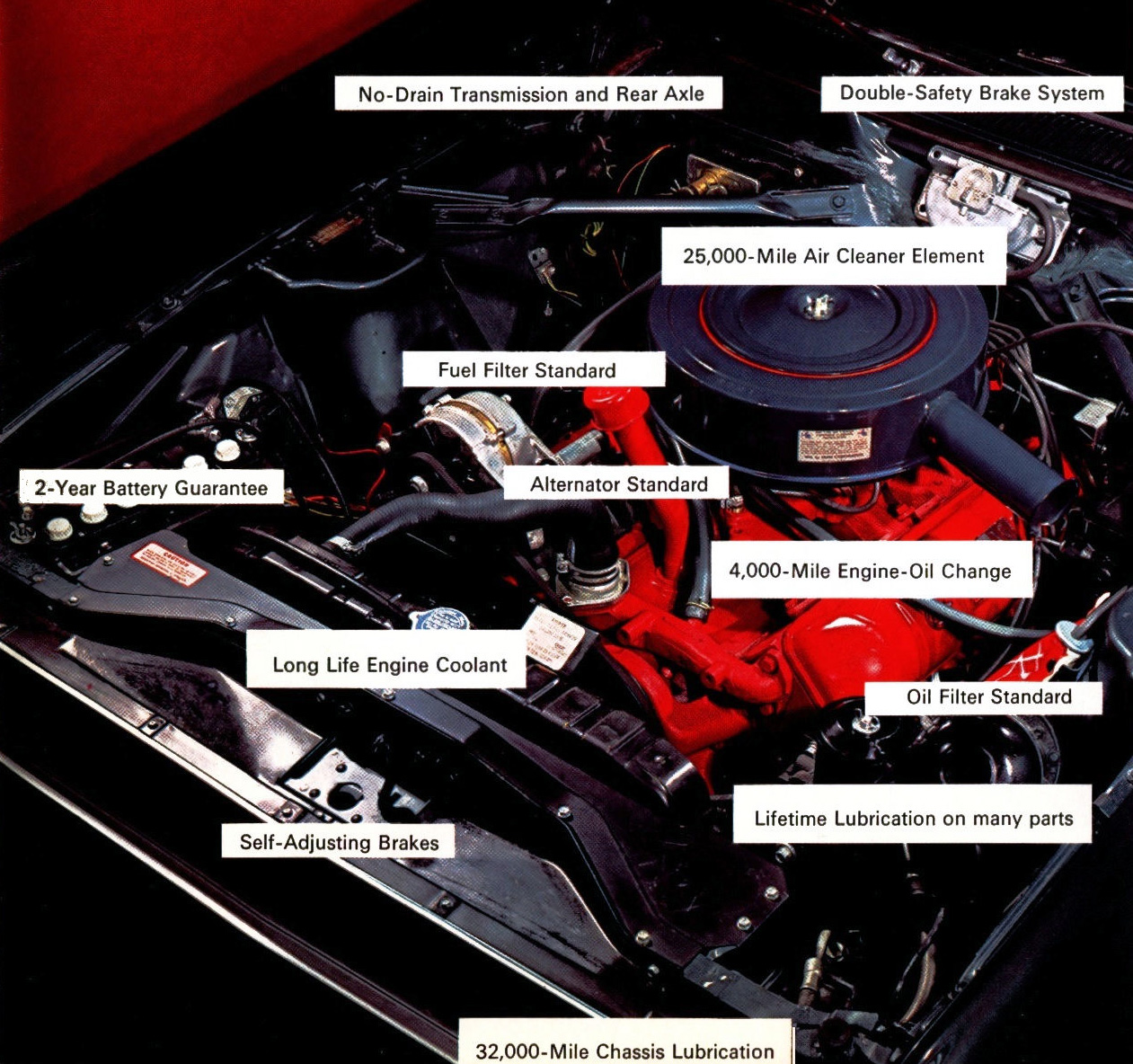
I also like seeing what was considered worthy of calling out in the technical side of a brochure. So many things we take for granted now, like alternators, oil filters, and fuel filters. Who calls out things like air cleaner life in car marketing today? Or chassis lubrication?
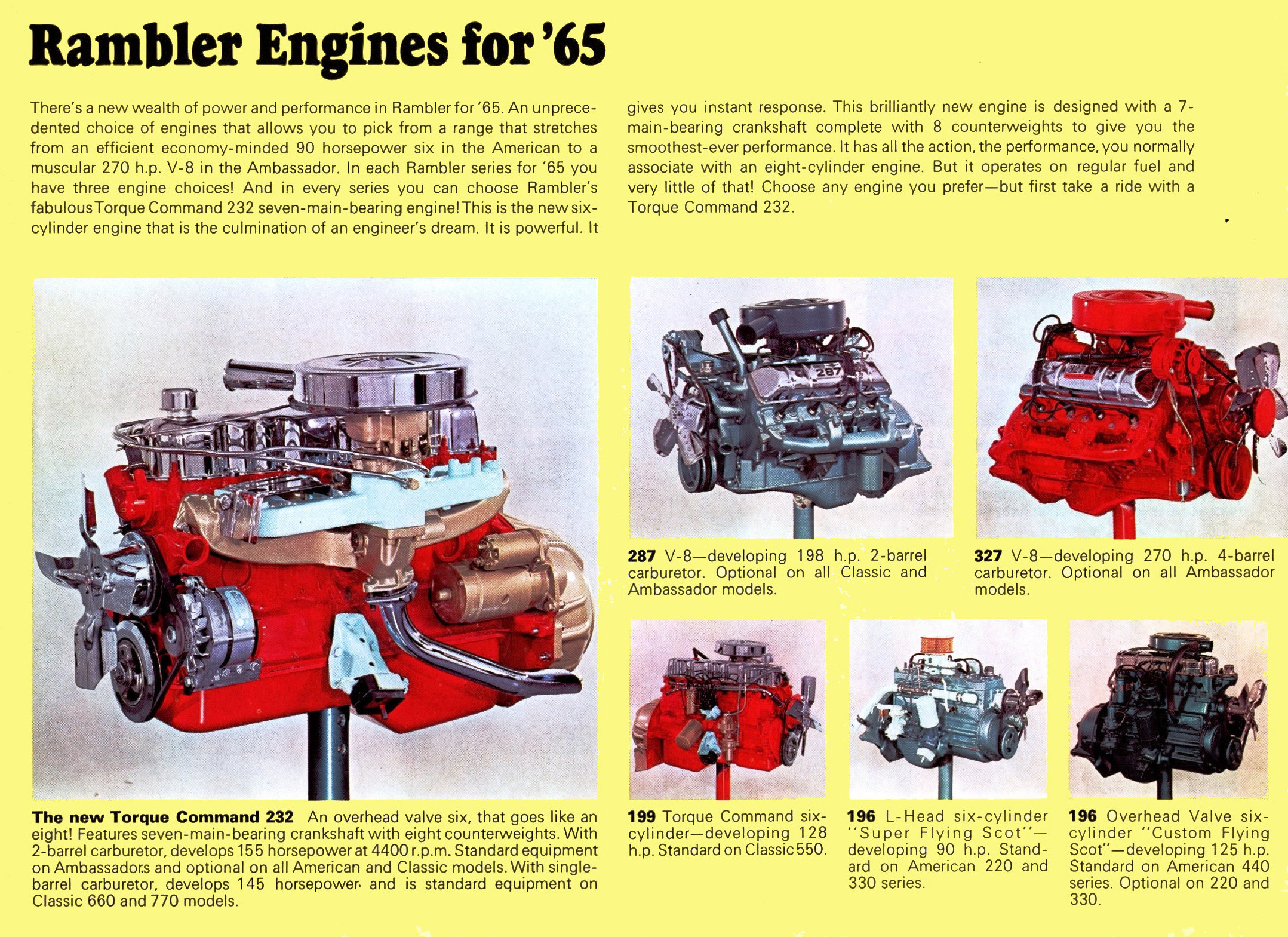
I do like when engine options are shown visually, in case you wanted to pick an engine by, say, pointing at the blue one. Also interesting are the multiple engines named after the Flying Scotsman, which was likely the most famous steam train at the time. I don’t think we still have a culturally significant train to reference today?
Top graphic image: Rambler




is it #c8102e? #cf142b? sorry, i’m not so obsessed with your hex
Solid front designs. My fav- american
Quality seemed to be an issue, judging by the third embedded photo of the 65-770: its hood proclaims it to be a R A M B . E R.
Or is that some illusion related to Jason’s scan?
My father and I camped out in our white over yellow 1965 Classic a few times. We had air mattresses. Great memories!
Any Rambler story is a good story…
….unless Seamus the dog is on the roof for a 12 hour drive to Canada.
First shot makes me hungry for a toffee apple.
Rambler sales declined in 1965; maybe the advertising was to blame. Beyond the grisly blood-toned brochure, their slogan was “The Sensible Spectaculars!” Sexy, amiright?
These were fine, well-designed cars though. The little American, mid-size Classic, and Ambassador shared a lot of body stampings to save money, but looked quite different thanks to clever styling tricks like those grilles. Due in part to the deep dip rust proofing the cars held up pretty well. The AMC 6 that became the legendary Jeep 4.0 was in its first full year in the larger two cars. The American could still be had with the older L head or OHV 6 from Nash days, but it was cheap and thrifty.
My son daily’d a 1965 Classic 660 with the 232 six, three-on-the-tree and overdrive in high school and college circa 2018-2022. I helped him paint it. Rhonda the Rambler was a classy, reliable, comfortable car. He drove back and forth from Wisconsin to college in Texas, and road-tripped for Texas to both coasts. His sister rear-ended another car in traffic and pranged the drivers fender badly. They drove it home and we were able to order a replacement fender and swap it out. Nice!
Stories of the two coastal adventures…
https://itisgood.org/around-the-southwest-in-15-days/
https://itisgood.org/rhondas-atlantic-adventure/
(David Tracy’s Jeep Easter adventures were a major inspiration for my son.)
Brief intro and photos of the car before and after painting…
https://itisgood.org/auto-biography/#65Rambler
I see you got a picture in my old stomping grounds, Mystic, CT, nice
Very nice. Thanks!
I browsed the page for a moment- wild to see a mention of Attica! I used to camp near there in college.
Strong family roots in Attica and across the river in Warren County. Trail 3 in Turkey Run State Park south of Attica is legendary. The Potholes nature conservancy property in Warren County is a hidden gem for creeking.
These days Attica is best known for the Badlands Offroad park in the old gravel quarry south of town.
Way back when my Gram drove a Rambler American and I distinctly remember the license plate. Her name was Win K and she owned the car at the time she was 71. The license plate was WNK 071. Fitting, eh!
That’s sweet. My mom’s name is Jill and when I registered my car in Texas, the plates came with JLL 7876. I flew her in from California and picking her up at the airport, she was tickled to almost see her name on the plates.
My grandparents had a ’65 Olds 98 Luxury Sedan with the plates NLP 016 which my grandmother informed my brother and me stood for “No Little People Under 16.” I will never forget that plate.
That first one makes me think of the blood tank in House on Haunted Hill.