In case you’ve been wondering what Bugatti does with the absurd amounts of money rich people pay them for their cars that they then use to keep the floors in their climate-controlled garages anchored in place, I think I have an idea, and it’s nothing good. I say this because I assume at least some significant amount of money was spent on Bugatti’s recent logo re-design, which, as you can see, is about as disappointing as getting white tube socks on your birthday, only this half-ass logo can’t even keep your feet warm.
Am I being too harsh? Maybe. Let’s look at the old logo, and the one that was just announced last month:

Yeah, I’m not being too harsh.

(Photo: Bugatti)
The old Bugatti logo has been around in essentially the same form since 1909, when Carlo Bugatti, a jewelry maker and the father of founder Ettore Bugatti, designed it as a badge for his son’s cars. This logo/badge was known as the Macaron, and you can read it lovingly described here:
In addition to the easily legible name lettering in white on a red background, the badge also features the initials EB (for Ettore Bugatti) above this in black, as well as 60 red dots on a white surrounding border. Red stands for power and passion, white for elegance and nobility, and black for excellence and courage. According to the legend, the 60 dots symbolise pearls or threads in a style that conformed to the “Art Nouveau” fashion. In those days, they were used like splints to produce a permanent connection on mechanical parts – and the reliability and durability of his vehicles was something that was always very close to Ettore Bugatti’s heart during his lifetime. Bugatti has changed the appearance of the Macaron only slightly over the course of the years.
It’s an iconic logo, absolutely, and I respect that it’s resisted change for so many decades. That’s not to say I don’t think changing a logo is bad – sometimes, it makes a lot of sense, and I don’t think the Bugatti logo is so precious that it shouldn’t ever be touched.
But, if you’re going to touch a logo, especially one as long-lived as this one, you’d think you’d want the result to be something that, I don’t know, doesn’t look like it was done in the elevator ride up to the presentation?
I don’t have a problem with simplification – I think a simple logo is often the right way to go. But there’s a difference between simplified and just plain boring. For example, what if the classic logo was simplified like this:

… or maybe even simpler:

These both evoke the color and feel of the original, but are pretty dramatically simplified while maintaining a consistent visual identity with their source. And these took me five minutes and I’m giving them out for free. Let’s look again at the one Bugatti has gone with:

Oh, come on. Sure, it’s basically the same san-serif type as the original, stripped down, but this alone just isn’t enough. It doesn’t feel spare or classy or elegant, it feels lazy. If you’re about to defend it, let me read you some of the praise heaped on the logo from Logos-World.net, which sounds like it must have originated from Bugatti’s PR department, but I can’t prove that:
The result is a simple, clear, strict, and businesslike Bugatti logo emphasizing the name. It is made in capital letters, from which the shadows have disappeared. It is two-dimensional, easily scalable, and conceptual. The glyphs are stretched vertically, so they look tall. They have clear edges and even corners. Only “B,” “U,” and “G” have natural rounding. Intra-letter space is free, as is inter-character spacing. Representatives of the company are confident that these are bold steps that will help them stay in the lead.
Who wants Bugatti to be “simple, clear, strict, and businesslike?” Have these people met Bugatti? They make cars with over 1,000 horsepower and cost over three million dollars. They’re possibly the least rational cars on the planet. Who is this logo for? Someone who spent so much on their Bugatti they can’t afford color printer ink refills? What’s the fucking point?
Oh, and speaking of the lack of color,
“There is no red background, which the authors considered too aggressive for the new concept because the brand wants to be attractive to everyone.”
Red was too aggressive? Okay, it’s the color of blood, sure, but it’s also the color of fresh cherries and apples and roses and somehow companies like Lego haven’t thought it was “too aggressive.” But maybe the average Lego customer is just a little tougher than the average Bugatti buyer.

I thought the company was already using the new logo on their site, but then I realized that typography was just a standard web font, not a graphic at all. But for a second I wasn’t sure, which is precisely what you don’t want people who see your logo to think.
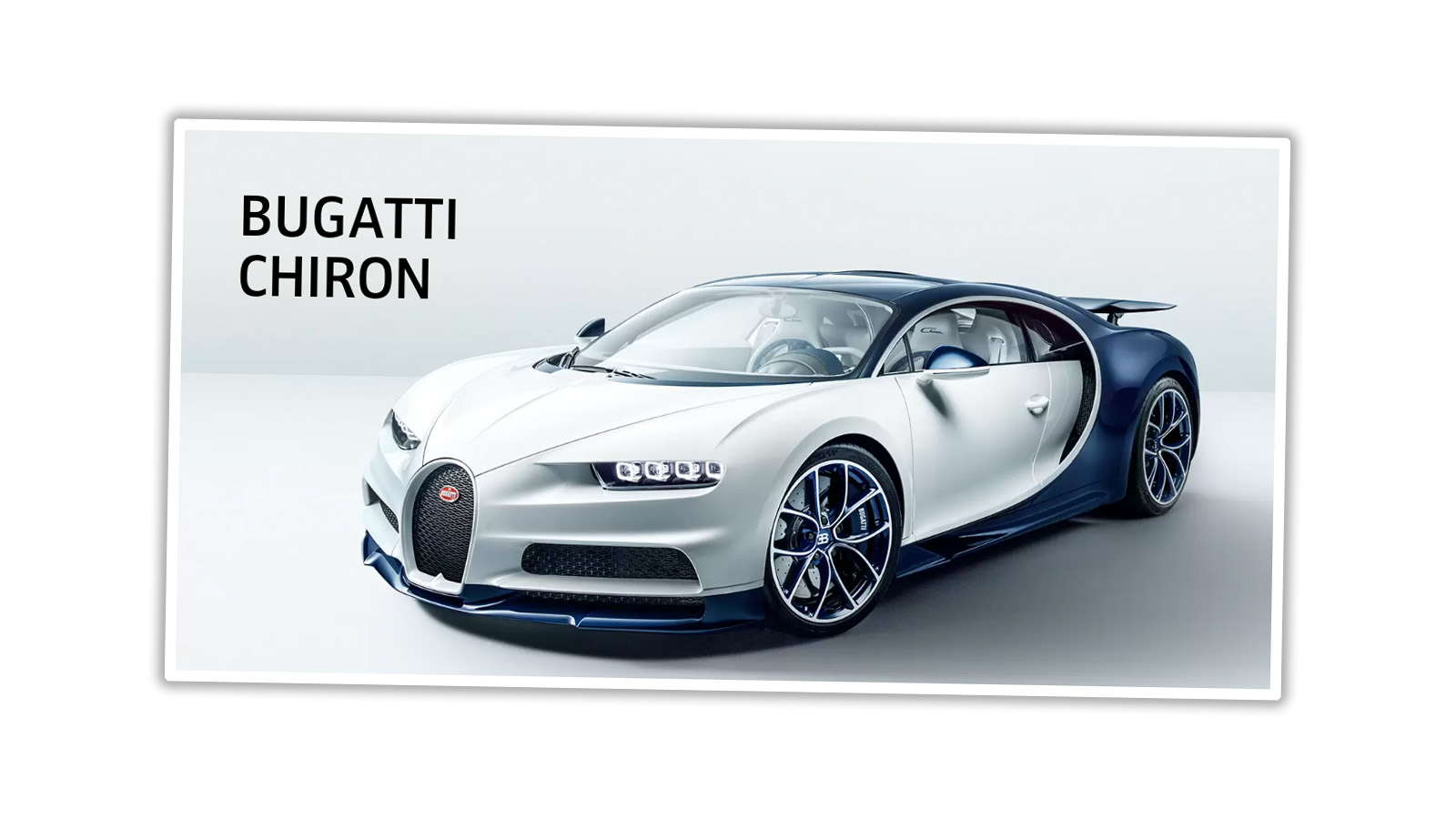
How did this happen? Did a Bugatti executive drive by a Hobby Lobby in their Chiron and think, damn, how can we get some of that for our company?
Anyway, congratulations on your new logo, Bugatti. Way to phone it in.


The typeface is DIN 1451 Engschrift with letters stretched half point in between DIN 1451 and DIN 1451 Engschrift along with kerning stretched a few points as to separate double T.
Why would BUGATTI want to use the same font that Germans use everywhere for the road signage, labels on the trains and wagons, warning labels, and so forth?
Ah, “Repo Man”! That needs its own Autopian write up!
Alas, am I the only one here that remembers “generic” products in the 1970’s? This could almost pass for an SNL take down of that lousy trend.
Okay, so the marketing brains at Bugatti decided to change the logo , went to an ad agency, were told it would cost $2M, balked at the price, then just printed the name on a blank sheet of paper?
I’m the first person to say logo pricing is silly, but a logo does have some value…
I think you’ve got it slightly flipped:
The marketing brains at Bugatti decided to change the logo, went to an ad agency who just printed the name on a blank sheet of paper, were told it cost $2M and shrugged at the price.
Looks like the font for a generic item like BEER, CIGARETTES, LUNCHEON LOAF. “because the brand wants to be attractive to everyone.” I’m excited to think I may actually be able to get one.
Unfortunately, this is an ongoing trend with logo design – companies ditching their iconic brand identity at the cost of millions of dollars, resulting in something so bland as to be unrecognizable. Remember the Gap logo that looked like someone just typed “Gap” into the default Powerpoint template? Look at the stupid Tropicana redesign. Look at Yves Saint Laurent – a typeface logo that was synonymous with luxury and fashion for a half-century; now it’s just the words “SAINT LAURENT” in all-caps Helvetica with the two Ts pushed closer.
This reminds me of when my alma mater redesigned its logo from a cool stylized script thing to some ugly font where they RAnDOMlY mADe SOmE LETTeRS SMaLLEr. I get that the script version had some practical problems, but they couldn’t have picked a much worse looking replacement.
Yep, that’s positively moronic. It’s a lesson in removing as much personality as possible, for some reason. Not seeing a little splash of red in the logo on the front of their cars is going to look strange. And as already noted, the red oval is iconic, killing it is absurd. It’s like Ford getting rid of the blue oval, it would make no sense. Horribly justified design choices, likely made by the wrong people.
The institute of higher learning that employs my wife is asking all departments to cut their budgets while at the same time are releasing new branding for the second time in the last 10-15 years. I am sure some jackass got paid a significant amount of money for this BS.
The praise heaped on Bugatti’s new logo is also one of the reasons that sciencey type people get annoyed by the artsy crowd. It just seems like masturbatory bullshit.
A few years back a particular very large customer was crying poor about not having enough budget to buy our products. Meanwhile, at the same time they were spending millions to change their logo from all uppercase to title case and replacing all the signage on their buildings, along with all the other associated costs of rebranding. Do these geniuses seriously think these rebrands make them a single cent of extra money? Do the folks at Bugatti think even one person would ever say to themselves, “I wasn’t going to buy a Bugatti before but I REALLY love that new logo!”
To me the simplified red logo looks like something on a pasta box. Why not just lean into the stylized “EB” and make that the standalone logo?
Right??? The EB seems like such an obvious choice for a stripped down logo. But really, they could’ve simply done away with the shades in the 2015 logo and go with just three solid colours – slightly more complex than Torch’s solid red version, with the EB the pearls in black, maybe – and it would’ve definitely worked.
“There is no red background, which the authors considered too aggressive for the new concept because the brand wants to be attractive to everyone.”
This is an exclusive brand with a rich history. You don’t WANT it to be attractive to everyone, just a few thousand people with money to burn. Also, the “EB” logo isn’t just classic, it’s iconic – in fact I dare say it would take me longer to read and comprehend the word “Bugatti” than it would take to make the mental connection with the “EB” logo, which has deeply hard-wired and favorable instinctual reactions for this particular car buff. This whole simplified flat logo trend is just so boring.
Ha, looks like something Otto would drive while eating “FOOD” and drinking “BEER” in Repo Man.
Ooo-Ooo…don’t forget the sweatshirt that says “College” too.