
In case you’ve been wondering what Bugatti does with the absurd amounts of money rich people pay them for their cars that they then use to keep the floors in their climate-controlled garages anchored in place, I think I have an idea, and it’s nothing good. I say this because I assume at least some significant amount of money was spent on Bugatti’s recent logo re-design, which, as you can see, is about as disappointing as getting white tube socks on your birthday, only this half-ass logo can’t even keep your feet warm.
Am I being too harsh? Maybe. Let’s look at the old logo, and the one that was just announced last month:
![]()
Yeah, I’m not being too harsh.

(Photo: Bugatti)
The old Bugatti logo has been around in essentially the same form since 1909, when Carlo Bugatti, a jewelry maker and the father of founder Ettore Bugatti, designed it as a badge for his son’s cars. This logo/badge was known as the Macaron, and you can read it lovingly described here:
In addition to the easily legible name lettering in white on a red background, the badge also features the initials EB (for Ettore Bugatti) above this in black, as well as 60 red dots on a white surrounding border. Red stands for power and passion, white for elegance and nobility, and black for excellence and courage. According to the legend, the 60 dots symbolise pearls or threads in a style that conformed to the “Art Nouveau” fashion. In those days, they were used like splints to produce a permanent connection on mechanical parts – and the reliability and durability of his vehicles was something that was always very close to Ettore Bugatti’s heart during his lifetime. Bugatti has changed the appearance of the Macaron only slightly over the course of the years.
It’s an iconic logo, absolutely, and I respect that it’s resisted change for so many decades. That’s not to say I don’t think changing a logo is bad – sometimes, it makes a lot of sense, and I don’t think the Bugatti logo is so precious that it shouldn’t ever be touched.
But, if you’re going to touch a logo, especially one as long-lived as this one, you’d think you’d want the result to be something that, I don’t know, doesn’t look like it was done in the elevator ride up to the presentation?
I don’t have a problem with simplification – I think a simple logo is often the right way to go. But there’s a difference between simplified and just plain boring. For example, what if the classic logo was simplified like this:
![]()
… or maybe even simpler:
![]()
These both evoke the color and feel of the original, but are pretty dramatically simplified while maintaining a consistent visual identity with their source. And these took me five minutes and I’m giving them out for free. Let’s look again at the one Bugatti has gone with:
![]()
Oh, come on. Sure, it’s basically the same san-serif type as the original, stripped down, but this alone just isn’t enough. It doesn’t feel spare or classy or elegant, it feels lazy. If you’re about to defend it, let me read you some of the praise heaped on the logo from Logos-World.net, which sounds like it must have originated from Bugatti’s PR department, but I can’t prove that:
The result is a simple, clear, strict, and businesslike Bugatti logo emphasizing the name. It is made in capital letters, from which the shadows have disappeared. It is two-dimensional, easily scalable, and conceptual. The glyphs are stretched vertically, so they look tall. They have clear edges and even corners. Only “B,” “U,” and “G” have natural rounding. Intra-letter space is free, as is inter-character spacing. Representatives of the company are confident that these are bold steps that will help them stay in the lead.
Who wants Bugatti to be “simple, clear, strict, and businesslike?” Have these people met Bugatti? They make cars with over 1,000 horsepower and cost over three million dollars. They’re possibly the least rational cars on the planet. Who is this logo for? Someone who spent so much on their Bugatti they can’t afford color printer ink refills? What’s the fucking point?
Oh, and speaking of the lack of color,
“There is no red background, which the authors considered too aggressive for the new concept because the brand wants to be attractive to everyone.”
Red was too aggressive? Okay, it’s the color of blood, sure, but it’s also the color of fresh cherries and apples and roses and somehow companies like Lego haven’t thought it was “too aggressive.” But maybe the average Lego customer is just a little tougher than the average Bugatti buyer.
I thought the company was already using the new logo on their site, but then I realized that typography was just a standard web font, not a graphic at all. But for a second I wasn’t sure, which is precisely what you don’t want people who see your logo to think.
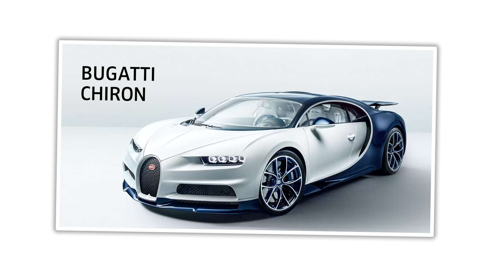
How did this happen? Did a Bugatti executive drive by a Hobby Lobby in their Chiron and think, damn, how can we get some of that for our company?
Anyway, congratulations on your new logo, Bugatti. Way to phone it in.


Well, the old one did kind of say E. B. Bugatti, which is a bit like PIN number or CPU unit. So they cleaned that mild mistake up.
Some quite ordinary cars uses the oval. Usually in blue. So that’s not very unique either.
Red is also associated with italian cars, so brand of french racing cars should really be blue, like all their cars were 100 years ago. A red logo looked great on a blue car, but ridding yourself of colour will make it work with more car body colours.
Going against everybody else, and not using some kind of silvery photoshop effect or some stylized rounded shapes, is a bold move. People who buys a Bugatti probably does it anyway, no matter how the logo looks.
Really exclusive and expensive stuff really doesn’t need a name or a logo.
AND with a boring logo, the amount of cheap knock off merchandize will probably fall also.
Yes, it looks boring. But you get to say “it’s not about the logo, it’s about the car”. So I think it will work just fine.
Yes I am a graphic designer.
That isn’t a logo, that’s a word
Torch… while on the subject of logos, could you break down what went into the Autopian logo? What wheel did you use behind the A? Is that a tail fin coming off the A pointing to the right? The font almost feels mid-century modern. I get The Jetsons vibes from it a little bit. Would love to know what inspired the look and feel. (The t-shirts look great also.)
The origins of the Autopian logo would be an interesting read.
“But maybe the average Lego customer is just a little tougher than the average Bugatti buyer.”
Now if that isn’t a slap in the face, I don’t know what is lmao
Ever stepped on a Lego barefoot?
Damn straight Lego customers are tough!
You know, Toyota got along just fine for something like 20 years with nothing but a plaintext sans-serif wordmark until they came up with the “pretzel”. I’m sure this plain BUGATTI lettering will look great on the tailgate of a pickup truck.
(Toyota pickup tailgate)
https://vellosvinyl.com/images/556616_396720183722489_472212089_n.jpg
That was distinctive and looked good. Their designs were clean and functionally attractive. The pretzel, and probably not coincidentally, their corporate styling since adopting the pretzel have not and do not look good.
Plus, you could over up to TO and TA and have YO centered on the rear of your truck. Saw this frequently when I was a yute.
With the new logo appealing to more people, I am now equally, as with the old logo, unable to consider a Bugatti. Can not even afford an oil change, whatever the logo.
The red logo did give me nightmares- Horrifying!
“The brand wants to be attractive to everyone.” That’s the problem. You dilute something so much in order to appease everyone that you end up with the design equivalent of homeopathy.
And since when a niche brand needs to appeal to everyone? Isn’t branding _supposed_ to target your specific audience?
And the best part is that Bugatti probably paid a consulting firm a million dollars for this “study” into redesigning the logo, when in reality, the night before the project was due the consultant opened a word document and selected “change font”. Boom, $1M please.
“But maybe the average Lego customer is just a little tougher than the average Bugatti buyer.”
Yes I am, thank you very much.
The average Lego buys has to be tougher…stepping on those little bastards hurts like hell!
Also, why does Bugatti logo need to appeal to everyone? They’re selling cars to the .1%
Oooo, a supercar logo that reminds me first and foremost of the generic shit my mom used to by at Aldi’s back in the day. BUGATTI? Is that next to the RAVIOLI?
“buy” – lack of an edit function strikes again. Also, for those that may not remember the way-back version of Aldi’s supermarkets, a good amount of their merchandise came in white boxes with black letters. The food inside tasted almost as good as this logo redesign turned out.
Oh, I remember that. Even better, a friend of mine made a joke about it back in high school. His first car was one of the square early-80s Fords, a Fairmont, maybe? Square and white, anyway. He took the badges off and just painted “CAR” in big block letters on the door.
That’s awesome! I’m going to guess he was also a fan of the movie “Repo Man”.
To be fair, the original always looked like something I would expect to find on a tin of biscuits. Still, the new one just looks like airport wayfinding signage.
I guess it’s a good thing I don’t covet using my meagre means to attain one of their cars.
But, but, and I say but…at earning $80 an hour trolling this site, I might be able to just scrape together enough for one of those sweet 1935 Bugatti Junior Type 55s. How many of you would pay to see me nekid?
I really, really hate this design trend, especially because it seems like companies are just doing it to ride the bandwagon, rather than for any valid reason
Buyer: “it’s so cool how the DMV puts the Bugatti logo right on the paperwork!”
Sales associate: “umm, that’s just the normal DMV font, sir.”
I didn’t realize that was the new logo in the title image, I just figured that was the title of the article or something.
Wow… That’s fucking lazy. If simplicity was the goal, why not just use the little “EB” logo, but flatten it a bit like VW did a few years back with their logo. I guess a lot of “normal” folk don’t recognize the logo, but Bugatti shouldn’t really care what normal people think. At least it would be an actual logo and not just a word in what appears to be a stock font from Illustrator or something.
Your redo’s look like the Barilla Logo.
Now that’s some fast pasta. There is probably a crossover here
That’s the trend in luxury brand logos. Look at the recent logo redesigns for Burberry, Calvin Klein, and others. Bugatti is actually behind the times.
https://qz.com/quartzy/1507040/every-brand-logo-looks-the-same-now/
So, these days, if you really want to stand out from your competitors you have to go in the opposite direction, like that metal band, Part Cannon, they surely stood out in festival posters:
https://www.buzzfeed.com/patricksmith/party-cannon
Even the 9 pairs of boring socks I just got for my birthday had designs.
On top of all that, I don’t actually like the kerning, which if your logo is just a word, better be goddamn perfect. I think the first T needs to be shifted left a hair.
That’s just DIN Condensed Bold with shitty kerning, isn’t it?
I think it’s more fitting. It just needs quotes around the name.
Alternative headline: Automotive Journalist Out Designs Luxury Brand Consultant in Minutes from Sofa
Careful, y’all! Writing the B word in plaintext might get you slapped with a trademark infringement suit!
From now on, I’m going to call them Fast Bs just to be safe.
Is that even copyrightable? A logo has to have an artistic or graphical element, i.e. it has to be more than just the name of the company itself, to be eligible for copyright. (Obviously it’s still a trademark regardless.) This is literally just the word “Bugatti” written in a pretty generic sans-serif font. It isn’t actually recognizable as a logo. This isn’t what they’re going to put on their actual cars, is it? This is for like, letterhead and web copy and stuff. Right? Right?
Honestly if anyone other than a news site told me Bugatti rebranded with this as their logo I wouldn’t believe them. If you see a logo and don’t even realize it’s a logo, that’s not good. Especially for a company that sells some of the most extreme cars on the planet.
Exactly. It doesn’t look like a logo, it just looks like, well, the name of the company in a sans serif font, written in all caps. Because that’s all it is. I mean, OK, they played with the font height and letter spacing a bit, but not to the extent that you’d really notice if someone didn’t point it out to you. It could easily be the default header font in, like, a free note-taking app that you delete after ten minutes because it has too many sketchy ads in it.