
I can’t recall who it was that said that “taillights are the red reflection of society and culture,” but they were absolutely correct. Maybe it was Winston Churchill? I can’t recall. But the point stands: We, as a culture, subconsciously steer taillight design to such a degree that driving behind a car of a given era can tell you more about that time than countless books on the subject. Hyperbole? Maybe. But, then again, maybe just normal-bole, as you may realize when I talk to you today about an interesting bit of 1970s (and into the 1980s) American taillight design.
What makes this period of American taillight design so interesting is how much it both was a response to the more dominant global taillight trends spearheaded by European taillight design and how it also mirrored one of the key divisions of 1970s design in general. To get a sense of what I’m talking about, take a look at two 1978 sedans, one from Europe and one from America:

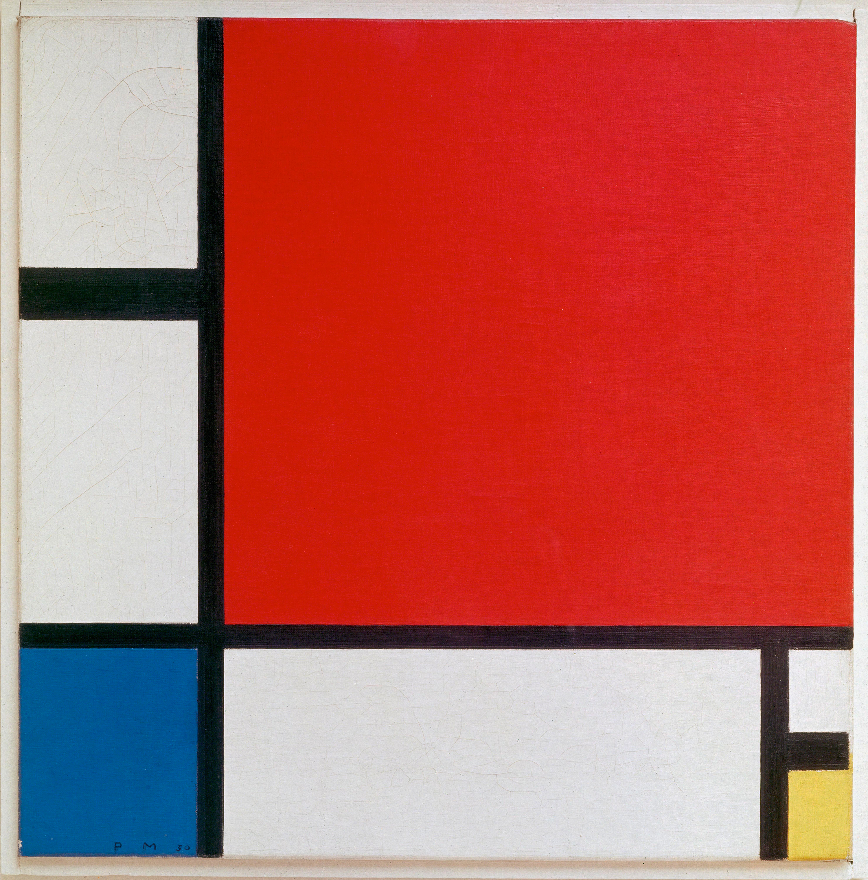
On the left we have an Audi 80, from Germany, sporting some very archetypal Euro-style taillights of that era: tri-colored, large, clean, simple, unadorned, rectilinear. They’re like Mondrian compositions rendered in plastic and light bulbs. On the right, we have a Ford LTD II, which takes a vastly different approach to its taillight design. They’re just red and clear, with no amber indicators, the shapes conform to details of the body design, forming a pair of Gothic-arch corners at each end and a large panel in the middle. There’s chrome piping and intricate detailing with faux-grillework, and on the reverse lamps themselves, there’s embossed filigree and iconography of three lions.
These two approaches really couldn’t be any more different! One seems to embrace a near Bauhaus-level of rational modernity, the other revels in detail and ornament. It’s like comparing a glass skyscraper to a cathedral. And yet, these cars are from the same year! How is this possible?
Well, I think it’s possible due to the inherent split nature of 1970s design, which crossed industries and disciplines, and could be seen in industrial design, architecture, graphic design, fashion, everywhere. As an example, let’s look at this divide in interior design:

Design in the ’70s was both boldly modern, with clean, geometric lines and shapes, large, flat planes, basic colors, and confident simplicity, and yet at the same time ’70s design also embraced wild colors, ornate designs, intense and detailed surface ornamentation, lots of references and inspiration from past styles and decoration, and an unashamed sense of busy textures and surfaces. These two design schools couldn’t be more different, really, and yet they co-existed and even at times merged.
It was a strange period, and taillight design, always near the beating heart of all design, was no exception.
In the case of many American cars, taillight design seemed to be a rejection of the clean linearity of European taillights and an embracing of novel, irregular, complex shapes, and lots of surface detailing. In fact, there was so much of this that I’d actually put the surface detailing into two distinct categories: Heraldic and Filigree.
Heraldic taillight design incorporated, for reasons I’ve always found a bit baffling, as America is one of the few countries on Earth to never have had any sort of actual royalty, elements of heraldic crests and coats of arms and all that crap. If there could be a shield or a medallion or a monogram or a way to treat the company’s logo so it resembled some near-religious talisman or something along those lines, American car companies found a way to shove that on a taillight.
Here’s some examples:

In hindsight, it’s kind of strange, right? What were we trying to say, exactly? Equating our luxurious ’70s barges to royal carriages? Maybe? Ever sat in the voluminous velour cushionry of the backseat of a “personal luxury coupé” of the 1970s? I doubt many kings were as coddled and pampered as that.
Alongside the majesty of the Heraldic taillights, you’d also find the Filigree, where it was all about surface ornamental elements like curlicues and flourishes and a stained glass or perhaps Tudor-style approach to taillight sections, where the lens was divided into distinct areas, each bounded and bordered by chrome piping and detailing:

Sometimes the detailing was on the lenses themselves, sometimes on the surrounding taillight bezel, as in the extreme case of that Dodge Aspen rear light assembly you see in the lower right up there.
Like any design trend, these were employed to varying degrees based on the car’s design, target audience, and so on. At times, it almost felt like some of this design was becoming almost compulsive, as even as the trend was starting to wane, you could see vestiges of it popping up on American car designs, even when it just didn’t make much sense. Take, for example, the Dodge Omni/Plymouth Horizon.
This was a car with a design heritage from Europe, France, even, as a derivative of a Sunbeam/Talbot design that became the Chrysler Horizon on the European market. This was a transverse-engined, FWD hatchback that very, very strongly resembled Giugiaro’s design for the Volkswagen Golf (Rabbit at that time in the U.S. market), like so many cars of the era did.
In translating the design of the Horizon to the American market, a lot changed. Sure, some of that was larger, U.S.-spec bumpers headlamps, but some of it were just things that made the car more, well, American, and did so in some hard-to-define ways.
Compared to cars like the VW Rabbit, the Omni/Horizon seemed to be reacting against the clean, crisp, unadorned modern look, and yet the Omni/Horizon shared, let’s be honest here, just about the exact same look as the Golf/Rabbit. And so we get things like this:

Look how similar those two cars look, and even the size and shape of their taillights are close. The original European taillights of the Horizon fit the general design vocabulary of the Rabbit, even. But in America, Chrysler made changes. Originally featuring amber rear indicators, later designs switched to the more traditional red/clear look, and then went further and added those silver-painted borders over the sections of the taillights in one variant, or had horizontal chrome bands in another.
I’d say both of these fit into a very distilled-down Filigree category, as they add needless surface ornamentation that seems to serve the aesthetic goal of adding visual complexity to an otherwise clean surface.
Does it look better? Personally, I don’t really think so, but there must have been plenty of people who disagreed. I think it’s interesting that even on this very European-looking car, they couldn’t just leave the lights be; they had to go in and add some kind of piping, some extra bit of jewelry on there. Was this from insecurity about the strength of the base design? A way to make the car seem more “premium” and luxurious? Or just simply tradition that was hard to shake?
By the mid 1980s, this whole business of adding ornamentation or coats of arms to taillights had pretty much died out, and the more European design ideals of cleanliness and simplicity won, and would remain dominant for decades to come.
I’ll admit, I used to roll my eyes at taillights like these, all covered in calligraphy and silly fake knights’ crests and wreaths or whatever. But now I find examples of these weirdly charming, as they’re so removed from what seem to be modern concerns. They’re fussy and strange and more than a little silly, but there’s a place for that, even in the demanding world of taillights.


One thats just an LTD not an LTD II. The II was the intermediate that basically replaced the Torino. I think the lavish styling on taillights had to do with trying to add flash to relatively boring cars. I love 70’s cars but during these “dark ages” of down sizing and emissions restrictions they gave cars “style” by adding nick nacks. Look at some of the cars Granada (beautiful city in spain on a tarted up Maverick platform). Its twin the Monarch. Even the Versailles.. not great cars but hyped up with styling to get them to sell. Cordoba a la Spanish monarchy. Lebaron (tarted up Aspen/Volare) with its Medallion trim level. All flash no substance. I thin the manufacturers did this on purpose to tick off consumers so that the pubic would force the government to relax regulations on safety and CAFE etc. BUT I wouldnt have my 70/80s cars any other way
Least important detail of this article: is it pronounced nor-MAL-buh-LEE or NOR-mul-buh-lee? You know, for the exam.
The Brougham Age was a strange, but wonderful era. I was a kid then, so I look back on it affectionately, but I’ll always wonder how we got to it. I guess all that faux luxury was a way to cover up how shit most of the cars were.
When are we going to get your coffee table book on taillights?
I approach this as a serious article. I imagine the dealerships are to blame for adding fuss to the Horizon’s and others’ taillights.
On a related note, the perceived need to create distinctions between the Dodge Omni and Plymouth Horizon.
badge engineering in its infancy lol
I kind of feel like pinstriping ties in here as well somehow. Though not all pinstriping was super ornate. You don’t see it too often anymore.
Good one. Remember in the ’90s when pinstriping started getting more ornate, with little filigrees at the ends and such?