
We finally got our first look at the all-new seventh generation BMW 7 series, and unsurprisingly, the response to those split headlights and the huge grille has been explosive. So I figured I’d take a look at the design and come up with some subjective improvements.
The new 7 Series, known by Bimmer trainspotters as the “G70,” has visual bulk problems. In other words, because of its dimensions, it looks fat. But all is not lost.
I recently checked out BMW’s U.K. website to have my first look at the car — specifically in its best-looking mean matte-black guise, M-Sport Pro. This trim brings the largest standard wheel of any 7 Series, and I think this is critical to balance out the car’s thick proportion. The M-Sport Pro also has a matte-black lower rocker, which is an optical trick to reduce some of the meat in the middle — and one most famously applied to the gorgeous Ferrari 512 Berlinetta Boxer.
Let’s get into that a bit more.
That Big Ol’ Body!
The G70 has some beautiful clean areas of form through the bodyside, and I think the car is successful from the base of the A-pillar back. There’s classic Teutonic architecture that invokes some nostalgic thoughts of two of my favorite-ever sedan designs — the unloved and short-lived 2003-2004 Infiniti M45:
And the 1992-1999 Mercedes S-Class:
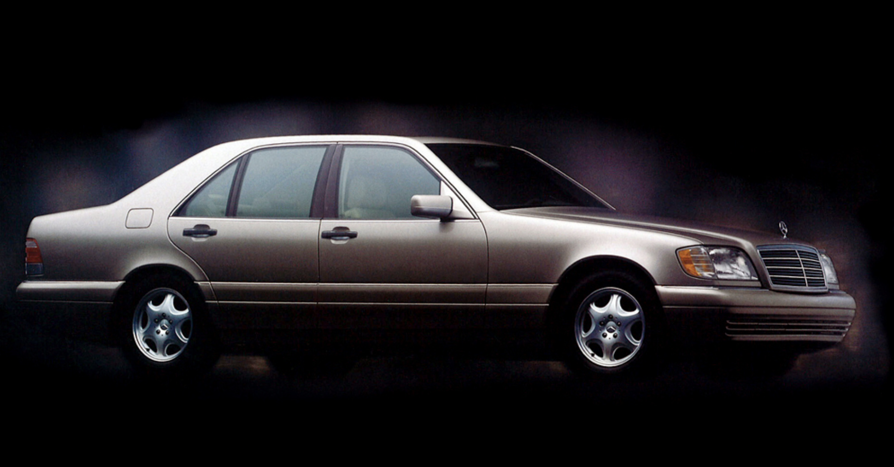
As with many cars of this size, the BMW’s linework (i.e. the shapes in the body) is staid and nearly level, a gentle bow to the character line above the door handles adds some form, executed much better than the uncomfortable banana-arched seventh generation Mercedes S-Class. There are no wedgy or directional angled lines. The side view is that of a proper flagship; the posture feels upright and generally proud. Wheels suggest sport performance, but the overall image is that of a parade vehicle; I’m searching the BMW site to determine the price for old-school dictator style front-corner flag mounting points.

The thick and heavy packaging motif is de rigueur for late-era gasoline-powered NCAP pedestrian safe cars, which require a certain amount of distance between the engine and the hood to allow for deformation in case of a collision with a person. (I have often wondered if we will get to enjoy a low hood/cowl renaissance soon — I’ve been expecting it for quite a while now with new generation of small displacement turbo fours becoming common. Electric skateboard platforms offer tremendous opportunities to reduce the engine box height even further, but manufacturers are stuck offering up traditional ICE options, so hoods still need to package 4-5 liters of displacement in this vehicle class with all of the stacked height of fuel efficient intake hardware and pedestrian-safe crushable hood zones above the engine).
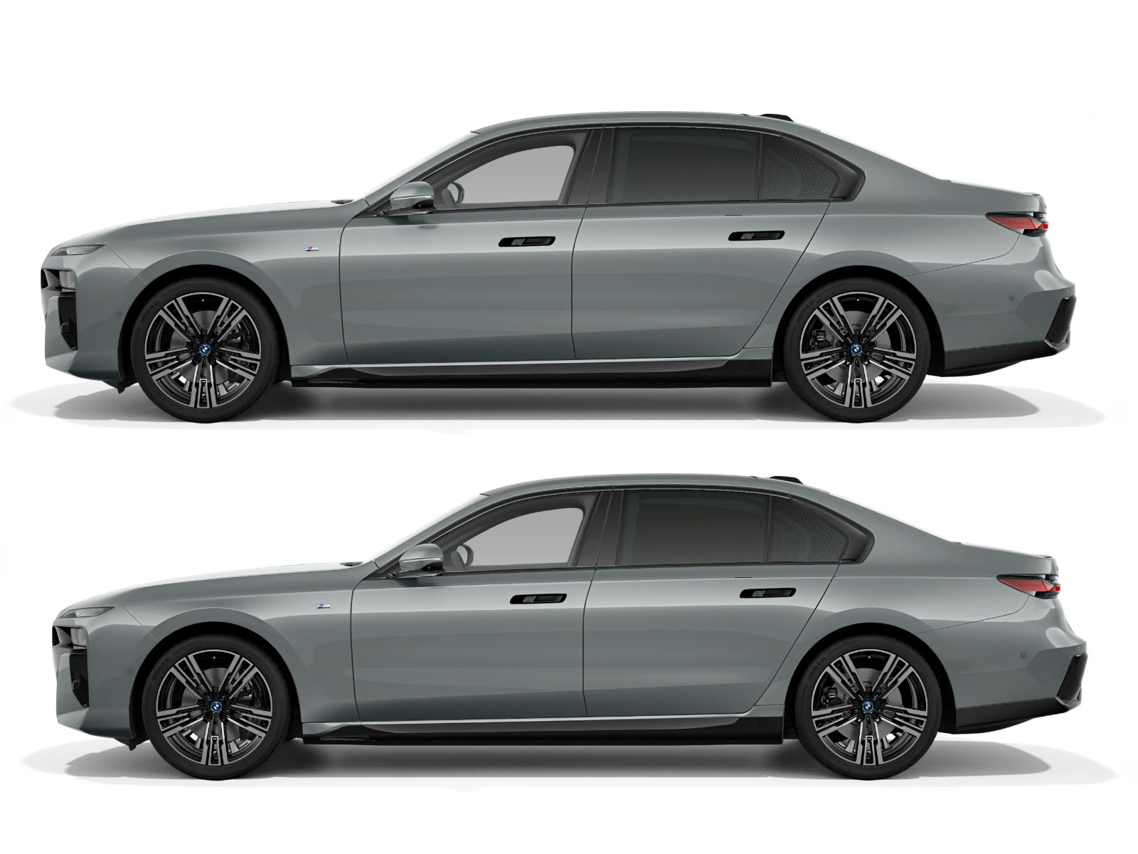
You’ll notice that in addition to outfitting the largest diameter wheels that the budget and chassis engineering team allow, the stylists also wrestled with reducing the bulk above the wheel openings with thick flat arch sections (which has become quite common) and with matte black added to the lower areas (see below). While BMW managed to cram the five liter M70 V-12 into the E37 7-Series in the late 1980s, today the 7-Series is four inches taller but with four fewer pistons and less engine displacement. Physical bloat has come a lot from increases in safety, but the height of the engine is a big part of the high-cowl equation, and the design teams need to challenge the engine architecture teams to get low.
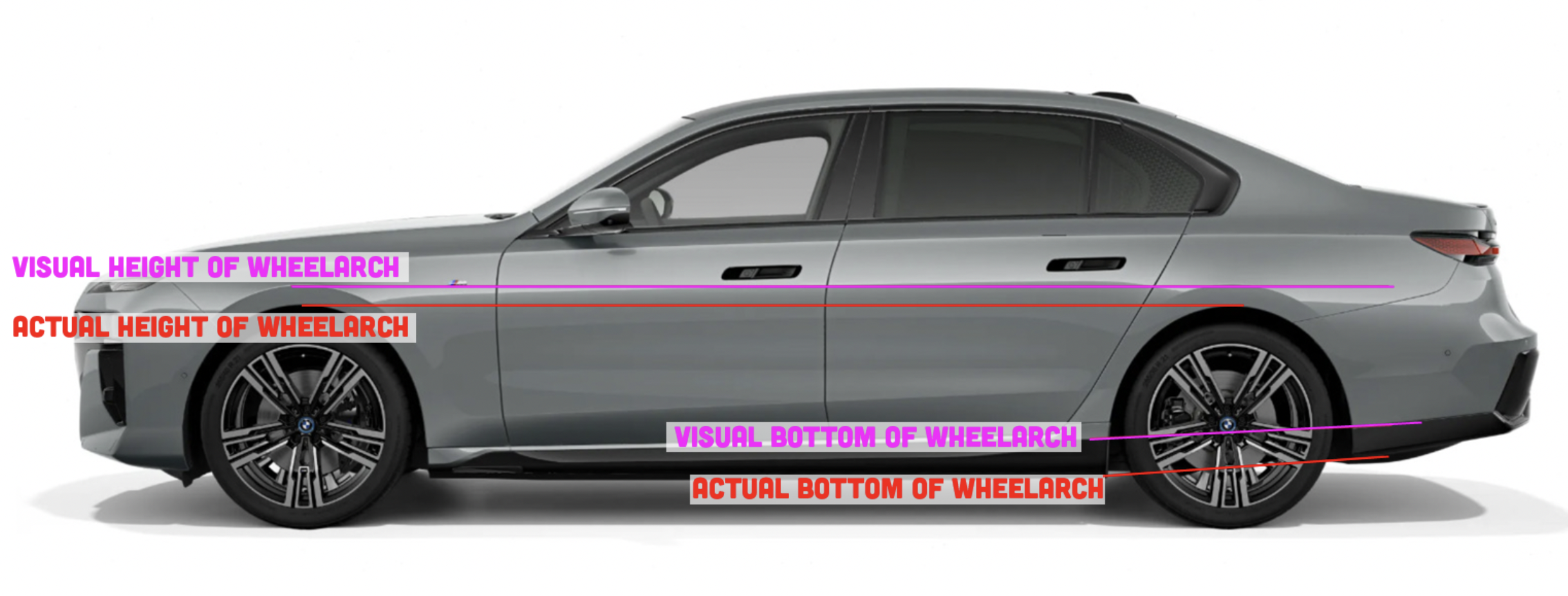
Mercedes chief designer Bruno Sacco expressed disappointment that one of his last designs, the beautifully slabby W140 S-Class (the still-beautiful one I showed above) was about 4 inches too tall, so designers are well aware of how important a low profile is. But the G70 BMW probably only needs a one inch section job to slim-down into an attractively sleek proportion. It’s an easy modification in Photoshop of course, but in the thick of engineering the entire car, a nearly impossible hurdle once the engine and packaging architecture are set.
There was an era where, for decades, manufacturers were able to reduce the height of each new generation to improve styling. I’m surprised that all that hard work is being lost (added back!) one inch at a time, year by year by many many manufacturers.
So we went the other way and just an inch removed here…do you see it?:
But What About The Front End?
Yes, of course! Getting to that! All eyes of course will immediately go to the front end of the G70, and with my first look, I did note that my eye was immediately drawn to that area. Good design is a balance of areas of detail and areas of rest (i.e. broad areas of surface that are not broken up by lines, shapes, decoration). There is great contrast looking from the bodyside to the busy front end. It’s playful, but with an angular digital line language. They are having fun with the flag-ship budget tech. At flag-ship price point, I would expect a more conservative approach, more maturity, and that would be accomplished with less movement of the lines and more horizontal emphasis to solidify the elements.

As for the graphic break-up, that’s a LOT of black area. Does black evoke a feeling of quality? “Piano-black” is used commonly to denote tech and to break up traditional graphics, but the application here is too indiscriminate and floundering for a car of this distinction.
Kidney Punch!
Are we getting used to the giant kidneys yet? Ugh, no. Again, they have mass problems in front. There’s too much height and they’re stacking up lines and shapes to fill it up. On an SUV, the kidneys have some logic in trucklike proportion, but on a sedan, they’re crude, and the coarsely spaced ribs have no elegance or grace. The thickness of the vertical bars is better suited to imply off-road brute durability, not urban high-end class. Unfortunately, this motif is one that the brand is stuck with for a generation. I expect the styling keyword will again be “gaaaaahhh!!!” for the fascias of the upcoming 3 and 5 series as well — gird yourself. In the sketch-over below, I restrained myself and simply reduced the height to a more sedan-like proportion, and made the fins denser.
“What Have You Done To Its Eyes!?”
I won’t be able to illuminate the subject of lighting as well as Jason, but you are always playing with fire when you deal fast and loose with headlight spacing, size, and location. Swarovski crystals (yes, they did) in the headlights is a cross-branding gimmick more than anything essentially functional, but I’m sure it is something the owner can brag about. “My G70 has Swarovski headlights!” “Oh, you have the new Hyundai G70?” “No, that’s a Genesis, and no, I have a BMW! I thought they said it wouldn’t be confusing!”
Human vanity dictates rules of normalcy for automotive fascia, and when we don’t see the “eyes” in their proper place, we start to sweat a bit and shift in our chair with discomfort. The upper row houses daytime running lights and turn signals. In most press photos, the actual functional headlights down at mid-kidney level are mercifully dark, as that odd location throws the balance off completely. Fresh but polarizing styling ideas like this often disappear during the mid-cycle refresh a couple years after launch, much to the chagrin of any designer trying to change the world. Depending on the response, it would not surprise me to see a more traditional singular headlight form replace the stacked units in the next iteration of the 7-Series. Make your Vegas bets now on it.
In defense of the concept though, we can take that sectioning job around to the front of the car and reduce the strip of body between the upper and lower light units. This deduces the vertical heft of the fascia and creates more visually “comfortable” appearance. In the front angle view sketch-over below, to complete the front lighting presentation, I felt a spot of color was needed, so an amber corner marker pennant shape added a spot of interest.

You Look Best When You’re Leaving
Around back, the 7-Series is surprisingly straightforward and attractive. Slightly compressed, but still conservative enough taillights, no odd angles or lines. What’s missing are some aggressive exhaust finishers. On the M-Sport Pro, the lower bumper gloss black swaths are similar in shape to those on the back of the Honda Civic, but here they only break up the color and don’t pretend to be inauthentic cooling vents. I’d leave it alone. Don’t fix what isn’t broken.

Post-Script: Configuration Madness
Really? Oh these are bad! It’s really fantastic that BMW’s online configurator allows the customer to make such poor decisions! It’s not cheap to manufacture cool paint options like this. I can’t find a two-toned paint job that I like, though the black and white one would be fun to make into an upside-down version of a Tokyo police car (I added the text, obviously). It will be interesting to see if these configurations will be available in the United States. In the introduction of this article I mentioned how the blackened lower section leans out the body, but a horizontal color separation near the beltline does not improve things as well.
As always, design is subjective, and improving a design that’s been worked over in a development studio over a long period of time isn’t going to happen in a day. What do you think? Where is BMW headed with this for the 3 and 5 series?


BMW, Audi all of them need to get rid of these huge, plasticky maw style grills that Lexus first started. All the models from 2020 on are terribly ugly, and cheap looking and that goes for Audi too!
I wanted to hate this, and then I realized that I’m not the target market for this vehicle and perhaps can’t understand the values that drove the design direction. This vehicle has a face that loudly and aggressively announces its dominance and that its owner doesn’t give a shit what you think. There are a lot of top-of-the-line luxury sedans getting big, aggressive, toothy faces right now, which makes me think that the target demographic is responding positively. Also, consider that China is now one of the biggest markets for the 7-series, accounting for over 40% of sales. Maybe, the fact that a peon like me finds the styling offensive is exactly what the company intended.
For those of us who remember, the E32 (second gen 7-series from 1988 to 1994) and the ensuing E38 followup (1995 to 2001) are both considered high watermarks for 7-series design. We haven’t been impressed with a 7 series design for right at two decades now. Looks like this one is no exception. Someone within the bowels of BMW somehow thinks “bloated” and obscenely large grilles are somehow attractive design features.
The proportions on the car seem to remind me of the current (yet dated) dodge charger / chrysler 300 twins. Both are big RWD sedans, and BMW boxied it up this time. Yes, the split headlight is like the other stellantis stablemate (of the dodge/chry twins) of the jeep cherokee and reminiscent of recent korean autos. A tesla model s this is not.
I can’t exactly put my finger on WHY, but the revised front end view screams VOLVO at me.
Don’t much care for the BMW 7-series and think that the height of the nose is as low as it can be due to European pedestrian protection rules, but I am happy to see you use my photo of the Infiniti M45 (one of my faves too!). Took this picture during a lull at a Trinidadian wedding in Toronto.
There must be equivalent Chinese automotive enthusiasts sites. I’d love to read a translation about this car.
On the next episode of “Unsolved Mysteries” – if Chinese buyers like to sit so far downwind of the driver that they’re in two different zip codes, why did they hire such a driver in the first place?
Hewell: Thanks for reminding me of that beauty that was the Infiniti M45. I always wanted one of those. Sadly there were so few made that they are nearly impossible to find. When I do find one I think about what else I could have for the same money or the competing LS400 and then I move on. Still, it was a beautiful design with great proportions.
Whoops, Huell. Sorry.
Our secret designer has just made the BMW look like a Volvo S90 and is that a good thing?
WTF is up with eyebrow DRLs on everything these days? Unoriginal, ugly, and did I mention ugly?
That two-tone paint, though. Wow. Flashback to 1980 Chevy Citation.
I think the “fix” removes some of the key details that make the car look good and unique. The headlights especially are way better on the real design.