

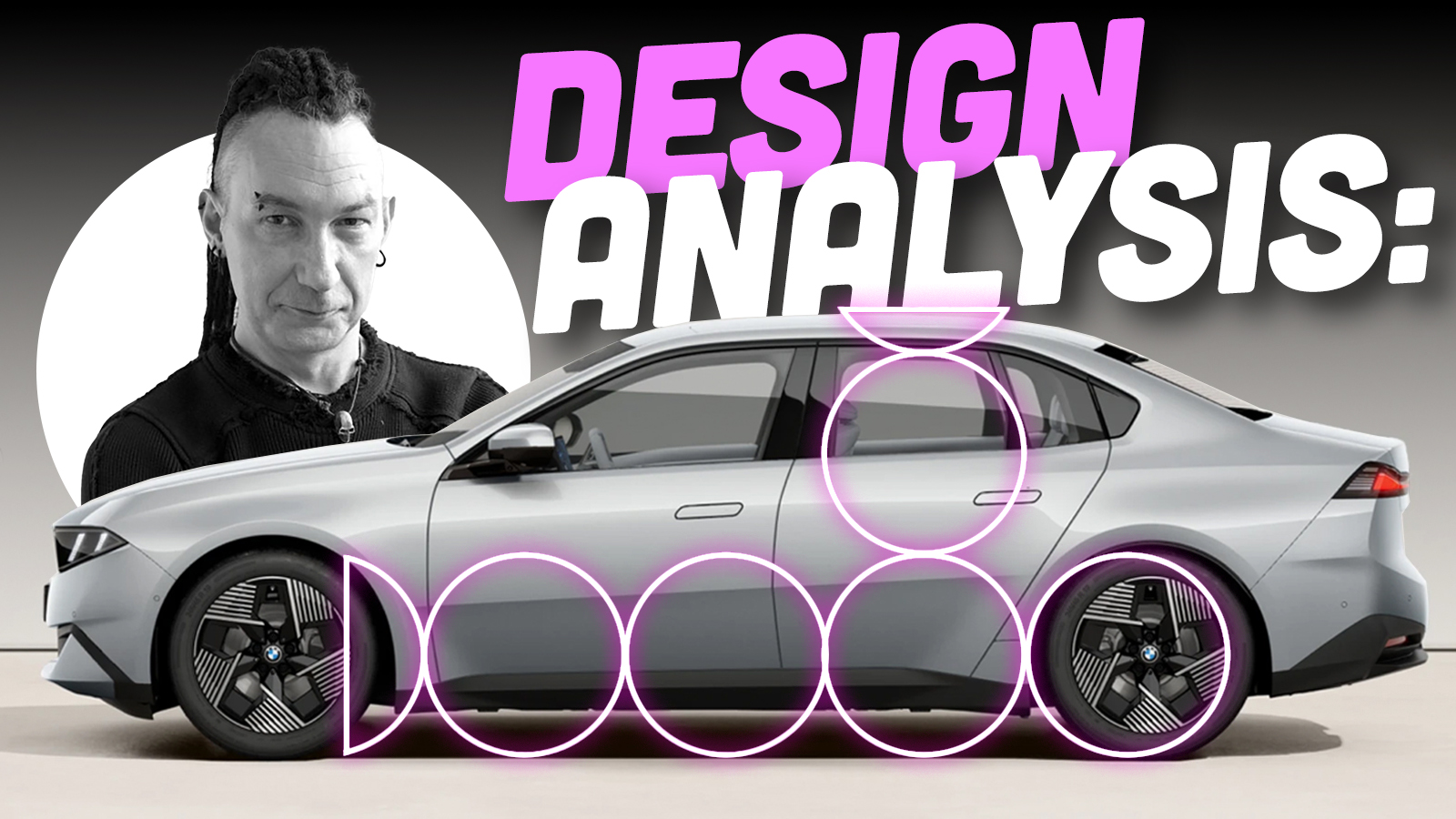
Well, it appears to be time once again for one of my semi-regular articles about BMW design. Like so many things in my life, this wasn’t a burden I particularly wanted or asked for, but instead is something inescapable the universe has foisted upon me because it likes seeing me suffer. As a self-confessed goth you might think suffering is something I enjoy, but that’s not the case. Unless I’m specifically paying for it.
When Lord Reith created the BBC in 1922, his intention for the broadcaster was that it should ‘inform, educate and entertain’ the public. David insists on something similar here at the Autopian. We have an editorial directive to adhere to the ‘3 E’s’. Educate, entertain, and I forget the third one. Embiggen or something. Before you change the channel, I’m not going to be writing another two-thousand-word discussion on the current direction of BMW design and the context around it. I’ve done that ad infinitum, and I’m so very, very tired. This past week BMW launched the next (G50) generation of its heartland 3 Series, and it presents me with a copper-bottomed excuse to talk about one of the fundamental building blocks of good car design – nailing the proportions. By comparing the new 3 Series to its superficially similar sibling, the EV i3, in side view, I can hopefully help you understand why some cars look right, and others don’t.


First of all, let’s set out some definitions. Saying ‘the side view’ is pretty self-explanatory, but you should understand exactly what these are and how they are used. When getting their initial ideas down on paper, designers will usually start with a quick side view sketch, because it’s the largest surface of the car and anchors the whole design. Concept artist Daniel Simon told me, ‘Once you nail the side view, that’s half the rent paid.’ In other words, you have to understand exactly what the side of your vehicle looks like before you can think about the front and rear. There are specific spatial relationships between the various parts of a car that subtly alter depending on what category it sits in, which we will get into, but creating a good side view is the starting point for any design.
The issue with side views is that they are quite static and boring. They’re not great at selling an idea to design managers for approval to take to the next stage, and they don’t show the whole of your design because you are looking at only one side of the vehicle in isolation. I’ve probably mentioned it before, but it’s a story worth retelling: the father of modern car design, Harley Earl, could not draw. He had little to no understanding of how to create a form in three dimensions, so he insisted his designers present their ideas in orthogonal plan drawings – that is, separate front, rear and side views – before allowing any modeling to commence. What this meant in practice was all of Earl’s cars (basically GM’s entire output from the mid-thirties to about 1958) had very little consideration for wrapping the design of the front and rear around into the side profile. Earl’s replacement, the equally hard-drinking and sweary Bill Mitchell, was a trained illustrator, having got his start working in advertising on Madison Avenue. Mitchell intrinsically knew that to really understand a car’s design, you needed to view the whole thing (as much as was possible in a sketch or rendering) rather than each side in isolation. Which is why, as designers, once we’ve got a side view we’re happy with, nearly all the sketch development is done in flat-perspective front and rear three-quarter views. This way we can properly work out how headlights wrap around onto the fender, for instance, or how the line of the hood might change direction as it meets the front of the car. Basically, side views are great as a tool for starting and evaluating a design, but not always helpful in selling or developing a design, at least in the early creative stages when it’s all still on paper or on a screen.
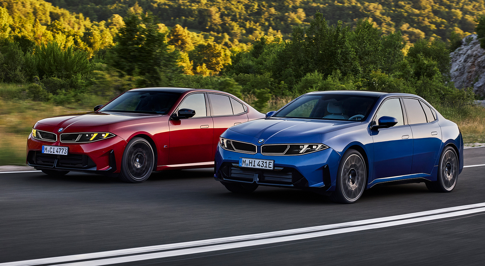
The second issue is that zero-perspective side views are not very flattering. When you look at a car in real life with your own eyeballs, perspective enhances shapes and hides overhangs. This is simply the physics of light and biology in action – and one of the reasons designers work on full-size models. Creating a zero-perspective side view, whether it’s done digitally in rendering software like VRED or by taking a photograph (using a long lens zoomed in from a distance), flattens the car and brings the overhangs into sharp relief – so to the untrained eye they can look gawky. Bear all this in mind as we look at some side views to make some comparisons between the two new BMWs.
The other definition to get your noodle around is what on earth am I blathering on about when I say proportions. If you think about the side view of a car – in this case, a three-box, rear-wheel-drive sedan – those three boxes are the hood, passenger cabin, and the trunk. In car designer speak, these boxes are known as volumes. This is why a vehicle that is all passenger cabin with no separate hood or trunk, like a minivan, is called a monovolume. When you have more than one ‘volume,’ the relationship between each one, and the wheels and wheelbase, is known as the proportions. Now this might all sound a bit subjective, but the thinking behind vehicle proportions is all about visual balance. Do all these constituent parts – wheels, hood, roofline, trunk, and overhangs come together in a way that looks cohesive and without any one element overwhelming the others? Do the wheels look like they are in the correct position, and does this vehicle sit on its wheels so that it looks balanced, or is it nose- or tail-heavy? Is the side view harmonious in a way that is appropriate for the segment of vehicle we are designing?
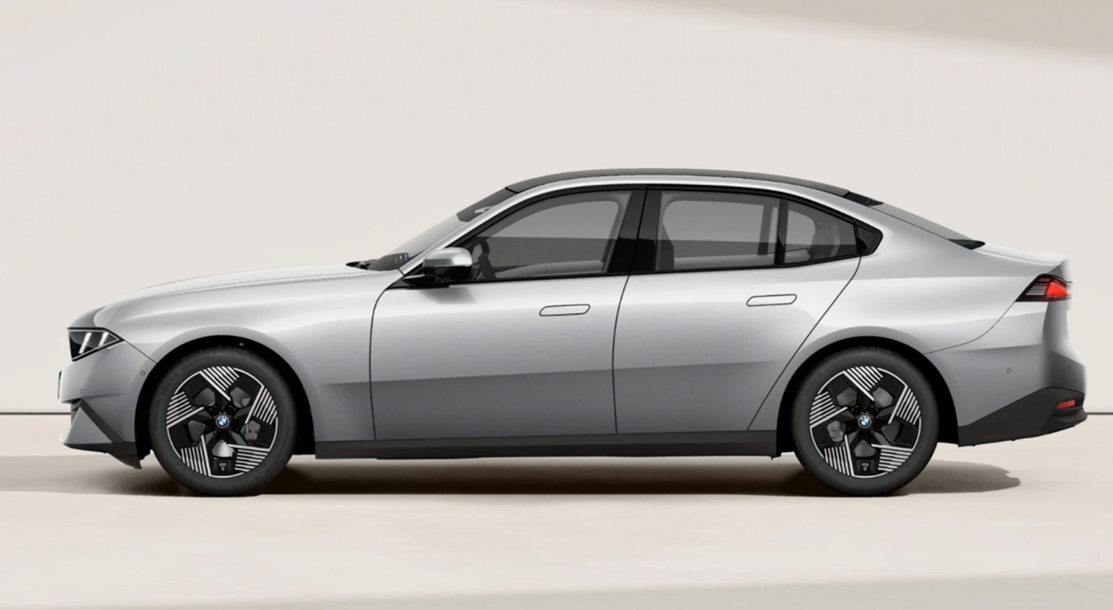
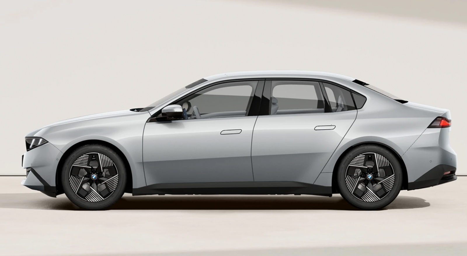
Alright, that’s all the tedious car design theory out of the way. How does all this apply to the new 3 Series and i3, and why should we care? The interesting thing to me is that this is the first time I can think of (feel free to chime in the comments) that an OEM has tried to put an identical body on two different platforms in an effort to convince customers it’s the same car. I’m not talking about similar lights or grilles or other visual DNA that’s been copied and pasted to create a family resemblance. What BMW is attempting is much more involved than that. It’s more akin to releasing a film on VHS and Blu-Ray. At first glance, the same to look at, but under the surface, different things with a very different visual result. And we can use side views to decode exactly what is going on, and why the CLAR-based ICE G50 3 series looks terrific, and the Neue Klasse-based EV i3 version less so. Fortunately, we have a very simple way of initially figuring it out by using the wheels to guide us.
For the purposes of this piece, I’m going to stick to the three-box sedan category of car, since that’s what we are talking about. Using the wheels to guide your overall proportions is universal across other categories of cars as well. For a EuroNCAP/Global D-class sedan (in the EPA definitions, the 3 Series falls in between Compact and Mid-size), the wheelbase should be about 3 1/3 wheels and body height between 2 and 2 1/4 wheels. Let’s have a look:
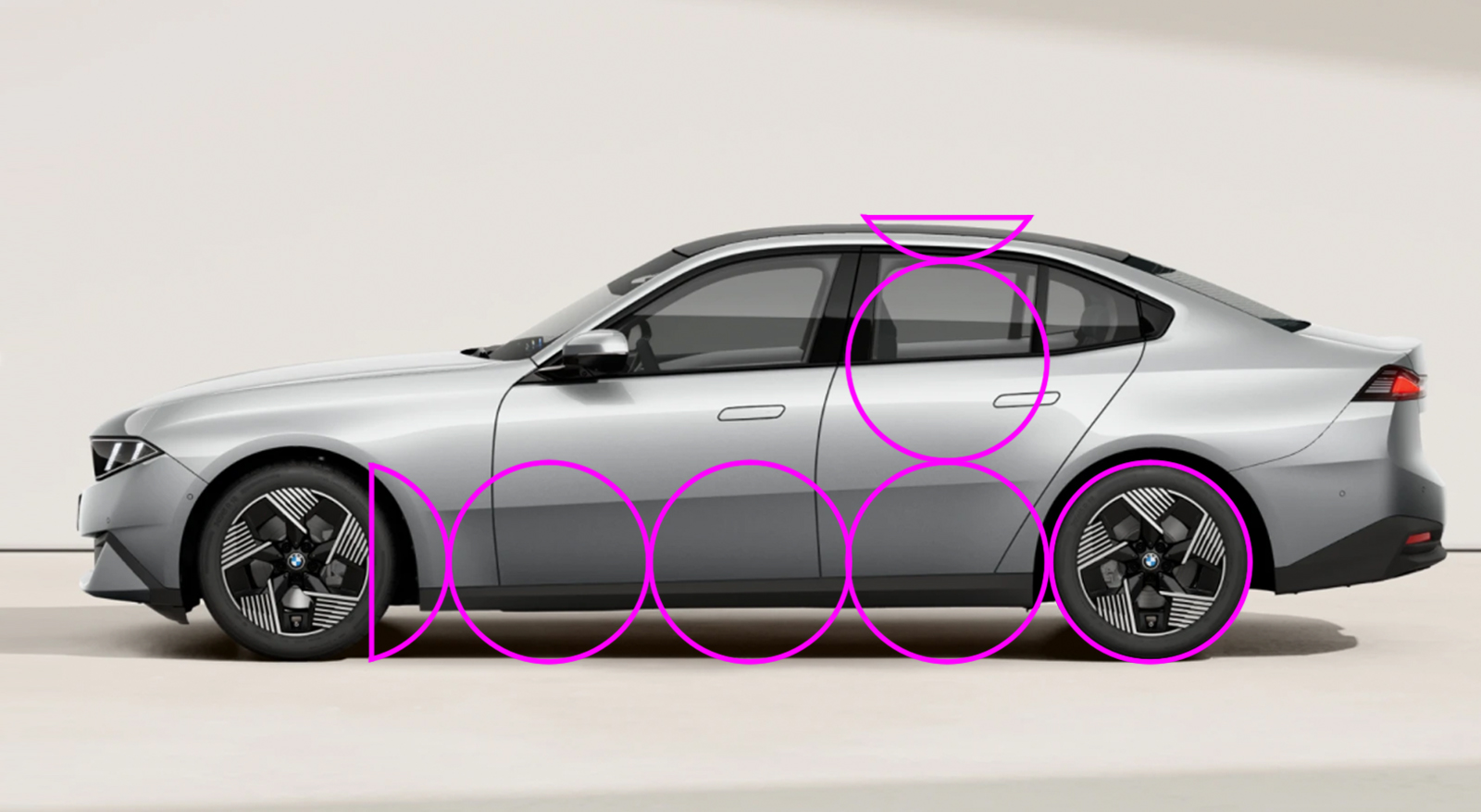
As you can see, the new ICE G50 3 series fits pretty much within these ideals.
… And in case you think this is something I pulled out of my ass, let’s have a look at some older models:
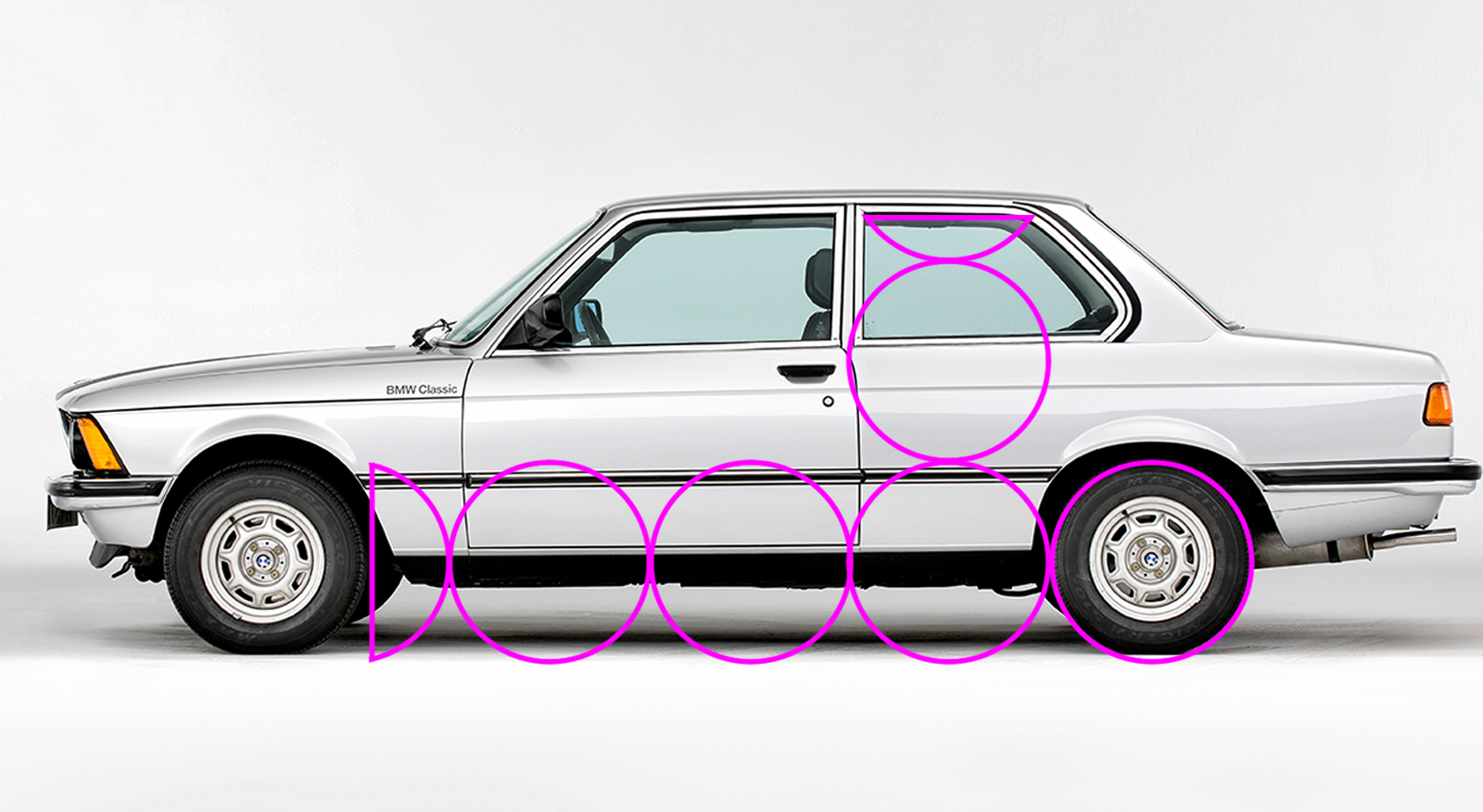
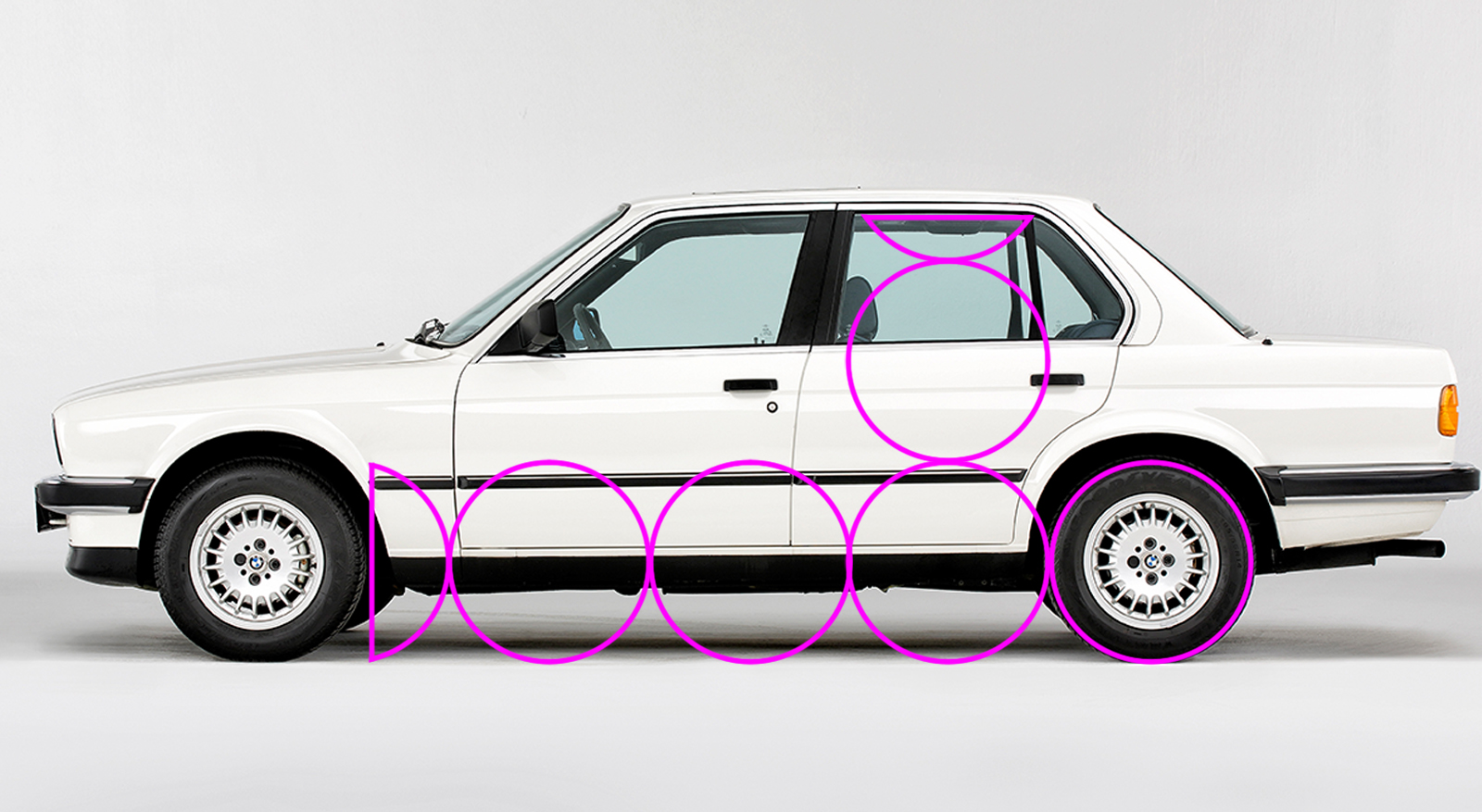
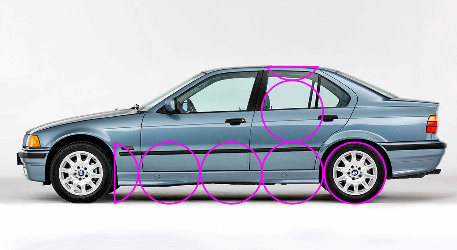
There’s a bit of a drop in cabin height between the E30 and the E36, but as the 3 Series grew slightly, it would have been possible to recline the passenger seating position more, and the car itself is longer overall. With these images, I’ve kept the pink overlay in the same place and at the same size, and then scaled the photos so the rear wheel fits. Like all cars, the 3 Series has grown over the years, but the wheels have also increased in size to match, so the overall proportions remain roughly the same. Let’s have a look at the i3, which is built on a different platform.
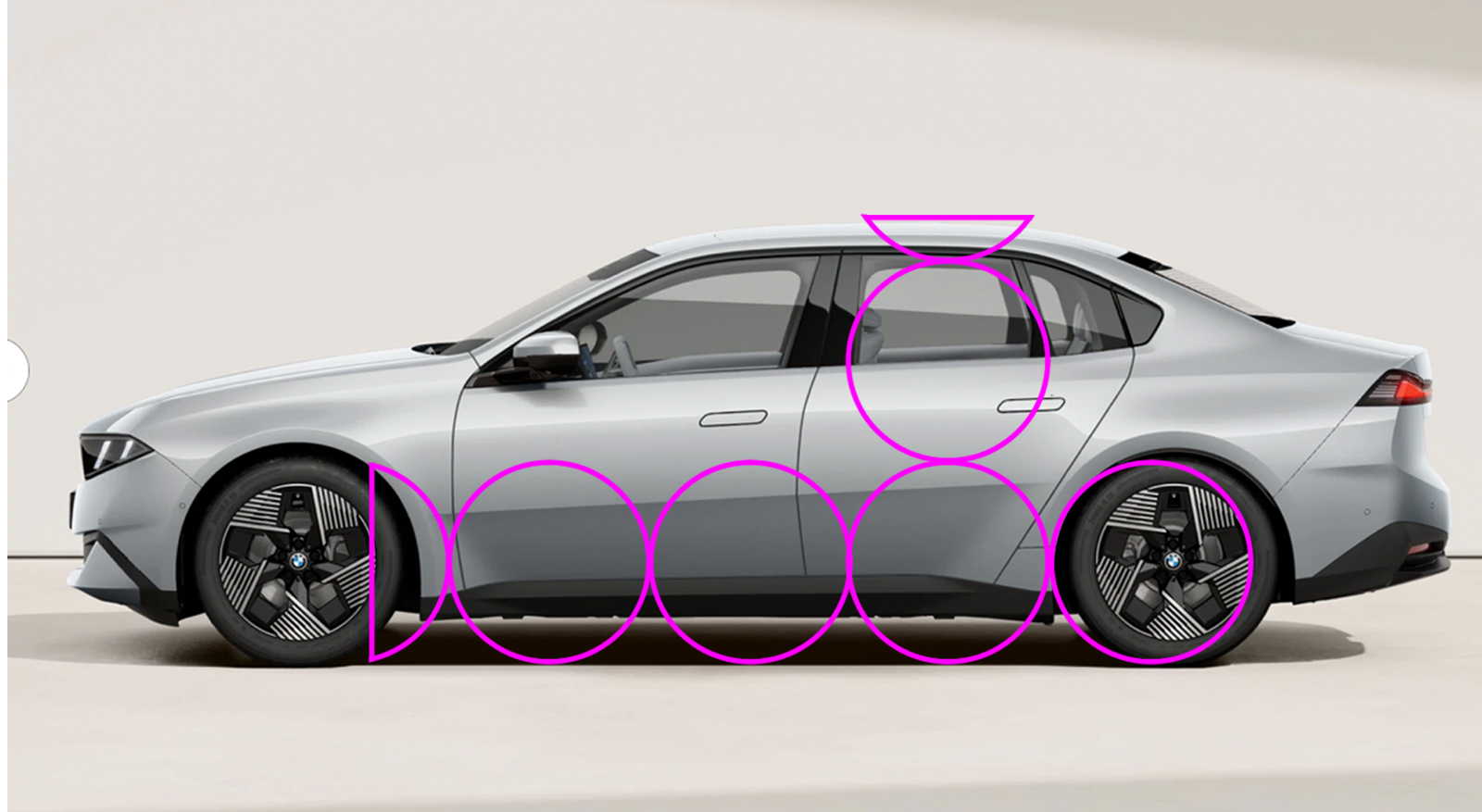
Huh. The wheelbase itself appears correct, but it looks like the wheels are in the wrong place. I’ve scaled the images of the 3 Series and the i3 to the same length, because in real life at 4760mm for the BEV and 4765mm for the ICE, when viewed on a screen, they near as dammit are. Using the wheel guide overlay, you can see the i3 has its total wheelbase pushed back, equalizing the length of the front and rear overhangs and making the whole car look static.
Front axle position is determined by the powertrain layout. Rear-wheel-drive vehicles need more hood length to package a longitudinal engine and gearbox arrangement. This pushes the passenger cabin rearwards, leading to a shorter front overhang and a longer rear one. We can demonstrate this by looking at the relationship between the A pillar and the centerline of the front axle. On a rear-wheel-drive car, if you continue the line of the A pillar, it should continue through or slightly behind the front axle.
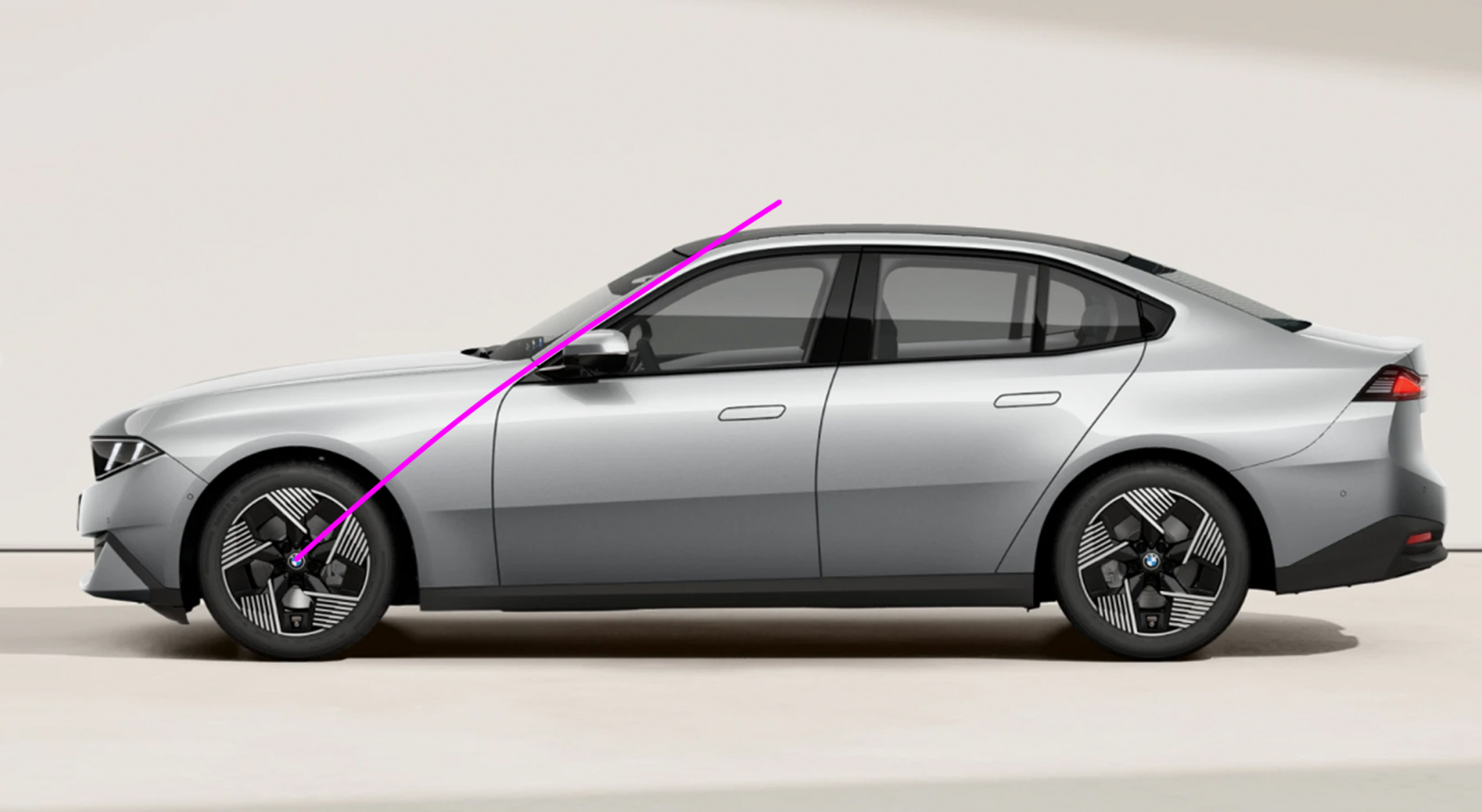
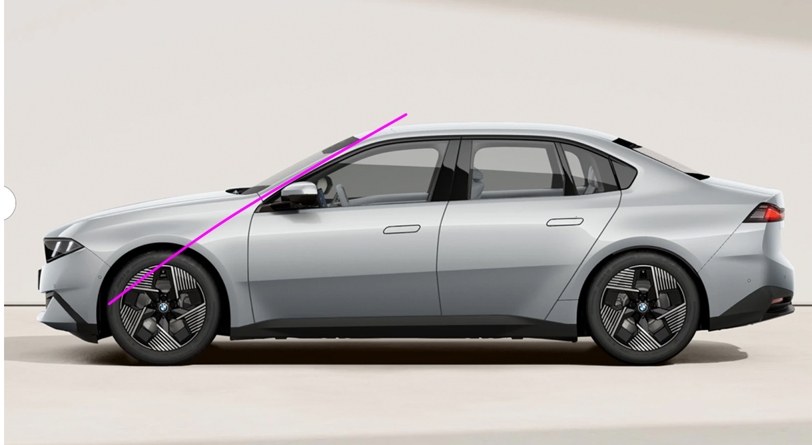
Doing the same thing on the i3 shows the A pillar pointing well in front of the axle centerline. This is more in keeping with the proportions of a front-wheel-drive car, which needs more front overhang to package a transverse powertrain, or a mid-engined car, which has a passenger cabin pushed forwards because everything else is behind it. When you have a longer front overhang, you need a shorter rear one to keep the visual weight more within the wheelbase and help maintain a sense of movement. The thing to understand about all this is not that RWD cars automatically have better proportions than FWD cars, or that there is some overall ideal proportion and any car that doesn’t fit that template is automatically a poor design. It’s all about nuance and what is appropriate for the car in question. There are plenty of horribly proportioned sedans and terrific-looking hatchbacks. When I dissected the design of the EV Ford ‘Capri’ two years ago, my main criticism was that its height was out of proportion compared to its length, and the A-pillars were too far forward. I’d be on thin ice (ha!) levelling the same height argument at the i3 because it’s only 25mm (1”) taller than the 3 Series. Of the two BMWs, the i3 actually has a 37mm (1.5”) longer wheelbase, so in theory it should have plenty of scope for pushing the front wheels forward – but this extra length disappears because the i3 rolls on 1” bigger rims. Let’s try that A-pillar and wheel overlay exercise on a 3-series competitor, the Audi A5:
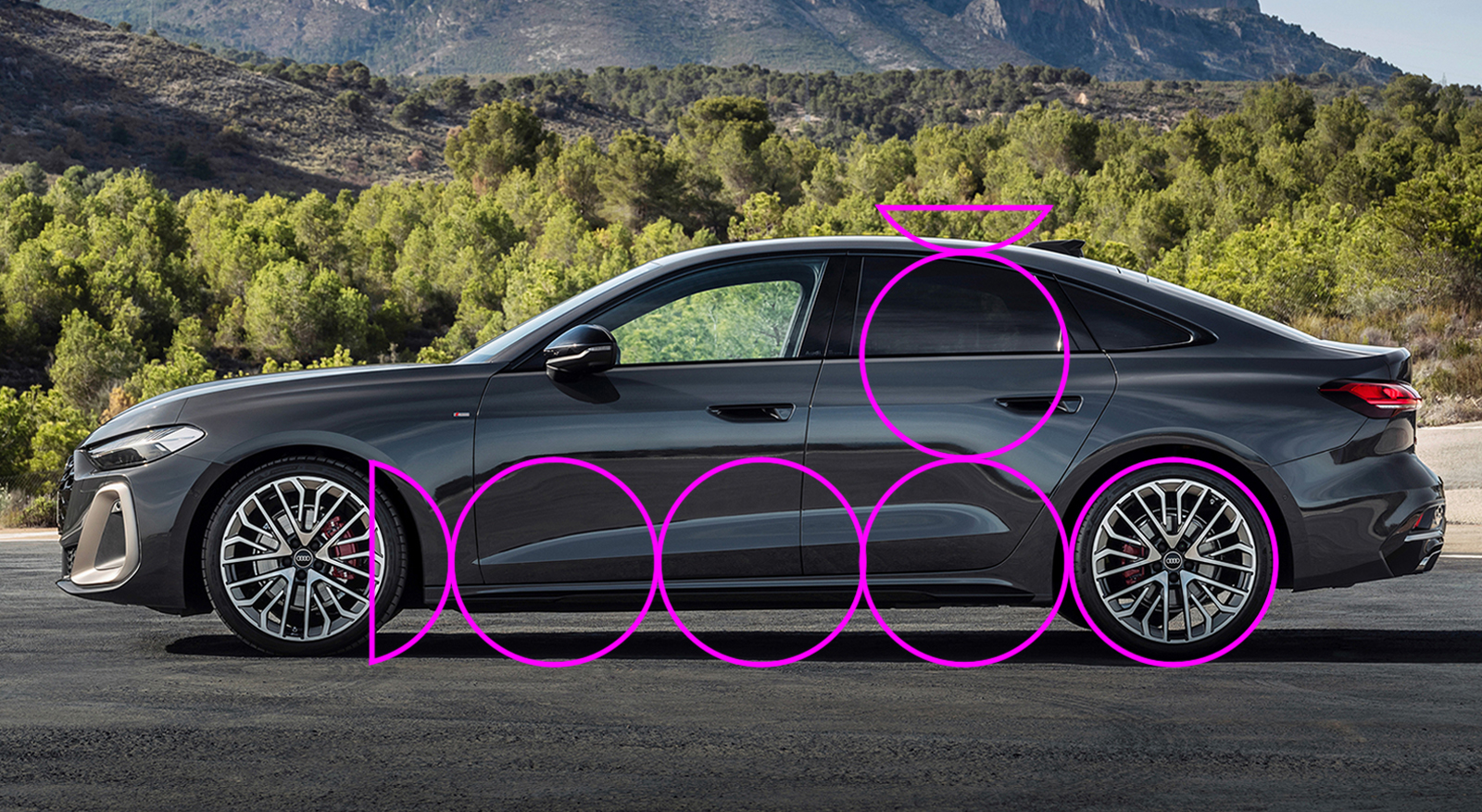
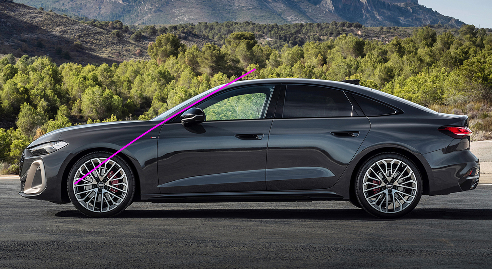
You can see the proportions are correct, and even though it has a shorter hood and the A-pillar points ahead of the front axle, I think this is a very nicely proportioned side view indeed. So it is possible to make a good-looking FWD sporting sedan – my star witness in this argument is the Alfa Romeo 156 or the first-generation Peugeot 406. Closer to home, the Chrysler LHS cars and Oldsmobile Aurora look brilliant. For all its head-munching faults, the Cadillac STS was admired by none other than Bruno Sacco. So that alone is not the issue. And the i3 is not FWD – the launch cars are all AWD.
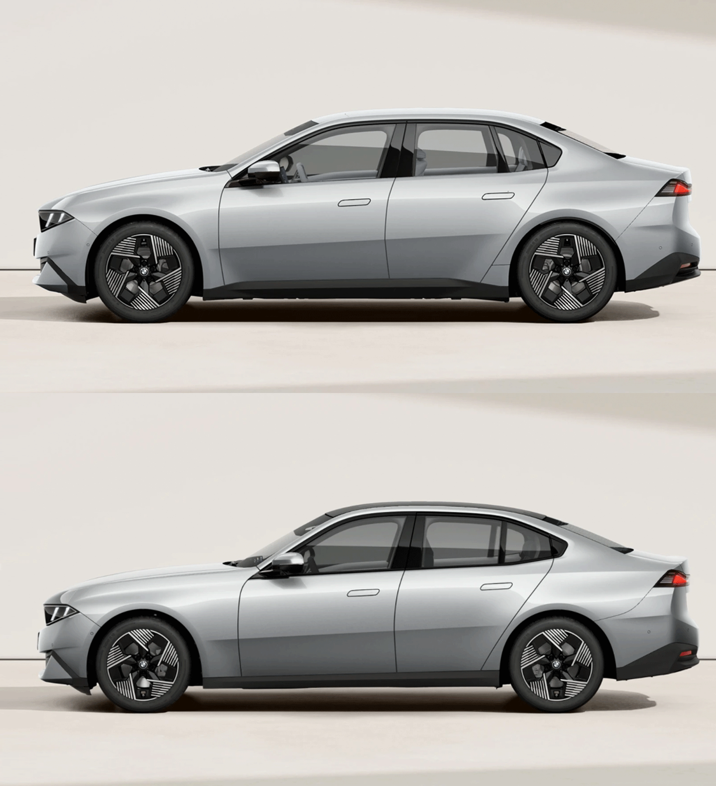
With its nearly equal overhangs and misplaced A-pillars, the i3 is neither fish nor fowl. It doesn’t commit to a proper cab-forward layout because that would move it too far away from the 3 Series. But neither does it match the lithe athleticism of the ICE car, because the front overhang is too long and the hood too short, because the base of the windshield is a long way forward. Normally you do this on a FWD car to make the most of the available length to liberate room for passengers. But in the press pack BMW makes no mention of interior dimensions whatsoever, so until the media gets its grubby hands on the new cars we won’t really know what they’ve achieved with the interior space.
Although modern platforms are more like a kit of parts and systems than just being a sheet metal foundation to build on, there are sometimes hard points that cannot be altered. My suspicion is that the firewall-to-front-axle distance on the Neue Klasse platform is one of them, and that is what has lumbered the i3 with shitty proportions. The same Neue Klasse platform also underpins the iX3 EV SUV, but the shorter dash-to-axle doesn’t matter on that car because it’s a two-box SUV, not a sporting sedan. As ol’ Martini Mitchell himself understood, the dumpiness of the i3 is a consequence of not taking a step back and viewing the car as a whole, and in this case that includes the thinking behind it.
All images BMW unless otherwise stated.


Maybe it’s just me who didn’t know there was a “new” i3 and thought this post was going to compare a nice sedan to that weird hatchback that David drives.
“I drive an i3. No, not the interesting one, the sedan that looks like what a Pontiac Sunbird would if they still made them.”
That animation reminds me of our old cat, when you’d give him a quick kiss on the face he’d pull his head back in a “WHAT did you just do to me?” manner.
The new 3 series is fine, I guess. Turns out I just don’t really like anything BMW has done in a decade+. Or the other Germans. Or most car companies, if I’m honest. Is it just from getting old (though at 39, only teenagers consider me old)? Am I falling into the “everything modern is bad” trap?
I don’t think so, at not quite 30 I also hate most new car design. I think it’s a matter of desensitization, most people think older cars look better, but to the layperson, “newness” is a very important feature in a car, and 2WD sedans/hatches are considered impractical, dangerous vehicles for those without responsibilities, so ugliness is just accepted as part of the deal when you buy a “practical all-season car” (an AWD CUV).
The new 3-series looks downright sleek by comparison to average vehicles now like the Rav4, which is as big as a Highlander was the last time BMW made an undeniably pretty car. Combined with the dearth of RWD-based sedans (and sedans in general), it makes cars like this very appealing to people who simply aren’t cross-shopping with anything made before 2020.
To a frog in boiling water, it’s very refreshing to jump over into a pot that’s only simmering.
Adrian sent me this link on Twitter last week about design that explains a lot of why modern/current car design is so unappealing and/or homogeneous, it’s a very good video:
https://t.co/dcCmWYVhYh
That’s a good watch, thanks for linking it!
I choose the the two oldest 3 -series cars pictured for the wheel base wheelie comparisons. Far cleaner, lots of glass, look lithe and athletic as compared to the following models where each one looks heavier, like a middle aged high school jock.
I really want to have been a fly on the wall when Design made their presentation to Accounting and the CFO on why they needed completely different door, roof, trunk lid etc stampings for two cars that end up looking exactly the same when not compared side by side.
I’m curious about this too. Why couldn’t the i3 share ice3 body panels and proportions?
Or why couldn’t G50 share i3 proportions?
Or at least everything from the A-pillar back, and stretch the wheelbase and bodywork forward to accommodate the inline 6, similar to how Volvo stretched the 140 series to create the 164 with it’s inline 6.
Yeah, you would think that they would try to share as many body panels as possible for cost purposes.
I don’t understand stuff like that
BMW are in the enviable position of being able to afford to do this – a lot of OEMs aren’t. Absolutely this must have had accounting on the fucking ceiling, but then Toyota makes two different mid-size pickups.
Well, and given you’ve confirmed my suspicions that the G50 is just the G20 in Neue Classe drag – now it makes sense.
I can’t argue with their results. They seem to have figured out how to sell their electric vehicles before Mercedes could, who am I to question?
I guess the battery in the floor makes the body taller, hence requiring taller doors to cover part of the lower bottom of the body, and then accomodating the character lines and pillars to disguise it as much as possible.
That may, additionaly, slightly change the glass bits. Then, boom, a completely different body.
But don’t quote me at that, I’m just a lawyer.
No you are correct in that cells in the floor pushes the H-point up, although the penalty is not as much as it used to be, there still is one.
No free lunches.
From a customer perspective a high H-point is usually a plus, even if it’s a drag for the design team. Literally.
Why do you think crossovers and SUVs are so popular? I’ve made this point many, many times.
Because they are trying to package both cars well while realising that most people don’t want an EV that announces itself as such. I think it’s quite smart actually.
The academics are nice but I think the i3/G50 ICE both look great. Compare to the A5 which you’re taking as a great side profile example and I’d pick the BMW every time. The Audi looks frumpy to my eye.
FWIW the Neue classe 3 series is one of the few BMWs that I’ve felt looks great out of the gate in a long time, and quite a bit more handsome than its german rivals.
I like the new 3-series a lot, and sat in one yesterday. Lack of hard controls would be a no-sale for me though.
This is an excellent explanation of design and proportion that educates and doesn’t punch down at us for being dumb. Peak Autopian stuff, which is why I have renewed my membership again. Keep it up Adrian!
We don’t punch down here.
I wouldn’t be much of an educator (in university or here) if I couldn’t explain this stuff in an understandable and hopefully entertaining way.
I just want pretty.
Call me crazy – but the i3 is better proportioned and styled to these eyes.
The rear decklid is a longer and more useful length because the rear roofline is more upright, which also makes the greenhouse appear airier.
The rear axle is pushed farther to the rear – giving a more planted stance.
The Hoffmeister kink – as fucked up as it is with the faux DLO in the C-Post – is better defined.
The i3 appears more correct probably because it was designed first – While the G50 is proportioned like the previous gen 3 series in Neue Classe drag.
Well the G50 is the pervious gen in Neue Klass drag, but the reality is we don’t know which was done first (my guess would be they were done at the same time).
The problem is the i3 proportions don’t communicate its design brief as a sporting sedan that’s happens to be an EV. The issue with the rear axle is it’s confirming what we already know – that the passenger cabin is a long way forwards, which combined with the equidistant overhangs doesn’t convey a feeling of motion.
Maybe it’s the racer in me, or just appreciation gained from driving a lot of miles in a modern Mini Cooper, but the equidistant overhangs actually enhances the sense of motion to me. The same for the longer wheelbase. The car looks more balanced and capable, therefore it looks faster even while sitting still.
(I know the Mini doesn’t have equal overhangs, it’s just that having the wheels pushed out further towards the corners looks faster to me.)
Relatively speaking, from the side view, the G50 version looks sort of laid back and chilled out, like it’s not sure it’s even interested in going fast, while the EV looks almost eager to go.
The lower hood/bonnet, especially where it meets the base of the A-pillar, is the only thing the gasser has over the EV.
I also think decades of front wheel drive market dominance may have changed the way I view automotive shapes, at least the modern ones.
All of this is dramatically emphasized in a flat side view, but barely noticeable in the 3/4 view. They’re both good-looking cars.
Thanks for the deep dive. In my profession good design is invisible, bad design runs from uncomfortable to unsafe. I need to copy your approach for some of our features that are hard to grasp!
I wonder, if you stretched the i3 so it had a longer hood and the A pillar pointed at the axel, would that be enough that it rival the size of a 5 series? The i3 is 4765mm and the current 5 is only 5060mm.
I’m not sure why you call the i3’s front overhang “too long”, visually, there is no real difference in the length of the front overhang between the i3 and the ICE version when watching the GIF. Really, the fundamental difference is the location of the base of the windshield/leading edge of the doors. The ICE version gives it the longer hood and proportions of traditional sport sedans, but I don’t think the styling capitalizes on those proportions in any way.
It’s relative. The overhangs are the same but the additional hood length of the gas car balances it out better. Visually, the overhangs “appear” bigger because they are in proportion to the rest of the design.
I love articles like this. I am equally nerdy, though in a different discipline (I could annoy you for hours on exactly where people go wrong with their risotto for example), and I really appreciate explanative deep dives like this
So what makes a good risotto and where do so many people go wrong?
Just guessing, but they start adding broth way too soon….
Interesting. That animation really highlights how frumpy they made the i3. Just at first glance I would have thought the EV packaging offered more freedom on the design side.
Same. It’s strange that they couldn’t use the same proportions as there should be fewer constraints packaging wise
Apart from the cells EVs still have a lot to package.
I do always forget that not everything in an EV is simpler than the ICE version
I think it’s really hard to design sedans and other non-crossover type vehicles when the in-floor battery tends to push everything up. It’s one of the reasons in my opinion, the design of the new Charger is so unappealing.
I’d guess that it might play a part in the different wheelbase, too. If the height is constrained for a sedan then they need to spread out somewhere. Packs are usually as wide as they can jam between the sills already so not much left.
I covered the new Charger a while back – it is a bit dumpy as well.
Thank you for explaining this. When I saw the new i3, it looked ‘off’ to me in some subtle way. I suspected the proportions were wrong, but I couldn’t put my finger on it.
Just a nit-pick…
Am I confused on what wheelbase means? I thought wheelbase was center-to-center. Is everything in here not showing inside-to-inside?
The circles are a little confusing to me too. Unit-length sticks might be clearer in a way, or possibly more confusing in a different way.
As far as I know, as with you, wheelbase is the distance from axle center to axle center. It certainly is in car spec sheets.. But while Adrian quotes the standard “ideal design” to have a wheelbase of 3-1/3 times the tire diameter, all the examples shown and in particular the great prior-gen 3s have a wheelbase of 4-1/3 tire diameters. And a space of 3-1/3 diameters between the trailing edge of the front wheel and the leading edge of the rear wheel. I suspect that this is some kind of normalized misnomer in the car design world. Either that, or the number should have been 4-1/3.
There are 3 1/4 tire diameters BETWEEN the actual tires is what he means. The fourth circle over the rear wheel/tire is just the confirming diameter
You realize that if there’s 3.25 tire diameters between the tires, that means there’s a 4.25 tire wheelbase, right?
Exactly the point (though the article says 3-1/3). So either it was a typo, or cardesigners’ concept of wheelbase is different.
“There are four lights!”
C’mon, does it really matter, Jean-Luc? Give a little.
Dystopia is built with alternative facts.
Greed is good!
They have used this same technique using tire diameter explaining vehicle proportions of height and length on this site in the past not using axle to axle so I just understood what he means when he said 3-1/4 tire diameters between the wheels. Maybe because I read it here before there was no confusion for me.
Fascinating insights! I always like learning about things that are absolutely not my field, but it really only works when it’s always well written and fun. This fits the bill, as usual.
I think a comparison of interior volumes is the important missing piece here. It may come out a wash due to battery packaging, but I suspect the i3 is proportioned the way it is to give better interior volume within the same footprint, since electric motors require far less space than a longitudinally-mounted ICE. Certainly that should probably have been mentioned as a factor in comparing the dash-to-axle ratios of the two cars—the i3’s can (and arguably should) be shorter simply because without a big engine there, it would be wasted space.
in theory they should have been able to increase the dash-to-axle (i.e. give the i3 a longer hood). But they haven’t, and I suspect that’s because of the limitations of the platform.
Because the i3 has the battery pack underneath raising the floor, they need to provide more longitudinal legroom to compensate for the high floor. And like you said, the ICE 3 needs to fit a long I6 engine, but since the floor is lower the rear legroom isn’t as bad even though it’s longitudinally shorter.
I prefer the side proportions of the i3 over the ICE version.
The styling, however, is what burns my eyes (and ever-increasing beltlines)
ever increasing beltlines: the result of aging.
Agree on the first paragraph, but not on the second.
Great read, thanks. The i3 C-pillar angle is catching my eye
I imagine it’s more upright to preserve rear headroom since the seat is likely mounted higher due to the battery pack under the floor. That also explains the i3’s more prominent rocker panels, since the floor, and consequently the bottom of the door openings, would be higher.
Huh. The ICE version looks ungainly to me. The new design language feels forced on it. By contrast, the i3 looks fully resolved to me.
Same. The i3 also forgoes the exterior window trim which makes it look cleaner and more modern. Hard to see it in those photos above, but CarWow on YouTube does a good job of comparing both designs.
Reread the paragraph about side views – you never see a car like this in real life. Having now seen both cars in the metal, the 3 series is so much better it’s not funny (this article was written Saturday before I saw both cars yesterday).
Agree, and I think part of that is that the headlights on the CIE version seem to be a little too low? Almost like they grabbed the “face” of the car in the model and dragged it down slightly.
Will have to reserve judgement until seeing them in person though as photos are notoriously bad for proportionality.
I wonder how much the front overhand is dictated by steering rack location.
On a longitudinal front-engine RWD platform your steering rack has to be low and in front of the oil pan. So that pulls the wheels forward with it.
In an EV with space for front motors your rack can be mounted to the bulkhead, at the base of the windscreen. It’s the stiffest/lightest/cheapest location for it, and it pulls the wheels rearward.
With rear overhang on a front-engined RWD car that you want 50:50 weight distribution in, you have to pull the rear wheels forward to put weight on them.
Again, we don’t know where the rack is mounted on the i3. You would hope it’s in the optimal position for response/feedback etc. etc seeing as it’s a BMW. And as you say, mounting it on the bulkhead is the exact opposite of all that.
I’d be interested in your overall design breakdown of this new 3 Series. I like the Neue Klasse design language, but something about this one seems a bit off or pinched.
Looking at the side view (especially compared to the i3) makes me like the design a bit more, but the front 3/4 view looks off to me and the rear feels like a bit of a mess.
Excellent article as always, and it’s fascinating to see these little design nuances demonstrated and articulated so clearly.
Edit to add: The 3/4 view with both the 3 and the i3 in the article makes me like the 3 a lot better, though. The i3 looks really off and makes the 3 look downright handsome in comparison.
Man, putting them right on top of each other was so weird. I could see all the little differences, and they seem so minor!
But you’re absolutely correct. The electric version is just… wrong.
Very interesting, thanks! I am curious about how these design conventions have changed over time. Much of what looks right or wrong to us is context dependent, and everyone reading this site has grown up with an idea of what different cars look like, both at their best and their worst. Certain proportions seem to be more appealing to most eyes, at least in our culture, but I don’t know that someone of Harley Earl’s era would necessarily look at a much later car and think it matched his ideas of good proportions, so how did we get to now?
A good point. I think most designers (or consumers) wouldn’t have a feeling for what a FWD car’s language would look like, so the context isn’t there.
On the upper images, it felt to me like the i3 has a bulkier front end, but I couldn’t put a finger on the details that made that until further into the article. Now it makes more sense, and putting the points together it does certainly read more “FWD family sedan” than “RWD sport sedan”
The conventions have evolved since the gestation of what we would consider the modern car, so really everything post-war. Packaging and powertrain developments have enabled new form factors, and as we see more vehicles within a category so the proportions evolve. But the fundamental thinking is based on Bauhaus teachings of visual and physical balance. When one is balanced the other is, and vice versa.
I wrote an article for Hagerty about it which goes a little deeper. It’s possible we will see new proportions, but the car is a much, much more mature product now, and anything that doesn’t gain acceptance with the buying public is not likely to make a second generation. The Jaguar iPace would be my go-to example of this, but I accept there are a bunch of other issues that contributed to the failure of that car.
Thanks, I’ll look up that Hagerty article.
Wow, that’s a great article. Thank you! I was quite confused when somehow I thought the ICE car looked more ‘right’ than the EV, and I didn’t realize it’s because they’re actually 2 different cars… I thought it was a ‘me’ problem, not a design problem!