

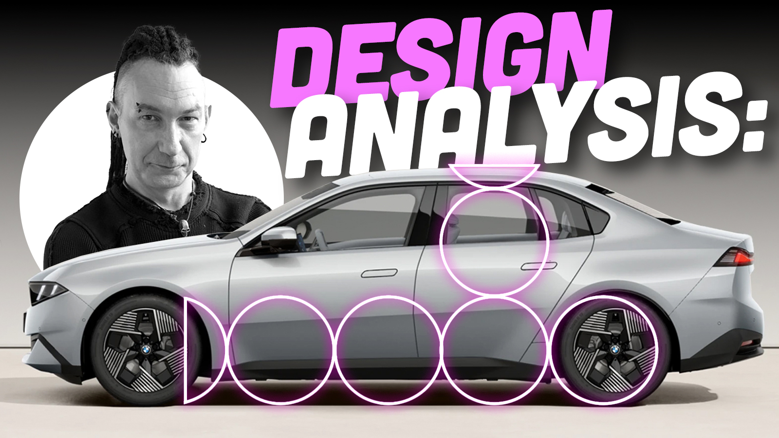
Well, it appears to be time once again for one of my semi-regular articles about BMW design. Like so many things in my life, this wasn’t a burden I particularly wanted or asked for, but instead is something inescapable the universe has foisted upon me because it likes seeing me suffer. As a self-confessed goth you might think suffering is something I enjoy, but that’s not the case. Unless I’m specifically paying for it.
When Lord Reith created the BBC in 1922, his intention for the broadcaster was that it should ‘inform, educate and entertain’ the public. David insists on something similar here at the Autopian. We have an editorial directive to adhere to the ‘3 E’s’. Educate, entertain, and I forget the third one. Embiggen or something. Before you change the channel, I’m not going to be writing another two-thousand-word discussion on the current direction of BMW design and the context around it. I’ve done that ad infinitum, and I’m so very, very tired. This past week BMW launched the next (G50) generation of its heartland 3 Series, and it presents me with a copper-bottomed excuse to talk about one of the fundamental building blocks of good car design – nailing the proportions. By comparing the new 3 Series to its superficially similar sibling, the EV i3, in side view, I can hopefully help you understand why some cars look right, and others don’t.


First of all, let’s set out some definitions. Saying ‘the side view’ is pretty self-explanatory, but you should understand exactly what these are and how they are used. When getting their initial ideas down on paper, designers will usually start with a quick side view sketch, because it’s the largest surface of the car and anchors the whole design. Concept artist Daniel Simon told me, ‘Once you nail the side view, that’s half the rent paid.’ In other words, you have to understand exactly what the side of your vehicle looks like before you can think about the front and rear. There are specific spatial relationships between the various parts of a car that subtly alter depending on what category it sits in, which we will get into, but creating a good side view is the starting point for any design.
The issue with side views is that they are quite static and boring. They’re not great at selling an idea to design managers for approval to take to the next stage, and they don’t show the whole of your design because you are looking at only one side of the vehicle in isolation. I’ve probably mentioned it before, but it’s a story worth retelling: the father of modern car design, Harley Earl, could not draw. He had little to no understanding of how to create a form in three dimensions, so he insisted his designers present their ideas in orthogonal plan drawings – that is, separate front, rear and side views – before allowing any modeling to commence. What this meant in practice was all of Earl’s cars (basically GM’s entire output from the mid-thirties to about 1958) had very little consideration for wrapping the design of the front and rear around into the side profile. Earl’s replacement, the equally hard-drinking and sweary Bill Mitchell, was a trained illustrator, having got his start working in advertising on Madison Avenue. Mitchell intrinsically knew that to really understand a car’s design, you needed to view the whole thing (as much as was possible in a sketch or rendering) rather than each side in isolation. Which is why, as designers, once we’ve got a side view we’re happy with, nearly all the sketch development is done in flat-perspective front and rear three-quarter views. This way we can properly work out how headlights wrap around onto the fender, for instance, or how the line of the hood might change direction as it meets the front of the car. Basically, side views are great as a tool for starting and evaluating a design, but not always helpful in selling or developing a design, at least in the early creative stages when it’s all still on paper or on a screen.
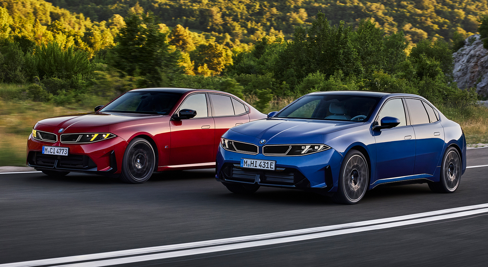
The second issue is that zero-perspective side views are not very flattering. When you look at a car in real life with your own eyeballs, perspective enhances shapes and hides overhangs. This is simply the physics of light and biology in action – and one of the reasons designers work on full-size models. Creating a zero-perspective side view, whether it’s done digitally in rendering software like VRED or by taking a photograph (using a long lens zoomed in from a distance), flattens the car and brings the overhangs into sharp relief – so to the untrained eye they can look gawky. Bear all this in mind as we look at some side views to make some comparisons between the two new BMWs.
The other definition to get your noodle around is what on earth am I blathering on about when I say proportions. If you think about the side view of a car – in this case, a three-box, rear-wheel-drive sedan – those three boxes are the hood, passenger cabin, and the trunk. In car designer speak, these boxes are known as volumes. This is why a vehicle that is all passenger cabin with no separate hood or trunk, like a minivan, is called a monovolume. When you have more than one ‘volume,’ the relationship between each one, and the wheels and wheelbase, is known as the proportions. Now this might all sound a bit subjective, but the thinking behind vehicle proportions is all about visual balance. Do all these constituent parts – wheels, hood, roofline, trunk, and overhangs come together in a way that looks cohesive and without any one element overwhelming the others? Do the wheels look like they are in the correct position, and does this vehicle sit on its wheels so that it looks balanced, or is it nose- or tail-heavy? Is the side view harmonious in a way that is appropriate for the segment of vehicle we are designing?
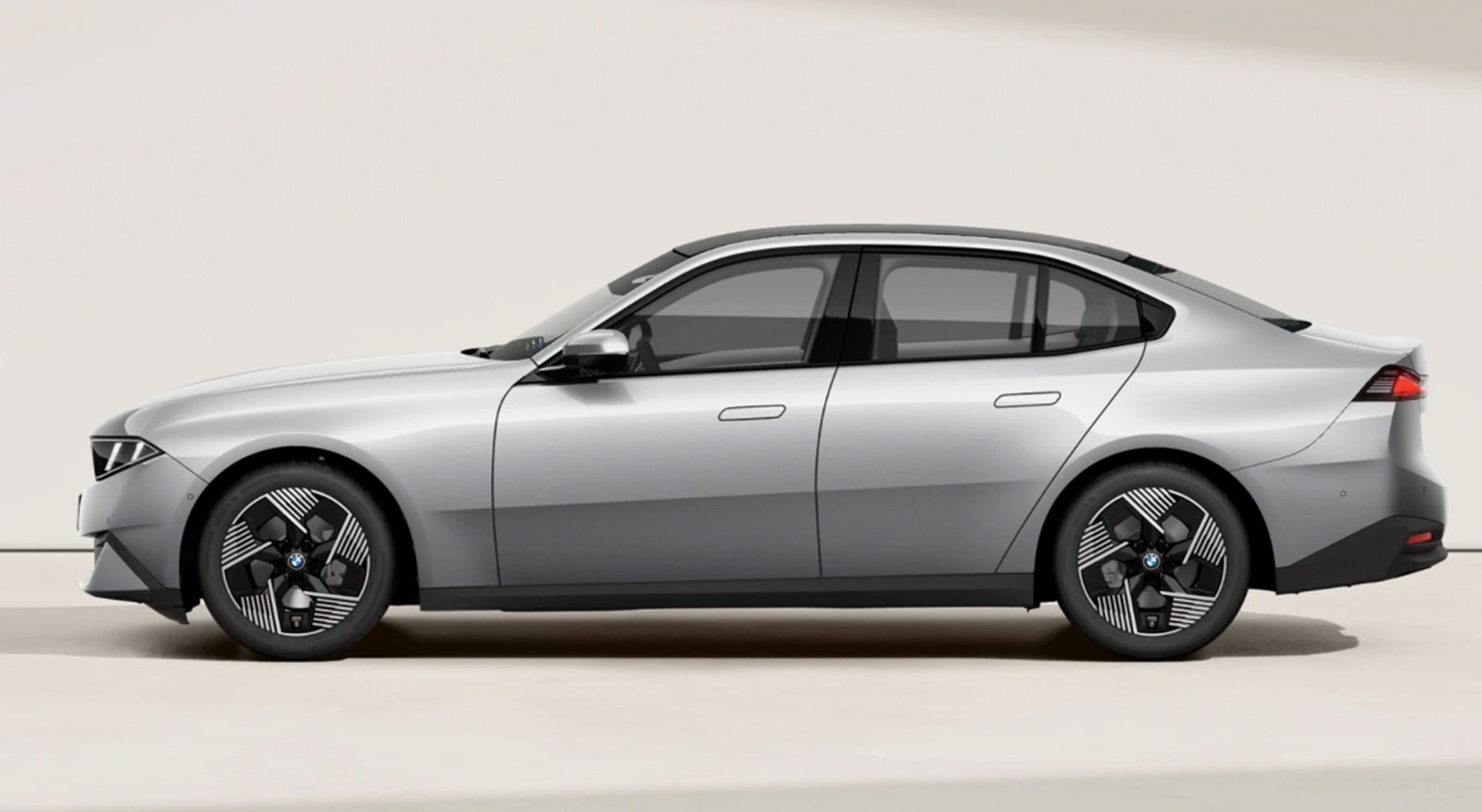
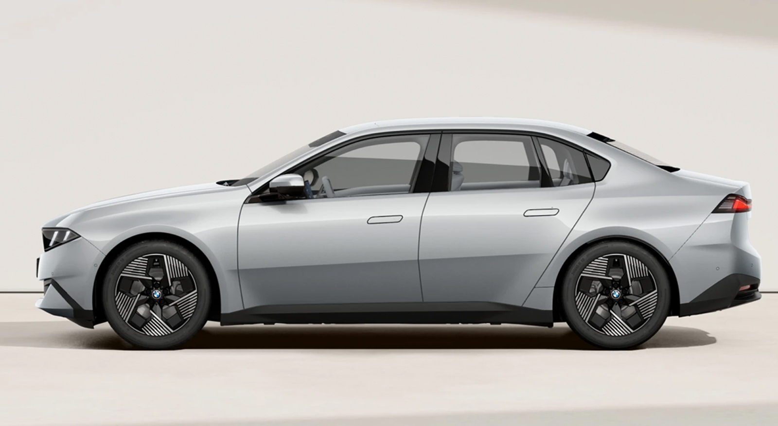
Alright, that’s all the tedious car design theory out of the way. How does all this apply to the new 3 Series and i3, and why should we care? The interesting thing to me is that this is the first time I can think of (feel free to chime in the comments) that an OEM has tried to put an identical body on two different platforms in an effort to convince customers it’s the same car. I’m not talking about similar lights or grilles or other visual DNA that’s been copied and pasted to create a family resemblance. What BMW is attempting is much more involved than that. It’s more akin to releasing a film on VHS and Blu-Ray. At first glance, the same to look at, but under the surface, different things with a very different visual result. And we can use side views to decode exactly what is going on, and why the CLAR-based ICE G50 3 series looks terrific, and the Neue Klasse-based EV i3 version less so. Fortunately, we have a very simple way of initially figuring it out by using the wheels to guide us.
For the purposes of this piece, I’m going to stick to the three-box sedan category of car, since that’s what we are talking about. Using the wheels to guide your overall proportions is universal across other categories of cars as well. For a EuroNCAP/Global D-class sedan (in the EPA definitions, the 3 Series falls in between Compact and Mid-size), the wheelbase should be about 3 1/3 wheels and body height between 2 and 2 1/4 wheels. Let’s have a look:
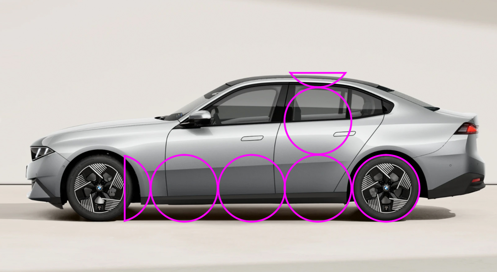
As you can see, the new ICE G50 3 series fits pretty much within these ideals.
… And in case you think this is something I pulled out of my ass, let’s have a look at some older models:
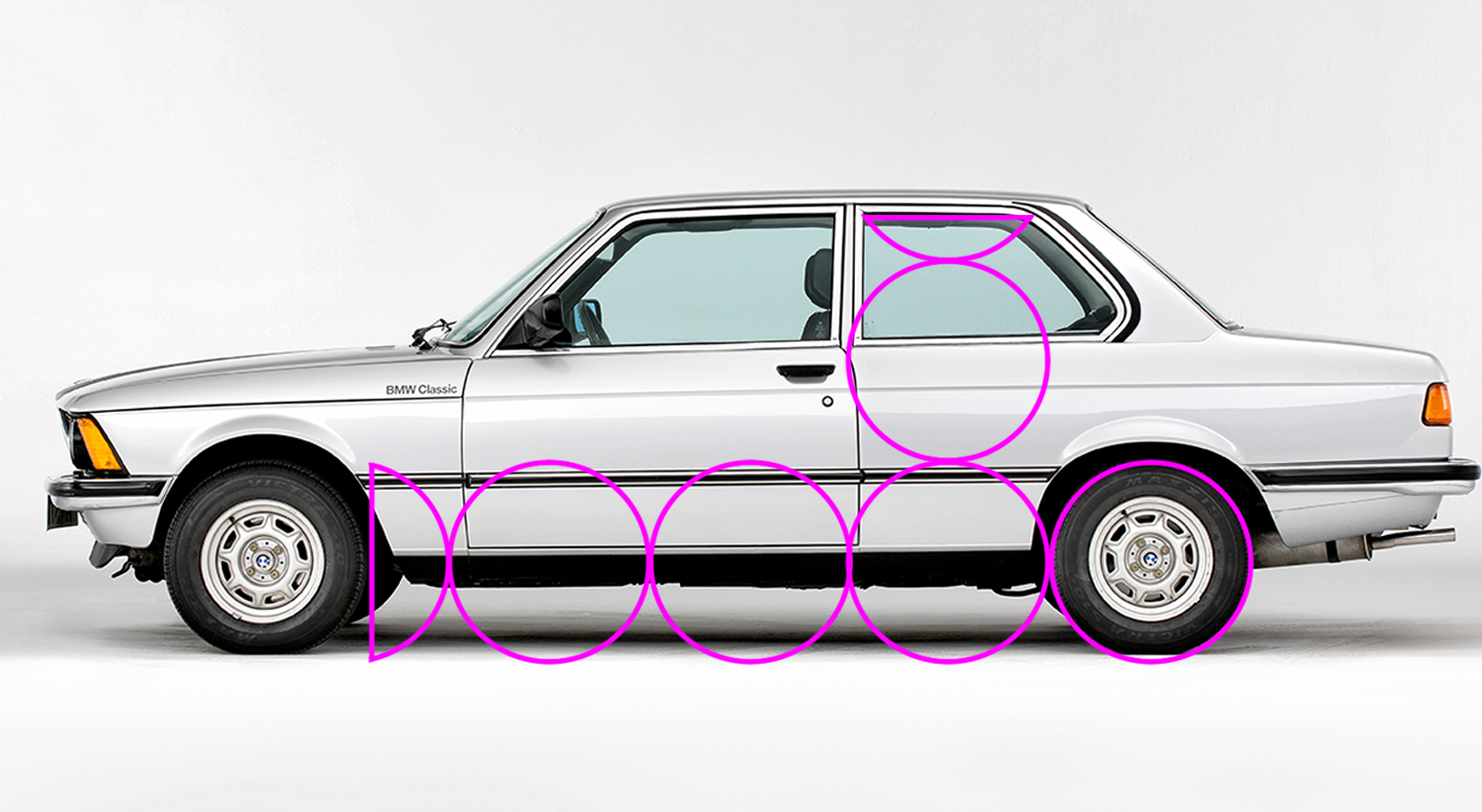
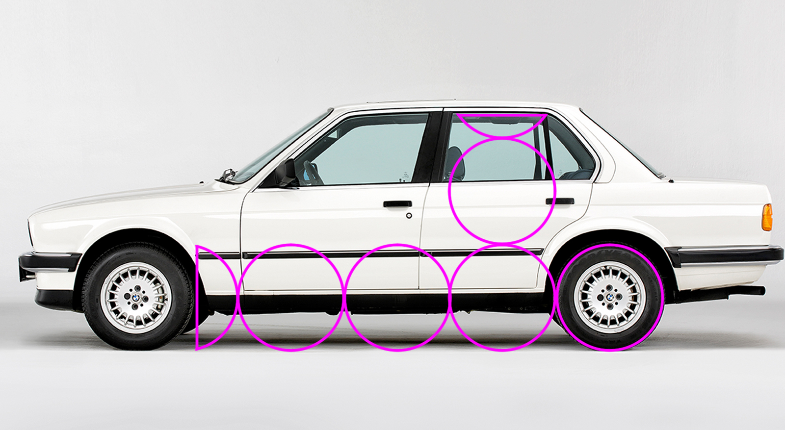
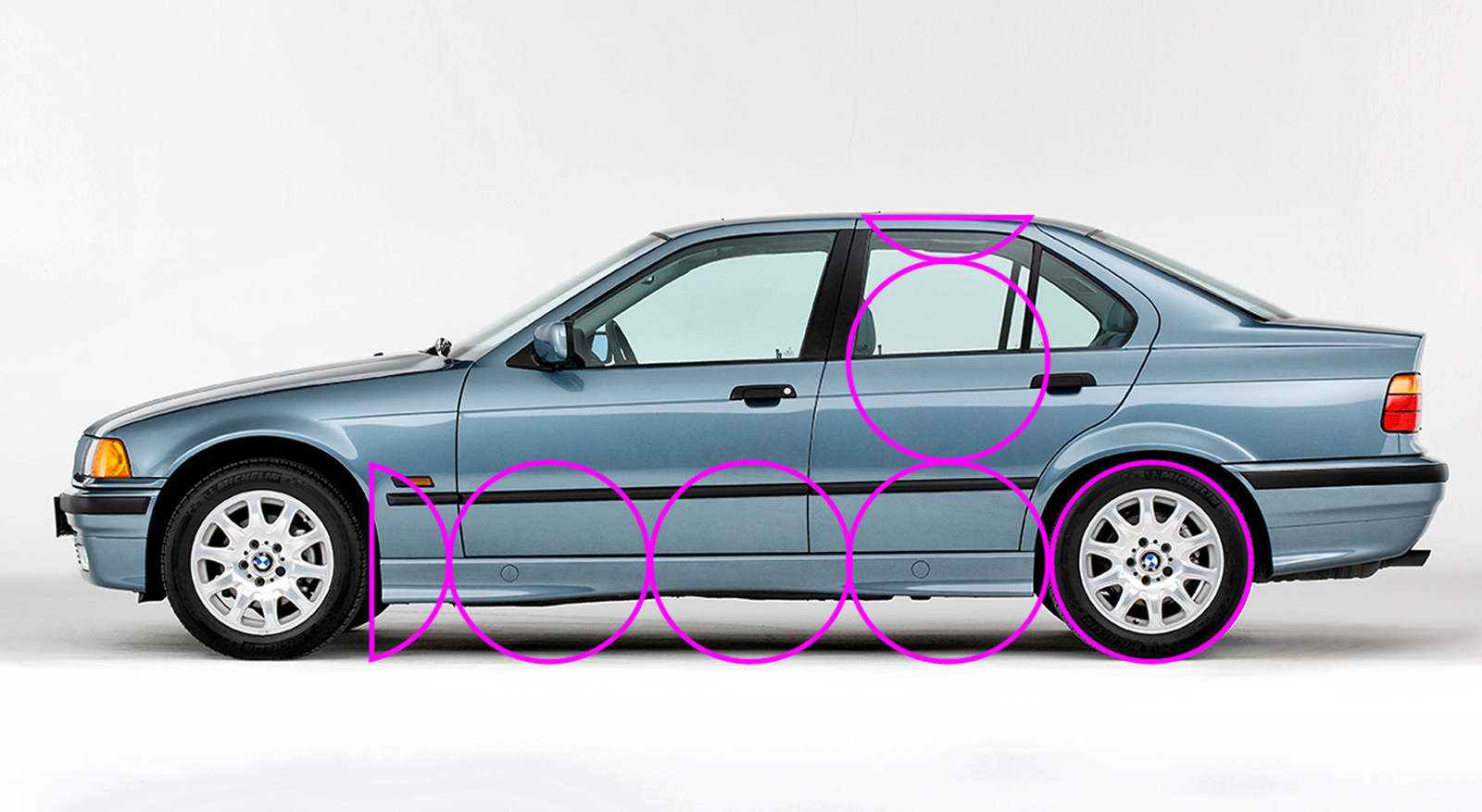
There’s a bit of a drop in cabin height between the E30 and the E36, but as the 3 Series grew slightly, it would have been possible to recline the passenger seating position more, and the car itself is longer overall. With these images, I’ve kept the pink overlay in the same place and at the same size, and then scaled the photos so the rear wheel fits. Like all cars, the 3 Series has grown over the years, but the wheels have also increased in size to match, so the overall proportions remain roughly the same. Let’s have a look at the i3, which is built on a different platform.
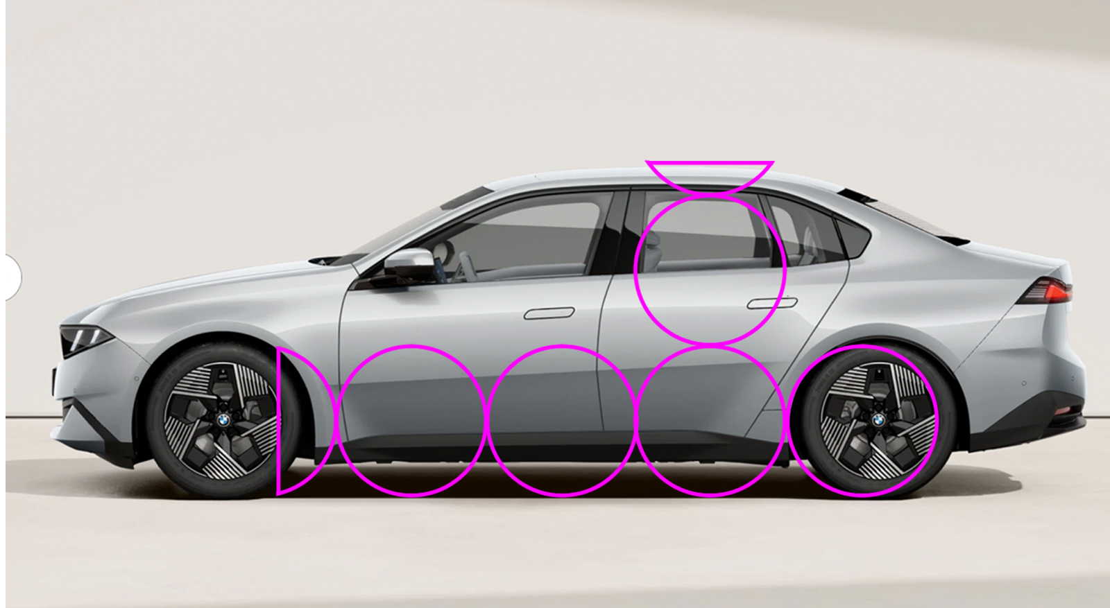
Huh. The wheelbase itself appears correct, but it looks like the wheels are in the wrong place. I’ve scaled the images of the 3 Series and the i3 to the same length, because in real life at 4760mm for the BEV and 4765mm for the ICE, when viewed on a screen, they near as dammit are. Using the wheel guide overlay, you can see the i3 has its total wheelbase pushed back, equalizing the length of the front and rear overhangs and making the whole car look static.
Front axle position is determined by the powertrain layout. Rear-wheel-drive vehicles need more hood length to package a longitudinal engine and gearbox arrangement. This pushes the passenger cabin rearwards, leading to a shorter front overhang and a longer rear one. We can demonstrate this by looking at the relationship between the A pillar and the centerline of the front axle. On a rear-wheel-drive car, if you continue the line of the A pillar, it should continue through or slightly behind the front axle.
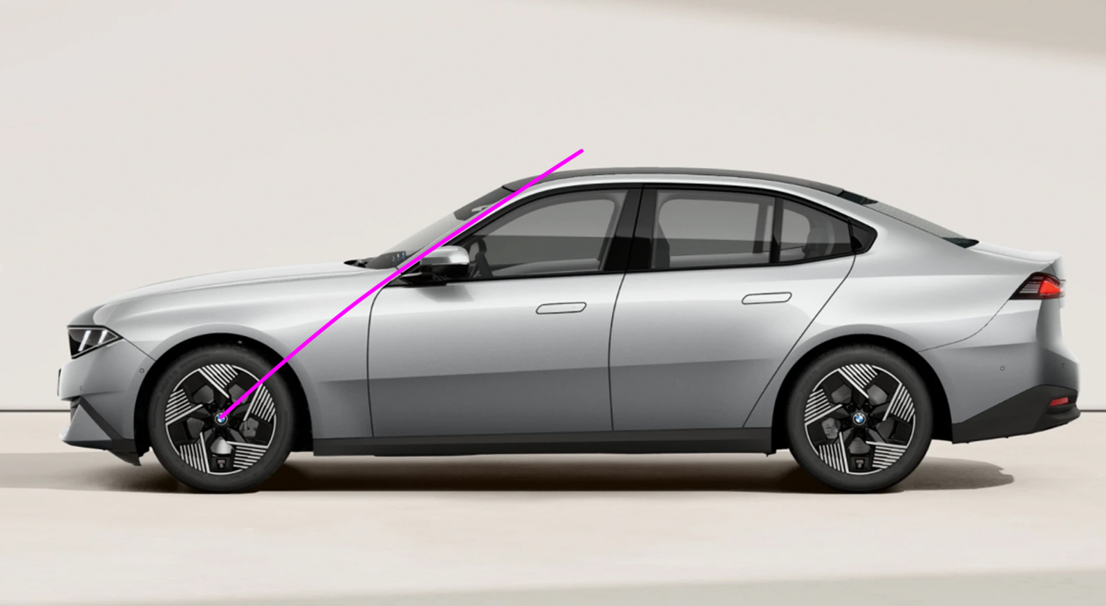
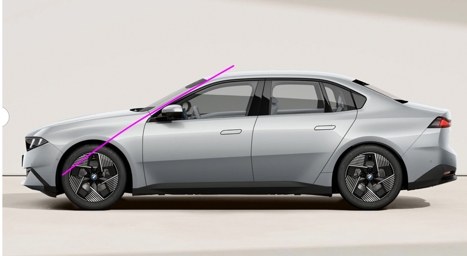
Doing the same thing on the i3 shows the A pillar pointing well in front of the axle centerline. This is more in keeping with the proportions of a front-wheel-drive car, which needs more front overhang to package a transverse powertrain, or a mid-engined car, which has a passenger cabin pushed forwards because everything else is behind it. When you have a longer front overhang, you need a shorter rear one to keep the visual weight more within the wheelbase and help maintain a sense of movement. The thing to understand about all this is not that RWD cars automatically have better proportions than FWD cars, or that there is some overall ideal proportion and any car that doesn’t fit that template is automatically a poor design. It’s all about nuance and what is appropriate for the car in question. There are plenty of horribly proportioned sedans and terrific-looking hatchbacks. When I dissected the design of the EV Ford ‘Capri’ two years ago, my main criticism was that its height was out of proportion compared to its length, and the A-pillars were too far forward. I’d be on thin ice (ha!) levelling the same height argument at the i3 because it’s only 25mm (1”) taller than the 3 Series. Of the two BMWs, the i3 actually has a 37mm (1.5”) longer wheelbase, so in theory it should have plenty of scope for pushing the front wheels forward – but this extra length disappears because the i3 rolls on 1” bigger rims. Let’s try that A-pillar and wheel overlay exercise on a 3-series competitor, the Audi A5:
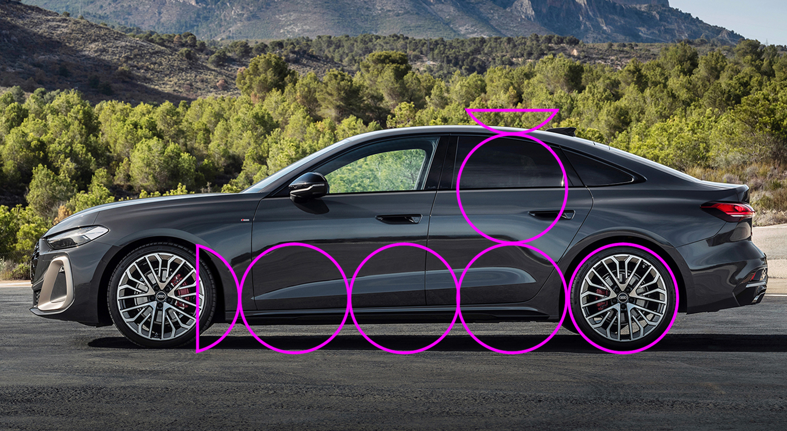
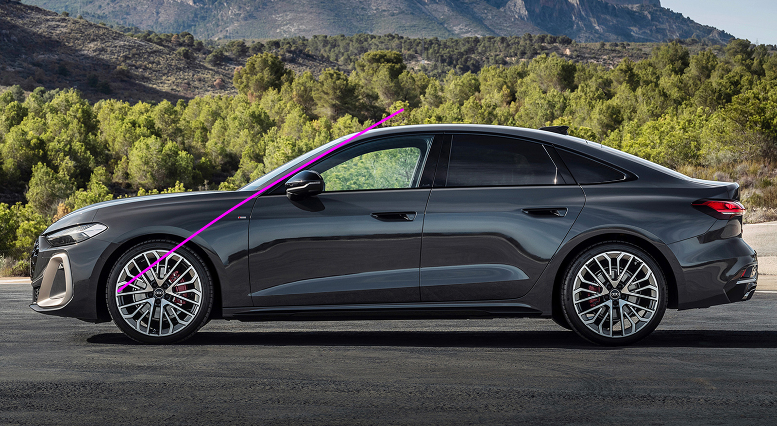
You can see the proportions are correct, and even though it has a shorter hood and the A-pillar points ahead of the front axle, I think this is a very nicely proportioned side view indeed. So it is possible to make a good-looking FWD sporting sedan – my star witness in this argument is the Alfa Romeo 156 or the first-generation Peugeot 406. Closer to home, the Chrysler LHS cars and Oldsmobile Aurora look brilliant. For all its head-munching faults, the Cadillac STS was admired by none other than Bruno Sacco. So that alone is not the issue. And the i3 is not FWD – the launch cars are all AWD.
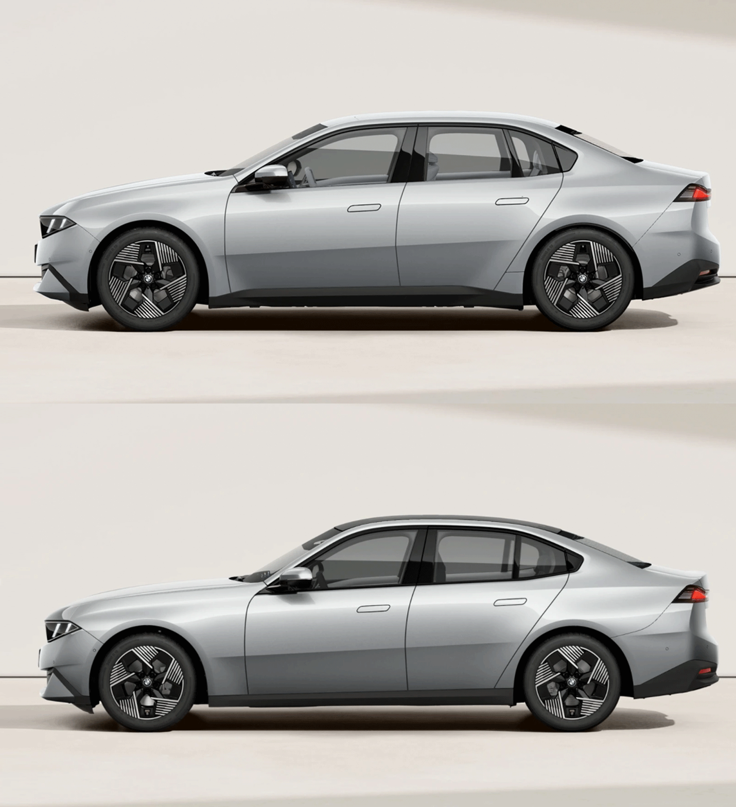
With its nearly equal overhangs and misplaced A-pillars, the i3 is neither fish nor fowl. It doesn’t commit to a proper cab-forward layout because that would move it too far away from the 3 Series. But neither does it match the lithe athleticism of the ICE car, because the front overhang is too long and the hood too short, because the base of the windshield is a long way forward. Normally you do this on a FWD car to make the most of the available length to liberate room for passengers. But in the press pack BMW makes no mention of interior dimensions whatsoever, so until the media gets its grubby hands on the new cars we won’t really know what they’ve achieved with the interior space.
Although modern platforms are more like a kit of parts and systems than just being a sheet metal foundation to build on, there are sometimes hard points that cannot be altered. My suspicion is that the firewall-to-front-axle distance on the Neue Klasse platform is one of them, and that is what has lumbered the i3 with shitty proportions. The same Neue Klasse platform also underpins the iX3 EV SUV, but the shorter dash-to-axle doesn’t matter on that car because it’s a two-box SUV, not a sporting sedan. As ol’ Martini Mitchell himself understood, the dumpiness of the i3 is a consequence of not taking a step back and viewing the car as a whole, and in this case that includes the thinking behind it.
All images BMW unless otherwise stated.


How much of what we deem to be “good” or “correct” proportions is just convention, and not universal? Is there an objective golden rule to car proportions, or is what’s “correct” just what we have been used to seeing and liking?
The i3 has some strange proportions, but it came out first. I had time to adjust to it and found that it isn’t as awkward as I initially thought. The car’s proportions didn’t change, but my perception of them being “correct” did.
Just as I got used to the i3, the regular 3 series came out with more “classic” proportions, and now the i3 looks weird to me again.
So, how much of this is just in our heads? The i3 is possibly no more “wrong” than the 3, just different.
The M3 concept with its additional width is even more strange, but somehow that totally works for me.
There is an element of convention certainly, but also package driven necessity. The issue is BMW trying to say this is the same car, despite one being an EV. The i3 doesn’t have the proportions of its design brief of a sporting sedan.
I would like to be open to new and different proportions on an electric car (I have even somehow made my peace with Tesla proportions, for example) but my disappointment with the i3’s proportions specifically is that they share a lot with a front wheel drive economy car instead of being something wholly new and different.
There are a lot of comments in this thread about how the i3 looks better in spite of the proportions. To me, when I look at the new 3 series and i3 together in a shared media photo, I see an approximation of an Alfa Giulia parked next to an approximation of a late model Corolla, both with BMW Neu Klasse surfacing. Just because the Corolla wears the Neu Klasse better than the Giulia doesn’t make it more attractive.
The worst Teslas are the Model 3 and X, both of which are high for their length – and Teslas insistence the X is an SUV, when it is clearly a minivan.
Great article – I learned a lot. Many thanks.
I have a few notebooks full of sketches that I drew in my thirties, back when I still believed I would find time (and money) to design and build my own car (from scratch, mind you – the hubris). I’ll have to dig them up and start checking the 3 1/3rd to 2 proportions on all of them.
(No wonder most of the sketches looked off. Well, that, and my lack of talent and design training).
I never knew that about Harley Earl, but now I have the reason and words for what it is about typical GM cars at the time that I always found a bit peculiar.
Funny about the BMWs. I haven’t spent a lot of time looking at the photos because I just don’t care about BMW, but in some pics I thought they looked halfway decent, then in others, a bit dumpy, like a post Hometown Buffet pig-out. Now I realize I was likely looking at photos of the two different powertrains.
That last animation really drove your point home. Great work.
If we had gone straight from the F30 to this, there’d have been riots. But instead, the G80 was so hideous, that this design is now quite handsome in comparison and all’s right with the world.
Well the G80 is bad, but the standard G30 3 was…fine? I agree the F30 was the best of the recent threes. I have considered buying one but they are old cars now.
Seeing the E21 (first car I ever drove) and E30 profiles made me long for the simpler times of BMW design. Just less fussy.
I was hoping these Neue Klasse cars would hew a bit closer to the purity of the the concept they showed a couple of years ago.
Maybe the next ones will.
Some people have been saying the i3 is sort of like a new retro styled e36. I kind of see it. But the wheelbase surprised me that the proportions are that similar. Might be BMWs best looking car in over 20 years.
I’m no expert on design. My ideal car shape is a Countach wedge with sharp creases.
But it looks like they expanded the cabin to give more interior room while keeping the front wheel to nose proportions the same, and moved the rear end back.
To me that makes the middle a sort of egg with everything else sticking out around it.
It’s all very odd.
Much of the genius of the Countach, IMO, is how many actual curves there are on a creased, wedge shape.
Great analysis – thanks for that, Adrian. I’m really curious now to see how they look in the wild.
I saw them both yesterday, and sat in the 3 series. I like the 3 series a lot, but the lack of haptic controls surprised me and made it an instant no deal.
The i3 I’m less convinced by.
I despair thinking how few people are going to go for the base spec because to my eyes the cleaner bumper graphics and black sills on the non-M sport really help reduce the visual mass on the i3. Seems to be a common occurrence on recent BMWs where the M sport pack includes overly aggressive and borderline baffling graphics with random bits and bobs stuck on.
Having seen both irl i much prefer the i3, it’s compact looking in a neat and dare i say athletic way. The ICE 3 series with its long hood and rear overhang almost looks cartoonish compared to it. Pictures don’t to justice to either car. Certainly not without some faults but seen on the street, in context, they have an aura of freshness and a clear strong theme. I’d take a base i3 with those wheels in red, that’s a genuinely fantastic and modern looking car.
Huh. Really interesting. Good stuff Adrian!
I think the side view helps because it keeps me from being distracted by the “What the H___ did they do to the front end of that car” (ick). Also, did they design the rear end of the car and then the marketing department told them they needed a flat spot in the middle of the trunk for the logo?
When we were talking about this car this morning in university one of my students said exactly that.
I don’t mind it, but it could be more subtle.
Every time I see the header image I see: DOOOOO
Add a squiggle and it could be the Disney version of GOOOOO
Adrian could have played with the drawings a bit more to make them say BOOB.
Thanks for the design lesson, Adrian. I get what you are saying but for my slightly above average height and standard middle-aged Amercan male girth, the bigger front doors on the i3 might be more practical. Not that I can ever see myself paying $65,000+ for a car, so moot point.
Only so much we can tell from images. I sat in the new 3-series yesterday at Bicester heritage and found it roomy enough, but I’m tall and thin.
Lack of hard controls was more of a concern for me.
Thanks for that reply. That’s why I qualified it with “might be.” I can imagine some interior bulwarks that make it the same entry space which would be a shame as the bigger doors make it harder to park here in F-250 land. Look forward to your opinion after you get a chance to drive one.
Now you have me looking at every car, noting the relationship between the A-pillar and the front hub! My Outback would definitely look better if they stood the windshield up more but then it would be even more of a scow on the highway.
Luckily for BMW, this is the last time anyone will notice the side proportions because the styling of the front and rear is such a disaster. 😛
Surprising Buc-ee’s hasn’t included BMW in their recent trademark infringement lawsuits. Or maybe BMW should turn the tables and sue Buc-ee’s.
To me, the i3 looks like someone took the ICE 3 and overinflated it a bit. That or the ICE version was stung by a bee and is waiting for someone to find the epipen. It looks puffy.
To my eyes, the ICE version is a much plainer design, with less sculpting (not sure if that’s the correct term) in front of the rear wheels. But there’s also less mass over the front wheels on the ICE car, which I prefer. The extra height from the top edge of the wheel wells to the top of the hood, combined with the shorter hood length is what makes the i3 frumpier to me.
There’s probably not much in it terms of the height of the belt line (where the glazing meets the body) but the shorter hood makes it look higher because there is less visual separation to the wheel arches.
Personally, even if the ICE version has mathematically better proportions, I think it looks worse. It’s trying to fit the design of the i3 into another box, so a lot of stuff looks weird and wrong-sized.
Wrong way around. They’re trying to fit the look of the i3 onto the 3-series, even though the i3 was released first.
If you like it that’s fine, and there is a discussion to be had about moving the consensus around proportions on – but the proportions of the i3 don’t communicate what BMW says it is – an electric sporting sedan.
The thing is that you can make a car look bad with good proportions if the details themselves are out of proportion. Like the window shape on the rear doesn’t take into account that it’s a smaller door, so it looks wrong. The bluntness of the front end doesn’t fit with the longer hood.
The i3 doesn’t look extremely dynamic, but it looks like everything was made for the shape.
Yes proportions is only one part, but it is the most important part. You can’t save a badly proportioned car with good details.
You get a good proportion first, then the main feature lines (shoulder, belt etc.) then the details (trim, lights, grill etc.) are worked out last.
I think that discussion about proportion would be right on time. Definitely an article I would love to read, though it realize it would be challenging to write.
Personally, I disagree that the i3 fails to communicate it’s purpose- Like it or not, the i3 is sporty, and the divergence in proportion makes it clear we are looking at a vehicle designed from the ground up for electric propulsion.
Why should BMW target the proportions of a longitudinal straight-six sedan anyway? After all, we don’t judge a Lamborghini on its non-existent dash to axle, or A pillar pointed toward its chin. Dynamically, a skateboard EV has more in common with the Lambo than a traditional Bimmer, moving even further towards a pyramid of centralized mass. If anything, BMW showed considerable restraint adjusting their proportions so incrementally.
Clearly taste is subjective, but I truly believe that much of what we consider to be “visually attractive” is based on our informed and innate understanding of what qualities make for a successful plant, animal or even object. We rely on our eyes to make judgement calls, welcoming the familiar and avoiding the uncanny. Creepy patterns trigger trypophobia, scaring us away from infection or infestation. We learn to respect animals based on their appearance: Slender = speed, mass = power. We identify potential mates in a crowd based on some arcane combination of visual factors signifying care, child rearing and companionship.
That is to say, when we design new machines, it takes time for our aesthetic sensibilities to catch up. I don’t know where the visual language of EVs will lead, but it’s going to be different.
Your penultimate paragraph undoes your point because speed and athleticism are what a slightly longer hood/cab rearward proportion communicate – which is something sporty FWD sedans struggle with.
Rear-wheel-drive vehicles need more hood length to package a longitudinal engine and gearbox arrangement. This pushes the passenger cabin rearwards, leading to a shorter front overhang and a longer rear one.
It’s not as much a packaging issue as it is a handling intention. The engine is packaged together with the cabin, you don’t really the cabin or engine forward/rearward on its own. Unless there’s some weird shit afoot, the engine will always be butted up to the firewall. You can visually move the cabin aft by leaning the seats back and lowering them so the driver’s legs are stretched between their seat and the firewall, but the cabin starts at the firewall nonetheless.
The front wheels on any front-engined sedan/wagon are astride of the engine, not ahead of or behind it, so they can be anywhere longitudinally, as long as the strut towers aren’t too close together.
A RWD car could very well fit a short dash-to-axle ratio if the designers so desired, but placing the wheels as far forward as possible maximizes weight on the rear contact patches and improves traction, so chassis engineers universally do what’s better for traction and place the front of the wheels flush with the engine’s nose (or even farther forward, if there’s room in the crash structure). Likewise, they could place the rear wheels all the way out at the car’s rear corners like a hatchback, but always choose to push them up against the rear seats to maximize rear axle weight.
FWD cars can also have their wheels moved freely fore/aft of the engine, but the decision must be made at the drivetrain design stage, as it’s contingent on the transaxle’s shape.
By having the transmission ahead of the engine, you can make a FWD car with a low, long hood, as seen on the Citroen Traction Avant, DS and SM, as well as the Renault 5. This is still very much possible, it’s simply not done anymore because having the wheels behind the engine is better for traction in a FWD car. It’s still a choice driven by chassis dynamics, rather than a packaging necessity, however.
With a skateboard chassis like the i3, I suspect moving the front wheels to where they are on the 3-series would make the car tail-heavy, as its mass is mostly in the floorpan, rather than under the hood.
I think it’s natural that EV’s would have the nose of a rear-engined car and the tail of a front-engined RWD car from a handling perspective, though it would look cooler and drive nicer if they had both axles pushed out to the corners instead of both pushed against the cabin. I’m sure it has to do with the shared platform, a compact chassis is just more versatile.
When a car is designed, what do you think comes first – the package or the handling dynamics?
I reckon the package, naturally, but my claim isn’t that they compromise packaging for handling, but rather that the front suspension is almost never in front of the engine in a sedan, it’s usually on either side of it, and with a long engine, that means the packaging team has some wiggle room to move the wheels around, so they look down the list of priorities, and around priority 10 or 30 they see “please place the wheels towards the front of the engine, if possible, xoxo the chassis team”, and seeing no reason not to do so in the 9 to 29 priorities above it, they do, and then they place the fuse boxes, washer fluid reservoirs and other freely movable shit behind the strut towers instead of in front since that’s where they have the extra space now.
I’m not really thinking about handling here, the handling can be sorted by the suspension and chassis team later and chassis issues can be compensated for with sway bars,roll centers and tire pressures, but traction is paramount to usability, and very straightforward. if your vehicle is front-engined and RWD, it benefits from moving the wheelbase forward relative to the body, so the packaging team facilitates that by placing the wheels at the forward end of the available wiggle room. Not by creating space through a compromise of packaging, but by using the available space.
That said, I was arguing semantics from the start, my core issue was that you said the longitudinal engine pushes the cabin back and lengthens the hood, which isn’t necessarily true. If you line up a 2008 Accord and a 2008 5-series bumper to bumper (make sure to select the front bumper alignment in the viewer), their A-pillars are perfectly in line with each other, because while the Accord has the wheels pushed up against the cabin, it has that much longer of a front overhang. That’s fairly common, you can study plenty of other FWD cars like the Volvo S60, Kia K4 or most Audis, and they all have a hood length very similar to a comparable RWD sedan, just with the front wheels farther back within that volume (and often a taller hood) due to the more upright engine/transaxle combo).
I was keeping it simple but there isn’t always as much freedom as you think, because of things like crush space, suspension packaging (which is dependent on the type of suspension used), wheel movement envelopes, stuff like that.
There was an Acura that attempted to improve the dash-to-axle, but being FWD it still had a long front overhang, so it was the worst of both worlds because it had a swollen nose.
I would assume for a company like BMW, handling dynamics would be considered quite early in the engineering of the chassis, with a clear knowledge of the models slated to make use of it.
Regardless, the optimum layout of a performance EV is no secret:
-Battery located as low as possible.
-“Square” wheel & tire setup located symmetrically around the battery.
-Cabin, occupants & cargo positioned centrally over the battery and wheels.
It’s an elegant system, with the vehicle structure and weight distribution resembling a pyramid, rather than an asymmetric balancing act.
There’s a lot more to packaging than that, and EVs still have a lot of mystery black control boxes to fit in.
Aerodynamic concerns also play into wheel placement as they effect potential airflow management. Too close to the corners makes management more difficult.
True, you can’t have a straight bumper all the way across the front like they used to have on cars like the Austin 3000 or the Morgan Plus 8, so your front overhang has to have enough room to curve the bumper and bump the air aside instead of bulldozing it.
I prefer the longer hood/bonnet proportion on the ICE version. I only hope they have other options for the wheels on both models.
They do, but I wanted to use the same style on both. They are 18″ on the ICE model and 19″ on the i3 though.
And this makes no sense to me. Wheel size makes such a big impact on EV range, I don’t get why BMW didn’t start the i3 at 18s as well.
Because it would make the proportions worse. The i3 has a lot of range so it was probably a compromise worth making.
I’ll have to admit that I haven’t really bothered study the new 3-series because at first glance these cars seem identical unless they’re side by side.
Not sure why they couldn’t be give the i3 ‘better’ proportions, as the i4 was one of very few electric cars I felt could compete with the Polestar 2 on looks (while still being a relatively fun to drive family hauler)
Not sure how the seating position is in one of these, or the i4 for that matter. It feels like the Polestar 2 and the Taycan are the only EV’s willing to sacrifice battery shape to make more space for peoples feet.
Wait until the Jaguar Type 01 is revealed tomorrow night.
It was just leaked. Yikes, and I try to be nice.
I saw that but I’m going to wait until I see the official images. It does something very interesting from a package point of view.
I’ve always thought it odd that there’s so much emphasis on flat perspective and isometric visualization. I get it with architecture, but the human to object scale is so different. I mean, we never look at a car from these angles. Perhaps when I wake up hung over on the sidewalk on A Sunday morning, sure. But then I’m not really in a shopping for a car mood. Nobody looks at cars from the low angles used in promotional images and press photos. Likewise not from a crane either. Peeps are typically 1.5-1.9M tall with a bit more added when standing on a curb. A vehicle should look good from this vantage.
Also, I get the wheels as a unit of measure thing, but I prefer using hands. I guess I’m just still stuck on horses. Of course these two vehicles can’t be measured in hands because the idiots took away the door handles.
Hence my explanation about side views. They are a useful tool for designers, but not representative of how we look at a car in real life.
Really interesting to see this broken down, when seen side by side I thought the i3 variant looked frumpier but it was hard to put my finger on why. Not directly related but these proportion visualizations finally helped me see why wheel sizes have kept getting larger on EVs.
This seems to imply BMW has decided the ICE version is more important for sales? I’d expect them to focus on styling whichever version they cared more about first and then let the chips fall where they may with whatever design compromises were necessary for the less popular variation? Unless the underpinnings they went with for both just allowed for better proportions on the ICE car given the fundamental compromises with a shared platform?
Hence my suspicion that the Neue Klasse platform doesn’t allow for moving the front axle forward. The G50 uses an updated version of the CLAR platform that underpins the current 3.
Solid analysis. I like the i3 design and I think part of that is the lack of BMW shape allowing it to subvert expectations to a degree
To me it’s more of an appliance and the frumpy design sort of supports that. Not really a justification of what BMW did but me trying to put into words why I like it
Proportions or not, the 3-series version really gets nailed by pedpro hood