
As I suspect many of you are already aware, yesterday Apple announced a new version of its popular CarPlay feature as part of its new iOS 16 mobile device operating system. This is something our society is interested in, just in case you forgot. This new version of CarPlay has one really dramatic difference: Where all previous versions were restricted to a car’s center stack infotainment display, the new version of CarPlay is free-range. It can expand and fill seemingly any and all digital displays on a car’s dashboard, including the traditional center display, but also instrument cluster displays and any other displays that may be built-in, regardless of size or shape. This means that you can have an Apple-designed user interface (UI) for your gauges, HVAC controls, radio — everything. This also means that other non-traditional dashboard elements, called “widgets” by Apple, can exist in these displays. Is this good or bad? That’s actually a more complicated question than it seems, I think.
First, let’s take a look at just what Apple has introduced for us here:
…and here’s Apple’s description:
Next generation of CarPlay
The next generation of CarPlay covers all of a driver’s screens for a cohesive experience. Deep communication with the vehicle’s systems allows for driving information on instrument cluster displays and control of the radio and HVAC. This new version of CarPlay is specific to each vehicle, accommodating unique screen shapes and layouts. New levels of personalization allow drivers to choose their gauge cluster design, including brand‑specific options.18
Fueling and driving task apps
Fueling and driving task apps are available in CarPlay. Your favorite apps that help you fill your tank and provide you with road information, toll support, towing help, and more can find a home in CarPlay.
Before we get into my asking the Big Question, let’s look at the design of the gauge clusters themselves. These are especially interesting because they’re the clearest reminder that what Apple is making here is not just another center-stack infotainment system, but rather an entire operating system/user experience for your car, replacing whatever the original carmaker came up with.
I actually think these instrument clusters are generally pretty good, no matter how much grousing comes from people online and even right here in The Autopian’s vast, filthy breakroom-furnace room. Here are some examples Apple showed:
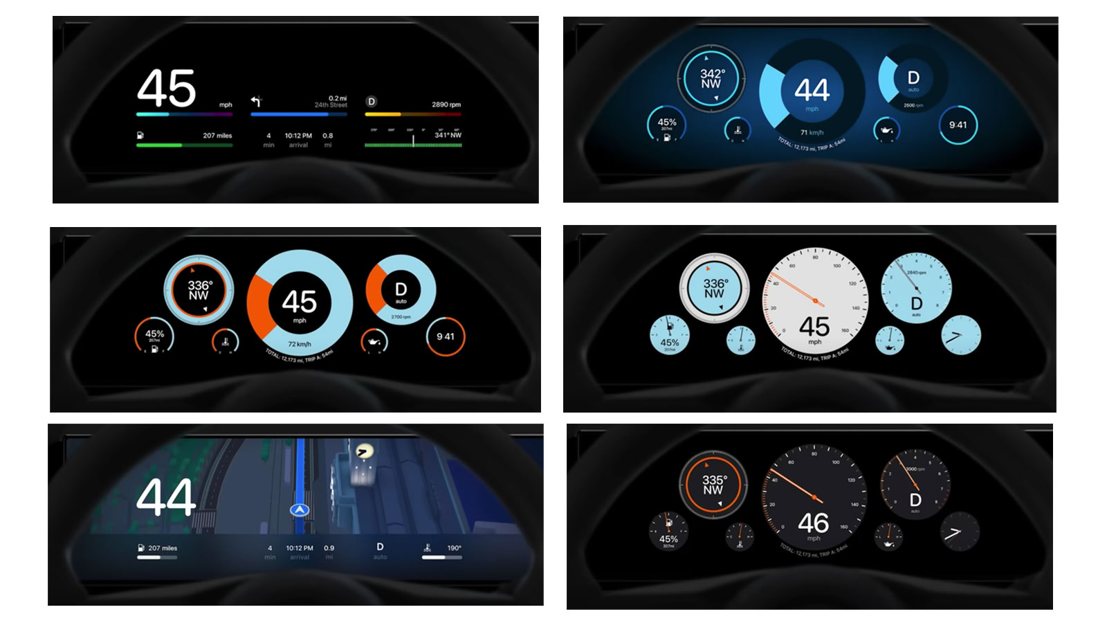
Now, I’m not saying there are no problems here; the circular gauges without hashmark divisions don’t make a whole lot of sense, and the fake-analog-gauge, almost-skeuomorphic ones have foolishly tiny text on them. Also, I really don’t get the prominent inclusion of the compass on many of these, especially since all of these cars certainly have actual GPS, map-based nav. Is there anyone who is really craving knowing how many degrees NW they’re facing?
In fact, the general tone and look of these reminds me a lot of some gauge cluster ideas I made back in 2016:

To be sure, I had some hashmark-less gauges myself, there. And, it’s not like OEMs have been generally doing anything that great with their instrument gauge digital design, anyway:

Presented with the terrifying freedom of the blank slate of a full-color LCD display for instruments, most carmakers have either tried to replicate physical gauges, or have seemingly just been baffled about what best to do, creating a mess like that Prius cluster there (bottom one) or making elegant, but largely useless clusters like the Tesla Model S one on the right, which uses a tiny amount of the screen real estate to show you useful stuff (speed, battery range, outdoor temp) and lots more space is used to show a portrait of the car and a techy-looking graph that really doesn’t help you drive any better.
Some carmakers have been doing a good job on their dash displays, like Ford:
But, is even that so different than the CarPlay gauges? Not really. No, the bigger news here has to do with this:
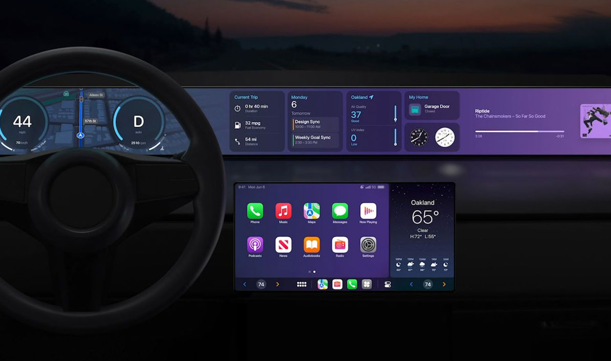
Apple showed how CarPlay can take over pretty much any size and shape display in a car, and many new cars are coming out with long, full-dash display setups , like the Mercedes-Benz EQS, for example. In this case, all of that vast screen real estate can be populated with widgets from iOS, little panels that could potentially display, well, pretty much anything.
This is where the Big Question comes in.
Before I became an automotive journalist, celebrated and/or reviled depending on what sort of taillight bar I’m in, I was a user interface/user experience designer, working on interfaces for desktop and mobile and all sorts of applications. I can tell you that the sort of design shown in these widgets is pretty much the same as you’d find for most mobile devices, usually the sort that don’t have a motor or wheels and weigh about 3,998 pounds less than a car. [Editor’s Note: Glad you stated your qualifications for that truly shocking insight. -DT]
These widgets are designed to be legible and able to capture your attention when needed. None of the widgets shown here are actually necessary to drive a car, and, in many cases, have the potential to take away the driver’s attention enough to become something of a hazard.

A lot of these widgets may be for things we’d expect to deal with in a car, anyway: music or podcast apps, perhaps HVAC controls (though, in the shot Apple provided the temperature controls are restricted to the edges of the bottom bar of the center screen) but several of the ones seen in this example shot are decidedly non-important to driving, and would require real focus to read/pay attention to, like the calendar widget there or the air quality widget or those two analog clocks or the weather in the center display.
Based on what Apple demonstrated, it would be technically trivial to add a texting widget or a video-chat widget or Facebook widget or, hypothetically, any app could be in there, a web browser or a dating app or Wordle or whatever.
Even if there are restrictions and safeguards to prevent non-driving apps from showing up in the instrument cluster area (those clocks and compasses shown are iffy), there are still plenty of dash real estate that can be used for these possible widgets, as Apple showed.
The thing is, all of these non-driving-focused apps or features could be – and absolutely are, on a daily basis – accessed on a driver’s phone. Drivers routinely read texts or check websites or try to hook up with people or choose podcasts or whatever on their phones as they drive, and the act of that requires much more attention taken from that big window in the front of the car and the task of driving than glancing at a dash display does.
So, The Big Question here is this: Is it actually worse to have non-driving-task-related displays on the dashboard, formatted and designed for dash display, than it is to have people actually looking down at their phones while driving?
I know the ideal is that you shouldn’t be looking at your damn phone at all while you’re driving, but we all know people do it. So should our cars vainly try to cling to an ideal circumstance that doesn’t actually exist, or should a car’s UX accept the failings of human nature and do what it can to try to mitigate the consequences?
I’m not a fan of putting non-driving-related displays on the instrument cluster, or, really, driver-facing dash at all. The passenger can have a separate one with whatever they’d like, why not? But, at the same time, I think I’d rather have a driver be able to glance at a display of an incoming text on the dashboard, which is placed at an optimal location for the line of sight and allows the hands to stay on the wheel, than for that same driver to hear their phone buzz and fish it out of their pocket to look.
So, I admit, I’m a little conflicted. As much as I’d like to be a hard-ass and say this is all terrible, and these sorts of frivolous widgets have no place on a dashboard, I’m also a human being, with faults and flaws ingrained and mixed in me like peanuts and marshmallows in Rocky Road ice cream, so I know that we make bad decisions every day, all the time.
As you probably expected, this idea got me a lot of blowback already, even before we published this. David fundamentally doesn’t seem to get my point, and Thomas thinks that adding any extra distractions is a bad idea.
I don’t think either of them are wrong.
However, I also wonder if maybe accepting people’s bad habits and taking some control of them could make sense. What if you could add almost any dash-app widget you want, but doing so locks out the app on your phone, and the widget could at least be designed to limit the amount of attention/interaction demanded? Is that a reasonable solution that takes into account the worst of our natures?
This way, people who may be willing to do stupid things by interacting with a particular app could at least be mollified by getting whatever essential bit of interaction they need, but framed and designed in a way that is the most minimally invasive or distracting.
Or, maybe that would just open up the possibility of incredibly distracting dashboard displays? But, maybe that’s still better if it gets people off their phones, which takes even more focus away from driving than glancing at the dashboard would?
I genuinely don’t know if what I’m suggesting is right, but I think it’s a question worth asking, especially now since this new CarPlay has essentially made all of these possibilities far more accessible, even if we’re not seeing all the possibilities demoed right out of the gate. The other, safer option would be to just lock out all phone use while driving, but I feel like that would be a non-starter for many, many people. What I’m wondering is if perhaps there’s a way to meet people and their bad habits half-way, which may be better than pretending people won’t do stupid things behind the wheel.
None of these solutions are perfect, but, then again, neither are we, which is why we’re here. I’m really curious to hear what you think about this!


I don’t care as long as I can use my old winamp skin on it.
Unfortunately Winamp for iOS never materialized. Oh, what could have been.
Overall I am not opposed to the option. Interesting to see how this plays out.
In my DTS, the new radio I put in can pull data from the sensors giving me speed, rpm, intake temp, load. Along with a screen that pulls tire pressure and other warnings. Nice and sometimes I just put it on.
As long as I can turn it off if I don’t like it, no worries.
There is a larger issue that the ones about possible user error/purposeful user manipulation.
It ultimately boils down to more subscriptions to pay for. With the amount of data involved, it’s basically gotten to the point of paying for a watch sub, a phone sub, a car sub (?), a home security sub, a home internet sub, and on and on…
So, then, how much more are people willing to pay to allow themselves to be data-mined, monetized, and sold in the trade-off of convenience vs. end-user privacy?
There is a certain irony in the phrase du jour these days of “Eat The Rich” when we are not only voluntarily and willingly providing the data and information of value, but we as the end-users are subsidizing the mining of it. Just baby-stepping our way into the full exploitation of our every waking (and sleeping, for that matter) moment.
This shit has to stop at some point. Right? Maybe? Is there anybody out there?
I dont pay for any of this shit.
Where I draw the line is whether or not new tech is facilitating bad behavior or not.
To your point, Jason, people are already on their phones while they drive, so integrating these tools into the dash could be an ‘improvement’. On the other hand, how many people that aren’t on their phones already might see this extra dash screen functionality as an excuse to start browsing phone-type apps while driving because, “well, it’s right there in the dash now!”
Because people are already doing it is not reason enough to facilitate this bad behavior to be performed more seamlessly, and thus likely by even more people.
I’ve always said the paradigm used for automotive gauges and controls for the last century were all wrong and need to be replaced. /s
I’m all for updates to the interface for CarPlay, but this seems too far, while iPhone is a large chunk of the market, what does this do for Android users?
Will the updated center stack interface work with current gen CarPlay head units?
In aviation, there’s a philosophy of the “quiet dark cockpit.” If things are operating normally, then there is no reason to show an indicator for them. Such an indicator would serve only as a distraction to the pilot.
I think a valid frame of reference would be to compare to the status quo. When looking at my existing gauge cluster, there is a LOT of unnecessary information taking up real estate; it’s clear that car designers are less strict about following the “quiet dark cockpit” philosophy.
Starting with that’s required, there’s a speedo and fuel gauge taking up about 40% of the real estate on one side. Both are analog, and I like it that way. As a kid, I remember thinking digital speedometers were cool and futuristic when they were showing up in cars in the ’80s, but my dad hated them because they make it harder to gauge acceleration/deceleration. With a single number readout, all you get is your current speed, but with an analog gauge, you can watch how quickly the needle is moving. That’s why I like analog speedos (or at least digital speedos that mimic analog gauges). They don’t have to be round, but I like to see more than just an instantaneous speed number. Similarly with the fuel gauge, I like the analogue display because it shows more detail than the video game style “health boxes.”
But that’s where the useful information ends. The opposite side (another ~40% of the area) is taken up by a tachometer (totally unnecessary for an automatic transmission car) and a temperature gauge (engine temperature is only necessary if there is an issue — overheating or not yet warmed up (and even the latter is not as important as it used to be)).
Then the center is the “Multi Function Display” which can be configured to show any information you want ranging from the useful (GPS directions) to the marginally useful (current trip distance, current trip fuel economy, instantaneous fuel economy, average trip speed) to the completely frivolous (the name of the person you’re currently talking to on the phone through the Bluetooth speakerphone, the name and artist of the music currently being played on the sound system). I’ll admit that my default is to keep the Multi Function Display set to show me my music information, and it’s for the reason Jason mentioned — I’ll look at that information anyway, so having it right next to my speedo allows me to keep my eyes on the road more than if it were only on the center stack (even if it’s just a fraction of a second difference).
Aside from those large areas, there are several unnecessary indicator lights as well. I don’t need a light to tell me that my daytime running lights are on. I don’t need a light to tell me that my fog lamps are on — I know; I’m the one who turned them on. I don’t need to see the “check engine” light all the time — it’s a German car; I know there’s always an engine problem. (Ok, that last one was a joke.)
So, after thinking about it, I am ok with “non mission critical” information being included in the gauge cluster because it’s already there. A line needs to be drawn, of course (maybe show who an incoming text is coming from, but don’t transform the gauge cluster into a touchscreen keyboard for the driver to use to respond to the text), and I hope that Human Factors engineers are involved in the design process.
As someone who was driving a Stellantis car (giant effing Ram 3500) with automatic headlights on the weekend, the ‘headlights on’ light is very useful for figuring out if your headlights are on or the dashboard just got dim because it’s not like Stellantis is famous for reliable electronics.
The explanation of the above: The lights turn on when the wipers are on, which is good. But it dims the entire dash, which is bad. My own car actually has dash dimming independent of whether or not headlights are on, which also keeps the light indicator light pretty necessary.
I agree with most of this — no news is good news. But I’m not entirely down with the idiot light-style engine health gauges. I want to know how long the oil pressure has been hovering above the CEL threshold or how quickly the heat has been amassing. But I think a history graph can do a lot to ameliorate this. (Note: Most current “analog” health gauges are pretty much idiot lights, locking onto straight-up “OK.” But at least there’s some indicator there for the observant when it does venture past hysteresis.) Yeah, pop up that graph well before setting off the CEL and I’m good.
If you wouldn’t have buttons there, don’t put a touchscreen there, the physical limitations of a mechanical trip counter reset aside. But please, pretty please, leave my in-motion controls like volume, HVAC and defrost, traction control, suspension setting, switchgear, seat heater, etc. in logical, by-feel locations on physical dials, levers and buttons. I’m begging here.
Love your point about the tach.
Back before the ’90s, only cars with manuals or those commonly ordered with a manual had them.
Then they became de rigueur for at first luxury cars, and by now, nearly every car, the overwhelming majority of which aren’t available with manuals period.
And they’re near often sportscar-style (equally-sized to the speedo). I kinda miss the days of tiny little oddball tachs for cars that didn’t really need them.
(Yes, I have a Torch-like fetish for gauges, and I’m proud of it)
I agree with a lot of what you say. However, I like having a tach, even with an automatic, so I can find the sweet spot speed and RPM combo to hopefully save some gas. Also, if I knew my vehicle had a possibility of overheating, I’d like to be able to monitor temp and not just wait for an idiot alert. Had a car with a fan issue for a little bit, and I would watch that temp like a hawk so I could pull off and let things cool down if it started rising too quickly.
The main question is how the new display modes/apps in the cluster available compare in terms of eyes off road time with center stack or phone displays. There’s going to be an advantage of look down angle for the dash compared to a display that’s further away from the forward roadway, but if the info itself draws eyes unnecessarily then it’s just an extra distraction. NHTSA has guidelines to evaluate; Apple should be upfront if they did any evaluation and exclude any task that fails.
Autonomy is critical for electric cars. Hey lets put a screen bigger than your tv and the power of a gaming desktop in it. ????
“David fundamentally doesn’t seem to get my point”
Confirmed, David is an engineer.
There’s quite a bit of research that goes into where OEMs put different pieces of information on the cluster. One of my professors in my graduate program was conducting research on this topic for a major OEM, looking at response times and individual processing times for different locations and display styles. Depending on how fast your eyes refocus (correlated with age), different locations are more or less desirable for time with your eyes off the road. Large, stand alone numbers work well for relatively static values, but are hard to interpret for rapidly changing values.
A program like this could offer some benefits in allowing the user to select a layout that fits to their needs, but more likely users would select layouts that slow their reaction times or worsen their understanding of the vehicle.
I personally find CarPlay and Android Auto’s reconfiguration of apps more distracting. I know where things are on the phone app. Dumbing them down and moving around the interface only makes the app harder to use and MORE distracting.
This sounds like a question that would have come up in my philosophy 101 class because there are so many valid arguments to be made around the topic of tech distractions while driving. On the one hand, I absolutely agree with Thomas that any added distractions are bad, but on the other hand Torch is completely right that people are gonna do stupid shit anyway. Is it a net benefit to make those distractions as minor as possible rather than eliminate them completely? Quite possibly, but quantifying that is almost impossible.
So. Your iPhone will know when you’re driving. It already has a mechanism built-in for limiting distractions (focus), which could be automatically invoked. The phone could find a middle path, letting you know that you’ve received a text message and offering to read it aloud (which it can already do). It could even wait until you’re at a stop, or cruising on a low-traffic highway. So this is definitely an opportunity for more bad behavior, but it could also be an opportunity to limit bad behavior. I’m sure these ideas have been batted around inside Apple.
I’m more interested in the fate of physical controls. Will cars have knobs and buttons whose function you could customize in CarPlay? That could be super-fun for couples who share a vehicle.
I very much like that middle path.
That would give people what they want while putting hard limits on certain behaviors.
In defense of Tesla’s cluster… The layout is modular. Meaning, one can change the information on the left and right sides. You can have for instance your tire pressure information on the right and navigation details on the left. Or music, or a few other things. That energy graph that the picture shows is just one of the options.
And about the middle, it is not just a portrait of the car. What the sample picture shows is rather empty because the car is not driving. When the car is moving, the cluster shows what the car sees through the sensors, and also shows autopilot status. So big picture, you can see if the car sees all the vehicles around it, if it sees the road markings, and if autopilot is tracking the car ahead or following the lane markings. It is rather useful when using autopilot to anticipate what the car is going to do (or fail to do).
Also, that portrait of the car is not just a static picture, it changes with actual information about the vehicle. So for instance, if one of your headlights or taillights fails, the rendering will show it not working. From experience I can say that this is very useful.
My 92 Accord had a electrical system that would tell me if a bulb was out:
If I turned on my right signal and it moved too fast.. the rear one wouldnt be working. As simple as listening and taking care of it.
I dont need.. nor does anyone else need a entire dashboard full of screens.. to tell me that a light bulb is out. Also, I do a pre-trip and a POST-trip inspection. Make sure everything is fine before I get in to go somewhere.. and after.
I would love more instrument cluster customization, but I am torn on this overall. Yes, seeing your text notification more easily may help some people. Yes, you could use the excess screen real estate on most modern cars to do a lot of useful and customizable shit. But we also know that the easier we make something to access, the more likely someone will do it. In many places, the risk of a cell phone ticket is enough to limit the number of people using their phones and the duration of those uses. I think the dash might embolden people. It also might give them false confidence. Will they feel it is safer and therefore use it more than intended?
And what widgets will be created? Will Apple carefully screen them for function and safety? Will people jailbreak it and put unapproved apps on? Will someone find ways into a lot of essential car functions and brick cars? Too many questions for my taste.
The best dashboard display of all time is the old Saab “Night Mode.” Can we get back to that idea? Just tell me how fast I’m going and let me concentrate on the road. For everything else, make it voice-activated. “Play Mazzy Star.” “Decrease temperature two degrees.” “Alert me when I’m a mile from my exit.”
And pre-emptively ban any company from ever pushing unsolicited ads onto the dash, because you KNOW someone out there is working on it.
I dig the Night Mode. ✓ But please, oh please, don’t subject me to yet another terrible voice control UI. They’re pretty good for simple stuff like setting a timer, but distractingly frustrating for just about anything else.
When they work well, voice commands are awesome. But the failures can be amusing. I have a voice-activated dash cam that uses the command “Take picture” to capture a still image. A while back, someone cut me off and I shouted, “Hey, dipshit!”… and the camera took a picture. So now, naturally, I use “hey dipshit” as the command.
“Play Mazzy Star”
“Rerouting to QuickStar. Take a U-turn at the next light. Rerouting. Rerouting. Rerouting…”
Scrolled down looking for this comment. My ’02 9-5 Aero was absolutely the best dashboard I have experienced. With night mode on, the only thing illuminated would be the speedometer up to 90 MPH. If you exceed 90, the rest of the speedometer would illuminate. If you are low on fuel, the fuel gauge would illuminate. If the engine got hot, the temp gauge would illuminate. It was genius – and the complete opposite end of the distraction-spectrum from apple car play.
NOOOO!!!! Less screens=more better. I feel like this constant charge towards more screens is going to be looked back on like talking cars of 80’s. Badly.
I hear this argument about screens in cars a lot, and I just don’t get it. We can all agree that 80’s tech was extremely limited, both by screen tech and processing tech. Now without those limits, why on earth would we expect the same results? Already we are well past the tech of the 80s, where cars with a single screen, or touch screen, or talking function, were few and far between. Every car has a least one screen now and I’d venture a guess that the average is at or above 2 per car. This is the new norm, not a gimmick. Move on.
As usual, nuance is required here. To phrase it in typical internet needless aggression, you’re both wrong.
Pro-screen – Screens have made a lot of important information more easily accessible and understood. A fault which would otherwise be indicated by an unclear light can now be expressed more precisely and allow for more driver information to be available. It also allows for easier access to navigation and entertainment, makes parking and navigating easier via camera systems, and so on. The screens add flexibility of information.
Anti-screen – The primary problem is that screens are over-used. It’s easy to see why, Tesla did the frankly brilliant move of making cost cutting decision making appear to be high tech and cutting edge. For a manufacturer, especially a smaller one, all screen means you only have to buy one stock component, and you can make your car unique via software – nobody will make fun of you for parts sharing, nobody has to tool up unique secondary controls, and so on. However, it is actually a disadvantage for the driver. A lot of secondary controls work better as knobs and buttons – climate controls are best with gloves, for example, and touch screens are kinda bad for precision if they’re specced too cheap. Beyond physical analog gauges looking nicer, they also emit less light during night driving, which a lot of modern UX designers don’t consider. Someone elsewhere mentioned Saab’s night panel, and seriously that needs to be knocked off immediately by all manufacturers. Screens provide valuable information but you don’t need to know it at all times, and there is far too much light in cars at night now, making them more difficult to drive after dark.
Fuck Apple and their overpriced crap. I just want my music to play. Passengers are shit outta luck, if they feel the need to Instagram or play video games or anything else.
Things I’m for: Gulf Oil livery-themed gauges. Shut up and take my money.
Things I’m against: Apple further locking its vice-like attention grip on those addicted to their phones (like my wife)
Honestly really interested how the system would approach area management. No two cars will have the same layout, so how is Apple going to decide how to manage that variable space?
Personally, I hate it, I think it’s a bad sign of things to come. Like you said in the article you don’t NEED any of those little widgets in the dash, the distracted drivers are bad enough already. I like my cars to have real, physical, gauges and buttons. I don’t need a slider for HVAC, I need a tactile knob with a numeric readout. I don’t need a digital animated dash, I need a tachometer and a speedometer. I don’t need a bunch of apps or weird technical add-ons, I need Bluetooth and/or an AUX jack.
But I guess I’m not in the majority of consumers, the only reason I have an iPhone is because my company provided it. I’d happily go to the dumbest smart phone I could find if I was paying for it myself. I even keep my phone silenced 24/7 so I don’t have to hear the ringing, messages or emails I get through the day.
Old man rant over. I’m sure people will love this and go nuts for it but I’m not interested.. I’ll keep my old cars thanks.
“Is there anyone who is really craving knowing how many degrees NW they’re facing?”
I’m a geologist happiest with the quadrant system, so I’d express it as degrees west of north, but to answer your question, yes, very much so.
This will be great for things like bringing frequently-used automotive functions up-menu in accessibility. Maybe you dont want to tap through two menus to access your heated seats or wipers, for instance – or you want to group the HVAC, lighting, and audio controls in a particular way, or display the map a certain size or shape – lots of possibilities.
Will be curious to see what happens when someone jailbreaks this to throw your text messages or Netflix up on the “gauge cluster” section. Could you hack it to display the live feed from your smartphone-controlled drone set to follow you for additional situational awareness?
Additionally, at what point will you be able to take the camera feeds from the array plastered around most modern luxury cars and pipe them through your phone to a VR headset for the full F35 HMD effect?
I am morbidly curious about what the sick bastards at OEMs like Mercedes Benz do with this. Introducing the 2031 C-Class, now with a $10/month subscription just to get rid of ads beamed directly to your dashboard.
How is Android going to respond to this as well?
But how long until some developer figures out how to add a jump scare into their giant screen app, and then we start seeing people swerving.
I love my phone integrating, but I don’t really need other apps besides maps to be present on the screen.
Android is actually ahead, but is taking different approach. Ford, Volvo, and GM have all signed up to use Android Automotive as the car’s native OS (this is separate from Android Auto…oh, Google), with custom skins for each brand. Both the newest Polestar models and the GMC Hummer use Android Automotive, but of course look completely different.
I already have an Android head unit in my car. I play Sega Genesis on it when I’m in the drive thru. No thanks, Apple.
Related, Autopian totally should try to get Matthew Crawford on as a guest at some point.
He delves into the philosophical issues of the ethos of driving/vehicles in his 3 excellent books, is currently restoring/hot rodding a ’70s Beetle, and definitely seems like he’d be a natural fit with the down-to-earth, make it work yourself cool of this place.