
You know this look. I know you do. You’ve seen it innumerable times in innamable places. I’m also just now realizing that “innumerable” does not have an equivalent “innamable” equivalent, and “unnamable” is not really what I’m going for here. The point is this look – the intense deep-purple-to-burning-citrus-orange sunset, the mountains, the moon, the stars, the flat, reflective ground – all of that is such a wonderful and strange ’80s visual trope. We need a name for it.
It’s an incredibly versatile design language, too, being used on everything from Trapper Keepers to the Electronic Arts poster in my childhood bedroom, to, as we see here, selling cab-over-engine Freightliner trucks.
It sure as hell is evocative of…something. Something cosmic and ethereal, something bigger than all of us, something powerful and numinous that can make us really want to buy a truck. I mean, look:

Where are we? On the surface of another planet? But that’s our moon up there? Why is the ground so smooth? Is it perpetually dusk here?
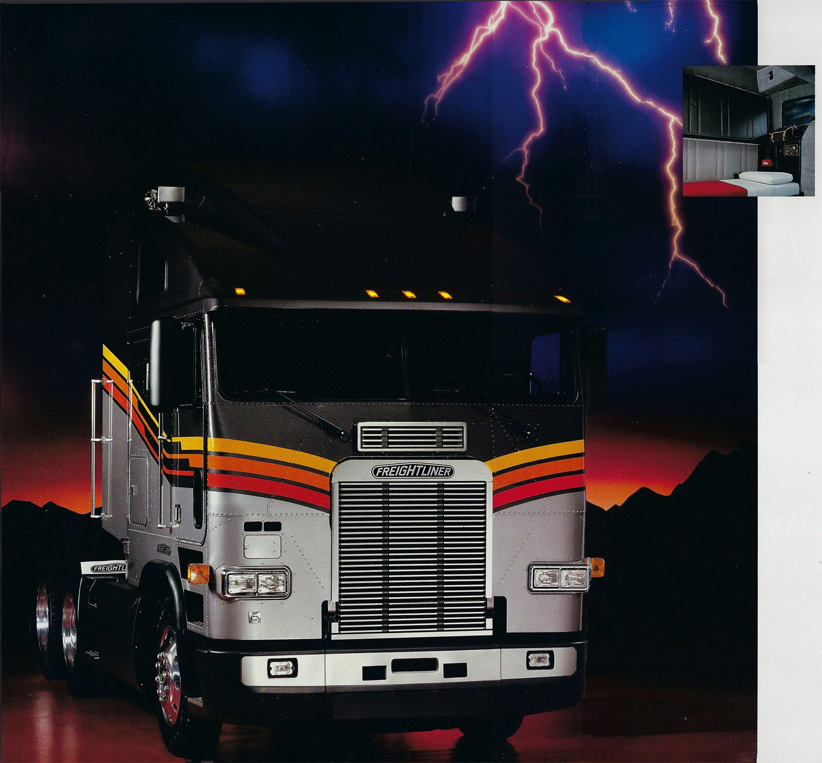
The lightning! Just when I thought that sky couldn’t get any moodier or more dramatic, blammo, here comes some purple lightning, arcing and branching through the sky like bolts from an unseen Tesla coil.
So what do we call this environment and look? Gradient Thunderscape? Planet Drama? Power World? Firehorizon? It needs something suitably intense.
You’re probably wondering if a mechanic can work in such an intense environment, with that vivid sky and those looming mountains and the ever-present danger of purple sky plasma bolts. The good news is that, yes, yes they can!
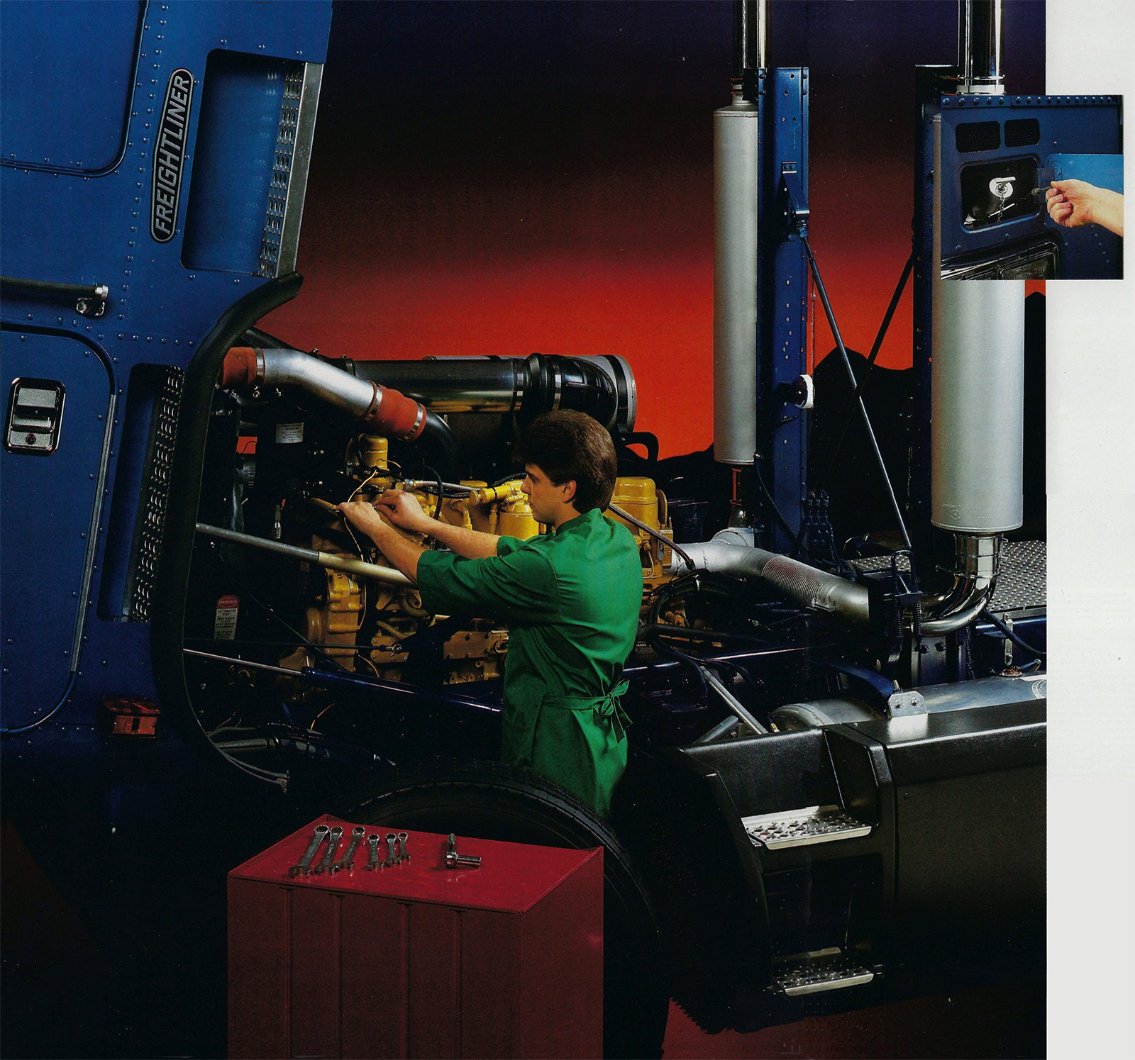
The engine access in these cabover trucks seems pretty great, though I’ve been told that truckers didn’t like having to secure all their crap when they had their trucks worked on. One mechanic told me that the danger of portable TVs flying through the windshields when the cab was tipped was very real.
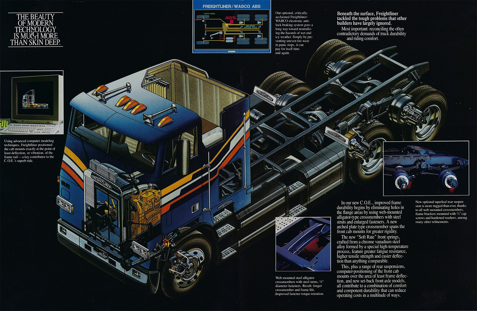
Oh man, I love a good cutaway, and this one is. Look, it’s a sleeper cab, too! Here’s a closeup of the sleeping area, if you’re interested:
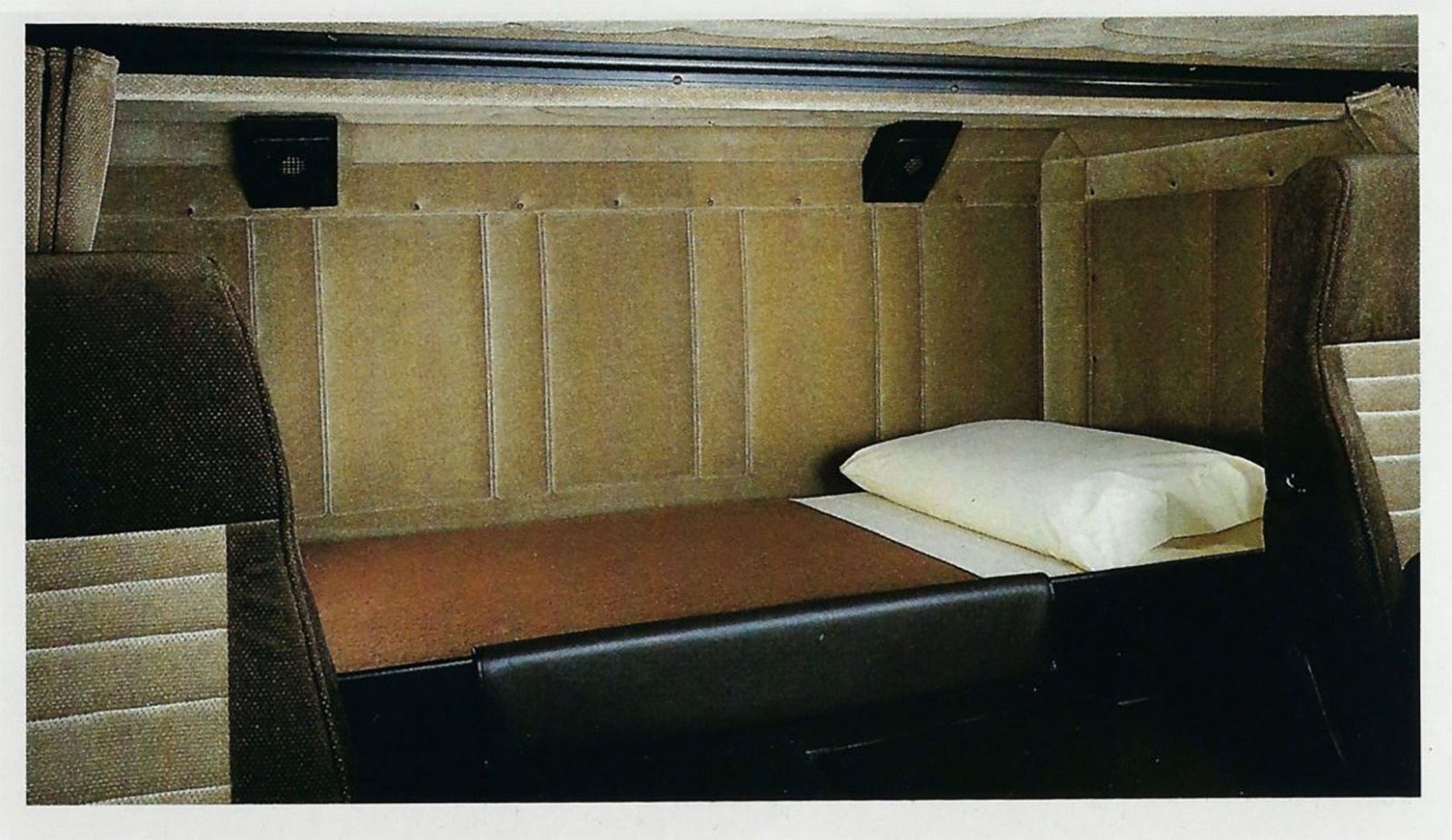
Looks pretty cozy. I always like sleeper cab interiors. So much wall padding! I can almost feel the texture of them from this picture. Did these things come with pillows from the factory? Was there a Freightliner factory pillow part number?

Speaking of parts, this is a very artfully-arranged collection of Freightliner parts. I could see it as a striking-looking wall hanging in some trucking executive’s swanky apartment, with lots of black leather-and-chrome furniture.

Cabover trucks like these are no longer common in America, where trucks with hoods are preferred, but in Europe and much of the rest of the world, where linear space is at a greater premium, they’re still popular. They’re roomy inside despite their compressed footprint, too.
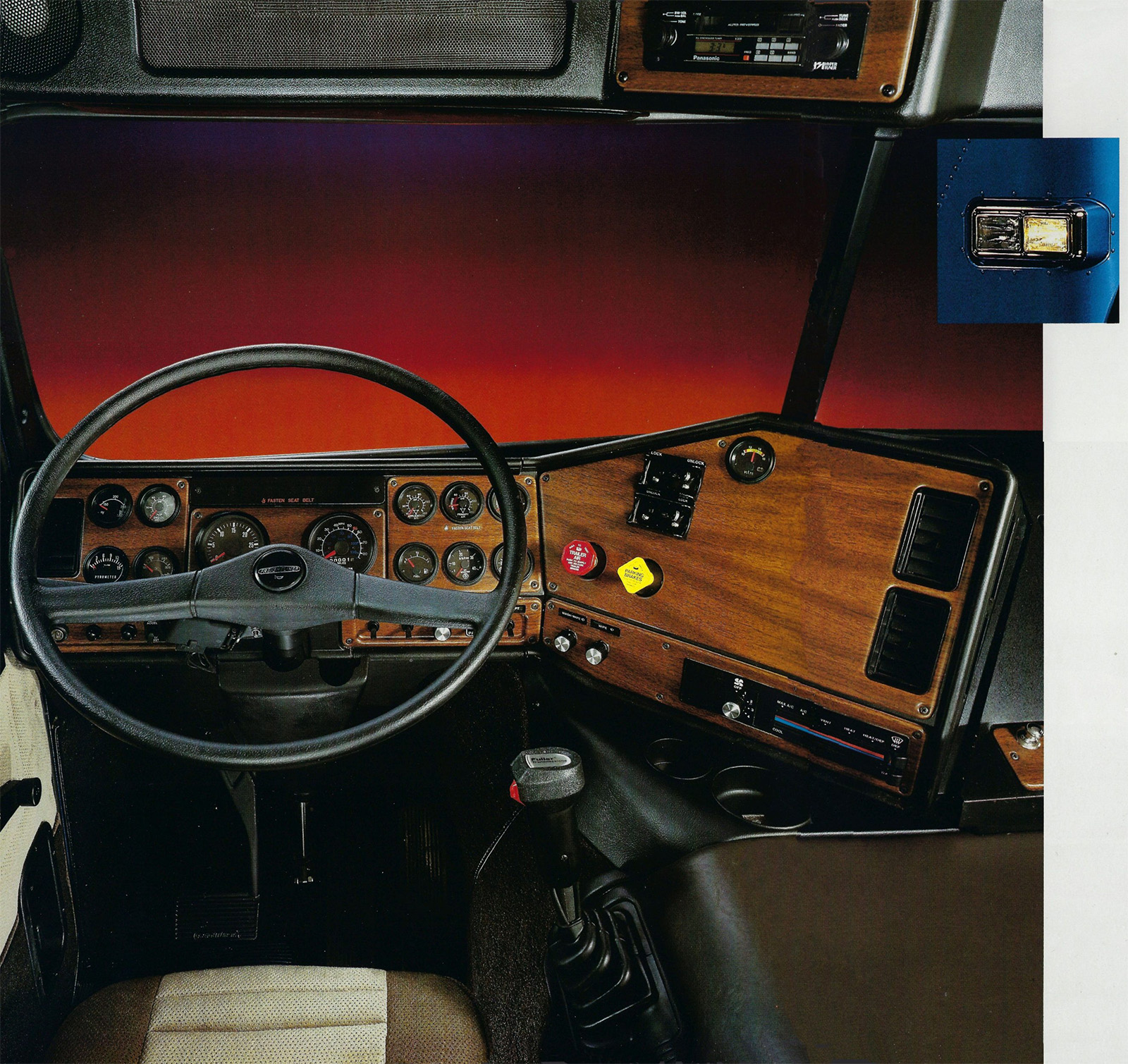
These wraparound dashboards are pretty great, too, and if large, unbroken expanses of fake woodgrain excite you, then you’re welcome. I wonder what’s behind the huge panel at the right there? HVAC equipment?

Finally, I have to come clean with you. This diagram took me way longer than it should have to process. I was reading the brownish shape as a sort of hammer; it sort of reminds me of the hammer in the flag of North Korea:

It’s not, though. That’s an overhead diagrammatic drawing of the truck and trailer, showing its improved turning circle.
Wow, this ended up in a really weird place. I’m going to stop now, before this gets worse.
But! Feel free to help me come up with a name for that general ’80s intense-sunset-on-other-smooth-planet aesthetic!


It’s got three wolf moon vibes.
Semi Heavy Metal.
Optimus Grime
Just “Awesome”. That’s it. Nothing else needed.
Glam.
Tantric Terminator.
Chevy Chevy Astrocore or maybe just call it Thunderstruck and play some AC/DC over it.
ZZ Top “EliminatorCore” is my vote.
It’s simply More Than Meets The Eye.
Yeah the colors are cool and all, but do they come with the monkey?
This look is generally considered to be part of the Outrun aesthetic. It’s often associated with various apsects of the synthwave genre.
It’s an Icy Alien Nightscape!
At first, I thought you were looking for a name for the aesthetic represented by the paint scheme – the bold multicolor stripes. I was going to suggest “80s ski jacket”:
https://encrypted-tbn0.gstatic.com/images?q=tbn:ANd9GcR4R55FEbncCFFoiJ4Gi7Vq9fgNkumecHrTPuV8SWZ-5Q&s=10
A few weeks ago when we were on a road trip I saw a lady wearing that “80’s ski jacket” (OK it was a vest) with the tri-color red, orange, yellow striping. As I started to walk to the bathroom a modern motorhome rolled in with that retro red, orange, yellow striping. So yeah that look is on its way back in or at least there are a few people who want it to be in again.
I think, with some reservation, it should be called darkwave. We have a well established visual aesthetic synthwave which shares many commonalities, but with a much more digital palette and backgrounds. This reminds me of the album covers of Depeche Mode, Gary Neumann, and so on. My only reservation is I hate the idea of a post-punk movement being cribbed for advertising… but I suppose twas ever thus.
I agree that this aesthetic is distinct from more typical synthwave style due to it being less digital. Synthwave and Outrun aesthetics share the color gradients and mountains/stars, but they often feature digital vector graphics and grid motifs, like a desert sunset in the TRON universe.
The ads shown here and the many similar ones that were around in the ’80s are as you said more analog, drawing to mind the desert/salt flats of the Knight Rider intro but adding lightning in the distance.
Darkwave is close and there’s definitely some overlap, but the lighting on the horizon strikes me as a distinctive feature of the specific aesthetic we’re discussing.
I hereby nominate “Stormwave” as the name for this particular subset of the synthwave/Outrun aesthetic.
Coke lines
I often think of it as VHScore, as it reminds me of so much of the box art (usually but not always for scifi movies) seen down at the local video barn.
Timex also used this motif in an awesome ad featuring a Vector W2 to hype quartz watches as being from the future!
VHS Core is perfect. I miss those simpler times.
+1 for VHScore
Mood Court
The just-so combination of mall food court and Glamour Shots studios.
Take my upvote, you sumbitch. LOL
the Gloaming Desert Chrome Dimension
ooh yeah, gloaming
Is that graphic showing that moving the turning wheels back closer to the dually wheels on the tractor gives a tighter turning radius? Took me a while to realize that instead of wondering about possible dual-steering-axles as an option on one of these trucks
I think you are correct. The silver model in the photos has the setback front axle.
It must not have been a popular option? These cabover Freightliners were everywhere when I was a kid, but I don’t think I’ve ever seen one with the setback axle.
80’s planetscape
It’s the classic 80’s dusky glam shot.
With the level of attention to detail, you would have thought they could have rotated those front tires about 2″ forward so the rims and lug nuts aligned with the ground.
To make things perhaps a little more weird… My partner said they once had sex in one of those beds with an ex. I’m a little jealous AND appalled at the thought.
It’s the Void-Desert aesthetic
I’ve never wanted a cabover freightliner more than I do in this moment.
That’s how you know it’s working.
I love when I see these old cab overs on the road they are so much cooler looking then modern trucks. This also might be because of being a fan of Terminator 2 haha
There’s an International cab over about twenty miles from me with an original air conditioner still mounted on the roof for sale……cheap.
Cat powered.
Twin stacks.
You know what you have to do.