
Today was my first day of cardio rehab, which is basically where I have to get up ungodly early, go to a hospital-run gym, and do exercise things while wearing a few sensors seemingly designed to rip as much chest hair off as possible when you remove them. This is all because my aorta exploded late last year, you see.
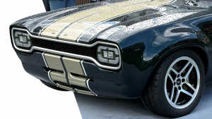
Anyway, on the way back home, I was at a stoplight behind a second-gen Mini Clubman when I noticed something about the car that was, um, unsettling. One of those things you see and you can immediately think of like 30 people who will absolutely hate knowing it exists. I’m talking about the Clubman’s badge placement at the rear.
Here’s the thing about the Mini Clubman – and I should mention I’m talking about the modern, BMW-built Clubman that is sort of the Mini version of a wagon, but not named like the original Mini version of a wagon, the Traveler, and not the original British Leyland facelifted Mini Clubman; here, this should help:

Now, in all versions of Mini-based wagons, you’ll note that instead of a liftgate or hatch, there’s a pair of side-hinged doors. It’s a great and distinctive detail, and is part of the charm of the car; I’m very pleased BMW kept this design on the modern versions of the Clubman. From the rear, the central split makes the Clubman a very symmetry-focused car, which is why I find the badging decision so baffling.
The way Mini badges the Clubman is via the old classy-car trope of individual chrome letters with very generous kerning, or letter spacing, for an effect that looks like C L U B M A N. Those of you good at math may have noted that there are seven letters in clubman, an odd number. This means unless you want to split the “B” in half, you’re going to be in a situation where you have four letters on one side of the central door-split, and three on the other if you try to place this badge centrally.
If there was no central split in the rear, this would be easy; you’d just make sure the B was on the centerline, and there were three letters on either side of it. But you can’t do that with the central door gap, so we end up with this:

The green boxes show the distance between the outer letters and the edge of the taillights, and, as you can see, the left is much closer than the right. The badge is off-center, shifted closer to the left edge.
I just can’t understand why this was considered okay? I mean, it’s not the biggest deal, but if you have a car with a literal line running down the center of it, why would you choose to attempt a center-mounted badge setup on your car that is inherently incapable of being centered?
Humans are really, even strangely good at visually finding the center of things, and many people feel genuinely unsettled when something is just off-center enough to be barely noticed. It’s uncomfortable, and almost worse if it’s subtle, like in the case of the Clubman.
Plus, it’s an un-forced error; they could have stuck a smaller Clubman badge on one of the sides. That Mini badge on the left would have been a good candidate to be split down the middle and stuck in the center, and a Clubman badge could have taken its place.
As it stands, it just looks wrong. This was a baffling decision! I’ve met car designers, they’re incredibly fussy people, very aware of How Things Look and How They Should Look and they’re always all about concepts like how They’re Not Going To Be Seen With You Unless You Change That Awful Shirt and that sort of thing. This badging deliberate sloppiness just seems completely antithetical to them.
The problem isn’t the asymmetry; asymmetry is fine if you intend it. But in this case, it’s clear that they wanted it to be centered, and couldn’t do it. And didn’t have the dignity to just admit it and move on.
Ugh. Why? Does this bother anyone else? Am I just being a jerkhole?


Is this why my Clubman is always leaning a little to the left?
(Disclaimer: I do not own a Clubman.)
The first time I saw this it sent shivers down my spine. I don’t have that level of attention to detail, but just the asymmetrical aspect just messed me to the point of nausea.
The real kicker is if you see one de-badged next to one with the odd letters. It looks so much better without any letters.
It’s 2024, so Mini will just gaslight us and insist that it IS centered.
It just boils down to the logistics of BMW thinking. I own an R53 Mini, and am still baffled why there are some parts designed the way they are.
Not really a thing to get excited over I think, but I agree this lettering and its positioning is problematic. It would have been better to remove it all together and only have one sort of chrome wart on the rear, if any at all.
We really need to talk about the awful contemporary trend of wide kerning of logos. Last known offender is the facelifted Model 3, but seems like everybody’s doing it; Kia, Skoda, Volvo, Tesla.
Pontiac were doing it in the 1950’s, Oldsmobile were doing it in the 60’s, and I’m sure there was other brands doing it around the same time too.
Yes! This has always driven me crazy.
Noticed it right away. Anyone in graphic design or has a slightest eye for art will be driven crazy by this ham-fisted afterthought. Luckily you can debadge this will a hairdryer. This was bound to happen given an odd number of letters and the lack of being able to center the text in the middle.
D+, go back and redo.
Best answer was the R55 version of the Clubman. It actually had absolutely no external badging that said Clubman. As a matter of fact thinly use of the word Clubman was on the door sill below the funky suicide door on the passenger side.
We need to enlist the help of Wes Anderson on this abomination.
How about option 3? Not putting a hideous, oversized badge on the car. It has 3 branding badges on the back. Remove the Cooper badge, and replace it with a small Clubman badge. Done and done.
Thanks Torch, now that is the one thing I will see when behind one! Also having some aftermarket parts myself I can say that the hospital cardio course was one of the best things I did. Hang in there and keep at it.
Outside of hideously splitting the B in half, I think that they did a reasonable job. You don’t want to vary the spacing between letters.
Yeah and it really doesn’t read as off center, it’s only when you notice that the number of letters isn’t the same on both sides that you can figure that it’s slightly off center. I feel like it’s similar to the way that the Google G isn’t perfectly round but still looks right.
They did the best they could do, assuming they HAD to put the logo in the middle. But they could have put the Clubman logo on one side, like many cars do including, for example, the Cooper S.
I think the bigger issue is how many they have sold, suggesting how many people are incredibly mentally unstable. I genuinely couldn’t buy one because of it, and prob couldn’t be friends with someone who has, unless they were aware of how much of an issue it is, and only bought it because it’s cool for their wacky business…
Just remove the U B M, the remaining letters will be far enough from the split that it’ll look great!
C L A N
… what?