
The average person probably doesn’t grow up thinking that font choice matters until they end up formatting their first resume in Comic Sans. It might seem silly how the shape and arrangement of letters can spell out success or failure, but hey, someone ended up owning a video rental store called “MEGAFLIX” in tight sans-serif font. That went viral in the days of ye olde internet.
Now, kerning alone can be a minefield. One false move, and you could cause a scene reminiscent of SNL’s Celebrity Jeopardy. That’s “Catch These Men,” not…anyway. Best-case, a little bit of a necessary fudge can make text a little annoying, sort-of like the badge on the back of a Mini Countryman.
However, every so often, font choice and kerning converge to give us a real gem, and that’s exactly how we’re kicking off today’s edition of Comment Of The Day.
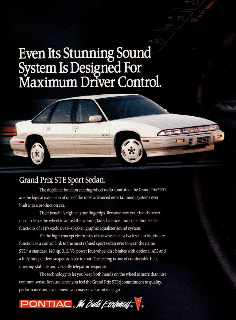
Earlier today, The Bishop wrote about the time Pontiac tried to meet the surprisingly potent Ford Taurus SHO head-on with a warmed-over Grand Prix. While it couldn’t catch the fast Ford, it did look pretty swish with its vision of early ’90s futurism. Mind you, the font choice for Pontiac’s ad tagline of the day wasn’t so futuristic or even supremely legible, as Bronco2CombustionBoogaloo pointed out:
At first glance, I misread the funky script at the bottom of their ad as being “We build excrement”
That’s going to be a hard one to un-see. Also, bonus points to Griznant for mentioning the third hotted-up American midsize sedan of the early ’90s.
Then the Spirit R/T waltzed in, downed a beer, and punched them both in the back of the head.
“I got your torque-steer right here you MFrs!”
Ah, what a wonderfully silly car. If it could talk, it would indeed talk like this.

Meanwhile, Antti wrote about an estate agency that snubbed an applicant because she drove a perfectly serviceable 2014 Citroen C1 that didn’t fit their internal criteria for a car less than a decade old. While this seems to be a simple case of car discrimination, it’s not uncommon for companies to have age limits on business-use vehicles for insurance purposes and whatnot. Sometimes such policies come with a benefit of sorts, and Matthew Strachan showed how to game a car stipend to the max:
My old employer had a similar car-age policy. They would pay your car note up to $600 if the car was newer than 10 years old. So I bought a Jaguar F-Type and rode my bicycle to work.
Buying a sports car? Excellent. Getting your employer to pay for it? Simply genius.
You know how Ferrari’s option list is simply ridiculous? Jason recently shone a light on a stenciled emblem that takes 16 hours to lay on the car by hand and costs an insane $16,000. That’s a whole lot of money for something easily mistaken for a sticker at 15 yards, but thankfully, SlowCarFast has found a much quicker way of hand-painting a Ferrari:
(Sticks hand flat into a tray of paint. Presses it against car.)
There! Hand painted!
Circling back to the General, I recently found out that GM has an ideas submission portal and decided to let everyone know they could contact GM with ideas for improvement. While some ideas were gloriously unhinged, Lori Hille pointed out a GM-ism that always irked me:
Gauges. Not gages.
It’s about time that got fixed, yeah? They’re meters to gauge speed and revs and whatnot, not some guy named Gage stuck inside the dashboard.
Anyway, that’s all from me today. Have a wonderful evening, everyone.
Top graphic image: Pontiac


Interesting fact about Comic Sans. It is a great font for many people with dyslexia. Still ugly though.
Keming strikes again.
I must admit that I had a lot of fun with that Grand Prix article. It also had me searching up reviews for the different iterations of that car. The 2005 GXP version, with the front tires wider than the rear ones was interesting. Still not a great car, but interesting.
Ford shit the bed with the SHO after ’95, so I guess that left the Dodge Charger to pick up the American sport sedan flag.
As a mechanical engineer in the US, I use the spelling “gage” much more than gauge. Er.. Guage? gauague?
Strain gages, gage blocks, gage R&R, those are pretty much standardized (at least in my mind) to gage. And it gets rid of the annoying, British “U.” I’m not laying down our revolutionary war victory that easily.
That said, it does seem wrong to call the instrumentation in a car “gages” instead of “gauges”, no matter how gross the version with the “u” looks to my eye.
My old 2nd gen Ram had an idiot light on the dash for “CHECK GAGES” (no “U”) that was tripped by low oil pressure or high engine temp, so at least DaimlerChrysler (this was a 2000 model) thought it was spelled sans-u.
Seen the meme with a birthday cake what says “Happy Birthday Clint” and it doesn’t look like Clint?
Gauge vs gage is a weird one, and one I run into a lot working with measurement equipment in the US. It’s odd how this one Americanism dropping the British “u” just didn’t quite catch on the same way others did, but I think it’s just because it’s a word used less often, and where it is used, you’re generally working with international equipment at least as often as American, usually more often. So most of your gauges call themselves gauges in their literature and labeling but those few engineers who came up in more heavily American industries are still spelling it without the “u”. Interestingly, it’s not a word I’ve seen anyone be obnoxious about insisting one or the other, so that’s nice. We definitely have plenty of documents at my current job where the spelling changes depending on who wrote different sections though, so that’s kind of unusual.
Yep, I pretty much only use “gage” but don’t mind if others want to use “gauge.”
Unless they’re British. We won the right to drop all their stupid extra “u’s” in the Revolutionary War, and I’ll be damned if I give up that easily (brns rbber as I tear off in my lxrios Jagar XJ Spersport).
Pretty sure it’s “Revoulutiounary Waur”
I remember that comparo. I was very proud of the Spirit R/T.
Also – “We build excrement” was noticed and repeated at the time, as well. It’s great and should make a comeback
I always thought Pontiac’s idea of “excitement” referred to the amount of plastic cladding they slathered down the side of their cars.
Interesting, because it show how we actually read. Studies have shown that we really only need the first and last letters in a work to be correct, and our brain will auto-correct most misspellings. In this case, there is clearly a t in the middle of excitement, but some people’s brains are disregarding it and turning it into excrement.
Yep.
Even if you’re not a designer (I’m not, for instance), you might find this book really, really informative:
100 Things Every Designer Needs To Know About People
Talks about how they eye scans, how memory works, techniques like “chunking,” colors and typefaces for legibility (youngs, olds, women, and men all see things a little differently – as in actual senses working differently, not euphemisms for opinion…)
I spent a decade in direct response advertising, and we practiced a lot of neuromarketing rather than just taking wild guesses. It’s very effective to shut down the opinion discussion with “here’s what the science says”
Gauge vs. gage? An engauging discussion.
Stop needling us!
Stop fighting! I can’t tach it anymore!
That escalated at the speedo light.
Way to dial up the intensity.
No one person can decide that. You’ll need to convene an instrument panel.
Benny Hill would get an entire episode out of Therapist <> The rapist.
Tobias Funke in Arrested Development was an analyst and a therapist… an analrapist.
Then he made Anustart.
Canal is anal that starts with a C, but they are pronounced differently
Interesting, anal is at the end of the alimentary canal.
Sounds like a SNL Celebrity Jeopardy joke for the Sean Connery character as he reads the categories: An Album Cover becomes Anal Bum Cover, etc.
Connery: “I’ll take Le Tits Now for $800”
Trebek: “That’s Let It Snow”
Thanks for the shout out! Adam Wade did an episode on weird ways that GM saved costs by using creative spelling in their corporate documents. It goes beyond gages.
https://youtu.be/W-Hfmozfwp4?si=Em_iauOvXIKxZ4B1
Wow thank you for posting that. So the logic is spelling it without the ‘u’ will save enough microseconds over time to boost productivity. I was thinking it sounded almost plausible until the part where he says GM published a style guide (how many work-hours did that take) so you could study up on all the letters you could skip. How many hundreds of times do you have to type “gages” to make up for the time to read the style guide?
My favorite part is the “gages” button is right next to the ”DIAGNOSTICS.” So many letters to say “STATUS.”
Srsly
rght. lok at al th tme Im svng.
LOL
Noah Webster is smiling from his grave.